
Newcastle University provides quite a lot of information about how to produce a good poster. There’s an online course which is a useful start, and some supporting information. Here is some additional guidance.
Formatting guidelines
A template for posters can be found at:
http://www.ncl.ac.uk/library/services/print-bind-copy/print-services/large-print#4
Use of this template is not compulsory. You may use a template favoured by your supervisors but the choice is your responsibility. Your overriding criterion should be clarity of communication.
Please stick to standard Microsoft fonts. Suggestions for text size on A1 reproduction to be no smaller than:
Title: 70 pt bold Subheadings: 30 pt bold
Author & Address: 30 pt Body text: 20 pt
Be careful with colour and effects
 These days, you may not be required to print your poster; even some conference venues use completely electronic displays. However, bear in mind that others – examiners, reviewers, interested readers – may wish to print the poster, and some constraints are worth bearing in mind to get a good quality result.
- Use fonts that will print to at least 10-point size on A4 paper.
- Graduated and strong coloured fills will not print as well as flat, pale colours. Use a pale coloured background with dark text.
- Transparent fills may not print correctly.
- The resolution of images (photographs, graphics & logos) should be at least 300 dpi when printed. It is inadvisable to embed images (including logos) from websites, as they are usually of a low resolution and will render poorly in print.
What else?
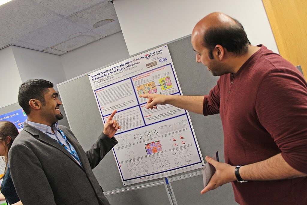
 If there was space to add only one thing, this is it: KEEP IT SIMPLE!
As a rule of thumb, a scientific poster should have no more than about 300 words. That’s ABOUT THE SAME AS AN ABSTRACT.
Many, many people condense their entire project onto a poster, and that’s hopelessly inappropriate. The two media are very different; the whole point of a poster is easy engagement and rapid communication.
Ask: would you stop to look at a poster with an entire manuscript printed on there? Pick out the important points, make it attractive and eye-catching, and give the reader a simple take-home message.