A few years ago I was in an internal meeting with presentations from across the University. Someone from outside of my Faculty was making an impassioned argument for the use of the open source programming language R and suggesting all students who require quantitative skills within their discipline should be taught R. Something they said then stayed with me.
“If SPSS is like waiting for the bus, then R is like taking a taxi”
Although intriguing there was something in what they said that made me a little uneasy. It took me a little while to work out what it was, and a good deal longer to write about it but I think I am OK about saying what the issues are; The bus can take you on a route that anyone can follow and assuming you have a pretty good idea where you are going it will get you there, along with whoever wants to follow you to that destination. Taxis in a familiar place a fine but what about when you are going somewhere new? It is really down to the taxi driver to interpret where your destination is, if you are not sure then you could end up in the wrong place and if the taxi has followed a circuitous route, or a route only they know is it realistic to expect anyone else to be able to follow you?
I am not going aiming to suggest everyone should use standardised statistics packages for data analysis, or that everyone should always get the bus. What I would say is there are reasons to be vigilant when following the analysis performed by others and to also be very careful when working with tools as powerful as R with all of its downloadable packages.
It can be quite laborious remaining faithful to the scientific method, which requires you to discount the null hypotheses before accepting your own as the most likely. The using a programming language such as R offers several short cuts and it is good to be aware of what is acceptable and what might be ways that confirm inherent biases.
Free to use
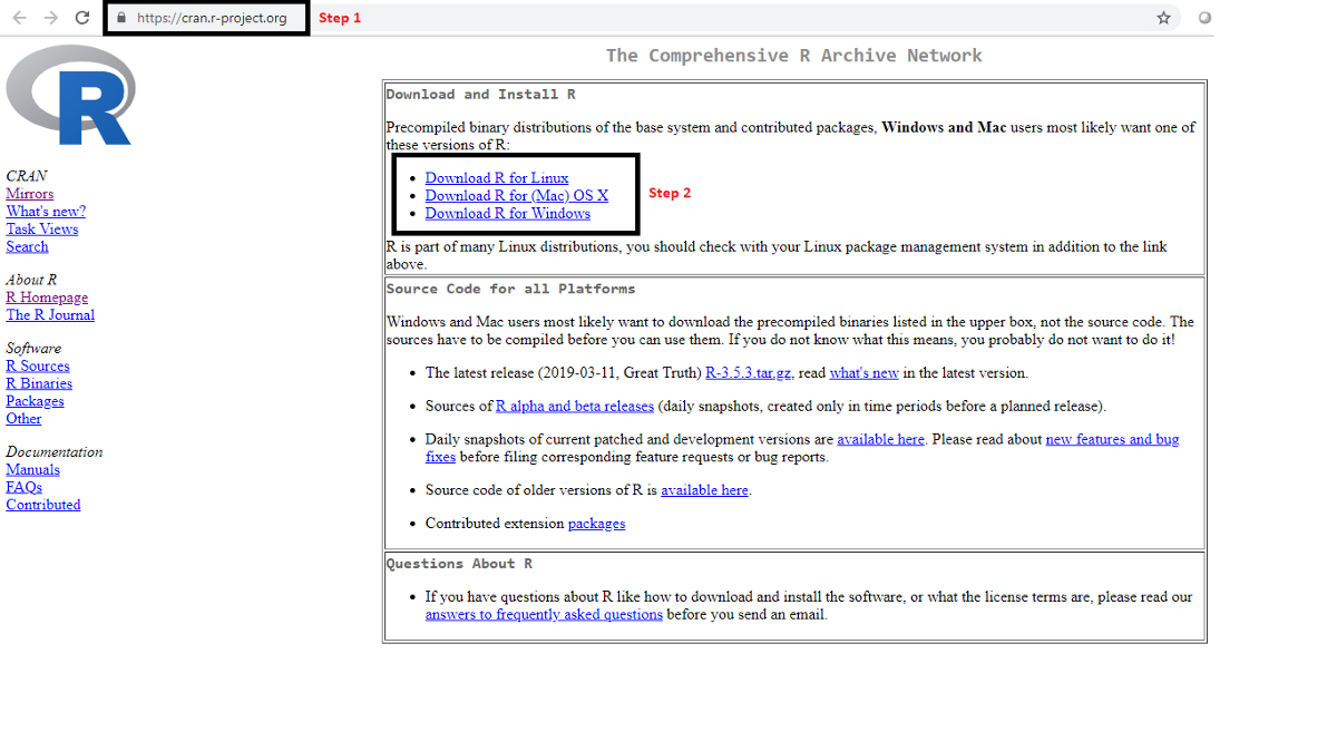
One absolutely undeniably brilliant feature of R is it is free and can be downloaded at https://www.r-project.org/ in a somewhat ironic way this means that anyone can use it to do their research analysis as long as they can afford a half decent computer. The only people who might struggle are those who have system administrators that will not allow packages to be added. It is likely those working on a University machine can access ‘R Studio’ or something similar but they may struggle to download the ‘distributed packages’ that have been created to run in R.
“R is an anarchist utopia” [1]
The many thousands of distributed packages are a great positive but also presents a couple of the inherent risks with R, one is the packages are not guaranteed to work, which could be annoying. What I see as more problematic is choosing the right packages. One of the packages might provide a significant result with your dataset but what checks are in place to make sure the data is being analysed appropriately?
Choosing the right statistical test
As an example there is function, cor.test which can test for correlation between two datasets but it will assume parametric data for variables and how do you know the data is normally distributed? Let us imagine that we are looking for a correlation between the heights of parents and their children. I don’t suppose anyone would make such a simple mistake but if we were to look for the correlation between both the heights of mothers and fathers with the height of sons and daughters the test should be a non-parametric test and require a different function. The data from both comparison variables may appear normally distributed but is actually bimodal and so a non-parametric test would be required. The function won’t know this, only you will. In this example the same mistake could be made just as easily in SPSS or Minitab, as it could in R but I guess as the data or the questions get more complex then the chances of errors increase.
If one was to use the Correlation Test perhaps the shapiro.test should be used first to test whether the data is normally distributed. I guess the issue here is it might take a very large sample to recognise that the distribution is not exactly normal.
Representing data graphically
The ability to make attractive looking graphics is a very useful function in R. This is very helpful for making publication quality graphics. The ability to change the qualities of a set of variables is a good way to emphasise the point you are trying to make with your data. Inherent with the capacity to do this is the risk that you give an impression your argument is somewhat stronger than it really is. There is also the chance to change the graph type or the axis to make a point more convincingly. The peer review of any academic outputs is reasonably likely to pull you up on anything too obvious or flagrant but this is not a clearly defined right and wrong. Of course you can do this with any graphics package as well as you can with R but cycling through a set of alternatives might not be quite as straight forward as it would be with the graphics packages in R. This is also something to consider beyond the academic publication. It’s unlikely the general public would find many of the graphs displayed in academic papers as visually appealing. So the chance to redraw graphs for public consumption is there, with alt-metrics becoming an important feature what researchers do to present their data could be quite critical in getting some broader recognition to their findings. There are some very obvious ways to display data in a misleading way, covered well in this blog (https://venngage.com/blog/misleading-graphs/) [2]
I wouldn’t really expect anyone reading this blog to be displaying information with complete contempt for the relationship to evidence but as I say there is some gradation between helping the reader see key points in the data and exaggerating significance.
Standard Tests and Model Selection
With any quantitative analysis plotting out the data to see how what it looks like is a very good thing to do. It’s possible to see trends and correlations and then you can test to see if there is a fit that goes along with what you might expect. If there is not an obvious fit to go along with your hypothesis you can see how other variables might be at play. Faceting a dataset could help identify a key factor. I guess the troublesome question I have in faceting is, how many different variables should be tried to find a trend or correlation that matches what is expected. If this is just an exploration of datasets in order to generate a hypothesis to be tested then that seems fine, how else do we find out? However, if it’s a finalised dataset and this is an action to find some significance, any significance well there might be something there but run enough tests with enough variables and one it twenty times one will crop up. I think. Splitting up data sets in enough ways could even end up with a Simpson’s Paradox (https://en.wikipedia.org/wiki/Simpson%27s_paradox [3]) type situation where entirely the opposite findings could be retrieved from the same data set.
An advantage of looking for statistical significance with something like a T-test or a linear regression is the relative simplicity of the answer. Comparing two datasets to see if they are different or if they correlate gives something of an all or nothing result, even though it should not really be viewed that way. R appears to be good if you have a more complex set of variables and you want to see which model fits the interactions best. I guess the concern I have with this approach is what if the best model is just the best of a bad bunch. It also appears there are a few methods of testing which model is the best, so selecting which is best might make a difference and is it clear which is best [4].
The complexity and rigour of analysis for research
My impression is the very nature of research is changing, maybe quite slowly but as more questions are answered the next set of queries we look at become ever more complicated and involve more variables. When there are a large number of factors at play generating evidence through the scientific method becomes complicated. If the null hypothesis is going to be disproved all of the confounding variables need to be accounted for. So I can see why looking to alternatives to the scientific method become attractive. I guess the risk is how robust alternative approaches are. The great advantage of trying to disprove the null hypothesis is it’s a pretty rigorous process and as long as the experiments are set up without biases it should be sound. So when we look at alternatives can we be as assured they have the same degree of rigour? My issue with model selection is it could be possible to find solutions to a data set where the model fits but the solutions are correlative, not causal. The same thing could happen with the scientific method approaches but it somehow seems like less of an easy trap to fall into. Sorry for a rather cruel example, lets imagine someone has noted that ‘Spiders with no legs aren’t eating any flies’. In the scientific method checking the dietary consumption of spiders with their legs removed might show us that they do eat less but it doesn’t disprove a null hypothesis that spiders are hungry regardless of how many legs they have. However, if we start comparing the hypothetical models that ‘the fewer legs spiders have the less hungry they are’ and ‘Spiders count the number of flies they should eat each day on their legs’ we might find we select a hypothesis that correlates with our data but does not reflect what is really going on.
Once model comparison has been adopted as an approach to search for evidence then maybe it is better just to concede that dredging the data to find the best model is an inevitability. If you don’t do it someone else may well use your open data and look. If you have missed the most likely model that the data predicts you might need to explain why you went with the one that you did select. If the model the dredging throws up as the most likely doesn’t match your hypothesis, then that seems a bit like the null hypothesis and maybe a new a hypothesis is needed.
Meta-analysis
Collecting data together from various sources to build an evidence base on a particular hypothesis seems to be the most logical and strongest way of supporting that hypothesis. The meta-analysis of various datasets can be used to quantify how strongly you can support your hypothesis. It all seems perfectly reasonable, the only issue I have with this is the independence of the data sets. In my time I’ve been known to make a few bets on the horse racing. It is interesting to see how punters make this type of error when they analyse the chances of a horse winning. The will look at factors like how often a horse has won over different distances, ground conditions, against a certain number of runners, with a particular jockey etc. By the time they come to a conclusion they can be completely convinced the horse is bound to win. What they don’t consider is they have counted the same previous win or good run multiple times. I don’t think the mistakes are as obvious in meta-analysis of scientific research but the principle is the same. Unless the evidence isn’t associated in any way then the factors that are linked need to be considered and weighted appropriately. Here are some papers that describe that issue better than I have. Senn 2009 provides a helpful review on the subject. [5]
References
- Nettle D. https://workshops.ncl.ac.uk/fms/rprogramming/
- McReady R. https://venngage.com/blog/misleading-graphs/
- Colin R. Blyth (June 1972). “On Simpson’s Paradox and the Sure-Thing Principle”. Journal of the American Statistical Association. 67 (338): 364–366.
- Brownlee J. https://machinelearningmastery.com/probabilistic-model-selection-measures/


