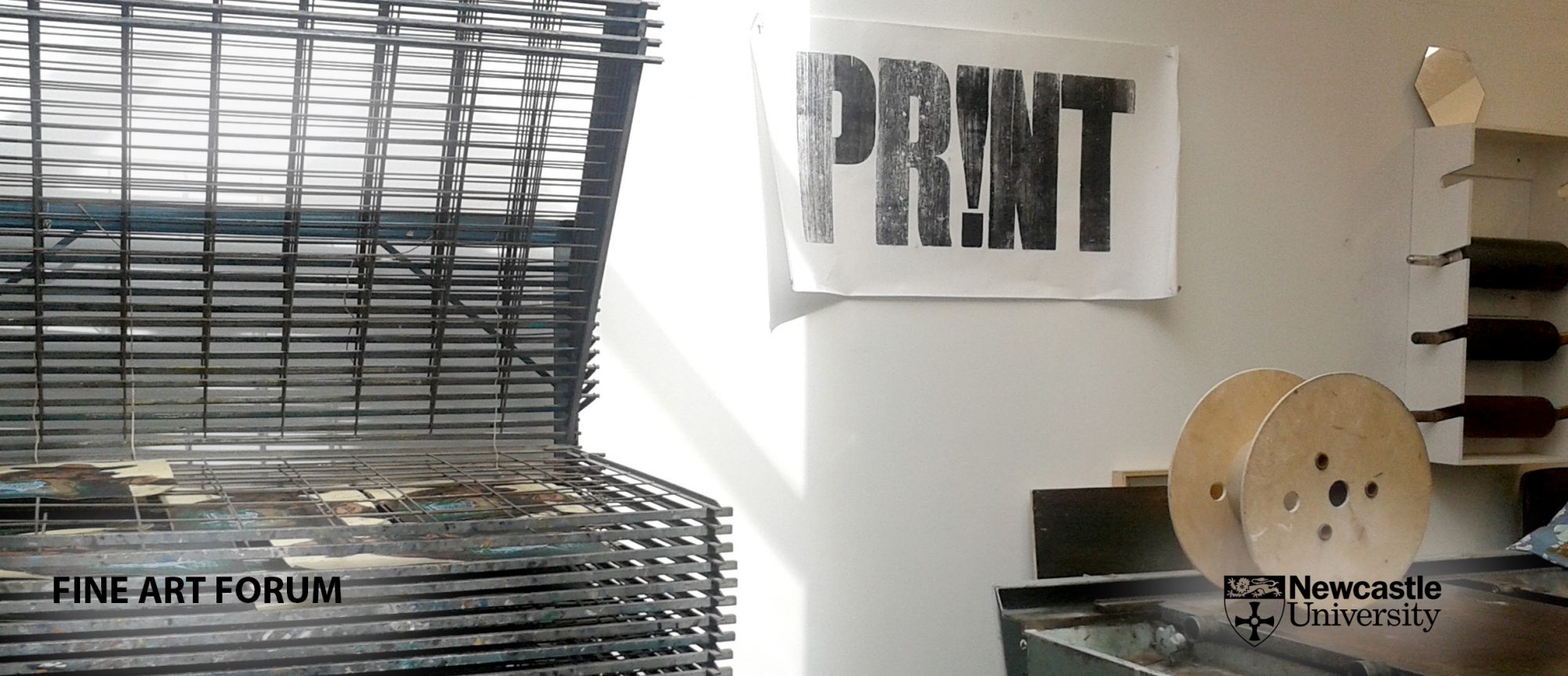
VISIT:
ncl_printmakers
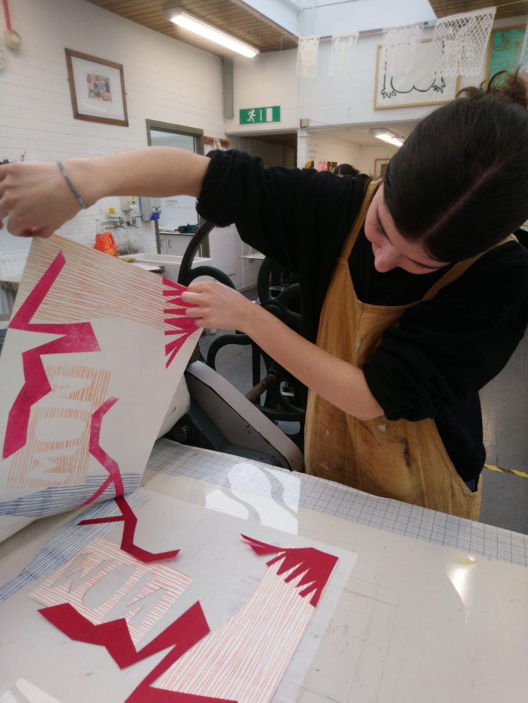
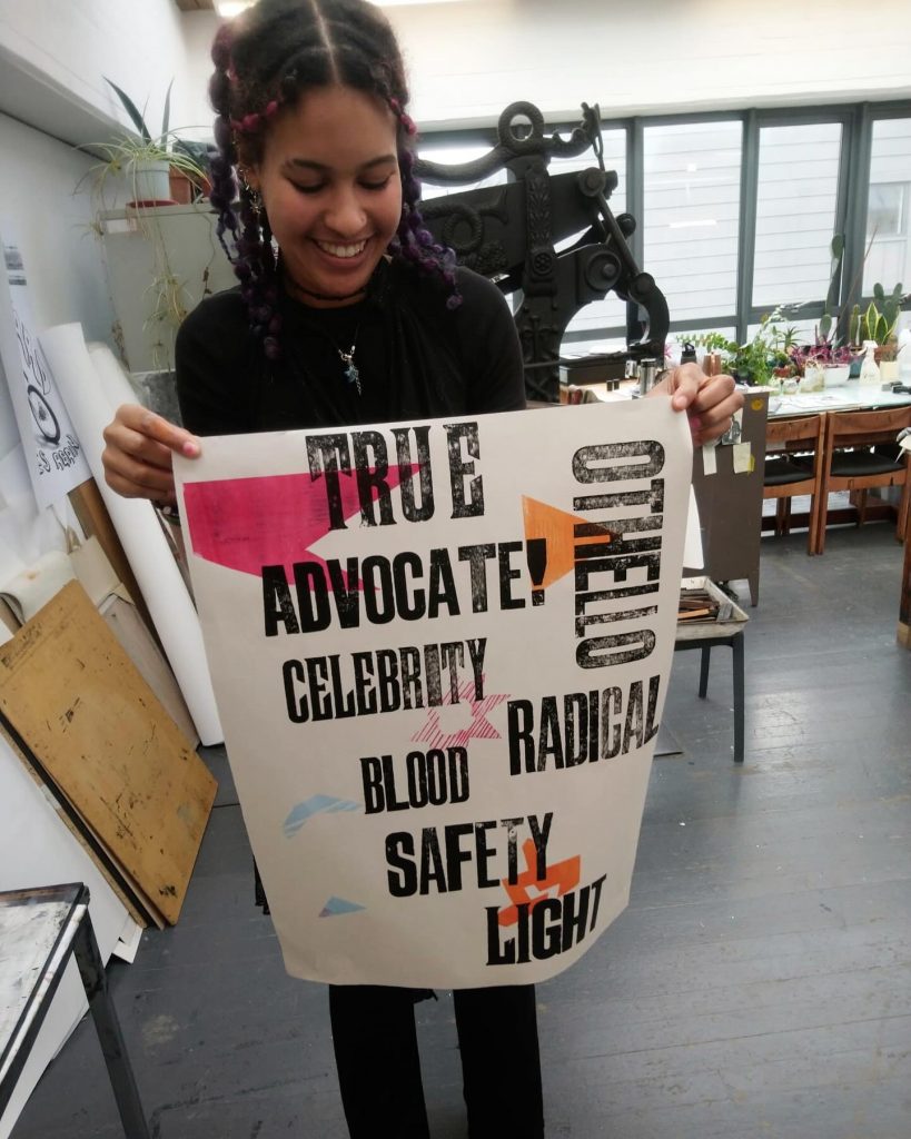
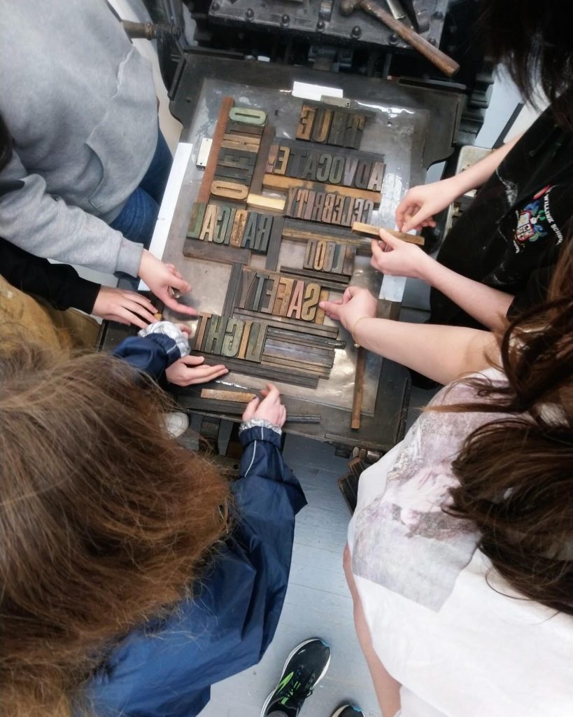
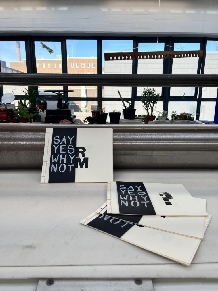
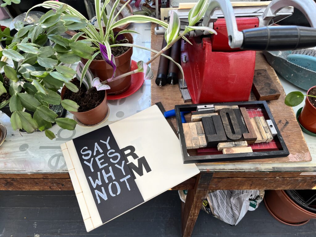
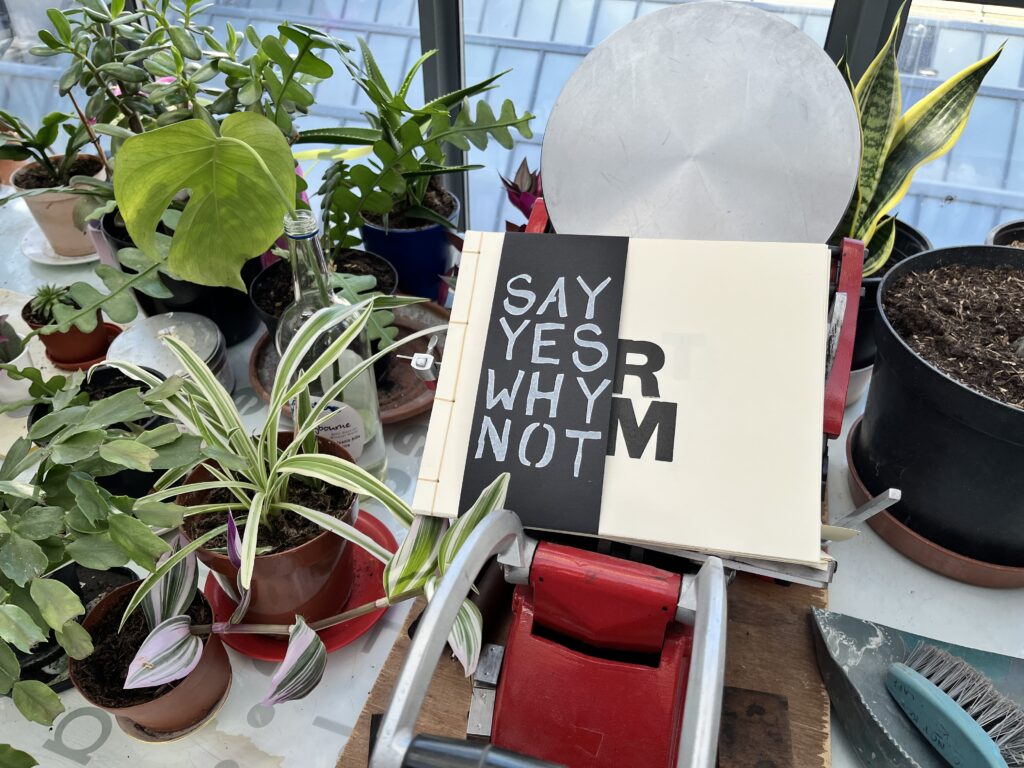
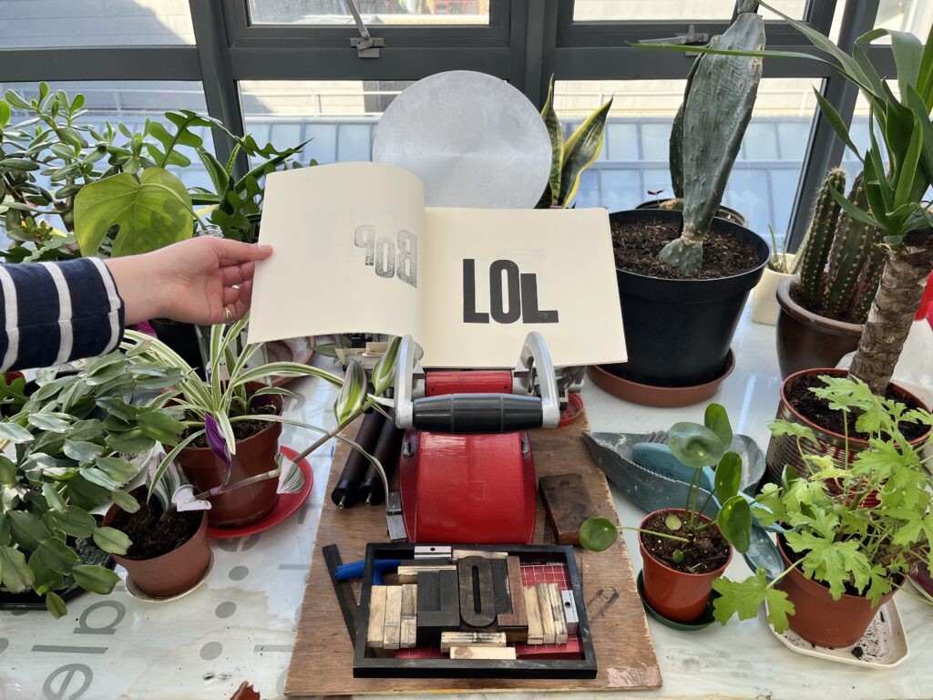
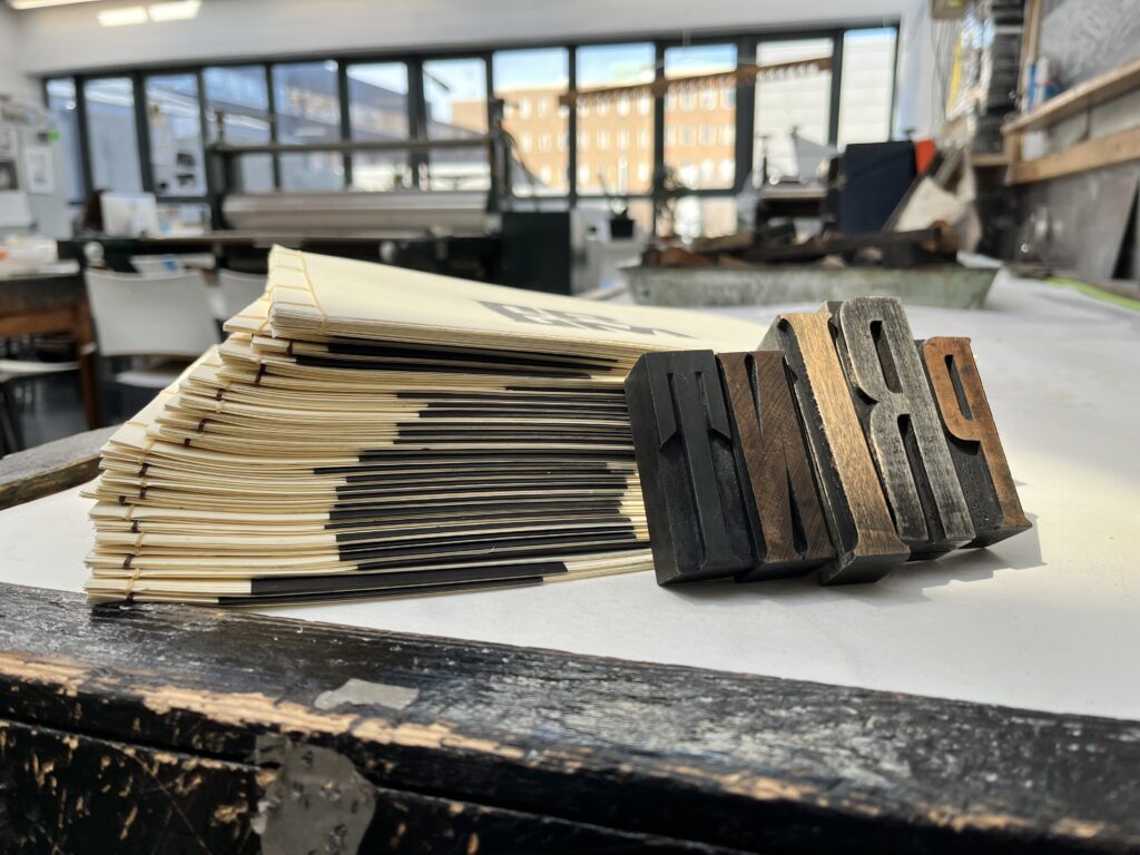
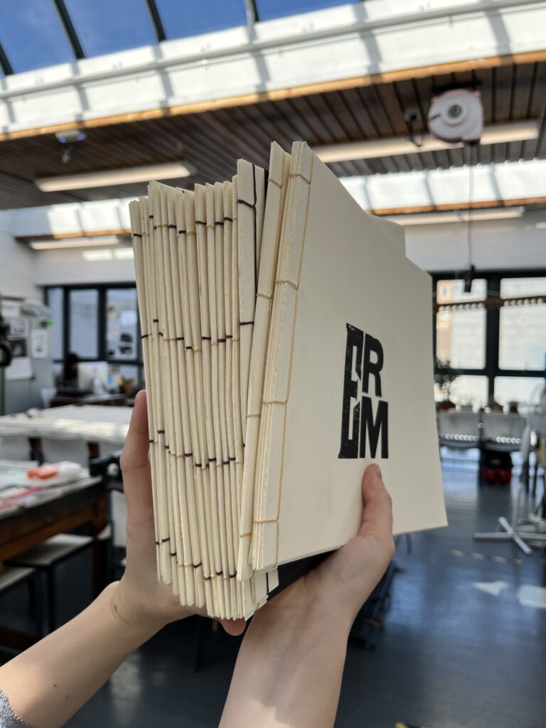
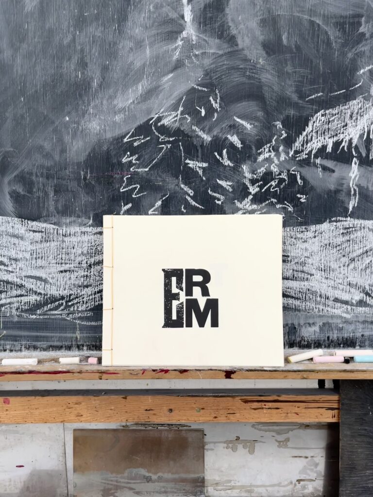
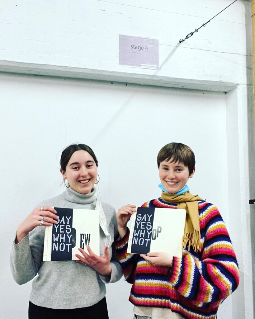
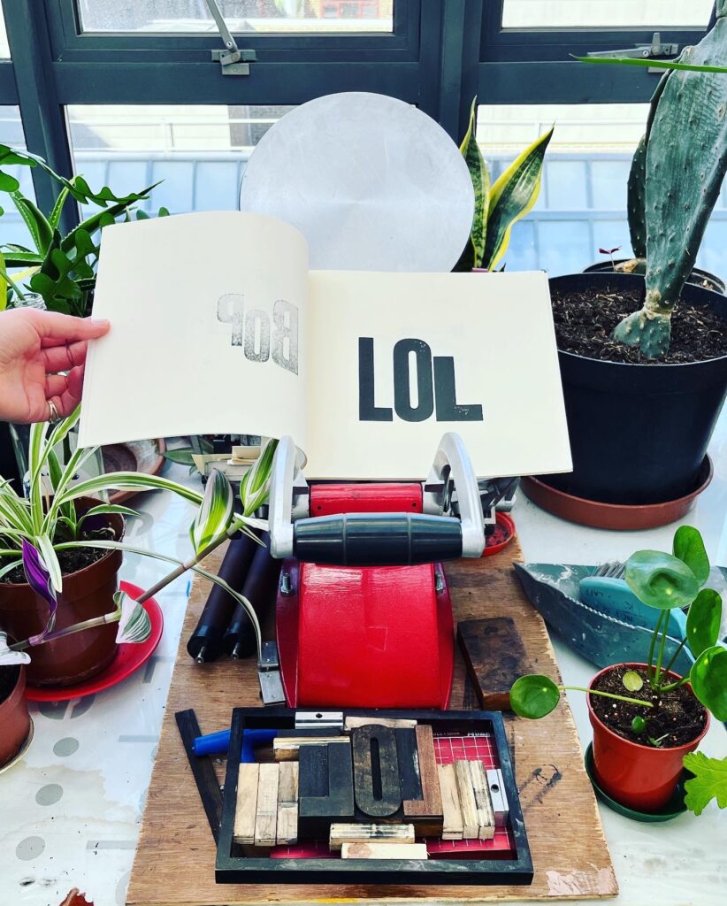
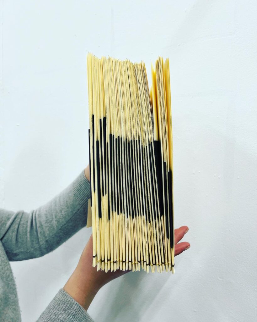
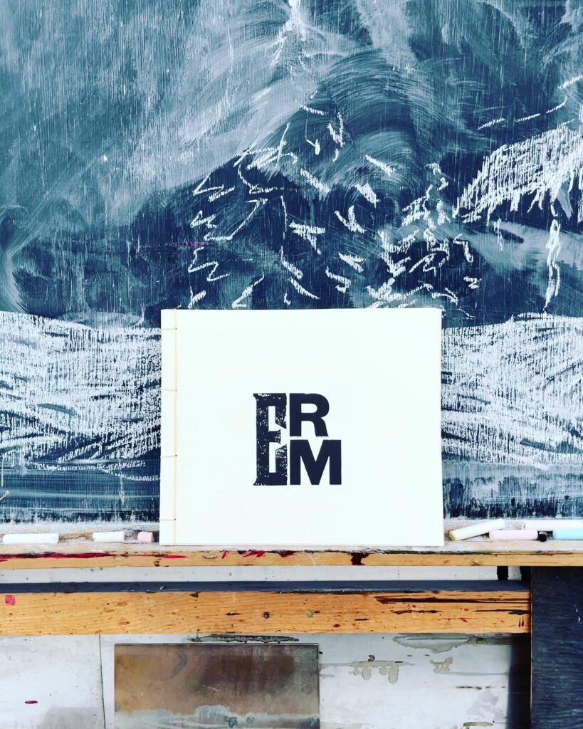
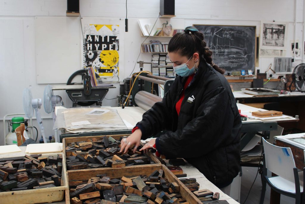
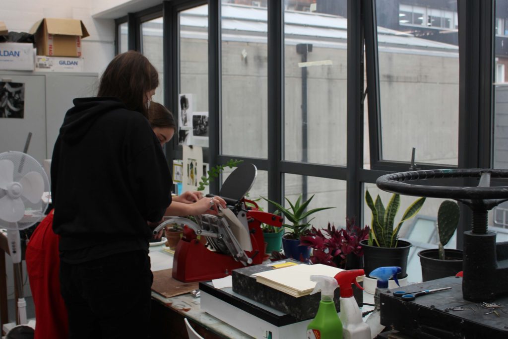
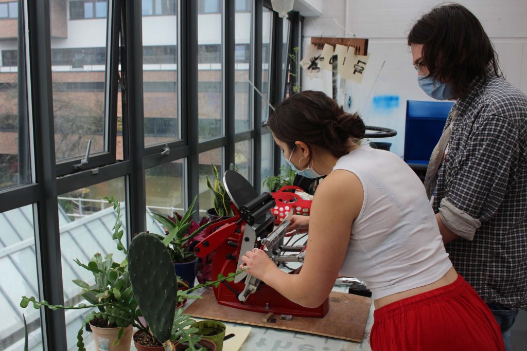
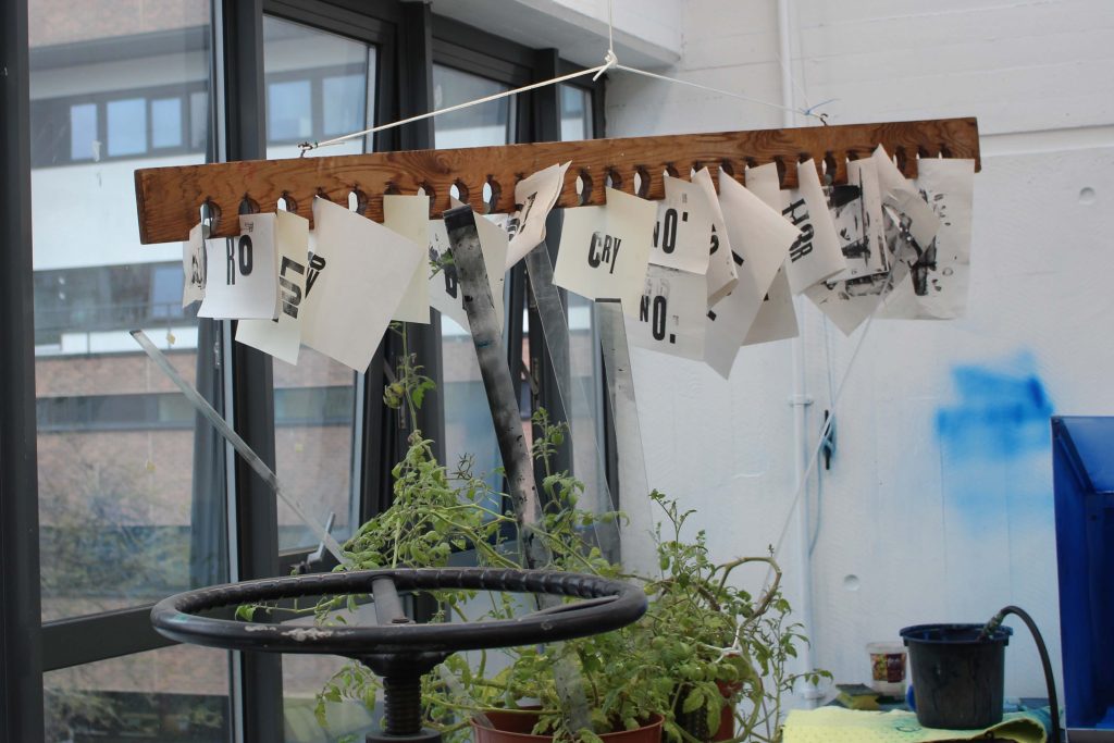
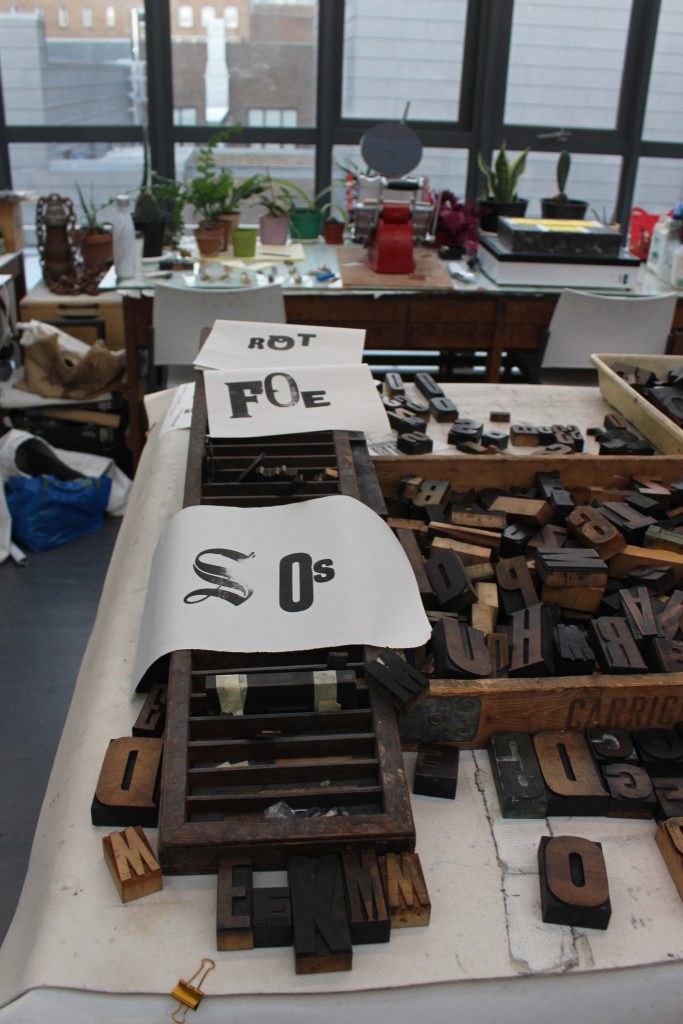
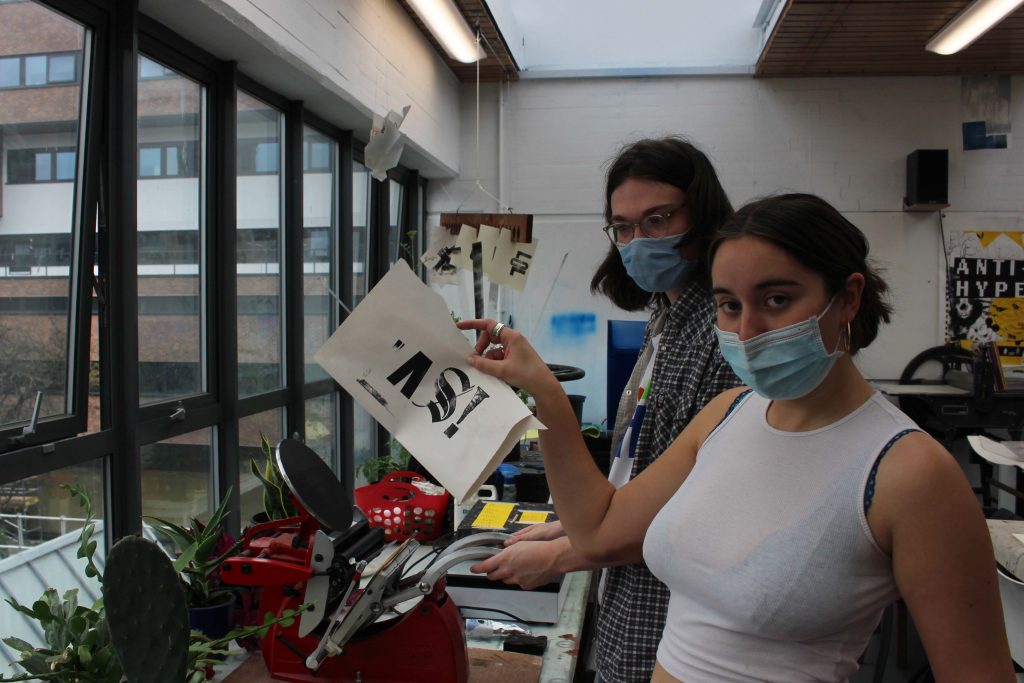
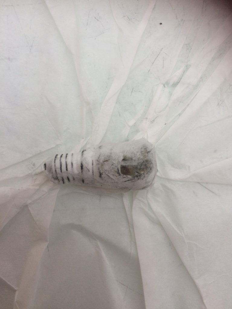
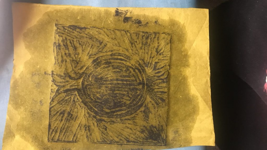
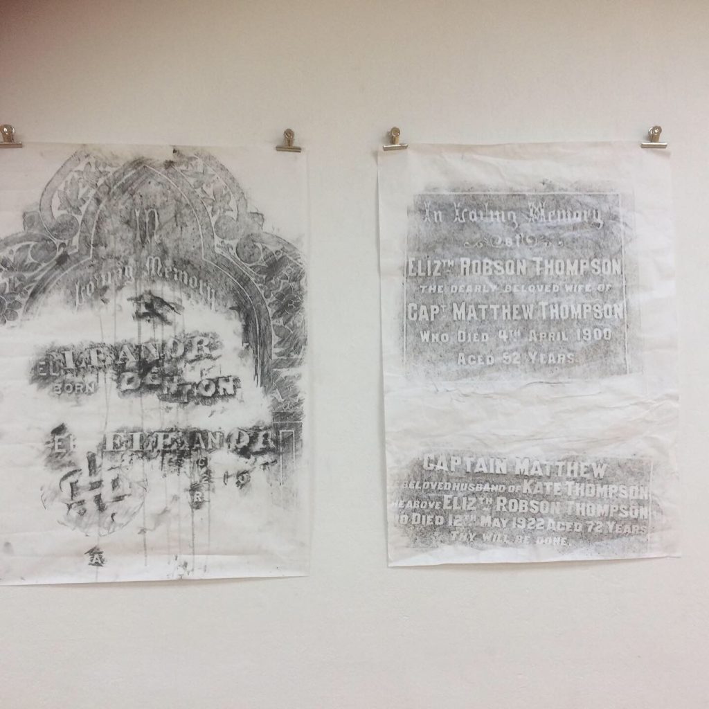
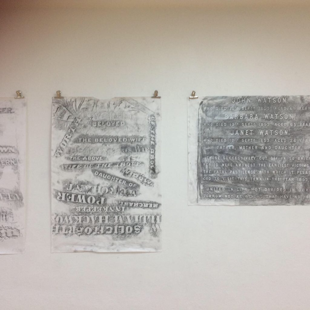
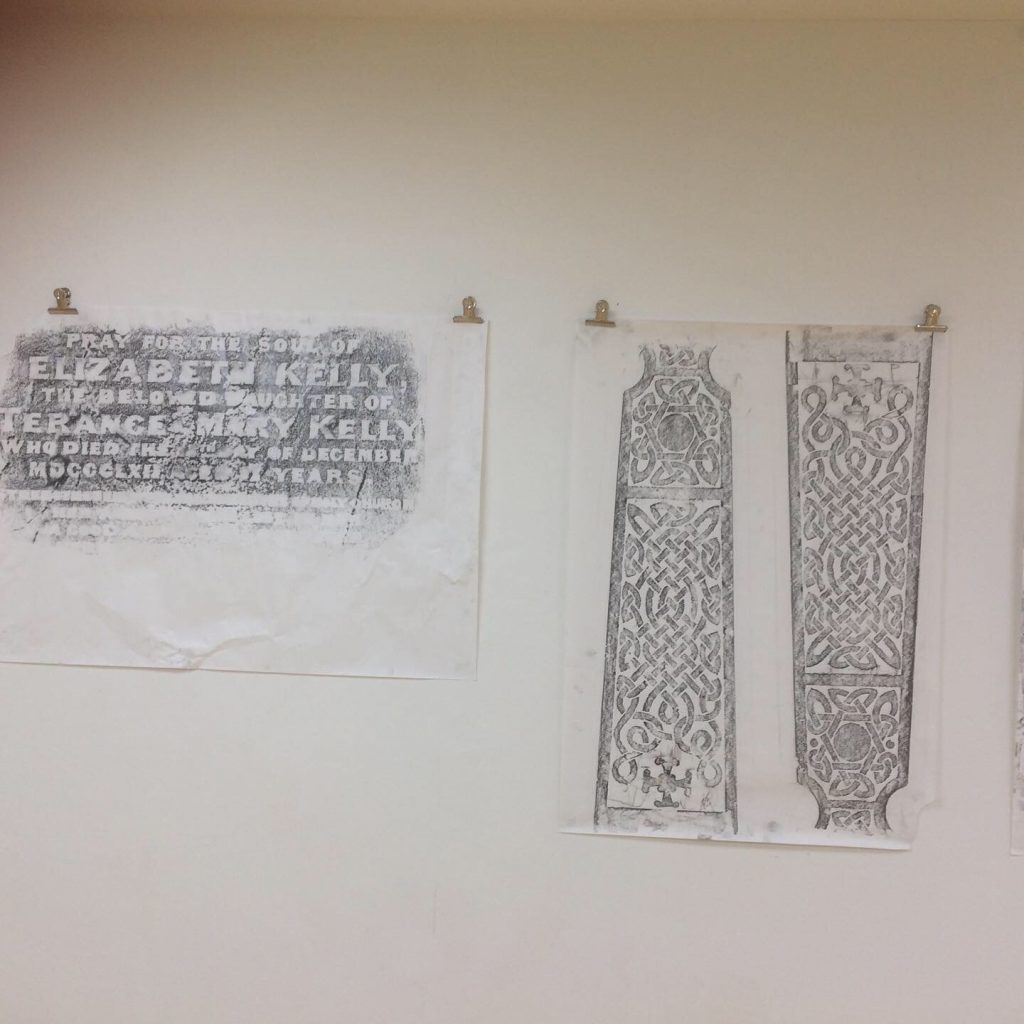
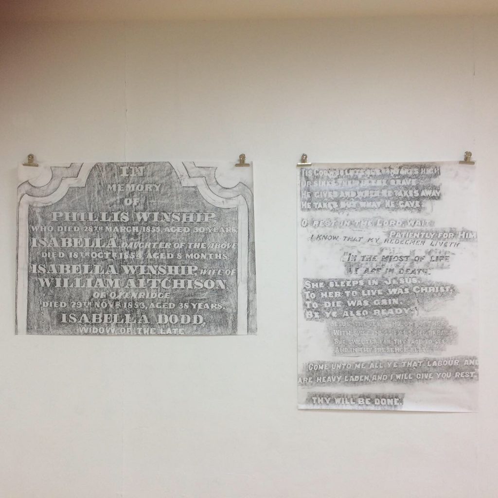
Letter press workshop with Theresa Easton.
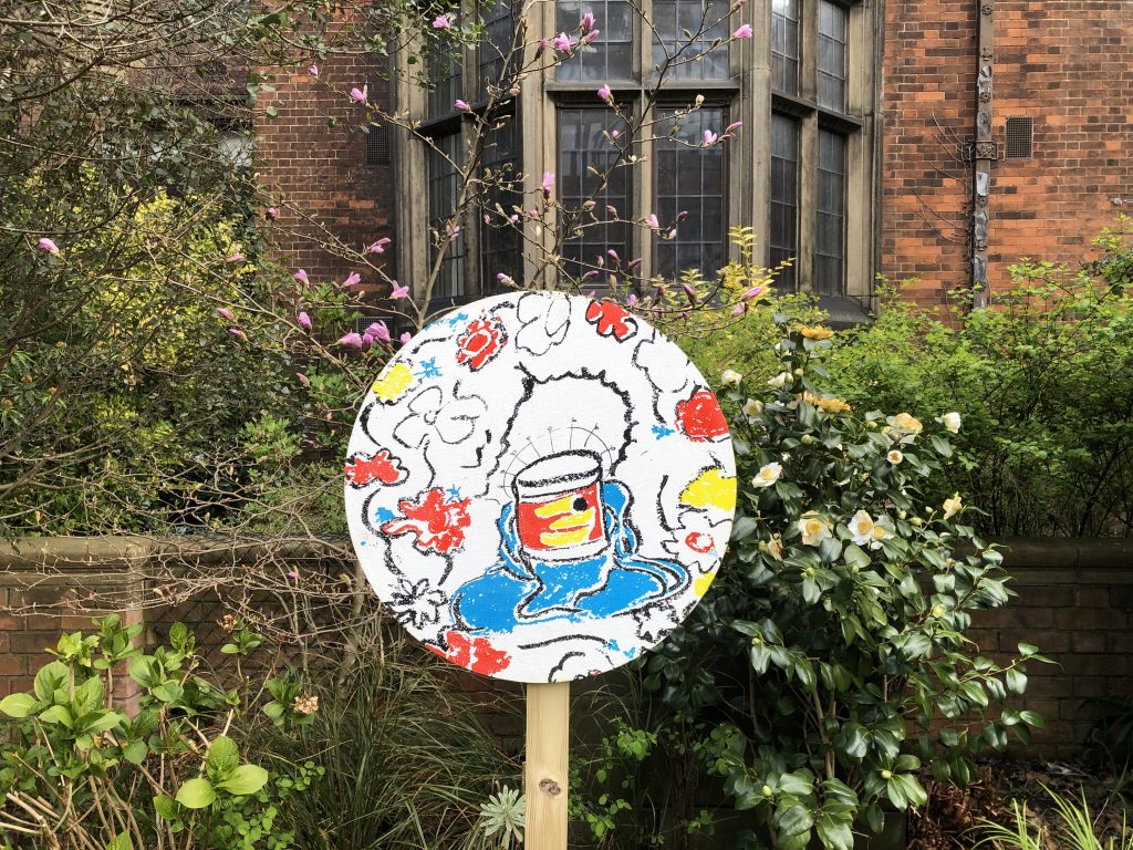
SAY YES WHY NOT

These texts are exercises to describe a piece of work from the exhibition: Print goes POP at the Hatton Gallery.
I was interested in Corita as an artist. I have yet to come across a female pop-artist, let alone a female pop-artist who is also a member of the religious order.
Erika mentioned her later work included letters, references to pop-culture and a politically driven subject matter, so I decided to explore her later works. As I ventured further into her work, I became increasingly inspired. Her exploration of text, religion, love, war and political issues were done so expertly, I wanted to know more. Her technique and eye for colours and shapes are exquisite and dazzling. If you would like to explore her work, I’ve included the link bellow for an online collection. Underneath this link I have also included a link to a short film about her technique and her life.
And if anyone is going to London, there is an exhibition that includes some of her work within Joy, an exhibition at the Wellcome Collection, open until February 2022. (I have also included the link to the exhibition below).
Alice Wong
I have chosen Joe Tilson’s “Luftbery and Rickenbacker”. I liked how he had combined the photographic image with the clear and hard-edged screen-print and the contrast of the bright red and yellow with the pale blue and the grey tones of the photograph. There was an interesting contrast of the detailed photographs and the larger scale flames and numbers with an ambiguous message with the American hat (which had fallen over) and the flames which reminded me of motorcycle stunt tricks as well as crashing aeroplanes!
Gaynor Voice
Sister Mary Corita St. Thomas A Becket (1950’s)
The silk screen printing technique has an alluring grainy texture to it. The way the artist layers both complimentary and contrasting colours creates depth in the picture. The alternations between warm and cool in the palette could indicate a sense of day and night or chronology to the narrative. The simplified figurative forms are sophisticated and can be clearly identified as women on the left. Shape, especially circles, are seen repeatedly throughout the print, tying in the different sections. Their viscosity is phantom like and similar to a tissue paper transparency. In this way, the print imitates the material in a collage setting. The main figure is brought to our attention by a lovely lilac tone, cleverly used to exaggerate the character’s personal features. The lines are gestural and aesthetically charming. The pose, regardless of the title of the work, inclines a religious theme in itself.
Annie Weatherley

It is a space to show what we do! And also it would be wonderful to hear from you! Specially if you want to leave any comments or suggestions as YOUR opinions is what makes this Forum grow.
I really like this project as it has so many possibilities!