
A poster display concerned with improving student awareness of Jesmond, Newcastle and the North East, featuring material from Newcastle University’s Special Collections & Archives, on the evolution of data visualization for social improvement.
People often have a poor understanding of the demographic and social profile of the areas in which they live.
The posters displayed in this exhibition explore this problem in the context of so-called ‘town and gown’ tensions in Jesmond and other areas around Newcastle University.
Today the perceived divide between locals and students is often framed in the context of ‘studentification,’ (the growth of student populations within neighbourhoods around universities) which is thought to exacerbate a range of social problems.
That said, as the news stories from University’s student newspaper, The Courier displayed in cabinet 4 show, tensions between locals and students are far from a new problem here in Newcastle.
This exhibition seeks, in a modest sense, to address some of these problems particularly those concerned with perceptions and with communication, by making public data more engaging, and (hopefully) more memorable.
Data visualization is an increasingly familiar aspect of modern (online) media consumption.
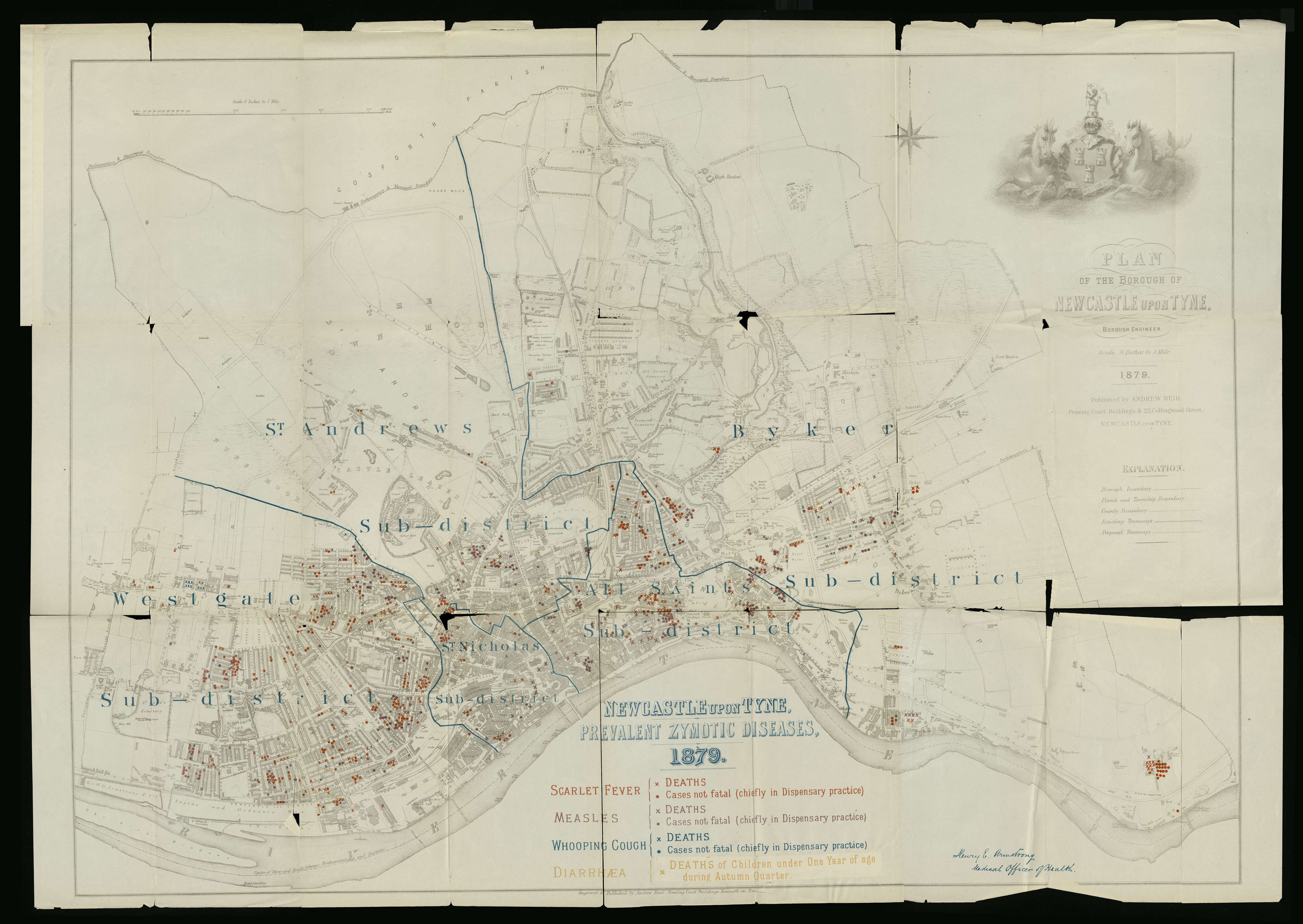
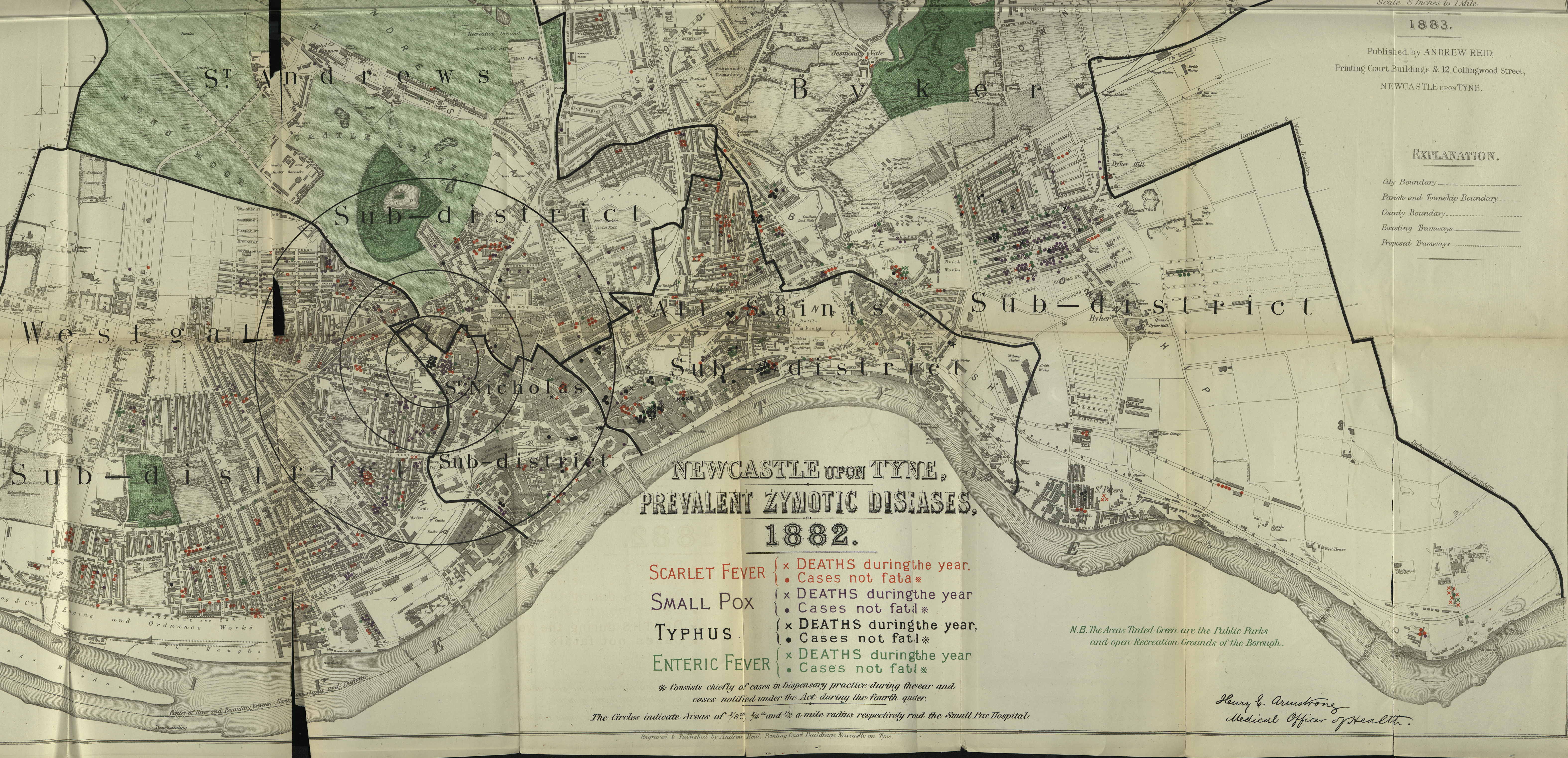
But as the archival material in cabinets 1, 2 and 3 indicate, data visualization has a long history, particularly in terms of improving (expert) awareness around health matters.
It is a history that has its roots in the spread of diseases in Newcastle and the North East during the early 19th century, to the localised public health initiatives of the late 19th century, and eventually, to government’s growing dependence on statistics across a broad range of policy fields, through the twentieth, and into the twenty-first century.
That said, visualized data are not universally appreciated and are not always well-understood.
During the UK’s 2023 COVID Inquiry, former Prime Minister Boris Johnson was said, by his then Chief Scientific Advisor, Sir Patrick Vallance, to have often been ‘bamboozled’ by the daily graphs produced to track the crisis.
Ideas about how data visualizations communicate are often based on a computational theory of cognition, that assumes that thought is enacted through activity in the brain.
But while this approach may be helpful in terms of helping explain comprehension and reasoning, it tells us little about what people find attractive, engaging, and appealing.
Alternatively, an embodied approach to cognition, based on the premise that knowledge is grounded in our bodies, and in our bodily, sensory and emotional interactions with the world, may yield new knowledge here.
In this view, what we find appealing in data visualizations is an important factor in better understand how and why we engage with them, and how potentially impactful they may be.
The method used in this poster display was initially developed during a pilot poster display study concerned with improving local awareness about civic data, in Jesmond during the summer of 2023.
This project was concerned with exploring a key empirical finding in the literature, namely that redundancy (or repetition) across different communicative modes seems to be an important factor in making data visualizations more memorable.
The pilot sought to broaden the scope for thinking about what ‘redundancy’ might include, beyond merely the charts and titles used, to incorporate a range of multimodal and structuring devices (including visual artefacts, typography, and dramaturgical devices), in such a way as to mutually re-enforce the message communicated; with a view to making these media more intuitive, more likely to spur conversation, and following discussion, more likely to impact its audience.
The present project takes an experimental, interdisciplinary approach, towards addressing the following problems:
- How we think visually
The selection of background images in posters may be informed by principles in cognitive metaphor theory.
This assumes that metaphors used in everyday language represent structuring devices that sit within language, mapping meaning from one (well-understood) domain to another (less understood) one, that helps us to make sense of the world.
Recurring patterns of experience are manifest in ‘image schemas’ (or scripts) that help us to negotiate certain experiences, and situations, in the world.
So, for example, a poster asking Jesmond residents in Newcastle to reflect upon what they know about where they live may be reinforced by an image of The Angel of the North, as this statue visually represents a ‘balance’ image schema (the angel’s body represents a fulcrum between its two wings), which in turn, reinforces the idea of passing judgement on something, or making a decision.
- How we reason visually
The choice of data visualizations used to communicate may be informed by diagram psychology.
This approach argues that the shapes we use to communicate abstract ideas are influenced by the shapes found in the structure of the built environment, that emerged as solutions to material problems.
So, lines represent paths; circles represent cycles, boxes (ie bars in bar charts) represent containers, arrows represent asymmetrical force, and so on.
To make optimal use of this vocabulary from a cognitive point of view, it may be possible to attach meanings to them, and so avoid (for example) the use of ‘empty containers.’
So for example, where a colour (say blue) is used to attribute an identity to a variable in a display (say a bar in a bar chart), this may be contrasted with ‘empty’ containers (greyed out bars).
This approach may also be seen to relate to empirical best practice in data visualization, that recommends ‘grouping cues’ along similar lines.
- How we communicate visually
In the interdisciplinary field of multimodal analysis, the arrangement of visual communication may be said to follow a structure, or a ‘grammar.’
So for example, in terms of increasing the redundancy within a visual communicative message, it may be possible to extend the notion of ‘redundancy’ to reflecting the visual arrangement within a media.
So, for example, the title ‘What do you know about North Jesmond?’ may be mapped to visual cues, read left to right on a poster; with the subject (you) and object (Jesmond) of the statement represented as symbols, images, or icons; and with the verb represented as a vector (the wings of the Angel of the North may be associated with the verb ‘know’).
The extent to which redundancy may extend to the wider design of the posters, may also be considered; concerning captions, colour schemes, font types, the presence (and arrangement) of figures, and other structural and communicative components; in a multimodal approach.
- How visual stories are effectively structured
To bring all the theoretical influences in these structuring devices together into a coherent framework, it is necessary to establish some common components associated with dramaturgy and storytelling, including; plot, setting, characters, a point of view, a point of conflict and a genre.
The aim of this project, which is to encourage a re-think about how we understand data visualization, and what purpose it should serve in public life), if not the approach taken, owes a debt to an earlier innovator in data visualization – namely Danny Dorling, who today is Professor of Human Geography at the University of Oxford.
Dorling, a social geographer, has been exploring social statistics, since the publication of his PhD thesis (available to view, in cabinet 5), Visualization of Spatial Social Structure, here at Newcastle (1991).
In this work, Dorling introduced an innovative way of exploring social data through cartograms.
These are maps that distort geographical size and layout to show differences in social structure.
His reasons for doing this relate to time scales.
For example, he asks why should we use constant geological shapes when we map statistical displays, when we are primarily concerned with (relatively) short-term changes in social structures.
The data produced in this project, and the iterative improvements to creative practice they underpin, are intended to lead to an improved, and a more consistent method for impactful data design, while the theory developed will help to firmly establish a broad framework for an emergent, embodied theory of data visualization.
Written and researched by Murray Dick, Senior Lecturer In Multimedia Journalism from the School of Arts and Cultures, as part of the Town and Gown on the Tyne exhibition.