
In an attempt to begin to think about how some of the data being generated by colleagues within the Infrastructure Transitions Research Consortium (ITRC) could be visualised, I started by considering how to visualise the seed projections that are used as inputs to the infrastructure capacity and demand models (CDAM) that have/are currently being developed by different institutes within the consortium. To find out more information about this aspect of the consortium please follow this link. The demographics projections have been developed by Leeds University, and give indications as to the number of people living in each government office region and local area district within the UK, out to the year 2100. Alongside this standard variable, projections for the quantity of urban area and number of households are also calculated and provided, although at this stage they are not being fed in to the CDAMs. The economics projections, developed by Cambridge Econometrics, contain many variables with reference to employment levels, imports/exports, gross value added (GVA) by industry, energy use by different fuel users, and many others. Each of these variables is supplied along a similar timescale to the demographics projections, whilst some are also disaggregated from UK-wide values to the government office region level. The following variables from the economics projections are supplied with this spatial disaggregation:
– GVA by region and industry
– Household expenditure by consumption category and region
– Investment by investing sector and region
– Employment by industry and region
The two data sets themselves are supplied in either comma-separated value (.csv) format, or via the use of the netCDF (.nc / .cdl) formats. In order to store these data, and then subsequently query them, the data is loaded via a Django-powered web form in to a PostGIS-enabled PostgreSQL relational database. The web form uploading process attempts to validate the values supplied within each of the projection sets against sensible ranges of values for each variable such that any erroneous data values can be detected. This approach ensures that the data is stored alongside other data related to the consortium, such as the infrastructure network models, and subsequently makes it quite (!) straightforward to create a web-based visualisation dashboard / platform for the data. The chosen web framework, Django, is Python-based and natively allows connections to PostgreSQL/PostGIS-enabled databases.
Both sets of projections, demographics and economics, are similar in nature in that they have a mix of UK-wide outputs over time, as well as a mix of spatially disaggregated outputs. I therefore chose to include the ability to view both a map, as well as charts and plots to give a user access to as much of the information as possible, without overloading them, within a single web page. In order to achieve this, a series of Django-enabled, and just standard SQL queries were developed to deliver data from either of the projections sets as JSON to the webpage. The webpages themselves (one each for demographics and economics respectively) communicate to Django via a synchronous AJAX request, which is all handled and powered via the use of the JavaScript framework, jQuery. Each webpage offers the user a series of dimensions or options that they can choose from, resulting in a new request being sent to the server to retrieve data matching against the chosen criteria. The following table represents the options available to a user for the two different interfaces:
| Demographics Dashboard | Economics Dashboard |
| Data:– Demographic projections – number of people in each government office region, or local area district
– Proportion of urban area projection – the percentage of each government office region, or local area district considered as urban – Change in the proportion of urban area projection – the change in the percentage of each government office region, or local area district considered as urban. – Household projections – the number of households in each local area district
|
Data:– Economics projections – a set of different economic-focussed variables in relation to employment, consumption, energy use and much more |
| Scenario – a user can select from a drop down list of scenarios that have been uploaded to the database. Each set of demographic data represents a different scenario of demographic change, and each value within the database references which scenario to which it is related. The different scenarios are generated by using different values for the attractors and detractors that make a region or district more or less attractive to reside in. | Scenario– a user can select from a drop down list of scenarios that have been uploaded to the database. Each set of economics data represents a different scenario of economic change, and each value is referenced against a particular scenario. In the case of the economics projections, each scenario represents a different combination of inputs for:- Population- World Economic Growth
– Fossil Fuel Price |
| Time – a drop down list of available years of data | Time – a drop down list of available years of data |
| Location – depending on the user’s selection of scenario, a drop down list of government office regions or local area districts is presented. The selection of a particular location is also possible via direct interaction with the map interface itself. | Location – as previously described, only a subset of all economics variables are disaggregated to the government office region level, and these regions are presented via a drop down list. Similarly to the demographics data dashboard, a location of interest can be selected by interaction with the map interface itself, as well as via the drop down list. |
| Number of equal-interval map classes – this option allows a user to determine the number of equal-interval classes to use when mapping the data satisfying the matched criteria defined by the user. | |
| Adjust overlay transparency – this slider allows a user to increase or decrease the transparency of the overlay map displaying the projections to allow them to more easily see the underlying base map layers provided. This for example can be used to help the user orientate themselves on a particular area of the UK, before seeing the overlay of chosen demographics or economics values. | |
| Gender – when selecting the standard demographics output i.e. the number of people in each region or district, this option determines whether the displayed map is showing projections for males, females, or both i.e. the total population. | Variable– the user is able to select from a drop down list of 18 possible variables to retrieve maps and charts about. The particular choice of variable determines which combination of the following options can subsequently be selected:- sector
– regional industry – fuel user – fuel type – consumption category – UK-wide investment sector – Regional investment sector – UK macro economic indicator – region
|
| Age category – similarly to the gender option, when selecting the standard demographics output, this option determines which age category is being mapped. Each category represents a 5 year cross-section of the population, ranging from 0 to 90+. | |
| Normalisation – this option allows a user to tell the displayed map to create equal-interval classification bounds based on other values that also satisfy the user’s selected criteria. For example a user could wish to normalise based on values for males/females for a particular region or against the whole of the UK. | |
As a user is changing the combination of the afore-mentioned options selected, whether for the economics or demographics data projections, a new request is sent to the server to query the database. Once the JSON data matching the selected criteria is returned to the webpage, JavaScript alongside the use of the HighCharts JavaScript-based graph library are employed to create the charts and graphs of the time series data. I selected HighCharts as it offers some fantastic, out-of-the-box functionality such as the slick animations activated when new data is supplied, or the hover-over tooltips to return actual data values. HighCharts however is a paid-for product, but has been used here as the work falls under the academic/research use. Furthermore, it is pretty straightforward to coerce the JSON output from the database in to something that HighCharts can handle. The maps themselves are created via the use of the OpenLayers JavaScript mapping client, largely employing the client-based vector layers and features for the rendering, rather than employing a WMS to serve the data. However it is possible that in the future a WMS version of the data streams will also be needed, probably employing Geoserver to do the leg work for this.
The following images illustrate the demographics and economics dashboards in their current form:
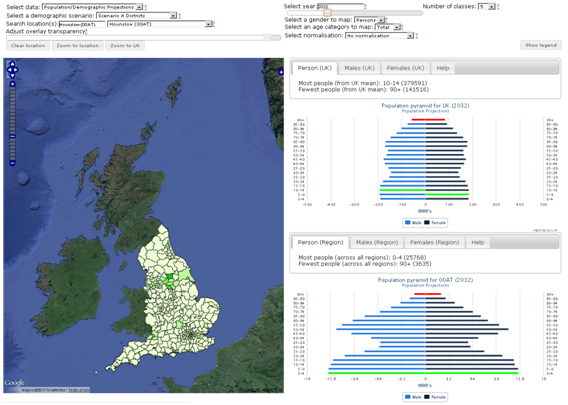
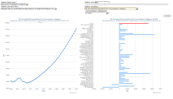
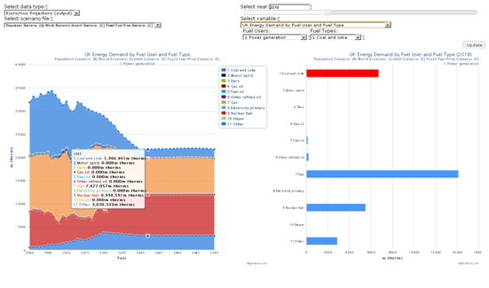
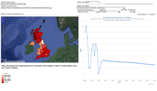
Please note that all the values displayed in the charts, plots and maps within the previous four images of the different dashboards are indicative only.