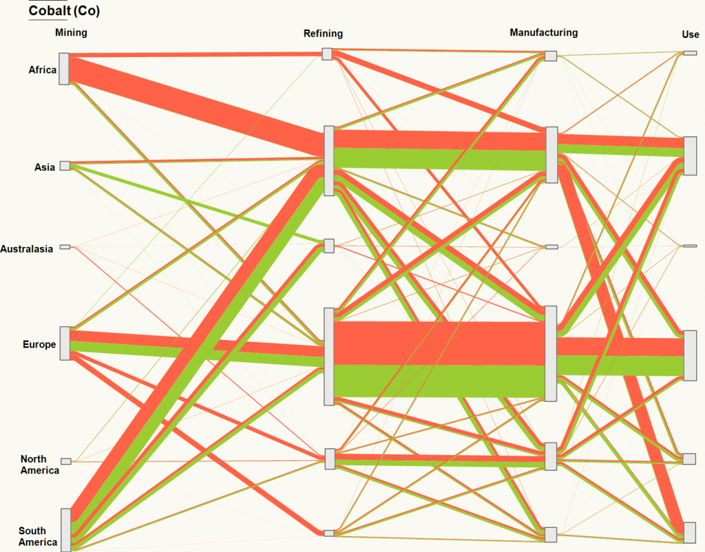
Working with colleagues Ali Ford, Oliver Heidrich, and David Manning on various papers and proposals, we have started to pull together a Sankey diagram of the reported tonnages of cobalt in 2012 through various processing stages within its life cycle. The orange and green colours denote the quantities of cobalt reported by the respective importing or exporting countries, but we have aggregated to the continent level. This information was extracted from the UN COMTRADE database and linked to eSankey! software via an intermediate Excel spreadsheet. The good thing about this approach is that by updating the spreadsheet with new values e.g. for different years etc, or for different elements/commodities/products, we can auto-generate (ish) the Sankey diagram.
Source: Cobalt, 2012, DESA/UNSD, United Nations COMTRADE Database
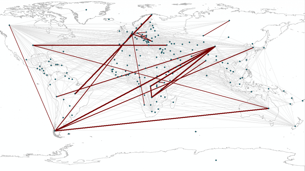
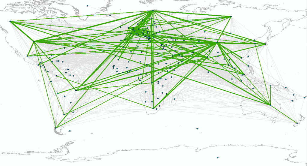
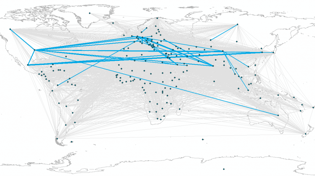
Going even further, Ali reproduced the data above at the country-level, across the same three stages i.e. Mining->Refining; Refining->Manufacturing; Manufacturing->Use, but using only the import flow data for now (matches orange flows above)
Source: Cobalt, 2012, DESA/UNSD, United Nations COMTRADE Database – Mining to Refining imports only
Source: Cobalt, 2012, DESA/UNSD, United Nations COMTRADE Database – Refining to Manufacturing imports only
Source: Cobalt, 2012, DESA/UNSD, United Nations COMTRADE Database – Manufacturing to Use imports only


Units = tonnes, 200px = 500,000 tonnes, built as an example using e!Sankey v3.2 from Comtrade and Promine data. Orange = quantity reported by importing continent, Green = quantity reported by exporting continent. Mismatches between quantities are either reflecting lack of data, or general mismatches in quantities reported within Comtrade data.