From the 1st – 3rd of December I visited a very sunny Grenada attending the 10th anniversary of Ivan symposium. This looked at the lessons learnt from the fallout of hurricane Ivan across the Caribbean region and how different sectors could help to prevent a future hurricane having a similar affect. I was there representing the CARIWIG project, along with Professor Michael Taylor and Jayaka Campbell from UWI, Jamaica. Michael Taylor brilliantly outlined the project and demonstrated elements of the portal site that I have been putting together over the past year. The presentation was very well received with myself and Jayaka Campbell being asked to demo the storm model element of the portal to a number of delegates.
The CARIWIG portal site is likely to go live following a workshop event in February so watch this space for more details.
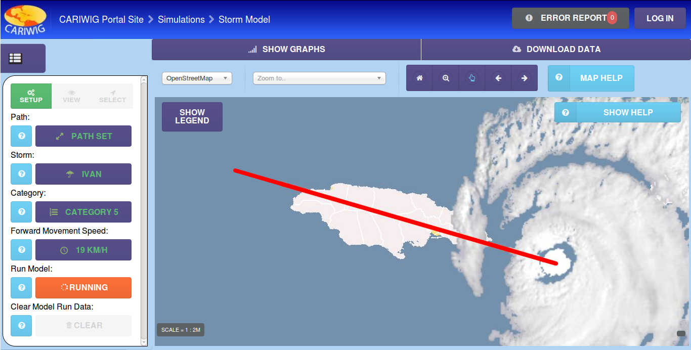
CARIWIG Storm tool
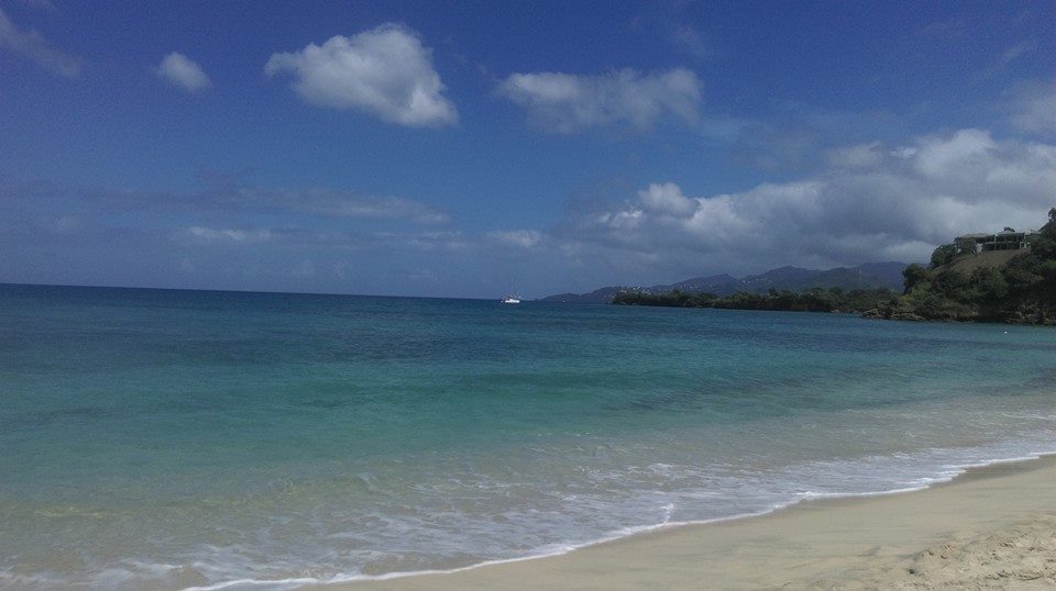
I would like to thank the members of of CDEMA for putting on this event, the conference was well run and contained many interesting talks about hurricane Ivan, including a opening address from the Prime minister of Grenada, as well as plenty of Caribbean food as lunch times. Plus December in Grenada beats December in the north east of England
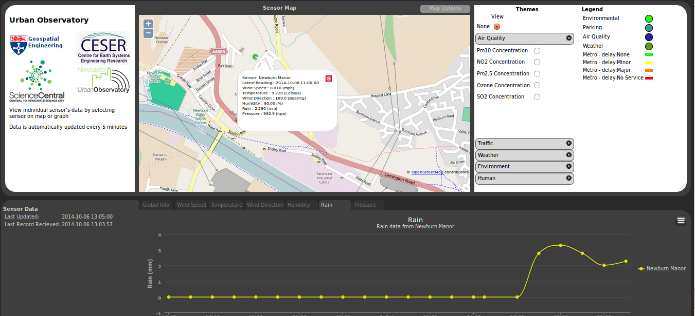
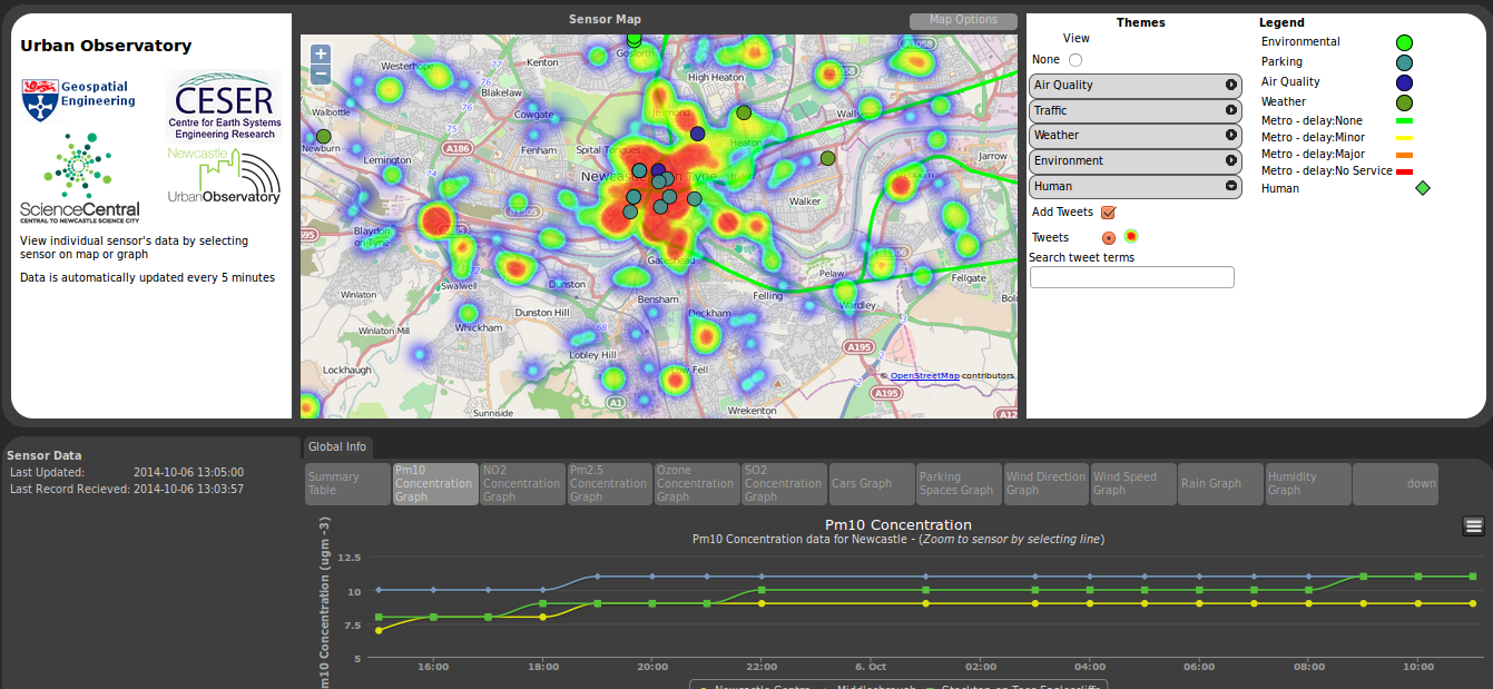
The Urban Observatory programme is deploying sensors and exploring the use of data to help inform the public about city services, and to help researchers better understand how cities work.
The data for this comes from a number of different streams and is held in a schemaless data structure. A python based middleware layer has been developed to ease the interactions with this structure. Facilitating the storing of data, the management of data and also creating different views onto the data.
It is through this middleware layer that a portal has been developed. By using django, the Python Web framework tool. That allows data to be extracted that works with a number of JavaScript libraries e.g openlayers , highcharts.
The portal itself show the location of the sensors, provides graphs of the sensor data. As well as some extra functionality like heat mapping.
With the deployment of a wave of new sensors being planned in the next few months. You should see a few more dots appearing on this map shortly.
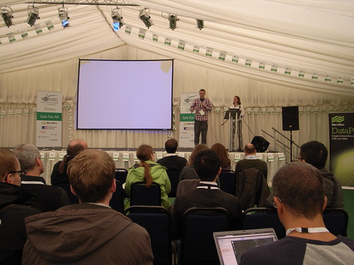
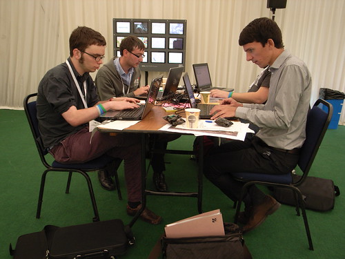
Wednesday 16th – Thursday 17th saw me attending my first sandpit event. Not really knowing what one was even when I was told I would be attending a sandpit event by the beach in Cullercoats I got very excited. Unfortunately I wasn’t given a bucket and spade on arrival but actually found the event probably more enjoyable and interesting than merely making sand castles on the beach for 2 days.
The venue for the sandpit
The event was actually part of the Urban Observatory (UO) with the aim of the 2 days to come up with ideas of pilot projects that could form part of the overall UO. The focus for the first morning was to brainstorm ideas of what data we should be recording and how we should be recording it. With a wide array of sectors being represented in the room these ideas varied greatly from transport flows, microbiology of computer keyboard, building movements and people’s motivations. In the afternoon we were asked to predict what the world will be like in 20 years time. With most group taking a pessimistic approach the outlook proposed was rather depressing. Basically climate change will only get worse, economic disparity will increase, society will divide , technology will take over people’s lives and who knows what league Norwich City will be playing in. The conclusion made was if this is to happen the Urban Observatory has to be the “good-guy” and not just record interesting information but to make recordings and carry out analysis that will help the general public and feed this data back to the general public in a manner which will be beneficial to masses.
Day 2 begun with cross-sectoral teams of three sent off to come up with an idea that represented the overlap in the 3 represented sectors of research. This is where my blog post has to get a bit cagey as it seemed every idea that came from this breakout session was either a clever or novel piece of research. The main overall theme of the ideas was public participation, either in collection of the data or in how the data was disseminated. These ideas were then honed down with more people contributing their suggestions on how an idea could be improved. As a result of this process 7 projects began to take shape. These ideas were presented to the group with more feedback coming from across the room. Some more polishing was done taking on board the feedback before again each of the 7 projects were presented. Each of which I thought had the potential for some great research and development to take place. Having not been to an event like this before I didn’t know whether this was a good haul or not. But I was told it is very rare for there to be so many good ideas which exhibit so much cross-sectoral research. Either way I don’t envy those in charge of whittling these ideas down.
I’d like to thank Rich, Phil and the other members of the UO team that put on the event. And a massive thanks to Tim and Liz from KnowInnovations for brilliantly facilitating the event.
From the 16th April to 18th April I attended GISRUK in a surprisingly sunny Glasgow. The started with a welcome from Jane Drummond followed by an interesting key-note talk from Mike Worboys , A Theoretician’s eye view of GIS Research. He talked about how GISRUK has developed there has been a dramatic fall in the proportion of papers that covered the theoretical side of GIS, with the focus now being on Application.
Talks from the first day that I particularly enjoyed focused on Spacebook, a system of delivering directions via audio as users encountered various way points on a route. William Mackaness talked about his research in comparing directions given using street names and direction given using landmarks.
Phil Bartie, who was a researcher on William Mackness’s paper delved deeper into the issue of Landmarks. Using images he looked at what people identified as landmarks and then analysed them semantically and spatially to distinguish related and unrelated features.
The following day saw me presenting a talk on some of the sensor infrastructure work we’ve done at Newcastle using HStore as a key-value based approach to storing heterogeneous data. Robin Lovelace’s talk round the merits of twitter data in research. Sparking some interesting debate about how research using twitter data uses data from the public so should benefit the public.
Thursday evening then featured the conference dinner followed by the Céilidh, an event that I was secretly dreading, dancer I am not. So was pleasantly surprised at how much fun the event was, as someone pointed out to me; it’s dancing but dancing with an algorithm.
Friday morning then featured my favorite talk of the conference with Paul Brindley talking about his Phd work on extracting the additional address information from addresse listed on the internet to map out neighborhoods. A simple idea but with fascinating results.
The conference was then wrapped up with a keynote from Professor Alias Abdul Rahman who gave an interesting overview on the state of 3D GIS work.
The event was a fun filled thought provoking and thoroughly interesting. Thanks must go to Jane Drummond for seamlessly organizing the event, even managing the weather. I would also like to thank William Mackness who brilliantly chaired my session.
Bring on Leeds 2015. Wonder what there version of Céilidh will be?
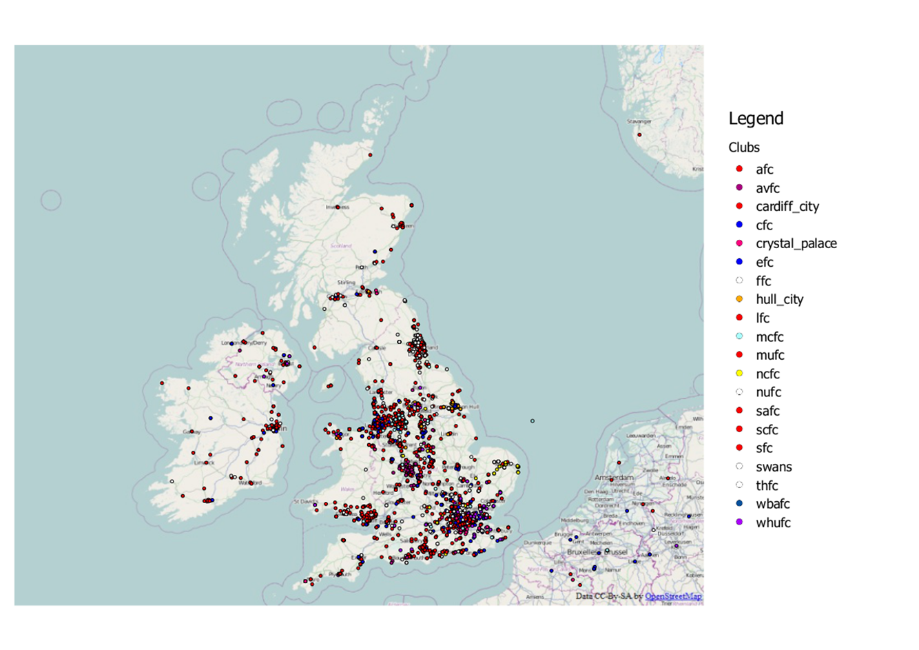
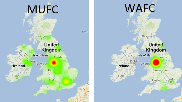
A while ago here at Newcastle we set up a system to record the locations of football fans on twitter. Whilst this system was mainly a bit of fun and also a great means of testing our infrastructure it also very rapidly provided us with a considerable amount of data. And with an upcoming talk about our football tweet work I was given the opportunity to again carry out some analysis on this data.
Last time round when I analysed the football data I used about a month’s worth of data to look at football team fan locality. However this selection of data wasn’t particularly fair as it contained a number of different fixtures with teams playing both home and away which would have heavily affected the distance from tweet to club. For instance if Newcastle were playing away at Fulham it’s not fair to measure the distance from “#NUFC” tweets to St James Park “ooh look Newcastle have loads of fans in London, they’re not local supporter are they”. So this time round I looked at just tweets taking place in the UK during the recent international break during which there were no Premier league games. The map below shows this data subset.
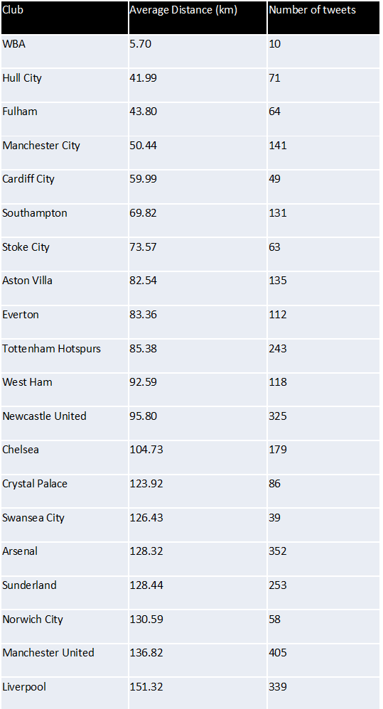
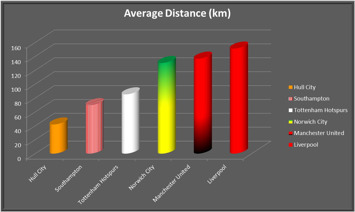
Firstly I carried out the same analysis as last time whereby I measured the distance from tweet to the ground of the club it was about. These distances were then averaged per club to give an average tweet distance for each club. The result are below (click to enlarge). The club with the shortest distance was West Brom with a very impressive average distance of 5.7km. However we only actually recorded 10 tweets during this period, so in short not many people tweet about West Brom but the ones that do are very close to The Hawthorns. At the other end of the spectrum you have your expected “glory” clubs. Your Liverpools, your Man Us and your Norwich Citys…
…hang on Norwich City?? I myself am a Norwich City fan so found this stat at little hard to believe, you’d be hard pressed to call me a glory supporter. I tried to think about why Norwich may have scored so highly here. My conclusion was that as Norwich is the only football league team in Norfolk it represents a larger area than most clubs. Therefore this large distance could maybe be justified.
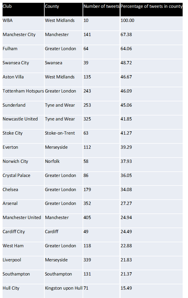
So my next piece of analysis was to look at whether the tweet about a club fell in the same county as that club. Again my results are shown below. Yet again West Brom performed the best with 100% of its tweets falling in the west midlands. And Norwich city had disappeared from the bottom 3 into mid table (something I wish we’d do in the premiership). But now the worst performer was Hull City. Had their rebrand to Hull City Tigers really caused them to have a wider fan base? Probably not, this is probably caused by Kingston upon Hull being considerably smaller in comparison to a lot of other football team counties. And you could very easily be from outside Kingston upon Hull with Hull city still being your nearest (premier league) club.
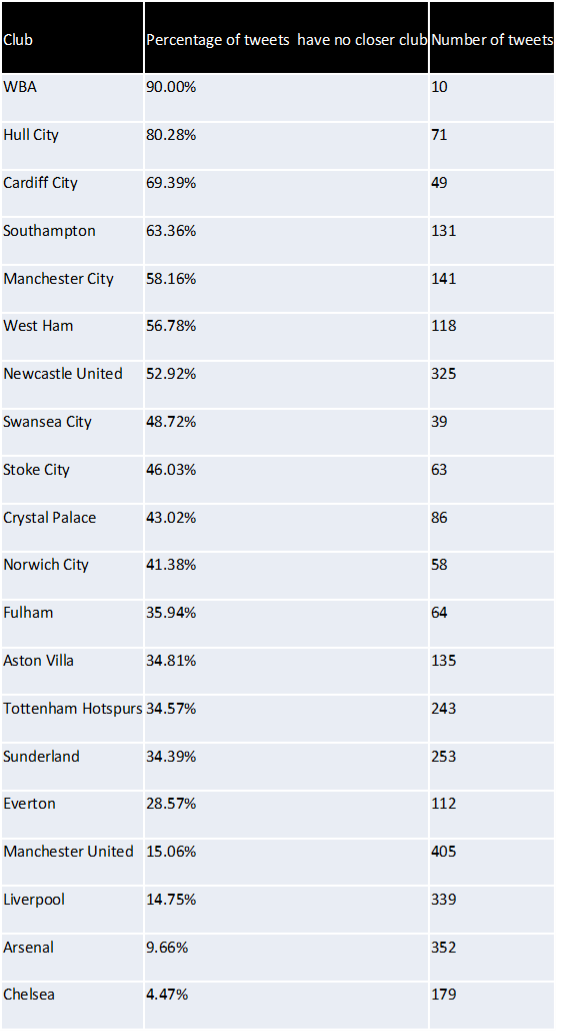
Therefore I thought I’d carry out another piece of analysis this time looking at whether or not the tweet was about their nearest club. Once again my results are displayed below. Here Hull have leapt from bottom to 2nd and Southampton have also made a considerable leap up the table. However again I noted something from the results which was that this time the bottom 5 is made up of clubs with another in very close proximity so the tweet may still be about a “nearby” club but not be counted as there is a club closer.
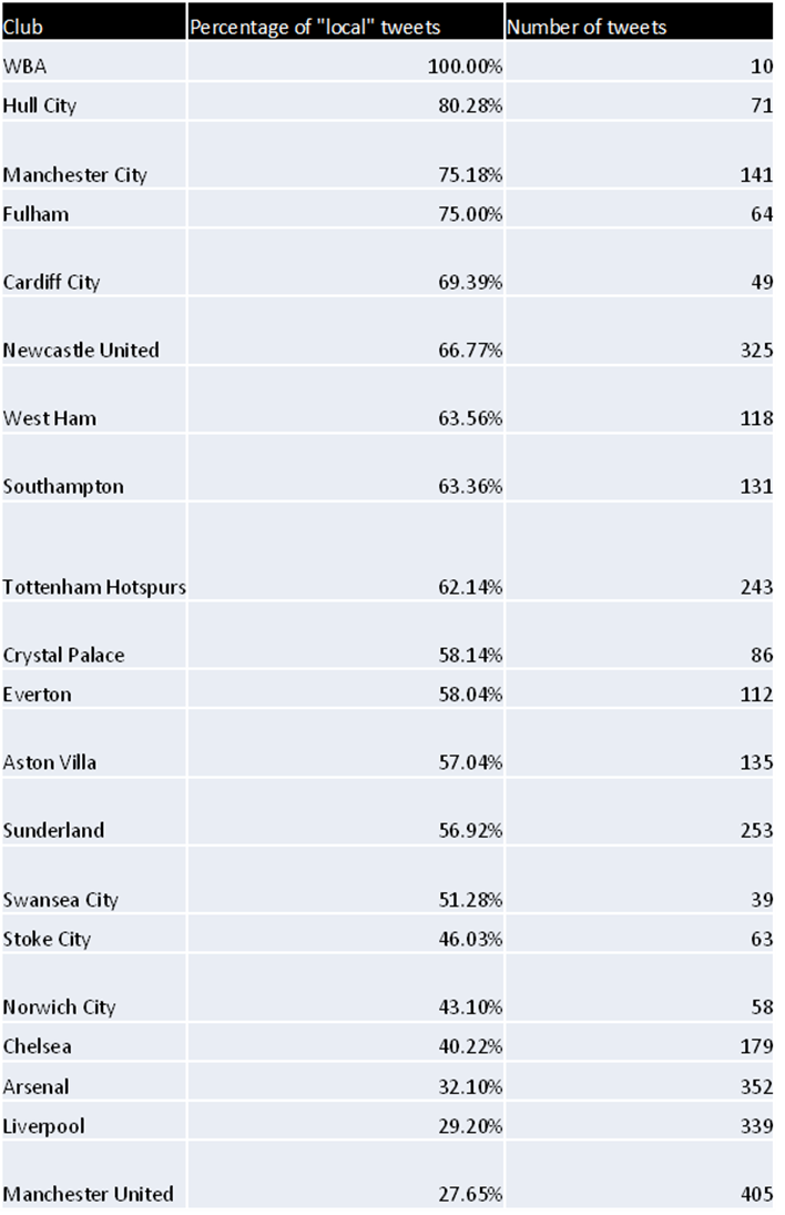
To account for this I needed some meaningful distance which would be considered as local. After a quick search I found that CAMRA consider any ale produced in a 20 mile radius of the pub to be local, could this be applied to football fan? Therefore I conducted one last test using this CAMRA metric of “localness” which counted the number of tweets which had no closer club OR were with 20 miles of the club. And for a final time my results are shown below.
Hopefully this shows some interesting results produced by just a few simple POSTGIS queries.
From the 18th to 21st September Phil James and I attended FOSS4G 2013 (Free and Open Source Software 4 Geospatial) in Nottingham. The conference kick started on the Wednesday evening with an Ice-breaker event featuring a pub-quiz following by a light-hearted talk given by Mike Parker, the author of Map Addict. The talk was very enjoyable but the quiz proved somewhat challenging and my sole contribution to my team’s effort being that I knew which animal Friar Tuck is in the Disney Robin Hood. He’s a badger.
The conference then truly came to life over the next two days with some great keynote talks. Particular highlights being Chris Tucker from MapStory.org, Tim Sutton from QGIS and Paul Ramsey from POSTGIS who’s sermon on being an open source citizen was one of the best talks I’ve ever been to. These were interspersed with a great selection of talks (some of which are available here ) showing the uses of software as well as outlining releases of new software such as the OpenLayers 3 which looks very exciting.
The conference was also complimented brilliantly with some great evening events featuring comedy, music and drinks. I would like to thank Steven Feldman and all of the FOSS4G heroes for putting on what was a thoroughly enjoyable event
From the 17th-18th of September I attended the Geohack event at FOSS4G conference in Nottingham. The event was sponsored by the MetOffice in partnerships with many other of organizations within Environmental Science to Services Partnership. A number of challenges were presented for hackers to work on, these are listed here http://2013.foss4g.org/geohack/challenges/ . As part of the LTURF project I have found myself working with a number of APIs trying to extract any information for around Newcastle. This lead me to picking the outdoor event challenge as it was making use of several APIs http://2013.foss4g.org/geohack/challenges/events/ .
This aim of this challenge was to estimate the effect that weather has on outdoor events in the UK. The first task was to retrieve information about any outdoor events happening in a given location. This was achieved by using the skiddle.com, an events listing website, and their API. Which allows you to search for events planned using a point and a buffer. Once we had the events the next goal was to gain an estimate of the number of people attending each event. This task was assigned to me, and for this I used both the Facebook and the twitter APIs. With Facebook returning the numbers of attending and maybe responses to the event, and twitter returning a popularity score. The final step was to use Met Office DataPoint API to get the weather forecast of the event. These were then all integrated into a very simple web portal. This is live here , we had little over 24 hours to complete this task so the portal is very much substance over style.
At 1pm on the second day everybody had to stop developing and then present they work for it to be judged. It was very interesting to see what the other groups had achieved , with some of the achievements being very impressive given the amount of development time. Phonegap, which is a free and open source framework that allows you to create mobile apps using standardized web APIs across many platforms, was used by a number of groups. And is clearly a very powerful tool with some groups having a completed app developed in just 24 hours. Unfortunately my group didn’t finish in the top 3 which I’m certain is only because the complexity of our app was hidden, in short we lost because it was too good.
The event was brilliantly run with plenty of food, drink and electricity to go round and I would like to thank the members of the Met office and the foss4g volunteers for organizing the event. And Also Steven Citron-Pousty who setup the OpenShift server for our app.
The location of the football team that you support is often a cause for debate, with chants like “we support our local team” being heard on the terrace week in week out. And now with the influx of football fans taking to twitter to support their teams this provides another way of measuring this metric.
As a group the idea of using twitter to crowd source the location of events is not a new one. Previously we have used it to record flood events across the north east allowing for a real time map to be produced. An idea which will be used heavily in the forthcoming iTURF project (integrating Twitter with Realtime Flood modelling).
So for me to develop a football script it was simply a matter of applying our previously developed scripts to record the locations of tweets related to football teams. For this I used the official hashtag for each team and then simply recorded the club, location and time, the actual body of the tweet is not stored.
Once this script was in place and I had the data feeding into a database I was able to develop a webpage displaying the tweets in real-time.
As well as this by using the google maps api I was also able to produce heat maps for each club. Showing the hotspots for the support of each team, predictably some show more spread than others.
Analysing a section of tweets also revealed some interesting statistics the club with the lowest average distance from tweet (uk based only) to their home ground was Fulham and Newcastle who pride themselves in their local support were the second furthest away.
club
Average distance in km
Fulham FC
81.64537729
West Ham United FC
82.46339901
West Brom Fc
82.78354779
Wigan Athletic
109.7845034
Tottenham Hotspur
112.3828775
Southampton FC
121.436554
Stoke City
123.7468635
Manchester City
128.4830384
Chelsea
134.4779064
Reading Football Club
141.2626039
Arsenal FC
147.5236349
Aston Villa Football Club
148.2891941
QPR
157.5900255
Swansea
162.7745008
Norwich City
164.774284
Sunderland
172.5479224
Everton
176.5113378
Manchester United
184.157026
Newcastle United
203.0311727
Liverpool
209.1425266
However analysing the proportion of tweets by county about team in their county, it revealed that almost 85% of the recorded football tweets in the Tyne and Wear region were about either Sunderland or Newcastle. Whilst Norfolk, which is said to be a one team county, had only 47% of the recorded tweet mentioning Norwich City.
County
Teams
Proportion about teams
Tyne and Wear
Sunderland & Newcastle
84.54%
Haringey
Tottenham Hotspur
74.83%
Manchester
Machester United & Manchester City
64.44%
Merseyside
Liverpool & Everton
63.86%
Hammersmith and Fulham
QPR & Chelsea
62.79%
Southampton
Southampton
61.80%
Stoke-on-Trent
Stoke
48.25%
Norfolk
Norwich
46.99%
West Midlands
West Brom & Aston Villa
36.12%
Islington
Arsenal
30.00%
Newham
West Ham
18.52%
Berkshire
Reading
18.35%
Swansea**
Swansea
11.11%
Richmond upon Thames
Fulham
8.51%
**Note the low proportion for Swansea is suspected to be due to the clash with Stoke City. Whilst Stoke City hashtag is #scfc and Swansea City’s is #swansfc are large number of #scfc are still recorded in south wales.
The hope is for this work whilst relatively simple and rather unscientific it demonstrates what can be achieved by using twitter as a source of information. It also provides a good way of load testing our code and backend database that we will use in the iTURF project
In order to establish a long term urban research facility Newcastle University is looking to bring together new and existing data that includes the urban climate, air quality, pedestrian and traffic flows as well as hydraulic flows. These new data sources will come from a number of sources, one of which will be a system of new sensors set-up around Newcastle. The particular sensors that are going to be used are waspmotes developed by Libelium, sensor devices specially oriented to developers. They work with different protocols (ZigBee, Bluetooth and GPRS) as well as a variety of frequencies (2.4GHz, 868MHz and 900MHz). More than 50 sensors can be connected with these devices with the measurements and frequency configured manually. The sensors can take a number of readings such as the concentration of different gases, temperature, liquid level, weight, pressure, humidity, luminosity, accelerometer, soil moisture and solar radiation.
Thus, as part of my role as a research assistant on this project I was sent along to a training course learning how to write the code to configure these devices. The training course took place in Zaragoza, Spain at Libelium HQ.
It consisted of 4 days of demonstrations and exercises getting familiar with the equipment and how to use them. These ranged from getting the waspmote to send “hello world” to a gateway (a USB device that receives messages and prints them to the screen) all the way through to sensing nearby Bluetooth devices then sending these to a database. We were also taught “clever” uses of the sensors like using the internal accelerometer to detect whether the device had fallen or was being stolen (attach a GPS and a SIM card and you can get it to text you the thief’s location!).
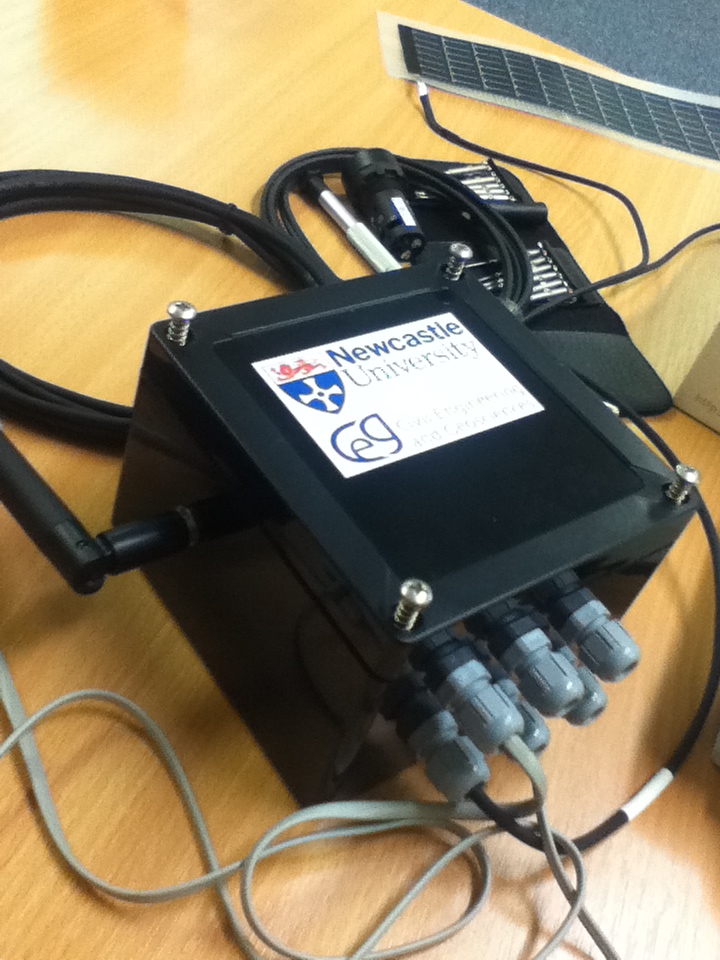
At the end of the training course we were shown their next generation of sensors; the Plug and Sense. These require very little development work as the devices come already mounted in a box and the user just has to attach the relevant sensor probe and then use the code generator to set the recordings taken and frequency at which they are taken.
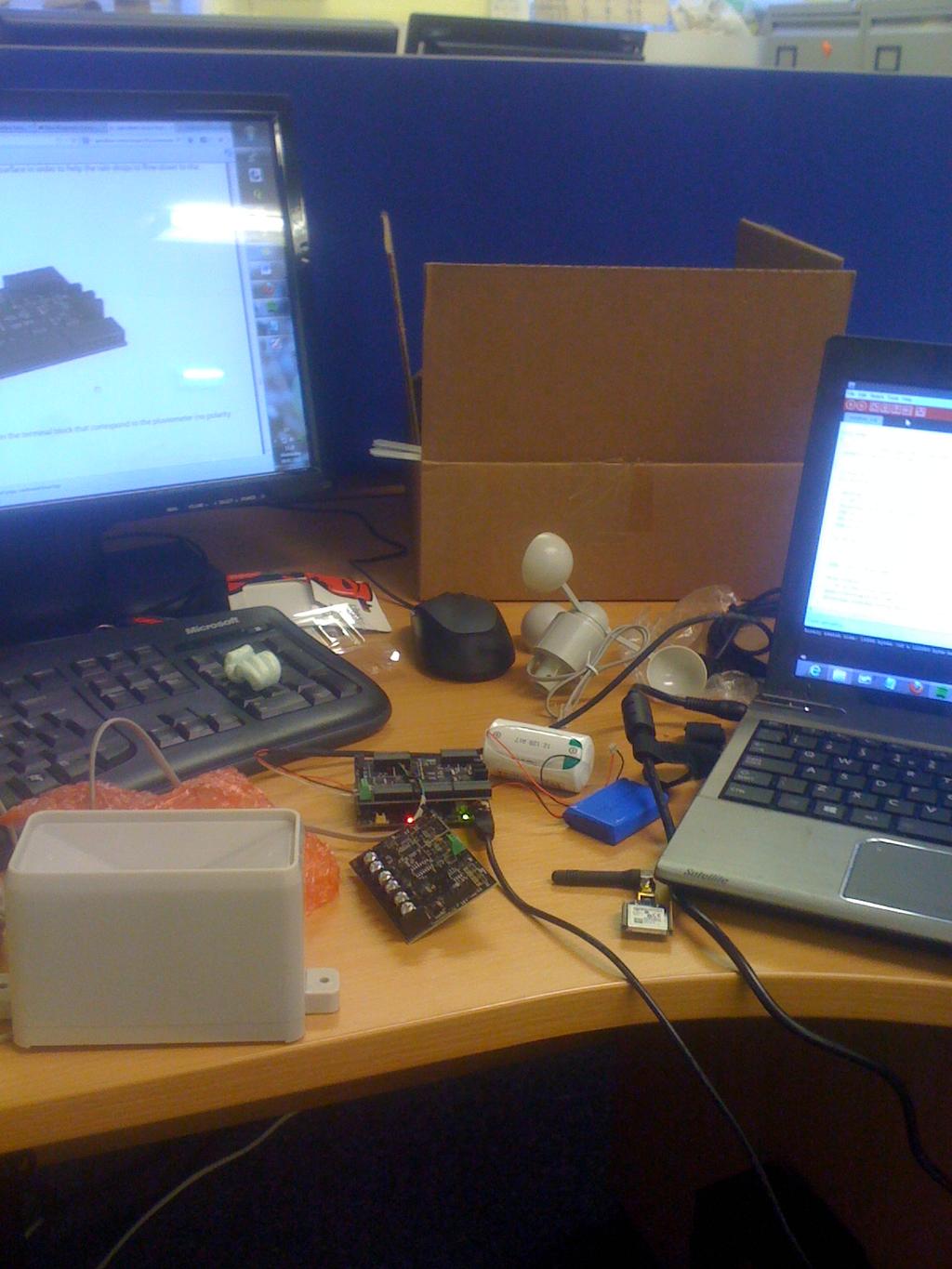
Since returning I have started to develop a weather station using a waspmote, an agriculture board and weather sensors such as a rain gauge, an anemometer and a temperature gauge.
My cluttered desk whilst developing the weather station
Despite initial setbacks, like recording monsoon like conditions whilst inside, I was able to get it set up and feeding into a postgres database. From this, I set-up a simple webmap using the database along with django to display the location of the sensor and the data feed.
The first version of web map and data feed
The aim is now to develop more sensors and deploy these in more meaningful places (not everybody just wants to know the temperature in my office) around the University campus and wider city.
Weather proof box for the deployment of the sensors