Introduction
Good communication of the results from any models or analyses to the potential end-user is essential for environmental data scientists. R has a number of excellent packages for multivariate analyses, one of the most popular being Jari Oksanen’s “vegan” package which implements many methods including principal components analysis, reducancy analysis, correspondence analysis and canonical correspondence analysis. The package is particularly popular with ecologists: it was originally developed for vegetation analysis (hence its name), but can be applied to any problem needing multivariate analysis. (As an aside, if searching Google for advice on the vegan package, remember to add the word “multivariate” as a search term, otherwise you’ll return rather a lot of recipes!).
One weakness of vegan is that whilst its default graphics are fine when analysing the data, they are not good enough to publish, or include in presentations at conferences. In the past I’ve exported vegan output into Excel, but then you get into chaos of menus, click boxes and general lack of reproducibility. There is a development package by Gavin Simpson, called ggvegan, which looks promising but is not yet available on CRAN and does not yet provide the amount of flexibility I need for plotting reliably. In this post I’ll show you how we can make use of vegan + ggplot2 to produce good quality plots.
Unconstrained ordination
In unconstrained ordination we’re typically dealing with a samples x species matrix, without including any explanatory variables in the ordination. However, it can be expanded to any set of “attributes” data, so instead of species, you might have soil data, land cover types, operational taxonomic units (OTUs) etc. The most widely used techniques are Principal Components Analysis (PCA), Correspondence Analysis (CA) and Non-metric multidimenional scaling (NMDS) all of which are available in vegan. If your data matrix contains nominal or qualitative data you might want to consider Multiple Correspondence Analysis (MCA) available in the FactoMineR package.
First, using one of vegan’s in-built datasets, Dutch dune vegetation, let’s undertake a PCA and look at the default species plot:
library(vegan)## Loading required package: permute## Loading required package: lattice## This is vegan 2.4-6data(dune)
dune_pca <- rda(dune)
plot(dune_pca, display = "species")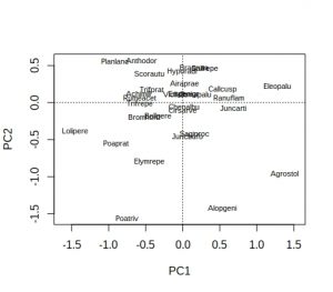
Hmm… not ideal, because many of the labels overlap and are unreadable. As is conventional, species names are reduced to 8 characters (4 for genus plus 4 for species) to save space, but a lot of labels still overlap. A better approach is to extract the PCA species scores, pipe them into ggplot, and use ggrepel to display the species names:
library(tidyverse)
library(ggrepel)

# Extract the species scores; it returns a matrix so convert to a tibble
dune_sco <- scores(dune_pca, display="species")
dune_tbl <- as_tibble(dune_sco)
# Note that tibbles do not contain rownames so we need to add them
dune_tbl <- mutate(dune_tbl, vgntxt = rownames(dune_sco))
plt <- ggplot(dune_tbl, aes(x = PC1, y = PC2, label = vgntxt)) +
        geom_point() +
        geom_text_repel(seed = 123)
plt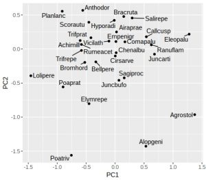
If like me you don’t particularly like the grey background then add a theme. One oddity of ggrepel is that it uses a random number generator to try and position the labels, so if you run the identical command twice you’ll end up with different plots (not very reproducible!). Luckily it is easy to fix with a fixed seed for the random number generator used by ggrepel, which is why I’ve added the “seed = 123” option. We can also add dotted vertical lines to indicate the zero on the x and y-axes:
plt <- plt +
        geom_vline(aes(xintercept = 0), linetype = "dashed") +
        geom_hline(aes(yintercept = 0), linetype = "dashed") +
        theme_classic()
plt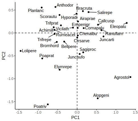
There are other options in ggrepel allowing you to increase the distance from the points to labels, change the point types etc.
Constrained ordination
In constrained ordination you have two sets of data, one the response matrix (conventionally the samples x sites matrix) and the other a set of explanatory variables (e.g. environmental variables). The importance of these environmental variables can be tested via permutation-ANOVA, but the most useful outputs (in my experience) are the graphs, where the environmental variables can be superimposed onto the species or samples to create ‘biplots’. Let’s look at one of the default vegan datasets, Scandinavian lichen pastures plus their environmental data, and carry out a constrained analysis via canonical correspondence analysis, and display the default vegan plots:
data("varespec")
data("varechem")
# For simplicity, just use three of the fourteen soil variables
vare_cca <- cca(varespec ~ Al + P + K, data = varechem)
plot(vare_cca, display=c("sites", "bp"))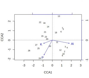
plot(vare_cca, display=c("species", "bp"))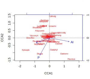
A few comments about these default plots, apart from the obvious one that the species plot is very cluttered. The importantance of an environmental variable is indicated by the length of the arrow, so Al and P are more important than K. The direction of an arrow indicates the main change for that variable, so samples 9, 24 and 28 will be relatively high in P, whilst sample 13 relatively low. Calluna vulgaris appears to prefer low P conditions etc. Notice that Al and P are at almost 90-degrees to each other, which indicates that the two variables are uncorrelated. Finally, be alert to the fact that the scaling of the arrows on the plots is relative: in the species plot the Al arrowhead is at about 1.2 on CCA1 x-axis, whereas on the samples plot it is at about 1.8. It is their relative positions that matter when interpreting the plots.
These plots are still rather messy, so how can we smarten them up within a ggplot framework. We need to create a tibble containing the species, samples and environmental (biplot) scores, plus a label to indicate the score type. We also need a simple method of rescaling the environmental scores so that they fit neatly within the plot window for either species or samples plots.
vare_spp_sco <- scores(vare_cca, display = "species")
vare_sam_sco <- scores(vare_cca, display = "sites")
vare_env_sco <- scores(vare_cca, display = "bp")
vare_spp_tbl <- as_tibble(vare_spp_sco)
vare_sam_tbl <- as_tibble(vare_sam_sco)
vare_env_tbl <- as_tibble(vare_env_sco)
vare_spp_tbl <- mutate(vare_spp_tbl, vgntxt=rownames(vare_spp_sco),
                       ccatype = "species")
vare_sam_tbl <- mutate(vare_sam_tbl, vgntxt=rownames(vare_sam_sco),
                       ccatype = "sites")
vare_env_tbl <- mutate(vare_env_tbl, vgntxt=rownames(vare_env_sco),
                       ccatype = "bp")
It may seem a bit cumbersome having to extract each set of scores separately, labelling, given that vegan will allow you to return all three in one command. However, vegan returns the three sets of scores as a list, and I find it easier to handle them separately. The output tibbles has the CCA1 and CCA2 axis scores, plus character variables varetxt (species names, sample names and env names) and ccatype (to indicate the type of score).
You’ll recall that the environmental variables are plotted with scales relative to the samples or species plots. Therefore, it’s usually easiest to plot the species on their own, next check values of the environmental variables, then decide on an appropriate scaling factor.
plt <- ggplot(vare_spp_tbl, aes(x = CCA1, y = CCA2, label = vgntxt)) +
       geom_point() +
       geom_text_repel(seed = 123)
plt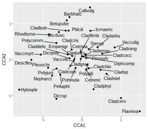
In this plot the species names are still a little cluttered in the centre of the graph, around zero on both axes. These will tend to be the most ubiquitous species, and so are of least interest. Later on we’ll remove the labels from some of these species to tidy up the plot. As noted earlier, we’ll want the arrowhead of the Al to be at about 1.2 on the x-axis for a reasonably proportioned plot. Let’s check what the actual biplot scores are:
vare_env_tbl## # A tibble: 3 x 4
## CCA1 CCA2 vgntxt ccatype
## <dbl> <dbl> <chr> <chr>
## 1 0.860 -0.160 Al bp
## 2 -0.420 -0.751 P bp
## 3 -0.440 -0.165 K bpWe can see that Al is 0.86 so we need to apply a multiplier of about 1.5 to all the environmental variables. Then we need to select the environmental variable labels, and create a single tibble containing both the (rescaled) environment and species scores and labels:
rescaled <- vare_env_tbl %>%
            select(CCA1, CCA2) %>%
            as.matrix() * 1.5
vare_tbl <- select(vare_env_tbl, vgntxt, ccatype) %>%
            bind_cols(as_tibble(rescaled)) %>%
            bind_rows(vare_spp_tbl)
Now we are in a position to create a biplot, with arrows for the environmental variables:
ggplot() +
  geom_point(aes(x=CCA1, y=CCA2), data=filter(vare_tbl, ccatype=="species"))  +
  geom_text_repel(aes(x=CCA1, y=CCA2, label=vgntxt, size=3.5),
                  data=vare_tbl, seed=123) +
  geom_segment(aes(x=0, y=0, xend=CCA1, yend=CCA2), arrow=arrow(length = unit(0.2,"cm")),
               data=filter(vare_tbl, ccatype=="bp"), color="blue") +
  coord_fixed() +
  theme_classic() +
  theme(legend.position="none")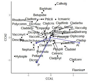
This is a little more complex than previous ggplot calls, with a call to geom_points, a calls for geom_text_repel, and a call to geom_segment to add arrows. The coord_fixed is to ensure equal scaling on x and y-axes, and there is no need for a legend. However, the plot is still rather cluttered by labels from ubiquitous species in the middle. Let’s not label any species +/- 0.5 on either axis, and for clarity use black or blue labels for the species and environmental names, controlled by scale_colour_manual
critval <- 0.5
vare_tbl<- vare_tbl %>%
           mutate(vgntxt=ifelse(CCA1 < critval & CCA1 > -critval &
                                CCA2 < critval & CCA2 > -critval &
                                ccatype=="species", "", vgntxt))

ggplot() +
  geom_point(aes(x=CCA1, y=CCA2), data=filter(vare_tbl, ccatype=="species"))  +
  geom_text_repel(aes(x=CCA1, y=CCA2, label=vgntxt, size=3.5, colour=ccatype),
                  data=vare_tbl, seed=123) +
  geom_segment(aes(x=0, y=0, xend=CCA1, yend=CCA2), arrow=arrow(length = unit(0.2,"cm")),
               data=filter(vare_tbl, ccatype=="bp"), color="blue") +
  coord_fixed() +
  scale_colour_manual(values = c("blue", "black")) +
  theme_classic() +
  theme(legend.position="none")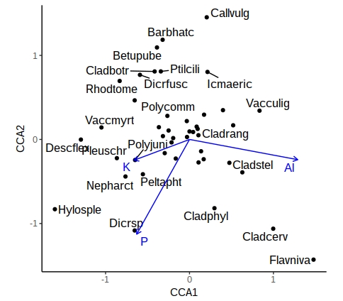
A similar approach can be used with samples, or where the environmental variables are categorical (centroids). This now gives you a publication-quality ordination plot that is easy to interpret.
(P.S. – thanks to Eli Patterson for giving me this challenge to solve in the first place!)