How to be a productive researcher

Book review – The Productive Researcher by Mark Reed

Like many scientists I find it a challenge to juggle time and energy so as to be an effective research worker, whilst simultaneously undertaking my responsibilities in teaching and (yawn) administration properly.  I’ve read numerous self-help books, of variable quality, many of which could be summed up by claiming that a clever filing system or the correct use of Post-It notes will solve everything.

Mark Reed’s new book, The Productive Researcher, is in a quite different order from these.
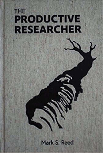
For a start, it is searingly honest.  He describes his own experience of panic attacks at public lectures, ‘impostor syndrome’, last-minute preparation of talks, mistakes made in chairing meetings and episodes of depression.  This honesty was deeply reassuring.  I can still remember having just become a lecturer when late one day I was suddenly asked if I could cover for another member of staff and teach their ecology lectures the following morning.  “Usual Lotka-Volterra competition and predation models” I was told, to which I replied  “Fine” without having a clue as to what L-V models were.  Went home with a couple of theoretical ecology textbooks and some blank acetates (pre-PowerPoint days): for some reason I hadn’t taken a theoretical population dynamics module as an undergraduate and hadn’t done any calculus since school, so spent much of the night getting to grips with both.  Bleary-eyed the following morning I gave the first lecture, pretending to be confident at an overhead projector in a big lecture theatre full of students.  The students didn’t seem to notice, but it was my first of now numerous episodes of “impostor syndrome”: on speaking to other academics I’ve realised the syndrome is common.

Mark Reed’s book is wide-ranging, and includes issues about examining what really motivates us in our research, how to achieve a good work-life balance, cope with rejections of grant applications or papers, avoid wasting time in meetings, and defeat the tyranny of emails (although on emails he omits my whizzo technique – see later).  His comments on work-life balance are pertinent.  It seems that the number of hours academics work per week in the UK is steadily increasing, with more than half doing over 50 hours per week.  I’ll admit that at the end of the day I’ll usually stuff a pile of papers into my bag with the intention to read them that evening ‘stay on top of the literature’, but somehow most of it doesn’t get read.  He provides evidence that longer hours don’t necessarily result in more productive researchers anyway.  The book covers ‘when to stop’: the analyses you’re doing, or paper you’re writing will never be perfect, so you need to know when it is good enough to consider complete and publish.  There’s a brilliant chapter on How to write a literature review in a week which ought to be compulsory reading for everyone.  He cheekily re-invents the tired management-speak of SMART objectives (Specific, Measureable, Achievable, Realistic, Timely) that are waffled about by administrators who have nothing better to do with their time, into something more valuable for researchers.  In Mark’s case they become goals that are Stretching, Motivational, Authentic, Relational and Tailored.  The chapter explaining these was much more valuable to me as a research scientist than the management-speak version.

Some of the most insightful parts of the book come from interviews Mark Reed has conducted with several of the top-performing most highly-rated university scientists internationally.  These scientists came from a wide-range of disciplines, including electronics, epidemiology, mathematics, environmental change, and some had published over 1000 papers, which had been cited hundreds (and even thousands) of times.  Clearly they are doing something right, and are worth listening to!  Despite the breadth of scientific disciplines encompassed by these highly-productive researchers certain common threads were apparent to both their philosophies and working patterns.  Despite their professional success they all came over as lacking in pride, indeed were relatively humble about what they had achieved, but could nevertheless be decisive when necessary.  They all emphasised the importance of listening (truly listening!) to others, irrespective of the status of the other scientist.  Their two main priorities were generally the supervision of PhD students, and second publishing in top journals.  They said it was important to allow other scientists to grow, to be a good collaborator, to not correct colleagues who repeatedly got trivial facts or figures wrong etc.  I thought the emphasis on PhD students was a good one, especially given the additional pressures PhD students face with the competition for papers, post-docs etc.  Most interviewees only worked during office hours, and not at home, therefore said it was important that every hour counted in the office (e.g. in 2 hour blocks).  Another good point was to do the exciting, motivationally interesting research first thing in the morning, and the boring, tedious administration later in the day when you’re tired.   All of them knew what their top priorities were, and could keep them focused in front of them at all times.

This is a short (176 pages), easy-to-read book that I would recommend to any scientist.  It is so full of nuggets of truth as to how to increase your productivity as a research scientist that it is difficult to take fully on-board in one reading (I’m in the process of re-reading it!).

Addendum – My Email Trick

Mark Reed discusses “The Tyranny of Email”, and although the book has lots of excellent suggestions on the subject, he doesn’t mention the little tricks I’ve stumbled across.  Until a few years ago I suffered under its tyranny, in that like most colleagues my Inbox contained between one to two thousand emails, in a confused muddled state, some read, some unread, some irrelevant, some urgent.  Now my Inbox usually contains only 10 to 20 emails, and most of the time it contains no emails whatsoever.  What’s the trick? (this is for Microsoft Outlook 2016):

  1. In the morning fire up Outlook: I let it load the 20 or so emails that have accumulated overnight into the Inbox. All my mailboxes are arranged so that the most recent emails are at the bottom of the list, and only the subject line shows.
  2. Switch Outlook offline. This is crucial as personally I get really distracted if, whilst replying to an email I constantly see notifications of new ones arriving in my Inbox. Note: you can still send emails whilst offline, by pressing the small ‘send’ icon at the top left of the screen, without receiving any new ones.
  3. Scan the emails and delete the junk ones; sometimes these are pretty obvious from the subject matter or sender.
  4. Check the remaining emails and take the following actions:
    1. If you can reply to it in less than 2 minutes, then do so, and file the email (and reply) appropriately.
    2. If it’s going to take a little longer to sort out and write a suitable reply, but it’s still going to need attention in the next week, or you’ll need to do a bit of work first, put it into your ‘Action’ mailbox.
    3. If you might need to do something later with the email, for example in the next 10 to 14 days, but possibly not that urgent, put it into the ‘Review’ mailbox.
    4. If you’ve got to wait for someone else to do something before you can deal with the issue, put it into the ‘Waiting’ mailbox. (Occasionally I also file emails I’ve sent, where I’m needing a reply from someone else before continuing, into the Waiting mailbox.)
  5. A couple of times a day flick Outlook into ‘Online’ mode to receive a new set of emails – this means that you only have to look at them when the time suites you.

The big advantage of the approach, only having ‘Action’, ‘Review’ and ‘Waiting’ mailboxes to think about is that it save so much time. Even my Action mailbox rarely has more than 10 to 15 emails in it.  When I re-check my Review mailbox about once a week, half the things have been dealt with by someone else already.  This seems to apply particularly to tedious administrative emails: academic administrators are very good at generating large numbers of duplicate emails tagged ‘high priority’ which actually are very low priority!  The Waiting mailbox provides a useful check on follow-ups, and if needed I can add a reminder to Outlook Tasks for a specific item.  I can still send emails whenever I want, and only receive new ones when I switch Outlook online.

I found the hardest part was switching from the old, disorganised system, to my current one.  “But what if someone needs to contact you urgently and you only check your incoming emails 2 or 3 times a day?” I hear you say.  Colleagues seem to phone or visit me in person, just as they did in pre-email days…
Reproducible, publication quality multivariate plots in R

Introduction

Good communication of the results from any models or analyses to the potential end-user is essential for environmental data scientists. R has a number of excellent packages for multivariate analyses, one of the most popular being Jari Oksanen’s “vegan” package which implements many methods including principal components analysis, reducancy analysis, correspondence analysis and canonical correspondence analysis. The package is particularly popular with ecologists: it was originally developed for vegetation analysis (hence its name), but can be applied to any problem needing multivariate analysis. (As an aside, if searching Google for advice on the vegan package, remember to add the word “multivariate” as a search term, otherwise you’ll return rather a lot of recipes!).

One weakness of vegan is that whilst its default graphics are fine when analysing the data, they are not good enough to publish, or include in presentations at conferences. In the past I’ve exported vegan output into Excel, but then you get into chaos of menus, click boxes and general lack of reproducibility. There is a development package by Gavin Simpson, called ggvegan, which looks promising but is not yet available on CRAN and does not yet provide the amount of flexibility I need for plotting reliably. In this post I’ll show you how we can make use of vegan + ggplot2 to produce good quality plots.

Unconstrained ordination

In unconstrained ordination we’re typically dealing with a samples x species matrix, without including any explanatory variables in the ordination. However, it can be expanded to any set of “attributes” data, so instead of species, you might have soil data, land cover types, operational taxonomic units (OTUs) etc. The most widely used techniques are Principal Components Analysis (PCA), Correspondence Analysis (CA) and Non-metric multidimenional scaling (NMDS) all of which are available in vegan. If your data matrix contains nominal or qualitative data you might want to consider Multiple Correspondence Analysis (MCA) available in the FactoMineR package.

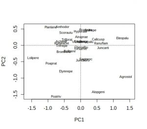
First, using one of vegan’s in-built datasets, Dutch dune vegetation, let’s undertake a PCA and look at the default species plot:

library(vegan)
## Loading required package: permute
## Loading required package: lattice
## This is vegan 2.4-6
data(dune)

dune_pca <- rda(dune)
plot(dune_pca, display = "species")

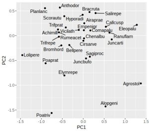
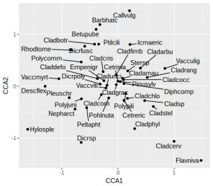
Hmm… not ideal, because many of the labels overlap and are unreadable. As is conventional, species names are reduced to 8 characters (4 for genus plus 4 for species) to save space, but a lot of labels still overlap. A better approach is to extract the PCA species scores, pipe them into ggplot, and use ggrepel to display the species names:

library(tidyverse)
library(ggrepel)

# Extract the species scores; it returns a matrix so convert to a tibble
dune_sco <- scores(dune_pca, display="species")
dune_tbl <- as_tibble(dune_sco)
# Note that tibbles do not contain rownames so we need to add them
dune_tbl <- mutate(dune_tbl, vgntxt = rownames(dune_sco))
plt <- ggplot(dune_tbl, aes(x = PC1, y = PC2, label = vgntxt)) +
        geom_point() +
        geom_text_repel(seed = 123)
plt

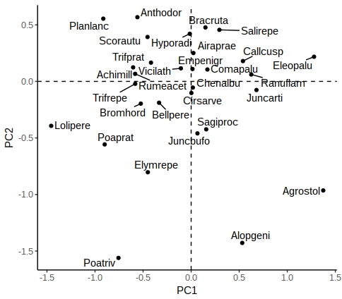
If like me you don’t particularly like the grey background then add a theme. One oddity of ggrepel is that it uses a random number generator to try and position the labels, so if you run the identical command twice you’ll end up with different plots (not very reproducible!). Luckily it is easy to fix with a fixed seed for the random number generator used by ggrepel, which is why I’ve added the “seed = 123” option. We can also add dotted vertical lines to indicate the zero on the x and y-axes:

plt <- plt + 
        geom_vline(aes(xintercept = 0), linetype = "dashed") +
        geom_hline(aes(yintercept = 0), linetype = "dashed") +
        theme_classic()
plt

There are other options in ggrepel allowing you to increase the distance from the points to labels, change the point types etc.

 Constrained ordination

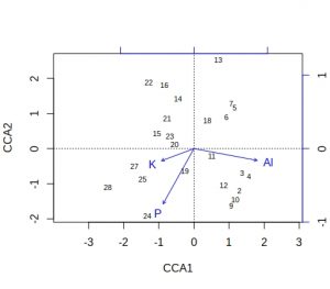
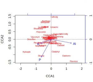
In constrained ordination you have two sets of data, one the response matrix (conventionally the samples x sites matrix) and the other a set of explanatory variables (e.g. environmental variables). The importance of these environmental variables can be tested via permutation-ANOVA, but the most useful outputs (in my experience) are the graphs, where the environmental variables can be superimposed onto the species or samples to create ‘biplots’. Let’s look at one of the default vegan datasets, Scandinavian lichen pastures plus their environmental data, and carry out a constrained analysis via canonical correspondence analysis, and display the default vegan plots:

data("varespec")
data("varechem")
# For simplicity, just use three of the fourteen soil variables
vare_cca <- cca(varespec ~ Al + P + K, data = varechem)
plot(vare_cca, display=c("sites", "bp"))

plot(vare_cca, display=c("species", "bp"))

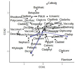
A few comments about these default plots, apart from the obvious one that the species plot is very cluttered. The importantance of an environmental variable is indicated by the length of the arrow, so Al and P are more important than K. The direction of an arrow indicates the main change for that variable, so samples 9, 24 and 28 will be relatively high in P, whilst sample 13 relatively low. Calluna vulgaris appears to prefer low P conditions etc. Notice that Al and P are at almost 90-degrees to each other, which indicates that the two variables are uncorrelated. Finally, be alert to the fact that the scaling of the arrows on the plots is relative: in the species plot the Al arrowhead is at about 1.2 on CCA1 x-axis, whereas on the samples plot it is at about 1.8. It is their relative positions that matter when interpreting the plots.

These plots are still rather messy, so how can we smarten them up within a ggplot framework. We need to create a tibble containing the species, samples and environmental (biplot) scores, plus a label to indicate the score type. We also need a simple method of rescaling the environmental scores so that they fit neatly within the plot window for either species or samples plots.

vare_spp_sco <- scores(vare_cca, display = "species")
vare_sam_sco <- scores(vare_cca, display = "sites")
vare_env_sco <- scores(vare_cca, display = "bp")
vare_spp_tbl <- as_tibble(vare_spp_sco)
vare_sam_tbl <- as_tibble(vare_sam_sco)
vare_env_tbl <- as_tibble(vare_env_sco)
vare_spp_tbl <- mutate(vare_spp_tbl, vgntxt=rownames(vare_spp_sco),
                       ccatype = "species")
vare_sam_tbl <- mutate(vare_sam_tbl, vgntxt=rownames(vare_sam_sco),
                       ccatype = "sites")
vare_env_tbl <- mutate(vare_env_tbl, vgntxt=rownames(vare_env_sco),
                       ccatype = "bp")

It may seem a bit cumbersome having to extract each set of scores separately, labelling, given that vegan will allow you to return all three in one command. However, vegan returns the three sets of scores as a list, and I find it easier to handle them separately. The output tibbles has the CCA1 and CCA2 axis scores, plus character variables varetxt (species names, sample names and env names) and ccatype (to indicate the type of score).

You’ll recall that the environmental variables are plotted with scales relative to the samples or species plots. Therefore, it’s usually easiest to plot the species on their own, next check values of the environmental variables, then decide on an appropriate scaling factor.

plt <- ggplot(vare_spp_tbl, aes(x = CCA1, y = CCA2, label = vgntxt)) +
       geom_point() +
       geom_text_repel(seed = 123)
plt

In this plot the species names are still a little cluttered in the centre of the graph, around zero on both axes. These will tend to be the most ubiquitous species, and so are of least interest. Later on we’ll remove the labels from some of these species to tidy up the plot. As noted earlier, we’ll want the arrowhead of the Al to be at about 1.2 on the x-axis for a reasonably proportioned plot. Let’s check what the actual biplot scores are:

vare_env_tbl
## # A tibble: 3 x 4
##     CCA1   CCA2 vgntxt ccatype
##    <dbl>  <dbl> <chr>  <chr>  
## 1  0.860 -0.160 Al     bp     
## 2 -0.420 -0.751 P      bp     
## 3 -0.440 -0.165 K      bp

We can see that Al is 0.86 so we need to apply a multiplier of about 1.5 to all the environmental variables. Then we need to select the environmental variable labels, and create a single tibble containing both the (rescaled) environment and species scores and labels:

rescaled <- vare_env_tbl %>% 
            select(CCA1, CCA2) %>%
            as.matrix() * 1.5
vare_tbl <- select(vare_env_tbl, vgntxt, ccatype) %>%
            bind_cols(as_tibble(rescaled)) %>%
            bind_rows(vare_spp_tbl)

Now we are in a position to create a biplot, with arrows for the environmental variables:

ggplot() +
  geom_point(aes(x=CCA1, y=CCA2), data=filter(vare_tbl, ccatype=="species"))  +
  geom_text_repel(aes(x=CCA1, y=CCA2, label=vgntxt, size=3.5),
                  data=vare_tbl, seed=123) + 
  geom_segment(aes(x=0, y=0, xend=CCA1, yend=CCA2), arrow=arrow(length = unit(0.2,"cm")),
               data=filter(vare_tbl, ccatype=="bp"), color="blue") +
  coord_fixed() +
  theme_classic() +
  theme(legend.position="none")

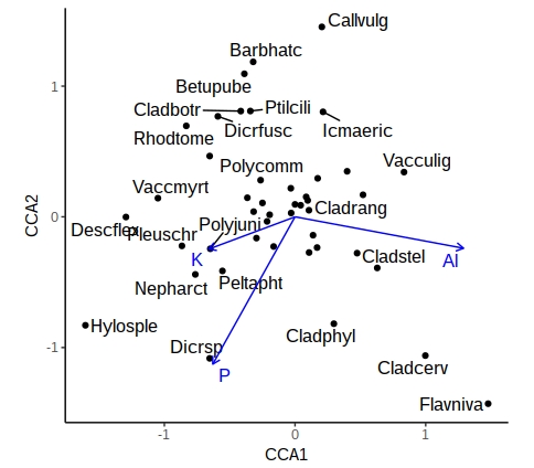
This is a little more complex than previous ggplot calls, with a call to geom_points, a calls for geom_text_repel, and a call to geom_segment to add arrows. The coord_fixed is to ensure equal scaling on x and y-axes, and there is no need for a legend. However, the plot is still rather cluttered by labels from ubiquitous species in the middle. Let’s not label any species +/- 0.5 on either axis, and for clarity use black or blue labels for the species and environmental names, controlled by scale_colour_manual

critval <- 0.5
vare_tbl<- vare_tbl %>%
           mutate(vgntxt=ifelse(CCA1 < critval & CCA1 > -critval &
                                CCA2 < critval & CCA2 > -critval &
                                ccatype=="species", "", vgntxt))

ggplot() +
  geom_point(aes(x=CCA1, y=CCA2), data=filter(vare_tbl, ccatype=="species"))  +
  geom_text_repel(aes(x=CCA1, y=CCA2, label=vgntxt, size=3.5, colour=ccatype),
                  data=vare_tbl, seed=123) + 
  geom_segment(aes(x=0, y=0, xend=CCA1, yend=CCA2), arrow=arrow(length = unit(0.2,"cm")), 
               data=filter(vare_tbl, ccatype=="bp"), color="blue") +
  coord_fixed() +
  scale_colour_manual(values = c("blue", "black")) +
  theme_classic() +
  theme(legend.position="none")

A similar approach can be used with samples, or where the environmental variables are categorical (centroids). This now gives you a publication-quality ordination plot that is easy to interpret.

(P.S. – thanks to Eli Patterson for giving me this challenge to solve in the first place!)