PhD opportunities within the Modelling, Evidence and Policy group

New PhD opportunities in the Modelling, Evidence and Policy research group.

Are you interested in undertaking a PhD project within the MEP research group? If so, now is a great time to consider applying! We are currently advertising a wide range of funded projects through our Natural Environment Research Council (NERC) Doctoral Training Partnerships (One Planet and IAPETUS2). In joining the MEP group, you will work alongside our existing PhD students, who are studying topics as diverse as understanding emerging bee diseases, the impact of roads on rainforests, and technologies for monitoring tree health. The group has a very active researcher community, including seminars, journal club, coffee times and weekly group research meetings, and has strong links to policy, industry and end-user stakeholders who help to inform and apply our research. Many of the projects below are CASE studentships, meaning you would have the opportunity to work alongside stakeholder partners, including undertaking a placement. More information on research within the group can be found on the MEP website: https://www.ncl.ac.uk/nes/research/biology/modelling-evidence-policy/#ourresearch

The NERC DTPs are training partnerships which provide the opportunity to be part of a wider cohort of like-minded researchers across a number of institutions, as well as a delivering a dedicated training programme. Eligibility criteria and application process vary between the different schemes. Please check the website of the scheme (given below) for details. For further details on specific projects, please contact the lead supervisor directly.

Available PhD projects:

NERC One Planet (https://research.ncl.ac.uk/one-planet/ ). DEADLINE: 18th January 2021.

Projects based in MEP:

  • Interventions to reduce the impact of climate change and other environmental stresses on oak health.

Supervisors: Dr Rachel Gaulton, Dr Roy Sanderson, CASE partners: Woodland Heritage and Action Oak initiative.

https://research.ncl.ac.uk/one-planet/studentships/OP2161%20-%20Rachel%20Gaulton,%20’Reducing%20the%20impact%20of%20climate%20change%20and%20other%20environmental%20stresses%20on%20oak%20tree%20health’.pdf

  • Identifying hotpots of riparian invasive species colonisation and spread

Supervisor: Zarah Pattison, Clare Fitzsimmons and Rinke Vingenog (Northumbria University).

https://research.ncl.ac.uk/one-planet/studentships/OP2169%20-%20Clare%20Fitzsimmons,%20’Identifying%20hotpots%20of%20riparian%20invasivespecies%20colonisation%20and%20spread’.pdf

Co-supervised by MEP (based at Northumbria University):

  • Astro-turfing the city: quantifying the impact of artificial lawns on the structure and function of urban ecosystems

Supervisors: Mark Goddard (Northumbria University), Miranda Prendergast-Miller (Northumbria University), Rachel Gaulton. CASE Partner: Royal Horticultural Society.

https://research.ncl.ac.uk/one-planet/studentships/OP2198%20-%20Mark%20Goddard,%20’Astro-turfing%20the%20city%20-%20quantifying%20the%20impact%20of%20artificial%20lawns%20on%20the%20structure%20and%20function%20of%20urban%20ecosystems’.pdf

  • Quantifying the importance of tree floral resources for pollinators in urban landscapes.

Supervisors: Katherine Baldock (Northumbria University), Mark Goddard (Northumbria University), Darren Evans, Matthew Pound (Northumbria University), Rachel Gaulton. CASE Partner: British Beekeepers Association

https://research.ncl.ac.uk/one-planet/studentships/OP2180%20-%20Katherine%20Baldock,%20’Quantifying%20the%20importance%20of%20tree%20floral%20resources%20for%20pollinators%20in%20urban%20landscapes’.pdf

NERC IAPETUS2 (https://www.iapetus2.ac.uk/). DEADLINE: 8th January 2021.

Based in MEP:

  • Biological invasions in ancient woodlands

Supervisors: Zarah Pattison, Aileen Mill and Nigel Willby (Stirling University). CASE Partner: Woodland Trust.

  • Invasion pathways of aquatic invasive non-native species using the canal network.

Supervisors: Mark Shirley, Nigel Willby (Stirling University), Zarah Pattison, Olaf Booy (APHA-INNS)

https://www.iapetus2.ac.uk/studentships/invasion-pathways-of-aquatic-invasive-non-native-species-using-the-canal-network/

  • Understanding the functional relationship between krill, the krill fishery and demersal sub-Antarctic fish populations.

Supervisors: Dr William Reid (Newcastle University), Dr Martin Collins and Prof Eugene Murphy (British Antarctic Survey) and Dr Jason Newton (Glasgow University). CASE and end-user partners: Aker Biomarine and Government of South Georgia and the South Sandwich Islands.

  • Predicting future invasion impacts: Indicators and models to measure success in “bending the curve” of species accumulation.

Supervisors: Aileen Mill, Bethan Purse (UK CEH), Helen Roy (UK CEH), Olaf Booy (GB Non-native Species secretariat).

Co-supervised by MEP:

  • Trophic structure and isotopic turnover rates of Antarctic benthic marine invertebrates: assessing temporal variability in benthic food webs and the response of cold-adapted species to dietary change.

Supervisors: Dr Ben Wigham and Dr William Reid (Newcastle University), Prof Llyod Peck (British Antarctic Survey) and Dr Jason Newton (Glasgow University). 

https://www.iapetus2.ac.uk/studentships/trophic-structure-and-isotopic-turnover-rates-of-antarctic-benthic-marine-invertebrates-assessing-temporal-variability-in-benthic-food-webs-and-the-response-of-cold-adapted-species-to-dietary-change/

  • From farmland to wildland: an ecological journey

Supervisors: Nigel Willby (Stirling University) and Zarah Pattison

https://www.iapetus2.ac.uk/studentships/from-farmland-to-wildland-an-ecological-journey/

Bumblebee ID NHSN

NHSN Bumblebee Project – Android ID app

In 2019 the Natural History Society of Northumbria is undertaking a survey of bumblebees in the North East of England, as the number of records is very patch. It is hoped to produce a new atlas of bumblebees in Northumberland Naturalist as a result. You can read all about the project at http://www.nhsn.ncl.ac.uk/news/take-part-in-the-nhsn-bumblebee-project/

Identifying bumblees has been made a little easier for you by Hamza Zaib, a Stage 2 undergraduate working with Roy Sanderson on a 2-week placement. Hamza has based his app on information in “Field Guide to Bumblebees of Great Britain and Ireland” by Mike Edwards and Martin Jenner, and we thank Mike Edwards for permission to adapt his key so that it works in the app. As well as helping you identify bumblebees, the app also records your latitude and longitude (and you can tag habitat information) so you can submit your records to iRecord https://www.brc.ac.uk/irecord/ Alternatively you can click the ‘submit’ button in the app to email your record to our email address, and Roy Sanderson will try and upload them all later (not tested yet!).

Well done to Hamza for getting so much done from scratch in just 2 weeks of work. You can download his app for your Android phone if you search on Google Playstore by searching for “Bumblebee ID NHSN” (quotes needed) or via https://play.google.com/store/apps/details?id=appinventor.ai_bbeenhsn.BeeID  Obviously, this software has not been fully tested, so probably contains bugs, but hope it helps everyone on their survey work!


Thinking of studying on an MSc programme led by MEP staff…

This week saw our Postgraduate Open Day, in which we described the four research-led MSc programmes run by staff from the Modelling, Evidence and Policy Research Group.  Here’s a brief description of the four programmes, and what they offer. Feel free to contact us for more details, or download the leaflet about the degrees, with information on how their modules link together here

We offer four integrated postgraduate degrees within the School of Natural and Environmental Science on the following programmes:

  • Computational Ecology MSc
  • Ecology and Wildlife Conservation MSc
  • Global Wildlife Science and Policy MSc
  • Wildlife Management MSc

A common set of three taught modules are taken by students on all four degrees, plus a research project, and each degree programme also contains its own  specific set of additional modules. The degrees are led by staff in the Modelling, Evidence & Policy Research Group.

Computational Ecology MSc

This course addresses the severe shortage of scientists trained to a high standard in both data modelling and ecology. Ecological and environmental scientists now generate large amounts of observational data, e.g. from camera traps, GPS, epidemiology and eDNA samples. You will gain hands-on experience of using modern computing and modelling methods. This will develop your essential technical skills, which are in demand by employers.

https://www.ncl.ac.uk/postgraduate/courses/degrees/computational-ecology-msc/

Ecology and Wildlife Conservation MSc

Our Ecology and Wildlife Conservation MSc gives you the skills needed for a successful career as an ecologist or in an environmentally-related field. You will gain the knowledge and skills you need to work in an environmental or ecological role. You will study an area of ecological science, such as wildlife conservation policy and practice, environmental impacts, and sustainable development. This course has a professional focus, which will help prepare you for the workplace.

https://www.ncl.ac.uk/postgraduate/courses/degrees/ecology-wildlife-conservation-msc/

Global Wildlife Science and Policy MSc

This programme allows you to develop skills to work at the interface of science and policy, understand how wildlife-related research can influence policies, and gives you the opportunity to take part in projects with notable wildlife organisations. It has a professional focus that prepares you for the workplace and help you into a career in global organisations such as the Intergovernmental science-policy Platform on Biodiversity Ecosystems Services (IPBES).

https://www.ncl.ac.uk/postgraduate/courses/degrees/global-wildlife-science-policy-msc/

Wildlife Management MSc

Our course provides a link between the theory and practice of wildlife management. We teach from the perspective of regulatory authorities associated with UK wildlife management. You will receive advanced training in policy and science implementation. It is professionally focused and relevant to a range of roles in the sector. The degree aims to provide graduates with advanced knowledge of wildlife management theory, the principles of biodiversity and conservation, epidemiology and wildlife conflicts. It also provides practical and field skills in wildlife and environmental data collection, data analysis, data handling, statistics and modelling methodologies with a focus on providing evidence for policy.

https://www.ncl.ac.uk/postgraduate/courses/degrees/wildlife-management-msc/


Bayesian statistics for environmental scientists with BUGS and greta

Introduction

Bayesian statistical have become very popular in the last 5 to 10 years amongst environmental scientists, due to their much greater flexibility than conventional frequentist approaches. They also have an intuitive appeal: many people still incorrectly mis-interpret p-values, thinking that they are testing the significance of a hypothesis, when of course in reality they are giving the probability of the data, given the null hypothesis. This ‘back-to-front’ approach of the traditional methods also causes problems for students learning statistical methods.

Several excellent books have been published in the last few years on Bayesian stats, aimed at ecologists. I particularly like the approach taken by Marc Kery and colleagues, who now have now published three texts on the subject.


You’ll have spotted that the most recent book has ‘Volume 1’ in the title, so we look forward to the second volume in the series. As you’ll have guessed from the titles, the difficulty and complexity of the models increases with each book. If you’re new to Bayesian stats, start with the Introduction to WinBUGS for Ecologists. This covers models which could mainly be done with standard frequentist statistics (some of the mixture-models described in the last chapters would be tricky however). A big advantage of this approach is that the book initially covers straightforward analyses using the linear model lm command, examines the outputs, and then shows the identical analysis done from a Bayesian approach. This approach rapidly illustrates the much ‘richer’ amount of information that can be obtained from a Bayesian rather than frequentist approach. So the book shows how to calculate a mean (yes, I know that sounds trivial, but still useful), equivalent of a t-test (but via lm for the frequentist method), one- and two-way anova, regression, glm, and mixed-effects models. Yes, all these can be done by conventional methods. If I’m doing a simple regression, I’ll still use lm rather than writing BUGS code, but as a way of describing Bayesian methods its clarity is difficult to fault.

As you might expect, all the R code for the analyses described in the book can be downloaded from the web. But intriguingly, not the datasets. This is because Kery has a bottom-up approach to the data (see pages 7 and 8 of his introductory book):rather like a motorbike mechanic, you can only fully understand how the motorbike works if you have assembled all the pieces together before riding off on it. Likewise with a model: Bayesian models can become complex, so rather than presenting the reader with a set of data to analyse, the reader creates a set of data with known properties (mean, sd etc.), which is then assembled for modelling. Then the reader can look at the output of the model, and see how well it matches the original inputs. This avoids the ‘black-box’ problem of not understanding what the model is up to. It isn’t really needed for a simple familiar model like the Bayesian regression we’re about to discuss here, but for complex mixture, hierarchical random-effects or state-space models it seems an excellent method to test that your Bayesian code, in BUGS, JAGS, Stan or Greta, is doing what you think it should, before trying it out on real data.

The book uses WinBUGS, although the code works fine for OpenBUGS (still under active development), and with minor tweaks for JAGS. More changes would be needed for Stan, the newest Bayesian framework. I’ll admit here that there are a number of things that I strongly dislike about existing Bayesian methods:

  1. You have to learn yet another language. BUGS, JAGS and Stan all have a different syntax to R, with slightly different function names etc.

  2. You have to write a set of instructions to an external text file outside of R, which is then called via the relevant R library (e.g. R2OpenBUGS) to carry out the Bayesian analysis.

  3. The BUGS/JAGS/Stan instructions cannot be debugged readily in R: it is fired off in one block for Bayesian analysis making debugging tricky with complex models. If you use RStudio, the IDE simply sees the code as a block of text and so ignores it.

I was there very intrigued by the new Greta R package by Nick Golding https://greta-dev.github.io/greta/ which was released on CRAN a few months ago. Potentially, this has the potential of providing R users with a much more intuitive interface for running Bayesian models. It works directly in R (no more writing of external text files), calling the Google Tensorflow backend for the heavy lifting. So, out of curiosity, I thought I’d try to run one of the simple examples from Marc Kery’s first book via lm, R2OpenBUGS and greta for comparison.

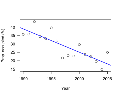
This is a slightly simplified version of the example in Chapter 8 of Kery’s book; a simple regression of Swiss wallcreeper numbers, which have declined rapidly in recent years:

As Kery comments, strictly-speaking it would be better to use a generalised linear model (since these are proportion data), but as a simple example this is OK. As usual, he generates the data to play with, for 16 years worth of data, intercept of 40, slope of -1.5 and variance (sigma-squared) of 25:

set.seed(123)
n <- 16 # Number of years
a <- 40 # Intercept
b <- 1.5 # Slope
sigma2 <- 25 # Residual variance

x <- 1:16 # Values of covariate year
eps <- rnorm(n, mean=0, sd=sqrt(sigma2))
y <- a + b*x + eps # Assemble the data set
plot((x+1989), y, xlab=“Year”, las=1, ylab=“Prop. occupied (%)”, cex=1.2)
abline(lm(y ~ I(x+1989)), col=“blue”, lwd=2)


Note: I have set a random seed, so your data should be the same. However, whilst the linear model results will be identical, the Bayesian results will still differ due to the MCMC.

Conventional analysis via linear model

Let’s look at the results from a standard analysis using lm

print(summary(lm(y ~ x)))

## Call:
## lm(formula = y ~ x)
##
## Residuals:
## Min 1Q Median 3Q Max
## -7.5427 -3.3510 -0.3309 2.0411 7.5791
##
## Coefficients:
## Estimate Std. Error t value Pr(>|t|)
## (Intercept) 40.3328 2.4619 16.382 1.58e-10 ***
## x -1.3894 0.2546 -5.457 8.45e-05 ***
## —
## Signif. codes: 0 ‘***’ 0.001 ‘**’ 0.01 ‘*’ 0.05 ‘.’ 0.1 ‘ ‘ 1
##
## Residual standard error: 4.695 on 14 degrees of freedom
## Multiple R-squared: 0.6802, Adjusted R-squared: 0.6574
## F-statistic: 29.78 on 1 and 14 DF, p-value: 8.448e-05

Bayesian analysis using OpenBUGS

I’m using OpenBUGS simply because WinBUGS is no longer being actively developed if I’ve understood the changes correctly. Remember that the bulk of the commands go into an external file, before being called by the bugs function. Kery’s original code also calculates predicted and residuals for each observation, plus Bayesian p-values.

library(R2OpenBUGS) # or library(R2WinBUGS) if using WinBUGS
# Write model
sink(“linreg.txt”)
cat(
model{
# Priors
alpha ~ dnorm(0,0.001)
beta ~ dnorm(0,0.001)
sigma ~ dunif(0,100)

# Likelihood
for(i in 1:n){
y[i] ~ dnorm(mu[i], tau)
mu[i] <- alpha + beta*x[i]
}

# Precision
tau <- 1/(sigma * sigma)
}
,fill=TRUE)
sink()

# Bundle data
win.data <- list(“x”,“y”, “n”)

# Inits function
inits <- function(){ list(alpha=rnorm(1), beta=rnorm(1), sigma = rlnorm(1))}

# Parameters to estimate
params <- c(“alpha”,“beta”, “sigma”)

# MCMC settings
nc = 3 ; ni=1200 ; nb=200 ; nt=1

# Start Gibbs sampler
out <- bugs(data = win.data, inits = inits, parameters = params, model = “linreg.txt”,
n.thin = nt, n.chains = nc, n.burnin = nb, n.iter = ni)

print(out, dig = 3)
Inference for Bugs model at “linreg.txt”,

Current: 3 chains, each with 1200 iterations (first 200 discarded)
Cumulative: n.sims = 3000 iterations saved
           mean    sd   2.5%    25%    50%    75%  97.5%  Rhat n.eff
alpha     39.896 2.729 34.389 38.210 39.970 41.710 44.981 1.006 1100
beta      -1.348 0.277 -1.879 -1.524 -1.349 -1.178 -0.776 1.006  970
sigma      5.204 1.155 3.533 4.393 5.006 5.773 8.186 1.001 3000
deviance  96.374 3.015 93.000 94.187 95.600 97.652 104.200 1.001 2800
For each parameter, n.eff is a crude measure of effective sample size,
and Rhat is the potential scale reduction factor (at convergence, Rhat=1).

DIC info (using the rule, pD = Dbar-Dhat)
pD = 2.767 and DIC = 99.140
DIC is an estimate of expected predictive error (lower deviance is better).

detach(“package:R2OpenBUGS”, unload=TRUE)

So the Bayesian analysis via BUGS is giving intercept of 39.9 and slope -1.4,, with sigma at 5.2 (we set sigma-squared at 25 when generating the data).

Greta package

The new greta package (apparently named after a German computer scientist) requires Tensorflow to be setup. I’ll admit that I’ve struggled to get Tensorflow to run on a Windows PC (python bindings go astray) but it works fine on Linux.

library(greta)

# Note: R allows <- or = to assign variables. Following greta documentation
# advice to use <- for deterministic and = for stochastic variables.

x_g <- as_data(x) # Convert input data into greta arrays
y_g <- as_data(y)

# variables and priors
int = normal(0, 100)
coef = normal(0, 100)
sd = normal(0,100)

mean <- int + coef * x_g # define the operation of the linear model
distribution(y_g) = normal(mean, sd) # likelihood
m <- model(int, coef, sd) # Set up the greta model
plot(m) # Visualise structure of the greta model

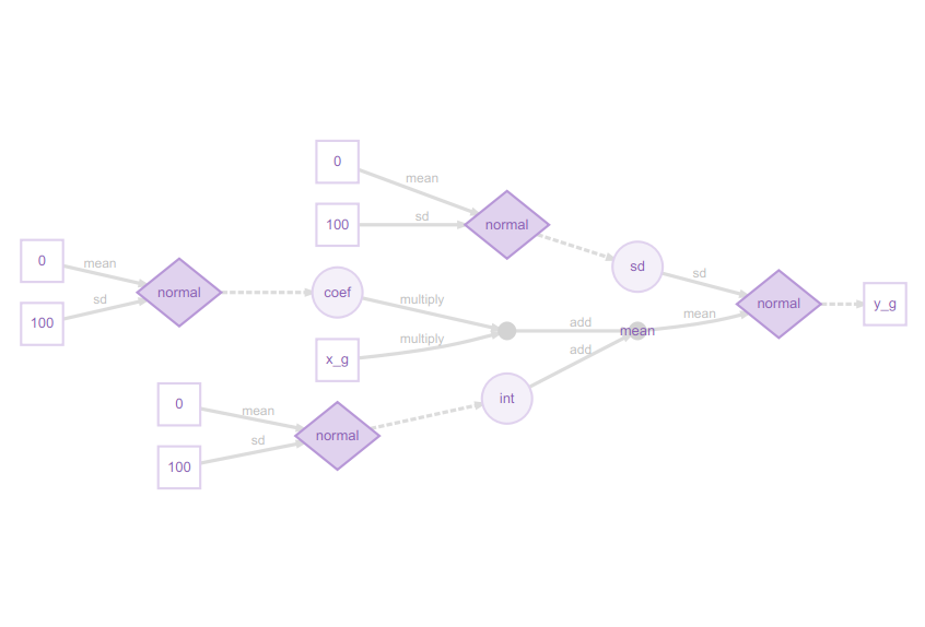
I really like these greta model plots, as they explain even complex models clearly from a Bayesian perspective.  This may at first glance look excessively detailed for a simple regression model, but the legend shows how it all fits together:

You can now see how the slope coefficient is multiplied by the x_g (year) predictor, then added to the int (intercept), but both the slope and intercept are sampled from a normal distribution, as is the residual error. The response variable, the proportion of sites occupied (y_g) is itself sampled from a normal distribution. This might strike you as confusing at first, if you are used to the conventional way of writing a linear model as:

y = a + b.x + ε

Here, the diagram shows the approach more commonly used in Bayesian methods:

y ~ N(a + b.x, sd)

in other words, the response variable y is being sampled from a normal distribution with mean a + b.x, and standard deviation sd.

# sampling
draws <- mcmc(m, n_samples = 1200, warmup=200)
print(summary(draws))

##
## Iterations = 1:1200
## Thinning interval = 1
## Number of chains = 1
## Sample size per chain = 1200
##
## 1. Empirical mean and standard deviation for each variable,
## plus standard error of the mean:
##
## Mean SD Naive SE Time-series SE
## int 40.209 2.7641 0.079791 0.20055
## coef -1.378 0.2884 0.008324 0.02069
## sd 5.200 1.1180 0.032274 0.05647
##
## 2. Quantiles for each variable:
##
## 2.5% 25% 50% 75% 97.5%
## int 34.226 38.487 40.219 42.118 45.4184
## coef -1.955 -1.561 -1.377 -1.200 -0.7697
## sd 3.679 4.403 4.976 5.833 7.6671

Here the greta model has intercept of 40.2,  slope -1.4, and sd (sigma) 5.2.

Conclusions

The greta output is very similar to that from BUGS, but to my mind the code is simpler and more intuitive. Both packages can produce the usual MCM trace plots (or ‘hairy caterpillars’ as I heard them described in one talk!). Greta is much slower to run than BUGS, so I suspect with large datasets CPU time might be an issue, and Tensorflow might be tricky to setup for some configurations.. The greta graphical description of the model, via the diagrammeR package, is particularly clear and intuitive, explaining the structure of the Bayesian model. This document was drafted in RMarkdown https://rmarkdown.rstudio.com/ which promptly crashed with BUGS, but was fine with greta.

Greta is still in an early stage of development, but its website https://greta-dev.github.io/greta/ has lots of useful examples. It is clear that people are already pushing it to its limits, implementing hierarchical models https://github.com/greta-dev/greta/issues/44 etc., so watch this space…

Louise Mair – The contribution of scientific research to conservation planning

Louise has kindly written this blog about her new paper in Biological Conservation

The contribution of scientific research to conservation planning

To read the scientific publication that this blog is based on, click here.

Introduction: Questioning the value of research

Understanding the contribution of scientific research is of great importance to research fields that claim to have direct relevance or application to action on the ground. There is a strong feeling in the conservation community that research should be conducted not only for the pursuit of knowledge, but also to meet the needs of practitioners and decision makers.

One field that has strong links to action on the ground, and that is of particular interest to myself and other researchers within our MEP group, is conservation planning. Conservation planning is the process of “deciding where, when and how to allocate limited conservation resources” (Pressey & Bottrill 2009). This may involve, for example, understanding the threats to a species, and then identifying and implementing actions that would most effectively mitigate these threats. At the other end of the scale, conservation planning may involve assessing existing protected areas within a country and then identifying where new reserves should be placed to achieve habitat representation across the protected area network. Planning is therefore an essential tool in practical and strategic conservation management.

Conservation planning as a tool to achieve international biodiversity targets

Conservation planning also plays an important role in achieving international biodiversity targets. Since 2010, the global conservation community has been striving to achieve a set of twenty targets, called the Aichi Biodiversity Targets. These targets were set by the Convention on Biological Diversity (CBD), with the aim of halting the global loss of biodiversity by 2020. 192 countries plus the EU are signed up to the CBD, each of them committed to this ambitious goal. The CBD has certainly pushed conservation up the political agenda, however with 2020 fast approaching, we are not on track to meet the Aichi Targets.

Application of a novel method to review the literature

Having recognised the importance of conservation planning for achieving biodiversity targets, and that at a global level we are failing to achieve these targets, we were interested in understanding what contribution scientific research has made to conservation planning. This initially seems like a reasonable question, but a preliminary search in Web of Knowledge covering the years 2000-16 returned an overwhelming 4,471 articles. Reviewing such a large volume of literature requires an innovative approach, and so my MEP colleagues and I adopted a novel method, called topic modelling.

Topic modelling is a statistical tool used to assess the content of articles in a body of literature. The model identifies topics present in the literature based on the co-occurrence patterns of words in the article abstracts. This provides a quantitative framework for summarising themes and analysing trends in articles that cover a wide range of biological, spatial and temporal scales. Topic modelling was therefore an ideal tool for tackling this mountain of literature (for a great article demonstrating the approach in ecology, see Westgate et al. 2015).

The scientific literature on conservation planning neglects the social sciences

We found that the scientific literature on conservation planning was diverse, but it was dominated by biological rather than socio-political research. This might seem unsurprising given that conservation tends to be thought of as a biological discipline but, more than three decades ago, conservation was defined as dependent on both biological and social sciences (Soulé 1985). Indeed, it is the socio-political context (i.e. support and cooperation from locals and governments) that ultimately determines the success or failure of a conservation project.

This preference for biological research is borne out in the attention given to the different stages of conservation planning. Very loosely, conservation planning has three stages:

1. Status Review involves assessing the current status of, and threats to, species or areas;

2. Action Planning involves determining what actions should be taken;

3. Implementation involves carrying out and monitoring the planned actions.

We found that research into the status of species and habitats (primarily biological areas) was the most prevalent, with the process of action planning receiving considerably less attention, while implementation (which requires greater emphasis on socio-political considerations) attracted by far the least research.

This pattern is problematic, as there has long been a concern in conservation planning that there is an ‘implementation gap’, in other words, knowledge is rarely translated into action. Champions of evidence-based conservation have for decades bemoaned the lack of research into what works and what doesn’t work (e.g. Sutherland et al. 2004), yet our study indicates that the scientific community continues to neglect implementation.

The scientific community could do with building bridges

We also found weak links between socio-economic and biological topics, indicating a general lack of interdisciplinary research. This means that, for example, an article primarily about species genetics (which is a biological Status Review topic) rarely considered how the data could be used in Action Planning or Implementation. This lack of ‘joined up’ research means that the literature is highly fragmented and, in many cases, the applicability to practitioners and decision makers is unclear.

We suggest that the applicability of research could be improved, and the implementation gap closed, if conservation planning research was more frequently designed and executed in collaboration with both practitioners and relevant stakeholders. This would make the link between the biological and social sciences, and join up the different parts of the planning process to give more holistic outputs.

So what does this all mean for conservation?

Our interpretation is that, as a scientific community, we are continuing to conduct research within unidisciplinary realms, which is ultimately hindering our ability to produce research that is valuable to action on the ground. We are also missing the opportunity to learn lessons from the many conservation plans that are implemented but not reported in scientific publications. Shifting the focus and reporting of research is clearly challenging, but part of making progress requires understanding our past and current behaviour, which is where studies such as ours help shed light on what we’re doing and what we could be doing better for conservation planning.

Summary of key points

  • We assessed the contribution of scientific research to the field of conservation planning by applying topic modelling to a body of literature consisting of 4,471 articles
  • Research into the status of species and habitats was most prevalent, the process of action planning received considerably less attention, and implementation attracted the least research of all
  • The scientific literature was dominated by biological rather than socio-political research, and showed a lack of inter-disciplinary research
  • The number of publications on implementation and monitoring declined over time, suggesting that limited efforts have been made to address the “implementation crisis”
  • We suggest that filling research gaps, through integration of the social sciences and placing greater value on evidence syntheses, would push scientific research towards greater applicability

This blog is based on: Mair, L., Mill, A.C., Robertson, P.A., Rushton, S.P., Shirley, M.D.F., Rodriguez, J.P., McGowan, P.J.K., 2018. The contribution of scientific research to conservation planning. Biological Conservation 223, 82-96.

How to be a productive researcher

Book review – The Productive Researcher by Mark Reed

Like many scientists I find it a challenge to juggle time and energy so as to be an effective research worker, whilst simultaneously undertaking my responsibilities in teaching and (yawn) administration properly.  I’ve read numerous self-help books, of variable quality, many of which could be summed up by claiming that a clever filing system or the correct use of Post-It notes will solve everything.

Mark Reed’s new book, The Productive Researcher, is in a quite different order from these.

For a start, it is searingly honest.  He describes his own experience of panic attacks at public lectures, ‘impostor syndrome’, last-minute preparation of talks, mistakes made in chairing meetings and episodes of depression.  This honesty was deeply reassuring.  I can still remember having just become a lecturer when late one day I was suddenly asked if I could cover for another member of staff and teach their ecology lectures the following morning.  “Usual Lotka-Volterra competition and predation models” I was told, to which I replied  “Fine” without having a clue as to what L-V models were.  Went home with a couple of theoretical ecology textbooks and some blank acetates (pre-PowerPoint days): for some reason I hadn’t taken a theoretical population dynamics module as an undergraduate and hadn’t done any calculus since school, so spent much of the night getting to grips with both.  Bleary-eyed the following morning I gave the first lecture, pretending to be confident at an overhead projector in a big lecture theatre full of students.  The students didn’t seem to notice, but it was my first of now numerous episodes of “impostor syndrome”: on speaking to other academics I’ve realised the syndrome is common.

Mark Reed’s book is wide-ranging, and includes issues about examining what really motivates us in our research, how to achieve a good work-life balance, cope with rejections of grant applications or papers, avoid wasting time in meetings, and defeat the tyranny of emails (although on emails he omits my whizzo technique – see later).  His comments on work-life balance are pertinent.  It seems that the number of hours academics work per week in the UK is steadily increasing, with more than half doing over 50 hours per week.  I’ll admit that at the end of the day I’ll usually stuff a pile of papers into my bag with the intention to read them that evening ‘stay on top of the literature’, but somehow most of it doesn’t get read.  He provides evidence that longer hours don’t necessarily result in more productive researchers anyway.  The book covers ‘when to stop’: the analyses you’re doing, or paper you’re writing will never be perfect, so you need to know when it is good enough to consider complete and publish.  There’s a brilliant chapter on How to write a literature review in a week which ought to be compulsory reading for everyone.  He cheekily re-invents the tired management-speak of SMART objectives (Specific, Measureable, Achievable, Realistic, Timely) that are waffled about by administrators who have nothing better to do with their time, into something more valuable for researchers.  In Mark’s case they become goals that are Stretching, Motivational, Authentic, Relational and Tailored.  The chapter explaining these was much more valuable to me as a research scientist than the management-speak version.

Some of the most insightful parts of the book come from interviews Mark Reed has conducted with several of the top-performing most highly-rated university scientists internationally.  These scientists came from a wide-range of disciplines, including electronics, epidemiology, mathematics, environmental change, and some had published over 1000 papers, which had been cited hundreds (and even thousands) of times.  Clearly they are doing something right, and are worth listening to!  Despite the breadth of scientific disciplines encompassed by these highly-productive researchers certain common threads were apparent to both their philosophies and working patterns.  Despite their professional success they all came over as lacking in pride, indeed were relatively humble about what they had achieved, but could nevertheless be decisive when necessary.  They all emphasised the importance of listening (truly listening!) to others, irrespective of the status of the other scientist.  Their two main priorities were generally the supervision of PhD students, and second publishing in top journals.  They said it was important to allow other scientists to grow, to be a good collaborator, to not correct colleagues who repeatedly got trivial facts or figures wrong etc.  I thought the emphasis on PhD students was a good one, especially given the additional pressures PhD students face with the competition for papers, post-docs etc.  Most interviewees only worked during office hours, and not at home, therefore said it was important that every hour counted in the office (e.g. in 2 hour blocks).  Another good point was to do the exciting, motivationally interesting research first thing in the morning, and the boring, tedious administration later in the day when you’re tired.   All of them knew what their top priorities were, and could keep them focused in front of them at all times.

This is a short (176 pages), easy-to-read book that I would recommend to any scientist.  It is so full of nuggets of truth as to how to increase your productivity as a research scientist that it is difficult to take fully on-board in one reading (I’m in the process of re-reading it!).

Addendum – My Email Trick

Mark Reed discusses “The Tyranny of Email”, and although the book has lots of excellent suggestions on the subject, he doesn’t mention the little tricks I’ve stumbled across.  Until a few years ago I suffered under its tyranny, in that like most colleagues my Inbox contained between one to two thousand emails, in a confused muddled state, some read, some unread, some irrelevant, some urgent.  Now my Inbox usually contains only 10 to 20 emails, and most of the time it contains no emails whatsoever.  What’s the trick? (this is for Microsoft Outlook 2016):

  1. In the morning fire up Outlook: I let it load the 20 or so emails that have accumulated overnight into the Inbox. All my mailboxes are arranged so that the most recent emails are at the bottom of the list, and only the subject line shows.
  2. Switch Outlook offline. This is crucial as personally I get really distracted if, whilst replying to an email I constantly see notifications of new ones arriving in my Inbox. Note: you can still send emails whilst offline, by pressing the small ‘send’ icon at the top left of the screen, without receiving any new ones.
  3. Scan the emails and delete the junk ones; sometimes these are pretty obvious from the subject matter or sender.
  4. Check the remaining emails and take the following actions:
    1. If you can reply to it in less than 2 minutes, then do so, and file the email (and reply) appropriately.
    2. If it’s going to take a little longer to sort out and write a suitable reply, but it’s still going to need attention in the next week, or you’ll need to do a bit of work first, put it into your ‘Action’ mailbox.
    3. If you might need to do something later with the email, for example in the next 10 to 14 days, but possibly not that urgent, put it into the ‘Review’ mailbox.
    4. If you’ve got to wait for someone else to do something before you can deal with the issue, put it into the ‘Waiting’ mailbox. (Occasionally I also file emails I’ve sent, where I’m needing a reply from someone else before continuing, into the Waiting mailbox.)
  5. A couple of times a day flick Outlook into ‘Online’ mode to receive a new set of emails – this means that you only have to look at them when the time suites you.

The big advantage of the approach, only having ‘Action’, ‘Review’ and ‘Waiting’ mailboxes to think about is that it save so much time. Even my Action mailbox rarely has more than 10 to 15 emails in it.  When I re-check my Review mailbox about once a week, half the things have been dealt with by someone else already.  This seems to apply particularly to tedious administrative emails: academic administrators are very good at generating large numbers of duplicate emails tagged ‘high priority’ which actually are very low priority!  The Waiting mailbox provides a useful check on follow-ups, and if needed I can add a reminder to Outlook Tasks for a specific item.  I can still send emails whenever I want, and only receive new ones when I switch Outlook online.

I found the hardest part was switching from the old, disorganised system, to my current one.  “But what if someone needs to contact you urgently and you only check your incoming emails 2 or 3 times a day?” I hear you say.  Colleagues seem to phone or visit me in person, just as they did in pre-email days…

Reproducible, publication quality multivariate plots in R

Introduction

Good communication of the results from any models or analyses to the potential end-user is essential for environmental data scientists. R has a number of excellent packages for multivariate analyses, one of the most popular being Jari Oksanen’s “vegan” package which implements many methods including principal components analysis, reducancy analysis, correspondence analysis and canonical correspondence analysis. The package is particularly popular with ecologists: it was originally developed for vegetation analysis (hence its name), but can be applied to any problem needing multivariate analysis. (As an aside, if searching Google for advice on the vegan package, remember to add the word “multivariate” as a search term, otherwise you’ll return rather a lot of recipes!).

One weakness of vegan is that whilst its default graphics are fine when analysing the data, they are not good enough to publish, or include in presentations at conferences. In the past I’ve exported vegan output into Excel, but then you get into chaos of menus, click boxes and general lack of reproducibility. There is a development package by Gavin Simpson, called ggvegan, which looks promising but is not yet available on CRAN and does not yet provide the amount of flexibility I need for plotting reliably. In this post I’ll show you how we can make use of vegan + ggplot2 to produce good quality plots.

Unconstrained ordination

In unconstrained ordination we’re typically dealing with a samples x species matrix, without including any explanatory variables in the ordination. However, it can be expanded to any set of “attributes” data, so instead of species, you might have soil data, land cover types, operational taxonomic units (OTUs) etc. The most widely used techniques are Principal Components Analysis (PCA), Correspondence Analysis (CA) and Non-metric multidimenional scaling (NMDS) all of which are available in vegan. If your data matrix contains nominal or qualitative data you might want to consider Multiple Correspondence Analysis (MCA) available in the FactoMineR package.

First, using one of vegan’s in-built datasets, Dutch dune vegetation, let’s undertake a PCA and look at the default species plot:

library(vegan)
## Loading required package: permute
## Loading required package: lattice
## This is vegan 2.4-6
data(dune)

dune_pca <- rda(dune)
plot(dune_pca, display = "species")

Hmm… not ideal, because many of the labels overlap and are unreadable. As is conventional, species names are reduced to 8 characters (4 for genus plus 4 for species) to save space, but a lot of labels still overlap. A better approach is to extract the PCA species scores, pipe them into ggplot, and use ggrepel to display the species names:

library(tidyverse)
library(ggrepel)

# Extract the species scores; it returns a matrix so convert to a tibble
dune_sco <- scores(dune_pca, display="species")
dune_tbl <- as_tibble(dune_sco)
# Note that tibbles do not contain rownames so we need to add them
dune_tbl <- mutate(dune_tbl, vgntxt = rownames(dune_sco))
plt <- ggplot(dune_tbl, aes(x = PC1, y = PC2, label = vgntxt)) +
        geom_point() +
        geom_text_repel(seed = 123)
plt

If like me you don’t particularly like the grey background then add a theme. One oddity of ggrepel is that it uses a random number generator to try and position the labels, so if you run the identical command twice you’ll end up with different plots (not very reproducible!). Luckily it is easy to fix with a fixed seed for the random number generator used by ggrepel, which is why I’ve added the “seed = 123” option. We can also add dotted vertical lines to indicate the zero on the x and y-axes:

plt <- plt + 
        geom_vline(aes(xintercept = 0), linetype = "dashed") +
        geom_hline(aes(yintercept = 0), linetype = "dashed") +
        theme_classic()
plt

There are other options in ggrepel allowing you to increase the distance from the points to labels, change the point types etc.

 Constrained ordination

In constrained ordination you have two sets of data, one the response matrix (conventionally the samples x sites matrix) and the other a set of explanatory variables (e.g. environmental variables). The importance of these environmental variables can be tested via permutation-ANOVA, but the most useful outputs (in my experience) are the graphs, where the environmental variables can be superimposed onto the species or samples to create ‘biplots’. Let’s look at one of the default vegan datasets, Scandinavian lichen pastures plus their environmental data, and carry out a constrained analysis via canonical correspondence analysis, and display the default vegan plots:

data("varespec")
data("varechem")
# For simplicity, just use three of the fourteen soil variables
vare_cca <- cca(varespec ~ Al + P + K, data = varechem)
plot(vare_cca, display=c("sites", "bp"))

plot(vare_cca, display=c("species", "bp"))

A few comments about these default plots, apart from the obvious one that the species plot is very cluttered. The importantance of an environmental variable is indicated by the length of the arrow, so Al and P are more important than K. The direction of an arrow indicates the main change for that variable, so samples 9, 24 and 28 will be relatively high in P, whilst sample 13 relatively low. Calluna vulgaris appears to prefer low P conditions etc. Notice that Al and P are at almost 90-degrees to each other, which indicates that the two variables are uncorrelated. Finally, be alert to the fact that the scaling of the arrows on the plots is relative: in the species plot the Al arrowhead is at about 1.2 on CCA1 x-axis, whereas on the samples plot it is at about 1.8. It is their relative positions that matter when interpreting the plots.

These plots are still rather messy, so how can we smarten them up within a ggplot framework. We need to create a tibble containing the species, samples and environmental (biplot) scores, plus a label to indicate the score type. We also need a simple method of rescaling the environmental scores so that they fit neatly within the plot window for either species or samples plots.

vare_spp_sco <- scores(vare_cca, display = "species")
vare_sam_sco <- scores(vare_cca, display = "sites")
vare_env_sco <- scores(vare_cca, display = "bp")
vare_spp_tbl <- as_tibble(vare_spp_sco)
vare_sam_tbl <- as_tibble(vare_sam_sco)
vare_env_tbl <- as_tibble(vare_env_sco)
vare_spp_tbl <- mutate(vare_spp_tbl, vgntxt=rownames(vare_spp_sco),
                       ccatype = "species")
vare_sam_tbl <- mutate(vare_sam_tbl, vgntxt=rownames(vare_sam_sco),
                       ccatype = "sites")
vare_env_tbl <- mutate(vare_env_tbl, vgntxt=rownames(vare_env_sco),
                       ccatype = "bp")

It may seem a bit cumbersome having to extract each set of scores separately, labelling, given that vegan will allow you to return all three in one command. However, vegan returns the three sets of scores as a list, and I find it easier to handle them separately. The output tibbles has the CCA1 and CCA2 axis scores, plus character variables varetxt (species names, sample names and env names) and ccatype (to indicate the type of score).

You’ll recall that the environmental variables are plotted with scales relative to the samples or species plots. Therefore, it’s usually easiest to plot the species on their own, next check values of the environmental variables, then decide on an appropriate scaling factor.

plt <- ggplot(vare_spp_tbl, aes(x = CCA1, y = CCA2, label = vgntxt)) +
       geom_point() +
       geom_text_repel(seed = 123)
plt

In this plot the species names are still a little cluttered in the centre of the graph, around zero on both axes. These will tend to be the most ubiquitous species, and so are of least interest. Later on we’ll remove the labels from some of these species to tidy up the plot. As noted earlier, we’ll want the arrowhead of the Al to be at about 1.2 on the x-axis for a reasonably proportioned plot. Let’s check what the actual biplot scores are:

vare_env_tbl
## # A tibble: 3 x 4
##     CCA1   CCA2 vgntxt ccatype
##    <dbl>  <dbl> <chr>  <chr>  
## 1  0.860 -0.160 Al     bp     
## 2 -0.420 -0.751 P      bp     
## 3 -0.440 -0.165 K      bp

We can see that Al is 0.86 so we need to apply a multiplier of about 1.5 to all the environmental variables. Then we need to select the environmental variable labels, and create a single tibble containing both the (rescaled) environment and species scores and labels:

rescaled <- vare_env_tbl %>% 
            select(CCA1, CCA2) %>%
            as.matrix() * 1.5
vare_tbl <- select(vare_env_tbl, vgntxt, ccatype) %>%
            bind_cols(as_tibble(rescaled)) %>%
            bind_rows(vare_spp_tbl)

Now we are in a position to create a biplot, with arrows for the environmental variables:

ggplot() +
  geom_point(aes(x=CCA1, y=CCA2), data=filter(vare_tbl, ccatype=="species"))  +
  geom_text_repel(aes(x=CCA1, y=CCA2, label=vgntxt, size=3.5),
                  data=vare_tbl, seed=123) + 
  geom_segment(aes(x=0, y=0, xend=CCA1, yend=CCA2), arrow=arrow(length = unit(0.2,"cm")),
               data=filter(vare_tbl, ccatype=="bp"), color="blue") +
  coord_fixed() +
  theme_classic() +
  theme(legend.position="none")

This is a little more complex than previous ggplot calls, with a call to geom_points, a calls for geom_text_repel, and a call to geom_segment to add arrows. The coord_fixed is to ensure equal scaling on x and y-axes, and there is no need for a legend. However, the plot is still rather cluttered by labels from ubiquitous species in the middle. Let’s not label any species +/- 0.5 on either axis, and for clarity use black or blue labels for the species and environmental names, controlled by scale_colour_manual

critval <- 0.5
vare_tbl<- vare_tbl %>%
           mutate(vgntxt=ifelse(CCA1 < critval & CCA1 > -critval &
                                CCA2 < critval & CCA2 > -critval &
                                ccatype=="species", "", vgntxt))

ggplot() +
  geom_point(aes(x=CCA1, y=CCA2), data=filter(vare_tbl, ccatype=="species"))  +
  geom_text_repel(aes(x=CCA1, y=CCA2, label=vgntxt, size=3.5, colour=ccatype),
                  data=vare_tbl, seed=123) + 
  geom_segment(aes(x=0, y=0, xend=CCA1, yend=CCA2), arrow=arrow(length = unit(0.2,"cm")), 
               data=filter(vare_tbl, ccatype=="bp"), color="blue") +
  coord_fixed() +
  scale_colour_manual(values = c("blue", "black")) +
  theme_classic() +
  theme(legend.position="none")

A similar approach can be used with samples, or where the environmental variables are categorical (centroids). This now gives you a publication-quality ordination plot that is easy to interpret.

(P.S. – thanks to Eli Patterson for giving me this challenge to solve in the first place!)

Random encounter uncertainty

Matt Grainger has kindly written this post about random encounter uncertainty models and camera traps

Random encounter models with camera traps

A recent paper in the Journal of Zoology by Tom Gray (“Monitoring tropical forest ungulates using camera-trap data” doi:10.1111/jzo.12547) used a random encounter model (REM) to assess the density of lesser oriental chevrotain Tragulus kanchil in the Southern Cardamom National Park, in south-west Cambodia. Random encounter models were adapted for camera trapping by Rowcliffe et al. (2008); these models allow estimates of populations of animals that are not individually-identifiable.

Density (D) is estimated from camera trap encounter rates by:

where y is the total number of photographs, t is the survey effort (camera-trap nights), v is the animals speed of movement and the camera detection zone is denoted by the radius (r) and angle (θ) of detection. The model assumes that camera traps are placed at random in relation to the animals movement. Variances can be estimated by non-parametric bootstrapping. Rowcliffe et al. (2008) suggest that the variances of the independently estimated variables (v, r and θ) can be incorporated by adding the squared coefficients of variation to that derived from bootstrapping to give an overall squared coefficient of variation for the density estimate.

Gray (2018) does not account for these variances in his paper, despite giving an indication of the size of the variation in these independently estimated variables. What difference would this make to the estimated density of lesser oriental chevrotain? Rather than using the delta method of Seber (1982) as suggested by Rowcliffe et al. (2008) I used the R package “propagate” (Spiess 2017) to propagate the uncertainty around the estimates of v, r and θ.

First we set up some data using the uncertainty estimates shown in Gray (2008).

set.seed(10101)
DAT <- data.frame(r = c(0.0014, 0.00026), v = c(0.82, 0.2),
                  y =c(501,0), theta =c(0.063,0),tm=c(8236,0),pi=c(pi,0))

Next we write the formula to estimate D as an expression.

EXPR <- expression((y/tm)*(pi/((v*r)*(2+theta))))

Then we can propagate the expression using the data. You can use the full data set or (as I have here) mean and standard deviations.

res <- propagate(EXPR, DAT)

We then convert the simulation results to a dataframe so we can plot it with ggplot2. Propagate has a plot function but I have not worked out how to customise it to my own liking yet.

dat <- as.data.frame(res$resSIM)
names(dat) <- "Density"

Let’s also look at the 95% highest density region (the credible interval) and the median density estimate from the simulation.

hdr(dat$Density, h = bw.nrd0(dat$Density))

 ## $hdr
 ##          [,1]     [,2]
 ## 99% -18.52657 213.3657
 ## 95%  19.59911 152.7857
 ## 50%  70.37278 109.9119
 ##
 ## $mode
 ## [1] 96.91486
 ##
 ## $falpha
 ##          1%          5%         50%
 ## 0.002749692 0.018249954 0.059715893

(median <- median(dat$Density))

## [1] 82.59773

lwr<-19.59#95% CI
uppr<-152.7857

Let’s plot the result of the simulation:

The simulated density of lesser oriental chevrotain when uncertainty is taken in to account (the median density value is indicated by the solid black line and the 95% credible interval is indicated by the dashed black lines).

In Gray (2018) density was estimated at 80.7 km-2 with boot-strapped 95% confidence intervals of 56.6-98.1 km-2. Here I have estimated density at 82.60 with 95% HDR 19.59 – 152.78 km-2. The median value is similar to the estimate in Gray (2018) but the credible intervals are much wider when we take uncertainty in to account. Given the wider credible intervals there is greater uncertainty in the estimate of density. Conservation managers might wish to increase the precision in the independently estimated variables by further research in to the species ecology (e.g. movement ecology) or by improving the estimate of the camera detection zone.

Decision making under uncertainty

With this approach we can ask questions related to the probability that the population density is greater than a value.

#What is the probability that the density is greater than 90 per Km-2?
sum(dat$Density>90)/dim(dat)[1]

## [1] 0.39562

These sorts of questions cannot easily be addressed outside of a Bayesian or simulation approach. This makes them extremely useful in decision making and wildlife monitoring. With monitoring data (e.g. several surveys over time) we can obtain the probability that the population is increasing or decreasing by a set amount.

References

Gray, T. (2018) Monitoring tropical forest ungulates using camera-trap data. Journal of Zoology, doi:10.1111/jzo.12547

Rowcliffe, J.M., Field, J., Turvey, S.T., Carbone, C. (2008) Estimating animal density using camera traps without the need for individual recognition. Journal of Applied Ecology, 45(4), 1228-1236

Seber, G.A.F. (1982). The estimation of animal abundance and related parameters. ISBN-13: 978-1930665552

Spiess, A-N. (2017). propagate: Propagation of Uncertainty. R package version 1.0-5. https://CRAN.R-project.org/package=propagate