Introduction
Good communication of the results from any models or analyses to the potential end-user is essential for environmental data scientists. R has a number of excellent packages for multivariate analyses, one of the most popular being Jari Oksanen’s “vegan” package which implements many methods including principal components analysis, reducancy analysis, correspondence analysis and canonical correspondence analysis. The package is particularly popular with ecologists: it was originally developed for vegetation analysis (hence its name), but can be applied to any problem needing multivariate analysis. (As an aside, if searching Google for advice on the vegan package, remember to add the word “multivariate” as a search term, otherwise you’ll return rather a lot of recipes!).
One weakness of vegan is that whilst its default graphics are fine when analysing the data, they are not good enough to publish, or include in presentations at conferences. In the past I’ve exported vegan output into Excel, but then you get into chaos of menus, click boxes and general lack of reproducibility. There is a development package by Gavin Simpson, called ggvegan, which looks promising but is not yet available on CRAN and does not yet provide the amount of flexibility I need for plotting reliably. In this post I’ll show you how we can make use of vegan + ggplot2 to produce good quality plots.
Unconstrained ordination
In unconstrained ordination we’re typically dealing with a samples x species matrix, without including any explanatory variables in the ordination. However, it can be expanded to any set of “attributes” data, so instead of species, you might have soil data, land cover types, operational taxonomic units (OTUs) etc. The most widely used techniques are Principal Components Analysis (PCA), Correspondence Analysis (CA) and Non-metric multidimenional scaling (NMDS) all of which are available in vegan. If your data matrix contains nominal or qualitative data you might want to consider Multiple Correspondence Analysis (MCA) available in the FactoMineR package.
First, using one of vegan’s in-built datasets, Dutch dune vegetation, let’s undertake a PCA and look at the default species plot:
library(vegan)## Loading required package: permute## Loading required package: lattice## This is vegan 2.4-6data(dune)
dune_pca <- rda(dune)
plot(dune_pca, display = "species")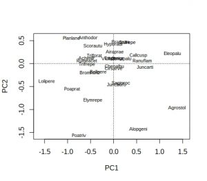
Hmm… not ideal, because many of the labels overlap and are unreadable. As is conventional, species names are reduced to 8 characters (4 for genus plus 4 for species) to save space, but a lot of labels still overlap. A better approach is to extract the PCA species scores, pipe them into ggplot, and use ggrepel to display the species names:
library(tidyverse)
library(ggrepel)

# Extract the species scores; it returns a matrix so convert to a tibble
dune_sco <- scores(dune_pca, display="species")
dune_tbl <- as_tibble(dune_sco)
# Note that tibbles do not contain rownames so we need to add them
dune_tbl <- mutate(dune_tbl, vgntxt = rownames(dune_sco))
plt <- ggplot(dune_tbl, aes(x = PC1, y = PC2, label = vgntxt)) +
        geom_point() +
        geom_text_repel(seed = 123)
plt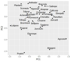
If like me you don’t particularly like the grey background then add a theme. One oddity of ggrepel is that it uses a random number generator to try and position the labels, so if you run the identical command twice you’ll end up with different plots (not very reproducible!). Luckily it is easy to fix with a fixed seed for the random number generator used by ggrepel, which is why I’ve added the “seed = 123” option. We can also add dotted vertical lines to indicate the zero on the x and y-axes:
plt <- plt +
        geom_vline(aes(xintercept = 0), linetype = "dashed") +
        geom_hline(aes(yintercept = 0), linetype = "dashed") +
        theme_classic()
plt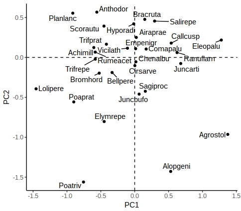
There are other options in ggrepel allowing you to increase the distance from the points to labels, change the point types etc.
Constrained ordination
In constrained ordination you have two sets of data, one the response matrix (conventionally the samples x sites matrix) and the other a set of explanatory variables (e.g. environmental variables). The importance of these environmental variables can be tested via permutation-ANOVA, but the most useful outputs (in my experience) are the graphs, where the environmental variables can be superimposed onto the species or samples to create ‘biplots’. Let’s look at one of the default vegan datasets, Scandinavian lichen pastures plus their environmental data, and carry out a constrained analysis via canonical correspondence analysis, and display the default vegan plots:
data("varespec")
data("varechem")
# For simplicity, just use three of the fourteen soil variables
vare_cca <- cca(varespec ~ Al + P + K, data = varechem)
plot(vare_cca, display=c("sites", "bp"))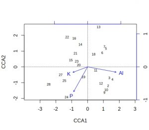
plot(vare_cca, display=c("species", "bp"))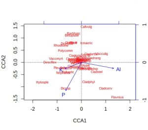
A few comments about these default plots, apart from the obvious one that the species plot is very cluttered. The importantance of an environmental variable is indicated by the length of the arrow, so Al and P are more important than K. The direction of an arrow indicates the main change for that variable, so samples 9, 24 and 28 will be relatively high in P, whilst sample 13 relatively low. Calluna vulgaris appears to prefer low P conditions etc. Notice that Al and P are at almost 90-degrees to each other, which indicates that the two variables are uncorrelated. Finally, be alert to the fact that the scaling of the arrows on the plots is relative: in the species plot the Al arrowhead is at about 1.2 on CCA1 x-axis, whereas on the samples plot it is at about 1.8. It is their relative positions that matter when interpreting the plots.
These plots are still rather messy, so how can we smarten them up within a ggplot framework. We need to create a tibble containing the species, samples and environmental (biplot) scores, plus a label to indicate the score type. We also need a simple method of rescaling the environmental scores so that they fit neatly within the plot window for either species or samples plots.
vare_spp_sco <- scores(vare_cca, display = "species")
vare_sam_sco <- scores(vare_cca, display = "sites")
vare_env_sco <- scores(vare_cca, display = "bp")
vare_spp_tbl <- as_tibble(vare_spp_sco)
vare_sam_tbl <- as_tibble(vare_sam_sco)
vare_env_tbl <- as_tibble(vare_env_sco)
vare_spp_tbl <- mutate(vare_spp_tbl, vgntxt=rownames(vare_spp_sco),
                       ccatype = "species")
vare_sam_tbl <- mutate(vare_sam_tbl, vgntxt=rownames(vare_sam_sco),
                       ccatype = "sites")
vare_env_tbl <- mutate(vare_env_tbl, vgntxt=rownames(vare_env_sco),
                       ccatype = "bp")
It may seem a bit cumbersome having to extract each set of scores separately, labelling, given that vegan will allow you to return all three in one command. However, vegan returns the three sets of scores as a list, and I find it easier to handle them separately. The output tibbles has the CCA1 and CCA2 axis scores, plus character variables varetxt (species names, sample names and env names) and ccatype (to indicate the type of score).
You’ll recall that the environmental variables are plotted with scales relative to the samples or species plots. Therefore, it’s usually easiest to plot the species on their own, next check values of the environmental variables, then decide on an appropriate scaling factor.
plt <- ggplot(vare_spp_tbl, aes(x = CCA1, y = CCA2, label = vgntxt)) +
       geom_point() +
       geom_text_repel(seed = 123)
plt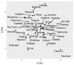
In this plot the species names are still a little cluttered in the centre of the graph, around zero on both axes. These will tend to be the most ubiquitous species, and so are of least interest. Later on we’ll remove the labels from some of these species to tidy up the plot. As noted earlier, we’ll want the arrowhead of the Al to be at about 1.2 on the x-axis for a reasonably proportioned plot. Let’s check what the actual biplot scores are:
vare_env_tbl## # A tibble: 3 x 4
## CCA1 CCA2 vgntxt ccatype
## <dbl> <dbl> <chr> <chr>
## 1 0.860 -0.160 Al bp
## 2 -0.420 -0.751 P bp
## 3 -0.440 -0.165 K bpWe can see that Al is 0.86 so we need to apply a multiplier of about 1.5 to all the environmental variables. Then we need to select the environmental variable labels, and create a single tibble containing both the (rescaled) environment and species scores and labels:
rescaled <- vare_env_tbl %>%
            select(CCA1, CCA2) %>%
            as.matrix() * 1.5
vare_tbl <- select(vare_env_tbl, vgntxt, ccatype) %>%
            bind_cols(as_tibble(rescaled)) %>%
            bind_rows(vare_spp_tbl)
Now we are in a position to create a biplot, with arrows for the environmental variables:
ggplot() +
  geom_point(aes(x=CCA1, y=CCA2), data=filter(vare_tbl, ccatype=="species"))  +
  geom_text_repel(aes(x=CCA1, y=CCA2, label=vgntxt, size=3.5),
                  data=vare_tbl, seed=123) +
  geom_segment(aes(x=0, y=0, xend=CCA1, yend=CCA2), arrow=arrow(length = unit(0.2,"cm")),
               data=filter(vare_tbl, ccatype=="bp"), color="blue") +
  coord_fixed() +
  theme_classic() +
  theme(legend.position="none")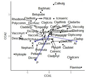
This is a little more complex than previous ggplot calls, with a call to geom_points, a calls for geom_text_repel, and a call to geom_segment to add arrows. The coord_fixed is to ensure equal scaling on x and y-axes, and there is no need for a legend. However, the plot is still rather cluttered by labels from ubiquitous species in the middle. Let’s not label any species +/- 0.5 on either axis, and for clarity use black or blue labels for the species and environmental names, controlled by scale_colour_manual
critval <- 0.5
vare_tbl<- vare_tbl %>%
           mutate(vgntxt=ifelse(CCA1 < critval & CCA1 > -critval &
                                CCA2 < critval & CCA2 > -critval &
                                ccatype=="species", "", vgntxt))

ggplot() +
  geom_point(aes(x=CCA1, y=CCA2), data=filter(vare_tbl, ccatype=="species"))  +
  geom_text_repel(aes(x=CCA1, y=CCA2, label=vgntxt, size=3.5, colour=ccatype),
                  data=vare_tbl, seed=123) +
  geom_segment(aes(x=0, y=0, xend=CCA1, yend=CCA2), arrow=arrow(length = unit(0.2,"cm")),
               data=filter(vare_tbl, ccatype=="bp"), color="blue") +
  coord_fixed() +
  scale_colour_manual(values = c("blue", "black")) +
  theme_classic() +
  theme(legend.position="none")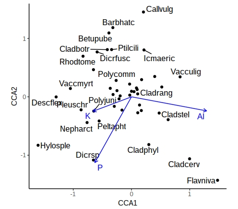
A similar approach can be used with samples, or where the environmental variables are categorical (centroids). This now gives you a publication-quality ordination plot that is easy to interpret.
(P.S. – thanks to Eli Patterson for giving me this challenge to solve in the first place!)
This is a impressive story. Thanks! https://bzp65.com/
Thank you for very useful blog. How should be the script accommodated if I want to plot also centroids of categorical variable?
Glad you found the post useful Benjamin. You raise a good point about centroids. Basically, the simplest approach is to initially do a default vegan plot with your species (or sites) plus centroids, and check roughly where the centroids are on the graph so that you can work out the rough scaling factor to apply. I’d slightly change one line, when creating the tibble with centroid scores, so that it is indicated by a “cn” if you want to handle it differently, especially if you have a complex analysis with both categorical and continuous explanatory variables:
vare_env_tbl <- mutate(vare_env_tbl, vgntxt=rownames(vare_env_sco), ccatype = "cn")
Then assemble the scores together into a single tibble as before:
rescaled %
select(CCA1, CCA2) %>%
as.matrix() * 1.5
vare_tbl %
bind_cols(as_tibble(rescaled)) %>%
bind_rows(vare_spp_tbl)
Note that with centroids, instead of “bp” they should now be labelled “cn”, and of course you want points rather than arrows in your plot. So you will have to call the geom_point and geom_text_repel functions twice, but filtering the data differently. So your code would be something like:
ggplot() +
geom_point(aes(x=CCA1, y=CCA2), data=filter(vare_tbl, ccatype==”species”)) +
geom_text_repel(aes(x=CCA1, y=CCA2, label=vgntxt, size=3.5), data=vare_tbl, seed=123) +
geom_point(aes(x=CCA1, y=CCA2), data=filter(vare_tbl, ccatype==”cn”)) +
geom_text_repel(aes(x=CCA1, y=CCA2, label=vgntxt, size=3.5), data=filter(vare_tbl, ccatype==”cn”), color=”blue”, seed=123) +
coord_fixed() +
theme_classic() +
theme(legend.position=”none”)
I’ll admit that I haven’t test out the above code, but think it should work (the varechem dataset does not contain categorical explanatories). Personally I prefer categorical variables to be displayed as points rather than arrows. I guess it should also be possible to adapt the method so that arrows and centroid points can also be displayed.
Thank you Roy. Finally, inspired by your script, I accommodated the script including centroids of factor variables to:
ggplot() +
geom_point(aes(x=CAP1, y=CAP2, color = ccatype), data=filter(vare_tbl, ccatype==”species”| ccatype== “cn”)) +
geom_text_repel(aes(x=CAP1, y=CAP2, label=vgntxt, size=3.5, colour=ccatype),
data=vare_tbl, seed=123) +
geom_segment(aes(x=0, y=0, xend=CAP1, yend=CAP2), arrow=arrow(length = unit(0.2,”cm”)),
data=filter(vare_tbl, ccatype==”bp”), color=”blue”) +
coord_fixed() +
scale_colour_manual(values = c(“blue”, “red”, “black”)) +
theme_classic() +
theme(legend.position=”none”)
Hello Dear,
I am unable to plot cca plot with nitrogen and phosphorus of lakes with species abundance value. Here I have plots by aquatic species cover and plots by lakes and their nutrient amount (nitrogen and phosphorus). Please kindly help.
Best regards
There is now a development package called ggvegan which you might find easier to use than the one I proposed https://github.com/gavinsimpson/ggvegan
Hello Roy, this is an excellent way of plotting the “sometimes” confusing ordination plots with many species, sites and environmental variables like CCA, thank you very much for this post.
Your script above worked for my data, but now I have a question:
How can I add convex hulls or ellipses to my sites that I have managed to add to my CCA plot?
Here is the code I have to my CCA (Note that mbc is for my data instead of vare for your script):
ggplot() +
geom_point(aes(x=CCA1, y=CCA2), data=filter(mbc_tbl, ccatype==”species”)) +
geom_text_repel(aes(x=CCA1, y=CCA2, label=vgntxt, size=3.5, colour=ccatype),
data=mbc_tbl, seed=123) +
geom_point(aes(x=CCA1, y=CCA2), data=filter(mbc_sam_tbl, ccatype==”sites”)) +
geom_text_repel(aes(x=CCA1, y=CCA2, label=vgntxt, size=3.5),
data=mbc_sam_tbl, seed=123) +
geom_segment(aes(x=0, y=0, xend=CCA1, yend=CCA2), arrow=arrow(length = unit(0.2,”cm”)),
data=filter(mbc_tbl, ccatype==”bp”), color=”blue”) +
coord_fixed() +
scale_colour_manual(values = c(“blue”, “black”)) +
theme_classic() +
theme(legend.position=”none”)
**I’ve tried many ways, but I wasn’t able to add convex hulls to my “sites”.**
Kind regards,
Rodrigo
Hello Rodrigo
Glad you found the post useful. As far as I know there isn’t a direct way of creating a convex polygon in ggplot, and the geom_polygon() function results in a rather jumbled output. However, there is this package ggConvexHull which contains a single function, geom_convexhull() which can do the trick. Note that the data and aesthetics for the item that you want to contain the convex hull has to be in the ggplot() line, for some reason it didn’t work for me when the ggplot() line is blank, and the aes() is in the geom_point() line. This type of approach works, which hopefully you can adapt.
Roy
library(devtools)
devtools::install_github(“cmartin/ggConvexHull”)
library(ggConvexHull)
ggplot(aes(x=CCA1, y=CCA2), data=vare_sam_tbl) +
geom_point() +
geom_convexhull(alpha=0.3, fill=”blue”)
This is exactly what I am looking for! Thanks for sharing, I will try with my own dataset.
Glad you found it useful
Hi, at the beginning of the script when displaying the bp scores, the command doesn’t work for biplot scores. Do I need a newer version of vegan or ggplot? Or is there other option to display this data?
Thanks in advance for your reply.
Apologies for the delay in replying. Since writing this blog there has been a development package called ggvegan released. You might find this more robust than the method I suggested. https://github.com/gavinsimpson/ggvegan https://github.com/gavinsimpson/ggvegan
Hi Roy,
Thank you. It is a wonderful help.
I am struggling with getting both qualitative as well as quantitative variables names into the plot.
I tried as you mentioned but no variables appeared.
For qualitative variables it depends whether you are dealing with simple categories (such as Fertiliser = “Control”, “N” and “P”) or ordinal variables (e.g. river Strahler number = “first”, “second”, “third”) as the latter are displayed in a different way. Have a look at the dune example and dune.env data in the vegan package and you will see both types. Neither are particularly easy to display by the method I describe. Suggest you have a look at the new ggvegan development package to see if that is easier https://github.com/gavinsimpson/ggvegan
Hi Roy,
Thank you for the very useful post about the cca plots.
I am struggling to colour code different species in my plot. Is there a way of colour-coding certain data points on the plot? I have got a plot showing many different species of dragonflies which all belong to two families. I need to have two different colours showing which family they belong to, is there a way I can do this?
Here is my code:
ggplot() +
geom_point(aes(x=CCA1, y=CCA2), data=filter(tbl_final, ccatype==”species”), shape =3)+
geom_text_repel(aes(x=CCA1, y=CCA2, label=vgntxt, size=3.5, colour=ccatype),
data=tbl_final, seed=123) +
geom_segment(aes(x=0, y=0, xend=CCA1, yend=CCA2), arrow=arrow(length = unit(0.2,”cm”)),
data=filter(tbl_final, ccatype==”bp”), color=”blue”) +
coord_fixed() +
scale_colour_manual(values = c(“blue”, “black”)) +
theme_classic() +
theme(legend.position=”none”)
Hi Jonny
I’ve never tried the approach of colour-coding species rather than sites. Looking at your R code you seem to have two flags for colour: ccatype and then later a filter colour=”blue” statement. My feeling would be to initially extract the species scores, create a column with the two family names and add it to the species scores, then push that into ggplot. (don’t included the site or biplot scores initially). Once that part is working, then you should be able to link it into the main code.
Roy
Really great.
What if I want to increase the font size of variables and species separately.
Regards.
Interesting point. I haven’t tried this, but maybe adding an additional column called e.g. “font_mult” to the vare_tbl used for the CCA plot would do the trick. This column could, for example, contain the value 1.00 for all the species, and 1.25 for the environment variables. Then replace the line:
geom_text_repel(aes(x=CCA1, y=CCA2, label=vgntxt, size=3.5, colour=ccatype),
data=vare_tbl, seed=123) +
in the code with:
geom_text_repel(aes(x=CCA1, y=CCA2, label=vgntxt, size=3 * font_mult, colour=ccatype),
data=vare_tbl, seed=123) +
and then hopefully the font sizes for the environmental variables will be 25% bigger than those for the species.
Thank you for the response.
I did run the code as suggested:
> vare_spp_tbl$font_mult vare_env_tbl$font_mult vare_tbl %
bind_cols(as_tibble(rescaled)) %>%
bind_rows(vare_spp_tbl)
When I run the “vare_tbl” the font_mult of all the variables becomes NA
however, after running the final command,
> ggplot() +
geom_vline(xintercept = c(0), color = “grey70”, linetype = 2) +
geom_hline(yintercept = c(0), color = “grey70″, linetype = 2) +
geom_point(aes(x=CCA1, y=CCA2), data=filter(vare_tbl, ccatype==”species”),
size=5, alpha = 0.4, color = “green”) +
geom_text_repel(aes(x=CCA1, y=CCA2, label=vgntxt, colour=ccatype, size = 3*font_mult ),
data=vare_tbl, seed=123, max.overlaps = 30, segment.color = NA, size = 4)
It displayed:
Error in 3 * font_mult : non-numeric argument to binary operator
Regards
Hi Ashaq
I’m not 100% sure why the error is coming up, but I know some of the functions in my original post from ‘tidyverse’-based packages are now deprecated. However there’s a new development package https://github.com/gavinsimpson/ggvegan by Gavin Simpson which largely replaces what I provided. It’s fairly easy to adapt his code too so that you can customise the plots as needed. Roy
Hi Roy.
Which scaling is used in constrained biplot in your example?
For samples (sites), for variables (species) or symetric?
Hi Benjamin – just the default scaling, which I think is by species (will admit that it’s a while since I wrote the original post). Roy
Hi Roy. Couldn’t it just be unscaled raw scores, since the extracted scores are not modified in the ggplot script? In that case, how should the biplot be interpreted?
Hi Roy. Couldn’t it just be unscaled raw scores, since the extracted scores are not modified in the ggplot script? In that case, how should the biplot be interpreted?
Oh yes, I see what you mean. I’m very busy for the next month (and quite rusty now on what I did / why in my original posting to be honest). I’ll try and re-check it when things are quieter. Roy
Thank you. I’m looking forward to it 🙂
Benjamín