You may wish to remove the sidebar and use a two column layout for one of your pages -usually when you are wanting to acknowledge equal parity by funding bodies or supporters as in the case of our Research Scholarships and Expeditions website.
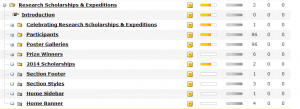
In this case, the site has a hidden section called ‘Home Banner‘ which contains the slideshow (four pieces of content) as described in our post on Slideshows and Banners.
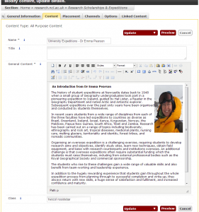
The homepage – seen at the top of the above screenshot, contains two pieces of content. When we go to ‘Modify Content’ for that homepage section, we see that these are given names corresponding to the two columns on the websites screenshot above.
Choosing either piece of content, each would contain one of the columns. The important thing is the ‘class’ field, which contains two words:
- twocol: this gives the piece of content a width of just under 50% of the whole content area, plus some padding.
- nosidebar: this removes the usual menu bar from the site, meaning that the two columns fill the whole width of the template.
As you can see, the Class field can contain multiple instructions for the page layout, so you could also embed ticker taped bulleted lists in a column, or other things documented on this blog should you wish to.


