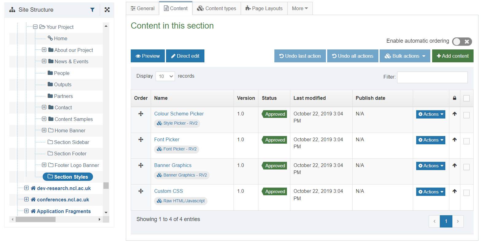
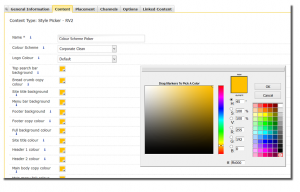
The new Research and Conferences template has a “Colour Scheme Picker” in the Section Styles section of your site.
Using the Colour Scheme Picker you can choose from a range of pre-set colour schemes or else choose your own colours for parts of your site (headings, body text, links etc). You can also choose the style of University logo on your page or remove the logo completely.
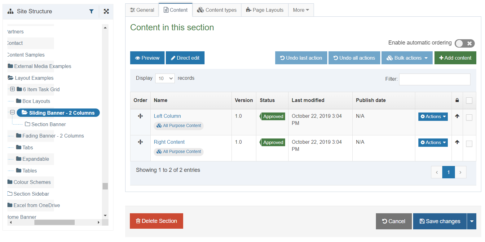
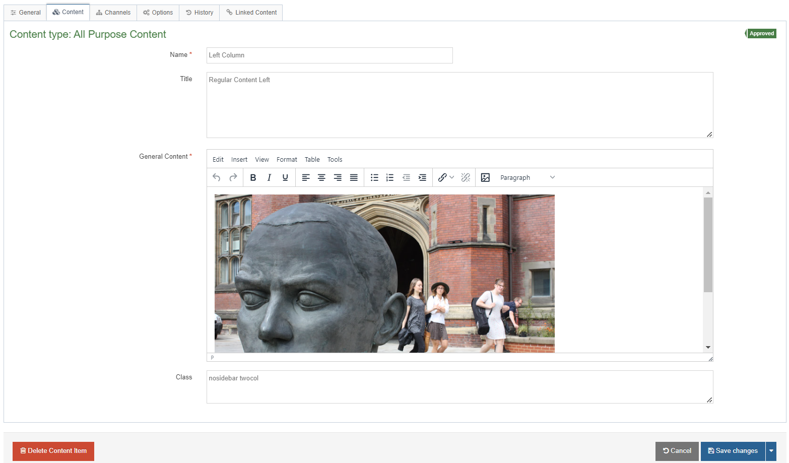
Click the yellow arrow next to the Section Styles section and “Modify Content”, then click the yellow arrow next to the “Colour Scheme Picker” content and select “Modify” to edit the colours used on your site.
The default colour scheme for your template is ‘Corporate Clean’ but you can change this by choosing a pre-set colour scheme and logo type from the drop down menus or click on the yellow square next to a title (e.g. “Header 1 colour”) to open the custom colour picker window for those elements.
Preview your content by clicking “Update and Approve” from in the Colour Scheme Picker and then clicking the yellow arrow next to your site home section and selecting “Preview”.
If you’ve chosen a custom colour for an element of your site (e.g. “Header 1 colour”) and you wish to revert back to the original colour scheme, simply click on the yellow box next to that element to open the custom colour picker, then select the white box with the red cross in it (bottom right hand corner) to reset.
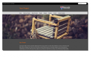
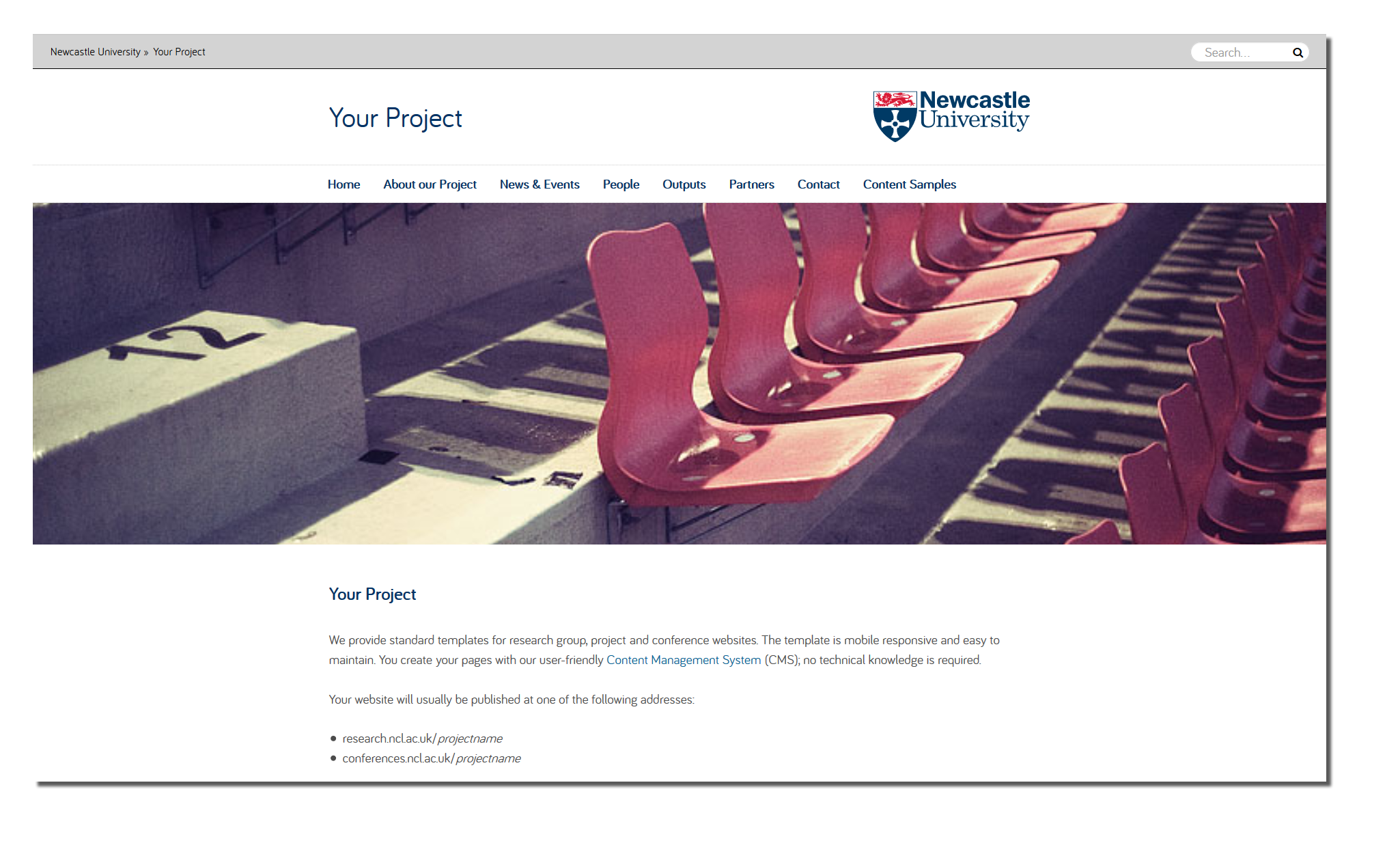
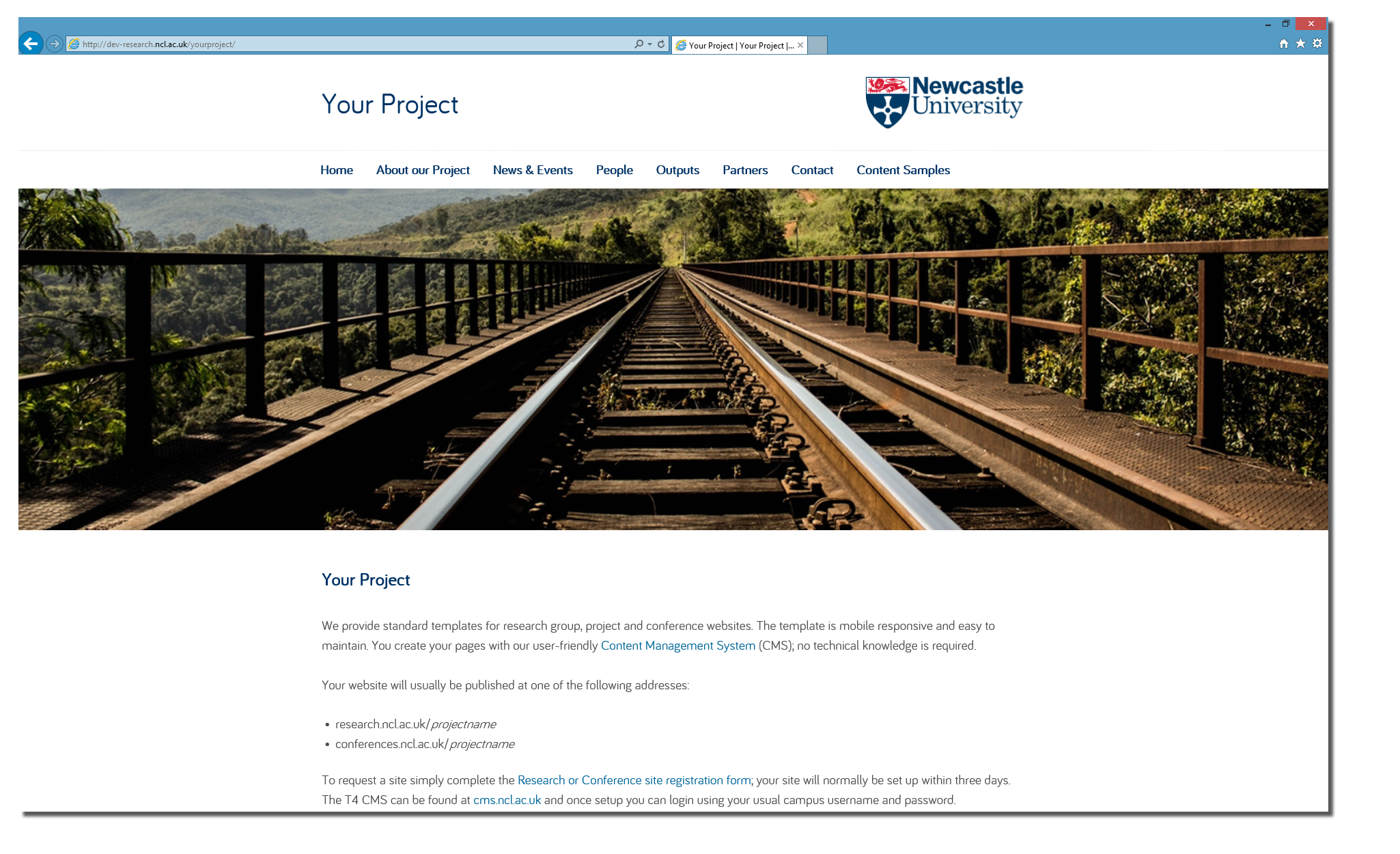
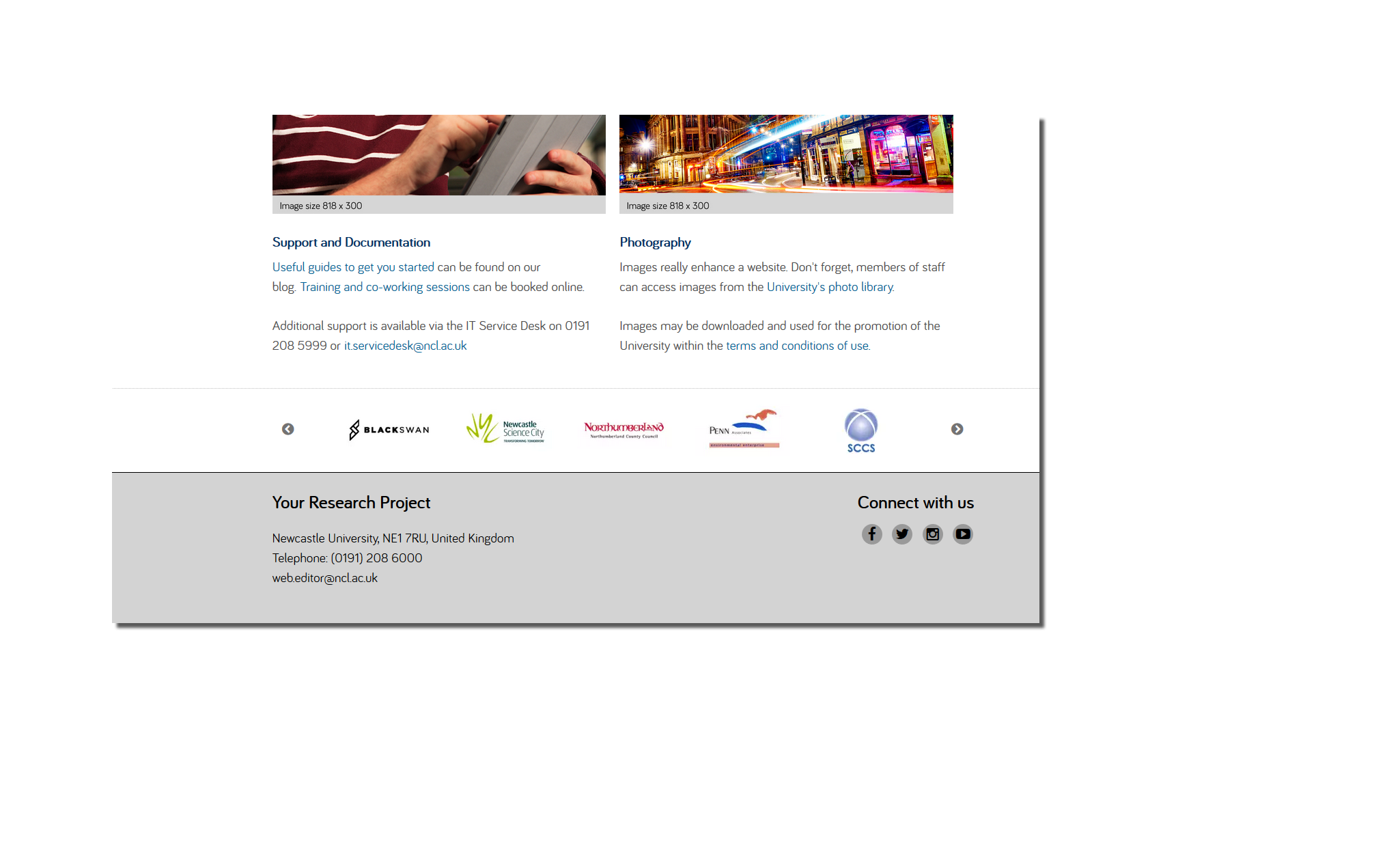
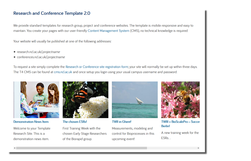
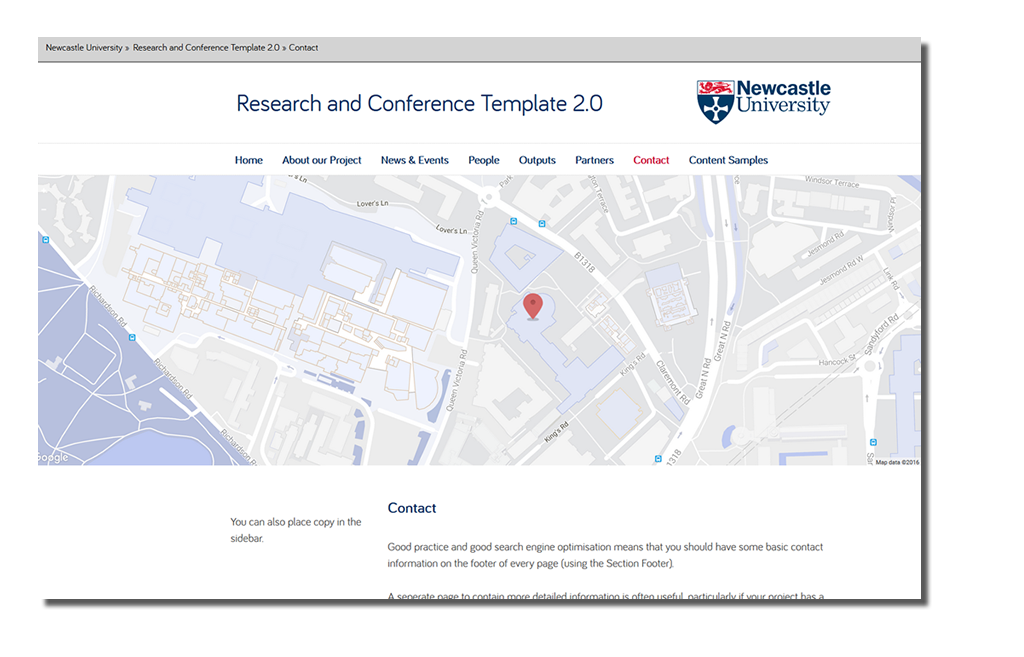
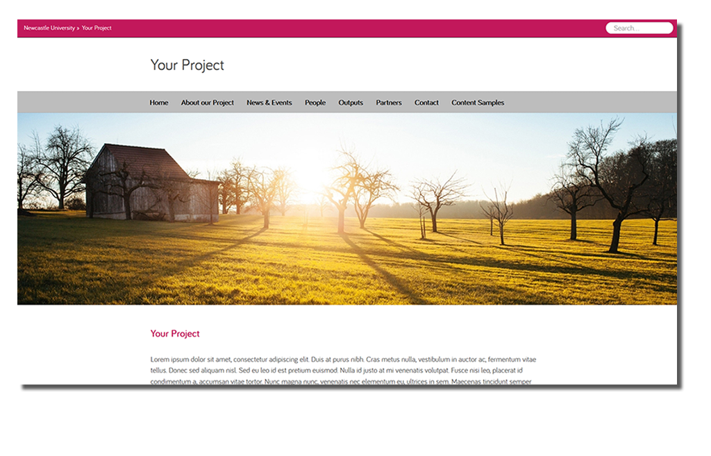
The site above uses the “Graphite Flood” colour scheme and “White out” logo style.(the white out logo works better on dark backgrounds). The site below uses the “Berry Clean” colour scheme, without a logo.