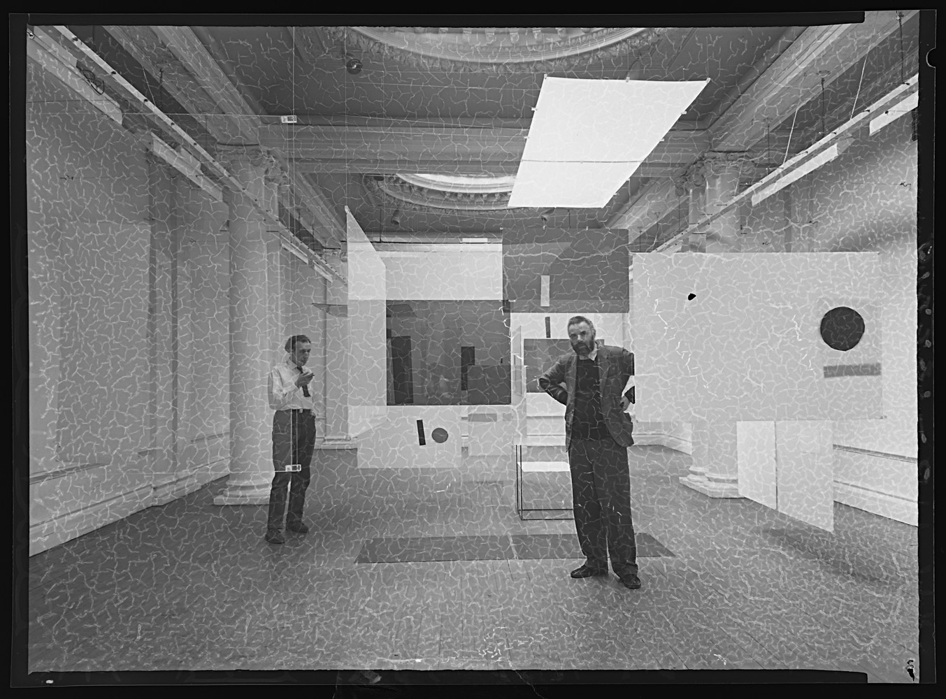
We recently scanned a set of deteriorating transparencies and came across this. It shows one of the Fathers of Pop Art, Richard Hamilton, and his fellow King’s College Fine Art lecturer, Victor Pasmore, hanging their ground-breaking exhibition ‘An Exhibit’ in the Hatton Gallery in 1957. The exhibition consisted of hanging perspex sheets which formed a visual ‘maze’. Hamilton and Pasmore pioneered a new method of art training at Newcastle and mounted a series of ground- breaking exhibitions between 1953 and 1966.
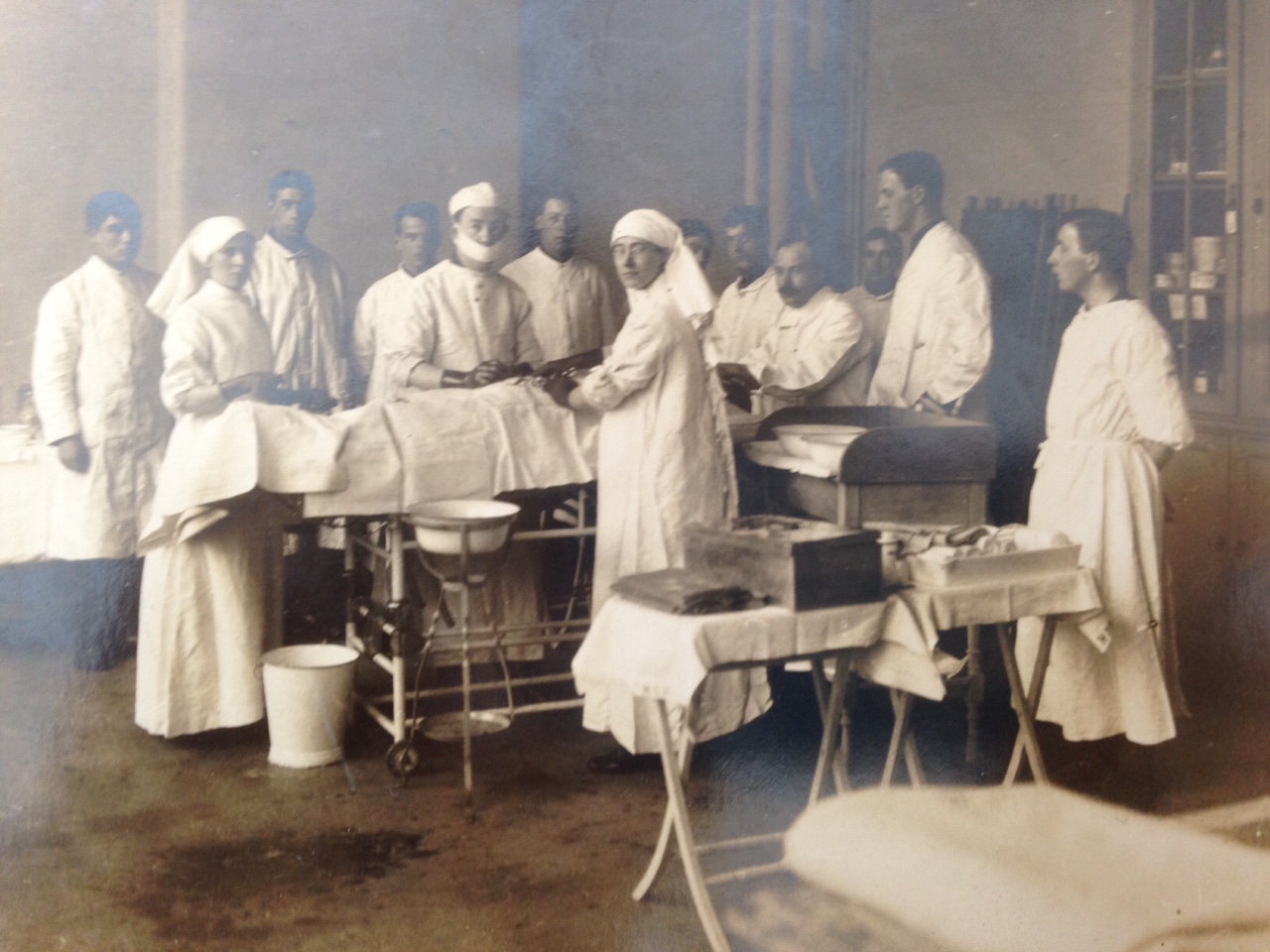
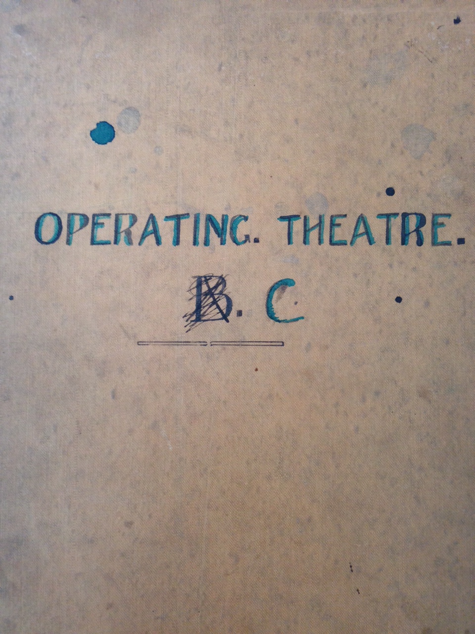
Operating Theatre, Fine Art Dept., 1st floor., 1st Northern General Hospital, Armstrong College, 1915 – 16 (Pybus in the centre with a mask on)
Pybus was informed of his mobilisation in 1909, he became a Captain in the Royal Army Medical Corps, Territorial Force. Initially he had very little to do in his role as Captain, he spent time in York Military Hospital and camped at the Royal Station Hotel, during this stay he described visiting the hospital to understand the organisation and also lots of form filling.
In 1913 Pybus was persuaded by a colleague to become a Registrar at the RVI which meant he had to be coached in military law, organisation and equipment, he passed this and became a field officer; meaning his authority changed to training the unit based at the RVI. For Pybus, this mainly meant leading marches. This all changed in 1914 and on the 4th of August he received the mobilisation papers to take authority of Armstrong College and establish the First Northern General Hospital. Pybus surveyed the college deciding which rooms would be turned in to wards, bathrooms and sanitary accommodation. He renamed the main building block A and two newer buildings B and C. Block C first floor was designated ordinary rank and lower floor for officers.
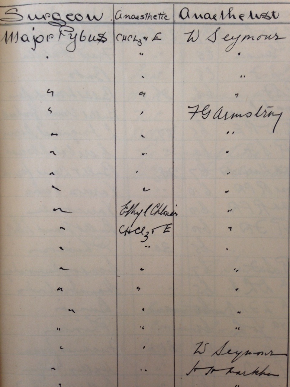
The notebook details patients name, ward, regiment, number, date of surgery, type of surgery, surgeon (Pybus), anaesthetic used, anaesthetist, result and remarks. 1364 operations are listed.
This was organised within 48 hours and set up with Infirmary staff so if any wounded soldiers arrived they could be provided for immediately. It was sometime after the initial set-up that the first wounded were brought to Newcastle, these consisted of Belgian soldiers and officers.
Section of the Operating Theatre C notebook
The Hospital gradually expanded from 520 beds to 2166 in 1917. Huts were built in the grounds of Armstrong College and extra wards built on the North side of main infirmary corridor. Further places were offered as convalescent or auxiliary hospitals these were mainly Country houses on estates such as Howick Hall owned by Earl and Countess Grey. The most northern of these homes was Haggerston Castle just south of Berwick-upon-Tweed and the most southern was Crathorne Hall in Yarm. These were all visited weekly by surgeons and physicians including Pybus, his work also meant that he was on boards which decided what to do with soldiers after injury.
Pybus eventually transferred from registrar to surgeon due to shortages, he was briefly posted in Alexandria, but on his returned continued as surgeon at Armstrong College where he performed at least 1346 operations.
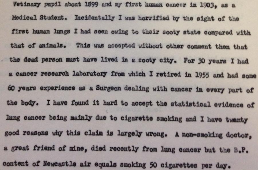
Pybus had a wide ranging interest in cancer and published many cases and research papers in the medical journals concerning all aspects of his research. What comes through in his papers is that his main research focus was on lung cancer and carcinogens found in the air pollution, particularly benzopyrene in soot from burning materials and diesel fumes. Pybus did discuss lung cancer and tobacco smoking but felt that air pollution should be considered a bigger threat. He primarily used statistical evidence and cases he had seen to understand lung cancer and its association with air pollution. He worked in his own research institute for 30 years and retired from active research in 1955; going on to campaign for cleaner air in the UK due to his findings.
1-3-49 [boxlist number]
Pybus’ interest in cancer first began as a schoolboy, but became fully realised when he saw his first tumour as a veterinary pupil in about 1899. He saw a human cancer for the first time in 1903 after deciding to switch from veterinary school to medical school. He made this decision due to his distaste of the treatment of animals; such as lack of anaesthetic while surgery was performed. Pybus worked primarily as a surgeon, but in 1925 was able to set up his own Cancer Research Institute.
During this time Pybus was supported by the Imperial Cancer Research Fund, this fund was set up in 1902 and was aimed at finding new approaches to cancer and its treatment. In the 1920’s a new funding party was set up, namely the British Empire Cancer Campaign who also went on to fund Pybus’ Newcastle based Research Institute.
During his active research period Pybus used similar techniques to other researchers, including a “Tar-Painting” method which was first used in 1915 by Katsusaburo Yamagiwa and Koichi Ichikawa at Tokyo University to induce cancer in animals – the tar acted as a carcinogen. Using this method in 1924 Pybus produced neoplasms in mice.
3-1-29 [boxlist number]
Not only did Pybus explore various carcinogens he also researched and published an article in the British Medical Journal on hereditary bone tumours in mice. This follows a strong research theme within oncology which, since the discovery of DNA, has led to the ability to actively pinpoint inherited defective genes which can lead to cancer, such as a mutated BRCA1 and BRCA2 gene which link to breast cancer.
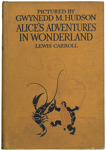
Front cover of Alice’s Adventures in Wonderland (London: Hodder and Stoughton, 1922) [20th Century Collection, 823.8 CAR]
This year celebrates the 150th anniversary of jam tarts, rabbit holes, mad hatters, secret doors, tea parties and even more ‘curiouser and curiouser’ delights in Lewis Carroll’s fantasy children’s book, Alice’s Adventures in Wonderland. Published in 1865, the tale follows Alice, a seven year old girl, who falls asleep and enters a world full of nonsense. Upon following the White Rabbit, she encounters many iconic characters whose symbolism aim to teach children lessons surrounding growing up, identity and curiosity.
Lewis Carroll is a pseudonym of Charles Lutwidge Dodgson. Born in the village of Daresbury, Chesire, he was the eldest boy in a family of eleven children. Carroll was educated at home, until the age of twelve when he was sent to Richmond Grammar School in North Yorkshire. In 1851 he registered at Christ Church, Oxford, where he excelled at maths. He received the Christ Church Mathematical Lectureship in 1855, which he continued to hold for the next twenty six years. However, he is best known as an adept storyteller; spinning new tales to entertain his friends.
Alice’s Adventures in Wonderland was inspired by real events and a real child. The story occurred in 1862 during a river outing with Henry Liddell, the Dean of Christ Church, Oxford, and his family. Along the journey Carroll spoke of a bored little girl called Alice who goes looking for adventure. Alice Liddell (one of three daughters on the trip) loved the story so much that she asked for it to be written down. Carroll agreed and he eventually completed the story two and a half years later.
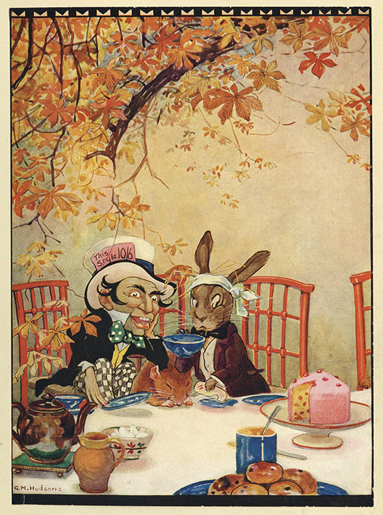
Reproduction of a tipped-in colour plate by Gwynedd M. udson depicting the Made Hatter’s tea party [20th Century Collection, 823.8 CAR]
The enchanting tale has charmed both children and adults through numerous re-prints, theatre productions, film adaptations and more. Special Collections hold a version of Alice’s Adventures in Wonderland that was published in 1922 by Hodder and Stoughton and contains twelve reproduced illustrations of highly detailed tipped-in colour plates by Gwynedd M. Hudson. Each illustration contains specific scenes from the story, including Alice receiving advice from the Caterpillar, Alice and the Queen of Hearts playing croquet, and Alice meeting the Gryphon and the Mock Turtle. Hudson passed away at the age of twenty six but, despite her short life, she is noted for her remarkable illustrations in J.M. Barrie’s Peter Pan and Wendy as well as Alice’s Adventures in Wonderland.
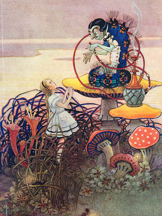
Reproduction of a tipped-in colour plate by Gwynedd M. Hudson depicting the Alice with the Caterpillar [20th Century Collection, 823.8 CAR]
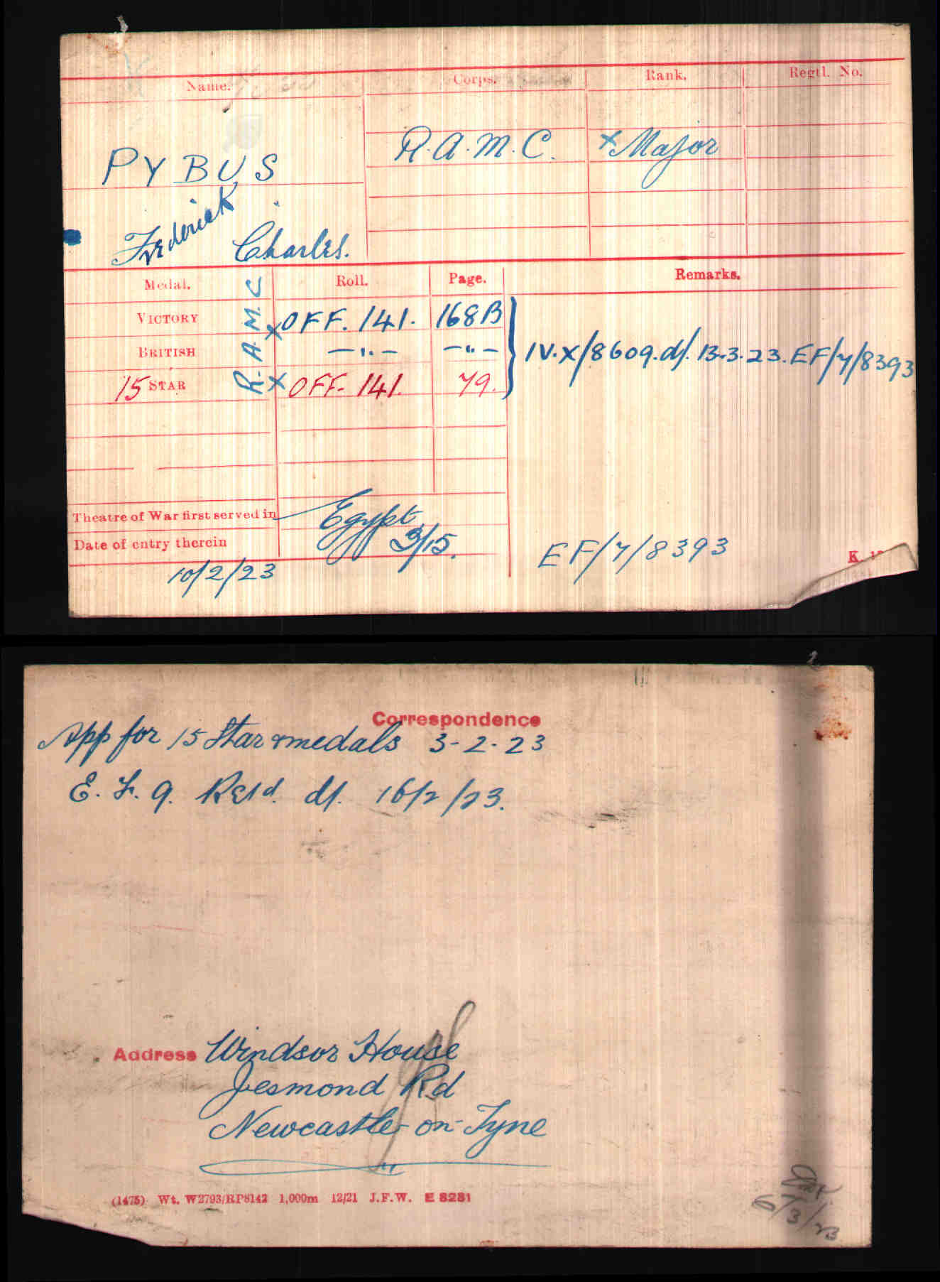
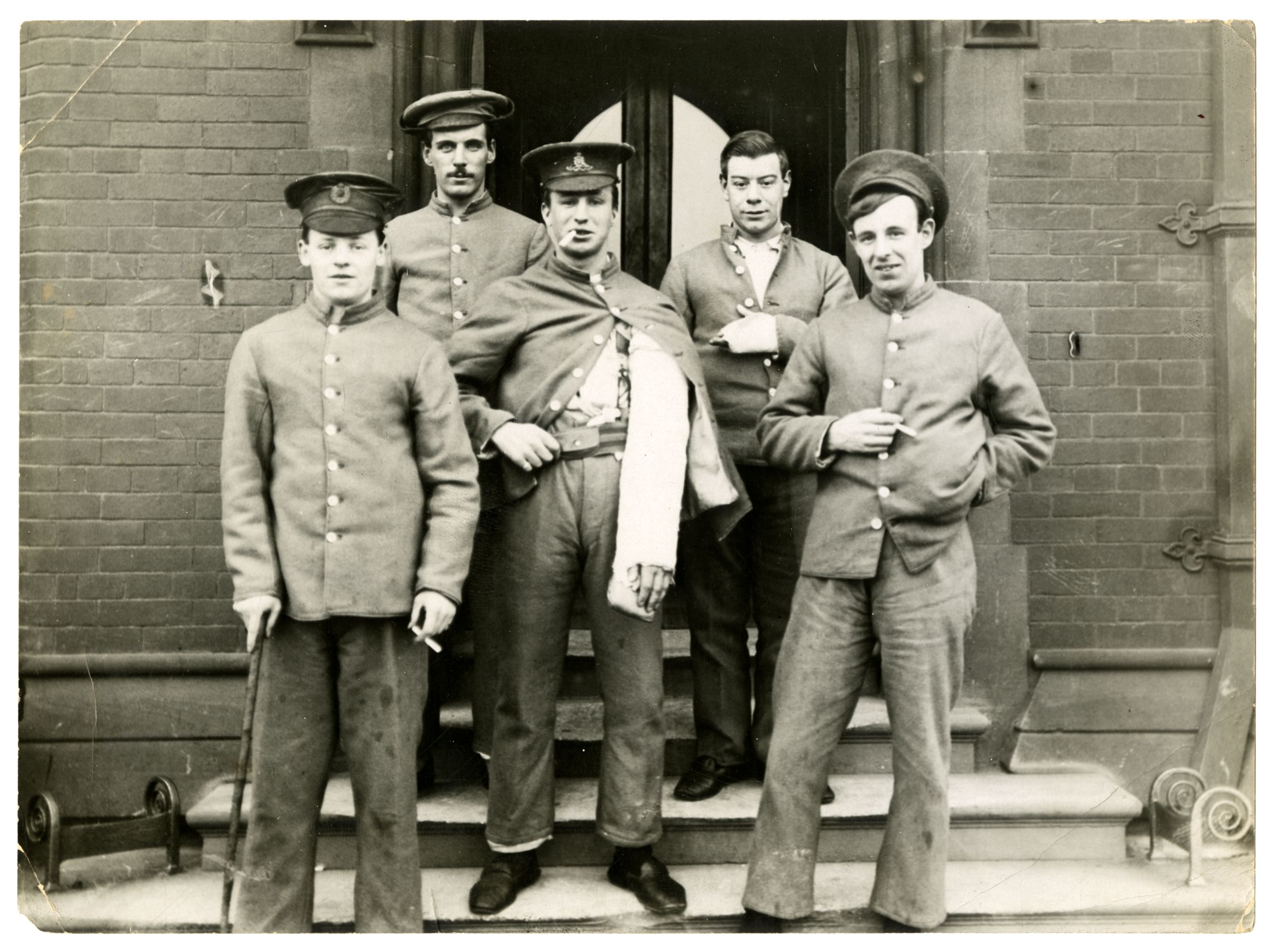
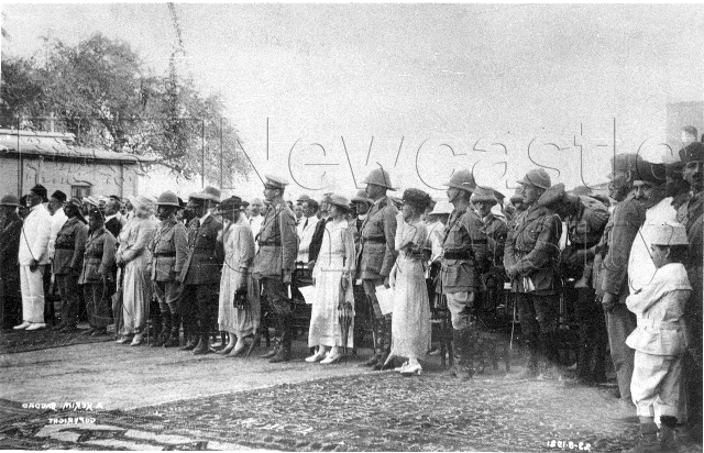
Professor Frederick Charles Pybus (1883 – 1975) was a surgeon and alumni of our College of Medicine, graduating in 1905. He joined the 1st Northern General Hospital shortly after its formation and was serving as its Registrar in 1914. As a Major in the Royal Army Medical Corps, except for a brief posting at the 17th General Hospital in Egypt, he served as a surgeon at Armstrong College throughout the war. Up until 1919, he carried out at least 1,364 operations on wounded servicemen.
WW1 MRC
Professor Pybus went on to have a distinguished career as a surgeon in the Royal Victoria Infirmary from 1920 until his retirement in 1944, becoming Professor of Surgery in the College of Medicine in 1941. Amongst his claims to fame was inventing a drink to sustain patients before operations, which was later developed and sold by a local chemist to Beechams, becoming Lucozade.
Lucozade
His lifelong concerns included cancer research, developed during his 50 year surgical career from 1924 and pursued through his own cancer research laboratory. He was amongst the first to make the link to atmospheric pollution as a major contributing cause of cancer and his work directly informed the Clean Air Act 1956.
For some 40 years Professor Pybus also built up a collection of international importance on the history of medicine, including books, engravings, letters, portraits, busts and bleeding bowls. In 1965, he donated the collection to the Library, where it remains a valuable source of information for medical historians. Meanwhile, his papers, also held in Special Collections, offer a unique insight into a renaissance man of medicine.
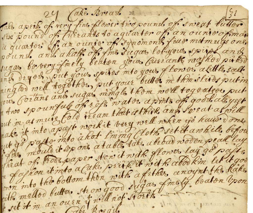
A group of Year 9 (13-14 year old) students from Bedlingtonshire High School in Northumberland took part in a two day event inspired by a 17th century recipe from our Special Collections. As part of this ‘Use Your Loaf’ project, they baked and sampled bread from a recipe that, as far as we know, had not been used in over 300 years!
Misc Manuscripts 17th C recipe
Jane Lorraine’s recipe book, which was compiled between 1684-6, was adapted by the Food Technology students who transcribed the recipe for cake bread (similar to our modern day fruit loaf), interpreting the older spellings, letter formations, annotations and weights to create a recipe they could work with.
Next they visited the Chemistry Outreach Lab to gain an understanding of the science behind the chemical reaction of yeast and the impact that heat has on the effectiveness of yeast.
Students at NU
The following day they returned to have a go at baking both modern day bread and their newly discovered 17th century bread in NU Food – surprisingly finding more similarities than differences. The students remarked that the 17th century bread was indeed edible (as Library staff who sampled the bread baked by the education outreach staff will testify – (in itself a miracle if anyone knows our baking abilities!). They also did some food tasting and experienced the difference salt makes to the taste of bread before finding out about current University research on the benefits of various herbs and spices.
The primary purpose of the pilot was to work with the School of Agriculture, Food and Rural Development and the School of Chemistry on an outreach project with a widening participation school, which showcased the potential and breadth of University education to students from families with limited experience of higher education. One student remarked of the University that “it is a big interesting place” with many others commenting on how “it was different” and how they got to do “something we don’t usually do”, whilst a significant number remarked on how the visit made them more likely to consider applying to University. One student summed it up succinctly when asked what they would change about the visit: “nothing, it was brilliant”.
17th C bread
We hope to condense the pilot into a one day event which can be offered to other schools and to open up the project to other interested parties through the development of a libguide. Hopefully, more forgotten recipes that have not been baked for centuries will be revisited and eaten again.
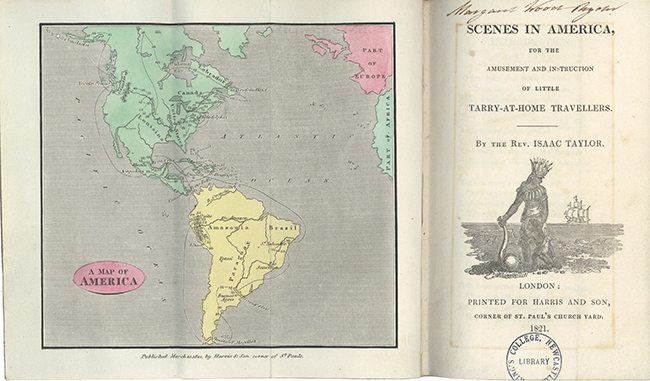
A map of America and frontispiece from Scenes in America, for the Amusement and Instruction of Little Tarry-at-Home Travellers(Rare Books, RB375 9 TAY)
‘ONCE again your friend a hearing
Claims from you, my little miss;
With a volume neat appearing,
Full of pictures, see, ‘tis this.
Long ago he gave a promise
O’er America to roam;
Travelling far and wide, tho’ from his
House ne’er moving, still at home.
Yet o’er many a volume poring,
Such as you could hardly read;
Distant realms and climes exploring,
Your enquiring minds to feed.
He has travelled thro’ and thro’ them,
Often wearied with his toil,
That at ease you here might view them,
Gath’ring knowledge all the while….’
These verses open Isaac Taylor’s Scenes in America, for the Amusement and Instruction of Little Tarry-at-Home Travellers (1821). Scenes in America was part of the wider Scenes series, ‘a series of armchair traveller books for children’.Other titles included Scenes in Europe (1818) and Scenes in Africa (1820), as well as several other titles.
The books in the Scenes series follow a standard pattern: ‘three small, coloured engravings appear on each page of illustrations, and they are linked by captions to the scenes which they represent. As for the text, it is rather light in tone, mixing prose and verse with the instruction which was its putative purpose’.
Isaac Taylor was a man of many talents. He was a talented engraver and artist, a popular Church pastor, an ardent educationalist, and a successful children’s writer. Taylor’s educationalist outlook was both a major part of his life and his literary work. As deacon of an Independent congregation in Lavenham, Suffolk, Taylor had founded a Sunday School, where his ‘successive workrooms doubled as schoolrooms for his own children and later for those of neighbours too, Taylor giving instruction from his engraving stool as he worked’. When the family moved to Colchester, ‘he began a series of monthly lectures for young people, delivered free of charge in the parlour of his own house; these proved extremely popular and the programme continued for several years’.
Taylor’s belief in education and the stimulation of young minds can be seen as a driving force in his production of the Scenes series. However, Taylor’s moral and educational instruction could also take on a more overt form. Taylor was an ardent opponent of slavery and the slave trade. Scenes in Africa had spoken out against slavery, and Scenes in America reinforced those sentiments. Taylor was keen to explain to his young readers that, although they may have won a victory by abolishing the slave trade in the British Empire, they had not yet won the war against slavery:
‘Although the slave trade is happily put an end to, so that no more can be brought over; yet there are many thousand negroes who are still slaves. It has made no difference to them, except that their masters are not so oppressive to them, as they cannot easily replace them if they die’. P.61
The moral decay slavery caused in those who took part in it was evident the ‘masters’ who only cared for their profit. This moral dimension was of course part of Taylor’s moral education of his readers. But he also mentioned the physical brutality and callousness of slavers: ‘To every party there is an overseer, who stalks among them with a long whip, ready to lash any who do not work fast enough to please him’. The images this passage conjured would no doubt have made an impact on his young audience.
As J.R Oldfield has suggested, ‘most children’s books published between 1750 and 1850 were unashamedly moralistic and concerned, above all, with inculcating a compassionate humanitarianism’. Taylor’s abolitionist message in his books certainly fits this wider trend, but it also within the more specific trend of attempting to create an anti-slavery consensus ‘through the education of young and impressionable minds’.
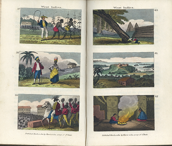
Yet Scenes in America was far more than a moral instruction book. It was meant to evoke a sense of wonder in the reader, of this faraway world and the flora and fauna it contained. There were strange animals found there, like the ‘dreadful serpent’ the rattlesnake, the ‘passionate’ hummingbird, and, ‘glowing with celestial light’, the firefly. He showed the reader societies of people with different customs and ways of life. Taylor devotes sections to several difficult indigenous groups, and the engravings provide tantalising glimpses of these exotic lands to stimulate the minds of child readers (the accuracy of these descriptions and engravings, is of course, another matter). No doubt some of these are sensationalised or included for dramatic effect, such as the section ‘Sacrificing a Child on its Mother’s Grave’. Yet there are also sections on ‘Hunting the Buffalo on the Ice’, ‘Indian Sagacity’, and ‘the Pipe of Peace’. For those interested in studying European perceptions of indigenous Americans, Taylor’s work provides an example of an attempt to show the cultural diversity of Native American societies, while at the same time never quite seeing them as worthy or as equal as his own.
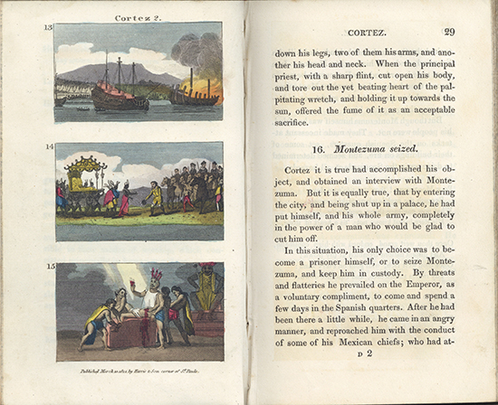
Pages 28 and 29 from Scenes in America, for the Amusement and Instruction of Little Tarry-at-Home Travellers(Rare Books, RB375 9 TAY)
Scenes in America was also an abridged history of European involvement in the New World. The narratives of the Spanish conquistadors of course provided an exciting tale for his readers, from Columbus’ contact to the conquests of Hernan Cortes and Francisco Pizarro. Indeed, the history of what we would call Latin America takes up approximately half of the book, so Scenes is in no way a glorified account of English and British settlement. But North American history was also discussed, with sections ranging in content from religious emigration to the New World, to the American War of Independence, with sections on Canada and, as we have seen, the West Indies.
Pages 68 and 69 from Scenes in America, for the Amusement and Instruction of Little Tarry-at-Home Travellers(Rare Books, RB375 9 TAY)
It wasn’t just the grander narratives of history that Taylor included. He discussed the daily lives of the ordinary settlers and tried to portray a sense of their daily lives, with sections such as ‘New Settlers First Log House’, and ‘Cultivating Tobacco’.
The fruits of Taylor’s educational mission can be seen in the literary and artistic abilities of his own children. Indeed, the family have been labelled as ‘amongst the most famous and prolific children’s authors and illustrators of the early nineteenth century’.
Ann and Jane Taylor were successful children’s poets, with Jane in particular achieving prominence. Her works include the still famous classic (and often anonymised) Twinkle Twinkle Little Star). Jane was also well regarded as an essayist and literary critic. We hold several of Jane’s works here in Special Collections, including Original Poems for Infant Minds and The Memoirs, Correspondence, and Poetical Remains of Jane Taylor, edited by her brother Isaac.
Isaac himself was known as a writer on theology, philosophy, and history. He was also a talented artist and engraver (indeed, he collaborated with his father to produce the illustrations for Scenes in America). We hold a number of his works here in Special Collections. These include The Natural History of Enthusiasm, the work that made his name, and Home Education, a work clearly influenced by his own experiences.
Jefferys Taylor, the youngest child, also gained prominence as a children’s writer, producing numerous works of varied character over a number of years. Like his father’s writings, Jefferys’ works ‘were overtly educational in purpose’, but their message was delivered through fictional or adventurous settings. Like his siblings, he also engraved some of the illustrations for his own books.
One of the verses in the conclusion contains a pearl of Taylor’s wisdom that is perhaps even more relevant today than then, and that we would all do well to remember:
Our new project to tell the lost stories of Newcastle and Durham University staff and students who fell during the First World War has been awarded a Heritage Lottery Fund (HLF) grant. Newcastle University and Durham University Library’s Special Collections are seeking volunteers in the region and beyond to help research the lives of mainly alumni who were unable to fulfil their potential.
Wounded soldiers in front of the Quadrangle entrance to the Armstrong Building
Like heritage organisations across the country, we are marking the centenary with a programme of commemorations relating to our collections and the university’s role in the conflict. We are holding a series of exhibitions from 2014 – 2018, the first of which A Higher Purpose explored how the university became a military hospital; the 1st Northern General.
Universities at War itself came from another project based around the 223 names on the Armstrong Memorial in the foyer of the Armstrong Building. Often overlooked as part of the furnishings, our Head of Archaeology Dr Jane Webster sought to remedy this in 2011 through original research by undergraduate Sophie Anderton as part of her dissertation Small Sorrows Speak: Great Ones Are Silent. This piece of work, based around the University Archives, shone a light on many of the personal stories and provided the basis for further research by Archaeology students and library staff.
The Newcastle Institute for Social Renewal recognised the importance of making this research available to the widest possible audience, awarding the project a grant to create the initial Armstrong Memorial Digital Memory Book. This also included teaching resources aimed at schools into how to research war memorials, devised by our Education Outreach Officer Gillian Johnston. The site was launched in 2014 and the project was nominated for a Times Higher Education Leadership and Management Award (THELMA) in the same year.
Digital Memory Book Launch Event, with Dr Jane Webster presenting the new interface
The Armstrong Digital Memory Book on a kiosk in front of the memorial, with Library Systems Developer Scott Bradley, Archivist Ian Johnson, and Archaeology student Ben Howson
It now takes a prominent place on a kiosk in front of the memorial itself, providing context and personal depth to the names. This resource has also seen many descendants of the fallen and members of the public get in touch with more information, and it was this that sparked us and colleagues at Durham, already undertaking their own research on everyone that served, to team up and create a much more expansive picture.
However, the information we have, including the 53 fallen from our Medical College not yet represented, is incomplete. Further research into these important stories will be promoted through public events and an exhibition in 2017 showcasing the work of any volunteers who come forward. Both Universities will also work with local schools to help young people understand the local impact of the conflict and develop the skills to research their own memorials.
We are thrilled to have received the support of the Heritage Lottery Fund to engage the public in the important aim to make these fallen more than just names on a memorial. As many of these fallen were local and the commemorations have sparked everyone’s interest nationally, we know the experts are in our communities and we want them to get in touch to make this a success through credited contributions.
Ivor Crowther, Head of Heritage Lottery Fund North East, said:
“The impact of the First World War was far reaching, touching and shaping every corner of the UK and beyond. In this Centenary year we’re pleased to fund this project which will provide a truly personal link to the conflict and ensure the stories of Durham and Newcastle alumni are heard and remembered.”
Both universities invite anyone interested in learning more to an open event at Newcastle University’s Robinson Library at 6pm on 25th June. The work done so far is available to view both at the Armstrong Memorial Digital Memory Book and dur.ac.uk/library/asc/roll/. Anyone interested in joining the team are also welcome to get in touch through contact details available on these sites.
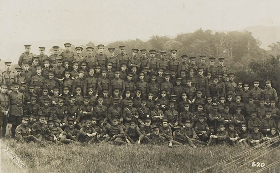
Durham University Officers’ Training Corps, Stobs camp, 1914, Durham University Library Special Collections, Ref: MIA 1/307
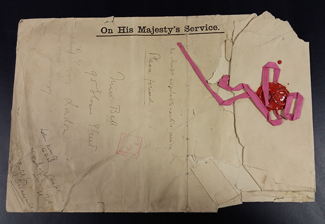
Envelope returned to Gertrude, 29th April 1915, after Doughty-Wylie’s death (Bell (Gertrude) Archive)
The 25th April 2015 marks the centenary of the Gallipoli Campaign during World War I, where over 100,000 men lost their live. Amongst them was Lieutenant Colonel Charles Doughty-Wylie, who had already had a distinguished military career in Turkey and was respected both by his own troops and the Turks.
On 26th April Doughty-Wylie’s leadership and complete disregard for his own safety had succeeded in transforming the dispirited remnants of the landing force and in securing the beach at Gallipoli. While commanding the capture of the strategically important hill 141, armed only with a cane out of respect for his former Turkish allies, Doughty-Wylie was shot by a sniper and died instantly. The hill was renamed Fort Doughty-Wylie in his honour and he was posthumously awarded the Victoria Cross; the highest ranking officer to win the award during the Gallipoli campaign.
His lifelong connections to Turkey proved fatalistic in more ways than one and it is through his correspondence with explorer and archaeologist Gertrude Bell, whom he met there in 1907, that we come to understand him through our Gertrude Bell Papers. Although married to Lilian Doughty-Wylie, following a visit to the Bell family home in August 1913, their friendship became something more intimate. Their correspondence, nearing nearly 100 letters and beginning in that August, reflect on their mutual expertise and love of the Middle East, but moreover their long distance, growing affection for each other. Gertrude repeatedly addresses Charles as ‘Dearest heart of my heart’, and expresses despair on hearing he has been mobilised to active duty on 24th January 1915.
Bell’s fears were well founded. His last letter was written five days before his death and her last two letters were written after. They were returned to Gertrude in the envelope pictured at the top on 29th April 1915 and eventually deposited along with the rest of her collection. Their affair remained a secret outside the Bell family and Doughty-Wylie’s letters to Gertrude did not become publicly available until after his wife’s death in 1960.
As part of our centenary commemorations, Bequest Student David Lowther transcribed all of this correspondence, which is now available on the Gertrude Bell website.
Gertrude Bell is also the subject of a Werner Herzog biopic due to be released this year ‘The Queen of the Desert’, the title of which springs directly from this correspondence. Writing on 28th December 1913, and fearing for the safety of Gertrude in her travels through Baghdad, Charles writes ‘And the desert has you – you and your splendid courage my queen of the desert – and my heart with you…’.
Special Collections were delighted to welcome, in January last year, actor Damian Lewis, who plays Charles Doughty-Wylie in ‘Queen of the Desert’ and researched his role by consulting these fascinating letters between two complex people.
Archivist, Geraldine Hunwick, pictured next to actor, Damian Lewis, in the Special Collections Reading Room.
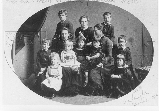
Gertrude Margaret Lowthian Bell was born on 14 July 1868 at Washington New Hall in County Durham, the daughter of Sir Hugh Bell and Mary Shield, and the granddaughter of eminent industrialist, Sir Isaac Lowthian Bell. Elected Lord Mayor of Newcastle in 1875, Sir Isaac owned several iron, steel and aluminium works and factories throughout the country, and was also the director of the North Eastern Railway and the Forth Bridge Company. His success meant that the Bells were, at the time of Gertrude’s birth, the sixth richest family in England. In 1870, Hugh, Mary and Gertrude left Washington Hall to set up their own home at Red Barns in Redcar. Gertrude’s younger brother Maurice was born here in 1871, but the family’s happiness was short-lived, as Gertrude’s mother Mary died shortly after his birth. In 1876, Sir Hugh married the Parisian Florence Oliffe, to whom Gertrude would gradually become very close.
For a young woman in the late nineteenth century, Gertrude’s education was extremely privileged. From the ages of fifteen to seventeen, she attended the exclusive Queen’s College School for girls in London’s Harley Street, established in 1848, and the first institution in Britain to offer the opportunity for girls to gain academic qualifications. In 1886, shortly before turning eighteen, Gertrude became one of the first women to be admitted to Oxford Universityand, just two years later in June 1888, she became the first woman to gain a first class honours in Modern History from Oxford.
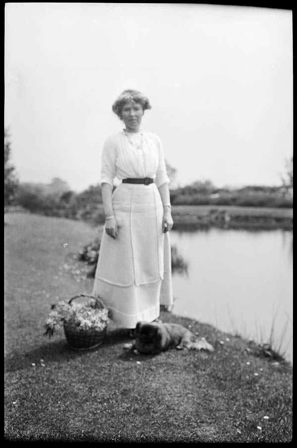
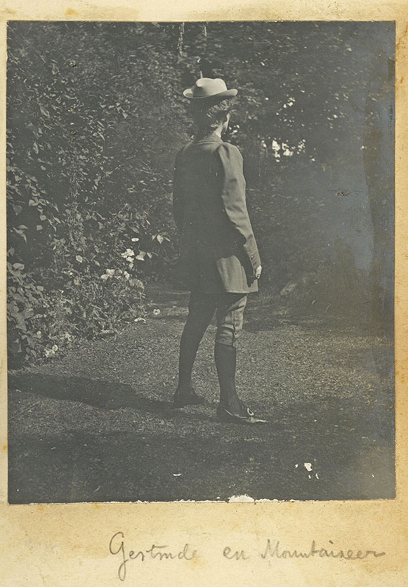
Photograph of Gertrude Bell dressed in mountaineering clothing titled ‘Gertrude en Mountaineer. [Trevelyan (Charles Philips) Archive, CPT/PA/1]
In May 1892, Gertrude embarked on her first major voyage to Persia (now Iran), beginning a lifetime of travel that encompassed two round-the-world trips (1897–8 and 1902–3), and numerous journeys to the Middle East, which continued until her death in Baghdad (1926). She was enchanted by the Persian surroundings and people, writing in a letter to her cousin Horace Marshall, ‘Isn’t it all charmingly like the Arabian Nights! but that is the charm of it all and it has none of it changed.’ In December 1897, Gertrude set off with her brother Maurice on the first of two round the world journeys, and from 1902–3 she undertook her second round the world trip with her half-brother Hugo. During this period (1899–1904), Gertrude also became a keen mountaineer, climbing regularly in the Alps, and summiting the Meije, Mont Blanc, and the Matterhorn. In 1901, Gertrude became the first person to summit seven of the nine peaks of the Engelhörner range in Switzerland, and in recognition of her achievement one of the peaks, Gertrudespitze, was named after her.
Archaeology, Photography and Cartography
Archaeological Work
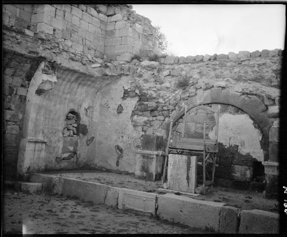
Gertrude’s interest in archaeology was initially sparked on a holiday in Greece (1899), during which she first met David Hogarth – an established archaeologist, and a key figure in Gertrude’s later experiences during the First World War. Her fascination with archaeology grew during her journey to Jerusalem (1900), but was cemented with her journey through the Syrian desert to Asia Minor (1904-5), during which she explored the Binbirkilise, a region in the modern Karaman province in Turkey that is known for its multiple Byzantine church ruins.
Gertrude’s account of her travels from Syria through to Asia Minor was published as the popular travelogue The Desert and the Sown (1907) . She returned to the same region with archaeologist Sir William Ramsay (April 1907), to continue work on inscriptions in the ancient churches that she had first discovered towards the end of her previous visit. Gertrude and Sir William Ramsay published their findings in the co-authored book The Thousand and One Churches (1909). She returned to the East again in 1909 without Ramsay, to explore the Roman and Byzantine fortresses and churches along the banks of the Euphrates in Mesopotamia. Her primary objective of this trip was to reach and explore the large castle of Ukhaidir, which lay on the west bank of the river some 120 miles south-west of Baghdad at Ukhaidir, and of which there was no detailed historical or archaeological record in existence. Once she reached the palace, in March 1909, she spent the limited time she had (four days) sketching the huge structure.
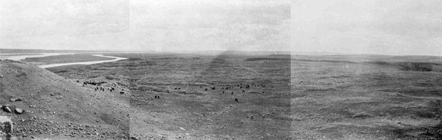
During these journeys, Gertrude became a skilled photographer, documenting her travels and archaeological explorations through her images as well as through her writing. She became a member of the Royal Photographic Society, which enabled her to develop her films professionally. Gertrude carried two cameras with her at all times, and took panoramic shots of entire horizons by combining multiple photographs (see image on left).
The photographs she took during her excavations of various ancient sites, such as image shown the left left, are invaluable to archaeological knowledge and research, particularly because many of the sites have since been looted or vandalised.
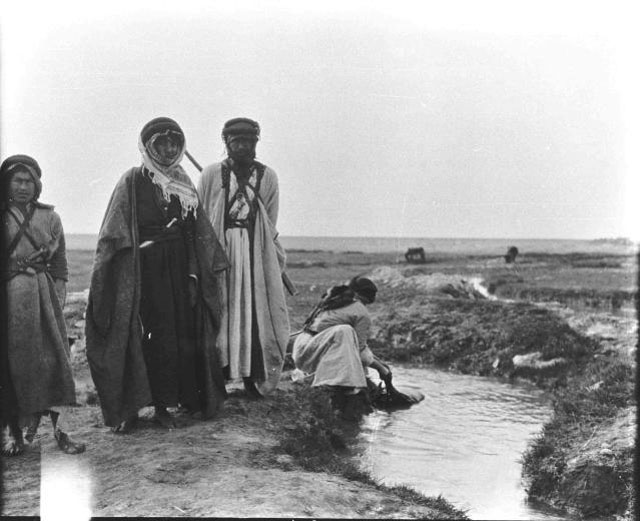
Also significant and fascinating are her photographs of the local people she encountered on her travels, for example (see image on left).
Cartography
As well as archaeological work and excavation, Bell was also interested in mapping the uncharted regions through which she travelled. To aid her in this, she undertook a course in survey methods and map projection at the Royal Geographical Society (1907), and returned to the East to travel a route that curved round the Druze mountains from Damascus to Hail, mapping and surveying the area as she went (1913). Bell’s journey of 1913 has since been highly praised, not least by David Hogarth, former President of the Royal Geographical Society, who, in April 1927, stated to the society that this particular journey of Bell’s ‘was a pioneer venture which not only put on the map a line of wells, before unplaced or unknown, but also cast much new light on the history of the Syrian desert frontiers under Roman, Palnyrene, and Ummayed domination.’
He also gives some hint of the importance of Bell’s work to wartime efforts and military strategies, arguing that:
‘Her information proved of great value during the war, when Hail had ranged itself with our enemy and was menacing our Euphratean flank. Miss Bell became, from 1915 onwards, the interpreter of all reports received from Central Arabia.’
Charles Doughty-Wylie
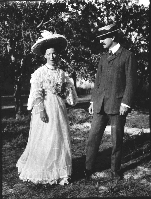
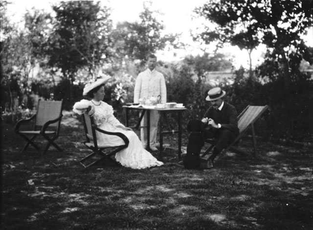
Konya (Iconium): The Doughty-Wylie’s with servant and dog in Consulate [Bell (Gertrude) Archive, I/246]
During her 1907 archaeological trip to Turkey with Sir William Ramsay to revisit the Binbirkilise, Gertrude met Charles Doughty-Wylie, who would soon become the love of her life. Major Charles Doughty-Wylie of the Royal Welch Fusiliers– known as Dick to his friends – had served in the Boer War, the East Africa campaign of 1903, and in Tientsin during the Chinese rebellion. By the time he met Gertrude, he was the British military consul at Konya in Turkey (see image above), and had married his wife, Lilian, just three years beforehand. Gertrude was invited to stay with the Doughty-Wylie’s at their house in Konya on the final leg of her trip, from where she wrote to her mother, ‘it’s a great alleviation to be staying with the Wylies – they are dears, both of them. I’ve had a very pleasant restful two days. It’s pretty hot but one sits out in their big garden under the trees.’ (see image show below).
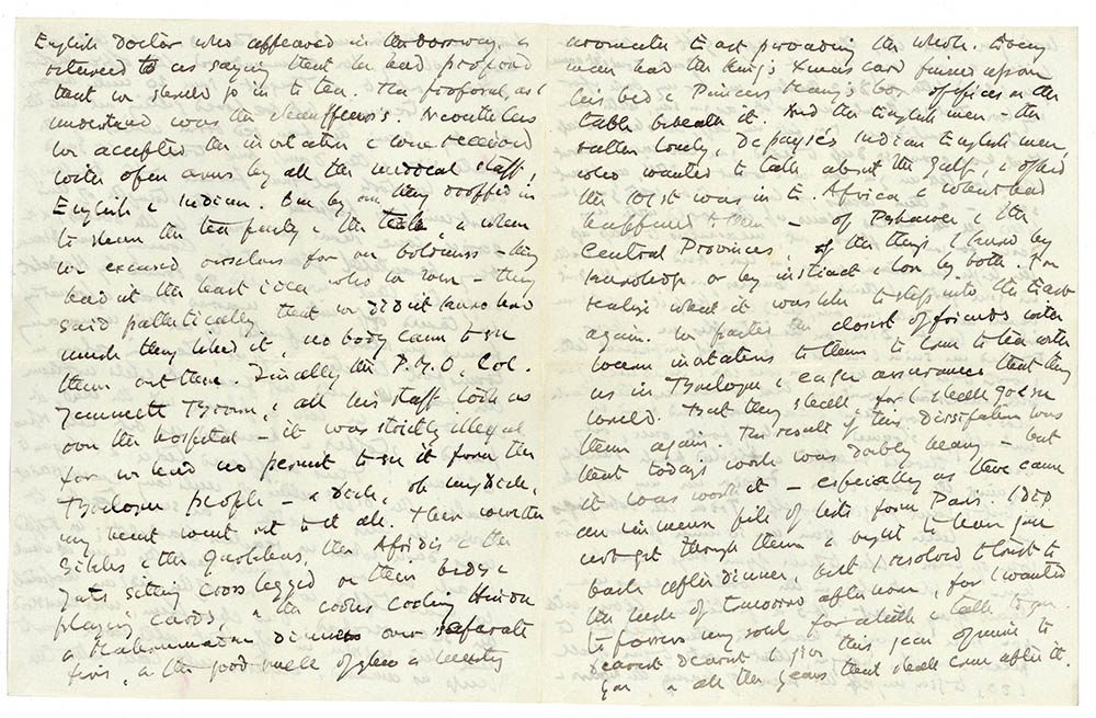
After meeting in 1907, Gertrude and Dick kept in touch, having discovered in each other a mutual love of the culture and history of the Middle East. In the spring of 1912, the two met in London when Dick arrived, without his wife, to take up the position of director-in-chief of the Red Cross relief organisation. During this brief period, Gertrude welcomed Dick into her circle of friends, and regularly took him to the theatre, to music halls, and to dinner. After this, the correspondence between the two intensified both in frequency and in passion. When Gertrude went travelling, she sent Dick full diaries of her journeys, such as the one of her journey to Ha’il. The depth of emotion in Gertrude’s letters to Dick in comparison to those she sent to her family becomes most evident during the First World War. Where she sent her family relatively short, largely factual missives designed, apparently, not to worry them, to Dick she poured out her heart and her fears concerning the conflict. For example, in a letter to her father written on 30 December 1914, when Gertrude was working in the Red Cross Office for the Missing and Wounded in Boulogne, she wrote of ‘the immense sacrifice we had to make to retake the trenches the Indian troops had lost’ (see image below).
In contrast, the language she uses in her letter of the same day to Dick is full of emotion, signifying the closeness between them:
‘When our men have to relieve them, they must go into trenches which offer them no shelter, nor pay in lieu of their neglect. Its not worth it. Oh my dear, my dear, the horror of it all, & then the shining courage, this devotion – yes, I know the more I talk of it, the more you long to be brave’ (image below).
Gertrude was willing to let only Dick see the pain and sadness she so often felt, and the deep depression that the war triggered within her. Though their affair remained unconsummated, the strength of their love for each other is overwhelmingly evident in their letters, and their relationship is focal point of Werner Herzog’s recent biopic of Gertrude, Queen of the Desert (2015), starring Nicole Kidman as Gertrude, and Damian Lewis as Dick.
Doughty-Wylie’s Death at Gallipoli
Newspaper cutting from the Daily Chronicle, 26th April 1915 titled ‘Hero’s Death after Victory Won’. [Bell (Gertrude) Archive, Item 39]
On 26 April 1915, the second day of the Gallipoli campaign, Charles Doughty-Wylie was shot and killed instantly by a sniper during a successful attack organised and led by him and another officer, Captain Garth Walford (who was also killed)
Unaware of his fate, Gertrude continued to write to Dick, only learning of his death when she visited London (June 1915). The letters to her parents during this period are sparse, but their brevity signals her heartbreak, in particular the short note sent on 11 June 1915, days after she had learned of Dick’s death:
‘Dearest Mother. Thank you and Father for your letters. I haven’t anything to say that’s worth, or at any rate worthy of saying, and therefore I don’t write. Your affectionate daughter Gertrude’.
Envelope that Gertrude Bell’s letter were returned to her upon Charles Doughty’Wylie’s death. [Bell (Gertrude) Archive, Item 19]
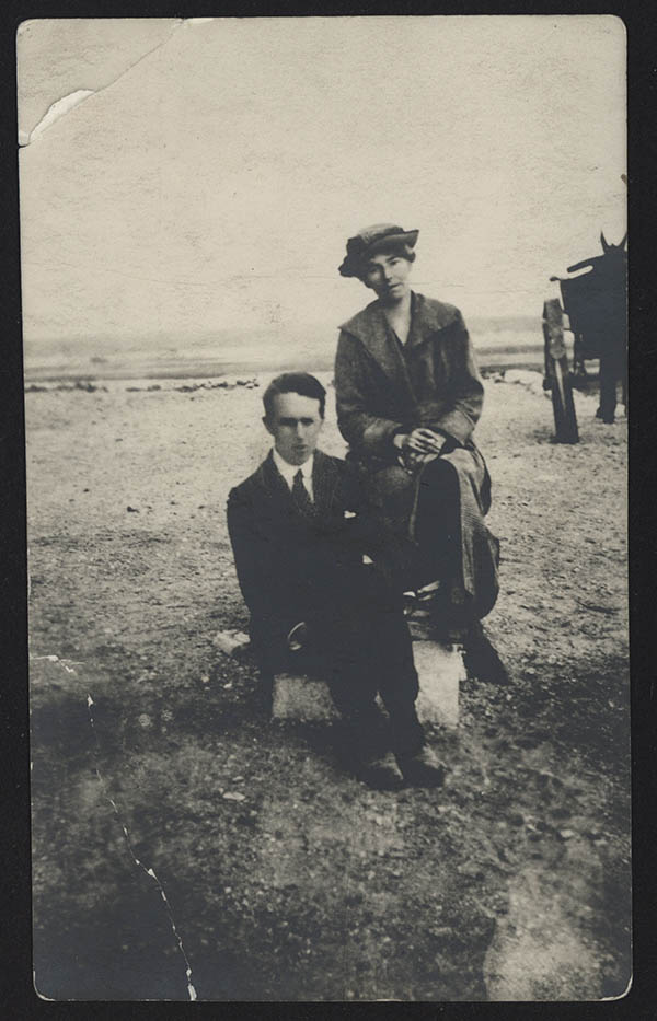
The image above is to show the envelope that was returned to Gertrude Bell containing her letters to Dick following his death. Dick was buried where he fell at Gallipoli, and towards the end of 1915, a mysterious, veiled female visitor was seen visiting his grave (image shown below), thought to have been the only woman who landed during the Gallipoli campaign. Who this woman was has never been confirmed – possibly it was Dick’s wife, but, equally possible, it was Gertrude.
Photograph of Charles Doughty-Wylie’s grave, buried where he fell at Gallipoli [Bell (Gertrude) Archive, Item 19]
Red Cross in London and Boulougne
Hospital Work at the Outbreak of the First World War
In November 1914, following
the outbreak of the First World War, Gertrude began work in a hospital at the
house of Lord Onslow in Clandon Park, Surrey, which was filled primarily with
wounded Belgian troops. However, much to her dismay, Gertrude’s role was purely
administrative, and involved none of the nursing she longed to do. In a letter
to her mother on 15 November, she complained:
However, a mere two days later, Gertrude was sent for by the Red Cross to work in their Boulogne office, helping to trace missing and wounded soldiers, and by 25 November, she was already hard at work in Boulogne.
The Boulogne Red Cross
Office
Upon her arrival at the Red Cross Office for Missing and Wounded in Boulogne, Gertrude was faced with a chaotic and ineffectual system for recording the missing and wounded. She took it upon herself to reorganise the entire office, and to put in place new indexing systems, writing to her mother that (8th January 1915),
Gertrude felt strongly that the Red Cross should be as sensitive as possible when informing families of the loss of their sons, fathers and brothers, and explained this to her mother (12th January 1915):
In March 1915, Gertrude agreed to move to the headquarters of the London Red Cross in London, to continue her work recording missing and wounded soldiers, and informing their families. Determined to do the job well, Gertrude found herself once more frustrated with the lack of adequate facilities, and most of all with the lack of space, writing to her mother that (20th August 1915):
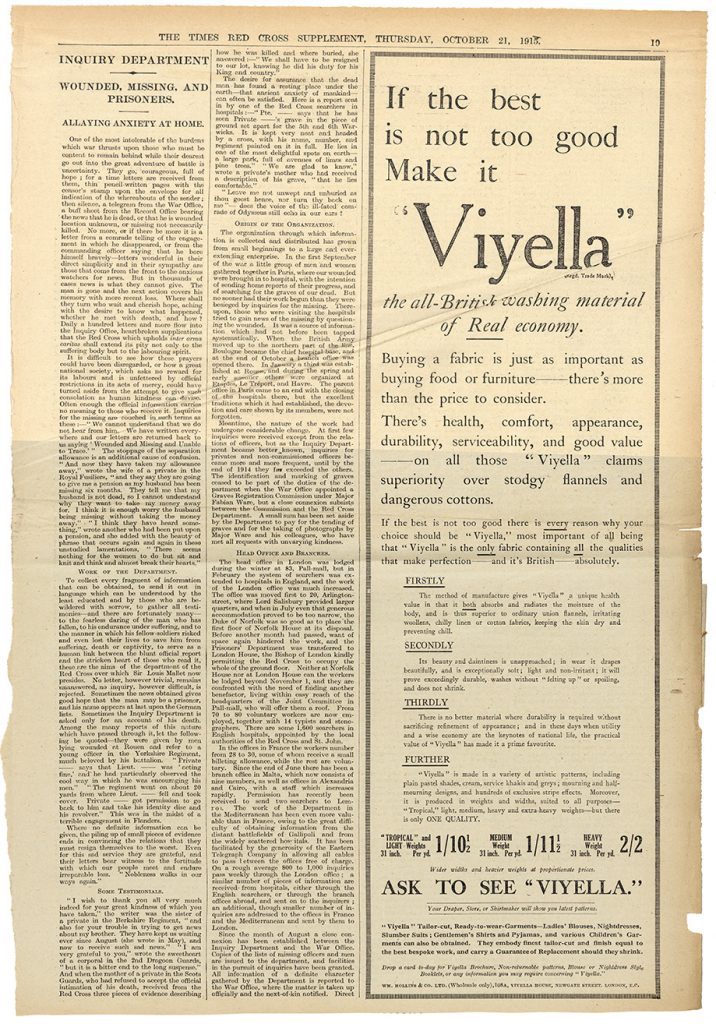
In October 1915, Gertrude wrote about the vital work of the Red Cross Inquiry Department for The Times (see Item G). By November 1915, however, after less than four months at the British Red Cross Headquarters in London, Gertrude was called to Cairo by the Foreign Office.
Article in the Times Red Cross Supplement, Inquiry Department: Wounded, Missing and Prisoners—Allaying Anxiety at Home, 21st October 1915 [Bell (Gertrude) Archive, Item 22]
In November 1915, David Hogarth, who had known Gertrude since 1899, enlisted her to come and work at the newly established Arab Bureau in Cairo, a British intelligence organisation dealing with Middle Eastern affairs. T.E. Lawrence – better known today as Lawrence of Arabia – also worked for the Bureau alongside Gertrude, and the two became close friends (see image to the left). Gertrude was employed by the Bureau in Cairo to interpret reports from Central Arabia, as well as to document ‘Arab tribes, their numbers and lineage. It’s a vague and difficult subject which would take a lifetime to do properly’. On New Year’s Day (1916), Gertrude wrote to her mother from Cairo reflecting on the past year of war:
When Gertrude arrived in Basra in March 1916, she stayed in the home of Sir Percy and Lady Cox until she could find a place of her own. Letters she wrote to her mother talk of her frustration at the impermanent, transient nature of her work. Nevertheless, Gertrude gave her full attention to the number of tasks at hand, which included classifying tribal material, a process in which her own prior knowledge from her travels. Gertrude also had strong views on the political situation in the Middle East, and was frustrated with what she perceived to be Britain’s mishandling of it:
Gertrude was appointed to the paid position of Official Correspondent to Cairo (June 1916), and also head of the Iraq branch of the Arab Bureau as an officer of the Indian Expeditionary Force D. She became increasingly influential, providing the Intelligence Department with summaries of recent Arabian history, and writing memoranda about British-Arabian relations, such as, ‘The Nomad Tribes of Arabia’ (pages 16 and 17 are shown below).
Page 16 from ‘The Nomad Tribes of Arabia’ [Bell (Gertrude) Archive]
Page 17 from ‘The Nomad Tribes of Arabia’ [Bell (Gertrude) Archive]
In January 1917, Gertrude was appointed Oriental Secretary by Sir Percy Cox, and continued as head of the Arab Bureau (Iraq). Gertrude left Basra for Baghdad (April 1917), following the British occupation of Baghdad (11 March 1917).
Gertrude was passionate about the future of Iraq, and wanted to ensure that the best was done for both the country and its people. On 30 October 1918, eleven days before the ceasefire of the First World War, the Turkish government signed the Armistice of Mudros with the Allied Forces. Gertrude’s work intensified in the months following the end of the war. She was heavily involved in decision making regarding Iraq, and while she felt strongly that the British administration needed to act in the best interests of the Iraqi population, she also had her own very clear ideas about what those best interests were. She was, for example, frustrated with calls for an Arab Amir to lead the country instead of Sir Percy Cox as British leader. For Gertrude, the only viable option was British rule in the Middle East:
The consequences of such views held by Gertrude and her colleagues, and the extent of British involvement in reshaping the Middle East following the First World War, continue to be powerfully felt today.
Bell’s Role in the Formation of Iraq
In the years following the end of the First World War, the British Government’s attentions turned to determining the lines along which the borders of the new Iraq would be drawn, and Gertrude was heavily involved in the decision making process.
Crowd at the coronation of King Faisal [Bell (Gertrude) Archive, Pers/B/17/O/Robinson]
She attended the Paris Peace Conference as the representative of the Arab Bureau (1919), and later attended the ten-day Cairo Conference (March 1921), which was organised by Winston Churchill with the objective to work towards an independent Arab Government. To that end, Bell was instrumental in the selection of Prince Faisal as the new King of Mesopotamia (crowned July 1921 – see image to the left). While she became a close friend to King Faisal, and worked closely with him for the rest of her life, she found the process of nominating and publicising a potential king strenuous, writing to her father shortly after Faisal’s coronation that ‘you may rely upon one thing – I’ll never engage in creating kings again, it is too great a strain’.
Perhaps most famously, however, Bell was central in drawing the borders of Iraq during this period. In a letter to her father (December 1921), she writes, ‘I had a well spent morning at the office making out the Southern desert frontier of the Iraq […] One way and another, I think I’ve been succeeded in compiling a frontier’. After the coronation of King Faisal, the drawing of these borders, and the establishment of the new Iraqi Government, Bell refocused her efforts back into archaeology and historical research, and was appointed the Honorary Director of Antiquities for Iraq (October 1922). Bell initiated the Iraq Museum (October 1923), the first room of which opened in June 1926, just one month short of Bell’s death from an overdose of sleeping pills (12 July 1926). Four years after her death, a commemorative bronze plaque was unveiled by King Faisal, and a bust of Bell was erected to identify the Gertrude Bell principle wing of the Iraq Museum.
Find out More
Transcripts of most of Gertrude Bell’s letters and all of her diaries, together with digital copies of her extensive photograph albums, are available to browse at the dedicated Gertrude Bell website.
![3-1-29 [boxlist number]](https://blogs.ncl.ac.uk/speccoll/files/2015/07/3-1-29-boxlist-number.jpg)
![3-1-22 [boxlist number]](https://blogs.ncl.ac.uk/speccoll/files/2015/07/3-1-22-boxlist-number.jpg)