The prototype for our design will include multiple user friendly interactive features that all revolve around improving the accountability and the communication of information of the forum. All these features will be available on a website dedicated to the cycle stakeholders forum.
One of the main features of our website prototype will be an interactive map which shows the location of issues raised involving cycling infrastructure in Newcastle. In this format everyone including new members to the site and forum will be able to clearly see the key issues and problems facing cycling in Newcastle. Users will be able to view the key issues raised in the meetings and also on the website and view comments by other member of the public, members of the forum, engineers and council representatives. Each issue will also show a progress bar showing different colours that indicate whether or not these issues are being addressed by the council and at what stage these improvements are at, this will improve the accountability of the council and show that the issues raised are being used by the council. There will also be markers to show where improvements have been completed by the council from issues raised by the forum to show new members that the forum works and cycling infrastructure is being improved in Newcastle.
There will be an organised minutes section that is set out in chronological order that users can access to see what was brought up at each meeting. Users will also be able to access meeting dates and times. It will also have links to other relevant groups and pages that are relevant to cycling in Newcastle. Users will also be able to create profiles to be able to comment on different issues. They will be awarded points when they contribute to the page which acts as an incentive to do so, this means that individuals can be recognised for the time and effort they put into the forum.
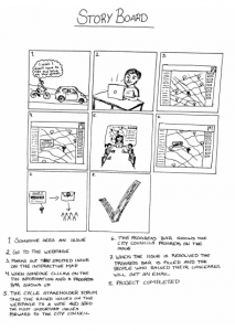
To have a glimpse of our prototype, here is a storyboard that shows how our project could be helpful and how we can use it. The starting point is basically a cyclist facing a problem and who wants to raise it up to the city council.

Thanks for this entry. The entry continues to reflect on design elements that the final prototype will have, which is part of the example / inspiration search. Naturally these design tasks cannot be founded to one specific week and over time you come back to earlier project activities, iterating and improving on earlier thinking. This is somewhat occurring here, too, as the post introduces new details that may serve to make the final proposition and prototype somewhat more distinct and tailored to the specific goals of your project. In the seminar, we had quite a long chat about different aspects of the prototype, especially what will be easier and what will be harder to design and prototype. It would be nice to reflect on this discussion and hear how you worked this through; especially as to how you may introduce design elements and features that may raise ‘accountability’ (here, for instance, the notion of ‘progress bars’).
The story board is helpful in explaining what your prototype may do and in which contexts it may be used. It takes an appropriate opening scene in the cyclist on the road. Effectively it seems to deal with three different contexts (the open road, the privileged setting of the forum, and the individual worked on his computer). I am not sure whether your story board may need to expand a bit further to clearly indicate / explain how those contexts are linked. Although the tick-box-symbo serves to convey a message of something being solved, you may want to reconsider the closing scene. Perhaps introduce somewhat more details on the end result on exactly what has changed (an individual / emotion, a part of a road, etc.)?
Finally, make sure your storyboard formatting matches the medium at hand. In this case, the story board is too small to read the text. Perhaps you could have broke it up in separate panels to help the reader understand what is going on in your story board. For your final reflective log, it would also be nice to relate the discussion to the in-class reading (incl. the Sprint book) so to make sure you have reflected on the definition and meaning of a story board as well as best practice.
Thanks and I look forward to the next post on the prototype prep.
Hi team! It’s nice to read your continuing design ideas and features for your prototype. For you reflective log, link these design ideas to the example search and other information you have gathered to show where they have come from. Try to think of it as telling the story of the module. The final reflective log should chart how you made decisions and why, and this should be based on the information you have gathered.
The storyboard looks good…however, it’s small and I can’t read it. Make sure it’s larger for your reflective log so we can see the storyboard you have developed. It would also be good to go into more detail as to how your storyboard was developed and how it links to the objectives of your system.