This week we looked at prototyping and made a start on creating our own interactive prototype. An interactive prototype is something which is ‘real’ for the user to look at and use. For example, they would be able to navigate around an app clicking on buttons which then moved to a different page etc. so that it feels the functions are real.
We have decided to use PowerPoint for our prototype of our app. PowerPoint is a simple tool for creating a prototype, but it is a tool which we are most familiar with and think it will be able to perform all the necessary functions that we need on our app. We will show our prototype by getting people to go through the prototype app on the PowerPoint by simply beginning the slide show and then the user can click on the buttons, such as a ‘main menu’ button or a ‘home button’ to go back to the main menu, these will be linked with a hyperlink which will make it interactive and give it a feeling of ‘realness’ because things will happen depending on which icon or button you select. We still need to complete a few more interfaces of different pages to the app before it is complete, but below are a few pictures of what our current prototype looks like.
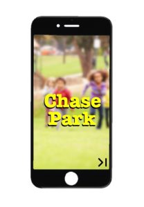
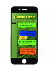
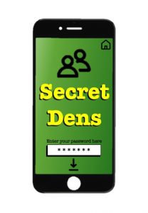
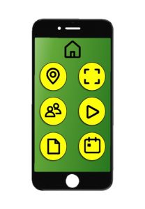
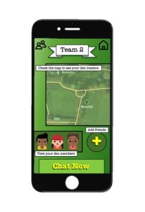
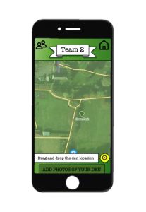
Hi team, this in combination with the PowerPoint you sent me looks great. It’s really clear to see how your prototype will look and the functionality that will come with it. As it appears to be a big part of your prototype the chat room aspect needs a bit more thought in terms of online safety and privacy. There’s loads of stuff on this in terms of cyber bullying, hate speech and so on. Will the app be moderated? If so, how and by whom? And how will you encourage people to use the chat functions at all – as opposed to say just exiting the app and using text? The latter is a perennial problem with apps like this – people will always prefer to use what they know already. Ideas that comes to mind – somehow integrating app actions / check ins into the chat, or merging the news feed and chat functionalities, or gamifying the chat (e.g. like how Snapchat does with its emojis)? As we discussed over email, you will probably also want to think about how you might be able to transpose all of this into an engaging activity to return to the school with. I can help you with all this after Easter. Have a good break.
Thanks for this update. Very helpful and I haven’t got much to add beyond Sean’s comments. It would be nice if you could revert to one of the reading materials and expand a bit on your understanding of an ‘interactive prototype’ or by referencing the discussion as to what level of ‘realness’ is advocated by Jake Knapp in his book on the Sprint for instance. These kinds of choices will ideally be discussed in the final reflective log.
In regard to your prototype, I wonder if you could perhaps provide some text overlay in relation to individual views to describe what is seen. It looks like there’s quite a bit of scope to ‘centerline’ your proposition. By that I mean to really hone in on your core idea: the game and dens; and your user audience: children. as an entry point, illustration 1 and 3 could almost be combined, e.g. “Secret Dens — Chase Park” Or perhaps page 3 could come before page 1 (as it seems more indicative of a unique proposition)? Really like the fourth image (bottom left): it is easy and simple to use. with regard to image 5 and 6 – could you prototype the team functionality? That could be quite a nice twist to for kids to play togehter. I’d also love to see the den and what happens if I found one…
Onwards.