Storyboarding and Prototype (1)
After the sketching stage, we created storyboards to illustrate the uses of our products in given contexts. We chose the digital intervention to come in the form of an app, available on the phone. This is because we want to create something new, that is easily accessible, with little effort.
Our concept focuses on encouraging engagement, which is why we choose features that simplify the process of engaging. QR codes will be a feature of the promotion, paired with advertisement and promotion.
As mentioned earlier, our target group is those who already have some interest, but who find the meeting times inconvenient, or find the current processes difficult/unsuitable. With that in mind, we focus on the feeling of uncertainty and hopefully turning it into action.
The promotion stage is therefore very important and one of the main ways to reach the audience will be through the City council. We hope they can promote our app on their webpage and incorporate It as a part of something bigger. From the Interview with Sheila, we have also noticed that community engagement is effective when promoted at community events.
So in addition to the councils website, we will promote It physically (flyers and posters) on notice boards and around the neighbourhood, promote it at events and have them on bus stops in the areas.

DigiVox- a platform for the community to engage with projects.
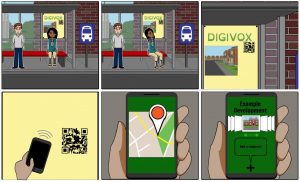
the storyboard illustrates how the user interacts with the app for the first time. It is a potential situation where the residents are waiting for the bus and will see the advertisement for the DigiVox APP. The QR code can be easily scanned by a smartphone which will then take you to the projects.
Prototyping part 1
So we decided to use Marvelapp for prototyping our app. It seems fairly straight-forward, and do not require specific skills in Adobe or programming.
We have assigned different roles:
Stitcher- Thomas (others can help)- keeping overview and piece together the
interfaces
Designers- Cindy (graphical components + Layouts)
Rory (Asset collector + Layout)
Ellie (text and communication + Layouts)
Writers- Cara (product assessment, description)
Hi team! I like the development of the storyboard from the previous week’s post showing you have continued to work on this and finalise it. Showing any changes and why they have been made would strengthen this for the final blog post. I also like that you have considered the roles each team member will play during the design of the prototype.
You mention the use of QR codes in the blog and I would suggest this needs to be elaborated on. This is a specific design decision and you don’t yet show where that idea has come from or why this is suitable for your target audience. Linking this with some kind of evidence from literature about the use of QR codes or from stakeholder interviews would enable us to see why this decision has been made. I would also encourage you to think about any assumptions you may be making about the use of the technology for the users – would it be that simple for everyone, would everyone know what to do with QR codes? Discussing this would strengthen your prototype and would benefit your final reflective log so we can see the decisions you are making and why you’re making them.