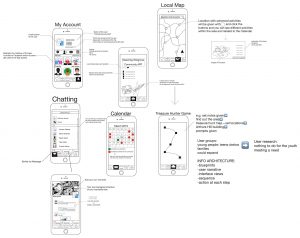
This one is the extra post of SIA’s storyboard blog and this is Zhaodong. This is the storyboard of the Greening Wingrove Community App and it is a little bit late to post it to the blog because of my personal issues so very sorry about that.
Basically the idea of the App is to provide a stronger connection between the community and one of our previous ideas was to make a treasure hunter game within the community and now we put the idea into the App which let it become a part of the App. Apart from the front page the App has four basic functions: Chatting, Calendar/Activities, Local Map and ‘My Account’. On the front page you can see the local temperature and weather today as well as the news and announcements within the community. The treasure hunter game is set as the latest news here and can be clicked for mor info. and we made some analysis on it (you can open the picture attached and have a look). The chatting function is similar to the iMessage but apart them a new function is designed called ‘Moments’. You can share your own special events happen around you here and let your friends to look and make comments. Calendar/Activities function looks like the calendar on your phone but also shows the activities that will take place as well as the activities that you will attend and show you the location of the activities. For the Local Map function, the location with schemed activities will be marked and able to be clicked and you can see different activities within the area and these are related to the Calendar/Activities function. ‘My Account’ is very easy to understand: manage your personal account, make self-introduction to others, add more friends and precious pictures into your album. More infomation of the App can be seen in the picture attached within this post.
Hello again, thanks for the storyboard. Your design is going through a significant pivot — consider which parts of the concept you think you’ll need to prototype in great detail and who you will aim to show this prototype for feedback. Also consider revising and updating your storyboard to review the user journey that takes place using this prototype. See you on Tuesday.
I like how your thinking is developing here and it’s good that you’re thinking about how all the features could work. I would suggest sticking with adding more detail to these features and not overloading it with too many more. In my opinion it’s better to elucidate on a couple of ideas well, rather than trying to propose too much. Also, always make sure you’re thinking about privacy and safety – will photos / messages be moderated? Will there be adult guardians observing the interactions, or will this be too intrusive for what you’re proposing? And how will you encourage people to use all these features, particularly the social ones? Anyway, great work.