Hello again,
This week started with our mid-term presentation in front of the rest of the class. With some mishaps while presenting we pinpointed things that we should remember for our final presentation in January. We got good response for our example research and were told that we should limit our key requirements a bit. Thinking about this we have now discussed and decided upon our most important requirements to be: easy to use and understand; time efficient and enticing; informational and provide opportunity to give feedback on the planned changes in Jesmond.
For this week’s seminar we continued with a bit more example research but later began talking about gamification which means adding game elements in order to evoke more interest in the users. Gamification is something we talked quite a bit about during our Tuesday meeting and that we want to implement in our final product. One of our biggest obstacles with this thought, however, is the risk of getting poor but high-quantity feedback instead of quality feedback. We tried keeping this in mind when we started sketching out ideas for the design.
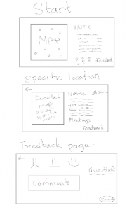
One of our earliest design ideas was very basic and not really interesting enough to evoke interest in the users. It basically just showed users the changes and were given an opportunity to comment on them if they wanted to. This of course is the main objective with our product but it isn’t really anything new since it is very similar to Commonplace.

After discussing a lot and sketching out ideas we landed, after many iterations, on a design rather similar to our first one but a bit more enticing and different. As a way to encourage users we introduced the concept of giving out stickers when they were finished using the product. These stickers are both meant as an reward but also a means to spread the word about the Streets for People project as well as our product.

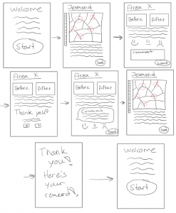
Also during our group meeting, we started creating a user experience flow chart so that we could have a clear idea in our heads of the whole feedback process. This is the most basic visualisation of our concept and from here on we need to start focusing on the small details such as colourways, sizing, stickers etc.

Hello team, thanks for the entry. This is quite a comprehensive post and nicely addresses the sketching tasks for this week, helping to determine options for your final prototype. I think the evolved concept sketches manage to show what users will be able to do through the tool; the additional “UX flow chart” helps to demonstrate you have through about the workings of your prototype. That’s very good; the post also offers further options for further improvement for your final reflective blog:
1) for example, on the aspect of gamification, perhaps articulate how ‘gamification’ relates to the user requirements you identified. And perhaps also outline a few well-working examples of gamification to demonstrate what’s meant by the concept (I guess VoxBox included some); ideally also extend your research by looking at some academic papers how this was implemented and what the effect of ‘gamification’ was on the user audience in the respective sample.
2) Perhaps more importantly, in terms of the prototype, what different aspects do you offer in comparison to, say, CommonPlace (the system the council uses)? I guess CommonPlace would need to become part of your example search. It seemed that the placement within specific local contexts was a key element of your design, but that needs further articulation; you could do much more with this part of the narrative; and also articulate how the placement of something that is ‘physical’ leads to (1) different requirements for your prototype (what requirements), and (2) different audience response…
3) In terms of “UX flow chart”, do you have a reference, what a UX flow chart is, or where the term comes from? In other books, this may be related to the information architecture of your prototype. In your techniques perhaps refer to the practice in the design sprint readings.
Hi team! I like the detailed blog post which takes into account the feedback from your midterm presentation too. Mainly thinking toward the reflective log for you final assignment, this post builds a great foundation to talk about the sketching concepts and outlining the decisions you made about your prototype and why you made them. A couple of suggestions to strengthen this for the reflective log would be to include more detail on the decisions you make and why they are relevant to your project. I’m particularly thinking about the gamification element – why is this important/relevant? This will help you to document the decisions you’ve made clearly to tell the story of your prototype. I would also be cautious with the use of the term gamification – what does it mean and is that really what you are doing? Is a sticker enough to regard it as gamification or are there other elements of the prototype that have been gamified?
The sketches and the UX flowchart are great too. I like that it shows your progression from a more basic idea to something more complicated and then you’re thinking about how it could work. For the final reflective log I would consider adding more detail to explain what those sketches show or add annotations to the sketches themselves which will help to outline your ideas to other readers.
Overall, a great blog post and some great progress made!