Hi, this week our group moved on from the ‘mapping’ section and began the ‘sketch’ section of our design sprint. We considered all the example research we had done, and thoroughly examined the summary notes each individual had made on their example readings as shown in blog 4. For us, it was also very important to consider the feedback we had received from client and mentor meetings (Nigel and John, Peter, Shelia, and David) which has been summarised in previous blog posts. The clients represented all the users we will be attempting to reach with the creation of the app, so, because different members of our group met with different clients, we then each acted as a facilitator for the opinions and interests of that user group. We had, firstly, come up with individual sketches based on the examples we had personally found and the feedback we had personally received from whichever client we met with. Here are some of the examples of our individual sketches:
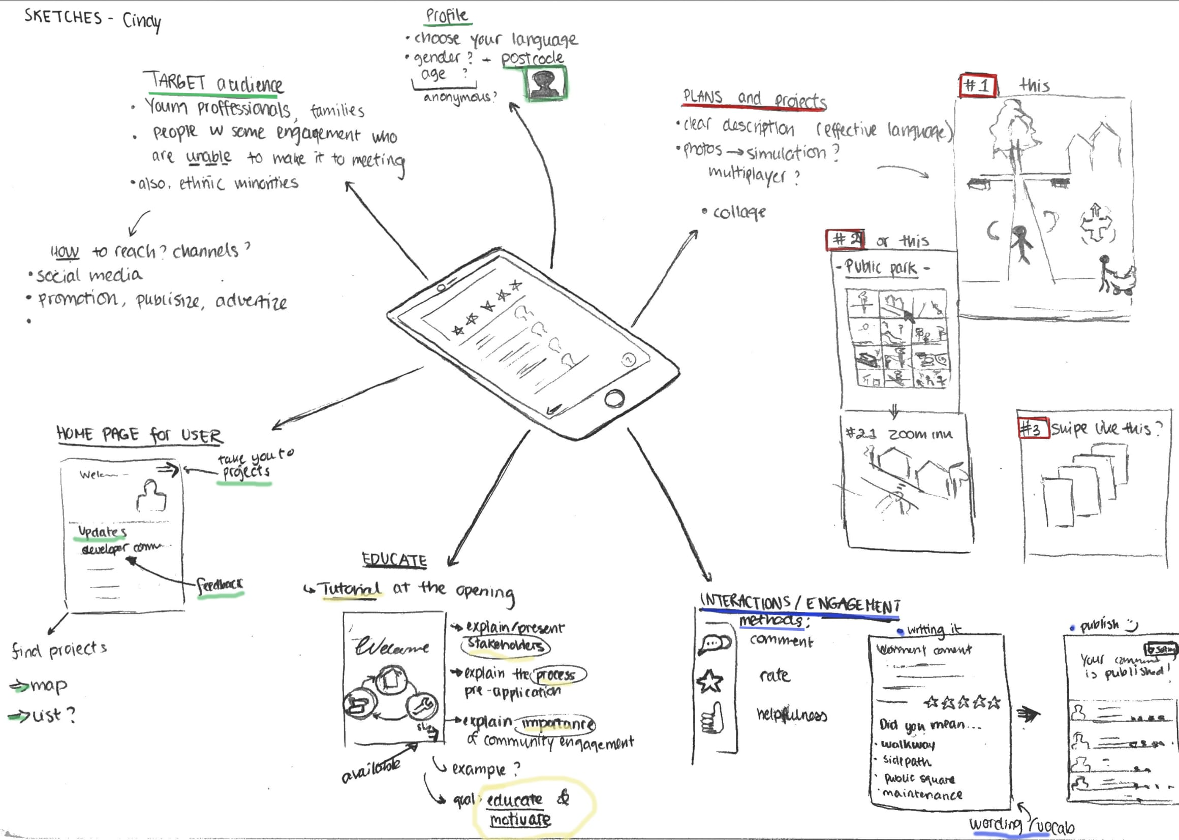
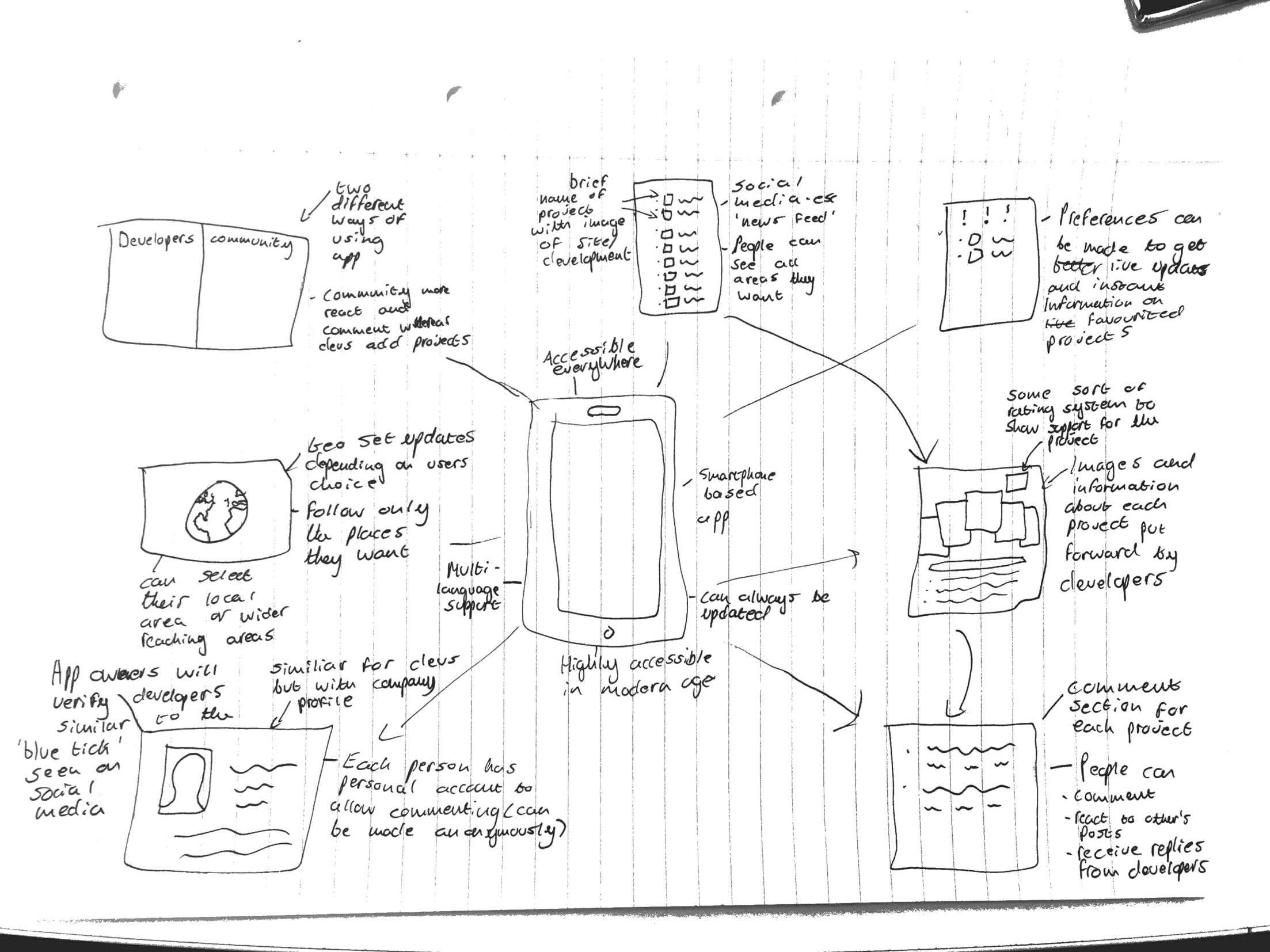
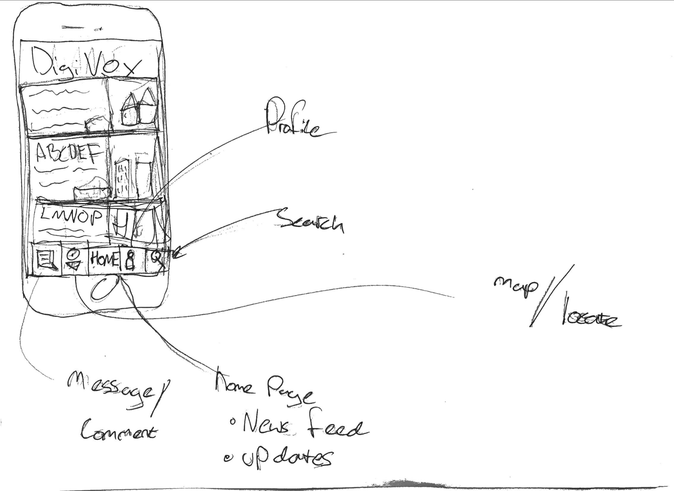 All of the sketches show we are designing a mobile based application, for easy accessibility and to modernise the process of community involvement, for which a profile home page will be needed. The most vital part of the app will need to be the uploaded content, that the developer provides, for the community to assess and comment on- an action that all of the individual sketches included. The developer can then see these comments, respond to them, and include them in their ‘statement of community involvement’ that they provide to the council. This way, the community can read any documents or images that would have normally only been available at the meetings and feel they are engaging directly with the developer- without having to attend the meeting, which is the main focus of people we are aiming this app at. One of the sketches includes a element of education within the app; to explain the process of community engagement, why is it important and what the pre-application stage involves. This could be important for including ‘harder to reach’ members of the community who may not understand the logistics or need for planning application consultancy.
In the seminar on 8th November, we then collaborated to come up with an ‘overall’ sketch, which will act as our draft concept for the process of the app- we can fine tune and amend this over the coming weeks as well as we receive more feedback and think of more ideas in order to create a neater, final version for the presentation.
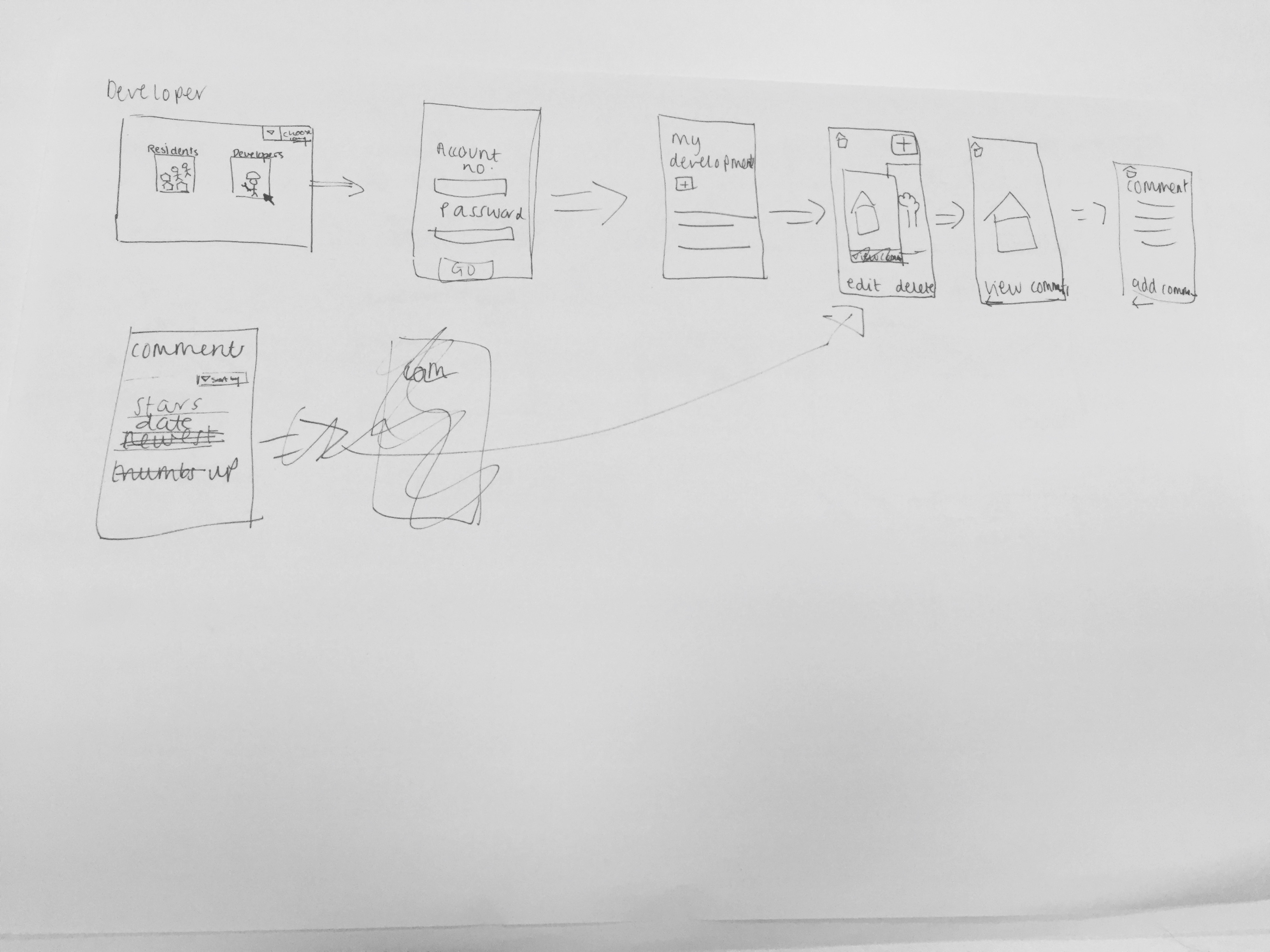
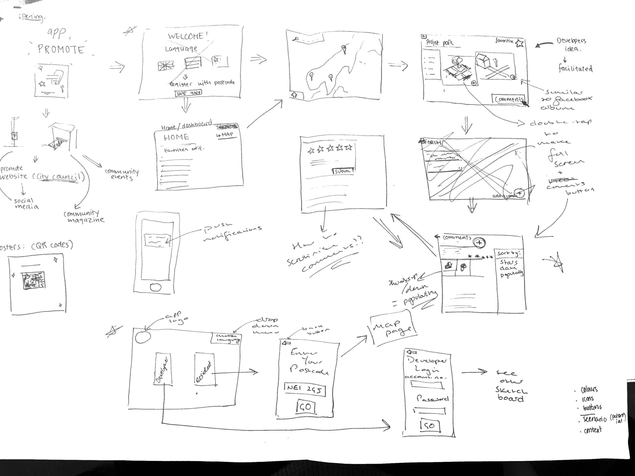 We decided the app would have to be accessible for both the developer and community residents, so would need two different overall sketches, depending on who was using it. Therefore, the opening page of the app would be a selection page where you can choose to access the developer part of the app or the residents part of the app; selecting the developer button will move you to login page where they can enter credentials provided by the council (so only legitimate developers can use it) or, selecting the resident button will move you to a page to enter your postcode, which will then automatically (only upon first login) take you straight to a map page, showing all the developments in the local area surrounding the postcode provided. We also all felt strongly about having a drop down language selection button on the home page, in order to include minority groups living in the area who may fall under the ‘harder to reach’ category.
The top image shows the sketch for the developer’s side of the app, so once they login they are taken to a ‘my development’ page, which will contain an overall description of the development and the ability to add, edit and delete documents or images relating to the development. This development page will then be accessible to residents from their side of the app by using the map to select which development page they want to view.
Key features of design:
-Commenting is also going to be available to both developers and residents, in order for them to engage directly with each other. Each document or image will include a 5-star rating system and a comments forum, and the developer can view comments on their ‘my development’ page, with the ability to sort the comments, for example, by number of stars. A thumbs up/thumbs down system will also be added for residents show agreement/disagreement with another resident’s comment, instead of writing their own comment saying the same thing- this will then make it easier for the developer when sorting through the comments as they can gauge which opinions are most/least popular.
Residents can also ‘favourite’ certain developments so updates regarding that development appear on their home page when they log into the app in the future and, if they choose to enable them, will receive push notifications telling them if, for example, the developer has uploaded a new photo into the developments’ document and image album- similar to a Facebook notification when someone you follow uploads a new image.
– The material published about the projects are facilitated by a third party (the app developers)- to reduce bias and increase communication by making the language understandable, clear and neutral.
-Update button is important to ensure that their opinions do not get lost in the process (as complained about earlier), and to ensure that all parties are updated with the most recent opinions and amendments.
Additional features
-There will be language options in the beginning of the app, so that minorities and “harder to reach” groups have an opportunity to get engaged.
-The graphic and visual design need to be simple to increase readability for the user.
To progress the overall sketch we now need to answer some questions that arose during the seminar- how do we scrutinise resident/developer comments? how do we encourage the developer to upload documents/images to maintain transparency? how to we simplify terminology to make it more accessible to residents? do we include the ‘education’ part of the app?
Over the coming weeks we will constantly refine the overall sketch as new ideas arise and issues become visible during the prototyping stage of the sprint.
Hello team, thanks for the comprehensive and detailed blog post. There are many nice things to be said here. It is good you differentiate between offerings for the different target groups attacking in this system, which is evidence of advanced level of thinking in terms of how your digital concept can be realised. The educational component is an interesting aspect to mention, as there may be aspects where both developers and residents can learn from each other and thus ‘educate’ themselves about each others’ point of view, in particular, in relation to any development schemes being proposed.
One thing to say is be careful in your terminology as to who is a ‘client’ and who is a stakeholder and who is a user. The client here is Jim all others are stakeholders and some might be users. Furthermore, in your final reflective essay, you could perhaps draw more strongly as to how your sketches relate to earlier example / inspiration search. In how far is what you do different or similar to example x,y,z etc. In terms of the final essay, you could perhaps also briefly comment on the way you went about addressing the task at hand across the members of the team; perhaps there were some key discussions and moments that were influential for your eventual design concept; in the sprint methodology it talks about having each team member prepare solution sketches separately and then the whole team comes together to identify popular elements that should become part of the final solution. Have you also done it in that way; if not, what was your experience with this activity and how might it have different from the design sprint method. Perhaps briefly comment on those.
Hi team! This is a great blog with a really detailed overview of your progress with storyboarding! It’s great to see that the group did those individual sketches then as a group moved forward with a ‘solution’. Including more information about how those decisions were made as a group would be great – why did you choose one over another or why was one feature more suitable? This would strengthen the reflective assignment.