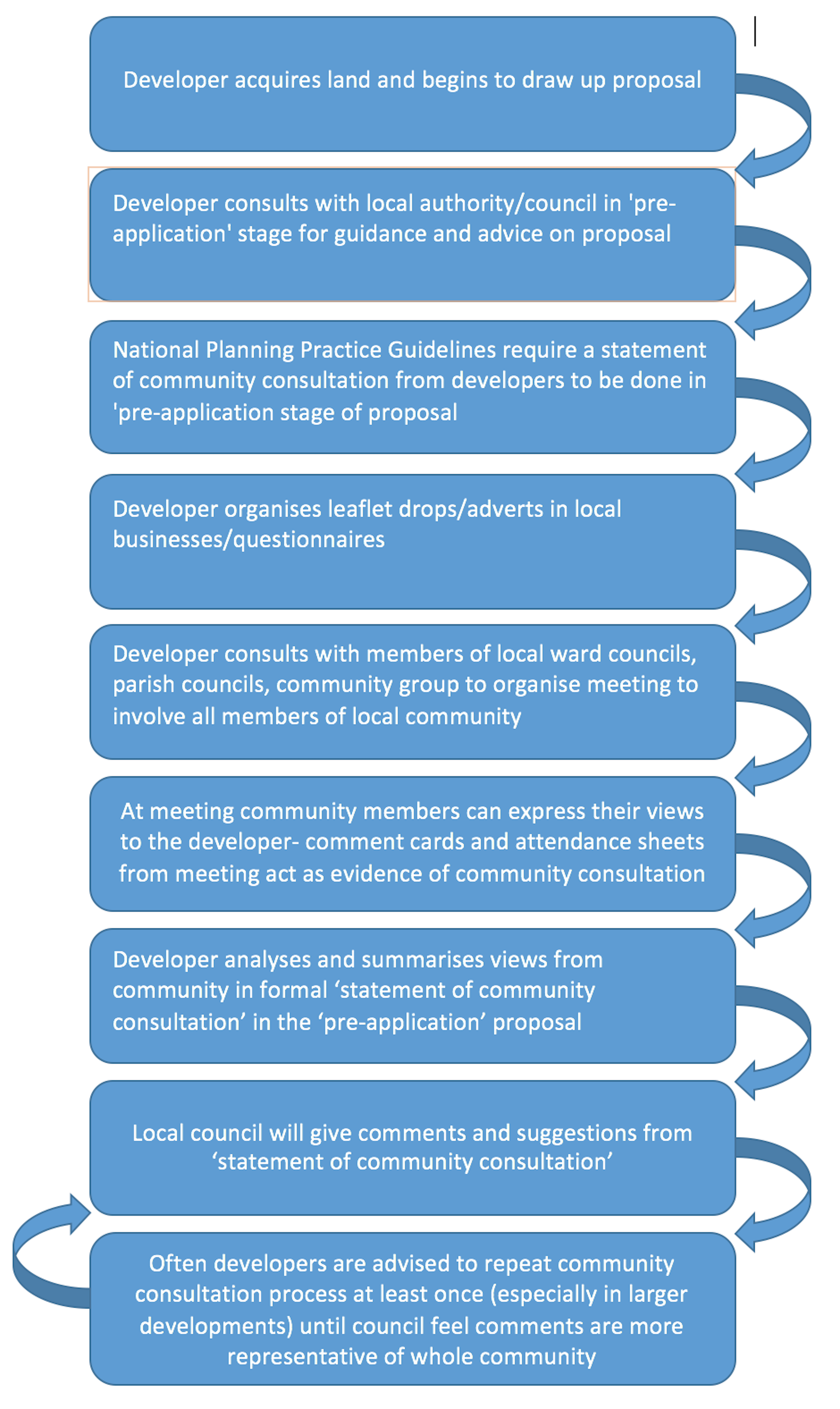
This week we tested our prototype app with everyone we originally interviewed, with regards to what they would like from our final product, in order to find out what they thought of it, both good and bad. As last week’s blog explains, we had a script of questions prepared and also an example poster and an A3 sheet of screenshots from the prototype (for if the user wanted to make any comments about a particular screen). Here are the questions we used in all three user testing session:
- Does the prototype do what it is supposed to do?
- Do you think the product’s design matches its purpose?
- Does anything distract you or get in the way?
- Does the navigation path work? (Can users find what they are looking for?)
- Do you think this fits the target market?
- Is anything confusing or unclear?
- How likely or unlikely would you be to recommend the finished product to a friend or colleague?
- How would you describe this product using your own words?
- Does this app solve the problem?
- What, if anything, would you change?
The first prototype demo session was with Nigel Brown, who works in the planning department at Newcastle City Council, and myself and Cindy were in attendance. Nigel represents a planning consultant, that developers would visit in the pre-application stage of the development, and who would advise the developers exactly on how successful their statement of community consultation was. Cindy opened the prototype on her phone, through the Marvel app, so we could demonstrate exactly how we intend the app to be used (rather than on a computer, which we had been designing it on). We then asked the questions from the script, which we think incorporates questions on how exactly Nigel used the app (timings, gestures, etc.), between us and I made notes of Nigel’s answers, which were as follows:
- Does the prototype do what it is supposed to do?
Yes, it definitely fills the gap.
- Do you think the product’s design matches its purpose?
Yes, it is simple and easy to navigate.
- Does anything distract you or get in the way?
No
- Does the navigation path work? (Can users find what they are looking for?)
Yes, I found things very easily
Very self-explanatory
- Do you think this fits the target market?
Yes, most people will be able to use it because it is simple and well designed, but I suspect it will be mainly younger people using it, which would match the target market of ‘young professionals’.
- Is anything confusing or unclear?
No
- How likely or unlikely would you be to recommend the finished product to a friend or colleague?
Very likely, I think most people could use it.
- How would you describe this product using your own words?
What I was looking for.
- Does this app solve the problem?
Yes I believe it would, however I would include a questionnaire to determine the demographics of people using the app, and then the developer could use these to show they are being inclusive.
- What, if anything, would you change?
-
- Make sure the developer and council can see who has commented- no anonymity .
- Include a structured questionnaire AND the ability the comment (rather than one or the other)
- Look into ‘geofencing’
- Terms and conditions
- Third party filtering
- Perhaps a page explaining limitations (what exactly is the app for?) or a help page (but not a step-by-step tutorial)
- Add a link to the council portal
- Need a cut off point for how long people can comment for
- Perhaps produce an automated report of the statistics from questionnaire, ratings, likes and dislikes, for the developer
- Developer should be able to add ‘overall’ comments
- Perhaps get developer to put link or QR code on their website to the app- would benefit us both
Next was the meeting with Peter Cockbain who works in the ‘Fairer Housing Unit’ at Newcastle City Council, working on turning council-owned land to delivered housing. He works closely with developers when it comes to planning and public engagement, so for us, he has been representing a developers point of view. Ellie and Rory met with Peter and these were their findings:
- Does the prototype does what it’s supposed to do?
Yeah, if I was a resident it seems simple to sign in and find information about developments
- Do you think the design matches the purpose?
The colour scheme gives it a nice style. I would make the icons clearer with words telling you what they do.
- Does anything distract you or get in the way?
No, not really
- Does the navigation path work?
Although I don’t really use apps on my phone it’s fairly easy to get through. I would use it on my iPad.
- Does it fit the target market?
It seems it will serve the purpose for residents well. Maybe bigger fonts for older people with worse eyesight.
- Is anything confusing or unclear?
No, not that i can tell
- Would you recommend it?
Again, don’t really use apps on my phone, I wish we all went back to old phones really. But if I did use my phone I would recommend it.
- How would you describe the product?
An easy to use app that allows for the community to get access to information on developments near them
- Does the app solve the problem?
It does to a certain extent. People use the website ‘sky scrapper city’ for pictures and comments on developments. Architects and planners like myself spend hours sifting through the comments on the progress of developments
- What, if anything, would you change?
Maybe somewhere where users can upload pictures of the progress developments near them so people can be aware of developments that people aren’t aware of.
Finally, was the meeting with Sheila Spencer who has worked with Ouseburn Valley Trust, as a trustee, for over 20 years, so is involved with community participation in the planning of projects in the area. Cindy and Thomas met with Sheila; these were her responses:
- Does the prototype does what it’s supposed to do?
Yeah it is clear. The app will help community involvement.
- Do you think the design matches the purpose?
The design is excellent. Clear and simple
- Does anything distract you or get in the way?
No not all
- Does the navigation path work?
Yes mostly. Getting to comment section wasn’t too easy. Maybe there could be somewhere to view and save your own comments. Or even type without uploading. Are the comments moderated? We don’t want abuse.
Can you sort comments by rating or amount of reply’s?
Will the developer reply to each comment?
- Does it fit the target market?
It will serve the purpose for residents. Bigger fonts for the elderly with worse eyesight is something I would change. And the icons at the bottom should be rearranged with the home button moved to the middle.
Also in the development page the bottom icons should be rearranged with overview being in the first thing on the left, description in the centre and comments being the last thing on the right.
What about people who work in the area but aren’t a resident? Or even architects? Can they use the app? Would they have a different account?
- Is anything confusing or unclear?
The comment section and the personal profile might need tweaking. I don’t see the point in the scoring. I don’t think people are bothered by their score
- Would you recommend it?
I would absolutely recommend it. I think it is a great idea. When will we be able to use it?
- How would you describe the product?
…
- Does the app solve the problem?
I don’t think it will replace community meetings yet. Although the planning portal is hard to use, it is also used a lot by members of the community. However, I think it is a great alternative, and maybe it will replace the comment section of the planning portal. And I can see it being used heavily by residents. Especially those who can’t make the meetings
- What, if anything, would you change?
The fonts might need tweaking. Bigger icons.
A few icons could be rearranged
Change the sign in page to Developers and Community. It will allow other members of the community to use the app. In the your profile you should then specify if you are a resident etc..
Add links to documents in the planning portal so members or users can access the full planning application documents.
Positive or Negative Reception?
Overall, the response from the user testing was definitely positive, with all three users saying they would recommend the app.
All three users also said they liked the design and style of the app, and the only negative comments we got, for things to change, were small changes with regards to font size and icon arrangement.
With regards to other changes to be made, Nigel recommended some fantastic additions, rather than changes, which we would definitely look at adding in; especially the ‘geofencing’ and ‘help page’. Both Nigel and Sheila recommended links to the council planning portal, which again is something we could easily incorporate; our overall goal was to create an app to work alongside the current process, not replace it.
Some comments we would need to discuss as a group, and perhaps decide if it was the direction we would want to go in. For example, Sheila’s suggestion of allowing non-residents to use the app may be useful in some ways, but our brief currently only focuses on ‘Large Housing Schemes’, so at first it would probably be best to just keep the app running for residents and developers. Sheila also noted that she didn’t see the point of the ‘scoring’ system on our app, which as a group is another point we need to discuss and probably do further reading on, to see if we can enhance it, or just get rid of it.
Peter’s suggestion of having somewhere users can upload photos of developments to make other users aware of new ones is also something we could look into in the future, and perhaps run it alongside Nigel’s suggestion of location tracking to alert you of new developments (which I did some research into and have found out it is commonly known as ‘geofencing’).
All three of the users found the app easy to navigate around, with only Sheila taking slightly longer to find the comment section. With more user testing, we would have been able to find out if this was a problem for more people. But overall they used the prototype as we had intended.
Reaching our Goals
Our long term goals were:
- To improve interaction between all 3 stakeholders
- To improve communication in order to make to community consultation process more effective
- Reach the harder to reach members of the community
- To improve visibility in order to make the process and information more transparent, accessible and approachable
I thinking, judging by the positive comments made by all three users, we have reached the goals we set out to achieve. We are definietly bridging the gap between developers and residents, as well as involving the council, so communication will be improved, using this digital platform. It is aimed at harder to reach members of the community, specifically young professionals, but I think the app (with some font size tweaking) could be used to reach out to all members of the community. Hopefully, the app would also improve transparency of the planning process, given all three stakeholders interact with each other as the app requires.
What would we do differently?
I think the overall process of our user testing worked very effectively and we received all the answers we were looking for, however I think for the testing to be more legitimate, and had we more time, testing with more than three users would have been very useful. It would have given us a more representative opinion of the app, and could have been tested across age ranges to see just how easy it was for all members of the community to use.
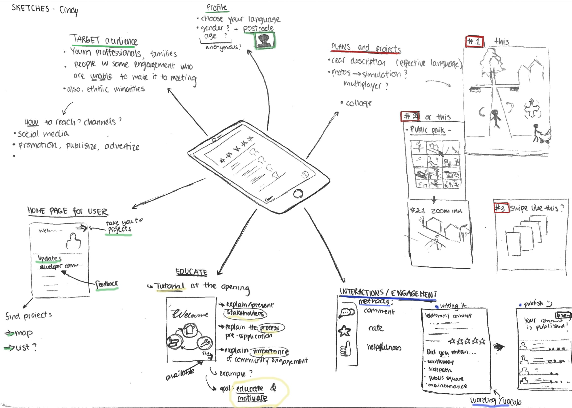
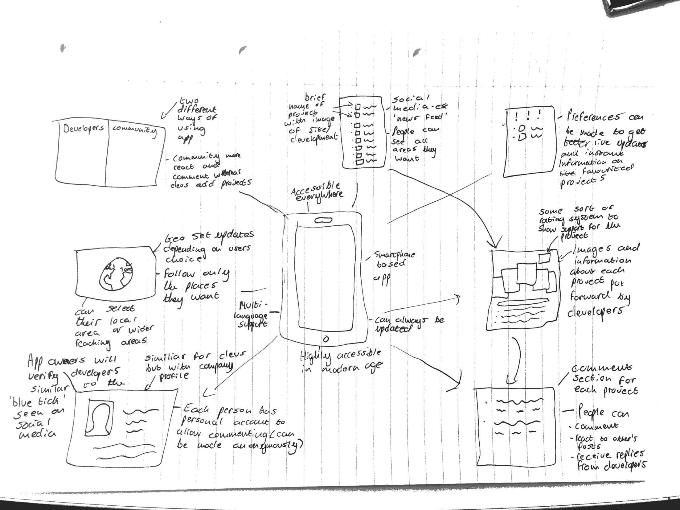
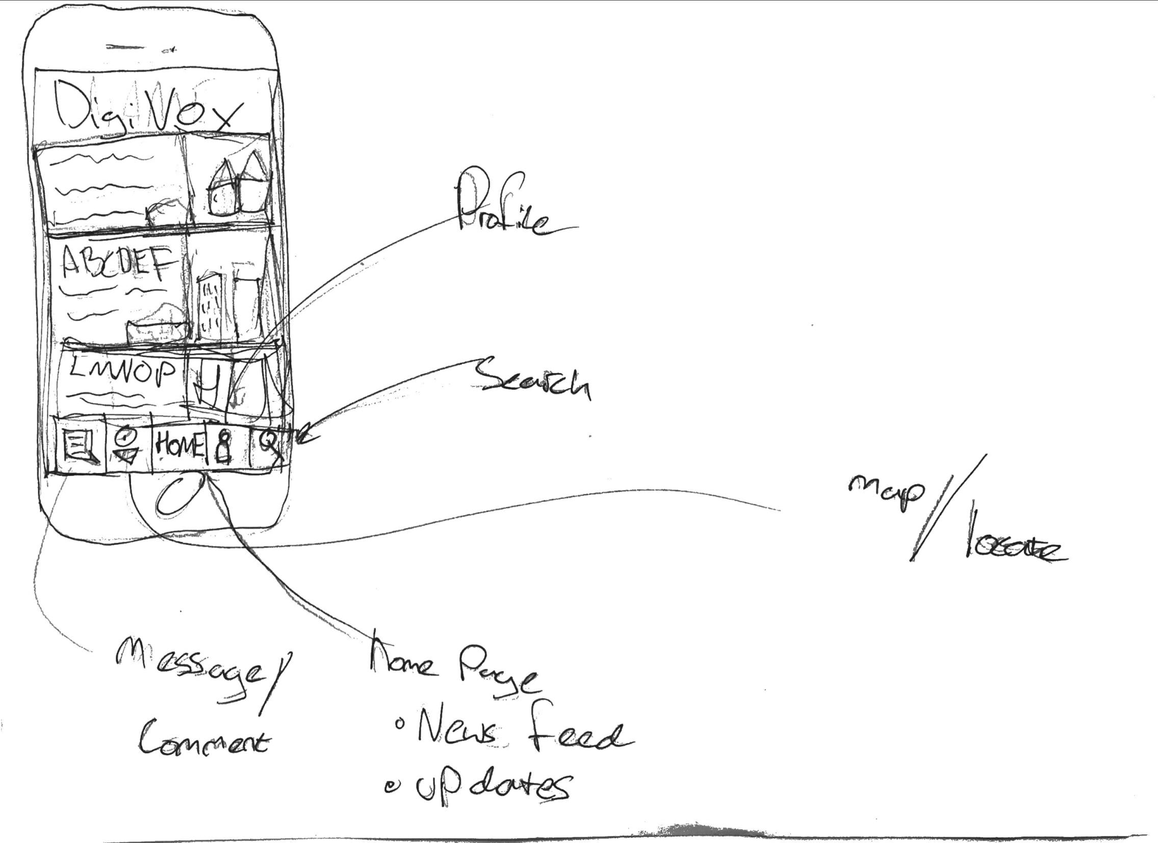 All of the sketches show we are designing a mobile based application, for easy accessibility and to modernise the process of community involvement, for which a profile home page will be needed. The most vital part of the app will need to be the uploaded content, that the developer provides, for the community to assess and comment on- an action that all of the individual sketches included. The developer can then see these comments, respond to them, and include them in their ‘statement of community involvement’ that they provide to the council. This way, the community can read any documents or images that would have normally only been available at the meetings and feel they are engaging directly with the developer- without having to attend the meeting, which is the main focus of people we are aiming this app at. One of the sketches includes a element of education within the app; to explain the process of community engagement, why is it important and what the pre-application stage involves. This could be important for including ‘harder to reach’ members of the community who may not understand the logistics or need for planning application consultancy.
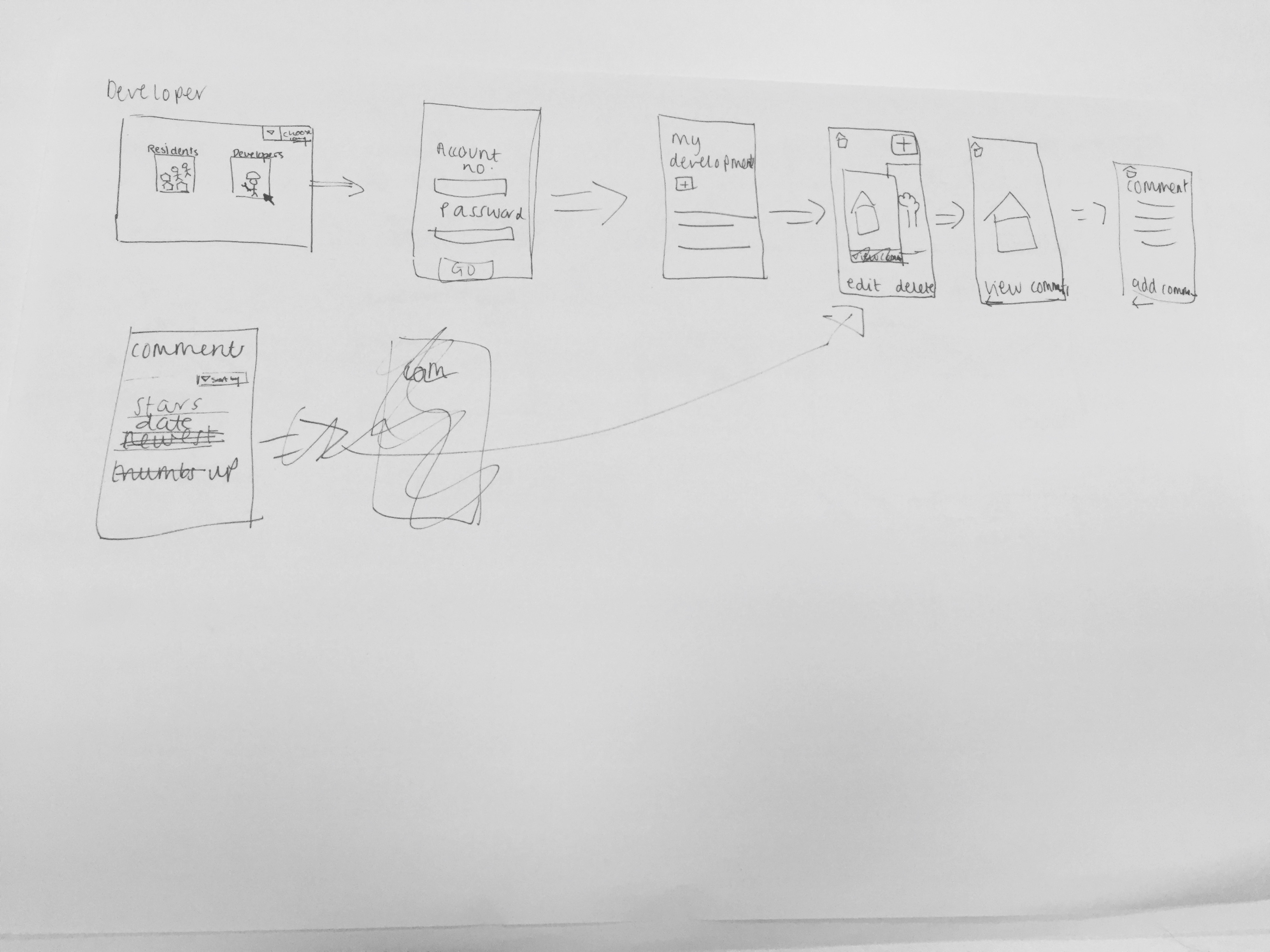
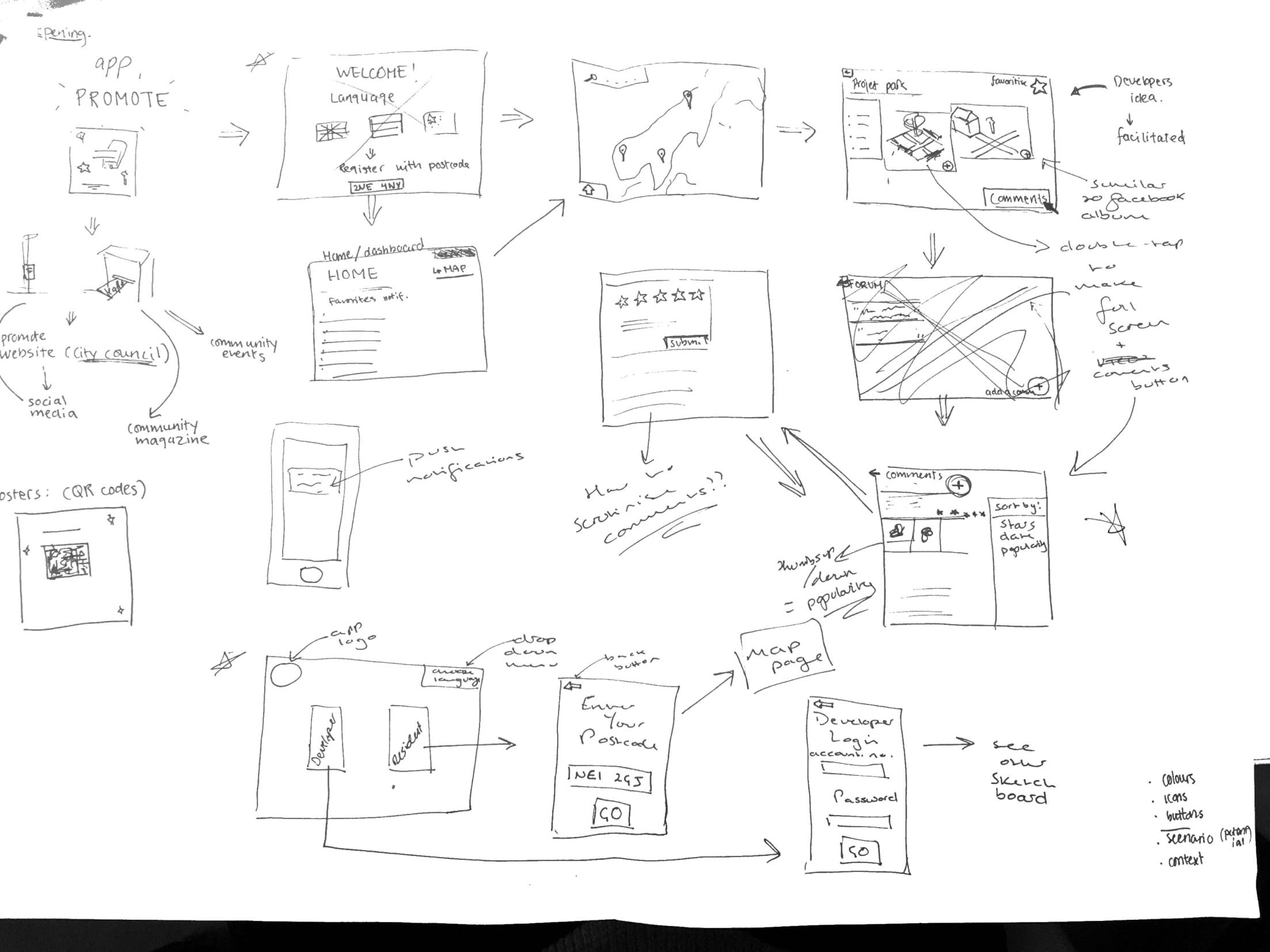 We decided the app would have to be accessible for both the developer and community residents, so would need two different overall sketches, depending on who was using it. Therefore, the opening page of the app would be a selection page where you can choose to access the developer part of the app or the residents part of the app; selecting the developer button will move you to login page where they can enter credentials provided by the council (so only legitimate developers can use it) or, selecting the resident button will move you to a page to enter your postcode, which will then automatically (only upon first login) take you straight to a map page, showing all the developments in the local area surrounding the postcode provided. We also all felt strongly about having a drop down language selection button on the home page, in order to include minority groups living in the area who may fall under the ‘harder to reach’ category.
