The August Assessment Period is taking place from 4th to 15th August 2025, with Inspera Digital Exams running from 7th to 15th August. In this blog post, we are sharing communications that are useful for Module Teams to share with their students ahead of their Inspera exams, along with information around support with marking.
Communications for Students
Module Teams are encouraged to share the following communications with their students. These communications are also shared via emails with module teams once the exam is set up by our Digital Exams Team:
Preparing for your [module code] Inspera digital exam: make sure you know your log in details
To sit your upcoming Inspera digital exam you will need to know your University login details(username and password).
Please check that you know your login details before the day of the exam and that you can successfully sign into a campus Cluster PC. If you do not know your login details on the day of the exam it may not be possible to reset them before the exam starts.
Your username begins with a letter (usually c) followed by the middle 7 numbers from your student number, which you can find on your smartcard. E.g. if your smartcard shows your student number is 212345678, your username is c1234567.
To help you prepare for your assessment, you can try out our demo exams via Canvas. There is a locked down demo and an open book demo. Both demo exams reflect the same demo content. The locked down demo allows students to experience the in-person Inspera exam security, therefore this particular demo should only be taken within a Campus PC cluster (as the required software will be installed).
There is also a student page on the Academic Skills Kit about Inspera which students may wish to look at ahead of your exams.
Marking your Inspera Exams
Once the Inspera exams have taken place, Module Teams mark the exams under the Grade area of Inspera. You can find various marking hints and tipsin a previous blog post about this. You can also view our Marking Exams in Inspera webpage, as well as our Inspera Feedback Release webpage.
Save the Date
Inspera are hosting an on-campus event with our users on Wednesday 5th November (Time TBC – but will be PM). Further details will be circulated to Module Teams using Inspera.
The Vice-Chancellor’s Education Excellence Awards aim to raise the status of education at Newcastle University by rewarding individuals and teams who have made a marked impact on the student’s educational experience.
The 2025 winners have now been announced, with five winning submissions out of a very competitive field of nominations.
Congratulations to the 2025 winners of the Vice-Chancellor’s Education Excellence Awards:
Dr JC Penet
School of Modern Languages
Dr JC Penet receives his award for his innovative and sustained contributions to the field of Modern Languages, in particular within the School’s Translation and Interpreting Section. In recent years, Dr Penet has successfully built a profile as an influential scholar and practitioner in translator education that has benefited Newcastle University, but also students and colleagues more widely through his engagement with coaching and mentoring practices. The awarding panel were impressed with how the winnings from Dr Penet’s previous Vice Chancellor’s award were used to reinvest in training that has led to the development of Translation and Interpreting Studies within the School of Modern Languages.
JC told us “I’m truly honoured to receive the Vice-Chancellor’s Education Excellence Award for a second time. This recognition means a great deal to me, as it reflects my unwavering commitment to co-creating, with our fantastic students and brilliant professional services colleagues (Careers, LTDS), experiential learning opportunities that make education more authentic and situated by connecting students with real-world industry practice. It’s a privilege to support students in developing the critical, analytical and reflective skills they’ll need to thrive in their future working lives. I’ve also found it incredibly rewarding to see how my research into emotional intelligence in translator training has contributed to their growth and wellbeing. Too often, education begins from a place of deficit. It doesn’t have to—and I’d like to believe that my work, both as an educator and a life coach, is helping to challenge this. Change and innovation are never easy, but what a joy it is to help shape empowering learning experiences that allow students to rediscover just how creative and resourceful they truly are.”
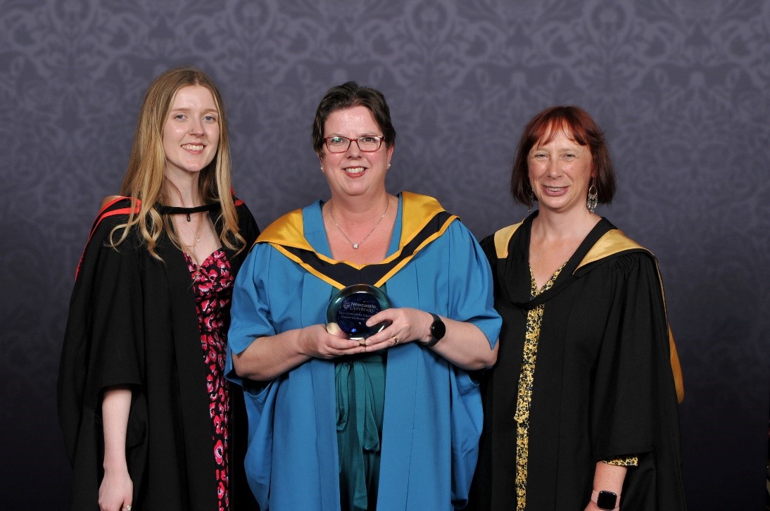
Bridging the Gap
Academic Services – Library
Pictured: Lauren Aspery, Liv Jonassen and Sara Bird
The Bridging the Gap Team, who have representation from the Library, the Learning and Teaching Development Service, as well as Undergraduate and Postgraduate Interns, receive their award for their engagement with local schools, prospective students, academic colleagues, and our own first year students, in order to support new students transitioning into their university studies. The awarding panel noted that all of the university’s values are well embedded in the team’s approach, and that the project has visibly strengthened the Newcastle University transition offering. There is also a real possibility for opportunities and expansion for individual, international, and mature students in the future.
The team fed back to us “We are delighted that our ongoing commitment to combat the challenges faced by students transitioning into university has been recognised by this award. It is testament to the meaningful and compassionate collaboration that took place throughout Bridging the Gap, the expertise and dedication of our project team, and the hard work of the talented and insightful students we partnered with, without whom none of this would have been possible.” – Lauren Aspery, Project Co-ordinator
“This award celebrates the long-term partnerships that have formed as a result of this work, and our collective commitment to make our university accessible for all students. Sharing expertise across teams has enabled us to provide high-quality, bespoke support for students who are struggling with their studies in those early stages, setting them up for success in the future.”- Liv Jonassen, Academic Skills Team Manager
“It is a privilege to be acknowledged for our contribution to supporting and empowering students to succeed. Having these resources means we are greater equipped to support students with all of the essential study skills they need to complete their A-Levels and transition smoothly into their degree studies with confidence, furthering our mission to provide equity of access to higher education.” - Sara Bird, Education Outreach Officer
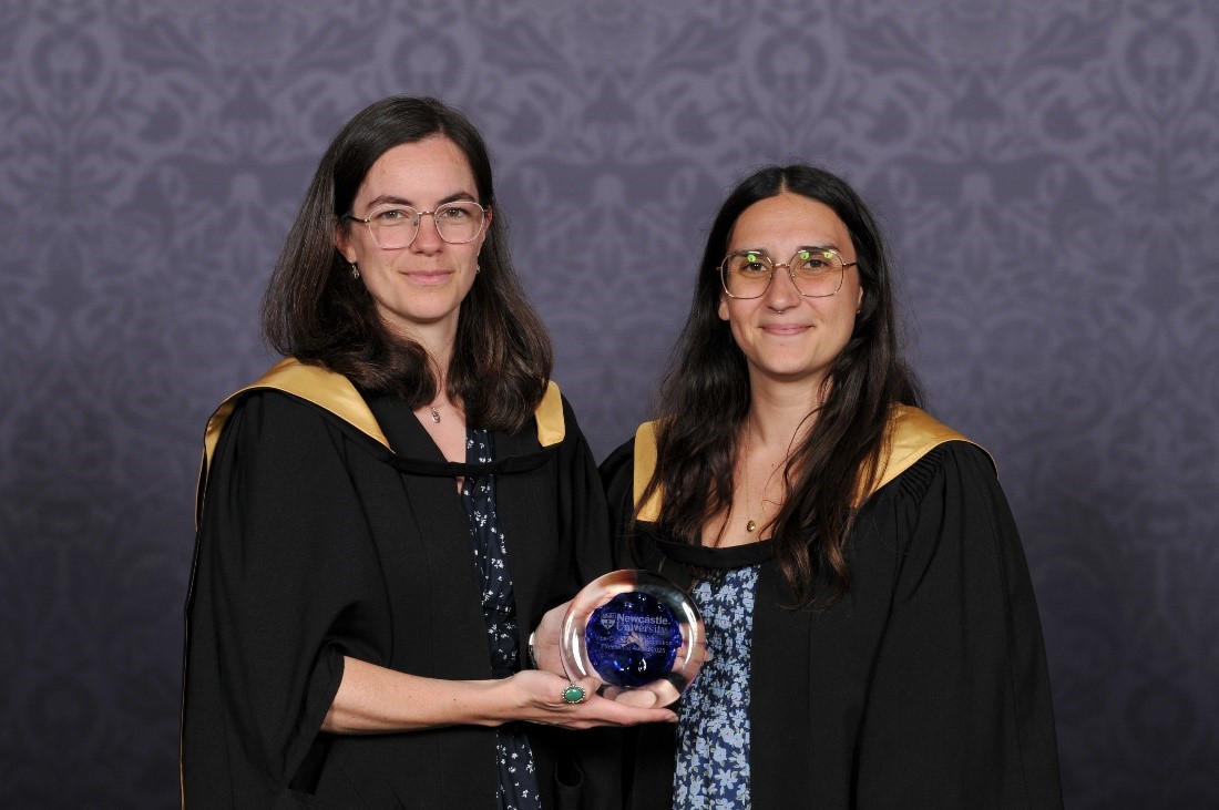
Loyola Study Abroad Centre
International Office
Pictured: Grace Baker and Dina Schwartz
Loyola Study Abroad Centre, part of the International Office, receives their award for significantly enhancing the educational experience of both students and colleagues at Newcastle and Loyola University, Maryland, through its innovative programme of dedicated support. It is evident the team have gone above and beyond to ensure Loyola students are happy during their time at Newcastle. The panel also acknowledges that this huge team effort has been working together for the benefit of the two institutions for 30 years, and that this award is a recognition of that group effort and the history of the centre. In addition, the project’s civil engineering accreditation is very innovative and offers a model for future collaborations
Grace explained “The relationship with Loyola University Maryland is a special and enduring partnership – celebrating 30 years in 2025. I’ve been the Center Manager for ten of those, and it is a role that never grows tired: watching students’ personal transformation each semester, providing support and structure to see them flourish. We’ve also developed innovative programming, which is possible when you work with a forward-thinking partner like Loyola, who also deeply care about the opportunities an international education brings. Thank you for this award, and a special ‘thank you’ to every school and team across the universities that contribute to the success of the Center.”
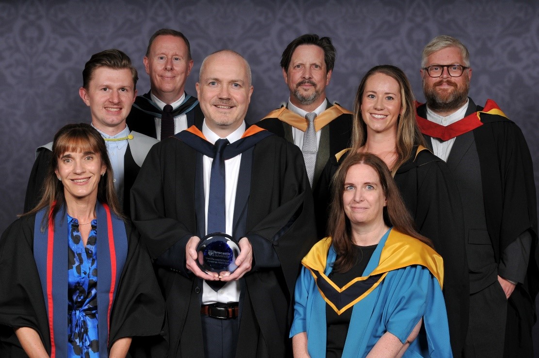
Initial Teacher Education
School of Education, Communication & Language Science
Pictured: (Left to Right) Fiona Hepton, Christian Kitson, Andrew O’Sullivan, Fred Clark, Jon Haines, Susan O’Hagan, Hayley Hands and Chris Blakey
The Initial Teacher Education team from the school of Education, Communication and Language Sciences, receive this award for successfully leading a rigorous, three-year reaccreditation process following the DfE ITE Market Review (from July 2021 to July 2024). This process required all ITE providers to develop detailed curricula for student teachers and school-based mentors, ensuring that training systematically and consistently drew upon the latest high-quality research on teaching and learning. The team’s leadership resulted in a successful reaccreditation, affirming the University’s status as a leading provider of ITE.
The team commented the following;
Fiona: “We are incredibly proud that the Initial Teacher Education Programme has been recognised with this award. It’s a testament to the dedication of our team and partner schools in preparing the next generation of outstanding teachers for both primary and secondary education. At the heart of our work is a deep commitment to supporting trainees as they begin their journey into the profession, ensuring they are well-equipped to make a meaningful impact in classrooms across our region and beyond. At a time when the education sector faces significant challenges in teacher recruitment and retention, the success of our ITE provision is more important than ever. We are proud to be playing a vital role in attracting and nurturing passionate, skilled teachers who are so urgently needed in our schools.”
Jon: “We are delighted to be recognised for our work in enhancing the quality and reach of our initial teacher education programmes at Newcastle University. As the lead partner in a growing collaboration with Durham University, we are extending our impact even further across the region and are proud not only to deliver training that meets the rigorous standards set by the DfE and Ofsted, but also to provide our local schools with some of the very best Early Career Teachers.”
Fred: We are deeply honoured to receive the Vice-Chancellor’s Education Excellence Award, which recognises the sustained commitment, innovation, and impact of our Initial Teacher Education programmes. This achievement is a testament to the extraordinary dedication of our team, our partner schools, and our collaboration with Durham University in preparing the next generation of outstanding teachers for both primary and secondary education. From navigating rigorous reaccreditation and inspection processes to expanding our regional reach, our team has consistently demonstrated leadership, resilience, and an unwavering focus on quality and equity. We are proud to be shaping a diverse and passionate teaching workforce that is making a real difference in classrooms across our region and beyond.
Business in Action Team
Newcastle University Business School
Pictured: (Left to Right)Jo Clark, Dr Lucy Hatt, Cian O’Sullivan, Jaclyn Wright, Keira Iveson and Steven Sadi. The award will be presented at a winter congregation ceremony.
The Business in Action team, from Newcastle University Business School, receive this award for their transformative work designing and delivering an immersive, experiential learning module for our MBA that bridges the gap between academic theory and real-world practice. The awarding panel found their student-centered offer, and the active learning approach taken, has had an exceptional impact on student learning. The panel also commended the team’s work developing a supportive and collaborative environment for both colleagues and students to flourish within; an approach already being adopted by other programmes within the school.
Jo told us “I am delighted that the work of our team of colleagues has been recognised with the Vice Chancellor’s Education Excellence Award. The Business in Action module, a transformative experience for our MBA students, ensures students have an opportunity, working on live consultancy projects, to apply their academic skills and knowledge in practice. Working together with external learning partner organisations we bring real challenges and business experiences into the classroom. We ensure that this experience benefits not only our students, but also our enthusiastic learning partners, a range of businesses and charities with whom we work on an annual basis, such as, PWC, Lloyds Bank, Aqua Consulting, Charity Groundwork North East and Cumbria and Northumbrian Water. These strategic learning partnerships are made possible by the effective teamworking between our academics and external relations colleagues, plus, alumni relations and careers advisors. Business in Action is both an enjoyable and rewarding experience, so we find that our learning partners are pleased to return year on year to engage with business school MBA students.
Effective team work, internally and externally, underpins all of this activity making it my pleasure to lead the Business in Action, MBA module. This year we were delighted that colleagues from the School of Engineering were able to join us for final presentations. We are looking forward to extending the benefit of working with Newcastle University students by taking an even more collaborative, interdisciplinary, approach in our work with external learning partners in 2026.”
The panel, chaired by Ruth Valentine, PVC Education, were greatly impressed by the wide-ranging impact, variety of initiatives, and creative approaches to teaching and student support demonstrated by all the awardees.
By Em Beattie, Stage 2, Geography, Politics and Sociology student
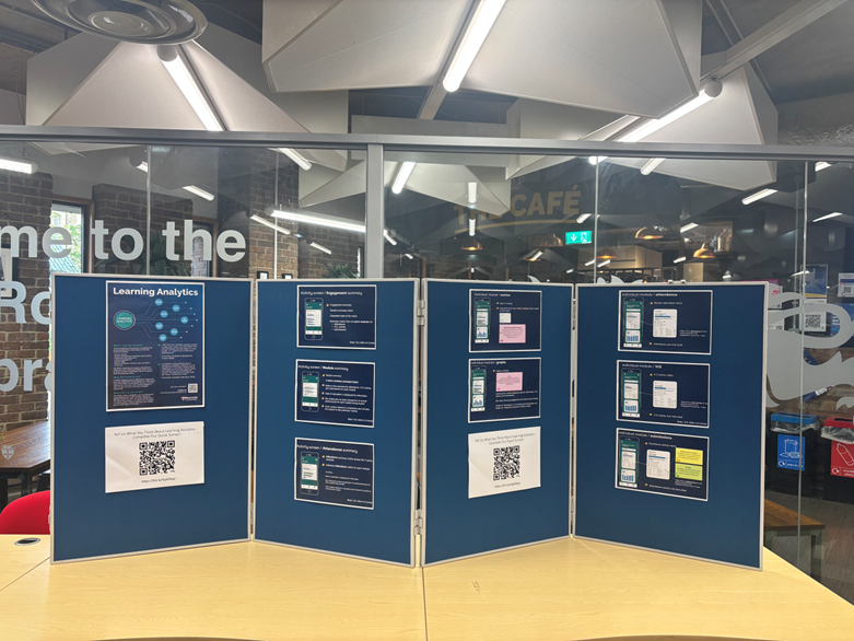
This summer I worked as an intern for the learning analytics team. The learning analytics team has been developing a new system for Newcastle University students to allow them to review and have access to their own learning analytics data. Learning analytics refers to the measurement, collection, analysis, and reporting of data, for the purpose of understanding and improving students’ learning. Student’s data is collected from a variety of sources to enable students to view their attendance, engagement and module summaries. The aim of this new roll out is to empower and positively impact students’ academic achievement and progress for smarter insights and stronger outcomes.
My key role was to contribute to the methodology and development of student communication channels, organise pop ups, analyse and manipulate data, contribute to design and evaluation of material and present findings. I really wanted this experience to develop my career skills, and I am passionate about academic growth and attainment.
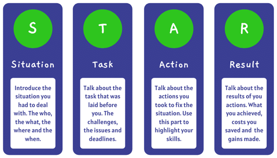
I found the internship on MyCareer, which is a Newcastle University platform which provides internships and work experience students can apply for. After finding the learning analytics internship and reading through the description I thought it would be a valuable and interesting opportunity. The applying process was very simple I attached my CV and answered three questions on how I would manage the hours required to work, what skills I brought to the internship and why I am the right person for the experience. When writing these answers, I used the STAR technique to provide efficient details of skills I brought to the table. After submitting my application, I was fortunately emailed a few weeks later asking if I was available for an interview. I was very nervous for the interview as I had never had an in-person interview before. However, to prepare I read over the description of the role, writing down on a notepad what skills I could bring to each of the tasks I would be completing and ideas I had. I also looked at the advice Newcastle university gave about internships on their website. https://www.ncl.ac.uk/careers/making-applications/interviews-assessments/interviews/. After I completed my first ever in person interview which although was nerve wracking provided me with real world experience which will be super helpful later in life, I waited to hear for the result.
Before starting the internship, I was slightly nervous, but I worked with an incredible team which were very supportive all the way. The learning analytics internship has given me an incredible experience, teaching me valuable skills and lessons that have allowed me to develop both professionally and personally.
Working with the learning analytics team has been so much fun. Through hosting pop-ups and interviewing students, I learned how to gather meaningful feedback, listen actively, and represent student voices in a constructive way. This experience also helped me understand the importance of real student insights and how they can inform and improve educational strategies. Although the pop up was quieter than expected as some students had left to go home for summer, we still gathered a range of responses online and in person.
After the pop up and students filling in online forms, I analysed data which taught me valuable skills of critical thinking and paying close attention to detail to observe patterns and trends of student’s responses. This experience confirmed my interest in qualitative and quantitative research, and I am now more confident in analysing data.
I thoroughly enjoyed providing a student perspective and spin to the marketing research. Another one of my tasks for the internship was to develop communication channels for students. There were multiple channels that were highlighted from the pop-up including emails, canvas, social media and in person discussion. For social media channels I utilised Canva, which was a fun experience to design a social media post about the new learning analytics system. Additionally, I also helped design the structure of the student facing webpages, using PowerPoint to design an example and writing descriptions around explaining why videos and images should be used. As someone who lacks creative skills, I found it really fun to try and design social media posts and webpages for learning analytics and felt it definitely developed my creativity.
The best part of the internship was knowing that what I was working on would help current students in their academic growth allowing students to set targets and review their engagement of their work.
An example of a type of day from the internship includes a meeting which would either be held in the Kingsgate building or remotely on teams depending on the team’s availability. During this meeting we discussed what we had all been working on, gave each other feedback and ideas and planned our tasks for next week. A lot of the work I did complete was online such as analysing data, creating ideas for communication channels and researching and comparing other universities learning analytics system.
The experience massively helped my confidence, interviewing students and presenting my research pushed me out of my comfort zone but helped me become much more comfortable in putting myself out there.
One challenge I faced was managing all the weekly tasks. Some weeks were busier than others, but on those busy weeks I used my notebook to schedule when I was completing each task, how long the tasks would take, when meetings where and if I had any questions during those tasks to keep track of everything.
One tip I would give to students doing an internship is to write down the skills that they have learnt during the experience with a description. I have done this, and it was helpful as I completed my student internship pathway reflection and will be useful for future interviews and applications as I can explain clearly what skills I developed from this experience.
Looking into the future…
Moving into third year is scary but knowing I am bringing valuable skills that I have learnt from this experience makes me feel more confident and ready. I am looking forward to use study goal to improve my academic progress and create targets to better myself.
Vevox has made some updates to their features in their June product update. Find out more about the new features available and improvements to existing features, including:
Updated view when adding content to polls
Introduction of non-polling ‘presentation content’
Updated ‘Present View’ with improved accessibility
As seen on our dedicated content creation features website, within your Inspera Question Sets using sections, you are able to apply Stimulus to questions.
Stimulus can be helpful when authoring exam content, as information that is relevant to question(s) within a section can be displayed alongside the question itself. Stimulus examples include:
case studies
background information
key concepts that students should refer too
To further capture student attention to a particular part of a stimulus, you can highlight text in a section Stimulus. The highlighted text becomes visible to students as outlined per individual questions in the section.
If a Stimulus is used for multiple questions, as students moves through the questions; you could highlight different parts of the Stimulus text in line with what is relevant for the selected question.
Using highlighting:
Add a Stimulus (using the document option) to your Section
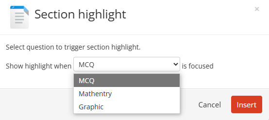
While editing the Stimulus, select the text that you want highlighted and click on the highlight brush (at the top right of the toolbar)
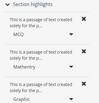
Select the question this highlight refers too:
In this example, the MCQ question is selected
Click insert
Repeat for all questions as required
Review all highlights using ‘Section highlights’
Save
Important note: for highlighting to be achieved, the Stimulus must be created as a Document.
As we near the end of the first academic year using the Newcastle University Learning Analytics (NULA) system, we’re taking a moment to reflect—and we want to hear from you.
NULA was introduced to support teaching and learning by giving colleagues greater insights into student engagement and progress. Over the past year, colleagues across the university have used the platform to inform tutoring conversations and connect with students in more meaningful ways.
Now, your feedback will help us understand what’s working, what could be improved, and how NULA can be better used to support students moving forward.
Share Your Experience
We’ve created a short survey (it takes less than 10 minutes to complete) to gather your thoughts. Whether you’ve used NULA extensively or only briefly, your perspective is incredibly valuable.
Your responses will directly influence how NULA evolves. We’re committed to ensuring the system continues to meet your needs and enhances the learning experience for all – thank you for taking the time to contribute.
What’s Next for NULA
We’re excited to share that several important developments are on the way:
Student app launch – September 2025
The student-facing version of the NULA app will be available for the start of the 2025/26 academic year, designed to give students greater insight into their learning and engagement. Dedicated resources for student will be made available on the Academic Skills Kit website.
New data sources for colleagues
From next academic year, the colleague-facing version of NULA will include ReCap lecture capture data and Library Reading List data—offering an even more comprehensive picture of student engagement.
These enhancements are driven by your feedback, and we’re committed to ensuring NULA continues to support your work in meaningful and practical ways.
The Inspera Digital Exams Team at Newcastle have set up and led on a user group for Inspera users at other institutions in the UK.
Through existing connections and the support of our Account Manager at Inspera, we have contacted colleagues in similar roles to ourselves (Learning Enhancement and Technology Advisers) to create a group where we can share best practice, learn from each other and have the opportunity to discuss aspects of our Inspera use.
The group first met in November 2024 and as of June 2025 has 33 members across 13 institutions. We have received lots of positive feedback on how useful the group is, and we have enjoyed meeting other fellow Inspera users.
The Inspera Leads at Newcastle are always looking for ways to improve the service our Digital Exams Team can offer and work with Inspera to share feature requests. The group have been sharing what their priorities are in terms of things we would like to see in Inspera so that we can share this with Inspera.
Inspera Priorities at Newcastle
Maddie and Kimberly of the Digital Exams Team, along with some of our academics who use Inspera, took part in some user research with Inspera in relation to marking and feedback.
In relation to marking and feedback, our key priorities are:
Release of feedback restrictions, i.e. flexibility to release essay feedback comments without releasing banks of MCQs.
Editing questions after an exam i.e. where mistakes have been found afterwards upon marking. A request has been highlighted whereby, for auto marked questions, users can use answer key corrections (like the functionality of MCQs) but for all for auto marked questions.
Data availability for questions used in exams. Inspera are currently working on their analytics, with a psychometric dashboard currently available for the Inspera Digital Exam Leads to access.
Other feature requests we support, which are in relation to question authoring, include:
Author tab to include example questions and question sets.
‘Tick box’ to confirm when a question set has been finalised.
Ability to have template of example question sets to share across users.
Being able to collapse sections in assessments to avoid having to scroll up and down when editing one of the later sections.
If you would like to know more about our priorities at Newcastle, you can get in touch with the Digital Exams Team via: Digital.Exams@newcastle.ac.uk.
We believe that accessibility is key to creating an inclusive and supportive learning environment for all students.
Our commitment to accessibility is reflected in the wide range of resources and tools we offer to ensure that every student can engage fully with their studies.
From the Canvas Baseline, which provides essential best practice information and promotes consistency across courses, to Ally for Canvas, which enhances the accessibility of digital learning content, we are dedicated to making education accessible to everyone.
In addition to these tools, we offer training and courses such as the Accessible Documents Training workshop and the Accessibility in Practice Canvas course.
Join us as we explore the various accessibility resources available at Newcastle University and discover how they can benefit you and your academic journey.
Canvas Baseline
The Newcastle University Canvas Baseline outlines the essential requirements for all University modules within the Virtual Learning Environment (VLE). It ensures students receive a core set of materials, including programme-related information and details about learning, assessment, and skills for each module.
The Baseline aims to create consistency across modules, provide clear guidance on available information and resources, and offer a foundation for module development while enhancing student engagement through Canvas.
More information on the Canvas Baseline can be found on the Canvas Baseline pages on the Learning and Teaching Website.
New Courses Guidance
The Get your Canvas courses ready has a checklist section provides a step-by-step guide for preparing Canvas courses. This includes checking your courses for accessibility in both Canvas and Ally.
More information on New Course Guidance can be found on the New Courses Guidance page on the Learning and Teaching website.
Ally
Ally for Canvas is a tool integrated into Newcastle University’s Canvas platform to enhance the accessibility of digital learning content. It automatically generates alternative formats of course files, such as MP3, electronic braille, ePub, and HTML, making it easier for students to access materials in the format that suits them best.
For instructors, Ally provides an accessibility score for uploaded files and offers guidance on how to improve them. This helps ensure that course content is inclusive and accessible to all students.
More information on Ally in Canvas can be found on the Ally for Canvas page on the Learning and Teaching website.
Accessible Documents Training
In this workshop we uncover why accessible practices are so important for our students and colleagues.
The workshop includes short activities to introduce participants to tools and techniques to ensure digital materials are accessible, and includes audience interaction via Vevox.
If you are interested in taking part in this training, please contact: ltds@newcastle.ac.uk
Accessibility in Practice – Canvas Course (Self Enrol)
Learning and Teaching Development Service (LTDS) host an Accessibility in Practice Canvas course. The course provides you with some core information, skills, and techniques for embedding accessibility into your teaching, learning, and work practice, and in making your digital resources accessible to everyone.
Accessibility benefits everybody, not just individuals with additional needs. You can self enrol on the course to complete at your own pace.
Ally is an external tool integrated into Canvas that automatically checks course materials against WCAG 2.0 accessibility standards and provides feedback on their accessibility. It’s important to note that Ally doesn’t evaluate the quality of your course content; it simply assesses how well the content meets accessibility standards.
This video provides an overview of Ally in Canvas and how it works within our Virtual Learning Environment:
Alternative Formats
A beneficial feature is that it also enables students to download accessible alternative formats of published module materials, without the need to create and upload these ourselves. These formats are made available with the original file, so students can find everything in one convenient location.
While the alternative formats are created for you, you can, if you want, disable alternative formats for any individual content item for whatever reason (a good example being translated versions of texts on foreign language courses).
Alternative formats made available by Ally are:
Tagged PDF;
HTML;
e-Pub;
Electronic braille;
Audio (text-to-speech conversion);
BeeLine Reader;
Course Accessibility Report
Accessibility Summary
The course accessibility report acts as a complement to the existing accessibility indicators. It provides an accessibility summary and overview at the course level.
The report gives an overall accessibility score for the course, which is an average of the accessibility scores of all course materials. Scores range from Low (0-33%), Medium (34-66%), High (67-99%), to Perfect (100%).
Detailed Feedback
It identifies specific files that need remediation, categorizing them by accessibility score and issue type. This helps instructors prioritize which content to fix first 1.
Guidance and Corrective Actions
The report provides detailed explanations of why certain issues are problems and offers step-by-step instructions on how to fix them.
Instructors can even upload corrected versions of files directly within Canvas.