After a successful site visit, we came together as a group and discussed the different possibilities of creating a digital device. We were inspired by a number of non-digital and digital ideas. We came across ideas such as having a VR hologram projecting the user’s propositions of the development. We debated other potential ideas, like the use of chalk to make graffiti visualisations on a surface that could show the user’s proposals but chose to keep a more digital approach to our final project because we considered the non-digital ideas to be less suitable for our users.
At first, we thought of making a QR code. The idea was that the code would be scanned by the users which would lead them to a government related website with information about the current development site. We knew this idea would appear quite late during the planning process and thought it might have an affect on the user’s propositions. We were also worried that the website would provide too much information at once for the users which would not be easy to understand nor enjoyable to read.
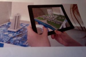
The second concept we were trying to develop was an app. We thought the proposition of an app would allow the users to take part in the planning process at an earlier stage, therefore giving time to the Council and developers to consider the user’s propositions. The app would work like a visual interface. The app will allow for new topics and activities to be created. How does it work? Well, once the app is opened, a plot of land would show up on the screen. Through its tools, the app would support a large variety of subjects, like inserting different types of infrastructures or ponds onto the plot of land. A dragging feature would allow the plot of land to be filled with houses, schools, parks, roads, shops. These would be designed through Sketch Up (One of our design software’s) and then integrated into our app with the help of our technician. We want these animated features to reflect what the users want to see in the new development like leisure centres, open spaces and well linked roads. We also suggested that the app would have a share button indicating that the user designs can be commented on by other users, or shared with developers and the community and downloaded for future use. This is where we have got to so far, next week we’ll be looking into more detail about our concept while discussing it with our project mentor.
