Why:
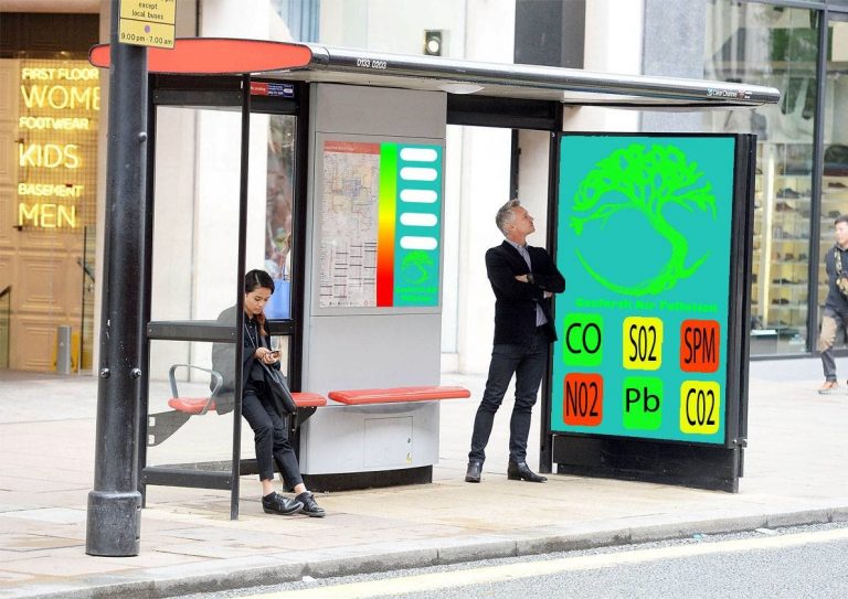
- Bus congestion a major concern towards air pollution levels
- Targets pedestrians along the street, public transport users at the stop, users already on the buses when they stop, cyclists and general Traffic
- Maximise user’s interaction with older less tech savvy still experience this on the street, simple and bite-size to engage the younger generations ACCESSIBLE FOR ALL
- Limited space for installations along the street use existing structures (bus stops), more installations on street level can be a hazard to navigation of the street for the disabled community
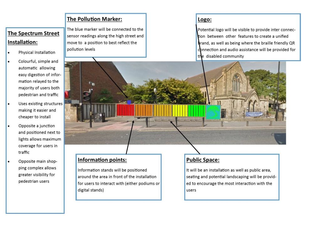
Interactive Display:
- Has options for display and information via pages as well as displaying scale of pollution and connects to the main screen
Logo:
- Changes colour (traffic light system) depending on levels of air pollution or the trees health changes size (leaves lost)
AR Feature:
- Large display double sided with camera fitted to allow AR view of the street (viewing portal) displaying live data along the street, controlled by the interactive display
Air Pollutants display:
- Shows the main 6, displayed in a traffic light colour as indication of the levels (e.g. red being bad) display targets pedestrians (simple navigation for young and old) , public transport and general traffic with bite size information
Accessibility:
- Braille like
- QR codes positioned on side of the display for audio assistance for the blind
- Hearing Aid Channel
Concept ideas:
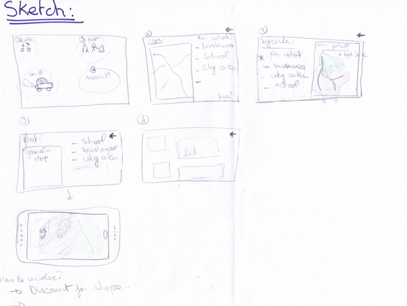
In the first place, the app for phone or computer needs to be simple to use for everyone. For example, in our presentation pages, we can find only four possibilities. Those possibilities are reduced by type of users, and they can recognise themselves by logos or simple draw.
For the first possibility (1), for drivers, there is a map with traffic congestion, like that they can reflect on fact of traffic congestion. In this part, we can ask for what they need to use this road (for businesses, school, go to the city centre). We can put other solution like buses to go there.
The second logo concerned bicycles (2); they can see a map of areas of air pollution and see a map of bicycling lanes and ask for what they need to go through.
The third (3) it for people by foot, they can have a map for safe areas in term of air pollution, ask them for what they need to be there and have like a game with air pollution in reality augmented.
Finally, the part (4) concerning the associations, in this part we can have links of all association concerned by that and involve more people to be connected with society.
In each page, people can go back and like that a people who planned to go in his job by car and finally decided to go by bicycle, so find alternatives.
Weaknesses:
The most weakness of the app it’s it need to have people who use it to have the real statistics on the new data (for what they through this street). But the combination of the app and boards on street can allow us to reach everybody. Only blind persons cannot have a visual of the air quality.
What we learned about other presentations:
There is a group who considered the QR code on streets to have a direct access to information. For our project, we can consider putting QR codes on boards to have a direct link to download the app or view a web page.