Week Log 10 – NUTC

This week we met with Ali, Mark and John who we had decided would be our user testers. We finished our prototype last week so wanted to test it firsthand with stakeholders who could give us an honest opinion on how successful they believe our prototype to be. We completed this test at the civic centre, gaining a lot of very helpful feedback. And decided to leed our user test with the 5 act interview and by giving each one a computer to test and respond with no exterior influence.

Some examples of the feedback were:

  • “We don’t have any strong, clear messages so that’s what I really like, something that’s hard hitting and to the point, talking to driving rather than alternatives.”
  • “Will grab peoples attention”
  • “Directly targets people” – especially the travelling public
  • “Really likable”
  • “Very positive way of reaching out to the people.”
  • “Way of seeing how people feel in a positive sense not just always the negatives”

This was all very helpful as it gave us a lot more confidence in the prototype we have made and it was nice to hear how the council liked our idea and found it believable even thinking of a way they could make our project a reality. The only concerns brought up were the fact that traffic administration people only allow signs in relation to road safety. Although they liked our idea so much they began to think about and suggest to us ways it could become a reality through the likes of roadside signs instead or using modes of transport to display the signs.  

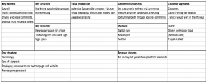
Later in the week we had a workshop on business modelling by Steve Bowden. This  helped us understand how to better our pitch for the proposition of our idea. And taught us how to make a Business Model Canvas.

Business model canvas are based on key partners, key activities, key resources, value proposition, cost structure, customer relationships, channels, customer segments. We figured while doing ours and talking to Steve, that we would have customers (City Council) and users (Heaton Road passers-by) and we could both see our design as a service or product.
Next week we plan to finalise our presentation more, adding the final information with the prototype test feedback, and correct it based on the last presentation feedback, to get it ready ready to present the week after, and to start bringing our blog posts together into a final log for for assignment due dates.


Week 10 – Team 2

This week we began our prototype testing process. We met with Clare Ross, from Gateshead Council at the Civic Centre to show her the PowerPoint presentation prototype of our app for Chase Park. As Clare is one of the stakeholders in our project, it was essential we gained feedback from her for the prototype to ensure we had fulfilled the project goals which were based around the stakeholders’ requests.

Overall Clare responded very positively to our prototype. She was especially impressed with the volunteer hours log section and explained how the volunteers currently use Whatsapp for this, but having this facility on the app would improve communication, make the volunteers feel that they were part of something and make volunteering more sociable. Clare also highlighted that having a public log for individuals’ hours, this could encourage volunteers to complete more hours as it may result in competitiveness. This would have a positive impact on the park and the log could be submitted to the Heritage Lottery Fund as proof of the volunteer hours completed. Clare also gave positive feedback regarding the location service and the ability to share photographs of the park within the app.

Clare only had two concerns about the app. Firstly, she suggested we label the options on the main menu rather than only using symbols; to avoid confusion or doubt of what the symbols meant. Clare also highlighted the obvious issue around safeguarding. Safeguarding is something we need to discuss further as a group and find the most effective way of using security measures within the app without taking the fun out of it.

Clare used the prototype as we intended and we asked her to think out loud as she did. This was useful as we gained feedback from her regarding every aspect of the app. Overall, this prototype test left us feeling positive about our progress but highlighted that we need to think further about the clarity of the visuals and explore the best measures we can introduce for high levels of security and safety.

Our next step will be to hopefully meet with Alan from the Friends of Chase Park to also test our prototype with him and gain feedback from another of our stakeholders.

LOG WEEK 9 – NUTC

This week we focused on getting the prototype test scenes done. Since we do not have the technology of the sensor (to identify the thumb up or down), we chose to do the prototype in a powerpoint presentation, we believe this method will be most efficient to display our ideas and present them in the most realistic and interactive way.

The slides show a scene sequence explaining how our design works and what would be the order we imagined it displaying, starting with a newspaper ad, followed by a street viewer scene and the drivers view of the traffic light. Then the different signs are shown and a voting system in powerpoint allows the user to actually vote as it would happen in real life. Depending of the users choice, a different sign or the Twitter handle will follow.

The scenes were made using Canva, Photoshop and Balsamiq, to create the signs layouts and the slides scenes, and a decision map was made explaining how the order the signs would be shown depending of the vote.

We have arranged to meet with Mark, Julie and Ali to test our prototype and see if they approve of our designs. We plan to do this within the civic centre which will be a fairly formal setting but very appropriate as this is where elections sometimes take place or ballots involving the public. We aren’t planning to ask questions during the prototyping but to explain our ideas more and how did we prepare the presentation so they understand when we expect them to actually interact and vote, so we can let our testers have a play around with our project to get to know it a bit better.

User Test Plan:

We believe our prototype is more a service than an actual device and we expect to find out if our users believe it would be effective for Heaton. We also want to find out if after testing it they agree that it would be a good method to introduce the idea that cycle routes are beneficial.

We know the ideal participants would be Heaton road passers by and residents such as Julie herself. But due to Ali’s wishes for us to keep this out of the public as much as possible, we decided to include her, Mark and third party to test it also.

We intend to start the testing with 5 act interview, welcoming the users, asking what kind of travellers are they, if they normally pass by Heaton road… Then, introduce the prototype, explain what it is and how we expect them to interact (after the scenes start voting). Fourthly, task – get them to carry out tasks on the presentation. Fifth, quick debrief to confirm whether they believe it is effective and would be successful.

For this testing we will only need a computer with the presentation and the users. We believe it will be very accessible and easy to perform the testing.


WEEK 9 USER TESTING

User Testing – Blog 9 

Who will test it?

For our user testing plan we aim to find out both the successes and failures of our design from the key stakeholders in our project. We want to invite Katrina, Nigel and also potentially some youths living in the area whom Katrina may have some connections to, to also invite, as our design is focused around giving the youth an opportunity to explore their area and create a link between them and 250 Philip Street.

Setting

Our test will be conducted in the Wingrove area as this is the base context for our design intervention therefore we would be able to receive genuine feedback of how well the explorer/game works within the setting.

We will need a smartphone for the interface and we thought about including paper charts with factors which we would ask users to rank from high to low, in terms of the games; ease of use, engagement, how well it responds to the brief, the longevity of the game and the overall enjoyment and fun element.

As for team numbers, we decided only 2 or 3 people in our group will take part in the user testing so we avoid the potential for us coming into their community and intimidating the users to respond positively. We want the testing to be as natural as possible as if we were not testing at all, with us occasionally prompting users to ensure we get all our questions answered as Herzum (2016) suggests, for instance:

  1. What would you do next?
  2. How would you use the navigation tool?
  3. Encouraging them to think aloud and ask why they did a certain thing.

We want to achieve “rich verbalisations…by employing relaxed thinking aloud” with the aims of gaining a more insightful response to usability problems and successes (Herzum 2016).

Prior Questioning 

Before testing the prototype however, we want to gain insight into the users’ knowledge of the area now, if they know about events and get involved in them and also their current digital abilities, as some may have little experience with a digital interface. This is one reason why we wanted a simple prototype with obvious navigation features.

Key testing elements

Running briefly through the testing, the participants will engage in the navigation feature and explore their area, completing tasks and activities. We want them to explore the routes and experience the active side to the game. We would also want them to interact with the background features of the calendar, chat, picture albums etc. to determine the success/failures of these as well.

In terms of measures of a ‘good’ design, we want to capture the users view on the ease of use, the durability of the game, and ratings of the ‘fun factor’ etc.

We will document all these through media images, basic charts and stickers, and written statements from users.

We want to ensure the design is a good idea and if it would actually help the community to improve the social connections within the area. The design we are proposing is a unique social explorer into the Wingrove community. At the beginning of our task, the digital scene was scattered with unused Facebook pages, Watsapp group chats and website events. We are aiming to combine all these features and create one interface in which Wingrove residents can check events, interact with one another with regards to these events, with a focusing on the youth as our target users as during our user research many mentioned the need for a youth program in the area. This explorer could be the start of the beginning to bringing the youth into community events, with use of 250 Philip Street, a building which was once a youth club itself.

We want users, particularly the youth, to progress this narrative and allow them to engage with their area through active exploration.

References

Hertzum, M. (2016). A usability test is not an interview. Interactions, 23(2), 82– 84.

Week 9, Team 2

Blog week 9-

This week we looked at user testing in order to provide a successful app. It is important that we get feed-back in order to improve the app for Chase Park users before we submit our final design. When planning what testing would entail, we think it would be useful to get Alan and Ken from Friends of Chase Park, Claire from Gateshead Council and a number of children from Front Street Primary School to trial our prototype which would be in the form of a power point. A way of carrying out the testing would be by conducting a 5- Act Interview. Firstly, a friendly welcome. Secondly, context questions- asking whether they use Chase Park, how often they go, if an app would be relevant to them etc… Thirdly, introduce the prototype, explain what it is. Fourthly, task – get them to carry out tasks on the app e.g. can you tell us an event or find and create your secret group. Fifth, quick debrief, get their feed-back about the app. When using the app and carrying out the tasks stated above we would get them to think out loud in order to understand the process through new eyes. When it comes to carrying out the user testing it will involve myself, Laura and James. Louis was heavily involved with creating and providing the prototype so as a group we feel it best that he isn’t involved in the interview/testing process. In order to make the app realistic for our testers we are going to be using power-point which will show the images of the app. Hyperlinks will be in place to allow movement between the app pages.

Week 9 – Usability Testing

We have been creating our prototype over the last couple of weeks and are now almost at the stage for it to be tested by our client. We have developed our prototype using the online software Marvel. It was fairly easy to use but proved a little more difficult when it came to linking the pages of the prototype together, as some of the questions we have decided to use have a number of different answer options, each of which needed their own individual page.

We also have prepared a list of questions to ask the client during the user testing. These will include what they liked/disliked about the prototype; if they found it easy to navigate and use; if there was anything that they would change etc. We realise now that when we undertake the user testing with the clients, the prototype doesn’t have to be a fully functioning product at this stage of the development process. Furthermore, it doesn’t matter whether they like everything about it because it’s not a finished product yet therefore again it will be useful to gather feedback to improve our prototype.

When it comes to the meeting whereby the client will test the prototype, we need to make sure they receive a friendly welcome to ensure we build a rapport with the users, especially in our case, as not all the team have met the clients before. We need to ensure that we create a friendly environment as the clients we are working with include children of secondary school age, therefore it’s very important that we make them feel relaxed and at ease to be able to be honest and critical of the prototype. This will make it easier to gain feedback and make improvements that they feel will be beneficial to the prototype.

During the user testing we needed to decide what aspects of the website we would test. We’ve decided to only test the game element within our website. We have chosen to do this because it’s the main part of our product and testing all elements would have been unrealistic as we wouldn’t have had enough time to prototype them all. Therefore the blog, events and newsfeed elements of  the website will just be explained to the clients before we begin the user testing with them. We will discuss these other elements with them to make sure that they understand what we envision to include within these other aspects of the website. This includes uploading their own events for the community on the ‘Events’ section of the website.

The user testing will allow us to see how the client uses the prototype and to collect useful feedback about what works and what doesn’t in their opinion. It will also give us the opportunity to collect any ideas the client may have of what we could improve at this stage of development. This in turn will enable us to make alterations to the prototype before we present out final version of it to the client in a few weeks’ time.

Blog 10 – North Tyneside Prototype Testing Outcome

BLOG 10 – North Tyneside Prototype Testing Outcome 

 
On the Thursday the 7th of December, our whole group took the opportunity to meet with Julia (our main client from North Tyneside council), Teresa (our academic mentor), Oscar (mayor of the Youth Council) and Emily (part of the environmental team on the youth council). The aim of this meeting was to allow them to participate in a prototype testing on our website ‘Tyne-vironment’ that we have made using the Marvelapp website. 
 
Overall, the experience of the prototype testing was very positive and our client’s/stakeholders were very happy with the outcome of our prototype. 

·      The digital method – would be a great way to connect with the young people as they don’t come to meetings so the blog would be a good aspect 

·      Liked the range of questions

·      They can see it as a viable option as it can be  put in the monthly meeting for Emily – could be to discuss statistics or change the questions

·      The children’s council could promote this aswell because this is there peers – they will have the right language to use 

·      Really liked how we have encorporated the youth council into the newsfeed

·     Liked how we focused on a single age group (Primary School) as they recognise that is difficult to get one method to be effective from 5-16. 

 
They did provide us some useful criticism as well that we will be using in the next couple of weeks to improve Tyne-vironment in order to make the necessary changes for our final presentation to ensure that we meet all of our clients needs. 
 
The following are a summary of the notes that were taken throughout the prototype testing that we will hopefully work to improve Tyne-vironment in the coming weeks – 
 

·      Little bit wordy for the small children 

·      Could be more information on how to make choices about recycling when they get the wrong answer

·      Legend on the map for the water refill stations

·      In the future, the water refill stations could utilise the logo that oscar’s campaign will have for water refill bottle’s in North Tyneside however they are still deciding on a logo

·      Implementation of things like existing cycle paths on the google maps page

Overall, the meeting for prototype testing with our client was successful and ran smoothly. We were happy with how the meeting went and the outcome of their feedback. 

Moving forward we hope to continue to have a positive relationship with our client’s surrounding the development of Tyne-vironment and work to improve the website in order to satisfy their needs. 

week 10 NUDC: User Testing

Hello Again,

This week we had meetings with our stakeholder, Ali Lamb, as well as our technical adviser and academic mentor. Before they started testing our prototype, there were a few points we had to mention; the fact that they keyboard was not fully functioning, only an image, there were aspects we already knew we wanted to add such as the ‘rating other comments’ page and we also asked the users to think a loud throughout their testing. During our meeting with Ali, she noticed some alterations we could make to further improve our prototype, but also the details that she liked, for example the fact that the reward sticker reinforces brand identity for Streets 4 People. Her suggestions for improvement included changing the language we used on our introduction page from “there will be” to “one idea is” to suggest that the plans are still negotiable and to add more images of the before and after photos from different perspectives to give the user a clearer idea of the changes. She suggested having overlayed before and after photos and having a ‘slider’ function to make the changes more obvious. From our observations of her use of the prototype, we noticed she did not see the zoom button on the before/after photos which we later pointed out to her. In our meeting with the technical adviser, Delvin Varghese, we mentioned this issue and he recommended making our buttons look more ‘clickable’ by giving them an embossed look.

Other alterations Delvin suggested included changing the colour of the blue text on our introduction page as over the green part of the background it gets less readable, rephrasing the text about stickers and the age question to be clearer and using an ios layout as people already know where to look for back/exit buttons etc making it more easily navigated by first time users. One important point that Delvin got us to think about was the sustainability of our product, where does the data go to, how can the JRA use it to benefit them and can it be adapted in future.

In our meeting with Sean, he initially presumed that the product was meant to be an app as we were presenting it on an ipad; this is something we noted to specify in our final presentation, that the finished product would be on a larger screen attached to a plinth. Aside from this, we carried on discussions about sustainability and what questions we may be asked at the end of our presentation but Sean didn’t have any new suggestions for changes.

In future, during user testing we could think about writing a script for an introduction to the prototype, however, in this situation we already knew the users and they had heard what our prototype was. We had agreed not to given them too much information beforehand what the prototype would ask or how to use it as we wanted to make sure the instructions were clear and it was easy to use.


9) TRECC – User Testing

The goals of our prototyping sessions is to gain critical information from our stakeholders on their opinions about our app design. The most important thing being whether they think the design has fulfilled our project brief and do they think it would work in practice. From here, we can add or take away any features they think as they are more knowledgable and because we have been working so closely to this app for a while we may have missed some vital elements.

We created a script that would be asked to all stakeholders so that the information we received was in some way structured and we could easily compare the comments. Here is a copy of our proposed questions:

  1. Does the prototype do what it’s supposed to?


  1. Does anything distract you or get in their way?


  1. Does the navigation path work? (Can users find what they’re looking for?)


  1. Do you think this fits the target market?


  1. Is anything confusing or unclear?


  1. How likely or unlikely would you be to recommend the finished product to a friend or college?


  1. How would they describe this product using their own words?


  1. Does this app solve the problem?


  1. What, if anything would you change?

We first of all get the basic questions out of the way and then we see if it is practical to use and easy to navigate. The usability sessions are needed to highlight if anything is unclear to the average user as we need to make is as user friendly as possible.

In the session, we would start off by introducing screenshots printed on A3 to give an outline of the features of the app and the design aesthetics. Also, we would show them how the app would be accessible in daily life by showing them the poster we designed with the QR code on. We would explain how this would be posted through letters boxes juts like they do every time there is a community consultation meeting. However, highlight this would minimise paper because from there the app allows notifications of new developments. This task is so they can see everything together to see if anything stands out immediately.

Following on from this we would then pass them a phone with the app loaded as any other user would see and give them tasks to reach certain pages. This would tell us how the app performs and makes it easy for them to express if they get stuck at any point. In the session, we would try and follow the questions so there is structure and they don’t go off on a tangent. It is also to ensure that the conversation is relevant. Our sessions will be private so that it is not too noisy so we can properly explain and can have a conversation with no distractions.

In terms of the 5 act interview from the Sprint Book, we would have already done a friendly welcome as we greet them at the meeting place and we will start to introduce the prototype with the A3 paper. The questions will follow merged with the tasks and the debrief will come at the end concluding the session.

Week 10 Cycle stakeholder forum

Cycle stakeholder forum week 10

During these 10 past weeks we’ve been working on this design project. It’s been challenging in many ways, such as working in a group and finding the time to work on the project, because as it turned out it takes a lot of time discussing, sketching and compromising to get to where we’re at today. The stakeholder interviews were very important in the design process since that’s where we got to interact with them and get a clearer picture about how they would like the product to work and what their expectations were. It is important to take the time to do all these things, even though it’s hard sometimes, in order to develop the prototype. After having our final meetings with Heather and Mark this week to show them the prototype, we learned that even though we put all this time into the design there is still some factors in the design that is hard to understand/get around. This showed us how important it is to have regular meetings with the stakeholders during the design process in order to get the design as good and easy to understand as possible.

Digital civics for us is about discovering ways in which we can use technologies to promote individuals participation in services, such as our projects with the Newcastle Cycle Stakeholder Forum.During this process we’ve been attempting to find digital solutions to a complex problem but doing so in a way that does not over complicate the already existing problems in the forum.

If we had an extended timeframe in this project we would begin by having more in depth stakeholder meetings with a wider range of stakeholders in order to really pinpoint and discover other key issues in the cycle stakeholder forum. This would then allow uss to add more detail to our prototype and add new features to it so that its a much better example of how our website would work and how users would interact with it, which currently our prototype does not accurately represent many of our websites features. Parallel to this we would run more user interviews with our stakeholders to make sure our site is interesting, clear and easy to navigate. if we had more time we would also focus on developing the prototype to a higher standard, so that it operates in a much more realistic way, like allowing our users to place pins on the map and be able to play around with the website’s features in a more interactive way.