SIA Week 2 Log

This is the second log by SIA for the Wingrove project. This week we met with Nigel Todd who is a local resident and City Councillor, as well as Chair of the Greening Wingrove CIC and Secretary of the WEA Green Branch. The WEA Green Branch undertakes activities such as courses and workshops that can help community groups understand sustainability and work better as a community. With his various roles, Nigel gave us a greater insight into the project and helped us understand what aims and goals the WEA Green Branch has for the task.

This week we made a mind map that discusses all the different stakeholders involved in the project and the various links between them.

Mind map:
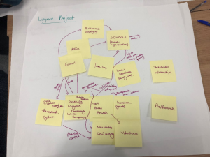
 We began by naming the main stakeholders such as families, local residents, community organisations and WEA Green Branch, then branching off from these, connecting in other local groups. We discovered that the WEA Green Branch would have a link with the Greening Wingrove Community Interest Company and also with investors (who provide grants for events and developments). Volunteers and students from Newcastle University were also interlinked within this group as they would help provide support for many of the events done by WEA and Greening Wingrove. Another connection was found between the WEA and schools in the area, as education centres are a central hub for community connection. We felt having schools as one of the key stakeholders would help disburse information more effectively. Lastly, from schools there comes a link with families, the police, businesses and the council, therefore creating a bridge between the different interest groups within the area.

Stakeholder Groups:

Below are the three main stakeholder groups (the council, local residents and community organisations) we have found for the project:
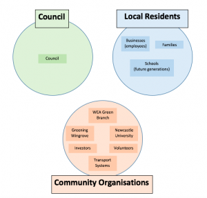
In order for the project to be a success, each group’s wants and needs must be taken into consideration. Therefore communication with the three will be very important when working on the project.

Indicative Project Aims:

After speaking with Nigel, we found that the primary focus of the project was to develop ideas for community uses of the new buildings on Arthurs Hill Terrace. He mentioned existing ideas included a café, offices and potential for a music studio in part of the building. There was also a plan for rooms in the building to hold children’s activities and youth projects. However, the council and community organisations were open to any new/different ideas. Finding ways of enabling neighbours to get to know each other and feel comfortable about interacting is another of the key project aims. From the talk with Nigel it is clear that finding an appropriate use for the building will be a key stepping stone in creating public togetherness and community cohesion in the area.

There was also discussion of creating a digital platform for locals to interact with each other and finding a platform (such as an app, website, etc.) that would be suitable for everyone.

 Next steps:

During the discussion, questions of how we could involve as many people as possible in the project arose, as it is unlikely every user or stakeholder group will agree on the outcome of the renovation idea or digital platform. Nigel himself did hold some reservations towards a larger digital platform, as different groups in the community may exploit it by uploading or sharing inappropriate or negatively opinionated content. At this stage with his hesitance, collecting user research from the local residents would be a natural progression.

Therefore, out initial next steps are to visit the Arthurs Hill Terrace building and the area of Wingrove in general. We are planning on going to the open day at the Arthurs Hill Terrace building on the 16th February where the future use of the building will be discussed. Visiting the area and building will help us collect user research on possible uses of the building and find out which digital platforms locals would be interested in for information distribution and social connections. It will also enable us to get a better insight into the project as a whole, understanding the people and area we are working with.


SIA Weekly Log 1


Week 1 Log (Wingrove Connected Digital Neighbourhoods):

Social Interactive Agency
Members: Sophia, Tham, Alex and Zhaodong

This is the week 1 blog done by Social Interactive Agency for the Wingrove Connected Digital Neighbourhoods project. Social Interactive Agency consists of Sophia, Tham, Alex and Zhaodong. Our group has a range of different skills and backgrounds, with the group having both urban planning and architecture and planning students. We also all bring different skills to the group such as creative visualisation, planning knowledge, research and analysis and collaboration. We feel as though these different backgrounds and skills will help with the project as we will have different ideas for tackling the issues and this will help produce the best outcome.

The project allows us to connect with a real neighbourhood and enables us to use what we have learnt whilst being at university in practice, such as designing for public engagement, planning to improve community organisation and improve environmental awareness as well as practicing sustainability. Being able to meet with clients and listen to their requirements needed in order to enhance the planning and organisation of the area is another aspect which will be invaluable experience for future client interaction and meeting client briefs.

The Wingrove Connected Digital Neighbourhoods project has the aim of enhancing neighbourly cohesion in order to create new public awareness of new developments happening in their locality and improving environmental and social sustainability locally. By creating a local social platform for users to post on and respond to, the project will not only expand the efficiency of data and information distribution, but also connect their area into an integrated and tight-knit group.

Neighbourhood activity and communication is a vital part of modern social life. Digital civics allows for easier and faster distribution of information, response to issues and a flourishing social hub of interaction.

We believe having Creative ideas is the key to the solution, and with technology we can fulfil the need of client directly. This project requires a lot of responsibility and time. This week we had a conversation relating to social interaction and we came up with an official group name. We want our project to be done professionally and expecting to further our career of this project in the future. We are confidently saying that Digital Civic is an important fraction in planning as now we have step into technological world. Therefore, we will be focusing toward the quality of the outcome by utilise our existing resource such as social platform for the best solution and importantly, it is free of charge. However, we must’ve considered minimising our budget in this project and ensure it is low-risk but high returns as in case this project require an extra money.

Initial questions:
• What are the current major downfalls of how they connect and share developments as a neighbourhood?
• How actively used is the current Facebook page for Sidney Grove and how many people currently use it?
• How would we initially promote our prototype so that locals know it is there?
• What can we do to ensure that only locals have access to the model?
• When would we carry out market research?
• How often do they have interaction with each other?

Week 1 Blog – Team 2 – Chase Park

Hello,

This is the first of our blog’s for our project, ‘Engaging Young People with Video’, with our focus are being Chase Park. We are a team of four, Laura, Kathryn, Louis and James. We believe that the four individual skill sets we possess will allow us to work effectively as a team. We believe that, together, we can produce a successful project and also learn and develop new skills from each other along the journey. Between us, we believe we have strong presentation skills, creativity, great organisation and a useful understanding of the digital world.

We chose the Chase Park project as, the use of video in the planning world is something we all found innovative and wanted to learn more about. Furthermore, the project itself is something, as a younger generation, we feel we are informed on and potentially have an advantage when deciding what does and does not work.

The stakeholders in our project are widespread from Gateshead Council, to the Friends of Chase Park Group to Front Street Primary School. We are excited to meet the stakeholders as we feel they can give us a more informed idea of what is required of us and how we can meet expectations.

The main aims of our project include

– Making the park a more attractive place to visit, central to this we will explore the vandalism problem currently in the park
– Making the park accessible to all age groups, ensuring no group feels they are unwelcome there
– Using video to express our ideas and encourage the surrounding community to make the most of their available green space

The next step in our process is to meet the stakeholders. We are intrigued to find out more about the park itself, the community it serves and the priorities the community have for their park. We believe this next step will leave us in a better position to make our plan of action for the project.

Week 1 Log – NUTC

Hi, this is our week 1 blog for the project “Digital visualisations for transport scheme engagement (focus on Heaton road)”, which is being done our group Newcastle University’s Transportation Committee or NUTC, which consists of 3 of us, Kim, Sofia and Gabriela. We are from different countries and have therefore different ideas of planning and are able to have a wider range of background knowledge from many places, which we think could be an advantage for us in this project as we may be able to benefit from our different lifestyles and come up with a range of solutions that would be beneficial in many different parts of the world. The skills we bring to this project vary between organisation, planning, research, visualisation/ creativity, analysis and communication. We chose this particular project as we found it particularly interesting as we all have taken an interest in transportation and in developing a sustainable infrastructure, hoping to create a more beneficial environment for the locals.

Aims

Our project is based in the location of Heaton Road, its objectives is to create less parking spaces along the roadside in preparation for a bicycle route along the road in which would create a safer environment for pedestrians. As it is the first week of the project our aim is to get a better understanding of the clients expectations and be able to identify ourselves as fellow cyclists and understand more the routes needed to link residential areas to more public areas, such as shops or schools. We also believe we need to focus on accessibility, safety, an appealable route and an incentive for people to want to take the route.

To prepare for our client we think we should take a more questionable approach upon the first meeting, to learn more about the project from them to help us gain a greater understanding of the locals and what they would want out of it. After this we believe it would be easier to bring propositions to the client of different approaches we come up with and imagine could be a suitable plan.

Questions for the Clients

  • The sort of questions we currently have are more uncertainties of their preference of formatting of our propositions.

  • Any specifics that should be included within our proposition

  • The current situation for cyclists and pedestrians in the area

  • How connected will the bicycle lane be once incorporated into the road

  • What is the main outcome of the scheme and what is the most important objective predicted

Week 9 – Usability Testing

We have been creating our prototype over the last couple of weeks and are now almost at the stage for it to be tested by our client. We have developed our prototype using the online software Marvel. It was fairly easy to use but proved a little more difficult when it came to linking the pages of the prototype together, as some of the questions we have decided to use have a number of different answer options, each of which needed their own individual page.

We also have prepared a list of questions to ask the client during the user testing. These will include what they liked/disliked about the prototype; if they found it easy to navigate and use; if there was anything that they would change etc. We realise now that when we undertake the user testing with the clients, the prototype doesn’t have to be a fully functioning product at this stage of the development process. Furthermore, it doesn’t matter whether they like everything about it because it’s not a finished product yet therefore again it will be useful to gather feedback to improve our prototype.

When it comes to the meeting whereby the client will test the prototype, we need to make sure they receive a friendly welcome to ensure we build a rapport with the users, especially in our case, as not all the team have met the clients before. We need to ensure that we create a friendly environment as the clients we are working with include children of secondary school age, therefore it’s very important that we make them feel relaxed and at ease to be able to be honest and critical of the prototype. This will make it easier to gain feedback and make improvements that they feel will be beneficial to the prototype.

During the user testing we needed to decide what aspects of the website we would test. We’ve decided to only test the game element within our website. We have chosen to do this because it’s the main part of our product and testing all elements would have been unrealistic as we wouldn’t have had enough time to prototype them all. Therefore the blog, events and newsfeed elements of  the website will just be explained to the clients before we begin the user testing with them. We will discuss these other elements with them to make sure that they understand what we envision to include within these other aspects of the website. This includes uploading their own events for the community on the ‘Events’ section of the website.

The user testing will allow us to see how the client uses the prototype and to collect useful feedback about what works and what doesn’t in their opinion. It will also give us the opportunity to collect any ideas the client may have of what we could improve at this stage of development. This in turn will enable us to make alterations to the prototype before we present out final version of it to the client in a few weeks’ time.

Blog 10 – North Tyneside Prototype Testing Outcome

BLOG 10 – North Tyneside Prototype Testing Outcome 

 
On the Thursday the 7th of December, our whole group took the opportunity to meet with Julia (our main client from North Tyneside council), Teresa (our academic mentor), Oscar (mayor of the Youth Council) and Emily (part of the environmental team on the youth council). The aim of this meeting was to allow them to participate in a prototype testing on our website ‘Tyne-vironment’ that we have made using the Marvelapp website. 
 
Overall, the experience of the prototype testing was very positive and our client’s/stakeholders were very happy with the outcome of our prototype. 

·      The digital method – would be a great way to connect with the young people as they don’t come to meetings so the blog would be a good aspect 

·      Liked the range of questions

·      They can see it as a viable option as it can be  put in the monthly meeting for Emily – could be to discuss statistics or change the questions

·      The children’s council could promote this aswell because this is there peers – they will have the right language to use 

·      Really liked how we have encorporated the youth council into the newsfeed

·     Liked how we focused on a single age group (Primary School) as they recognise that is difficult to get one method to be effective from 5-16. 

 
They did provide us some useful criticism as well that we will be using in the next couple of weeks to improve Tyne-vironment in order to make the necessary changes for our final presentation to ensure that we meet all of our clients needs. 
 
The following are a summary of the notes that were taken throughout the prototype testing that we will hopefully work to improve Tyne-vironment in the coming weeks – 
 

·      Little bit wordy for the small children 

·      Could be more information on how to make choices about recycling when they get the wrong answer

·      Legend on the map for the water refill stations

·      In the future, the water refill stations could utilise the logo that oscar’s campaign will have for water refill bottle’s in North Tyneside however they are still deciding on a logo

·      Implementation of things like existing cycle paths on the google maps page

Overall, the meeting for prototype testing with our client was successful and ran smoothly. We were happy with how the meeting went and the outcome of their feedback. 

Moving forward we hope to continue to have a positive relationship with our client’s surrounding the development of Tyne-vironment and work to improve the website in order to satisfy their needs. 

Blog 8 — North Tyneside

Reflecting on our design going into the the prototyping stages, it is evident that we may have overestimated how technical we could make our website. Originally we were looking at having an interactive game where you can scroll around the North Tyneside area and play along with in game challenges – it is now clear that we will not be able to design and create such a complex website. From this we have learned that design isn’t just a good idea, but also being able to fulfil. Now we are focusing on keeping the core principles of our design but making it more feasible and less design heavy. By doing this we should be able to have a sharper end product with less hiccups which should in turn create a better output for the end user. One thing that we have decided to stick with however is the website, as we can link it through the school as previously stated. We believe that this gives us the best approach to creating the most convenient and suitable channel to reach the young people and build a clear point of reference for where our digital prototype may sit. For us as a group digital civics has allowed us to from a new mindset in terms of planning and how we can use platforms to make a change on a more modern level that engages with a younger generation – something that is currently fundamental as we see a lack in interest from younger people with regards to their community. In addition digital civics has given us an opportunity to engage with stakeholders which is something new to all of us, and has therefore given us a new insight into something that we will come across in our planning careers. If were were to have had more time during the process of our project I think it would’ve been very beneficial to meet up with the stakeholders on a more frequent basis. Although this may be difficult, we believe that this would have provided a larger insight into what exactly our stakeholders want and in turn improve our final design. Finally another possibility with additional time would’ve been a more complex final output, and even though we still have time to do this, with an additional few weeks (like anything) we could’ve provided something that perhaps tackled more environmental problems within the Tyneside areas.

week 10 NUDC: User Testing

Hello Again,

This week we had meetings with our stakeholder, Ali Lamb, as well as our technical adviser and academic mentor. Before they started testing our prototype, there were a few points we had to mention; the fact that they keyboard was not fully functioning, only an image, there were aspects we already knew we wanted to add such as the ‘rating other comments’ page and we also asked the users to think a loud throughout their testing. During our meeting with Ali, she noticed some alterations we could make to further improve our prototype, but also the details that she liked, for example the fact that the reward sticker reinforces brand identity for Streets 4 People. Her suggestions for improvement included changing the language we used on our introduction page from “there will be” to “one idea is” to suggest that the plans are still negotiable and to add more images of the before and after photos from different perspectives to give the user a clearer idea of the changes. She suggested having overlayed before and after photos and having a ‘slider’ function to make the changes more obvious. From our observations of her use of the prototype, we noticed she did not see the zoom button on the before/after photos which we later pointed out to her. In our meeting with the technical adviser, Delvin Varghese, we mentioned this issue and he recommended making our buttons look more ‘clickable’ by giving them an embossed look.

Other alterations Delvin suggested included changing the colour of the blue text on our introduction page as over the green part of the background it gets less readable, rephrasing the text about stickers and the age question to be clearer and using an ios layout as people already know where to look for back/exit buttons etc making it more easily navigated by first time users. One important point that Delvin got us to think about was the sustainability of our product, where does the data go to, how can the JRA use it to benefit them and can it be adapted in future.

In our meeting with Sean, he initially presumed that the product was meant to be an app as we were presenting it on an ipad; this is something we noted to specify in our final presentation, that the finished product would be on a larger screen attached to a plinth. Aside from this, we carried on discussions about sustainability and what questions we may be asked at the end of our presentation but Sean didn’t have any new suggestions for changes.

In future, during user testing we could think about writing a script for an introduction to the prototype, however, in this situation we already knew the users and they had heard what our prototype was. We had agreed not to given them too much information beforehand what the prototype would ask or how to use it as we wanted to make sure the instructions were clear and it was easy to use.


9) TRECC – User Testing

The goals of our prototyping sessions is to gain critical information from our stakeholders on their opinions about our app design. The most important thing being whether they think the design has fulfilled our project brief and do they think it would work in practice. From here, we can add or take away any features they think as they are more knowledgable and because we have been working so closely to this app for a while we may have missed some vital elements.

We created a script that would be asked to all stakeholders so that the information we received was in some way structured and we could easily compare the comments. Here is a copy of our proposed questions:

  1. Does the prototype do what it’s supposed to?


  1. Does anything distract you or get in their way?


  1. Does the navigation path work? (Can users find what they’re looking for?)


  1. Do you think this fits the target market?


  1. Is anything confusing or unclear?


  1. How likely or unlikely would you be to recommend the finished product to a friend or college?


  1. How would they describe this product using their own words?


  1. Does this app solve the problem?


  1. What, if anything would you change?

We first of all get the basic questions out of the way and then we see if it is practical to use and easy to navigate. The usability sessions are needed to highlight if anything is unclear to the average user as we need to make is as user friendly as possible.

In the session, we would start off by introducing screenshots printed on A3 to give an outline of the features of the app and the design aesthetics. Also, we would show them how the app would be accessible in daily life by showing them the poster we designed with the QR code on. We would explain how this would be posted through letters boxes juts like they do every time there is a community consultation meeting. However, highlight this would minimise paper because from there the app allows notifications of new developments. This task is so they can see everything together to see if anything stands out immediately.

Following on from this we would then pass them a phone with the app loaded as any other user would see and give them tasks to reach certain pages. This would tell us how the app performs and makes it easy for them to express if they get stuck at any point. In the session, we would try and follow the questions so there is structure and they don’t go off on a tangent. It is also to ensure that the conversation is relevant. Our sessions will be private so that it is not too noisy so we can properly explain and can have a conversation with no distractions.

In terms of the 5 act interview from the Sprint Book, we would have already done a friendly welcome as we greet them at the meeting place and we will start to introduce the prototype with the A3 paper. The questions will follow merged with the tasks and the debrief will come at the end concluding the session.

Week 10 Cycle stakeholder forum

Cycle stakeholder forum week 10

During these 10 past weeks we’ve been working on this design project. It’s been challenging in many ways, such as working in a group and finding the time to work on the project, because as it turned out it takes a lot of time discussing, sketching and compromising to get to where we’re at today. The stakeholder interviews were very important in the design process since that’s where we got to interact with them and get a clearer picture about how they would like the product to work and what their expectations were. It is important to take the time to do all these things, even though it’s hard sometimes, in order to develop the prototype. After having our final meetings with Heather and Mark this week to show them the prototype, we learned that even though we put all this time into the design there is still some factors in the design that is hard to understand/get around. This showed us how important it is to have regular meetings with the stakeholders during the design process in order to get the design as good and easy to understand as possible.

Digital civics for us is about discovering ways in which we can use technologies to promote individuals participation in services, such as our projects with the Newcastle Cycle Stakeholder Forum.During this process we’ve been attempting to find digital solutions to a complex problem but doing so in a way that does not over complicate the already existing problems in the forum.

If we had an extended timeframe in this project we would begin by having more in depth stakeholder meetings with a wider range of stakeholders in order to really pinpoint and discover other key issues in the cycle stakeholder forum. This would then allow uss to add more detail to our prototype and add new features to it so that its a much better example of how our website would work and how users would interact with it, which currently our prototype does not accurately represent many of our websites features. Parallel to this we would run more user interviews with our stakeholders to make sure our site is interesting, clear and easy to navigate. if we had more time we would also focus on developing the prototype to a higher standard, so that it operates in a much more realistic way, like allowing our users to place pins on the map and be able to play around with the website’s features in a more interactive way.