5) TRECC- sketching concept ideas

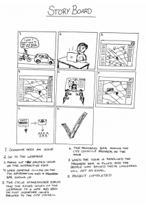
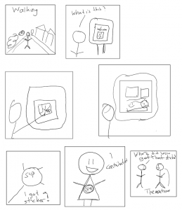
Hi, this week our group moved on from the ‘mapping’ section and began the ‘sketch’ section of our design sprint. We considered all the example research we had done, and thoroughly examined the summary notes each individual had made on their example readings as shown in blog 4. For us, it was also very important to consider the feedback we had received from client and mentor meetings (Nigel and John, Peter, Shelia, and David) which has been summarised in previous blog posts. The clients represented all the users we will be attempting to reach with the creation of the app, so, because different members of our group met with different clients, we then each acted as a facilitator for the opinions and interests of that user group. We had, firstly, come up with individual sketches based on the examples we had personally found and the feedback we had personally received from whichever client we met with. Here are some of the examples of our individual sketches:

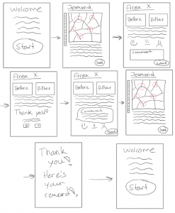
 All of the sketches show we are designing a mobile based application, for easy accessibility and to modernise the process of community involvement, for which a profile home page will be needed. The most vital part of the app will need to be the uploaded content, that the developer provides, for the community to assess and comment on- an action that all of the individual sketches included. The developer can then see these comments, respond to them, and include them in their ‘statement of community involvement’ that they provide to the council. This way, the community can read any documents or images that would have normally only been available at the meetings and feel they are engaging directly with the developer- without having to attend the meeting, which is the main focus of people we are aiming this app at. One of the sketches includes a element of education within the app; to explain the process of community engagement, why is it important and what the pre-application stage involves. This could be important for including ‘harder to reach’ members of the community who may not understand the logistics or need for planning application consultancy.

In the seminar on 8th November, we then collaborated to come up with an ‘overall’ sketch, which will act as our draft concept for the process of the app- we can fine tune and amend this over the coming weeks as well as we receive more feedback and think of more ideas in order to create a neater, final version for the presentation.

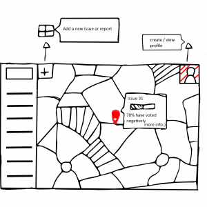
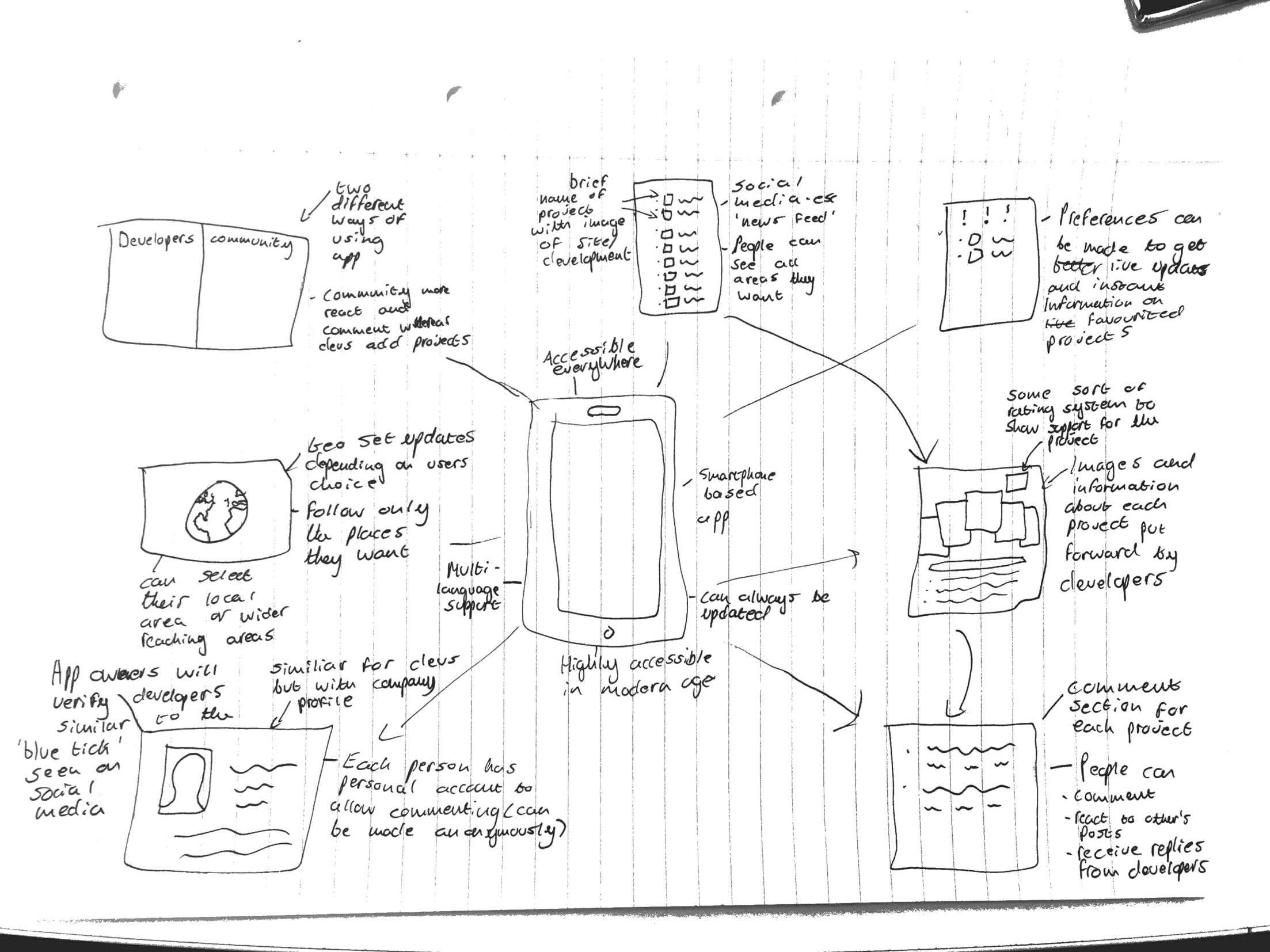
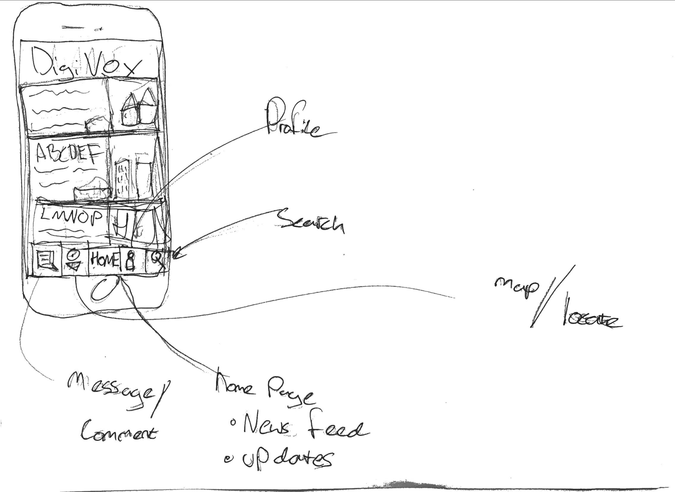
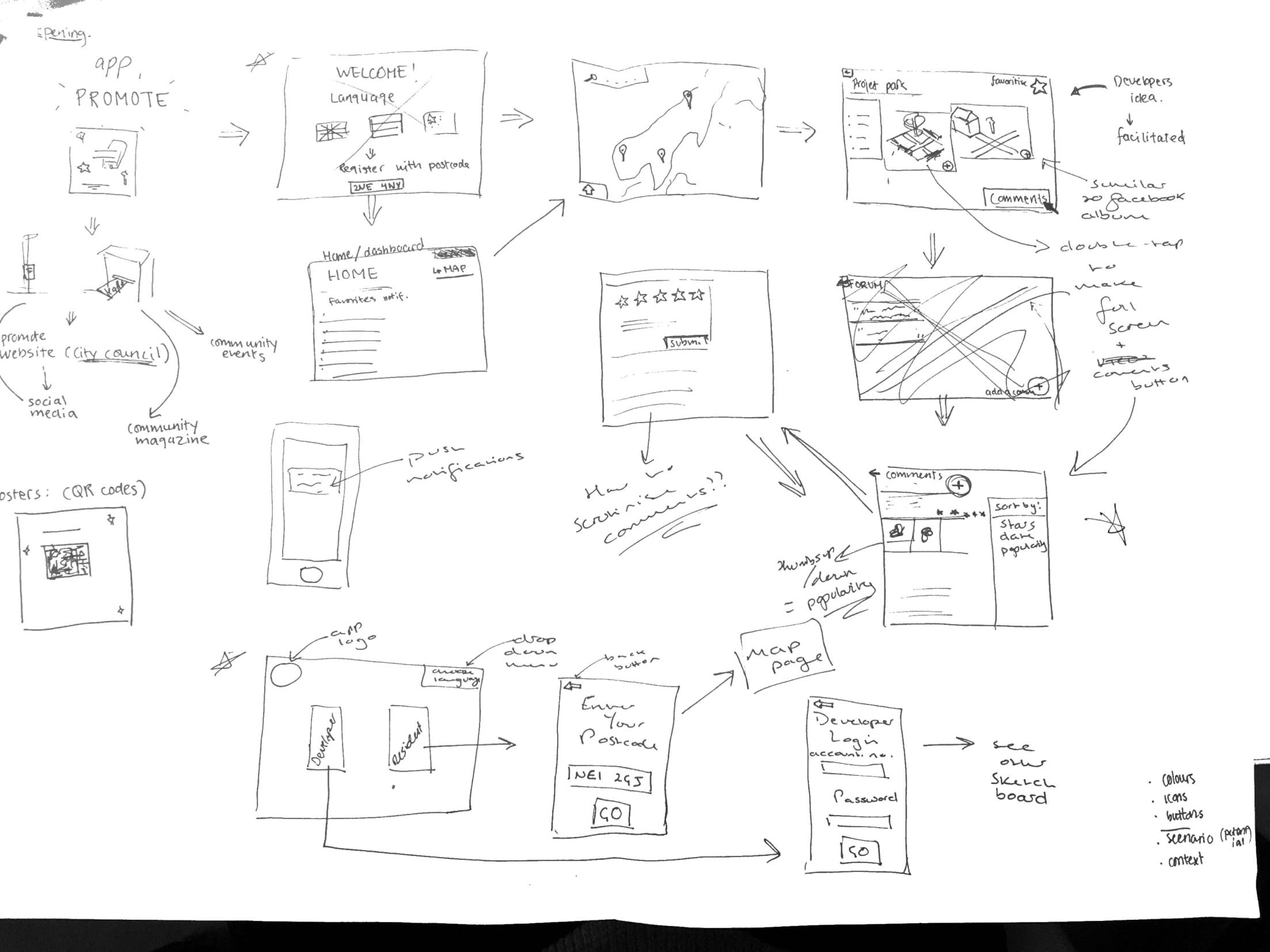
We decided the app would have to be accessible for both the developer and community residents, so would need two different overall sketches, depending on who was using it. Therefore, the opening page of the app would be a selection page where you can choose to access the developer part of the app or the residents part of the app; selecting the developer button will move you to login page where they can enter credentials provided by the council (so only legitimate developers can use it) or, selecting the resident button will move you to a page to enter your postcode, which will then automatically (only upon first login) take you straight to a map page, showing all the developments in the local area surrounding the postcode provided. We also all felt strongly about having a drop down language selection button on the home page, in order to include minority groups living in the area who may fall under the ‘harder to reach’ category.

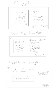
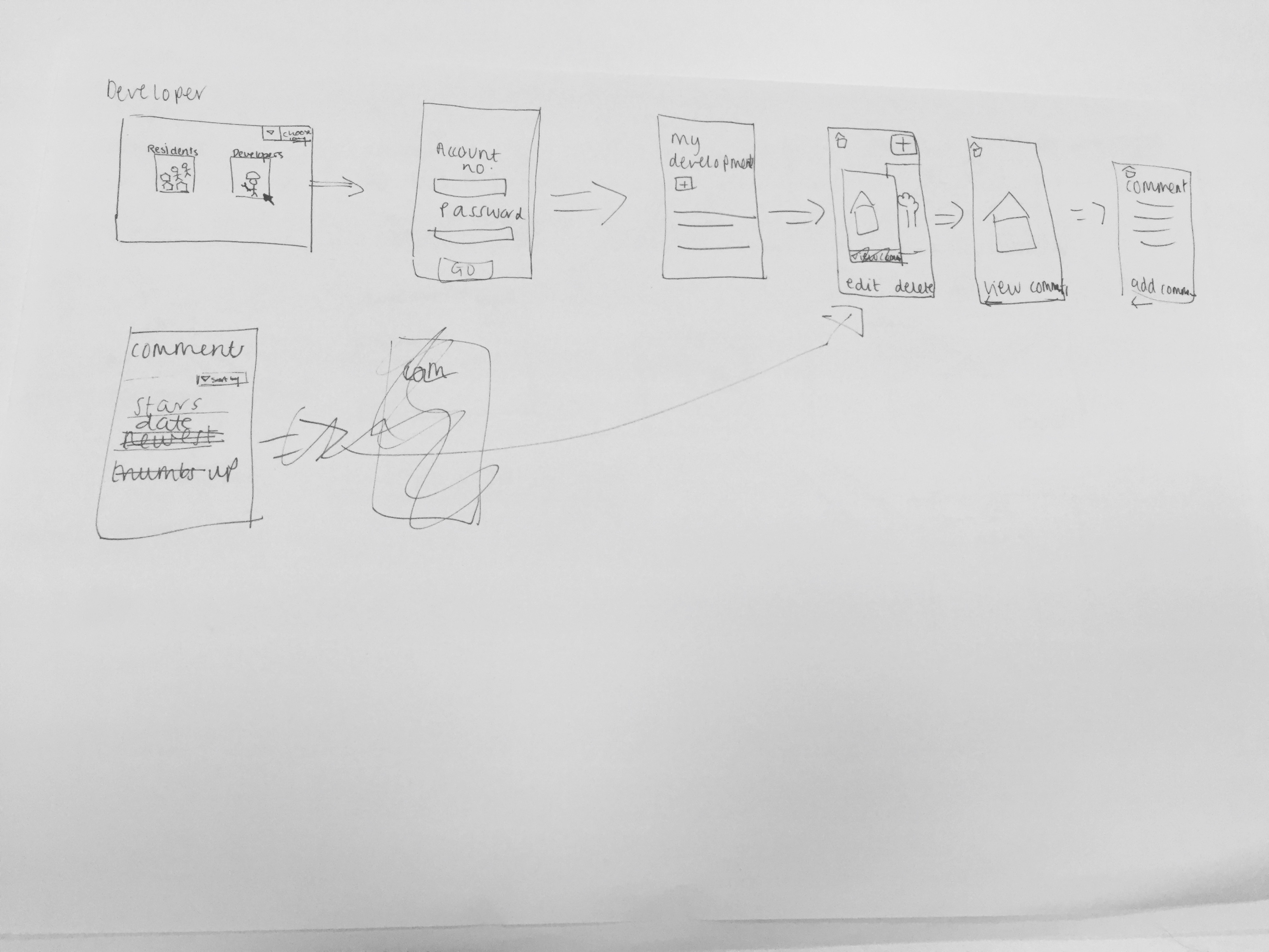
The top image shows the sketch for the developer’s side of the app, so once they login they are taken to a ‘my development’ page, which will contain an overall description of the development and the ability to add, edit and delete documents or images relating to the development. This development page will then be accessible to residents from their side of the app by using the map to select which development page they want to view.

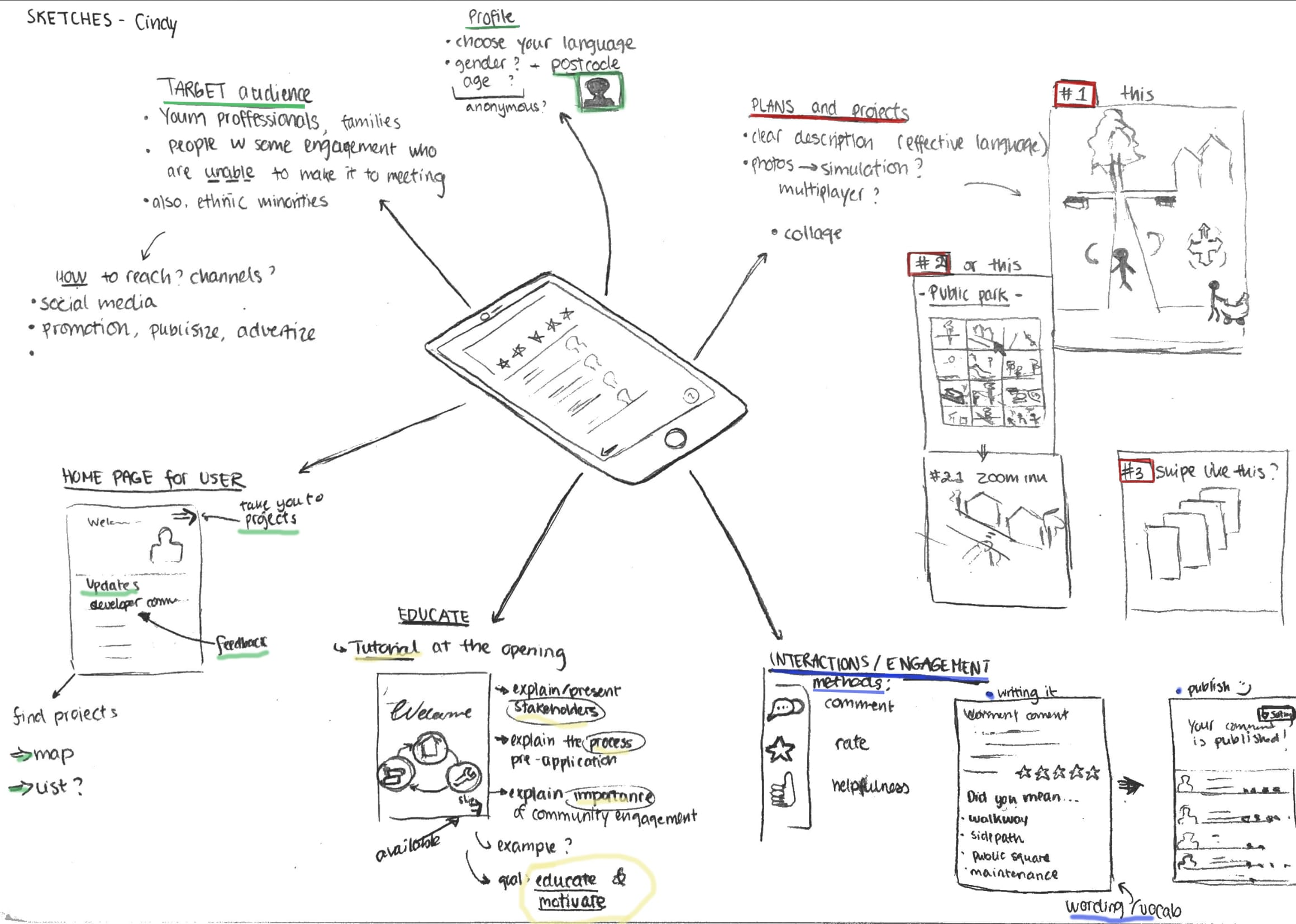
Key features of design:
-Commenting is also going to be available to both developers and residents, in order for them to engage directly with each other. Each document or image will include a 5-star rating system and a comments forum, and the developer can view comments on their ‘my development’ page, with the ability to sort the comments, for example, by number of stars. A thumbs up/thumbs down system will also be added for residents show agreement/disagreement with another resident’s comment, instead of writing their own comment saying the same thing- this will then make it easier for the developer when sorting through the comments as they can gauge which opinions are most/least popular.
Residents can also ‘favourite’ certain developments so updates regarding that development appear on their home page when they log into the app in the future and, if they choose to enable them, will receive push notifications telling them if, for example, the developer has uploaded a new photo into the developments’ document and image album- similar to a Facebook notification when someone you follow uploads a new image.

– The material published about the projects are facilitated by a third party (the app developers)- to reduce bias and increase communication by making the language understandable, clear and neutral.

-Update button is important to ensure that their opinions do not get lost in the process (as complained about earlier), and to ensure that all parties are updated with the most recent opinions and amendments.

Additional features
-There will be language options in the beginning of the app, so that minorities and “harder to reach”  groups have an opportunity to get engaged.

-The graphic and visual design need to be simple to increase readability for the user.

To progress the overall sketch we now need to answer some questions that arose during the seminar- how do we scrutinise resident/developer comments? how do we encourage the developer to upload documents/images to maintain transparency? how to we simplify terminology to make it more accessible to residents? do we include the ‘education’ part of the app?

Over the coming weeks we will constantly refine the overall sketch as new ideas arise and issues become visible during the prototyping stage of the sprint.

6) We Love Bikes: Prototype and StoryBoard

The prototype for our design will include multiple user friendly interactive features that all revolve around improving the accountability and the communication of information of the forum. All these features will be available on a website dedicated to the cycle stakeholders forum.

One of the main features of our website prototype will be an interactive map which shows the location of issues raised involving cycling infrastructure in Newcastle. In this format everyone including new members to the site and forum will be able to clearly see the key issues and problems facing cycling in Newcastle. Users will be able to view the key issues raised in the meetings and also on the website and view comments by other member of the public, members of the forum, engineers and council representatives. Each issue will also show a progress bar showing different colours that indicate whether or not these issues are being addressed by the council and at what stage these improvements are at, this will improve the accountability of the council and show that the issues raised are being used by the council. There will also be markers to show where improvements have been completed by the council from issues raised by the forum to show new members that the forum works and cycling infrastructure is being improved in Newcastle.

There will be an organised minutes section that is set out in chronological order that users can access to see what was brought up at each meeting. Users will also be able to access meeting dates and times. It will also have links to other relevant groups and pages that are relevant to cycling in Newcastle. Users will also be able to create profiles to be able to comment on different issues. They will be awarded points when they contribute to the page which acts as an incentive to do so, this means that individuals can be recognised for the time and effort they put into the forum.

To have a glimpse of our prototype, here is a storyboard that shows how our project could be helpful and how we can use it. The starting point is basically a cyclist facing a problem and who wants to raise it up to the city council.

5) We love bikes week 5 mid term presentation

After the midterm presentation it was made clear that we needed to rethink our design and function of the project. One key point that was brought to our attention was the fact we needed to find some way to improve the accountability of the council to the forum. After research we found a webpage called “Fix my street” that involves an interactive map where people can point out different places in the city that they find problematic, upload images of the issues they find on the spot and also leave a comment where they can describe the issue and also make suggestions for improvements. The council then address these problems and change the status of the issue to fixed so people can see that the council is accountable to these problems.

Another issue that needed to be addressed was that the notes and minutes don’t always get sent out to the forums email list and that the minutes on the internet were not easy to access and not organised clearly. During our research to remedy this  we found an organisational website called Trello that clearly organises information and shows which are the most important issues that need to be dealt with first, software like this would be ideal for the forum so that can rob can see which issues of cycling in newcastle need to be tackled first.

We started to think about how we could make a website that would address these issues raised above. We settled on a webpage due to our user research findings that showed this to be the most accessible format for the communication of information. The main feature of the website would be an interactive map of newcastle that would show all the areas that have been raised as an issue for cycling. Clicking on each individual point would show comments made by the forum and profile users on the site and also show a progress bar that fills when the comments have been addressed by the council and if these issues have been fixed to improve the accountability of the council to the forum which might encourage groups such as the newcastle cycling campaign to engage with the forum. There will also be a way for people to vote on which issue needs to be addressed. We’re choosing this as a feature so that the organization of the issues raised can be improved and rob and other council members can see which areas of newcastle’s cycling infrastructure needs to be improved first. When each issue is selected on the map it will redirect you to a page where there is more information on the issue and an area where you can view comments on the issue and write them yourself. A side note to the website will be a page that clearly and chronologically organises the minutes from the meetings so that people can access these whenever they want in a clear format. We decided to do this as this was one of they key problems that the stakeholders brought to our attention with the minutes from the forum.Users have the ability to create their own profiles on the webpage this will allow them to receive notifications and emails about the progress of projects this is in order to keep people interested in the projects taking place. Users involvement in the website is also rewarded for raising issues and voting on projects users will gain points which will gamify the website encouraging more user interaction. Once users have received enough points the can be redeemed for financial rewards.

4) TRECC Review and Project inspirations

This week we made a lot of advancements from the previous week as we felt we couldn’t really move forward without meeting our mentor. When we met with Peter he guided us on power dynamics as something major we need to consider- do community feel safe expressing their views to a large, intimidating company? Will their voices be heard? Will their views and opinions be twisted? David also expressed concerns over transparency- how much will be released to the public? Will anything be held from public? Regarding the app he suggested a few things for us to consider:

  •  A reference/scrutiny group to sign things off from developers before posting on the site and approve comments from residents before they go live
  • Is it possible to have a framework? Each development is different
  • Developers digitised proposals make it easy for them to gloss over more difficult/controversial parts of the scheme- we need to be aware of that and keep up level of transparency
  • Always going to be controversy and challenge around new developments- has potential to cause more dispute
  • WHO IS YOUR AUDIENCE?

From the meeting and time spent as a group we had began to perfect our ideas and think more in depth about the exact features of our app. Another main point is the we had previously been calling the group of people we wanted to engage with ‘hard to reach’ and from our mid term presentation it was pointed out that how could we engage with all these different groups of people with one app when they all have different needs. We came to the decision that we would be focusing our app on the groups of people that already show an interest in planning but due to current procedures they cannot express how they feel. Now our aim was to focus on people that wanted to engage but couldn’t rather than get more people engaged because you can’t really engage someone if they don’t want to be engaged. From this we had a clear focus and could begin to start thinking of how we would design our app.

Atlanta Community Engagement Playbook:

Inspirations for the app came from literature and ideas around the world and we could really start to get specific in what we wanted. One very helpful literature was about the Atlanta Community Engagement PlayBook which is designed for Atlanta one of the fastest growing cities in USA to engage communities to facilitate constructive engagement and to mobilise community-led development and change. The long-term goal is to offer community associates and service providers a set of actionable practices to achieve greater levels of quality engagement. We selected this as one of our main inspirations as we would be associated more closely with being a ‘service provider’, but some of the principles behind the plays for community associations are what we are trying to include within the app (e.g. creating a community led vision for change; creating an inviting and open platform for community members to rally around; and weaving elements of fun and culture the practice). The long-term goals of the playbook is similar to our long-term goal as we want to create a tool that will actually alter the current practices, however we are going down the route of the app rather than more community based projects. This makes it easier for us to involve all the members of the community that wish to be involved. Some of the action guides provide useful methods for some practices, we have used, and could still use, some of these guides when going through the processes of mapping, sketching, deciding, prototyping, and testing.

Playing with Empathy: Digital Role-playing games in Public Meetings

This literature was a study of the implementation of a game called participatory Chinatown a 3D multiplayer game designed to be played in the physical space of planning meeting in Bostons Chinatown neighbourhood. The reading helped us to understand how role-play can affect the way people understand issues and engage and looks at challenges of extracting player empathy from gameplay to a larger context that can then be studied and implemented. Some features include augmented deliberation like debating while playing as character in 3D virtual world (not necessarily as themselves) enchancing empathy, which is needed for group cooperation. There were high scores at the end for discussion where the discussion moderator asks people (using characters name) on how they felt about results this prompted discussion about competition, trade-off, lack of resources, transportation. Participatory Chinatown demonstrates that role-play can engage players in local issues and motivate engagement. However its making people aware of how the framework acts outside the game when you cannot score points. We used some extractions from this document rather than the framework of the game. Our target audience is not people that have a lot of time on their hands and would not really engage in something that required so much effort as going somewhere and walking around. However from this we learnt that the whole idea of visually seeing something and being able to walk around it and see all elements really helped with engagement. From this we started to develop ideas about a map feature in our app that would allow users to physically see the development locations and scroll around to see exact details. Also the importance of the discussion aspect, in our app rather than promote a huge conversation between everyone which could go off topic we are thinking about more of a news feed of everyone different comments so everyone feels their voices are heard.

Second life:

This idea is advanced logging (collection of data) techniques to capture the interactions of the user with the virtual environment to generate a log i.e. what people look for in a CAD imagine or where they go in a game. This is then brought together to create an approximate estimation of real user interaction with the project in real life. It can produce design ideas and amendments from planners and users of the programme. Second Life gives a running account of user experience with the project as it starts and moves on, giving planners better and more comprehensive ideas for the use of space. Second Life puts users in a virtual world in the place of an avatar or a playable character, users walk through and interact with the space and the objects within it. Users can see how the new development will look or show how they interacted with the old site and information is collected from both. We took a lot of inspiration for this as it really showed that ICT is becoming ever more vital for urban planning in 21st century but there is some worry about more local communities being overlooked in favour of more global and further reaching initiatives so we realised the importance of focusing on the local. From this we decided to make everything user specific so that the community felt that this application had been made for them and tailored to there needs which we had gathered from our stakeholder meetings. But also heavily featured these ICT features that are fairly new and we new we wanted the make something modern and innovative. It showed us that to visualise it there needs to be a feature of the virtual environment we have continually seen pop up to stay with the times.

We look forward to start defining and perfecting our ideas.

Week 6, NUDC: Storyboard sketching

Hello again,

During this week’s lecture we listened to a representative from the group SPACE for Gosforth. What he talked about is very much relevant for our project since the group wants to make Gosforth more amiable for cyclists. However, the area of Gosforth is not a part of the Streets for people campaign which makes it harder for them to evoke change. So while the council aims to change people’s way of transport via physical changes of the streets the SPACE for Gosforth aims to change people’s way of transport through an attitude change first and then physical changes of the streets. When we talked to the stakeholders one of the problem that came up was that the public did not understand why the council was changing the area. We’ve discussed this before and decided that we in our product will add information not just about the planned changes but also about Streets for people.

During the seminar and our meeting we started discussing the outline of our storyboard and user experience as well as starting to draw it. All in all we’re thinking about 7-8 storyboard panels for demonstrating the use of our product. Below is the basic outline sketch of the storyboard.

It is important for us to include the most important uses for our product, informing and gaining feedback, together with the sticker concept as a mean to spread the word. The setting will be outside and since we’re hoping to get a lot of response from students, who to a lesser degree have cars, we don’t think this will be a drawback. We’re also thinking about having a second display with the same software in an inside setting as well, for example in the library.

4) Youth Council group – example search

Digital Civics blog

During last week’s session it became clear that we had one main design concept in mind – a website with an interactive tool to address litter as a social problem. Originally we were going to design our interactive tool in an app, however it became clear that it could be too costly and therefore decided to do it via a website. The website also fits in well with the feedback that we got from the youth council as they said it would be a good idea to put the website link on the school home page, which in turn should generate a larger user group as more young people will be coming across our page on a daily basis and get to a large young audience as we are targeting schools.

The design of the interactive tool itself revolves around being able to go through the North Tyneside area with your mouse on the computer screen. From here young people will be able to gain more of a perspective of where litter ends up i.e. landfill, the ocean etc. There will also be a game that almost takes inspiration off Pokémon go where you can collect points from barcodes off bins and in turn get rewards when you pick up rubbish (this is an minimally developed idea and we are looking into the logistics of it more). We are also hoping to design a ‘North Tyneside of the future’ which will give an outlook on how the area will look if we continue to litter at such a rate, and on the other hand how it would look if we were to become cleaner- we hope that this could encourage behavioural change that will change their outlook on how to treat their local area. Below are a couple of links to show the sort of style we want our website to follow.

https://www.youtube.com/watch?v=Ur9MqboHfhw

https://www.youtube.com/watch?v=v64KOxKVLVg

Although we have a relatively clear idea in mind, we are still yet to get much feedback off the client, and because of this we have been in contact to ask a range of question. Although we are still waiting on a reply we hope that once we get these answers we will be able to shape exactly the direction that our project is going. In addition to this we received feedback during our presentation that it would perhaps be in our interest to look at a wider range of environmental issues which prompted us to think of the possibility of a quiz on the same webpage that young people can fill out, this data can then be collected and returned to the schools – this can then get passed to the youth council who can use this information to benefit them when putting forward ideas to change the area and express young people’s point of view in a more professional manner.

4) Cycle stakeholder forum

After the first meeting with Rob Snowball, we established some specific goals that we reached after interviewing our stakeholders, Rob Snowball, Heather Evans, Rorie Parsons and Mark Nelson. Regarding or long term goals, they haven’t really changed, they are just more precise. We still want to get more involved in the forum, a feeling shared by most of the people we met but our main goal will be to focus on how to make this forum progress.

This idea is divided in two points :

  • First, we need to improve the visibility of the forum, especially on the website which is not very visible. But also help cycling to get a better recognition in the city.
  • Secondly,  to make access to the feedback easier for all the people who attend the forum and also easier to publish it, after Heather has taken the minutes.

Furthermore, we find it useful to improve interactions between the council and the forum.


Products/services/devices that serve as inspiration for our project


Mobile Phone: We chose this piece of technology as it can be accessed by a wide range of individuals due to the popularity of smartphones and the fact that individuals can access information anywhere anytime. In our project it is important that we have a system that can communicate information clearly and can be accessed by a wide demographic of individuals in the forum, we think a mobile phone could meet this criteria.

Computer: We chose this device as it is one of the most effective ways of communicating information between individuals however this device is more accessible by the older generation. This is important as a large portion of the cycle stakeholder forum are of the older generation that might have more access to computers than mobile phones.

Email: Email was recommended to us as a good transfer and display of information by Mark Nelson as a way to communicate the time of meetings and also to supply the meeting notes to a group of individuals. Email newsletters are also simple to setup and use.

Website: A website is an accessible way to present and relay information. They can also be interactive which is important for the cycle stakeholder forum as we need a system in which people can communicate their opinions on different cycle routes around Newcastle.

Week 5 NUDC: Mid-term Presentation

Hello again,

This week started with our mid-term presentation in front of the rest of the class. With some mishaps while presenting we pinpointed things that we should remember for our final presentation in January. We got good response for our example research and were told that we should limit our key requirements a bit. Thinking about this we have now discussed and decided upon our most important requirements to be: easy to use and understand; time efficient and enticing; informational and provide opportunity to give feedback on the planned changes in Jesmond.

For this week’s seminar we continued with a bit more example research but later began talking about gamification which means adding game elements in order to evoke more interest in the users. Gamification is something we talked quite a bit about during our Tuesday meeting and that we want to implement in our final product. One of our biggest obstacles with this thought, however, is the risk of getting poor but high-quantity feedback instead of quality feedback. We tried keeping this in mind when we started sketching out ideas for the design.

One of our earliest design ideas was very basic and not really interesting enough to evoke interest in the users. It basically just showed users the changes and were given an opportunity to comment on them if they wanted to. This of course is the main objective with our product but it isn’t really anything new since it is very similar to Commonplace.

After discussing a lot and sketching out ideas we landed, after many iterations, on a design rather similar to our first one but a bit more enticing and different. As a way to encourage users we introduced the concept of giving out stickers when they were finished using the product. These stickers are both meant as an reward but also a means to spread the word about the Streets for People project as well as our product.

Also during our group meeting, we started creating a user experience flow chart so that we could have a clear idea in our heads of the whole feedback process. This is the most basic visualisation of our concept and from here on we need to start focusing on the small details such as colourways, sizing, stickers etc.

Week 4, NUDC: Mentor Meeting

Hello again,

For week four we had a meeting with our academic mentor Sean. At this point we had already got a good outline of the mid-term presentation which allowed us to go through it with Sean making sure it was efficiently informative of our research. Specifically, we went through our goals for the project along with our prioritization and stakeholders. The meeting acted as a reassurance for us that we were on the correct path. With the conclusion of the meeting we decided that the main stakeholder as the target for the project would be students, tailored for the JRA rather than the council.

Furthermore, the seminar gave us some time to go through relative literature about different digital civics projects. For example, one of the inspirations that we had from said literature was the VoxBox, a playfully nostalgic booth that provided the user with a reward in the form of a simple ball. With the addition of an old phone set with a clunky aesthetic it stood out in public and tapped into the public’s curiosity. This led us to the importance of grabbing the user’s attention before they even become a user of the prototype, furthermore this example showed that there is a lot of freedom available for the design of the prototype that could make it eye-catching and intriguing.