September.. it must be Kielder

As the leaves darken and the weather worsens, the new academic year starts with a bang as 50 students go off grid in Kielder, Northumberland to develop practical mapping and analysis  skills in a realistic setting.

Students from our Geographical Information Science, Surveying and Mapping Science, Physical Geography and Geography programmes spend 9 days collecting and analysing geospatial data using the latest technology.  We are based in the Calvert Trust Centre on the shores of Kielder Water surrounded by trees, midges and (well that’s about it…)

kielder
A fully networked geospatial gym!

Halfway through the fieldcourse, our students are “in the groove” , occasionally hampered by tricky conditions!  Students carry out a mix of detailed topographic survey tasks, DEM creation, Landuse mapping using remote sensed imagery and planning a new residential development site.  We are very grateful to the landowners and people of the Kielder valley who make us welcome each year.  So far, the torrential downpours of 2012 have been absent and conditions have been more benign, but there is time yet…

kielder dam in mist
Tricky survey conditions over Kielder dam

FOSS4G13 – 3 days of peace love and maps

From the 18th to 21st September Phil James and I attended FOSS4G 2013 (Free and Open Source Software 4 Geospatial) in Nottingham. The conference kick started on the Wednesday evening with an Ice-breaker event featuring a pub-quiz following by a light-hearted talk given by Mike Parker, the author of Map Addict. The talk was very enjoyable but the quiz proved somewhat challenging and my sole contribution to my team’s effort being that I knew which animal Friar Tuck is in the Disney Robin Hood. He’s a badger.


P9180726 by barryandjo, on Flickr
Creative Commons Attribution 2.0 Generic License  by  barryandjo  – Mike Parker’s Talk


The conference then truly came to life over the next two days with some great keynote talks. Particular highlights being Chris Tucker from MapStory.org, Tim Sutton from QGIS and Paul Ramsey from POSTGIS who’s sermon on being an open source citizen was one of the best talks I’ve ever been to. These were interspersed with a great selection of talks (some of which are available here ) showing the uses of software as well as outlining releases of new software such as the OpenLayers 3 which looks very exciting.

P9210739 by barryandjo, on Flickr
Creative Commons Attribution 2.0 Generic License  by  barryandjo  Paul Ramsey’s Keynote


The conference was also complimented brilliantly with some great evening events featuring comedy, music and drinks. I would like to thank Steven Feldman and all of the FOSS4G heroes for putting on what was a thoroughly enjoyable event


FOSS4G13 Geohack.

From the 17th-18th of September I attended the Geohack event at FOSS4G conference in Nottingham.  The event was sponsored by the MetOffice in partnerships with many other of organizations within Environmental Science to Services Partnership. A number of challenges were presented for hackers to work on, these are listed here http://2013.foss4g.org/geohack/challenges/ . As part of the LTURF project I have found myself working with a number of APIs trying to extract any information for around Newcastle. This lead me to picking the outdoor event challenge as it was making use of several APIs  http://2013.foss4g.org/geohack/challenges/events/ .

FOSS4G - Challengers presenting - Met Of by aburt, on Flickr

Creative Commons Attribution-Noncommercial 2.0 Generic License  by  aburt– The challenges being presented


This aim of this challenge was to estimate the effect that weather has on outdoor events in the UK.  The first task was to retrieve information about any outdoor events happening in a given location. This was achieved by using the skiddle.com, an events listing website, and their API.  Which allows you to search for events planned using a point and a buffer.  Once we had the events the next goal was to gain an estimate of the number of people attending each event.  This task was assigned to me, and for this I used both the Facebook and the twitter APIs. With Facebook returning the numbers of attending and maybe responses to the event, and twitter returning a popularity score.   The final step was to use Met Office DataPoint API to get the weather forecast of the event.  These were then all integrated into a very simple web portal. This is live here , we had little over 24 hours to complete this task so the portal is very much substance over style.

FOSS4G - Hacking teams working away - We by aburt, on Flickr

Creative Commons Attribution-Noncommercial 2.0 Generic License  by  aburt – Us Hard at work


At 1pm on the second day everybody had to stop developing and then present they work for it to be judged. It was very interesting to see what the other groups had achieved , with some of the achievements being very impressive given the amount of development time. Phonegap, which is a free and open source framework that allows you to create mobile apps using standardized web APIs across many platforms, was used by a number of groups. And is clearly a very powerful tool with some groups having a completed app developed in just 24 hours. Unfortunately my group didn’t finish in the top 3 which I’m certain is only because the complexity of our app was hidden, in short we lost because it was too good.

The event was brilliantly run with plenty of food, drink and electricity to go round and I would like to thank the members of the Met office and the foss4g volunteers for organizing the event.  And Also Steven Citron-Pousty who setup the OpenShift server for our app.

What an Asteroid Belter!

As part of the British Science Festival 2013 being hosted at Newcastle University, researchers, staff, lecturers and students were invited to contribute to a comic being developed and designed by local comic enthusiasts. The comic was officially targeting children between the ages of 8-13, with a view to promoting STEM subjects and science in general. The proposed content of the comic had, you guessed it, a distinctly scientific theme to it, with organisers interested in hearing from those staff members who could fit their work (or at least make it look like their work fits) in to one of the following themes:

  • Robots
  • Explosions and danger
  • Dinosaurs
  • Space, time and travel
  • Very big and very small things
  • Things we eat, and things that eat us
  • Codes, ciphers and hidden messages
  • Heroes and villains
  • Matters of life and death

Some of the work related to networks, connectivity and infrastructure that is currently being conducted within the context of the Infrastructure Transitions Research Consortium (ITRC – www.itrc.org.uk) and also within the School of Civil Engineering and Geosciences, seemed like something that kids could be interested in, and the idea of presenting this type of work within a comic context offered an alternative and novel mechanism for communicating our research. Once an expression of interest in contributing to the comic had been lodged, it was simply a case of meeting an artist and writer assigned by the organising committee, and beginning to think about what a comic to represent networks, connectivity and infrastructure should look like! In fact, largely due to the expertise and imagination of the artist I had been assigned (Terry Wiley), the ideas began to come together, and rather than stick to the traditional panel-based approach we decided on more of a spider diagram affair to communicate how different bits of infrastructure are connected together. However I still wish we had managed to get our idea of slightly transparent paper with networks hidden until the page was held up to the light, to fly to communicate the idea of hidden or non-obvious connections! Oh well, maybe next time. For all those interested, the comic, entitled “Asteroid Belter”,  in hard copy format was distributed at the British Science Festival 2013 (7th-12th September), but more information about it can be found here.

Everything's Connected


Students “flood” to measure the BlueLine

The hosting of the British Science Festival 2013 by Newcastle University gave staff and researchers of the School of Civil Engineering and Geosciences a chance to “show off”  some of their research to the general public, whilst also gave the opportunity to generate interest in science, technology, engineering and maths (STEM) subjects via hands-on activities delivered to school children from the North East. One such activity, named “BlueLine”, organised and delivered by Dr Geoff Parkin (Senior Lecturer in Hydrology), Professor Hayley Fowler (Professor of Climate Change Impacts), Dr Vedrana Kutija (Lecturer in Computational Hydraulics), Dr Claire Walsh (Researcher in Water Resources), Mr Vassilis Glenis (Researcher in Water Resources), Mr Philip James (Senior Lecturer in GIS), and Mr David Alderson (Researcher in GeoInformatics), focussed on explaining the complex nature of flooding and extreme flooding to separate groups of secondary school children from local schools in the North East. The schools represented are listed below:

–          Shotton Hall Academy, Peterlee

–          Berwick Academy, Berwick

–          Ponteland High School, Ponteland

–          Thomas Hepburn School, Felling

The sessions began with Dr Parkin delivering a brief summary of some of the causes of flooding and extreme flooding, citing many references that relate to flood events experienced in recent years within the UK, including those that occurred in Cumbria in 2005, Tyne and Wear in 2008 and 2012, and many others. However that was just the standard “in-class” part of the activity, and although the seminar generated interest from the students in such topics as the water cycle, climate change, global warming, and the impacts of flooding, the “really” interesting part came when the children were let loose outside on the University campus, to take part in a crowd-sourcing exercise.

Crowd-sourcing in it’s most simple terms involves members of the public contributing data, information, comments, stories, pictures etc, which are then subsequently used within some form of analysis. Within the School of Civil Engineering and Geosciences, there has been a concerted effort since the flooding in a local market town, Morpeth, in 2008, by water and geomatics researchers and lecturers alike to collect as much crowd-sourced based information about flooding and flood events that occur within the region. The contributions from the general public about the locations and timings of floods, alongside photography giving a reasonable indication of flood depths, levels and wrack lines, can be used to validate computer simulations of flood models, developed within the School. Some of the results of these crowd-sourcing endeavours can be found here.

So the purpose of crowd-sourcing in the context of flooding was explained to the students in attendance at the Blueline event, and how it can be used to help better understand how a flood propagates through different environments. Since the floods in 2008 and 2012, Philip James has developed an Android-compatible “app” that helps to facilitate this process, by allowing a user to use the location technologies within an Android device (tablet, smart phone etc) to locate themselves, and then subsequently use the camera to take a picture. The great thing about the app is that this data can then be sent to a server and published immediately onto a website, giving a near-real time record and subsequent archive of a flood event. As stated, this type of data is invaluable to understanding how a flood arises and then subsides. For more information about the app and the technologies employed to deliver this solution, have a look here.

So the school children were escorted outside where a “pretend” flood had been erected around Newcastle University campus (effectively just a line of blue tape indicating a flood level based on a particular amount of rainfall), and asked to use the app and a tape measure to record information about the depth of this “flood”. This seemed to go down a storm (sorry) as it offered them a chance to do all the things that children seemingly would rather be doing i.e. being outside and playing with technology! Each pairing were asked to try to record at least one reading at each point where we stopped around campus. Further to this a series of QR codes had been erected along the blue line that the students were able to scan, subsequently directing them to a site of historical photography of the flooding that occurred on campus in 2012, as well as some “constructed” imagery of the imaginary flood that they were measuring. For more information on this site and the photos, please follow this link.

BlueLine
BlueLine

BlueLine
BlueLine
The “BlueLine” around campus Imaginary flood on campus
   
Real time Flood Map Flood App Framework
 
Campus Flood Map


British Science Festival 2013

Infrastructure dashboard prototype: Economics and Demographics Data Dashboards

In an attempt to begin to think about how some of the data being generated by colleagues within the Infrastructure Transitions Research Consortium (ITRC) could be visualised, I started by considering how to visualise the seed projections that are used as inputs to the infrastructure capacity and demand models (CDAM) that have/are currently being developed by different institutes within the consortium. To find out more information about this aspect of the consortium please follow this link. The demographics projections have been developed by Leeds University, and give indications as to the number of people living in each government office region and local area district within the UK, out to the year 2100. Alongside this standard variable, projections for the quantity of urban area and number of households are also calculated and provided, although at this stage they are not being fed in to the CDAMs. The economics projections, developed by Cambridge Econometrics, contain many variables with reference to employment levels, imports/exports, gross value added (GVA) by industry, energy use by different fuel users, and many others. Each of these variables is supplied along a similar timescale to the demographics projections, whilst some are also disaggregated from UK-wide values to the government office region level. The following variables from the economics projections are supplied with this spatial disaggregation:

–          GVA by region and industry

–          Household expenditure by consumption category and region

–          Investment by investing sector and region

–          Employment by industry and region

The two data sets themselves are supplied in either comma-separated value (.csv) format, or via the use of the netCDF (.nc / .cdl) formats. In order to store these data, and then subsequently query them, the data is loaded via a Django-powered web form in to a PostGIS-enabled PostgreSQL relational database. The web form uploading process attempts to validate the values supplied within each of the projection sets against sensible ranges of values for each variable such that any erroneous data values can be detected. This approach ensures that the data is stored alongside other data related to the consortium, such as the infrastructure network models, and subsequently makes it quite (!) straightforward to create a web-based visualisation dashboard / platform for the data. The chosen web framework, Django, is Python-based and natively allows connections to PostgreSQL/PostGIS-enabled databases.

Both sets of projections, demographics and economics, are similar in nature in that they have a mix of UK-wide outputs over time, as well as a mix of spatially disaggregated outputs. I therefore chose to include the ability to view both a map, as well as charts and plots to give a user access to as much of the information as possible, without overloading them, within a single web page. In order to achieve this, a series of Django-enabled, and just standard SQL queries were developed to deliver data from either of the projections sets as JSON to the webpage. The webpages themselves (one each for demographics and economics respectively) communicate to Django via a synchronous AJAX request, which is all handled and powered via the use of the JavaScript framework, jQuery. Each webpage offers the user a series of dimensions or options that they can choose from, resulting in a new request being sent to the server to retrieve data matching against the chosen criteria. The following table represents the options available to a user for the two different interfaces:

Demographics Dashboard Economics Dashboard
Data:–          Demographic projections – number of people in each government office region, or local area district

–          Proportion of urban area projection – the percentage of each government office region, or local area district considered as urban

–          Change in the proportion of urban area projection – the change in the percentage of each government office region, or local area district considered as urban.

–          Household projections – the number of households in each local area district


Data:–          Economics projections – a set of different economic-focussed variables in relation to employment, consumption, energy use and much more
Scenario – a user can select from a drop down list of scenarios that have been uploaded to the database. Each set of demographic data represents a different scenario of demographic change, and each value within the database references which scenario to which it is related. The different scenarios are generated by using different values for the attractors and detractors that make a region or district more or less attractive to reside in. Scenario– a user can select from a drop down list of scenarios that have been uploaded to the database. Each set of economics data represents a different scenario of economic change, and each value is referenced against a particular scenario. In the case of the economics projections, each scenario represents a different combination of inputs for:-          Population-          World Economic Growth

–          Fossil Fuel Price

Time – a drop down list of available years of data Time – a drop down list of available years of data
Location – depending on the user’s selection of scenario, a drop down list of government office regions or local area districts is presented. The selection of a particular location is also possible via direct interaction with the map interface itself. Location – as previously described, only a subset of all economics variables are disaggregated to the government office region level, and these regions are presented via a drop down list. Similarly to the demographics data dashboard, a location of interest can be selected by interaction with the map interface itself, as well as via the drop down list.
Number of equal-interval map classes – this option allows a user to determine the number of equal-interval classes to use when mapping the data satisfying the matched criteria defined by the user.
Adjust overlay transparency – this slider allows a user to increase or decrease the transparency of the overlay map displaying the projections to allow them to more easily see the underlying base map layers provided. This for example can be used to help the user orientate themselves on a particular area of the UK, before seeing the overlay of chosen demographics or economics values.
Gender – when selecting the standard demographics output i.e. the number of people in each region or district, this option determines whether the displayed map is showing projections for males, females, or both i.e. the total population. Variable– the user is able to select from a drop down list of 18 possible variables to retrieve maps and charts about. The particular choice of variable determines which combination of the following options can subsequently be selected:-          sector

–          regional industry

–          fuel user

–          fuel type

–          consumption category

–          UK-wide investment sector

–          Regional investment sector

–          UK macro economic indicator

–          region


Age category – similarly to the gender option, when selecting the standard demographics output, this option determines which age category is being mapped. Each category represents a 5 year cross-section of the population, ranging from 0 to 90+.
Normalisation – this option allows a user to tell the displayed map to create equal-interval classification bounds based on other values that also satisfy the user’s selected criteria. For example a user could wish to normalise based on values for males/females for a particular region or against the whole of the UK.


As a user is changing the combination of the afore-mentioned options selected, whether for the economics or demographics data projections, a new request is sent to the server to query the database. Once the JSON data matching the selected criteria is returned to the webpage, JavaScript alongside the use of the HighCharts JavaScript-based graph library are employed to create the charts and graphs of the time series data. I selected HighCharts as it offers some fantastic, out-of-the-box functionality such as the slick animations activated when new data is supplied, or the hover-over tooltips to return actual data values. HighCharts however is a paid-for product, but has been used here as the work falls under the academic/research use. Furthermore, it is pretty straightforward to coerce the JSON output from the database in to something that HighCharts can handle. The maps themselves are created via the use of the OpenLayers JavaScript mapping client, largely employing the client-based vector layers and features for the rendering, rather than employing a WMS to serve the data. However it is possible that in the future a WMS version of the data streams will also be needed, probably employing Geoserver to do the leg work for this.

The following images illustrate the demographics and economics dashboards in their current form:

Demographics Data Dashboard


Economics Data Dashboard (household consumption)


Economics Data Dashboard (energy demand by fuel user and type)


Economics Data Dashboard (employment by industry and region)


Please note that all the values displayed in the charts, plots and maps within the previous four images of the different dashboards are indicative only.

Google API-powered heatmap viewer of student visitor numbers at Newcastle University Open and Visit Days

As part of the School of Civil Engineering and Geosciences involvement in University student recruitment activities, prospective 6th form and college students can attend Open and Visit Days. These days give students the opportunity to come and learn a little bit more about the courses that are offered at the University, including those taught within the School. Within Geomatics, prospective students are given some experiences of what it might be like to study Geographic Information Science (GIS), or Surveying and Mapping Science (SMS) Undergraduate courses via a handful of taster exercises. These exercises are designed to enable staff members to talk about some of the basic concepts that a prospective student might learn about should they decide to apply and study GIS or SMS.

A key student recruitment activity within the School and more widely the University, involves the coordinated marketing and distribution of promotional materials focussed on Undergraduate courses to different colleges and schools around the UK.  In order to better understand how the School’s involvement in this activity leads to prospective students attending the University Open and Visit Days, thus showing an interest in the courses on offer from the School, a very simple web-based tool has been developed to record where prospective students are travelling from on Visit and Open Days, by recording against the school or college at which the student attends. However not only does this begin to allow recruitment staff to understand how marketing activities are leading to prospective students attending the Visit and Open Days, it also doubles as a taster exercise in explaining some of the basic concepts of data capture, management and visualisation that a student would learn more about within the GIS and SMS courses. A prospective student is able to search for the school or college that they attend from a geocoded set of more than 60,000 schools, and then subsequently increment a count against that particular school for the particular year in which they attended a Visit or Open Day. All this information is stored within a PostGIS-enabled PostgreSQL relational database, and is served out to the webpage via JSON following the use of standard SQL queries to query the underlying data. As a result a prospective student, as well as recruitment staff, are able to create custom Heat Maps (intensity, not temperature!), all powered by the Google Maps API, of their data, or data from previous years. The query interface allows different HeatMaps to be created based on sub-selections of school type, gender (boys only, girls only, or mixed gender schools) and years of interest.

For clarification the database stores no other information about the student other than a count against a particular school or college at which the prospective student attends, and the addition of new information is protected behind a username and password. The following images give some illustrations of this interface and tool:

Increment count against a school, at which a prospective student attends


HeatMap viewer, with criteria dialog


HeatMap viewer, outputs

ITRC Assembly, June 10th-12th 2013, Chilworth Manor Hotel, Southampton

During the early summer of 2013, the UK Infrastructure Transitions Research Consortium (ITRC) underwent a mid-term review, approximately two and half years after the inception of the research programme, which coincided with the annual ITRC Assembly. The assembly and review gave all of those working within the consortium, and also invited guests and delegates, the opportunity to hear about the work accomplished during the initial half of the research programme. The 5 year research consortium is funded through an EPSRC Programme Grant, with the mid-term review offering the chance to discuss the future of the flexible funding available for the final two and half years of the programme.

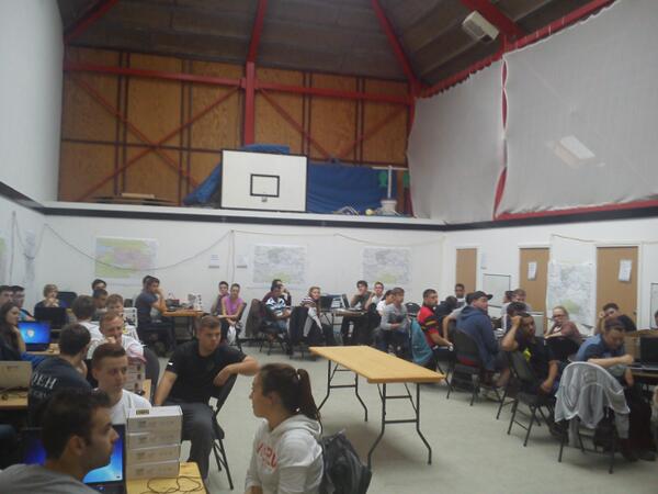
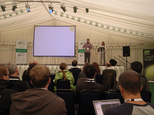
The three day meeting was held at Chilworth Manor Hotel in Southampton, and was facilitated by a facilitation group, Dialogue Matters to help coordinate and focus a delegation of researchers, academics, stakeholders and partners. Monday offered the chance for the Expert Advisory Group (EAG) to review the documentation and work completed under the five different work streams. Whilst part of this review took place behind closed doors alongside the program’s principal and co-investigators, subsequently the EAG gave direct feedback to all of those attending the three day meeting. This session was then followed by an open floor discussion and questioning by researchers, PhD students and investigators from the program of the EAG panel. The utility of the EAG in particular was felt by the program during these discussions, and also via their continued guidance on the cycle 2 and 3 assessments due for release in January 2014 and in the autumn of 2015 respectively. Further to the feedback delivered, the post-lunch slot was dedicated to researchers and investigators funded through the program the chance to present some more specifics about the tasks undertaken during the first half of the program. This was particularly effective in getting everyone up to speed with what others within the consortium had been working on, and helped certainly to set the scene for discussions about future directions assigned to day two and three. Finally, a group of ITRC-affiliated PhD students presented some scoping research they had carried out to try to pull together a set of data on projects, research centres and institutes at the global scale who are also working on similar research as that conducted under the ITRC banner. Not only was the presentation interesting in the manner in which it was delivered, the data and information collected offered a great starting point for further development of the ever-growing research community, acting as a focal point for information about the community at large.

Day two began to offer the affiliated researchers and investigated across the many universities represented within the program, the opportunity to address some of the following questions:

  • Where have we got to?
  • What is happening in this field, in other projects and around the world?
  • What externalities may adjust the way this research is conducted, or will influence the likely impact the research has e.g. changes in policy, education, funding, society, environment, markets etc)

Whilst discussions of these questions began immediately in the morning session to broaden the horizon of future possible directions, a selection of “seed” ideas or possible projects that were a priori selected as being potential key research directions were also considered. The opportunities to think more broadly about possible research directions for the final two and half years of the project and also consideration of ideas already identified as of interest, gave everyone the chance to give their opinion on what could or could not feasibly be achieved given the available remaining time and resource. From a personal perspective, I think this gave everyone a real sense of ownership of the future direction of the research and certainly helped to gauge the relative importance of the different tasks identified by researchers from wholly different backgrounds. Subsequently this session allowed researchers to consider new ideas and areas based on the knowledge gained during the first half of the program. The breadth of ideas was enormous, ranging from the need for autonomous analytics for infrastructure planning, provision, monitoring and recovery to the need for new systems to manage the proposed integration of unmanned aerial vehicles within commercially used airspace in the United States, currently being considered by FAA.

Whilst the majority of the second day was spent considering the future direction of program, the afternoon session gave an opportunity for those involved to take stock of the success of the mechanisms employed for internal communication within the consortium. As the consortium is spread over many research centres and universities, effective communication between them and within the consortium is critical to ensuring objectives are achieved. The qualitative review considered the utility of using social media to facilitate communication both internally and externally, such as the use of Twitter and Skype for external dissemination and internal discussions, whilst also appraising the use of the ITRC intranet for collaborative working, and assessing the state of the external facing ITRC website.

With Tuesday giving plenty of opportunity to widen the research agenda and look at possible future research directions that the consortium could move in to, as well as assessing what tasks are to be achieved within the remaining two and half years of the project, Wednesday’s agenda focussed on narrowing this scope. A series of research themes had been identified from Tuesday’s discussions, and researchers were invited to select a theme upon which to discuss what the key areas of interest within that theme might be. However, not only were ideas generated, but challenges to achieving success in these areas were also highlighted, to give an impression of the relative difficulty of each theme. The results of many of the discussions held on day two and three have certainly helped the principal and co-investigators of the program to coordinate what tasks and objectives are to be achieved within the final years of the program.

Overall the assembly and mid-term Review offered everyone involved in the program to take stock of the achievements to date, whilst recognising the significant challenges that lay ahead when trying to deliver on a program which is trying to understand the complex nature of infrastructure, how it is operated, and it’s likely resilience to impending changes in demography, economy and climate.

The following table offers a summary of those people who were involved in the three day meeting:

Role Name Affiliation
ITRC Expert Advisory Group (EAG)

Chairman

Colin Harris Independent
ITRC Expert Advisory Group (EAG)

Members

Rosemary Albinson BP
  Theresa Brown Sandia National Laboratories
  Jeremy Cooper Laing O’Rourke
  Yacov Haimes University of Virginia
  Geoffrey Hewings University of Illinois
  David Penhallurick HM Treasury
  Margot Weijnen TU Delft
     
EPSRC Representatives Christopher White EPSRC
  Iain Larmour EPSRC
     
ITRC Principal Investigator Professor Jim Hall University of Oxford
     
ITRC Program Manager Miriam Mendes University of Oxford
     
ITRC Investigators Dr Nick Eyre University of Oxford
  Professor John Preston University of Southampton
  Professor Chris Kilsby Newcastle University
  Professor William Powrie University of Southampton
  Professor Cliff Jones Newcastle University
  Dr Stuart Barr Newcastle University
  Dr Stephen Hallet Cranfield University
  Professor Pete Tyler University of Cambridge
  Professor Mark Birkin University of Leeds
  Dr Jim Watson University of Sussex
     
ITRC Researchers Simon Abele University of Oxford
  David Alderson Newcastle University
  Pranab Baruah University of Oxford
  Simon Blainey University of Southampton
  Modassar Chaudry Cardiff University
  Adrian Hickford University of Southampton
  Scott Kelly University of Cambridge
  Alexander Otto University of Oxford
  Raghav Pant University of Oxford
  Meysam Qadrdan Cardiff University
  Chris Thoung Cambridge Econometrics
  Rachel Beaven Cambridge Econometrics
  Martino Tran University of Oxford
  Chengchao Zuo University of Leeds
     
ITRC-affiliated PhD students Edward Byers Newcastle University
  Robert Carlsson University of Oxford
  Razgar Ebrahimy Newcastle University
  Timothy Farewell? Cranfield University?
  Ed Oughton University of Cambridge
  Oliver Pritchard Cranfield University
  Scott Thacker University of Oxford
  Katherine Young University of Oxford

ITRC WS1 Visualisation Workshop: Visualisation of multi-dimension data, 22/05/2013, St Hugh’s College, University of Oxford

As the ITRC programme progresses and approaches the mid-term review stage, in June and July of 2013, the of the work stream 1 (WS1) infrastructure capacity and demand modelling teams are beginning to produce outputs from their next round of modelling. Furthermore, the parallel development of spatial infrastructure networks as part of work stream 2 (WS2), is beginning to raise some significant challenges in terms of appropriate and effective data dissemination, communication and interpretation. The underlying high-dimensionality nature of the data being produced as part of WS1 for example, coupled with the complexity of the networks generated as part of WS2 means the consortium as a whole needs to begin to think about appropriate mechanisms to visualise these data.  For example, some initial prototypes of possible visualisation tools are beginning to be developed, (see here), but rather than build and design tools from the perspective of one researcher, it was considered more appropriate to consult with, other similar projects who are visualising similar data, or will require the ability to visualise similar data in similar ways to that required of ITRC, and also a host of visualisation and design experts from around the UK to gain better perspectives.

An initial workshop, organised by ITRC members, Dr Alex Otto (ITRC WS1 investigator), Dr Greg McInerny (Senior Research Fellow, University of Oxford), Mr David Alderson (Researcher in GeoInformatics, Newcastle University), Dr Stuart Barr (Senior Lecturer in Geographic Information Science, Newcastle University) and Miriam Mendes (ITRC Programme Manager, University of Oxford), sought to bring together relevant researchers from the plethora of Adaptation and Resilience in a Changing Climate (ARCC) network projects and leading researchers and experts in the field of data visualisation and design. Prior to the workshop, a questionnaire was distributed to both the invited ARCC project representatives and the visualisation experts in an attempt to give the organising team a better centralised perspective of what the respective groups would want to hope to gain by attending the workshop. The responses were then studied to tease out any overlaps between visualisation challenges faced across the ARCC projects, to attempt to collate a set of discussion points upon which to focus discussions in the afternoon of the workshop. Prior to these more focussed discussion sessions, the workshop initially allowed the ARCC project representatives to briefly (in 5 minutes or less) explain the nature of the project in which they are working, but also describe and explain some of the visualisation challenges being faced within that project. The aim of this early session was to allow the visualisation experts time to understand the background of the projects themselves, and also the nature of some of the data being produced, such that the more focussed discussions taking place in the afternoon had a little context.

From the responses to the questionnaire, and also following the morning’s ARCC project overview session, a series of 5 discussion topics were devised, that attempted to encapsulate the common visualisation challenges across all the projects, and are listed below.

  • Visualising multiple dimensions and scenarios;
    • Chair: Martino Tran (ITRC – University of Oxford)
    • Rapporteur: Craig Mills (Visualisation – UN)
  • The spatial dynamics of infrastructure networks;
    • Chair: Scott Thacker (ITRC – University of Oxford)
    • Rapporteur: Martin Austwick (Visualisation – UCL)
  • Temporal visualisation of infrastructure behaviour and response;
    • Chair: Sean Wilkinson (RESNET – Newcastle University)
    • Rapporteur: Min Chen (Visualisation – University of Oxford)
  • Simplifying and communicating effectively complex model outputs;
    • Chair: Jason Dykes (Visualisation – City University, London)
    • Rapporteur: Scott Kelly (ITRC – Cambridge University)
  • Multi-disciplinary co-production for infrastructure visualisation.
    • Chair: Simon Blainey (ITRC – University of Southampton)
    • Rapporteur: Jane Lewis (Reading e-Science Centre, University of Reading)

A chair and rapporteur, selected from the list of workshop attendees was devised such that each topic had a representative from the ARCC network, and from the visualisation community. Each topic was then discussed by attendees for about 10 minutes, with the chairs and rapporteurs capturing the salient points discussed around that particular topic. After 10 minutes of discussion the attendees subsequently moved on to the next discussion topic and a different table. Overall as a format for delivering break out sessions, this quick-fire, round-robin approach seemed to work well, allowing all attendees to discuss all the common discussion topics about visualisation, whilst at the same time having the discussions steered and reported by representation from both sides. The approach also seemed to help stimulate discussions between project representatives and visualisation experts, which was one of the objectives or organising and delivering the workshop. However further work is currently being undertaken to transform some of the excellent discussions in to a positioning paper with respect to visualising high dimensionality data for infrastructure planning and provision purposes. It is hoped that representatives from the projects, particularly those organising the workshop and on the ITRC side will be looking to further engage and collaborate with the visualisation community.  Watch this space…

Links to presentations split by those relevant to different communities are listed below:

Full Attendee List

ARCC Project-affiliated attendees (* speaker on visualisation challenges)

ARCC Project Representative Affiliation
ITRC Alex Otto* University of Oxford
ITRC Stuart Barr* Newcastle University
ITRC David Alderson Newcastle University
ITRC Raghav Pant University of Oxford
ITRC Scott Thacker University of Oxford
ITRC Jim Hall* University of Oxford (Principal Investigator – ITRC)
ITRC Miriam Mendes University of Oxford (Programme Manager – ITRC)
ITRC Simon Abele University of Oxford
ITRC Alex Leathard Newcastle University
ITRC Meysam Qadrdan Cardiff University
ITRC Modassar Chaudry Cardiff University
ITRC Simon Blainey University of Southampton
ITRC Kate Young University of Oxford
Transport Utilities’ Conversion Points (TUCP) Liz Varga* Cranfield University
All-in-One Tomasz Janus De Montfort University, Leicester
Undermining Infrastructure Jonathan Busch* University of Leeds
Land of the MUSCos Christof Knoeri* University of Leeds
Step-change Miles Tight* University of Birmingham
RESNET Sean Wilkinson* Newcastle University


Visualisation / Design Experts (presentations and speakers listed below):

Greg McInerny University of Oxford, Microsoft Research
Min Chen University of Oxford
Craig Mills United Nation Environmental Program World Conservation Monitoring Centre
Jason Dykes City University, London
Jane Lewis Reading e-Science Centre, University of Reading


Other invited attendees:

Vicky Hayman UK Climate Impact Projections, University of Oxford
Chris Cooper IBM, London
David Miller IBM, London
Mathew Carlos University of Oxford
Zoe Austin University of York
Martin Austwick UCL
Craig Robson Newcastle University
Glenn Hart Ordnance Survey
Paula Engelbrecht Ordnance Survey
Andrew Munslow Met Office


UK Infrastructure Transitions Research Consortium (UK ITRC) University of Oxford Newcastle University

From Rotterdam to Hannover via Köln then home

The last two weeks saw the World Geospatial Forum, Rotterdam and the ISPRS Hannover Workshop where the latest research and commercial activities in photogrammetry and remote sensing were presented.

Only attending the final day of the World Geospatial Forum meant a chance to attend the Technology Forums. These consisted of presentations from commercial vendors such as Leica Geosystems, RIEGL and Optech showing their latest hardware and software developments as well as universities and research institutes presenting their work. The final session of the day, entitled ‘3D – the next challenge for national mapping agencies’, presented how methods developed in research were being utilised by the Dutch national mapping agency for the reconstruction of buildings at the Level of Detail 2, in accordance with the CityGML standard. Although a very commercial conference some resources were sourced for the research into automated 3d building reconstruction.

After a nice weekend trip to Köln enjoying the sights and the sunshine, the ISPRS Hannover Workshop about High-Resolution Earth Imaging for Geospatial Information began. Talks included data collected from space all the way down to the bottom of the ocean for various applications. Across the four days keynote presentations were given by Rainer Sandau of DLR in Berlin who spoke about how space collected data can be used for disaster management and the integration of data, Lorenzo Bruzzone from Trento university spoke about the challenges and trends of multitemportal imagery and Charles Toth, the current ISPRS Commission 1 president, spoke about the different platforms available for data collection. The final keynote was Michael McCullagh from Nottingham University who spoke, a little off topic, about crowd source data. Several interesting examples were given, some closely related to the Twitter work undertaken by Newcastle whilst presenting a website (www.ushahibi.com) for a non-profit company promoting open-sourced data.

Research institutes and universities presented their current research which led to many discussions being carried on in the coffee breaks. Newcastle’s Abdulhamed Gneeniss presented his PhD work on the integration of photogrammetric and lidar data for aerial triangulation and camera calibration alongside several other young researchers, presenting in both oral and poster formats. Two poster sessions portrayed varying amounts of research including UAVs, GPS solutions and building detection from differing sourced data.

The conference’s main sponsors, Hexagon, gave a master class in the new hardware and software they have developed. After a brief overview of the company’s history, the company’s new large-format and medium format cameras were presented as well as their new oblique camera systems. The software included their photogrammetric software developed by tridicon, which included semi-global matching algorithms for point cloud generation from aerial imagery as well as automated 3D building reconstruction.

Social activities included an ice-breaker evening on the rooftop of the Leibniz Hannover university’s Institute of Photogrammetry and Geoinformation and the conference dinner at the Wilhelm Busch Museum where extravagant buffets were laid with some nice local beer to taste. These gave a great opportunity to discuss in further detail the research presented in the day and way to get to know people.

Thank you to Christian Heipke and the team at Leibniz Hannover University for organising such a captivating conference.