
What is the Psychometric Dashboard?
Inspera have been working on the release of a psychometric dashboard for data on Inspera exams. The dashboard is built using AWS QuickSight and provides insights into assessments conducted on the Inspera platform. The QuickSight Dashboard is part of Inspera’s phase 1 in their strategy for introducing Test-Level Analysis. You can find out more about the Psychometric Dashboard on Inspera’s website.
What can Inspera users access at the moment?
Phase 1 allows the Digital Exams Team to have access to an administrative dashboard, but by Phase 3 Inspera hopes to have this integrated into the Inspera platform, where colleagues currently create questions and grade exams. There is not currently an estimated date for this to be available, but we will be keeping up to date with all developments.
If colleagues are interested in accessing data, the Digital Exams Team can provide a PDF download from Inspera exam’s scheduled from 1st December 2024 onwards that have been graded and marks confirmed. Note: there are some limitations in how much can currently be shared in the PDF but a fuller view is expected later in 2025.
What data is available?
Information around the sort of data available is noted within this section and has been extracted from the Psychometric Dashboard page on Inspera’s website. Within this blog post, you can find out about all the different type of data available. Some screenshots are included but check out the Psychometric Dashboard page on Inspera’s website for further graphics.
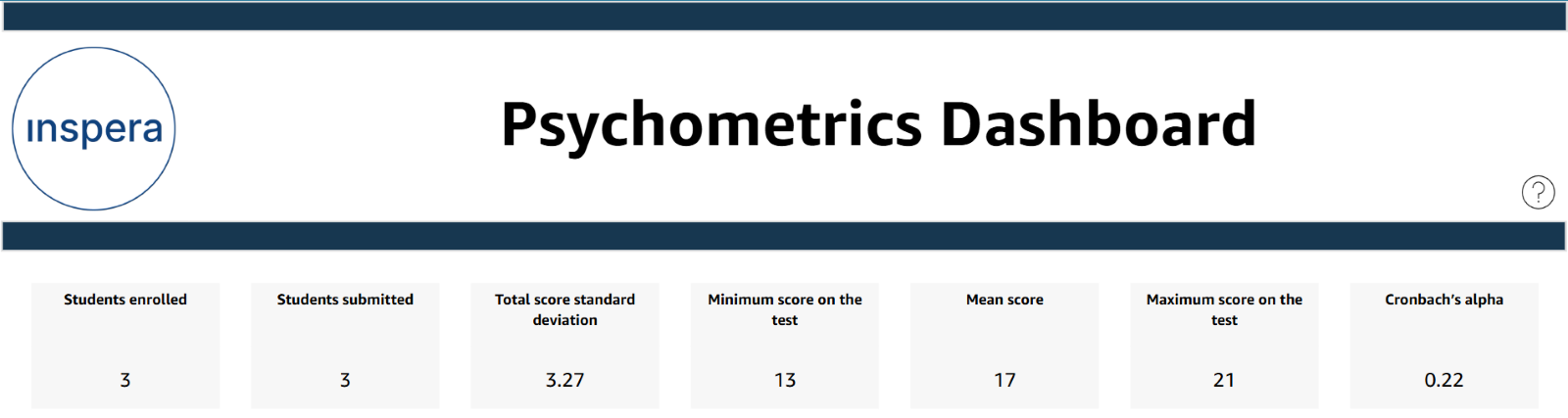
Overall Metrics
- Students Enrolled – The total number of students who were enrolled in the test.
- Students Submitted – The total number of students who successfully submitted the test.
- Score Standard Deviation – The amount of variation around the mean score.
- Minimum Score – The minimum score obtained on the test.
- Mean Score – The mean score obtained on the test.
- Maximum Score – The maximum score obtained on the test.
- Cronbach’s Alpha – This metric measures how well a set of test questions work together to assess the same concept.
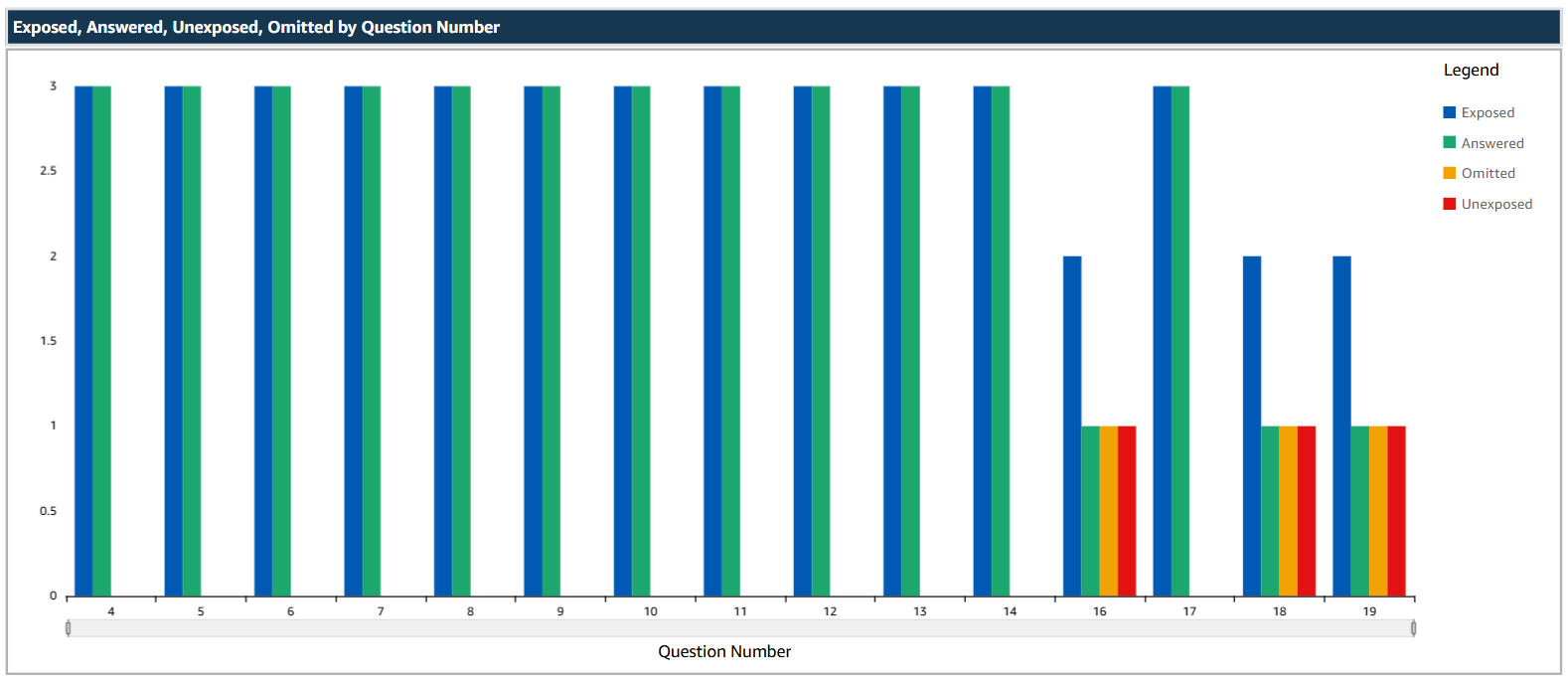
Student Response Trends Across Test Questions
A grouped bar chart is available showing the counts for “Exposed,” “Answered,” “Omitted,” and “Unexposed” responses per question across the students who have taken the exam.
- Exposed – The total number of students who saw a question (The question was loaded on their browser). This number does not consider students who were initially enrolled in the test but did not start the test.
- Answered – The total number of students to whom a question was exposed, and who provided some answer to the question.
- Omitted – The total number of students to whom a question was exposed, but they did not attempt an answer.
- Unexposed – The total number of students who did not see a question (The question was not loaded on their browser). This number does not consider students who were initially enrolled in the test but did not start the test.
Total Score Distribution
Bar chart
Description: A bar chart showing the frequency of total scores obtained by a student. There is also a table representing the spread of total scores achieved on the test and the frequency of each of them. The scores on the table are ordered from lowest score to highest score and the bar graph shows the frequency of total scores.
Metrics:
- Total score – The overall score achieved by a student on a test.
- Frequency – The number of students who achieved that score.
Box Plot
Description: A box plot representing the spread, median, quartiles, and outliers of total scores.
Purpose: Offers a compressed yet detailed view of score distributions, useful for spotting trends and outliers.
Facility, Discrimination by Question ID
Scatter plot
Description: A scatter plot depicting the relationship between facility (difficulty) and discrimination (differentiation) for each question.
Metrics:
- Facility – Indicates how “difficult” a question is. Values can range from 0 to 1. The lower the facility, the more difficult it is. This value is calculated as the number of correct responses/number of total attempts normalized to 1.
- Discrimination – Indicates how well the question discriminates between low performing and high performing students. Analysts generally consider values >0.3 indicate a “good value”, 0 indicates that most students performed the same on the question (regardless of their performance on the test), and values <0 indicates that the high performing students had a higher propensity to answer a question wrong when compared to lower performing students (maybe wrong answer key). Discrimination values can lie between -1 and +1.
Bar Graph (Facility)
Description: A bar graph depicting the facility (difficulty) for each question. There are also tables which list down the facility value and the discrimination value alongside their respective graphs, ordered from: Highest facility to lowest facility.
Bar Graph (Discrimination)
Description: A bar graph depicting the discrimination (differentiation) for each question. There are also tables which list down the facility value and the discrimination value alongside their respective graphs, ordered from: Highest discrimination to lowest discrimination.
Question Type Distribution
Bar Chart
Description: A bar chart showing the average scores for each automatically marked question type.
Metrics:
- Mean Score – Average score of all students who attempted to answer all questions of a question type.
- Mean Facility – Average facility of all questions of a question type.
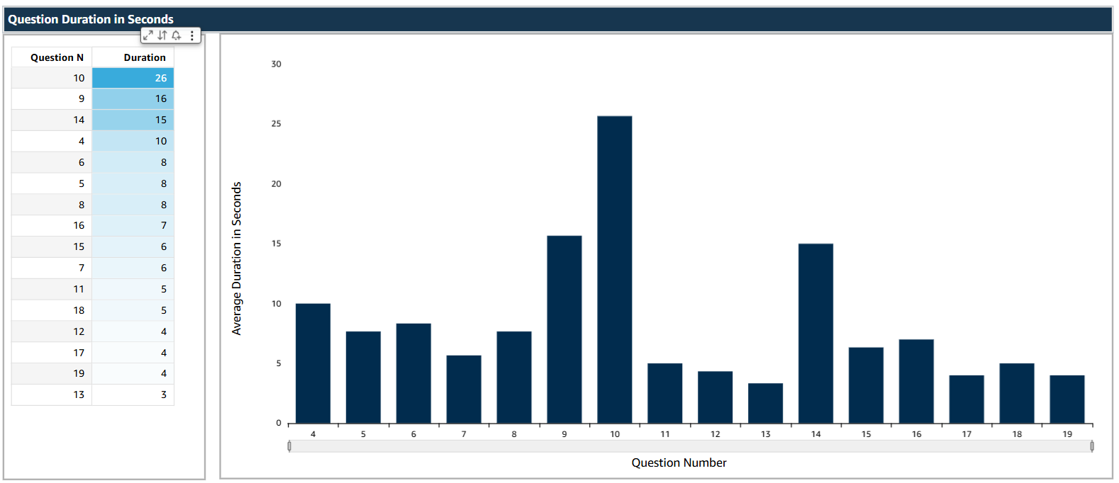
Question Duration in Seconds
Bar Chart
Description: A bar chart representing the average time (in seconds) taken to answer each question. There is also a table representing the average duration for each question.
Metrics:
- Avg duration (seconds) – Average time taken in seconds for each question in the assessment across all students. This metric only considers duration for students to whom the question was “exposed”.
Details Tables
A summary table of data is available at the end of the report, specifically showing the following data:
- Question Number (in order that questions show on the test)
- Question ID
- Mean Score
- Discrimination
- Facility
- Answered
- Exposed
- Omitted
- Unexposed
Further information and questions?
If you would like to access further information or have any questions about this, please contact the Digital Exams Team via Digital.Exams@newcastle.ac.uk. If you have any feedback around the type of data available and would like to share your thoughts, please do get in touch with the Inspera Digital Exams Team who can share feedback with Inspera.