Following constructive feedback from our ideas presented to the class on the 1st November we took initiative to reassess the core functions of OUR dashboard and who it could effect. An energy dashboard typically meters and displays quantitative energy consumption data primarily through reading the interior energy inlet and CAN provide a starting point to raise awareness. Sub metering is also an optional strategy that provides a broken down consumption figure based on external appliances from the main inlet in the home.
Ultimately the dashboard we wish to create will highlight real time consumption data based on the national grid provider with projections of informed hypothetical figures regarding renewable resources too. However we wish to motivate and engage the average user, whereby we see the homeowner as the impetus of change and to share an energy saving culture. The drive to “do better” than others would be an encouraging step towards energy saving. This way the neighbourhood will feel as though they each have a part to play in the broader context as a global citizen too.
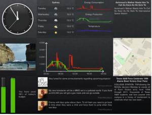
The Diagram below highlights a real time production/consumption energy dashboard interface for the home.

Features such as the energy quota bar (bottom left) are customisable so that the user can track their own progress of kWh consumption.
Source: Filonik ,Queensland University of Technology
Designing Interactive Dashboard Interfaces
On the 9th November members of the group put together dashboard interface concepts which they considered to be core to the function of the product.
Also factored into our concepts was means of engaging the user in a stimulating way, for example provoking the individual to think about the role they could play in doing their bit and encouraging their neighbours to likewise for the good of the community.
This reiterates that in order to influence the individual’s consumption patterns and to encourage them to be the “impetus for change” in their neighbourhood. Setting this data in context and educating the user contextually could be the answer to this.

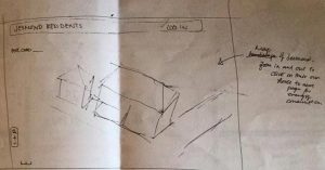
Above is a sketch of a welcome page that attempts to grab the attention of the user and their immediate surroundings in Jesmond
9th November, Meeting with Delvin and Geremy from Open Lab
The team organised a meeting with Delvin Varghese on the 9th November, Delvin was able to critique our designs and provide a useful insight into what makes a good dashboard interface that easily interpretable to the homeowner as well as stimulating to use. Delvin undertakes research in the field of Human Computer Interaction (HCI) and so it was useful to hear from his perspective about what makes a simple but stimulating experience for the user that fulfils our task.
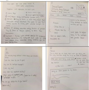
Proposed design to Delvin which assumes a website format:

This design comprises 5 navigable web pages:
(1) Home Page – Aiming to grasp the user by both identifying and familiarising them as a key member of the community that can facilitate change for themselves and the good of the community. One is also prompted to “sign up” on this page.
(2) About – The second page to navigate to is the “about” page which provides contextual information of the drive of the co-operative , as well as community personalities Tony and Steve and their visions ( which the neighbourhood can hopefully relate to)
(3) Stories (with picture wheel)-This page is an area for users to interact with each other, such as sharing their energy saving tips. These will actually be featured articles although users will be encouraged to send over articles. A factor for consideration would be moderating the suitability of the content to enter the public domain or “go live”, so this would most likely be in we form format.
(4)- Introducing the dashboard -The concept of an energy dashboard is then introduced and how one interprets the data so one can utilise it to their personal benefit as well as the wider communication and the environment.
5- Contacts
The content of this page would list the steps the user would take to install the solar energy hardware and a directory of recommended renewable energy providers.
Information on additional hardware such as SMAPPEE energy monitor box devices which measure consumption of individual household appliances would also be available.
Reflecting upon roles of the dashboard in engagement and fulfilling our task
A recent study by oxford university “open to change project” highlighted that game designers are good at representing quantitative measures of performance as qualitative indicators of social capital. It was echoed by Delvin also that the user may understand the cause of saving energy but to set it as a trend the best process to do this is by instilling reward by social capital in addition to obvious individual financial gain.
It became apparent that engaging the user so that there was some sense of immediacy to the data or put into a relatable context would be far more effective and interpreted more instantaneously.
- A customisable “quota function” as a progress bar so that the user can set themselves goals.
- Visual/contextual prompts for energy saving displayed in different measures such as money and also kWh converted to kg of C02 saved.
- Gamification of the savings could also make co-operating to save energy amongst the community more appealing for example to share your progress and challenge individuals and groups.
Moreover it would help us reach the goal that underpins our project .
“Support residents, organisations and businesses in Jesmond in adopting a more energy efficient approach to their current consumption patterns”
Team, thanks for this excellent post. The entry succeeds to give a good impression of your thinking process as well as the actions you took to inform your designs (such as the conversations with Delvin as well as your own research). This entry provides a good insight in your process. What makes this post strong also is your link to past activities (in the introduction) and the clear relation to how your proposition answers to the goals you set yourself earlier on (in the conclusion). You are critical towards your own approach and evidence you are responsive to feedback.
I was wondering if you could express more clearly how and if your proposition is aiming at energy production. Also, how exactly will these social incentives work that you are mentioning in your post? You mention gamification for instance: Is there a way you could test this model through your user tests next week? Also, could mechanisms for sharing of energy present interesting social incentives? How might this work and how might it happen? Perhaps these aren’t things you are considering in your prototype, but perhaps things to discuss in your final design log.
For your dashboard design (a dashboard is a sort of community artefact) could you consult the Maher article on collective designing that we’ve covered in the lecture; or perhaps another relevant article on designing of dashboards.
Good work.