Blog 11: Jesmond Energy Production Platform- What’s next?


We’re now here to conclude the design sprint project and to discuss what we feel would be best for the project in terms of progression. It will just be a shorter blog today than normal as there isn’t as much to discuss as there has been in the past.

Much like every single project going the next step is always where they’re looking to go so it’s only right we do so with this one too. We believe that the next and right step for this project would be to develop the prototype further by addressing the feedback we got from Peter and Steve, then to go out and test the project with real life residents of the Jesmond area and show it to them see how they would react to potentially becoming a member of this social/community energy dashboard and working towards the principles of an energy cooperative in the area.

Coming up for the team now we have our final presentations to our client Tony and hopefully all of our findings and results was what he was hoping to find and that we have aided his cause of helping the Jesmond community!

With the feedback we got from the user tests and discussed below we feel that a lot more research is needed of the local area, people that live there, who would really use the dashboard, feasibility, scouting out local businesses to use them and promote them have a fool proof plan that it really would become successful.

That is all for now!

Team JEPP signing out…

Blog 10: User Tests

Here we are again, nearing the end of the project and this week we have completed two user tests on our app. The two who participated were Peter Kellet and Steve Emsley, Peter works at the university as a senior lecturer in Architecture, he has a strong interest in the environment and sustainability. Steve is formerly a social worker , now retired , he is a resident in Jesmond and has a very keen interest in renewable energy , with a PVC panel installation on his own home now for over 10 years as well as an active member of the local Green Party.

Last week we spoke about what we planned for the user test so that the tests would run smoothly and all went to plan , so this week we will be filling you in on how they went, fingers crossed!

Now to take you through how the user tests with Peter and Steve went, to keep it simple  we will discuss Peter’s answers first with Steve’s following after.

User test with Peter Kellett 14/12/16, Claremont Tower

Peter participated in our first user test, so it felt right to discuss our findings from this first, most importantly to discuss first is how they reacted to the prototype we had created with it being the first time they had ever seen it.

Openly admitted he “wasn’t the most tech savvy person on the planet” however would give the best feedback he could based on what was in front of him, but all things considered he managed to navigate the app successfully without becoming stuck on anything and being very vocal throughout with constant feedback and everything he was doing/interacting with.

Peter provided us with good feedback for us to further develop our prototype with reflections such as:

  • A yearly consumption figure perhaps not such a good idea, and  broken down  two figures, one for summer and the other for winter as consumption patterns would be very different in those two, in addition energy providers typically take quarterly meter readings.
  • Integrating a pop up on the app projecting a well informed hypothetical figure  for the user if that particular user should not have solar panels.

With lots of other feedback on colour schemes, button’s, size’s etc.

We felt as though Peter interacted with the prototype as we expected him too with a good understanding of all the content, a good insight in to the goals we’re trying to achieve. The only thing I would say is that he didn’t really interact with the social media side of things but understood why we had it on our product.

Now, we move onto our user test with Steve who of course we already know from when we back at our research stage so it was good to meet up and show the progress we have made as a group.

User test with Steve Emsley 15/11/16, Jesmond Library

Much like Peter, Steve managed to navigate the prototype well and understood all of the content we had and didn’t have any negative comments towards colour schemes, text, sizes. We did feel as a group that the app wasn’t thoroughly tested by Steve as on the occasion there would be a long pause between using the app to talk about other matters that weren’t part of the interface.

However we did feel like we got some good feedback from Steve towards our project objectives as we had a discussion about fossil fuels and renewable energy. Steve expressed that he understood the link between the two but people should be buying their energy from renewables only companies which isn’t widely publicised on the app itself, so as a group we feel this is something we could push on with for our project and make Jesmond push towards being a renewables only using area with the right information and understanding throughout the app.

The general feedback we got from Steve in regards to the app was that it needed to be more informative with more text, pictures to ensure and enhance that understanding of energy and renewable energy in a simplistic way for everyone to understand.

In Conclusion

We felt that both our user tests went well and that we learnt a lot through the process but there are some things we would change if we was to do it again. I think the main one being that we kept the whole process a little too open which caused it to go off onto other subjects or start conversations that weren’t in regards to the prototype. So add a little more structure with it still being open discussion type feeling.

Now that we have come towards the end of the project as a group we can reflect that in spite of a hesitant start with the understanding of where we envisioned the product we have persevered and we are all pleased with the progress of the project and also the character of the group . We are satisfied with where we have taken this prototype and got the concept of a dashboard not just for the individual homeowner but also one that resonates at community level off the ground! We are happy to develop this concept through further with the client and have expressed this to them!

Blog 9: User Test Preparation

Firstly, before the test we need to prepare as a group and this is how we have managed that.

It may seem obvious but we made sure to begin with that the prototype on marvel was complete and everything was in working order ready for the tests.

We assigned the roles to team members for the day of the test and agreed that our schedule would allow for holistic input in addition to the Interviewer’s schedule from individual group members to the user if they thought it were necessary to do so. Each team member was asked to familiarise themselves with the schedule first.

An important part of the user test is location of the test and also creating an interview schedule to keep us on track so that during we remain on topic for the user and leave ample time for useful feedback.

Whilst one of the user tests is in an office on university campus the second user test will be taking place in a public library in Jesmond. As previously mentioned we keep it a very open experience without overly instructing the user what to do on the app, this way they are able to navigate the app freely and instinctively.

Google Developer’s usability testing video among others on youtube were able to guide us to make a 5 step process for the user interview ,as a schedule this will consist of: 1. A friendly welcome 2. Context and user background 3. Introduction to the prototype 4. User Tasks and 5. Debrief/ Final Feedback.

Examples of our format could include:

  1. Setting the tone to the user and reassuring them that “We aren’t testing you, we’re just testing the prototype” This will make them feel at ease right away.
  2. Ask the user a bit about themselves and why they are interested in the project/product.
  3. Introduce the app and the activity that we have planned for them to try. Play down the app a bit and explain it will be developed further.
  4. Set the user a task to do on the app and see if they can remember from memory what to do/where to go. Continue to prompt questions such as like, how, why, what do you feel worked well/didn’t work well. Observe what they are doing whilst using the app. Keep asking them to think aloud throughout to ensure the feedback is good quality.
  5. Gather general feedback of what they thought of the product and finally thank them for the time!

We now go again for the user tests, thank you.

Blog 8: Jesmond Energy Production Platform Prototyping

This week we have been working towards starting making a prototype for our project collating all our data and refining all the content we want to include in our product and with this session we were aiming to see how we use all this within our prototype to show Tony.

We felt the session was pretty clear on what we needed to understand when working on the prototype and that was the fidelity of our prototype and how we should be going about using this to our benefit and not hindering us when it comes to the user tests.

When prototyping depending on the product/idea you’re trying to get across to the consumer is which type of fidelity you should using whether it’s low or high.

We were told that it is sometimes better off using low fidelity prototyping rather than high, due to it being a prototype and will probably be edited, scrapped etc and then you don’t waste high sums of money on the prototype stage. Low fidelity can also sometimes cover the feasibility of it as well.

We feel as our project is based on renewable energy in Jesmond, we felt that the best subject on our app to prototype is this section as it would be the most interacted part with on our app, therefore is the most important to make sure is correct for the users not only with the user ability of this particular section that also all the content is easily accessible and understandable.

On our prototype we’re using Photoshop to create images which we show through the marvel app and edit them on there so it works like an app on the iPad when pressing on the screen for the hyperlinks so that the active parts of the prototype work like they would as if they were using them on a tablet such as the iPad we will be using for our user tests.

As a group we all decided to go with in between low and high fidelity and go in the middle so you can see the real potential with our prototype without it costing much money. We class our fidelity in the middle because of the software we are using to make and show our prototype on with using Photoshop, marvel and an showing it on an Ipad like an app and not for example on low fidelity which would be classed as low fidelity.

You will be able to see from these images how we first started prototyping with and have then progressed in on to something more in depth and better quality which we will take on to use for the user tests.

  1. When we first started prototyping with paper (We have progressed our thoughts into a more in depth conclusion)

paper-12. Multiple different pages we’ve all linked together through marvel.

thumbs


3. This is our prototype up to date and ready to be user tested in the coming days.

33

Blog 7 :Our approach to prototyping

A prototype is typically a physical manifestation of ideas or concepts and its form can range from a rough to finished take on the proposed end result(Stappers,2014). In the case of our product, we wish to test this with the user in week 10. Knapp (2016) suggests that a prototype mindset which follows 4 principles are key to the success of the prototype and feedback it evokes altogether. A “goldilocks-quality prototype” , that appears 90% real is recommended in order to gain the most from the feedback phase, whilst ultimately remaining time efficient.

knapp


Knapp et al. 2016 “Sprint : how to solve big problems and test new ideas in just five days


In the case of our Community Energy Dashboard a set of facades that are real enough to test and temporarily ready for simulation in the user test is our ideal approach , however we would hope they still equally evoke honest feedback results.

“If the quality is too low people won’t believe the prototype is a real product, if the quality is too high , you’ll be working all night and you won’t finish”(Knapp,2016) .It is also highly likely that the longer you spend on working on something the more attached you will become and the less likely you will take negative results to heart.

We have chosen marvel software to develop the facades of our dashboard application in addition to this a group member allocated the role of asset collector will source for the 2 makers/designers some data and empirical looking visualisations for the dashboard itself, which will require basic use of adobe photoshop 10 to weald these data based visuals such as gauges and graphs together.

The information display in particular regards to consumption and production is integral to our concept, however also is the role in promoting the user to think about their collective neighbourhood energy consumption, thus engaging them and creating a “buzz” to think about these issues and share their thoughts with their local community is also key, so the team is willing to invest time into providing a friendly space for thought and reaction to these topics, also equally important is the tone we deliver to the user.

Blog 6: Storyboarding our product

Before we jumped straight ahead into prototyping, the team had reservations about the number of potential conflicting concepts we had. Therefore, we approached the means of storyboarding to set the design in context , which would help us to visualise the app itself and clarify the key function we would like to include for our prototype.

Plot

Set: Friday night

After a long working week, our main character, Mr. X went back home and planned to have a chill out night. He then took out his iPad, went on Facebook and starting to browse his wall.

Suddenly, a notification from Jesmond Community Energy Dashboard pops up, saying ‘your estimated monthly bill for the end of the month: £124’. Mr. X was shocked, he didn’t expect to pay that much, since he normally pays £50-70 for a month.

He then went on the app, checked on the energy usage and found out the main source of energy usage was the radiator in the living room, which he always forget to turn it off when he doesn’t need it.

He’d like to share this experience with his family and friends, warning them not to leave any electric applicant on when not using it.

Luckily, there is a share button in the app, making it a convenient way for Mr. X to share it to his friends and family.

storybvoard-1

Unfortunately, this was the storyboard specifically for the app only. There will be some alteration so that there’s an influence to install a solar panel for their house, aiming specifically to the Jesmond Community. However, we’ve managed to determine that there are several key aspects that we would like to include in our dashboard prototype.

  1. Monthly Energy Consumption (i.e. the graph that shows how much energy used for the month)
  2. Estimated Monthly Bill (what all users care about the most)
  3. Energy Consumption Pattern of user
  4. Graph that shows the amount of energy used for the past months (Archives)
  5. Push Notification (smartphones and tablets specifically)
  6. Social Media Buttons for easy shares
  7. Of course, some extra minor widgets to add a little spice to the app.


However, after feedback on our first storyboard we as a group decided to alter our storyboard and we now have a new story based on the most important feature of our project which is renewable energy.

storyboard2-feedback


The concept is very much the same as previous just slight alterations.

They are as follow:

Setting is now end of July and the new production figures have come through from the company, so he/she goes signs into the app, goes onto the production page where last month’s figures for June are present, they then select the add new button which then takes them onto another page where they can enter the new data, once that has been done they can then submit the new data which updates on their production stats. Then finally they share their monthly figures with everyone on the JEPP app to show how much energy they’ve made for the month.

We have now finished with the storyboarding and are now moving on to start thinking about making the prototype, watch this space!

Blog 5- Refining our Concept of an Interactive Energy Dashboard

Following constructive feedback from our ideas presented to the class on the 1st November we took initiative to reassess the core functions of OUR dashboard and who it could effect. An energy dashboard typically meters and displays quantitative energy consumption data primarily through reading the interior energy inlet and CAN provide a starting point to raise awareness. Sub metering is also an optional strategy that provides a broken down consumption figure based on external appliances from the main inlet in the home.

Ultimately the dashboard we wish to create will highlight real time consumption data based on the national grid provider with projections of informed hypothetical figures regarding renewable resources too. However we wish to motivate and engage the average user, whereby we see the homeowner as the impetus of change and to share an energy saving culture. The drive to “do better” than others would be an encouraging step towards energy saving. This way the neighbourhood will feel as though they each have a part to play in the broader context as a global citizen too.


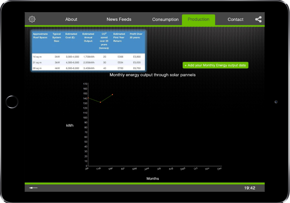
The Diagram below highlights a real time production/consumption energy dashboard interface for the home.

cropped-filonik

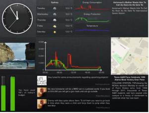
Features such as the energy quota bar (bottom left) are customisable so that the user can track their own progress of kWh consumption.

Source: Filonik ,Queensland University of Technology

Designing Interactive Dashboard Interfaces

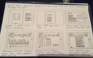
On the 9th November members of the group put together dashboard interface concepts which they considered to be core to the function of the product.

Also factored into our concepts was means of engaging the user in a stimulating way, for example provoking the individual to think about the role they could play in doing their bit and encouraging their neighbours to likewise for the good of the community.

This reiterates that in order to influence the individual’s consumption patterns and to encourage them to be the “impetus for change” in their neighbourhood. Setting this data in context and educating the user contextually could be the answer to this.

welcome

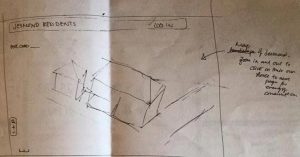
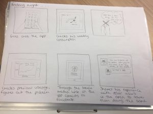
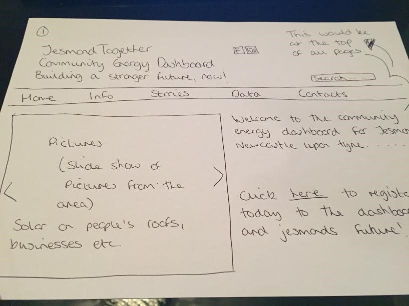
Above is a sketch of a welcome page that attempts to grab the attention of the user and their immediate surroundings in Jesmond


9th November, Meeting with Delvin and Geremy from Open Lab

The team organised a meeting with Delvin Varghese on the 9th November, Delvin was able to critique our designs and provide a useful insight into what makes a good dashboard interface that easily interpretable to the homeowner as well as stimulating to use. Delvin undertakes research in the field of Human Computer Interaction (HCI) and so it was useful to hear from his perspective about what makes a simple but stimulating experience for the user that fulfils our task.

Proposed design to Delvin which assumes a website format:

layout2

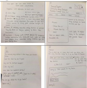
This design comprises 5 navigable web pages:

(1) Home Page – Aiming to grasp the user by both identifying and familiarising them as a key member of the community that can facilitate change for themselves and the good of the community. One is also prompted to “sign up” on this page.

(2) About – The second page to navigate to is the “about” page which provides contextual information of the drive of the co-operative , as well as community personalities Tony and Steve and their visions ( which the neighbourhood can hopefully relate to)

(3) Stories (with picture wheel)-This page is an area for users to interact with each other, such as sharing their energy saving tips. These will actually be featured articles although users will be encouraged to send over articles.  A factor for consideration would be moderating the suitability of the content to enter the public domain or “go live”, so this would most likely be in we form format.

(4)- Introducing the dashboard -The concept of an energy dashboard is then introduced and how one interprets the data so one can utilise it to their personal benefit as well as the wider communication and the environment.

5- Contacts

The content of this page would list the steps the user would take to install the solar energy hardware and a directory of recommended renewable energy providers.

Information on additional hardware such as SMAPPEE energy monitor box devices which measure consumption of individual household appliances would also be available.

Reflecting upon roles of the dashboard in engagement and fulfilling our task

A recent study by oxford university “open to change project” highlighted that game designers are good at representing quantitative measures of performance as qualitative indicators of social capital. It was echoed by Delvin also that the user may understand the cause of saving energy but to set it as a trend the best process to do this is by instilling reward by social capital in addition to obvious individual financial gain.

It became apparent that engaging the user so that there was some sense of immediacy to the data or put into a relatable context would be far more effective and interpreted more instantaneously.

  • A customisable “quota function” as a progress bar so that the user can set themselves goals.
  • Visual/contextual prompts for energy saving displayed in different measures such as money and also kWh converted to kg of C02 saved.
  • Gamification of the savings could also make co-operating to save energy amongst the community more appealing for example to share your progress and challenge individuals and groups.

Moreover it would help us reach the goal that underpins our project .

 “Support residents, organisations and businesses in Jesmond in adopting a more energy efficient approach to their current consumption patterns”
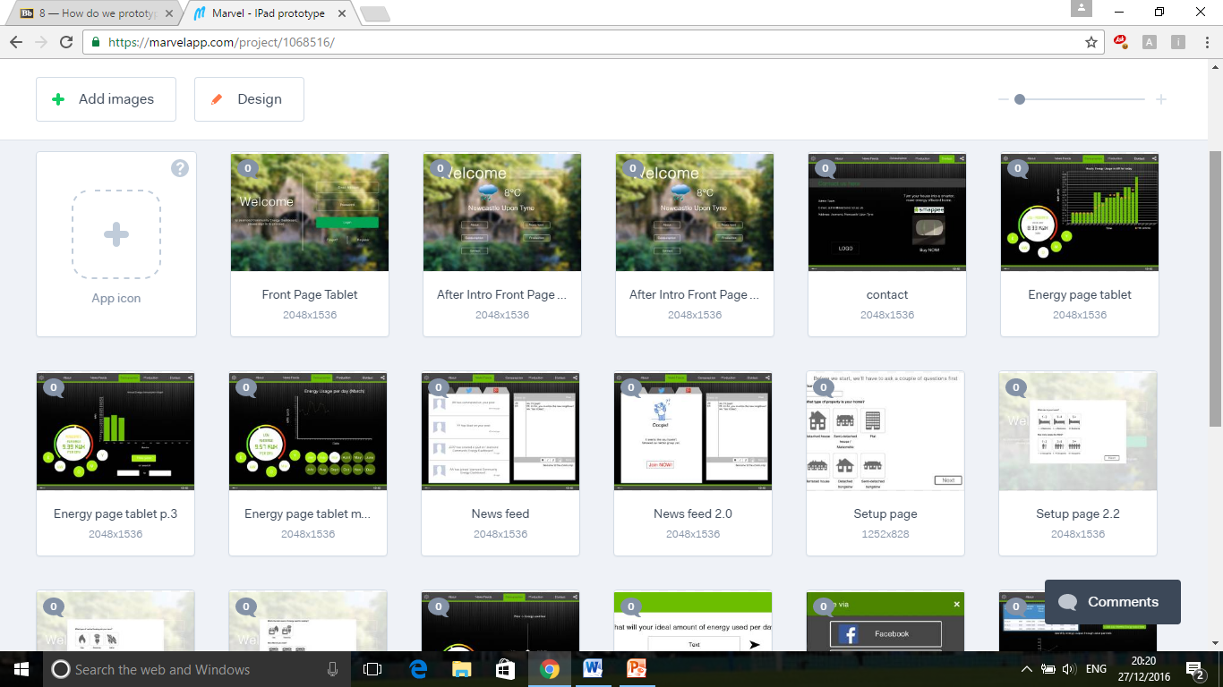