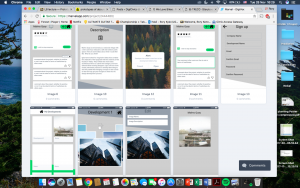
week 10 NUDC: User Testing

Hello Again,

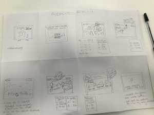
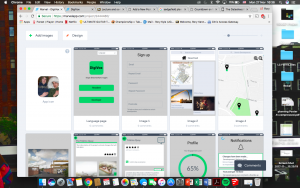
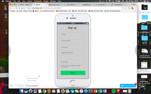
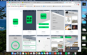
This week we had meetings with our stakeholder, Ali Lamb, as well as our technical adviser and academic mentor. Before they started testing our prototype, there were a few points we had to mention; the fact that they keyboard was not fully functioning, only an image, there were aspects we already knew we wanted to add such as the ‘rating other comments’ page and we also asked the users to think a loud throughout their testing. During our meeting with Ali, she noticed some alterations we could make to further improve our prototype, but also the details that she liked, for example the fact that the reward sticker reinforces brand identity for Streets 4 People. Her suggestions for improvement included changing the language we used on our introduction page from “there will be” to “one idea is” to suggest that the plans are still negotiable and to add more images of the before and after photos from different perspectives to give the user a clearer idea of the changes. She suggested having overlayed before and after photos and having a ‘slider’ function to make the changes more obvious. From our observations of her use of the prototype, we noticed she did not see the zoom button on the before/after photos which we later pointed out to her. In our meeting with the technical adviser, Delvin Varghese, we mentioned this issue and he recommended making our buttons look more ‘clickable’ by giving them an embossed look.

Other alterations Delvin suggested included changing the colour of the blue text on our introduction page as over the green part of the background it gets less readable, rephrasing the text about stickers and the age question to be clearer and using an ios layout as people already know where to look for back/exit buttons etc making it more easily navigated by first time users. One important point that Delvin got us to think about was the sustainability of our product, where does the data go to, how can the JRA use it to benefit them and can it be adapted in future.

In our meeting with Sean, he initially presumed that the product was meant to be an app as we were presenting it on an ipad; this is something we noted to specify in our final presentation, that the finished product would be on a larger screen attached to a plinth. Aside from this, we carried on discussions about sustainability and what questions we may be asked at the end of our presentation but Sean didn’t have any new suggestions for changes.

In future, during user testing we could think about writing a script for an introduction to the prototype, however, in this situation we already knew the users and they had heard what our prototype was. We had agreed not to given them too much information beforehand what the prototype would ask or how to use it as we wanted to make sure the instructions were clear and it was easy to use.


9) TRECC – User Testing

The goals of our prototyping sessions is to gain critical information from our stakeholders on their opinions about our app design. The most important thing being whether they think the design has fulfilled our project brief and do they think it would work in practice. From here, we can add or take away any features they think as they are more knowledgable and because we have been working so closely to this app for a while we may have missed some vital elements.

We created a script that would be asked to all stakeholders so that the information we received was in some way structured and we could easily compare the comments. Here is a copy of our proposed questions:

  1. Does the prototype do what it’s supposed to?


  1. Does anything distract you or get in their way?


  1. Does the navigation path work? (Can users find what they’re looking for?)


  1. Do you think this fits the target market?


  1. Is anything confusing or unclear?


  1. How likely or unlikely would you be to recommend the finished product to a friend or college?


  1. How would they describe this product using their own words?


  1. Does this app solve the problem?


  1. What, if anything would you change?

We first of all get the basic questions out of the way and then we see if it is practical to use and easy to navigate. The usability sessions are needed to highlight if anything is unclear to the average user as we need to make is as user friendly as possible.

In the session, we would start off by introducing screenshots printed on A3 to give an outline of the features of the app and the design aesthetics. Also, we would show them how the app would be accessible in daily life by showing them the poster we designed with the QR code on. We would explain how this would be posted through letters boxes juts like they do every time there is a community consultation meeting. However, highlight this would minimise paper because from there the app allows notifications of new developments. This task is so they can see everything together to see if anything stands out immediately.

Following on from this we would then pass them a phone with the app loaded as any other user would see and give them tasks to reach certain pages. This would tell us how the app performs and makes it easy for them to express if they get stuck at any point. In the session, we would try and follow the questions so there is structure and they don’t go off on a tangent. It is also to ensure that the conversation is relevant. Our sessions will be private so that it is not too noisy so we can properly explain and can have a conversation with no distractions.

In terms of the 5 act interview from the Sprint Book, we would have already done a friendly welcome as we greet them at the meeting place and we will start to introduce the prototype with the A3 paper. The questions will follow merged with the tasks and the debrief will come at the end concluding the session.

Week 10 Cycle stakeholder forum

Cycle stakeholder forum week 10

During these 10 past weeks we’ve been working on this design project. It’s been challenging in many ways, such as working in a group and finding the time to work on the project, because as it turned out it takes a lot of time discussing, sketching and compromising to get to where we’re at today. The stakeholder interviews were very important in the design process since that’s where we got to interact with them and get a clearer picture about how they would like the product to work and what their expectations were. It is important to take the time to do all these things, even though it’s hard sometimes, in order to develop the prototype. After having our final meetings with Heather and Mark this week to show them the prototype, we learned that even though we put all this time into the design there is still some factors in the design that is hard to understand/get around. This showed us how important it is to have regular meetings with the stakeholders during the design process in order to get the design as good and easy to understand as possible.

Digital civics for us is about discovering ways in which we can use technologies to promote individuals participation in services, such as our projects with the Newcastle Cycle Stakeholder Forum.During this process we’ve been attempting to find digital solutions to a complex problem but doing so in a way that does not over complicate the already existing problems in the forum.

If we had an extended timeframe in this project we would begin by having more in depth stakeholder meetings with a wider range of stakeholders in order to really pinpoint and discover other key issues in the cycle stakeholder forum. This would then allow uss to add more detail to our prototype and add new features to it so that its a much better example of how our website would work and how users would interact with it, which currently our prototype does not accurately represent many of our websites features. Parallel to this we would run more user interviews with our stakeholders to make sure our site is interesting, clear and easy to navigate. if we had more time we would also focus on developing the prototype to a higher standard, so that it operates in a much more realistic way, like allowing our users to place pins on the map and be able to play around with the website’s features in a more interactive way.


Week 7 – Prototype Planning

The practical prototyping activity that took place during the lecture this week was helpful with the further development of our own prototyping. Being able to create a basic prototype such as making a pair of glasses out of paper, allowed us to see that prototyping really doesn’t have to be a perfect example of the final product that is produced. As long as the prototype demonstrates to the client how it will work and gives them an alternative means of understanding of the proposed product, as an alternative to a basic explanation in words. From this, we felt more confident in beginning the prototyping for our product. We were now aware that if we could get an outlined product we would be okay, even if it possibly wasn’t perfect by the time it came to the initial review of the prototype with the client. So, this gave us confidence in moving forward.

Therefore, in terms of our project this week we have been using Marvel, an online prototyping tool. However, we realised that we were better off drawing out how our product would work on paper as a large step by step flow diagram, before going on to creating it using the online software. This is because we began to put our ideas onto Marvel first, but this proved difficult to do without a proper plan on paper. Creating a storyboard was very helpful in coming up with the concept for our game because it gave us more of an idea as to what the game would consist of. Also mapping out how the prototype would work on paper was similar to the storyboard we created but the storyboard didn’t include the added pages we would need to include within the prototype. This is especially important  when it comes to the questions asked in the game that have multiple choice answers which will make the user go back to select an alternative answer if they choose a wrong answer to begin with. Therefore we need to create copies of certain pages with minor alterations for the different possible variations of the ways in which a user could select their choice of answer, when it comes to the multiple choice questions.

Ultimately, we want to aim for our product to be of a medium to high fidelity and our main goal is for the client to use the prototype for exploration. However when creating the prototype for initial user testing we can afford to keep some aspects of the game to a lower fidelity such as the map showing where you can fill up your water bottle, as we wont have the time nor expertise to input a move-able map such as that of the level of Google Maps. Yet there are aspects of the prototype that we can produce with a higher fidelity i.e. no matter which answer the user chooses during the multiple choice questions, they will be able to go back to have another go at choosing another answer, with the first ‘wrong’ answer they chose having disappeared seamlessly so that they eventually get to the correct answer to move onto the next stage of the game. By creating the more fundamental aspects of the game to a higher fidelity, this will let the client pick up on more of the other things that could be improved without worrying about the mechanics of the game itself, they can focus on more of the content and visual aspects of the game.

Therefore, when it comes to the client testing the initial prototype, we can make note of what they like, dislike and if there are any improvements they suggest we make to the prototype. Whilst our intentions are that the prototype will look very similar to the final product, we don’t know that the visual imagery of the game will be up to the standard of the final product. This is because the process of creating our product on Marvel can’t be predicted as it could take a longer or shorter period of time than we expect it to. Therefore, the initial prototype that we will use for our user testing with the client may not look identical to what we hope the final product will look like. The purpose of prototyping our product is see how the client uses it and whether it actually works as it should. It is an experimental stage in development as we are testing out a number of different ways in which the product will work and look, to end up with the best product possible for the client to test at this stage. Our intention is to gain a valuable insight into the possible improvements we could make to develop the prototype further from the client during user testing. Furthermore, we don’t believe that our prototype will be at the stage that it’ll be testing for technical issues as it will not be in the format of an actual website. We believe this will be the most beneficial step, as when we present our prototype to the client, the product will still be used through Marvel.

8) TRECC: Prototyping detailed

Blog 8- Prototyping detailed

Level of fidelity
It is fair to say that our product has a middle to high level of fidelity. It is relatively high as we have refined our design, layout and pathways to make sure the app can run smoothly during prototype demonstration. Even though we started off with low fidelity, we quickly realized that it would be ideal for a higher level of fidelity to make the prototyping as realistic as possible, but also to ease the processes and tasks of prototype demonstration. Therefore we increased the level of fidelity , but not to the point of programming the product.


Design
The visual style of the prototype is essential in the prototyping as it becomes a tool for enchancing readability and communication. We have decided to use a Green theme combined with neutral blacks and whites, and the font roboto for the design. By limiting the color choices, we also simplify the design. Our icons and buttons are made to be as universal as possible. They all reoccur in the same format to simplify the navigation and communicate familiarity.

Pathways
As our main goal is to increase community engagement in the society, one the most important feature of this platform was the comment section. This became one of the pathways to test the user on, in the form of a task, where they had to post a comment about a development. The other important pathway is the designer’s pathway to editing and interact with the project.


Goals for the prototyping demonstration
Our main goal for the prototyping demonstration is to gain an insight into the interaction between product and user. We want to understand the products use in a context and see what areas the product lacks in. Our goals will therefore be: -To see the pathway to finding or completing our tasks such as commenting and checking their  engagement level.
-To understand the main weaknesses of the product
-To understand the readability of the product and the challenges of navigating through the app.


Prototype demonstration and User testing
We have generated a list of interview questions as well as a sheet for user testing. The sheet for user testing will largely focus on the pathways and tasks, while the set of interview questions are more for the overall feedback.

Week 9, NUDC: Preparing for prototype demonstration

Hello again,

This week we met with our client Tony, who reached out to us wanting an update on the project. We caught him up on our progress and gave him a rundown of our prototype, which was not completely ready for testing. He was very understanding of this and we felt like his input will help us improve our prototype even more for our next round of user testing with Ali, Ed and Sean. We would be testing their interaction with the user interface and ease of use, we’d only require devices such as an Ipad, a stable internet connection and a means of collecting data. One of the more important feedback inputs we got from Tony was that we should ask the user of our product to identify their age range and preferred mode of transport, this is because age and transportation will influence their responses.

We recorded notes on where Tony struggled to progress through our rough invision prototype and identified flaws with macro links. In addition, Tony didn’t properly read the text meaning he was unaware of the reward stickers and the progress bar, vital to incentivising our target audience. Henceforth, we plan to develop the design making the reward more obvious and include other improvements that attribute to the ease of use, such as zooming into the map so the user can see the proposed changes more clearly. We also discuss about implementing pop-up tips to make it clearer for our user. Our colour palette was very tertiary at first but we added bold pinks and blues to make the content more appealing and easier to read. Our ideal participants would be the younger demographic but are not exclusive to them, however it would be heavily influenced on the locations we would propose.

We also plan on asking Ali what the long term use of our project could be and if/how it may benefit them, if there is something we could include. We’ve decided to allocate ourselves roles where we’d split up into teams of two, one would interact with either Ali or Ed and the other record their progress. We also plan on conducting our prototype demos indoors in order to avoid any disruptions such as noise or bad weather. We plan on not providing them much help unless needed, and not give away too much information immediately as they wouldn’t be using it blind as our audience would.

9) We Love Bikes : Preparation for the user tests

At the moment we are writing this blog post, we still working on our prototype which will be completed by the end of the week. As we said before, we have chosen the Marvelapp website as a platform to build our prototype.

Meanwhile, we sent invitations to two of our stakeholders, Heather and Mark, to do the prototype demonstrations with them. We’ve agreed that these testings will take place on two different days, one day with Mark and another day with Heather, as our availabilities are not always compatible, and also that our group will be split for each interview as we don’t need to be all there, too many people can also make it difficult to conduct user interviews as the end user may feel uncomfortable if there are too many of us there. We think that the user will feel much more confident in this way, and it’s important to build a relationship of trust between us and the stakeholder.

So on Monday 4th December, Jordy and Isaac will have a meeting with Mark, and on Tuesday 5th December, Ellen and Aymeric will do the same with Heather. We still need to fix the time for each interview, knowing that we only can after 5 p.m on monday and after 3 p.m on tuesday.

Mark’s interview will surely be held in his office, just as we did when we first spoke to him, but the location of Heather’s prototype demonstration is still unknown. We don’t want to do the same mistake as go into a coffee shop to ask her some questions, as we did the first time we met her, because there were too much people and to much noise. So we are thinking on asking her to go at the university instead.  

The user interviews should help us to understand how well our designs perform in practice, the accessibility to the end user, and to get some fresh point of view about our project. This is very important for the end goal of our project as it needs to be easily useable. We also hope to answer the question of how effective our prototype is at displaying the accountability of the council when working on cycling projects. We will ask at the end of the interviews if the interviewee has any overall issues with the design and how we could correct them.

At the end of this process the two separate groups will come back together and discuss the feedback from the meetings. Using this information we would then address the major issues, which would most likely be the issues raised by both of the interviewees and add or remove these features to the design and correct them.

6) North Tyneside Youth Council (week 6 blog)

DISCUSS AND DESCRIBE WHAT USERS CAN DO WITHYOUR PROTOTYPE

Users will be able to engage actively with a game component of a website. It will include improving the environmental problems in North Tyneside throughout the game. The player can only achieve this by answering the correct questions that either directly relate to North Tyne side or globally. The website will also have areas such a blog space. Where people can post thoughts about the community and areas of concern. These will be viewed by the youth council and can become a platform for many people to post thoughts. Additionally, there would be are of the website that includes all upcoming community events that engage the youth directly such as clean ups in the area including time, location etc.

Our main goal is to create a digital method that is educational and will create long term change in North Tyneside. With particular emphasis on schools and the learning program as the students are the next generation and have a platform to create change.

Long term goals can also include the possibility for the website to cover other issues potential planning and developments in the area that the council wants feedback on.

CONSIDER HOWYOU WILL CREATEYOUR PROTOTYPE

  • Marvel
  • Indesign/photoshop
  • Invision

7) TRECC: prototyping.

This week we learnt the importance of prototyping, and the implications it has on our own project (DigiVox). It was interesting to learn and consider that a ‘prototype is a manifestation of a design that allows stakeholders to interact with it and to explore its suitability’. This manifestation has directed our design focus, a goal to create an efficient mobile application to improve community outreach between developers and residents and ultimately, our client’s needs.

Considering our story board, the area we want to prototype is the use of the app. With this in mind, our group has worked on designing and creating are first prototype this week. It was clear the process of a user using the app interface is the most important part of the storyboard to prototype because it is a radical innovation that has not been done before, so testing will be integral to meeting our goal. By doing this we can refine the application, and hopefully developing an ideal way to tackle community outreach between developers and the community.

Moreover, from this week’s lecture it was interesting to understand the broad scope to prototyping, especially with our own prototyping getting underway. With relevance to our own project, it was clear that our prototype has a fairly high level of fidelity. We knew early on that a mobile app was the way to answer our client’s needs, so after a only small amount of research by using other mobile apps, and a few sketches we were ready to create a digital version. By using MarvelApp to formulate our application we have been able to get as close to a final product as possible. This means we can test how easy the final interface is to use. The advantage to this is that we have the opportunity to get our stakeholders involved, and gain valuable feedback.

First use of MarvelApp

Sign Up page

Refined and Detailed version of our prototype (1)

Refined and Detailed version of our prototype (2)

The first use of MarvelApp was to get an understand to how the software works and ultimately organising the basics of our app.  We then added more detail in aesthetics and in the functionality of the app. By doing this there is more and more tweaking done to hopefully make the final product.

8) We love Bikes Prototyping and its challenges

Lecture​ ​8​ ​about​ ​prototyping​ ​was​ ​quite​ ​helpful​ ​because​ ​we​ ​saw​ ​why​ ​we​ ​need​ ​to​ ​do​ ​a prototype​ ​of​ ​our​ ​project​ ​and​ ​what​ ​different​ ​ways​ ​we​ ​could​ ​do​ ​it. Indeed,​ ​this​ ​activity​ ​must​ ​be​ ​taken​ ​seriously​ ​as,​ ​first,​ ​it​ ​allows​ ​us​ ​to​ ​see​ ​if​ ​this​ ​project can​ ​easily​ ​work​ ​when​ ​we​ ​trying​ ​to​ ​put​ ​it​ ​in​ ​a​ ​prototype​ ​and​ ​therefore​ ​meets​ ​our desired​ ​objectives​ ​for​ ​our​ ​project.​ ​Secondly,​ ​it​ ​is​ ​an​ ​interactive​ ​way​ ​to​ ​show​ ​how​ ​far we​ ​are​ ​in​ ​our​ ​work​ ​to​ ​our​ ​stakeholders​ ​and​ ​let​ ​them​ ​have​ ​their​ ​own​ ​point​ ​of​ ​view​ ​on the​ ​suitability​ ​of​ ​it.​ ​This​ ​interaction​ ​also​ ​is​ ​a​ ​test​ ​of​ ​our​ ​overall​ ​design​ ​of​ ​our​ ​prototype to​ ​see​ ​how​ ​easy​ ​it​ ​is​ ​for​ ​our​ ​stakeholders​ ​to​ ​use.​ ​This​ ​use​ ​test​ ​is​ ​important​ ​as​ ​before releasing​ ​the​ ​final​ ​version​ ​we​ ​want​ ​to​ ​be​ ​sure​ ​that​ ​the​ ​design​ ​is​ ​easy​ ​to​ ​navigate​ ​and not​ ​confusing​ ​for​ ​the​ ​end​ ​user.

Then,​ ​this​ ​session​ ​put​ ​the​ ​light​ ​on​ ​the​ ​concept​ ​of​ ​the​ ​prototype’s​ ​fidelity​ ​and​ ​more precisely​ ​the​ ​difference​ ​between​ ​the​ ​low​ ​fidelity​ ​and​ ​the​ ​high​ ​fidelity.​ ​Our​ ​focus​ ​on the​ ​high​ ​fidelity​ ​application​ ​is​ ​the​ ​progress​ ​bar​ ​which​ ​will​ ​show​ ​the​ ​accountability​ ​of the​ ​forum/council/webpage​ ​and​ ​it​ ​will​ ​be​ ​easy​ ​for​ ​the​ ​user​ ​to​ ​see​ ​at​ ​what​ ​stage​ ​of​ ​the progress​ ​the​ ​issue​ ​is​ ​at.​ ​To​ ​make​ ​it​ ​easier​ ​for​ ​the​ ​user​ ​to​ ​understand​ ​the​ ​different parts​ ​of​ ​the​ ​progress​ ​there​ ​will​ ​be​ ​different​ ​pages​ ​explaining​ ​the​ ​steps​ ​and​ ​allowing users​ ​to​ ​comment​ ​on​ ​each​ ​separate​ ​step​ ​to​ ​increase​ ​levels​ ​of​ ​accountability. Information​ ​that​ ​the​ ​council/forum​ ​can​ ​add​ ​to​ ​the​ ​different​ ​steps​ ​of​ ​the​ ​process​ ​and the​ ​users​ ​will​ ​also​ ​be​ ​able​ ​to​ ​add​ ​and​ ​read​ ​comments​ ​regarding​ ​the​ ​issue​ ​and​ ​the process.

In​ ​our​ ​opinion​ ​the​ ​hardest​ ​part​ ​to​ ​overcome​ ​during​ ​the​ ​prototyping​ ​stage​ ​will​ ​be creating​ ​an​ ​interactive​ ​and​ ​interesting​ ​way​ ​to​ ​show​ ​off​ ​the​ ​different​ ​reported​ ​issues and​ ​their​ ​progress.​ ​The​ ​most​ ​challenging​ ​part​ ​of​ ​this​ ​is​ ​designing​ ​the​ ​prototype​ ​to display​ ​all​ ​this​ ​information​ ​and​ ​the​ ​accountability​ ​of​ ​the​ ​council​ ​whilst​ ​still​ ​being​ ​easy for​ ​the​ ​end​ ​user​ ​to​ ​understand.​ ​We​ ​are​ ​attempting​ ​to​ ​overcome​ ​this​ ​challenge​ ​by​ ​not overloading​ ​the​ ​user​ ​with​ ​information​ ​they​ ​would​ ​have​ ​to​ ​click​ ​on​ ​a​ ​pin​ ​to​ ​reveal​ ​its information​ ​to​ ​avoid​ ​the​ ​screen​ ​from​ ​appearing​ ​cluttered.​ ​We​ ​will​ ​also​ ​use​ ​a​ ​colour scheme​ ​on​ ​the​ ​pins​ ​to​ ​illustrate​ ​the​ ​different​ ​stages​ ​of​ ​each​ ​project​ ​in​ ​a​ ​simplistic approach,​ ​with​ ​green​ ​showing​ ​the​ ​project​ ​being​ ​completed,​ ​orange​ ​illustrates​ ​the project​ ​is​ ​in​ ​progress​ ​and​ ​red​ ​means​ ​the​ ​projected​ ​hasn’t​ ​yet​ ​been​ ​started.