Storyboard (Extra) of SIA

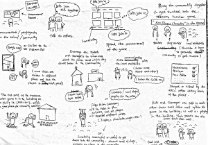
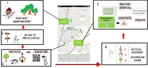
Here is the storyboard of SIA in today’s presentation and here I will explain it in detail.

Our aim is to introduce the treasure hunter game to the young children within the community and the idea is to enhance the neighbourhood relationship within the community. Treasure hunter game will be a team work. Children will be set up into groups with 2 or 3 members. It is better for the game as well as knowing each other. Firstly the treasure hunter game will be started from the gate of nearby park or a street the community. The start point can be vary but the concept is to relate to the community, but need to consider the safety of players as there will be many people gather together in a place. Secondly, there is a function called ‘Map’ on the app and players can use it to find locations they need to go next. First place’s location will be give to the player and use the map function to find the place. The clue of the location can become harder step by step. Thirdly, when reach a location, take photos and the player’s QR code will be scanned by the staffs. Volunteers and parents will become stuffs in the game and the QR code is in the ‘My Account’ function and players using cellphone to take photos so easier to upload the photos later in the App and the key idea is to let players know each place in the community better. After that players have to go to all locations shown on the map, take photos, let the QR code be scanned. Finally the finish point of the game will be at the Arthur’s Hill. After the game players can upload their photos taken during the game and give some interactive feedback of the game, for example, what activities you would like to see in the Arthur Hall.

This is the general idea of the storyboard.


Week 7- Team 2- Chase Park

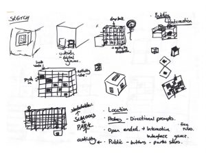
After visiting the primary school we gained a bit more of an insight of what features we would like to include within our app. Sketching out ideas of what features the app would have and what they would entail, we decided to focus on one specific feature of our app that seemed to be a strong point when visiting the school. Secret dens were talked about a lot and we think this feature would make our app unique and feel we have a lot to work with. Sketching out further detail and features of this one specific topic, sketching the app as a walk through and how the children would use it.

SIA Storyboarding – Blog 6

SIA Blog 6

This week we began storyboarding our idea with the aid of Erkki Hedenborg, our academic mentor. We discussed many alternative options and finally honed our digital idea into a designed interactive game for social cohesion and community exploration.

During the beginning of the session we began drafting potential ideas for a digital solution, initial ideas started as digital interventions placed around Wingrove in specific points that would advertise activities and allow users to interact with it, by sound or movement for instance. We then moved on to discuss this interaction in a more physical manner by creating an interactive game. With this, users would gain insight into the Wingrove area, meet other locals, and gaining knowledge of potential activities happening. This is important as those we questioned in our door-to-door survey did note that they did not know of many activities taking place within the area.

The idea stems from the concept of location based GPS games such as Pokemon Go, Geocaching, and ActionBound, in which users have to explore an area to earn rewards or learn things about the specific area chosen. We wanted to replicate this idea by giving young adults/teenagers/kids the option to discover Wingrove and connect with other users to enhance their social connections within the area.

Potential ideas for prototyping this concept could initially be a piece of paper with set questions or facts on it and use of google maps to navigate the treasure hunt. Those using the game would have a set route to follow and have to pick up points along the way that would collate into a final league board, with those with the most points earning prizes or gift vouchers (potentially). Some reservations are held by having incentives to play the game, however we did then lead onto looking at having proactive rewards such as a free one hour music session, or one free activity session at the Nuns Moor centre. In doing this, this improves the users awareness of activities within the area, therefore subverting their attention indirectly to other recreational activities for the youth to engage with within Wingrove.

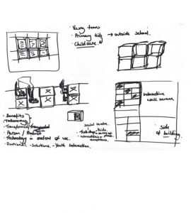
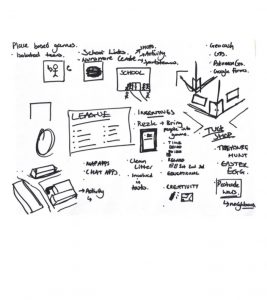
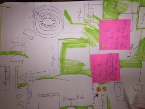
Below are some initial mind-mapping/sketching that led us to the interactive game idea.

. 

User Research

From this we took insight from our user research, as many of the people we interviewed discussed the need for more youth programmes and activities, by using the game idea it gives teenagers and kids the opportunity to play outside and embrace their area rather than having nothing to do. In addition, the use of the Arthurs Hill building as a central addition to the game to engage the youth of the area with the activities going on there, thus indirectly creating a youth centre/central point by having them physically visit the building. Katrina and David Webb both spoke about the need for youth engagement within the area, we feel targeting this group will then set the path for future generations to converse with one another and begin a narrative with them in Arthurs Hill and community engagement.

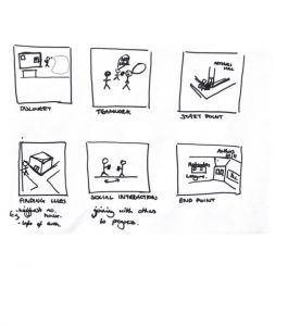
After including our user research we developed a final storyboard proposal which depicts the narrative of downloading the game to the end point of the game.

Storyboard

Next Steps

Our next steps include refining the game idea, deciding where the set routes would be, as well as potentially including different interfaces for alternative uses. The game idea does hold some reservations as we do need to define what exactly the user is putting in and getting out of the game, what sets this idea apart that would make users want to actively engage with it and also, perhaps developing what else the interface can offer, so that we define exactly how it meets our project aims.

Week 6 Log – Storyboarding – NUTC

Week 6 Log – Storyboard

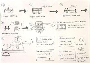
For the second part of this lesson, we decided what sketches and ideas would help bring our idea forward. We manifested this through a storyboard which depicted a theoretical, step-by-step process. It stems from the Newcastle City Council meeting where the main issue was addressed and the project discussed. We then looked at the official cycle lane plan to see what the council has done so far and how we can implement it to achieve our goals. Furthermore, we met with Ali Lamb who explained the whole procedure, we then began our group project and drew up our idea, along with its objectives and identified the surrounding issues such as stakeholders and opposition. This can all be seen on our hand-drawn storyboard.   

Final Idea

Through a long and insightful process of discussing and drawing up ideas, we collaboratively decided on a final concept for our NUTC project. The aims of the project were to advertise a new and extended cycling route for all and ultimately to convince residents and stakeholders of the advantages of this project and bring the issues surrounding it to a larger scale.

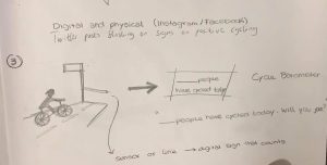
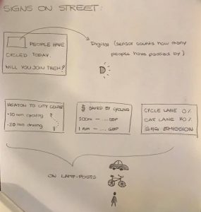
With this in mind we came up with a solid project – a series of digital, interactive sign posts for cyclists, drivers and pedestrians on Heaton Road. The way this would work is that the digital screen would display informative facts about the advantages of cycling for the environment and and show this to passers by so they can gain awareness of the positives it brings.

Our digital sign would be one of many, in different locations around Heaton Road (for increased exposure) and have a multicoloured digital face. It will display text as well as the twitter feed from our #thumbsupheaton campaign. In order to increase awareness of our project idea, this will be accompanied by a side project where we will create advertisements to promote this before the signs are introduced so people are aware of them coming – through leaflets, paper posters in the local area as well as Facebook adverts.  

Space for Heaton meeting

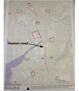
Apart from this we have also met with Mark and Julie. They gave us some more input about the project as well as explained the whole vision, which among other things is to connect the lower parts near Byker to High Heaton through a cycle route. As shown on the map, this cycle route runs through Heaton Road, which makes it a part of a “much bigger thing” that would promote future development in this area. After the meeting we decided that NUTC’s job is to inform the general public about the advantages with this vision, i.e the decrease of air pollution rates of the area, reduction of traffic congestion, improvement of health, offer of safe travel for children, elderly and disabled.

Next weeks plan

Our plan for next week is to start prototyping, as we feel satisfied with our ideas presented on the storyboard. We will also continue to search for project examples that are similar to our proposal. One of the main projects we want to look into are Vote with your feet and Vote as you go from Australia.

Week 6 Log – Sketching – NUTC

Log Week 6

Sketching

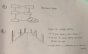
This week we began to pull all of our ideas together into sketches and a final storyboard for our choice of project. We had a range of ideas between us, all inspired by our previous research into cycling projects in the past/present.


Our ideas

Some of our ideas were the likes of using barometers to collect data of cyclists going by, animated signposts in which a thumbs up/down could be registered by the sign to see if people were to find it interesting or not, resulting in either more facts on the post or a link to a website/ twitter page in which people can leave positive feedback. We also came up with simpler ideas like bluetoothing/ airdropping people facts on their phones at certain points on the road so they are able to see benefits of the potential project, or even simple posters put up around Heaton to catch people’s attention or on buses.

Our Feedback From our Mid-term Presentation

Along with our seminar work we also completed our midterm presentation this week. We felt like this went okay and we got a lot of helpful feedback. From this feedback we realise we should do some more research into all aspects of our project, including other projects like ours from which we can get more inspiration, bus timetables and routes so we can supply the knowledge of other alternative transport methods to driving and needing to park along Heaton Road. We want to include more pictures from our site visit and our meeting with Julie and Mark, this wasn’t asked of us but came from our own personal reflection on the presentation. One final point given to us was to think about where we will display our signs.


SIA Week 5 Log

This week we researched further into digital solutions for public engagement and we found some examples which deal primarily with engaging public opinion on a local level. From our seminar work we found the example ‘Viewpoint’, which is a digital interface that allows residents to vote and submit their opinion on local matters. The original Viewpoint technology was developed as part of the Bespoke project and it allowed local councillors and community organisers to ask simple questions with binary answers. A concept like viewpoint would reduce the time needed to complete door-to-door surveys. It would also remove the unpredictability of uncertainty, as we found out, door-to-door are not always successful. Cons of the product however, include the loss of the personal face to face conversation that community thrives on, the lack of explanation or elaboration of peoples’ opinion.

The Viewpoint example can be seen at: https://blackboard.ncl.ac.uk/bbcswebdav/pid-3867159-dt-content-rid-13421720_1/courses/K1819-TCP2031/Reflections%20on%20Deploying%20Distributed%20Consultation%20Technologies%20with%20Community%20Organisations.pdf

We hope to continue looking for more examples in the following days.

We also finalised our user research tasks and performed door-to-door surveys around the streets of Wingrove with one of our project partners, Katrina, the Greening Wingrove CIC Community Organiser. Whilst surveying local residents we also took this opportunity to interview Katrina about her personal thoughts on the area and the aims for the Arthurs Hill building. She spoke passionately about the need of more activities for the youth, ranging from toddlers to teenagers, and about the interconnection and potential link the building could have with other community facilities within the area, such as Nunsmore park.

From our door to door survey we obtained 20 responses. Of the people who answered the door their opinions seemed to echo Katrina’s in their vision for a thriving youth programme within the area. Below are the questions we asked and the most common responses we received:

What activities or events usually take place in this area? This question received various responses including Greening Wingrove events, Nunsmore litter picking, community groups and parties. However, of the 20 responses, 10 said that they did not know of any.

What are the changes Arthur Hill should make to become more socially environmental? The most common response was creating or finding things for the youth to do, such as having kid’s clubs. There was also mention of waste management, a community centre and a social media platform for communication.

 How do you feel about interaction within the area? (Ranked 1-5, 1 = poor, 5 = good) Out of the 20 responses, the average response given was 2.7, which is a fairly poor response. Not a single person gave a 5 response and 1 was given four times.

How close are you with your neighbours? (Ranked 1-5, 1 = poor, 5 = good) Out of the 20 responses, the average response given was 2.6, which is also a poor response. From this question and the one before it is clear that there is room for improving social interaction in the area.

Do you wish to improve your interaction with your neighbours? (Yes or No) 13 respondents said that they would want to improve interaction with their neighbours.

Do you think a digital platform would help with this? (Yes or No) 15 respondents said that they believed a digital platform would help with improving interaction in the area.

What is your experience of using local facilities? (Ranked 1-5, 1 = poor, 5 = good) The average response received here was 2.9, so just below a satisfied response. Again this proves there is room for improvement.

What local facilities do you often use?  This question received a wide range of responses including restaurants, church, cafes, Time Centre, transport, shops and supermarkets. However, the most frequent response was green spaces and parks.

How often do you use existing local facilities in a week? From the responses, the average response was 2.4 times a week. The most common response was once a week.

Do you use existing social platforms (such as Facebook groups) regularly? (Yes or No) Only 10 of the 20 respondents said they use existing social platforms regularly.

What do you use these social platforms for? Of those that said they used the social platforms, entertainment and news were the most common response. Arranging meetings and reporting issues were the other responses given.

 Whilst surveying door-to-door, we did come to the realisation that this method is not as successful as pre-arranged interviews or meetings, it is a long process with little outcome. We felt that for the most part, a digital solution could be a highly effective potential going forward, taking inspiration from the Viewpoint boxes, which we found in our example search. From this, our digital design could be focused on gaining a broad and ranged opinion from a digital polling system. Whether this could perhaps be an interface inside/outside the building or in local shops/cafes is something we would have to discuss further.

Another idea that came from the user research was potentially creating a digital interface for the youth of the area to connect with the building, and the area, as we learnt of the hardships of many of the families within the area. It could potentially be worth-while to create an interface for the youth of the area, as many come from disenfranchised homes, some even being crammed into a house with 5 or 6 families, as we learnt from Katrina.

Our next steps for the project is to begin mapping out and sketching our digital interaction solution. Bringing together both our example search and user research to create the best solution for public engagement and interaction within the Wingrove area.
Week 6, team 2

This week, as a group we went to Front Street Primary school to carry out a workshop with a year 5 class. The workshop was split into 4 tasks- Firstly, to get the students to draw the park from memory. Secondly, to label their favourite parts of the park and why- by using stickers and post-it notes. Thirdly, in their opinion what they feel could be improved within the park and finally, how do they tell people about the park. They were split into groups of 4 and were able to write and draw their ideas. As a group we found the whole experience useful as our brief is aimed at their age range. When it came to the positives about the park some areas were clear favourites e.g.- windmill, play area and workout space to name a few. Many of the children felt a negative aspect of the park was the way some teenagers use it (drinking, smoking and being loud) and the amount of rubbish, many felt if these issues were tackled it would improve the park. Another improvement the children suggested was that events at the park were more publicly known about, as some felt they would miss out due to the lack of advertising prior to the event. When we asked the children how they would tell people about the park, the majority said through posters or a website. For the website to work they said it would need to be kept up to date and should include future events as well as links that allowed people to find out more information about the park.

Within our seminar this week, as a group we feel creating an app would be most appropriate. The app would consist of a video showcasing Chase Park, with different options- for example a few of the children mentioned that they would like to know more about the history of the park. By using the app, the children could scan a QR code in a particular area e.g. the Windmill and the app would pop up with information about the history of the windmill, this isn’t just applicable to the windmill. Another example would be an event time table- with pop up reminders. Children could either access the app through their own mobile phones (with parent permission) or done in a class environment- so the teacher could let them know what was going on, making sure it would be age appropriate.


Team 2- Workshop at Front Street Primary School
Team 2- Workshop Front Street Primary School ( what could be improved)

6) TRECC- Storyboarding and Prototyping

Storyboarding and Prototype (1)

After the sketching stage, we created storyboards to illustrate the uses of our products in given contexts. We chose the digital intervention to come in the form of an app, available on the phone. This is because we want to create something new, that is easily accessible, with little effort.

Our concept focuses on encouraging engagement, which is why we choose features that simplify the process of engaging. QR codes will be a feature of the promotion, paired with advertisement and promotion.

As mentioned earlier, our target group is those who already have some interest, but who find the meeting times inconvenient, or find the current processes difficult/unsuitable. With that in mind, we focus on the feeling of uncertainty and hopefully turning it into action.

The promotion stage is therefore very important and one of the main ways to reach the audience will be through the City council. We hope they can promote our app on their webpage and incorporate It as a part of something bigger. From the Interview with Sheila, we have also noticed that community engagement is effective when promoted at community events.
So in addition to the councils website, we will promote It physically (flyers and posters) on notice boards and around the neighbourhood, promote it at events and have them on bus stops in the areas.

DigiVox- a platform for the community to engage with projects.
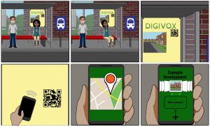
the storyboard illustrates how the user interacts with the app for the first time. It is a potential situation where the residents are waiting for the bus and will see the advertisement for the DigiVox APP. The QR code can be easily scanned by a smartphone which will then take you to the projects.


Prototyping part 1
So we decided to use Marvelapp for prototyping our app. It seems fairly straight-forward, and do not require specific skills in Adobe or programming.

We have assigned different roles:
Stitcher- Thomas (others can help)- keeping overview and piece together the
interfaces

Designers- Cindy (graphical components + Layouts)
Rory (Asset collector + Layout)
Ellie (text and communication + Layouts)

Writers- Cara (product assessment, description)


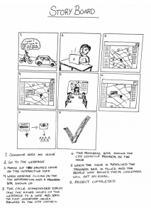
6) We Love Bikes: Prototype and StoryBoard

The prototype for our design will include multiple user friendly interactive features that all revolve around improving the accountability and the communication of information of the forum. All these features will be available on a website dedicated to the cycle stakeholders forum.

One of the main features of our website prototype will be an interactive map which shows the location of issues raised involving cycling infrastructure in Newcastle. In this format everyone including new members to the site and forum will be able to clearly see the key issues and problems facing cycling in Newcastle. Users will be able to view the key issues raised in the meetings and also on the website and view comments by other member of the public, members of the forum, engineers and council representatives. Each issue will also show a progress bar showing different colours that indicate whether or not these issues are being addressed by the council and at what stage these improvements are at, this will improve the accountability of the council and show that the issues raised are being used by the council. There will also be markers to show where improvements have been completed by the council from issues raised by the forum to show new members that the forum works and cycling infrastructure is being improved in Newcastle.

There will be an organised minutes section that is set out in chronological order that users can access to see what was brought up at each meeting. Users will also be able to access meeting dates and times. It will also have links to other relevant groups and pages that are relevant to cycling in Newcastle. Users will also be able to create profiles to be able to comment on different issues. They will be awarded points when they contribute to the page which acts as an incentive to do so, this means that individuals can be recognised for the time and effort they put into the forum.

To have a glimpse of our prototype, here is a storyboard that shows how our project could be helpful and how we can use it. The starting point is basically a cyclist facing a problem and who wants to raise it up to the city council.

Week 6, NUDC: Storyboard sketching

Hello again,

During this week’s lecture we listened to a representative from the group SPACE for Gosforth. What he talked about is very much relevant for our project since the group wants to make Gosforth more amiable for cyclists. However, the area of Gosforth is not a part of the Streets for people campaign which makes it harder for them to evoke change. So while the council aims to change people’s way of transport via physical changes of the streets the SPACE for Gosforth aims to change people’s way of transport through an attitude change first and then physical changes of the streets. When we talked to the stakeholders one of the problem that came up was that the public did not understand why the council was changing the area. We’ve discussed this before and decided that we in our product will add information not just about the planned changes but also about Streets for people.

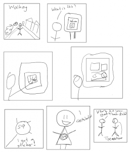
During the seminar and our meeting we started discussing the outline of our storyboard and user experience as well as starting to draw it. All in all we’re thinking about 7-8 storyboard panels for demonstrating the use of our product. Below is the basic outline sketch of the storyboard.

It is important for us to include the most important uses for our product, informing and gaining feedback, together with the sticker concept as a mean to spread the word. The setting will be outside and since we’re hoping to get a lot of response from students, who to a lesser degree have cars, we don’t think this will be a drawback. We’re also thinking about having a second display with the same software in an inside setting as well, for example in the library.