9) TRECC – User Testing

The goals of our prototyping sessions is to gain critical information from our stakeholders on their opinions about our app design. The most important thing being whether they think the design has fulfilled our project brief and do they think it would work in practice. From here, we can add or take away any features they think as they are more knowledgable and because we have been working so closely to this app for a while we may have missed some vital elements.

We created a script that would be asked to all stakeholders so that the information we received was in some way structured and we could easily compare the comments. Here is a copy of our proposed questions:

  1. Does the prototype do what it’s supposed to?


  1. Does anything distract you or get in their way?


  1. Does the navigation path work? (Can users find what they’re looking for?)


  1. Do you think this fits the target market?


  1. Is anything confusing or unclear?


  1. How likely or unlikely would you be to recommend the finished product to a friend or college?


  1. How would they describe this product using their own words?


  1. Does this app solve the problem?


  1. What, if anything would you change?

We first of all get the basic questions out of the way and then we see if it is practical to use and easy to navigate. The usability sessions are needed to highlight if anything is unclear to the average user as we need to make is as user friendly as possible.

In the session, we would start off by introducing screenshots printed on A3 to give an outline of the features of the app and the design aesthetics. Also, we would show them how the app would be accessible in daily life by showing them the poster we designed with the QR code on. We would explain how this would be posted through letters boxes juts like they do every time there is a community consultation meeting. However, highlight this would minimise paper because from there the app allows notifications of new developments. This task is so they can see everything together to see if anything stands out immediately.

Following on from this we would then pass them a phone with the app loaded as any other user would see and give them tasks to reach certain pages. This would tell us how the app performs and makes it easy for them to express if they get stuck at any point. In the session, we would try and follow the questions so there is structure and they don’t go off on a tangent. It is also to ensure that the conversation is relevant. Our sessions will be private so that it is not too noisy so we can properly explain and can have a conversation with no distractions.

In terms of the 5 act interview from the Sprint Book, we would have already done a friendly welcome as we greet them at the meeting place and we will start to introduce the prototype with the A3 paper. The questions will follow merged with the tasks and the debrief will come at the end concluding the session.

8) TRECC: Prototyping detailed

Blog 8- Prototyping detailed

Level of fidelity
It is fair to say that our product has a middle to high level of fidelity. It is relatively high as we have refined our design, layout and pathways to make sure the app can run smoothly during prototype demonstration. Even though we started off with low fidelity, we quickly realized that it would be ideal for a higher level of fidelity to make the prototyping as realistic as possible, but also to ease the processes and tasks of prototype demonstration. Therefore we increased the level of fidelity , but not to the point of programming the product.


Design
The visual style of the prototype is essential in the prototyping as it becomes a tool for enchancing readability and communication. We have decided to use a Green theme combined with neutral blacks and whites, and the font roboto for the design. By limiting the color choices, we also simplify the design. Our icons and buttons are made to be as universal as possible. They all reoccur in the same format to simplify the navigation and communicate familiarity.

Pathways
As our main goal is to increase community engagement in the society, one the most important feature of this platform was the comment section. This became one of the pathways to test the user on, in the form of a task, where they had to post a comment about a development. The other important pathway is the designer’s pathway to editing and interact with the project.


Goals for the prototyping demonstration
Our main goal for the prototyping demonstration is to gain an insight into the interaction between product and user. We want to understand the products use in a context and see what areas the product lacks in. Our goals will therefore be: -To see the pathway to finding or completing our tasks such as commenting and checking their  engagement level.
-To understand the main weaknesses of the product
-To understand the readability of the product and the challenges of navigating through the app.


Prototype demonstration and User testing
We have generated a list of interview questions as well as a sheet for user testing. The sheet for user testing will largely focus on the pathways and tasks, while the set of interview questions are more for the overall feedback.

7) TRECC: prototyping.

This week we learnt the importance of prototyping, and the implications it has on our own project (DigiVox). It was interesting to learn and consider that a ‘prototype is a manifestation of a design that allows stakeholders to interact with it and to explore its suitability’. This manifestation has directed our design focus, a goal to create an efficient mobile application to improve community outreach between developers and residents and ultimately, our client’s needs.

Considering our story board, the area we want to prototype is the use of the app. With this in mind, our group has worked on designing and creating are first prototype this week. It was clear the process of a user using the app interface is the most important part of the storyboard to prototype because it is a radical innovation that has not been done before, so testing will be integral to meeting our goal. By doing this we can refine the application, and hopefully developing an ideal way to tackle community outreach between developers and the community.

Moreover, from this week’s lecture it was interesting to understand the broad scope to prototyping, especially with our own prototyping getting underway. With relevance to our own project, it was clear that our prototype has a fairly high level of fidelity. We knew early on that a mobile app was the way to answer our client’s needs, so after a only small amount of research by using other mobile apps, and a few sketches we were ready to create a digital version. By using MarvelApp to formulate our application we have been able to get as close to a final product as possible. This means we can test how easy the final interface is to use. The advantage to this is that we have the opportunity to get our stakeholders involved, and gain valuable feedback.

First use of MarvelApp

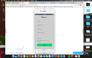
Sign Up page

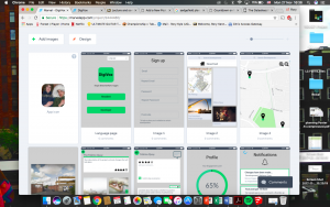
Refined and Detailed version of our prototype (1)

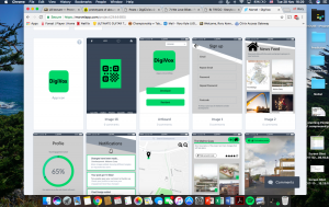
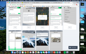
Refined and Detailed version of our prototype (2)

The first use of MarvelApp was to get an understand to how the software works and ultimately organising the basics of our app.  We then added more detail in aesthetics and in the functionality of the app. By doing this there is more and more tweaking done to hopefully make the final product.

6) TRECC- Storyboarding and Prototyping

Storyboarding and Prototype (1)

After the sketching stage, we created storyboards to illustrate the uses of our products in given contexts. We chose the digital intervention to come in the form of an app, available on the phone. This is because we want to create something new, that is easily accessible, with little effort.

Our concept focuses on encouraging engagement, which is why we choose features that simplify the process of engaging. QR codes will be a feature of the promotion, paired with advertisement and promotion.

As mentioned earlier, our target group is those who already have some interest, but who find the meeting times inconvenient, or find the current processes difficult/unsuitable. With that in mind, we focus on the feeling of uncertainty and hopefully turning it into action.

The promotion stage is therefore very important and one of the main ways to reach the audience will be through the City council. We hope they can promote our app on their webpage and incorporate It as a part of something bigger. From the Interview with Sheila, we have also noticed that community engagement is effective when promoted at community events.
So in addition to the councils website, we will promote It physically (flyers and posters) on notice boards and around the neighbourhood, promote it at events and have them on bus stops in the areas.

DigiVox- a platform for the community to engage with projects.
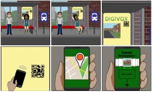
the storyboard illustrates how the user interacts with the app for the first time. It is a potential situation where the residents are waiting for the bus and will see the advertisement for the DigiVox APP. The QR code can be easily scanned by a smartphone which will then take you to the projects.


Prototyping part 1
So we decided to use Marvelapp for prototyping our app. It seems fairly straight-forward, and do not require specific skills in Adobe or programming.

We have assigned different roles:
Stitcher- Thomas (others can help)- keeping overview and piece together the
interfaces

Designers- Cindy (graphical components + Layouts)
Rory (Asset collector + Layout)
Ellie (text and communication + Layouts)

Writers- Cara (product assessment, description)


5) TRECC- sketching concept ideas

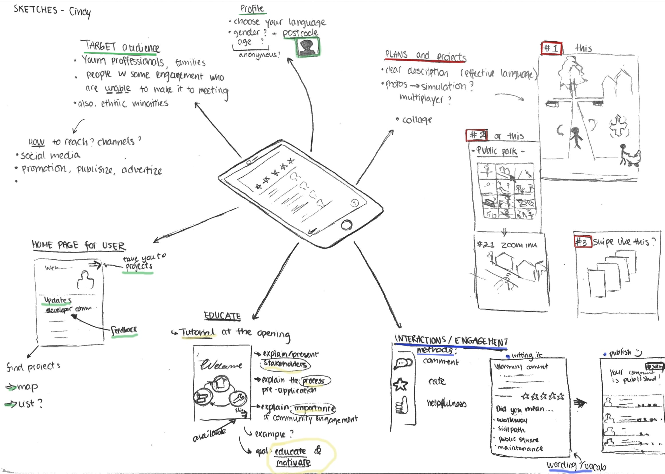
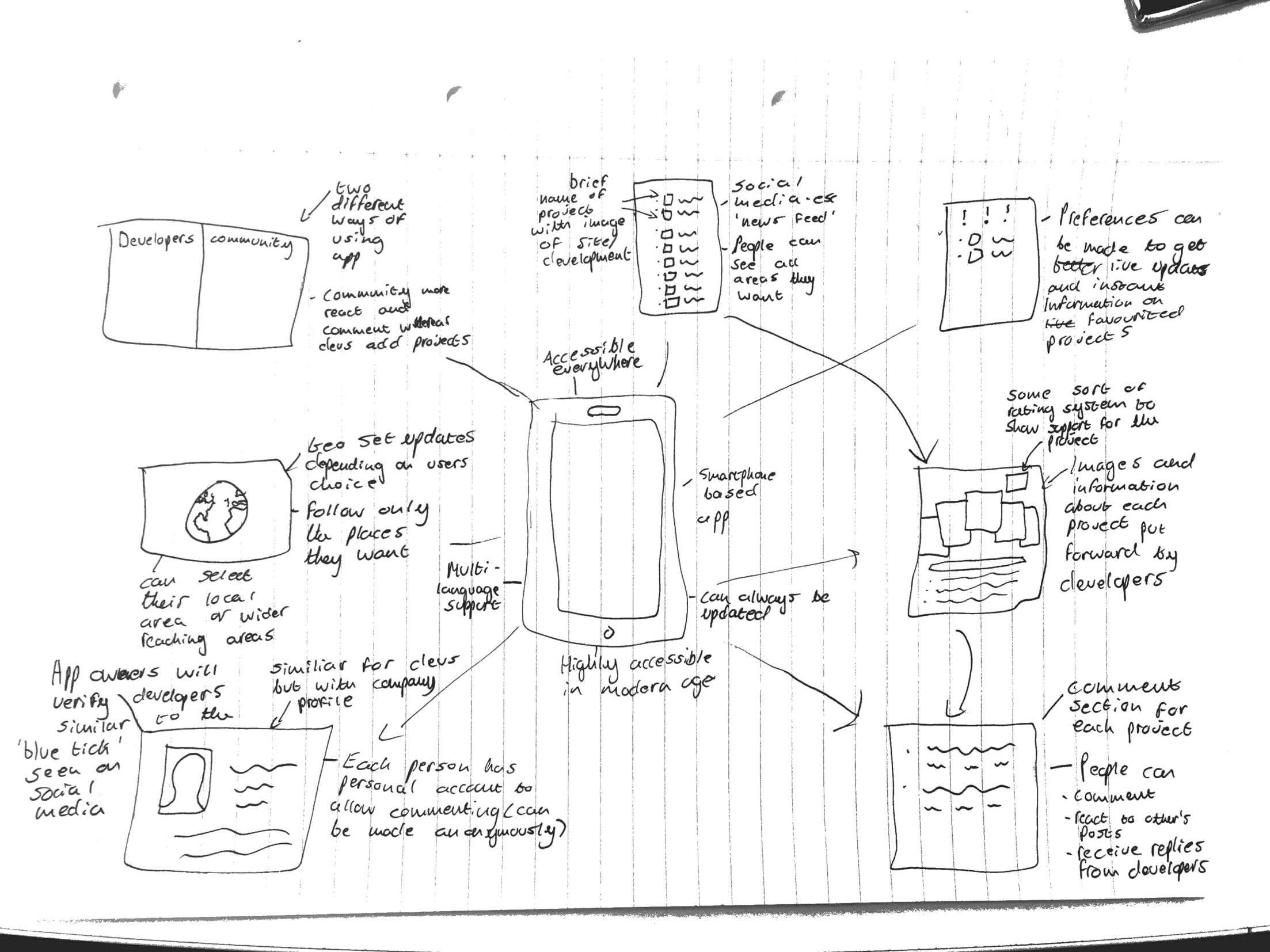
Hi, this week our group moved on from the ‘mapping’ section and began the ‘sketch’ section of our design sprint. We considered all the example research we had done, and thoroughly examined the summary notes each individual had made on their example readings as shown in blog 4. For us, it was also very important to consider the feedback we had received from client and mentor meetings (Nigel and John, Peter, Shelia, and David) which has been summarised in previous blog posts. The clients represented all the users we will be attempting to reach with the creation of the app, so, because different members of our group met with different clients, we then each acted as a facilitator for the opinions and interests of that user group. We had, firstly, come up with individual sketches based on the examples we had personally found and the feedback we had personally received from whichever client we met with. Here are some of the examples of our individual sketches:

 All of the sketches show we are designing a mobile based application, for easy accessibility and to modernise the process of community involvement, for which a profile home page will be needed. The most vital part of the app will need to be the uploaded content, that the developer provides, for the community to assess and comment on- an action that all of the individual sketches included. The developer can then see these comments, respond to them, and include them in their ‘statement of community involvement’ that they provide to the council. This way, the community can read any documents or images that would have normally only been available at the meetings and feel they are engaging directly with the developer- without having to attend the meeting, which is the main focus of people we are aiming this app at. One of the sketches includes a element of education within the app; to explain the process of community engagement, why is it important and what the pre-application stage involves. This could be important for including ‘harder to reach’ members of the community who may not understand the logistics or need for planning application consultancy.

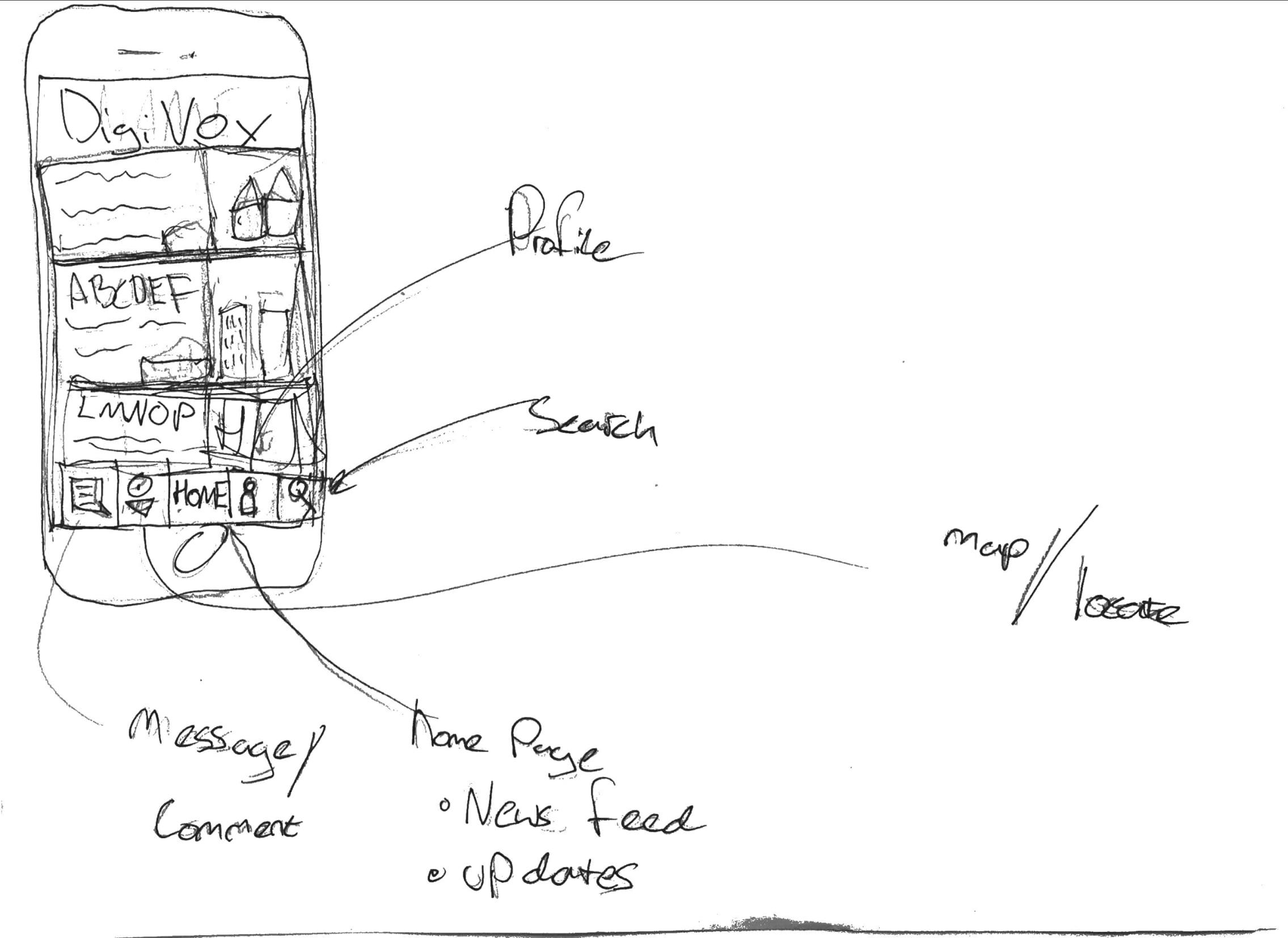
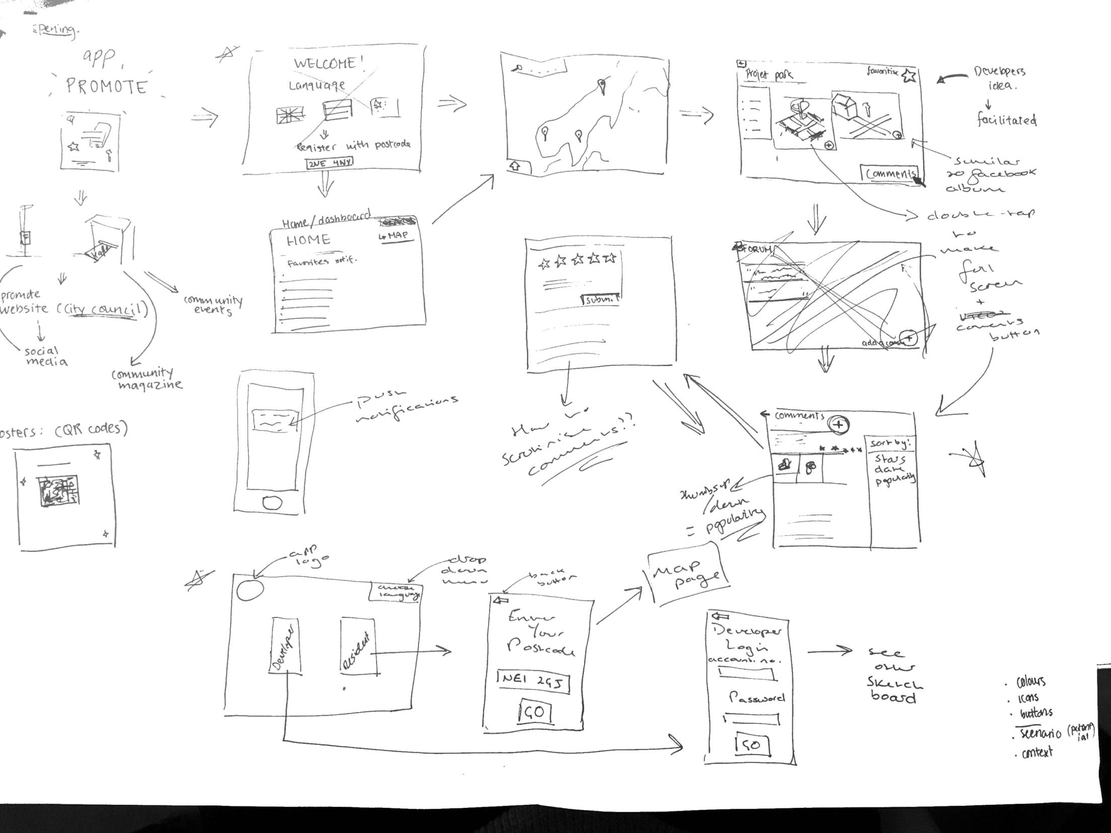
In the seminar on 8th November, we then collaborated to come up with an ‘overall’ sketch, which will act as our draft concept for the process of the app- we can fine tune and amend this over the coming weeks as well as we receive more feedback and think of more ideas in order to create a neater, final version for the presentation.

We decided the app would have to be accessible for both the developer and community residents, so would need two different overall sketches, depending on who was using it. Therefore, the opening page of the app would be a selection page where you can choose to access the developer part of the app or the residents part of the app; selecting the developer button will move you to login page where they can enter credentials provided by the council (so only legitimate developers can use it) or, selecting the resident button will move you to a page to enter your postcode, which will then automatically (only upon first login) take you straight to a map page, showing all the developments in the local area surrounding the postcode provided. We also all felt strongly about having a drop down language selection button on the home page, in order to include minority groups living in the area who may fall under the ‘harder to reach’ category.

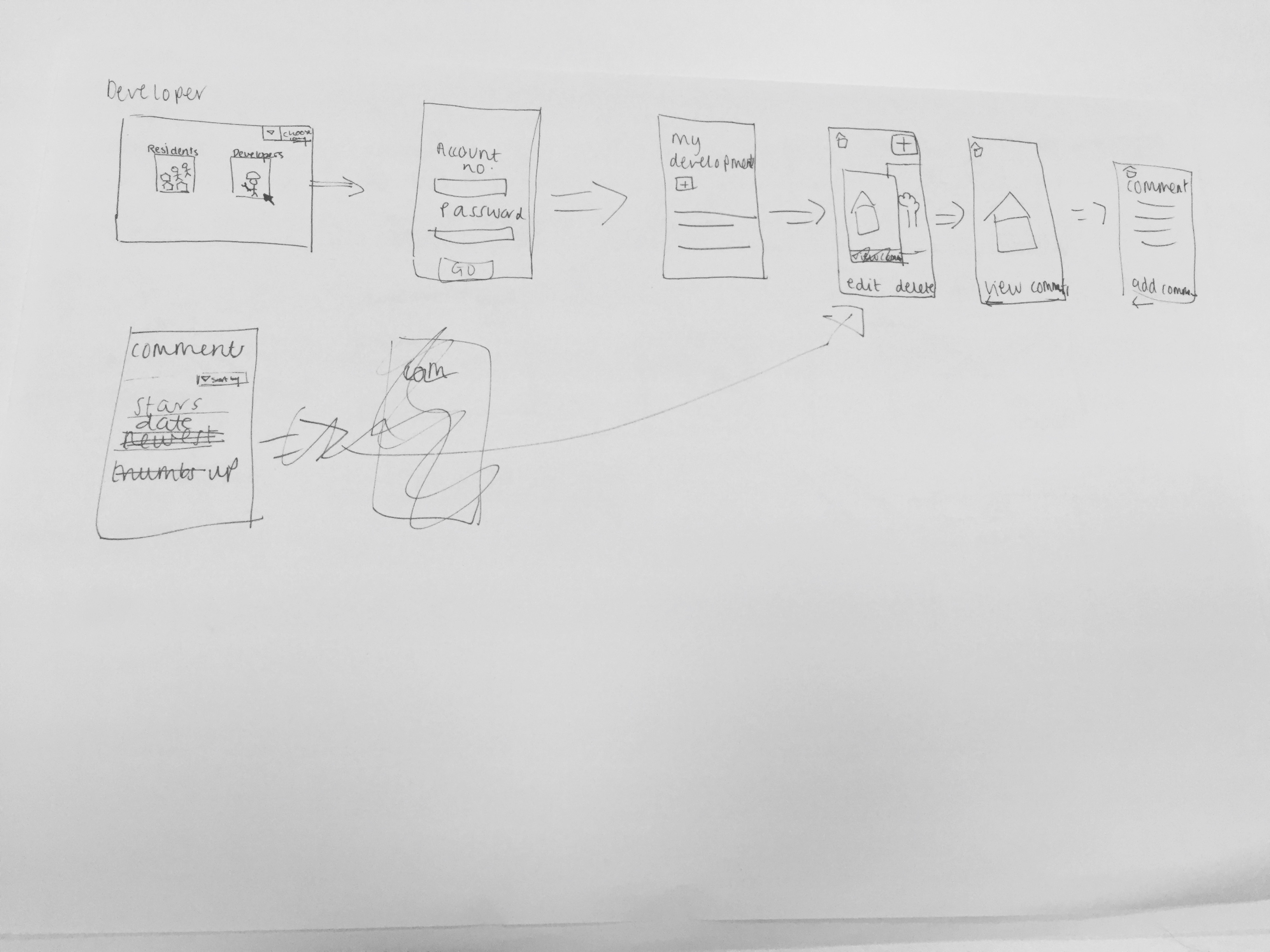
The top image shows the sketch for the developer’s side of the app, so once they login they are taken to a ‘my development’ page, which will contain an overall description of the development and the ability to add, edit and delete documents or images relating to the development. This development page will then be accessible to residents from their side of the app by using the map to select which development page they want to view.

Key features of design:
-Commenting is also going to be available to both developers and residents, in order for them to engage directly with each other. Each document or image will include a 5-star rating system and a comments forum, and the developer can view comments on their ‘my development’ page, with the ability to sort the comments, for example, by number of stars. A thumbs up/thumbs down system will also be added for residents show agreement/disagreement with another resident’s comment, instead of writing their own comment saying the same thing- this will then make it easier for the developer when sorting through the comments as they can gauge which opinions are most/least popular.
Residents can also ‘favourite’ certain developments so updates regarding that development appear on their home page when they log into the app in the future and, if they choose to enable them, will receive push notifications telling them if, for example, the developer has uploaded a new photo into the developments’ document and image album- similar to a Facebook notification when someone you follow uploads a new image.

– The material published about the projects are facilitated by a third party (the app developers)- to reduce bias and increase communication by making the language understandable, clear and neutral.

-Update button is important to ensure that their opinions do not get lost in the process (as complained about earlier), and to ensure that all parties are updated with the most recent opinions and amendments.

Additional features
-There will be language options in the beginning of the app, so that minorities and “harder to reach”  groups have an opportunity to get engaged.

-The graphic and visual design need to be simple to increase readability for the user.

To progress the overall sketch we now need to answer some questions that arose during the seminar- how do we scrutinise resident/developer comments? how do we encourage the developer to upload documents/images to maintain transparency? how to we simplify terminology to make it more accessible to residents? do we include the ‘education’ part of the app?

Over the coming weeks we will constantly refine the overall sketch as new ideas arise and issues become visible during the prototyping stage of the sprint.

4) TRECC Review and Project inspirations

This week we made a lot of advancements from the previous week as we felt we couldn’t really move forward without meeting our mentor. When we met with Peter he guided us on power dynamics as something major we need to consider- do community feel safe expressing their views to a large, intimidating company? Will their voices be heard? Will their views and opinions be twisted? David also expressed concerns over transparency- how much will be released to the public? Will anything be held from public? Regarding the app he suggested a few things for us to consider:

  •  A reference/scrutiny group to sign things off from developers before posting on the site and approve comments from residents before they go live
  • Is it possible to have a framework? Each development is different
  • Developers digitised proposals make it easy for them to gloss over more difficult/controversial parts of the scheme- we need to be aware of that and keep up level of transparency
  • Always going to be controversy and challenge around new developments- has potential to cause more dispute
  • WHO IS YOUR AUDIENCE?

From the meeting and time spent as a group we had began to perfect our ideas and think more in depth about the exact features of our app. Another main point is the we had previously been calling the group of people we wanted to engage with ‘hard to reach’ and from our mid term presentation it was pointed out that how could we engage with all these different groups of people with one app when they all have different needs. We came to the decision that we would be focusing our app on the groups of people that already show an interest in planning but due to current procedures they cannot express how they feel. Now our aim was to focus on people that wanted to engage but couldn’t rather than get more people engaged because you can’t really engage someone if they don’t want to be engaged. From this we had a clear focus and could begin to start thinking of how we would design our app.

Atlanta Community Engagement Playbook:

Inspirations for the app came from literature and ideas around the world and we could really start to get specific in what we wanted. One very helpful literature was about the Atlanta Community Engagement PlayBook which is designed for Atlanta one of the fastest growing cities in USA to engage communities to facilitate constructive engagement and to mobilise community-led development and change. The long-term goal is to offer community associates and service providers a set of actionable practices to achieve greater levels of quality engagement. We selected this as one of our main inspirations as we would be associated more closely with being a ‘service provider’, but some of the principles behind the plays for community associations are what we are trying to include within the app (e.g. creating a community led vision for change; creating an inviting and open platform for community members to rally around; and weaving elements of fun and culture the practice). The long-term goals of the playbook is similar to our long-term goal as we want to create a tool that will actually alter the current practices, however we are going down the route of the app rather than more community based projects. This makes it easier for us to involve all the members of the community that wish to be involved. Some of the action guides provide useful methods for some practices, we have used, and could still use, some of these guides when going through the processes of mapping, sketching, deciding, prototyping, and testing.

Playing with Empathy: Digital Role-playing games in Public Meetings

This literature was a study of the implementation of a game called participatory Chinatown a 3D multiplayer game designed to be played in the physical space of planning meeting in Bostons Chinatown neighbourhood. The reading helped us to understand how role-play can affect the way people understand issues and engage and looks at challenges of extracting player empathy from gameplay to a larger context that can then be studied and implemented. Some features include augmented deliberation like debating while playing as character in 3D virtual world (not necessarily as themselves) enchancing empathy, which is needed for group cooperation. There were high scores at the end for discussion where the discussion moderator asks people (using characters name) on how they felt about results this prompted discussion about competition, trade-off, lack of resources, transportation. Participatory Chinatown demonstrates that role-play can engage players in local issues and motivate engagement. However its making people aware of how the framework acts outside the game when you cannot score points. We used some extractions from this document rather than the framework of the game. Our target audience is not people that have a lot of time on their hands and would not really engage in something that required so much effort as going somewhere and walking around. However from this we learnt that the whole idea of visually seeing something and being able to walk around it and see all elements really helped with engagement. From this we started to develop ideas about a map feature in our app that would allow users to physically see the development locations and scroll around to see exact details. Also the importance of the discussion aspect, in our app rather than promote a huge conversation between everyone which could go off topic we are thinking about more of a news feed of everyone different comments so everyone feels their voices are heard.

Second life:

This idea is advanced logging (collection of data) techniques to capture the interactions of the user with the virtual environment to generate a log i.e. what people look for in a CAD imagine or where they go in a game. This is then brought together to create an approximate estimation of real user interaction with the project in real life. It can produce design ideas and amendments from planners and users of the programme. Second Life gives a running account of user experience with the project as it starts and moves on, giving planners better and more comprehensive ideas for the use of space. Second Life puts users in a virtual world in the place of an avatar or a playable character, users walk through and interact with the space and the objects within it. Users can see how the new development will look or show how they interacted with the old site and information is collected from both. We took a lot of inspiration for this as it really showed that ICT is becoming ever more vital for urban planning in 21st century but there is some worry about more local communities being overlooked in favour of more global and further reaching initiatives so we realised the importance of focusing on the local. From this we decided to make everything user specific so that the community felt that this application had been made for them and tailored to there needs which we had gathered from our stakeholder meetings. But also heavily featured these ICT features that are fairly new and we new we wanted the make something modern and innovative. It showed us that to visualise it there needs to be a feature of the virtual environment we have continually seen pop up to stay with the times.

We look forward to start defining and perfecting our ideas.

3.1) TRECC Interviews with stakeholders: Outcome

Reflection log 26th Oct

Here is a summarised, detailed overview of the interviews with each interviewee: Peter Cockbait and Sheila Spencer.
________________________________________________

Interview with Peter 25.10.17  
After introducing ourselves and briefing about the project we asked them to sign consent forms to allow us to record them.
Attendance: Cindy, Thomas, Rory

Who are they:
Peter Cockbain and Heather Docherty both work in the fairer housing unit in the Newcastle city council. They work on turning council-owned land to delivered housing. The council works closely with the developers when it comes to planning and public engagement. There is a large focus on accessibility and the residents well beings. They also pay a lot of attention to special minority groups.

Key problems:
Peoples mindsets, they are often negative and have little or no belief that they can influence or make a difference in the planning process.
ReachThey find it hard to reach out to the poorer neighbourhoods (Language and literacy issues), as well as students. Older generations and families tend to get more involved. With many groups, they mistrust towards the local authorities and feel like they are almost working against them.
Lack of common ground for the public to express their views and opinions.

Methodology:
-They try different methods ranging from questionnaires, surveys, interactive posters, joint consultation events. Sometimes they combine these methods with bigger events as opportunities to promote and engage.

Evaluation and results:
-The participation levels vary according to the issues.
-The results are not representative of the community as a whole as there are often small vocal minority groups that speak up and create an intimidating atmosphere for participation. -The Relationship between planners and public:
It depends on the planner, their experiences and how they communicate (tone, language). -The council tends to work alongside with developers. There is social value to high engagement, it’s important to make sure that there is a common interest to help the community amongst the local authority, planners and developer.

3 wishes:
-happy residents, living in good quality housing who feel like they are heard.
-positive perception (no assumptions) where they are comfortable with the process.
-better communication, promotion.

Brainstorming of ideas in regards to opportunities using digital platforms?
-anonymous participation. A technical platform can provide consultation opportunities at low costs.
-language barriers. Social media and tablets?

_____________________________________

Interview with Sheila Spencer 26.10.17  
After introducing ourselves and briefing about the project we asked her to sign a consent form to allow us to record her.
Note: Sheila has worked in the organisation for a while and can comment on the changes over the years if any.
Attendance: Cindy, Thomas.

Who:
Sheila Spencer has worked in the independent organisation, Ouseburn valley Trust, as a trustee for over 20 years and involved with community participation in the planning and projects in the area.
Experience with public engagement:
-Engagement levels vary as it depends on the projects and how it affects people.
-The perspective is still quite cynical amongst the communities.
-The way the organisation involves people has not changed drastically, but it has gotten harder to get information, as the council is possibly more hard pressed (little people). It is hard to get the information and find it.
-it is also not representative as mailing list goes to many people outside the area. People who use the area are usually quite passionate and engaged with the projects.

Other changes:
Many new accommodations of different groups of people. Those of higher socio-economic status are often more involved than the poorer neighbourhoods and new students.
students are not as invested as many don’t stay long-term, and disadvantaged and homeless groups do not trust the authorities.

Complicated process:
-The developers have to consult multiple times with the public, it is often unclear when
things get approved and informing people about it.

Key problems
Reach: Promotion, informing and communication methods are not very efficient, mailing lists are not efficient as many don’t check. (Facebook works to some extent)
Hard to attracpeople to meetings (depends on the issues)
Poor communication between planners and community in terms of planning process, important information and updates.

Relation and communication between developer and community:
Developers have different agendas and often mispresent things as they use CAD models instead of realistic photos. There is mistrust.
-Their language is misleading (like promising jobs, which are actually just temporary)
-Uncertainty, hard to see the actual changes, and many “invisible” amendments to plans.
-Method of engagement from developers side is sometimes successful such as using community events, stalls to increase participation, or using a facility and inviting people.
 Limitations to developers methods to engage the public:
-Developers tend to develop the questionaries’ with can use misleading or confusing language. It ends up supporting their views (motives).

3 wishes:
-Would like to see developers increase their reach and circulate to more people in more ways. Better promotion to reach people using clear (non-formal, legal) language and increased visibility (bigger posters).
Developers setting up events. Ideal: independent facilitators to engage people (reduce bias)
-More approachable and accessible material from planner: Improved design, layout and graphics of planning sites so that documents become easier to navigate. They also want to be better informed and updated about the most recent changes, amendments. (be more clear in the 2nd round of planning).

__________________________________
In both interviews, we experienced similarities in the responses regarding the engagement and that both stakeholders shared the key problem of reach, and increasing the engagement of the public. They both expressed the difficulty in changing the perception of the community.

3) TRECC Planning: Interview with Stakeholders: Peter and Sheila

Reflective log- Our Approach to user interview

This first part of the reflection log is about the planning of the the user interviews. We plan how to approach the interviewees, our goals and questions.
The second post 3.5 will be about the actual interviews and outcomes.

Who do you involve and what insights do you hope to gain?
It is important for us to understand the current situation as well as identify the key problems from the different sides.

We will be interviewing Peter Cockbain (and Heather Docherty) , who represents the city council (fair housing unit) and Sheila Spencer, who represents the community perspective. We hope to gain and insight to the perspectives of the stakeholders regarding the planning process and community involvement. At the end, we will ask each stakeholder: to make our project a success, what 3 wishes they might have in regards to improving the communication (planners and public) and community engagement.


The main goals and insights of the interviews
For Peters Cockbain interview, we plan to focus on the methods of engagement deployed by developers and councils and the evaluation of their effectiveness and outcomes.
We will ask about how they approach different groups and how they communicate with the public and the challenges that come with.
For Sheila Spencers interview, we look at the role of the user and how the community experiences planning projects and the public engagement. We will also look at their relation between the authorities and public as well as the the communication issues around this.


Method
We decided to use a Qualitative approach in users context. The key idea was to understand the practices that take place. We will focus on the existing situation and what each side perceive as the key problems. A Semi-structured interview will take place where we have a set of questions, but allow flexibility around topics and give room for open discussion. In both Interviews we try to guide the stakeholders through our questions, and to focus on the engagement and the relation between the authorities and communities.
We will ask the interviewees to sign consent forms, agreeing to be recorded for notetaking purposes.
For each interview we will have a person (or two) asking questions, and always one or more to take notes (electronically and/or paper format) as well as record.

Further Progress
Thomas and Rory have been assigned to do research for previous cases so we can gain more insight into similar situations and the implications that came along. It will give us a better understanding of old practices, the weaknesses and the opportunities.

2) TRECC- meeting with the stakeholders

Hi, this week our team (finally!) came up with a name and seeing as our project is all about community involvement, we decided to involve all of our team using our first initials to spell TRECC- we are TEAM TRECC.

Other than that, we met with two stakeholders, John and Nigel, who both work in the planning department at Newcastle City council and Nigel is a stakeholder listed in our project brief- he will be our main point of contact at the council. We went into the meeting with many questions and conversation points to discuss with the stakeholders, as listed in week 1’s blog post. We attempted to organise the questions into common themes, although we found both ourselves and the clients talking outside the ‘theme’ and often jumping ahead to discuss the overall aim of the brief. However, overall, we think the meeting was very successful and feel we gathered all the information that we were hoping for at this stage (plus a little more, perhaps for a later stage).

Who are the stakeholders and what do they do?

Firstly, we wanted to gather information about the stakeholders and how they currently exchange with each other; our stakeholders are the developers, the city council, and the community groups, all involved with a specific development proposal. We created a ‘user-centric’ process map to display this information, which outlines the interactions between the 3 main stakeholders.

Nigel and John explained to us that the developers engage with the council in the ‘pre-application’ stage of the proposal; the developers then,by request of council guidelines, engage with the community at a consultation meeting organised by the developers. Then, the developers go back to engage with the council, having produced a ‘statement of community consultation’ and community engagement will continue between locals and the developers until the council are satisfied with the developer’s community consultation and no more amendments are necessary; the application can then be submitted.

What is the current process? What issues does it raise?

It was made clear to us straight away that there are very few guidelines around the ‘statement of community consultation’, other than that developers have to do it, so it is seen more as something they need to ‘tick off’ in order for their application to be submitted. The council are the stakeholders mainly behind wanting this to change so that there becomes a more standardised process, as explained in our project brief. Nigel and John attempted to summarise the ‘pre-application process’, focusing specifically on the ‘statement of community consultation’ part, and so we have displayed this in the form of a flow chart.

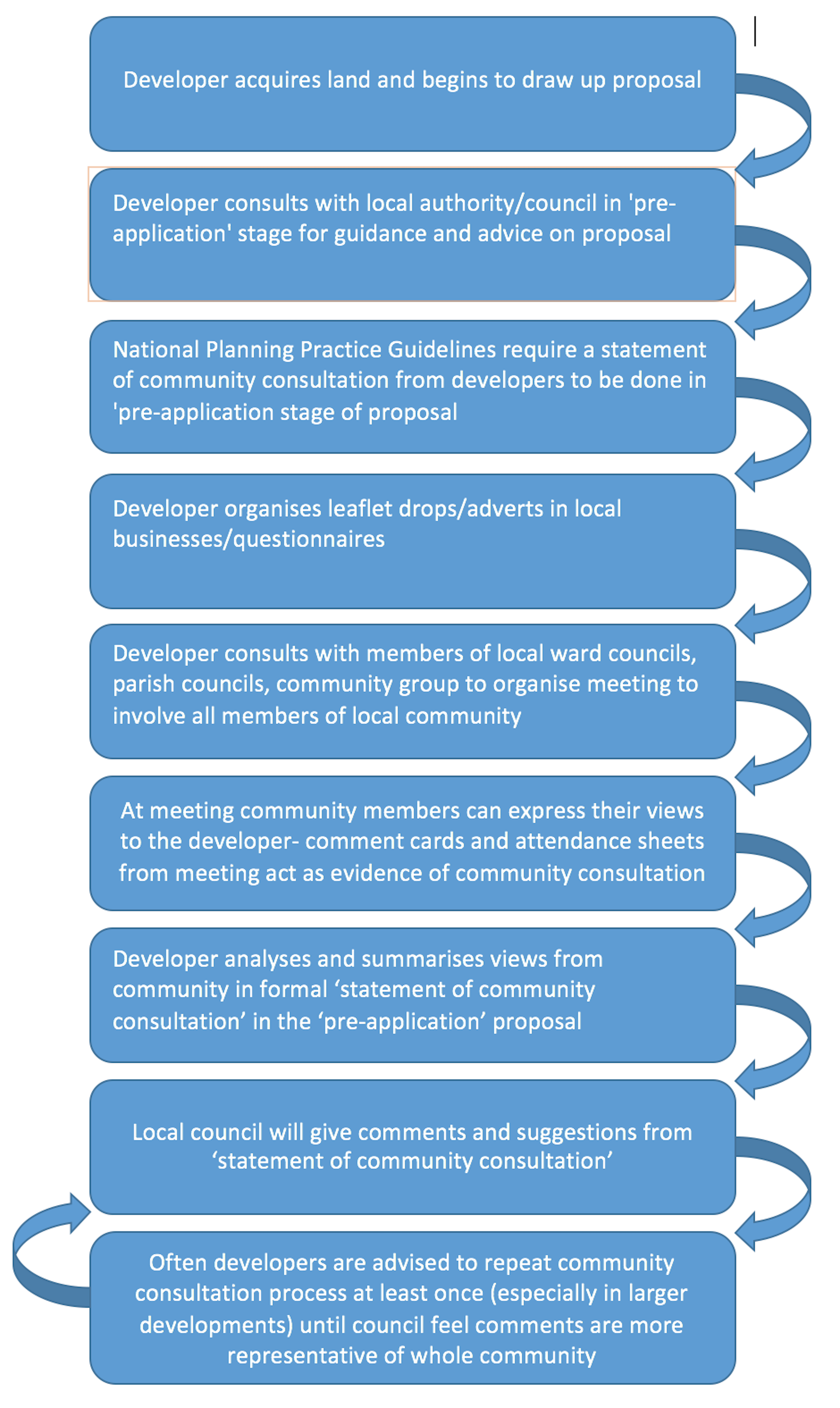


One of the main issues with this process is the lack of representation from certain demographics of the local community, so it is important for us to prioritise reaching out to these groups as a long term goal. An example Nigel and John gave of why this is happening is the fact that developers hold the community consultation meetings during working hours of the day, say 2pm on a Wednesday, when the majority of people in a community would be at work, or, if it was a densely populated student area, at university. The stakeholders went on to suggest the developers also do not advertise the meetings very effectively, as a consequence, only those members of the community with a real insight into planning within the area were aware of the meetings; these tended to be well-educated people of the older generation.

Furthermore, the impoverish or less-educated are often not represented at community consultations, because they simply aren’t aware and can’t access information about the development proposal or the meetings. Often, if comments and objections are made about developments, especially larger ones that will attract more attention from the public and media anyway, they will be ignored by the developers and council because they aren’t always planning related or specific to that site. This is down to lack of education about planning-which we could attempt to rectify on the app,-as well as the ‘nimbyism’ approach that many residents take to any type of development going on in their local area, something which nobody can do anything about if it is an area highlighted for development in the local plan.

A topic that was also brought up is how the space in a development is allocated; developers are obliged to leave some open space within a housing development, conforming to the space standards set by the local council, however, due to lack of input from the community, the open space often ends up being not used, or misused. Overall, this leads to tensions between the community and the council, where complaints from residents are made directly. If developers knew, in the early stages of the application, how this open space would be best served they could alter their designs to better fit the purpose of the space, in line with the community requests. It would also allow the community to raise practical issues that perhaps the developers wouldn’t be aware of, that only members of that specific community would perceive as a problem. Again, this issue highlights the importance of consulting with the community as early as possible, and with as much of the community as possible.

These issues could be solved, using the app we have to design, by making the information about developments more accessible for students and working members of the community, so even if they cannot attend the meetings there would be a space on the app for them to leave their comments about the development. Nigel and John also suggested for us to simplify and condense the application proposals, in someway, in order for it to be more understable for those who wouldn’t understand the terminologies or policies highlighted within a planning application; hopefully then everyone in the community would feel comfortable and confident leaving comments about the development. Furthermore, this would speed up the overall ‘pre-application’ process, benefitting both the council and the developers, so that issues raised by the community can be altered sooner rather than later, leading to fewer objections when it comes to being submitted and lowering tensions between all the stakeholders. Early engagement is key for a smoother process, improving relationships between all users so everyone feels like their voice has been heard and compromises have been made on all sides.

Long-Term Goals

Overall, our long-term goal is to design an app that improves the interaction between all 3 stakeholders, and standardises the way in which members of the community can leave comments about potential developments. Within the app we want to achieve 3 main things that will hopefully improve relationships between the stakeholders, making the process of community consultation much smoother and more efficient for all users:

  1. Early engagement- allowing users to access information about the proposal as soon as possible and leave comments for the developers to consider before it is too late for them to change anything.
  2. Education- simplifying and explaining the terminology within a planning application so people can understand the development proposal more thoroughly and leave relevant comments for the developers.
  3. Community representation- reaching out to all members of the community so everyone feels comfortable and confident leaving comments, and if all demographic areas are fairly and fully represented, there will be fewer objections and lower tensions between stakeholders.