Walkers: Designing Storyboards (week 6)

Week 6

While we have settled on the function of the webpage, we will be focusing to demonstrate the voting system and the volunteer point system in the storyboard.
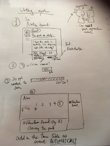
photo-20-11-2016-01-51-40


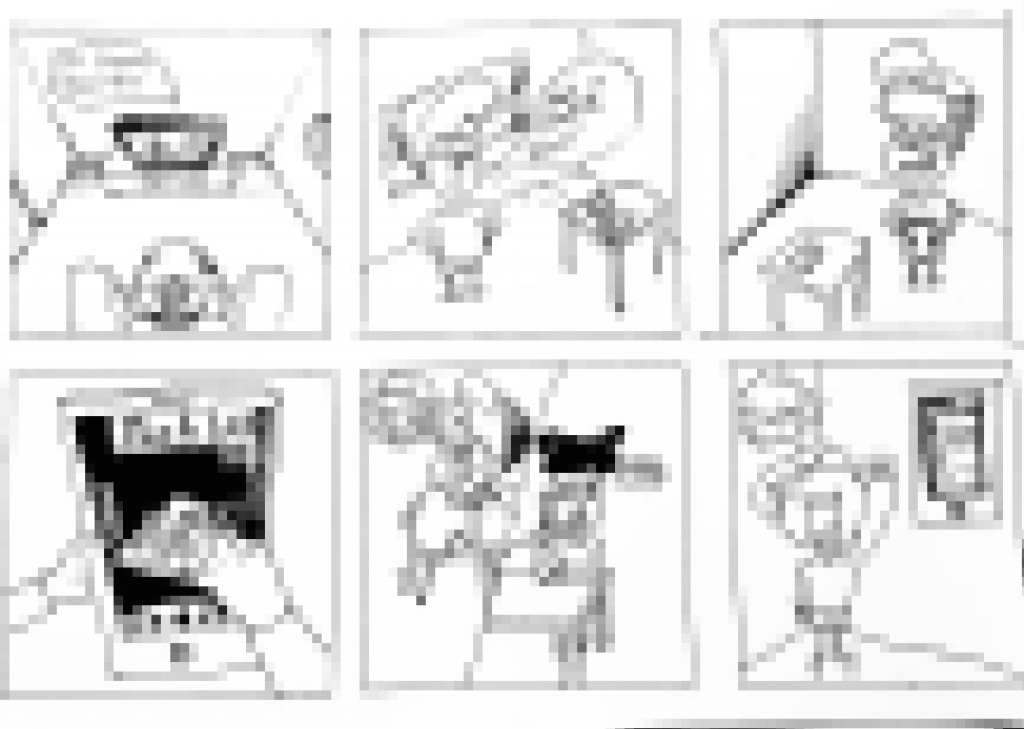
The voting system is a function for basic members to create their event on their own via Notice board. When they choose the ‘event’ categories in the notice board, they may be able to uphold their own event concerning no matter what. For example, in the above picture, a resident may be unsatisfied with a dirty park. He may send a post recruiting volunteers to clean it up. By inserting a number of minimum participants need (e.g. 20 people need here), the event will be created automatically on the calendar when 20 interested participates click ‘yes’ in the post. This save works in administering and can allow people to have a first try in participating in volunteering without processing a lot of registering process that gives pressure on them.
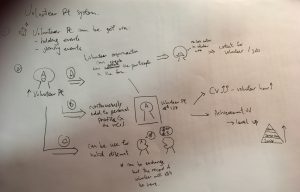
 

photo-20-11-2016-17-40-36

Another storyboard showing is one demonstrating how the volunteer point system works.

Volunteer points can be earned through holding and participating events. We try to make the online points to have an actual benefit in real life so as to encourage the community to involve in it. There are three major ways to use it:

  1. It can act as a counter for organization to know how active a participate in the community. It somehow works as an online cv, but more informal one to show some organization in the site who are potential volunteers or employee.
  2. When the points continuously add on, participates may unlock achievement and level up as higher level members to have higher authority (like admin) to edit post etc. Achievement may include exchanging for volunteer hours on CV in certain rate. (1 :1 may do also).
  3. By cooperating with business we can offer discounts through exchange points. (may involve another unit for exchange since the volunteer hours should not be gone when you purchase anything)

Both story boards are just showing the basic concept and may not be complete and thorough enough. We will continue to try editing for the final output.
Blog5 for self-built housing(1)

Blog 5

Ⅰ Reflection of the mid-term presentation

After the mid-term presentation, we found that most of the groups choose use an App as a digital tool to solve the problems. App is more popular among the young people, so our group thinking about create an extra App which can be linked to our website. In this App, we try to provide an implementation of design process and create a more direct contact between the customers and the self-built housing Co-op.

Ⅱ Sketches / concept ideas

APP Design:

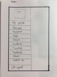
To involve self-build organizations with the design concepts. This includes a multi login page, with 3 types of login. These include people already registered, sign in with Facebook and also a register.
**1011049481 **img_9765

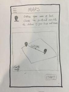
Include images of geographically located areas with ease of understanding for multi-generational use. We get this idea from the seminar, and try to add this into our APP. This section will link to the Google Map and help people to know the distance between their houses and the nearby services.

As well as this, having individual pages for other aesthetic principles including galleries of self builds and furniture buffers.

The program section will involve pictures of local self builds, which basic descriptions and more information too.

When it comes to the design page, we decided to take inspiration from a catalogue portfolio. The dimensions, materials and colors also, so people really can feel like they are making a different when it comes to design principles.

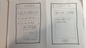
In the galleries section, there will be pages or present self-build homes, and potential blueprints for an individual to use also. There will also be a number of bedrooms’ slider, this is so the individual will be able to see designs that fit their criteria a lot better. – As well as this, we have thought about the audition of an advance settings page so again, people can very detailed, specific recommendations giving them more control over the process.app-design

When it comes to feedback, we feel this is going to be one of the most important sectors of the whole process. Recommendations from people who have used the site and have had a gain in their knowledge and participation, are the key for this service to keep going. Perhaps a rating system could help to see if there are any connections with self builds and see if any certain principle is more popular.

Include a real time chart of people interaction and their views also. This would enable the architects and the people who are involved with the self-build to be more active in what they need to do. This would be a great way to link the online website and the application as well.


The potential weakness & limitations:

We feel that a limitation for our idea is simply getting the publicity for people to use our app/site in the first place. Perhaps if self-build organizations in the area where prompted to actually promote it then there wouldn’t be an issue.

Another limitation is the actual size of the application. With such an expansive gallery and many features that we would like to offer, we don’t want this to take up significant space on our client devices.

Blog 4 – Energy Dashboard

After reviewing on our interviews with Tony and Steve, we have evaluated our goals again for initial development on our designs. We had ‘to support residents, organisations and businesses in Jesmond in adopting  a more energy efficient approach  to their current consumption patterns.’ as our initial ultimate goal, and this does not change.

With the details of what the client want in the energy dashboard we are going to developed, we tried to do some more in depth research on different dashboards as examples for us to get an idea on our initial design. Each of us brought in an example of an energy dashboard we found on the internet and indicate what is the pros and cons of every single detail of it, hoping to pull all the best things about each dashboard together to create the most suitable one for Jesmond. There were examples from America, Lincoln University and other companies, each has a different feature depending on the building it serves (eg. university campus, accommodation, commercial building etc)

However, we would still need different datas from the stakeholders in Jesmond in the future for further development. We would also need to decide on creating an app or a webpage for the Jesmond residents based on which one we think would allow more people to look at it constantly and conveniently.

Blog 3 – Energy Dashboard

Summary of our user interview

On Wednesday 19th October in Cafe 1905 in Jesmond the team met up again with Client Tony and a recommended contact Steve Emsley to get his knowledge, insight and opinion on Renewable Energy and the Jesmond area as a whole for the benefit of our research for our design concept. After tea’s, coffee’s were all purchased and all formal introductions were done we asked Steve and Tony whether it was ok for us to audio record the interview for us to review after to ensure we had everything they both talked about, which they were both happy with.

We had our interview schedule ready with all the questions we wanted to ask Steve and following on from this are all the comments and advice that Steve and Tony gave to us from the questions we asked that we thought would be helpful in continuing on the process of this project.

  1. He is a retired social worker, has worked in environmental fields before, had written for the evening chronicle on green issues, has and still does many talks on energy saving and was involved in the transition newcastle campaign which ran till 2012.
  2. Likes having a planet to live on.
  3. Has done various talks on renewable energy and people came to his house to have a look at the energy system installed. Held a walk in session in Jesmond in 2012 at 1901 cafe where face to face conversations were had, had a strong interest from local people. People who wanted to engage did, it’s a slow process and very political. Tony also commented that political climate and financial constraint had a drop off in awareness of climate change from the government.
  4. Fossil fuels to climate change are the serious problems which are also hard to understand not just renewables that people don’t understand, people don’t think of climate change as a problem. When doing his talks tries to present things in a simple way but it is a very complex subject so is difficult to convey in a simple way sometimes. Writes to newspapers to keep the subject alive. Stated renewables could be a way for people with money to find something to invest in as bank rates etc are no good. Tony also stated that good publicity was needed, that it needs to be made easier for understanding.
  5. Steve shared his energy data in the evening chronicle, 20-30 articles. Thinks that existing users of renewable energy sharing their data is important for people to see that you can actually save/make energy, money etc. Stated as long as he was aware what was happening with his data he would be more than happy to share his data online, Tony also agreed. Steve also stated that larger companies who have financial power should be helping out with renewable energy. Tony commented saying that the local authority should lead by example using solar, double glazing etc. they aren’t doing enough.
  6. Had a consistent level of production. 5 and a half years had solar panels now and very pleased, has now reached crossover point where Steve is now creating more than they’re putting in.
  7. Doesn’t really have an opinion thinks they should all be going towards renewable energy. Will spend more time and effort getting his opinion and point of view across to the local people. Doesn’t believe that people can not afford it. Believes media has a role to play to raise awareness. Tony commented that it’s all about finding the cheapest company for their energy which is wrong, again mentioned that the government aren’t doing enough on the matter.
  8. Peak oil has already been found, that’s why there are wars. Bears little relation with renewable energy. Saudi Arabia raised market prices. Carbon dioxide levels are disastrous, flooding, draughting, price of foods.
  9. Based on questions 8 reaction, answers we skipped asking this question.
  10. Hadn’t used an energy dashboard before, but would gladly put his energy data onto one and use it for beneficial purposes for the Jesmond area. Would be good to have comparative data on different types of energy levels. Energy performance certificates for homes are very important but seem to get pushed aside. Tony stated that city council do it for poverty, police for crime so their should be somewhere you can go for energy information, data, help etc.
  11. Thought we’d cover a very good detail of work and was pleased we got to meet and wish us luck with our project and if we should need any further help just to reach out and ask.

After this interview with Steve and Tony and all their comments on the different subjects we had covered we felt we had a good basis of information which we can start to use to help us in the designing of our prototype. Again the word that has kept cropping up and did again was the words awareness and understanding which re iterates back to our goals at the start of the project which shows we’re on the right track.

Blog4 Self-built housing

Blog 4

Ⅰ How the goals going

The intimal project goal is ‘To make the co-design self-built homes become more accessible to people. Improving the current weakness of co-design self-built homes, finding a way to promote their ideas (like workshop/website) and then widening public’s community participation.’

Our goals are mainly stay at the same, however, we do some small changes reflected on our interview. As a team our aim is to provide and design a website and an app, through this platform we would help those people who are already involved in self build houses, to become more involve with the design processes.

  • Detailed wants and wishes from the client. What are their aims and what they want to achieve?
  • Provide some easy soft wears and make it easier to understandable for non-professional self-build through our app and website.
  • Make a better link between our non-expert and expert such as (workshop, one to one contact, and online communication.
  • Make the design process smoother to understand.
  • Provide design concept e.g. 3D.

Ⅱ Search for relevant related project

Example1: Protor Homes

  • This establishment takes the idea of self-building to a more self-chosen type of style.
  • Proto homes take the self-build ideology to a more prefabricated manor.
  • The organisation from the off go incorporates the customer with design. For example the customer chooses a pre-made design, and can edit to their own needs. Useful in thought that people can see the development of their homes designs and other self-build activities.

Example2: Site For Self-Build

  • In addition, we thought the gallery would be a great concept when it comes to the sketch up. A gallery / portfolio of houses of which aspiring self-builders can look and choose depending on what they see fit. We thought that an interesting concept would be to have a more interactive design concept, which is where the sketch up idea came. Pre-designing houses over sketch up gives people great access and interaction with the design process as a whole.
  • The way in which the company involves the customer is clear from the get go. The Home page of Proto Homes’ website provides a potential and current self-builders a whole catalogue of dated events. This therefore gives both consumer and organiser a whole platform of interaction. We feel that using a similar idea on the home page of the website would be useful.
  • This organization is more of a platform to enable people to look at self-build organisations within their area.
  • The group describe themselves as self-build creators and offer their professional services to individuals, groups and private enterprises.
  • The organisation enables people to start and join self-build locations also, and have a large team enabling high quality of service.Also, the addition of blueprints and maps on their website is very useful. When it comes to the location of any build, it is important and also well worth doing research. We find that providing maps and location diagrams gives people understanding of that given self-build. Using Blueprints of the area, or potential blueprints, the consumers of the self-build project will understand that they can have influence on the project from the foundations.
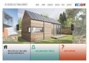
  • (Here is the initial design of the format of website)
  • The website of Site For Self-Build had strong social links. Compared to the West End Housing Association, and Proto Homes we felt that Site 4 Self build has much clearer contact methods. The whole point of this project is to get people more involved with the design, and this is obviously done by contacts and connections. A strong and explicit few of methods of contact I feel is essential for this type of project to go ahead. Especially, the phone number. Giving that other self-build projects have out of country numbers such as the Proto homes, a recognisable number I feel would suggest clarity and trust too.website

Blog3 for Self-built housing

Blog 3 —Response of Interview

On the 21st of October, our group met with Jerry Drake who is the member of West End Housing CO-OP. We asked a series of questions of her daily life and their organization, and then noted the key responses:

  • With her previous experiences she informed us that there is a lot of trouble regarding land and grants and she experienced many barriers during the process of self-built housing. She also struggled with finding available land that the government would provide to build on.
  • the West End Housing CO-OP are all equal members within their society and are all involved within their community as they all occupy the houses they own.
  • Before the housing co-op began to build, in the areas they were planning on doing so they vigorously asked the local community within that area. Finding out the local opinion and then questioning them how they felt it would affect them.
  • When the housing co-op began a regenerative project, Jerry said that the council were very helpful and supportive of projects like there’s. In addition, Newcastle council are interested in this form of project, along with Your Homes Newcastle owning the majority of the land available within the Newcastle.
  • Jerry made it clear that throughout the process that the West End Housing CO-OP went through to complete their self-build homes they had many issues along the way such as: time constraints on the planning side, financial issues for housing to rent, acquiring the land, the cost of self-build housing.
  • The housing co-op runs off a democratic model with every member as equal as the other. The co-op they run makes for a cheap living as they occupy their own properties they are their own landlords.

After this interview with Jerry, we found that the suitation of self- build housing is not as good as the other housings (like socail housing).Self-built housing is not the mainsteam housing in UK and most of the public are not familiar with this new type of housing. So we thought that engaging more people to have their own self-built housing can improve the current environment. In the next step, we try to create a new website for the West End Housing Co-op, because we found that the current website is not useful for the public to understand the process of self-built housing clearly. Therefore, in the new website we will provide more links for the public to contact with the Co-op. Also, we will try to create a bridge for both the experts and non-experts to join and cooperate in the design process of self-built housing.

Young People Engagement – Week 5

After a successful site visit, we came together as a group and discussed the different possibilities of creating a digital device. We were inspired by a number of non-digital and digital ideas. We came across ideas such as having a VR hologram projecting the user’s propositions of the development. We debated other potential ideas, like the use of chalk to make graffiti visualisations on a surface that could show the user’s proposals but chose to keep a more digital approach to our final project because we considered the non-digital ideas to be less suitable for our users.

At first, we thought of making a QR code. The idea was that the code would be scanned by the users which would lead them to a government related website with information about the current development site. We knew this idea would appear quite late during the planning process and thought it might have an affect on the user’s propositions. We were also worried that the website would provide too much information at once for the users which would not be easy to understand nor enjoyable to read.

The second concept we were trying to develop was an app. We thought the proposition of an app would allow the users to take part in the planning process at an earlier stage, therefore giving time to the Council and developers to consider the user’s propositions. The app would work like a visual interface. The app will allow for new topics and activities to be created. How does it work? Well, once the app is opened, a plot of land would show up on the screen. Through its tools, the app would support a large variety of subjects, like inserting different types of infrastructures or ponds onto the plot of land. A dragging feature would allow the plot of land to be filled with houses, schools, parks, roads, shops. These would be designed through Sketch Up (One of our design software’s) and then integrated into our app with the help of our technician. We want these animated features to reflect what the users want to see in the new development like leisure centres, open spaces and well linked roads. We also suggested that the app would have a share button indicating that the user designs can be commented on by other users, or shared with developers and the community and downloaded for future use. This is where we have got to so far, next week we’ll be looking into more detail about our concept while discussing it with our project mentor.

photo-on-10-11-2016-at-18-18


air quality group Week 5

Why:

  • Bus congestion a major concern towards air pollution levels
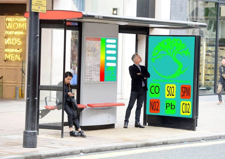
  • Targets pedestrians along the street, public transport users at the stop, users already on the buses when they stop, cyclists and general Traffic
  • Maximise user’s interaction with older less tech savvy still experience this on the street, simple and bite-size to engage the younger generations ACCESSIBLE FOR ALL
  • Limited space for installations along the street use existing structures (bus stops), more installations on street level can be a hazard to navigation of the street for the disabled community

Interactive Display:

  • Has options for display and information via pages as well as displaying scale of pollution and connects to the main screen

Logo:

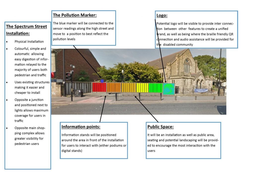
  • Changes colour (traffic light system) depending on levels of air pollution or the trees health changes size (leaves lost)

AR Feature:

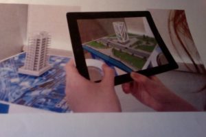
  • Large display double sided with camera fitted to allow AR view of the street (viewing portal) displaying live data along the street, controlled by the interactive display

Air Pollutants display:

  • Shows the main 6, displayed in a traffic light colour as indication of the levels (e.g. red being bad) display targets pedestrians (simple navigation for young and old) , public transport and general traffic  with bite size information

Accessibility:

  • Braille like
  • QR codes positioned on side of the display for audio assistance for the blind
  • Hearing Aid Channel


Concept ideas:

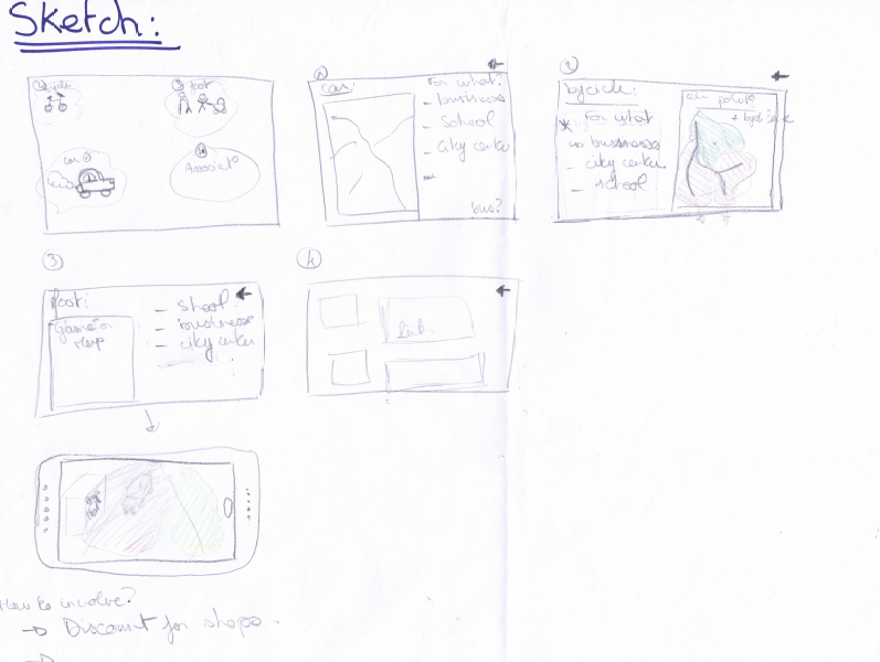
In the first place, the app for phone or computer needs to be simple to use for everyone. For example, in our presentation pages, we can find only four possibilities. Those possibilities are reduced by type of users, and they can recognise themselves by logos or simple draw.

For the first possibility (1), for drivers, there is a map with traffic congestion, like that they can reflect on fact of traffic congestion. In this part,  we can ask for what they need to use this road (for businesses, school, go to the city centre). We can put other solution like buses to go there.

The second logo concerned bicycles (2); they can see a map of areas of air pollution and see a map of bicycling lanes and ask for what they need to go through.

The third (3) it for people by foot, they can have a map for safe areas in term of air pollution, ask them for what they need to be there and have like a game with air pollution in reality augmented.

Finally,  the part (4) concerning the associations, in this part we can have links of all association concerned by that and involve more people to be connected with society.

In each page, people can go back and like that a people who planned to go in his job by car and finally decided to go by bicycle, so find alternatives.

Weaknesses:

The most weakness of the app it’s it need to have people who use it to have the real statistics on the new data (for what they through this street). But the combination of the app and boards on street can allow us to reach everybody. Only blind persons cannot have a visual of the air quality.

What we learned about other presentations:

There is a group who considered the QR code on streets to have a direct access to information. For our project, we can consider putting QR codes on boards to have a direct link to download the app or view a web page.


air quality group Week 4

Project Goals:

The initial project goals where;

‘A Newcastle university urban planning focused bottom up campaign initiative to increase user and community awareness of air quality control cantered on Gosforth high street. Working with the users on easy and effective forms of interpreting the data supplied by the air quality monitors situated along the high street, making the data accessible to everybody with the goal of increasing community awareness and support for self-managed air quality control through community projects.’

The Goals have mainly stayed the same as initially outlined, however, we have also reflected on our interviews and the progression in our designs in which have both led to the incorporation of further goals. These include a focus on smart technologies to present data interactively as well as improving the air pollution levels through new material innovations. Another goal we have added is the need for a community behavioural change from the current passive users to a more active user base improving interaction in air quality activism this was formed reflecting on Peter McDonalds interview. Reflecting on our interview with Duncan we decided to add to our project goals in relation to local business interaction and inclusion within our plans.

Examples

  • Augmented Reality

–              Using AR to visualise something, in our case it would be air pollution.  We selected this as it could help us engage with younger audiences.

  • Air Quality App – Breezometer

–              This app gives the user real-time information about air pollution across 27 countries. Furthermore, the app gives location-specific notification at times of bad air quality. We selected

  • Pollution Control Board – Eloor, India

–              Large public display that shows real-time air pollution levels. We selected this as it can be shown to everyone on the high street.

  • Air Pollution Cladding

–              Two types, one that cleans the air around it and another that changes colour depending on the current level of air pollution

  • Clever bus shelter advertising

–              A bus shelter that has an interactive display using smart technologies.