Over the summer there have been a series of updates to the SpeedGrader tool within Canvas to improve the ability to provide feedback.
In this blog post, we will highlight some of the key changes to the SpeedGrader and how you can utilise these changes in your courses.
Submission Comment Drafts
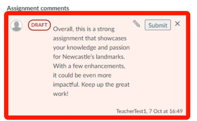
In SpeedGrader, after adding a submission comment, if this has not been saved, a Draft pill displays indicating that this comment has not been saved and a warning message is presented alerting the teacher that the comment has not been saved.
Previously there was no clear indication that a comment had been submitted and this would lead to students not seeing comments/feedback in their assignments.
With this update, it is clear for a teacher to see the status of a submission comment.
You can see in the example below that the submission comment has not been submitted and we have a draft pill alongside our comment:
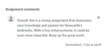
When we press submit on this comment, the draft pill disappears which means the comment is visible to the student:
Rich Content Editor (RCE) In Submission Comments
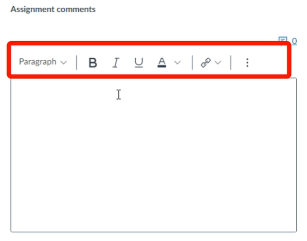
In SpeedGrader, some Rich Content Editor (RCE) features are available when using submission comments. The available RCE features include:
Heading
Bold
Italic
Underline
Font colour
Insert Hyperlink
Bullets
This allows teachers to style feedback and provide further resources via linking. In the example below, you can see a link is provided to further resources to assist the student:
This functionality is available at the top of the submission comments box as demonstrated below:
Equation Editor in Submission Comments
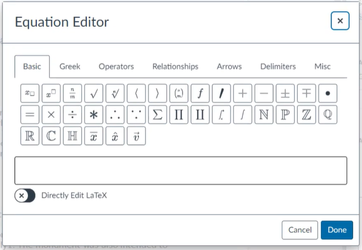
In SpeedGrader, an Equation Editor function has been added to the Rich Content Editor. This feature enables instructors to incorporate math equations into their submission comments.
In the below example, you can see the new equation editor function within the submission comments in SpeedGrader:
Randomise Students in Submission List
In SpeedGrader Settings, instructors now have the option to randomise the order of students within each submission status. This update helps mitigate grading fatigue and biases by ensuring a random sorting of students. Additionally, it enhances grading efficiency by maintaining this random order within submission statuses.
Below are step by step instructions on how to do this:
In the top left corner of the SpeedGrader, select the cog icon
From the dropdown menu select “Options”
Within SpeedGrader options, select “randomise students within a submission status”
Select the “Save settings” button
Please note that when the randomised students, the preference is saved as the default in the browser for the course. When logging in on another device, instructors must select the sort by options again.
Do you get frustrated when you click on a link and no content appears?
If you don’t hide inactive links on your Canvas courses, your course visitors could be clicking on links that have no content.
Your course navigation bar in Canvas should only include links to active items.
Hiding unused navigation links in a navigation bar has several benefits:
User Clarity: When showing only inactive navigation items, users might mistakenly click on items with no content. Hiding non-active items prevents confusion and frustration when no content appears.
Cleanliness: By hiding unused links, you declutter the navigation bar, creating a cleaner and more visually appealing menu.
Canvas Mobile App: As all links are displayed in the Canvas App, by including only active items, you will improve the usability of your course navigation.
Accessibility: Hidden links are less distracting for screen readers and visually impaired users. It ensures that the focus remains on relevant content.
The Rich Content Editor in Canvas offers a straightforward and efficient method for building content in your Canvas courses.
The Rich Content Editor is available in:
Announcements
Assignments
Discussions
Pages
Quizzes
Calendar
The Rich Content Editor allows for the embedding of various elements such as videos, images, other types of media files, course files. Additionally, it enables the creation of tables and lists. You are also able to link to content within your courses and to materials outside your course via hyperlinks.
The Rich Content Editor allows you to bring all your content together in one place.
In this blog post, we will show you examples of how to can use this in Announcements, Assignments, Discussions, Pages and Quizzes.
This short video from Instructure, you can see how to use the RCE in Canvas:
An example of using the RCE in Announcements
Links can be incorporated into your announcements to guide students towards specific resources you wish to highlight.
In the example provided, we prompt students to review a pre-lecture task located on a Canvas page. By including a direct link (highlighted as 1 below), students are navigated straight to the resource, eliminating any potential confusion. This ensures that all necessary resources are conveniently provided within the announcement message itself.
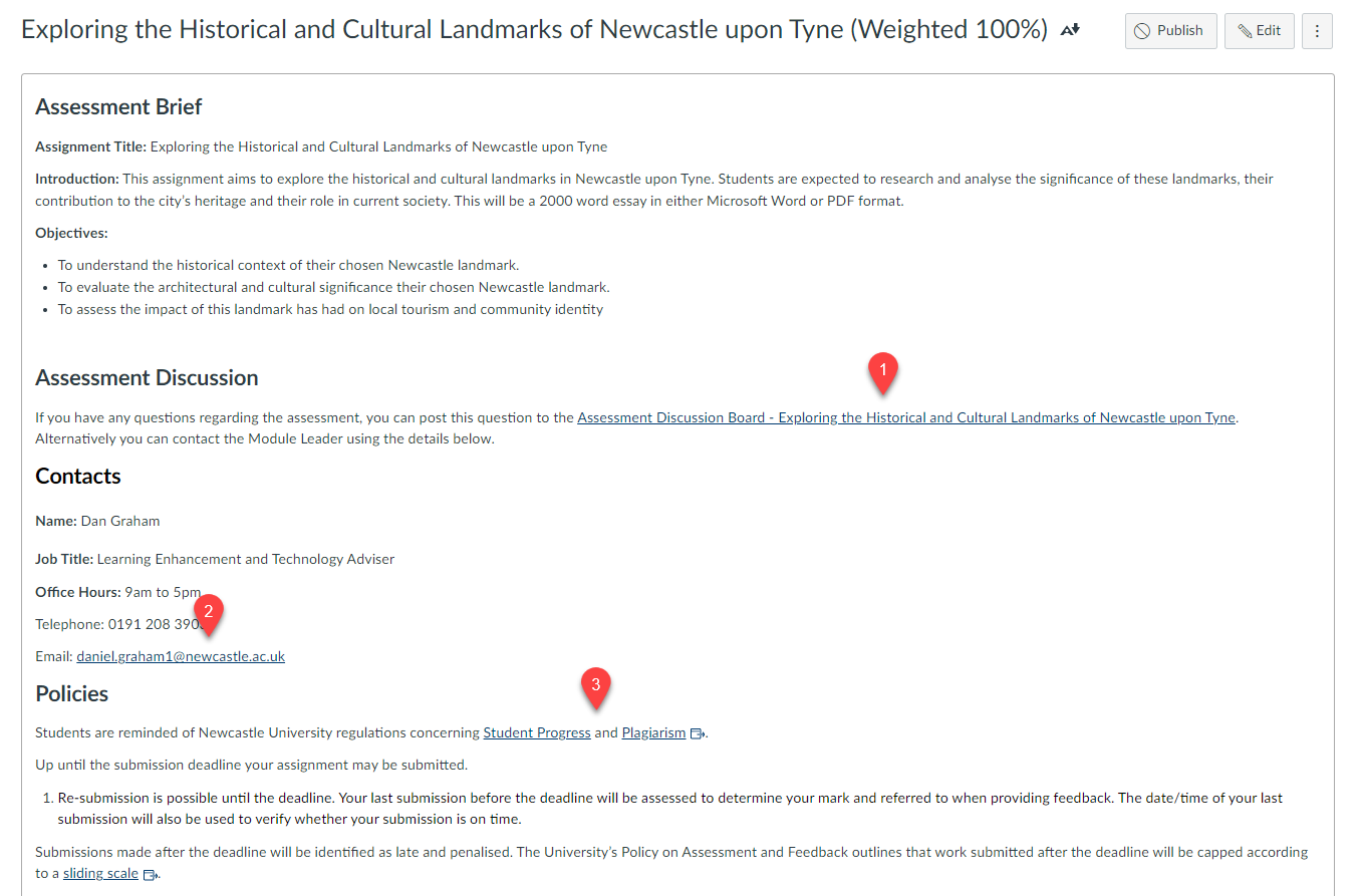
An example of using the RCE in Assignments
Essential resources for the assessment can be made readily accessible to students by providing pertinent links. These may include links to guidelines, policies, and additional support such as discussion boards.
In the following example, we have incorporated a link to a discussion board (1), enabling students to anonymously pose questions about the assessment. Additionally, we have included an email link (2) for direct communication with the module leader. Links to school policies and university regulations, such as student progress and plagiarism, are also provided.
By consolidating all necessary information for the assessment in one place, we eliminate the need for students to search elsewhere.
This approach promotes clarity and guidance, ensuring that students fully comprehend the expectations and requirements of their assessment
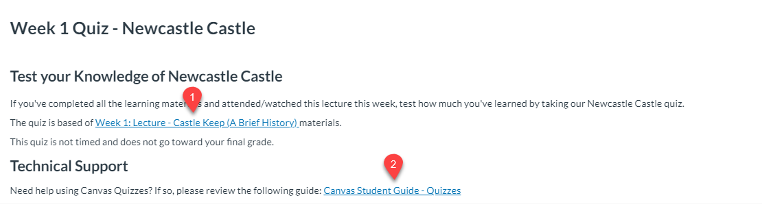
An example of using the RCE in Quizzes
In the Quizzes section, you have the option to include links that can assist students with their assessments. These could be links to the content that will be evaluated or to technical guidance.
In the given example, we are notifying students that the assessment will be based on the Week 1 Lecture (highlighted as 1). Additionally, a link for technical support (highlighted as 2) is provided for their convenience.
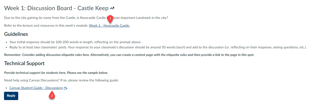
An example of using the RCE in Discussions
Links to the discussion topic and technical guidance on utilising Canvas Discussion boards can be incorporated. This approach is beneficial as it equips students with all the necessary resources for active participation in the discussion, while also providing context to the discussion topic.
In this instance, we are offering a link to the module corresponding to the current teaching week (highlighted as 1). This serves to give students a prompt for the discussion and context for the topic under discussion. Additionally, we provide technical guidance for utilising discussions (highlighted as 2).
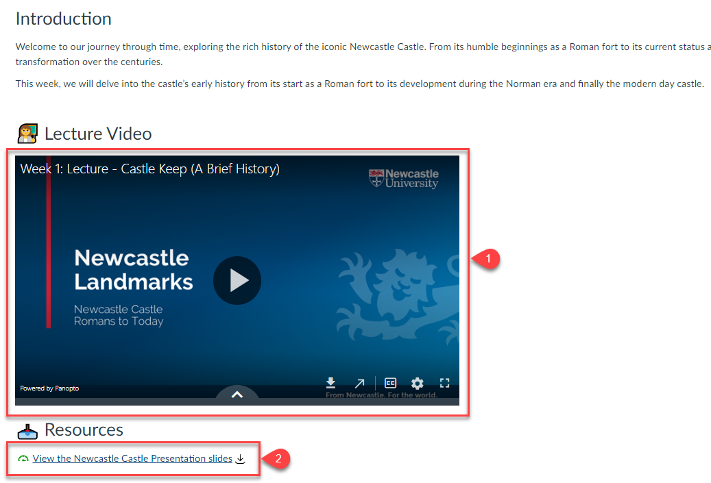
An example of using the RCE in Pages
Using the RCE in Canvas Pages
Leveraging the Rich Content Editor (RCE) in Canvas Pages, you have the flexibility to enrich your teaching materials with a diverse range of content items. This includes not only links to course-specific content and videos, but also resources like PowerPoint presentations and external webpages.
Canvas, our Virtual Learning Environment is constantly evolving to enhance user experience and functionality. Each month we inform you via this blog what changes are taking place, how they will impact users and how to make the best out of this new functionality.
In this blog, we will look at the new Find and Replace tool in the Rich Content Editor.
Rich Content Editor – Find and Replace
What is this new feature?
A find and replace tool has been added to the Rich Content Editor (RCE). This will be similar in functionality to Find and Replace your would find in Word Processing applications like Microsoft Word.
As this is a Rich Content Editor enhancement, you will be able to use this in the following areas of Canvas:
Announcements
Assignments
Discussions
New Quizzes
Pages
Quizzes
How do I use this Find and Replace Tool?
Access the Rich Content Editor:
When editing a Canvas page, discussion post, or any other content, click the Tools drop-down menu in the Rich Content Editor.
Select Find and Replace from the options.
Search and Replace:
In the modal that appears, enter the text you want to find in the Find field.
Enter the replacement text in the Replace field.
Click Replace to replace the first occurrence, or Replace All to replace all occurrences.
This blog post outlines how to use Ally to improve the accessibility of your teaching materials within Canvas.
Ally is a built-in accessibility checker that is integrated into Canvas which automatically checks course materials against WCAG 2.1 accessibility standards.
From an instructor perspective, it delivers guidance to improve the accessibility of their course content. For students it provides accessible alternative formats such as audio, electronic braille, epub and more.
Alternative Formats
Ally automatically generates alternative formats of your course files, so students can access the information they need, in the way that they need it.
Formats includes:
Electronic Braille
Audio
Immersive Reader
PDF – OCR
PDF – Tagged
HTML, Semantic
ePub
Translated Version
BeeLine Reader
For more information on these alternative formats, visit the Alternative Formats section of the Ally website.
The below video explains alternative formats in Ally, demonstrating how they are accessed and used.
Alternative Formats in Ally – Explanational video
Instructor feedback
Ally provides you detailed feedback and support to help you make your materials more accessible.
The below video explains the instructor view of Ally and how to improve the accessibility of your materials:
Instructor Tools in Ally – Explanational video
Further Resources
For more information on Ally in Canvas, please visit our Ally For Canvas pages on the Learning and Teaching website.
All learning resources we create should aim to be accessible as possible and this includes video content. For the purposes of this blog, we will be looking at video captioning in the Panopto (also know as Recap) system.
When discussing video content, we are referring to recordings that are provided to students for educations purposes (that is delivered via Canvas), for example lecture recordings, teaching presentations etc.
Captioning in Panopto
The ReCap service (Panopto) provides the ability to add ASR (Automatic Speech Recognition) generated captions to your recordings.
The University recognises that automatically generated captions are not 100% correct and have published a captions disclaimer for viewers.
We recommend reviewing automatically generated captions and making light-touch edits before making them available.
For further guidance on captioning video content and FAQs, please visit Captions and Transcripts pages on the Learning and Teaching development website.
This blog post outlines how to make Canvas pages accessible using the Rich Content Editor (RCE). Many of the techniques and tips are similar to those discussed in creating accessible documents.
The Rich Content Editor within Canvas is a powerful tool for create engaging content, blending text with multimedia resources. With a built-in accessibility checker, you can make some great content that not only looks good but is also accessible.
1. Text Headings
Use a hierarchy of headings such as Heading 2, Heading 3 and Heading 4. The heading options are limited in Canvas compared to other software, with the highest level of heading starting at Heading 2. Using headings allows easier navigation for all users, as well as allowing screen readers to identify and describe the structure of a document.
When selecting a font size use a minimum of font size 12 (which is the default font size setting in the Rich Content Editor in Canvas). For the main text of the page, use the Paragraph setting. It’s also best to keep your use of bold and italic text to a minimum
If lists are used in the page use bullet points for items that aren’t sequential or numbered lists for sequential items.
When using colours in a Canvas page, do not use colour alone to convey meaning. If someone has a visual impairment, including colour blindness, the emphasis you’re trying to create by using colour will be lost.
Please also be mindful of the colour contrast. This means the colour contrast between background and foreground content should be great enough to ensure it is legible.
Always use alternative text (or ‘alt text’) to provide a meaningful description of an image. Alt text allows screen readers and text-to-speech tools to read aloud the content of an image to the user.
Alt text should be clear and concise (1-2 sentences) and explain the relevant content of an image. Alt text is limited to 125 characters, so use that wisely and try to describe the key elements of the image.
If your graphic has text in it, this should be added to the alt text also.
If an image is there only for appearance, you can mark it as decorative.
Tables can be great for organising information. However, if used incorrectly, they can be difficult for people to navigate using assistive technologies.
If you add a table to your document, be sure to use it for data and not for layout or document design.
It’s important to ensure that your table has a header row that repeats itself when the table extends beyond a single page. When deciding on a structure for tables, remember they are read from left to right and top to bottom.
Use hyperlinks to describe where the link will take the user. It is recommended that you create descriptive text about where the URL will take the user so it can be easily read by a screen reader. For example, the “Semester 1 – Assignment Brief” details can be found in the Assignments section of Canvas, where “Semester 1 – Assignment Brief” is the hyperlink. Avoid using ‘click here’, ‘read more’ or ‘for more info’. Also avoid underlining text for emphasis, but rather use the bold function.
Guidance on how to create, edit and remove hyperlinks can be found in the following guides:
Use the built-in accessibility checker in Canvas to identify any accessibility issues on a page. This tool can help identify any accessibility issues in your pages, ensuring they meet the necessary standards. They will guide you, step by step, on how to make your pages more accessible.
This blog post outlines how to make presentations (Microsoft PowerPoint) accessible. PowerPoint presentations are one of the most popular tools for learning and teaching – especially to accompany lectures.
But have you ever considered their accessibility?
In this article, we’re going to outline some tips on creating inclusive and engaging presentations in Microsoft PowerPoint. While some of the accessibility tips may seem familiar from working with text documents, we’ll also mention a few special tricks for your presentations.
Presentation Design Fundamentals
1. Slide Layout
Most slide layouts should include a slide title, this is usually at the top of the slide. These layouts also include one or more placeholder areas where you are able to add content like images and text to a slide.
Slide titles are treated as a heading in a screen reader and will be the first thing read on each slide. If a slide has a descriptive title, it will make it easier for screen reader users to understand the context the slide.
Make sure slides are read in the order you intend using the Reading Order Pane within Microsoft PowerPoint.
Tip: Use the built-in slide designs. They are accessible, contain placeholders in a correct reading order, and predefined formatting.
2. Headings and Sub-headings
Use a unique title for each slide heading as detailed in Slide Layout above. This provides structure and assists with navigation. Headings assist screen reader users and also help with ease of navigation for all users.
The font size for headings should be minimum 36pt. Sub-headings provide additional navigation when defining a move to a different point.
This is useful when trying to get more than one point across or signals a break/change for the reader.
3. Text and Font
As with text documents use a Sans Serif font. (e.g. Arial, Calibri) as they are more accessible. These fonts are well defined and regular in shape and size and display better on computers and mobile devices. Most popular font styles, like Tahoma or Arial, are accessible; opt for the most popular fonts rather than decorative ones.
It’s also best to keep your use of bold and italic text to a minimum
Use a minimumpoint size of 24 for all slide text and don’t put too much text on slides.
4. Colour and Contrast
As with text documents, do not use colour alone to convey meaning. If someone has a visual impairment, including colour blindness, the emphasis you’re trying to create by using colour will be lost.
Additionally, when you use colours, please be mindful of the colour contrast. This means the colour contrast between background and foreground content should be great enough to ensure it is legible.
Tip: You can also go to View -> Grayscale to have a quick check whether the contrast is great enough. The images below show the same presentation in the full-colour and grayscale view.
5. Hyperlinks
When linking to a page or document via a hyperlink, use the hyperlink text to describe where the link will take the user. It is recommended that you create descriptive text about where the URL will take the user so it can be easily read by a screen reader.
For example, if you link to additional resources in your slide, avoid using “read more” or “for more info”. Also avoid underlining text for emphasis, but rather use the bold function.
6. Alternative Text
If you include an image in your presentation, if that image is essential to the context for the slide, always use alternative text (or ‘alt text’). When doing this provide a meaningful description of an image. Alt text allows screen readers and text-to-speech tools to read aloud the content of an image to the user.
Alt text should be clear and concise (1-2 sentences) and explain the relevant content of an image. Alt text is limited to 125 characters, so use that wisely and try to describe the key elements of the image.
If your graphic has text in it, this should be added to the alt text also. Alternatively, if the text is too long to fit in the alt text box (e.g. for charts, infographics), provide a text-only version on the slide.
If an image is there only for appearance, you can mark it as decorative. For example, In Microsoft PowerPoint, select the “Mark as decorative box” when the image is selected.
7. Tables – Use for Data not Never Layouts
Tables can be great for organising information. However, if used incorrectly, they can be difficult for people to navigate using assistive technologies.
If you add a table to your document, be sure to use it for data and not for layout or document design.
For design, use the dedicated layout templates (e.g. two columns, three columns).
8. Don’t go overboard with the animations
Animations can make your presentation more engaging and are an easy tool to illustrate processes. However, don’t use animations alone to convey meaning and keep in mind that some people can get vertigo or be sensitive to flashing or rapidly moving images.
9. Accessibility Checker
Use built-in accessibility checker in PowerPoint to identify any accessibility issues in the presentation.
These tools can help identify any accessibility issues in your documents, ensuring they meet the necessary standards. They will guide you, step by step, on how to make your document more accessible.
10. Captions and Transcripts for Video
If you add videos to your presentation, you also need to make sure it’s accessible. With video content it is likely that the audio and visual content are both key to the meaning and delivery of the message.
By adding captions/subtitles will make material accessible to hearing and visually impaired users. This is also useful for users that are unable to watch video with sound.
You can also add a link to transcript or include text-only version on your next slide.