Colleagues using Canvas should be aware of a recent change affecting YouTube videos embedded within their courses. Due to updates in YouTube’s monetisation policies, videos embedded directly into Canvas may now display adverts.
This change will take effect on 22nd September 2025.
This is happening as over the recent years, video content has become a staple in learning environments and monetisation of that content has become increasingly important to those creators, many of which are educators themselves. As a result, Google/YouTube has evolved its model and approach to this.
It applies to both newly added and previously embedded videos, and the adverts are controlled entirely by YouTube.
Unfortunately, there is no way to disable these adverts within the standard Canvas environment.
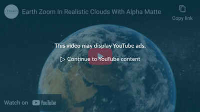
To warn viewers of the potential of adverts being displayed, Canvas has introduced a new content overlay warning. This message appears before a video plays, alerting viewers that the video may contain advertising.
On desktop browsers, the warning is shown prior to playback, while on the Canvas mobile apps, it appears at the top of the page.
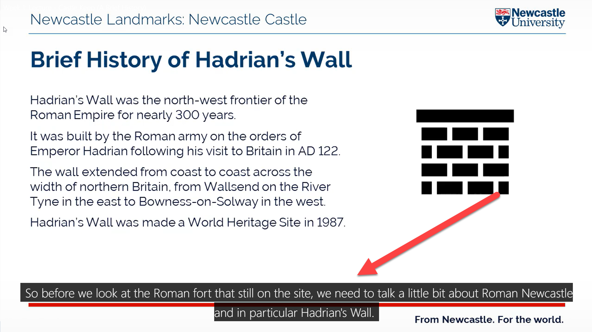
An example of this notice can be seen below:
Image from Instructure Canvas Community Website
If you have any questions regarding this change, please contact ltds@newcastle.ac.uk.
We believe that accessibility is key to creating an inclusive and supportive learning environment for all students.
Our commitment to accessibility is reflected in the wide range of resources and tools we offer to ensure that every student can engage fully with their studies.
From the Canvas Baseline, which provides essential best practice information and promotes consistency across courses, to Ally for Canvas, which enhances the accessibility of digital learning content, we are dedicated to making education accessible to everyone.
In addition to these tools, we offer training and courses such as the Accessible Documents Training workshop and the Accessibility in Practice Canvas course.
Join us as we explore the various accessibility resources available at Newcastle University and discover how they can benefit you and your academic journey.
Canvas Baseline
The Newcastle University Canvas Baseline outlines the essential requirements for all University modules within the Virtual Learning Environment (VLE). It ensures students receive a core set of materials, including programme-related information and details about learning, assessment, and skills for each module.
The Baseline aims to create consistency across modules, provide clear guidance on available information and resources, and offer a foundation for module development while enhancing student engagement through Canvas.
More information on the Canvas Baseline can be found on the Canvas Baseline pages on the Learning and Teaching Website.
New Courses Guidance
The Get your Canvas courses ready has a checklist section provides a step-by-step guide for preparing Canvas courses. This includes checking your courses for accessibility in both Canvas and Ally.
More information on New Course Guidance can be found on the New Courses Guidance page on the Learning and Teaching website.
Ally
Ally for Canvas is a tool integrated into Newcastle University’s Canvas platform to enhance the accessibility of digital learning content. It automatically generates alternative formats of course files, such as MP3, electronic braille, ePub, and HTML, making it easier for students to access materials in the format that suits them best.
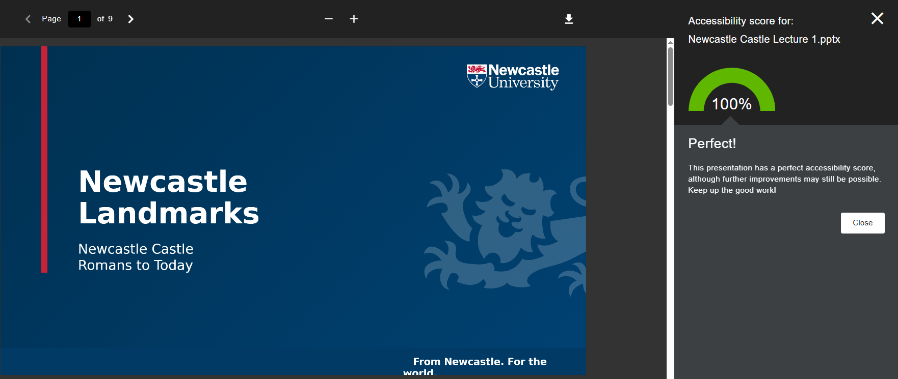
For instructors, Ally provides an accessibility score for uploaded files and offers guidance on how to improve them. This helps ensure that course content is inclusive and accessible to all students.
More information on Ally in Canvas can be found on the Ally for Canvas page on the Learning and Teaching website.
Accessible Documents Training
In this workshop we uncover why accessible practices are so important for our students and colleagues.
The workshop includes short activities to introduce participants to tools and techniques to ensure digital materials are accessible, and includes audience interaction via Vevox.
If you are interested in taking part in this training, please contact: ltds@newcastle.ac.uk
Accessibility in Practice – Canvas Course (Self Enrol)
Learning and Teaching Development Service (LTDS) host an Accessibility in Practice Canvas course. The course provides you with some core information, skills, and techniques for embedding accessibility into your teaching, learning, and work practice, and in making your digital resources accessible to everyone.
Accessibility benefits everybody, not just individuals with additional needs. You can self enrol on the course to complete at your own pace.
Ally is an external tool integrated into Canvas that automatically checks course materials against WCAG 2.0 accessibility standards and provides feedback on their accessibility. It’s important to note that Ally doesn’t evaluate the quality of your course content; it simply assesses how well the content meets accessibility standards.
This video provides an overview of Ally in Canvas and how it works within our Virtual Learning Environment:
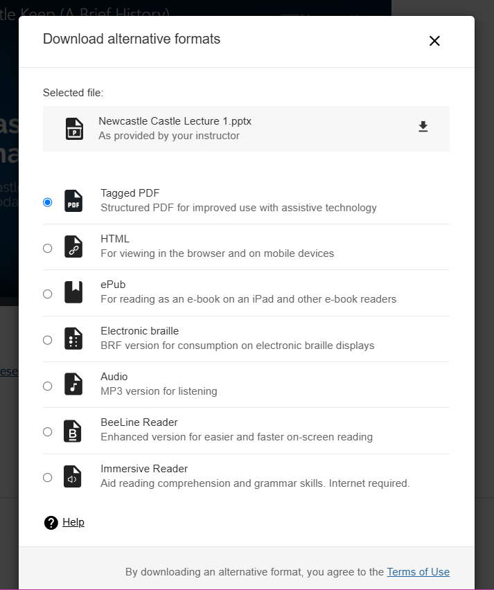
Alternative Formats
A beneficial feature is that it also enables students to download accessible alternative formats of published module materials, without the need to create and upload these ourselves. These formats are made available with the original file, so students can find everything in one convenient location.
While the alternative formats are created for you, you can, if you want, disable alternative formats for any individual content item for whatever reason (a good example being translated versions of texts on foreign language courses).
Alternative formats made available by Ally are:
Tagged PDF;
HTML;
e-Pub;
Electronic braille;
Audio (text-to-speech conversion);
BeeLine Reader;
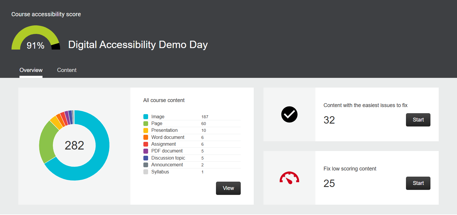
Course Accessibility Report
Accessibility Summary
The course accessibility report acts as a complement to the existing accessibility indicators. It provides an accessibility summary and overview at the course level.
The report gives an overall accessibility score for the course, which is an average of the accessibility scores of all course materials. Scores range from Low (0-33%), Medium (34-66%), High (67-99%), to Perfect (100%).
Detailed Feedback
It identifies specific files that need remediation, categorizing them by accessibility score and issue type. This helps instructors prioritize which content to fix first 1.
Guidance and Corrective Actions
The report provides detailed explanations of why certain issues are problems and offers step-by-step instructions on how to fix them.
Instructors can even upload corrected versions of files directly within Canvas.
The aim of this week is to help you strive to make all your learning resources as accessible as possible. This also extends to our video content, which plays a crucial role in the educational experience.
In this blog, we will explore the importance of video captioning and how it can be effectively implemented using the Panopto system (also known as Recap).
When we refer to video content, we mean recordings provided to students for educational purposes. These recordings are typically delivered via Canvas and include lecture recordings, teaching presentations, and other instructional videos.
By ensuring that these videos are captioned, we can enhance accessibility for all students, including those who are deaf or hard of hearing, non-native English speakers, and individuals who benefit from reading along while listening.
What is ReCap (Panopto)?
Panopto, also known as Recap, is a video platform at Newcastle University. This system facilitates the recording, editing, and sharing of video content, making it an essential tool for both educators and students.
The primary reason for using Panopto is to enhance the learning experience. By providing students with access to lecture recordings and other educational videos, Panopto allows them to review material at their own pace. This flexibility is particularly beneficial for revisiting complex topics and catching up on missed lectures.
Moreover, Panopto significantly contributes to accessibility. It supports students with diverse learning needs by offering features such as video captioning, ensuring that all students, including those who are deaf or hard of hearing, can benefit from the content.
Captioning in Panopto (ReCap)
The ReCap service (Panopto) provides the ability to add ASR (Automatic Speech Recognition) generated captions to your recordings.
The University recognises that automatically generated captions are not 100% correct and have published a captions disclaimer for viewers.
We recommend reviewing automatically generated captions and making light-touch edits before making them available.
How Do I Edit Captions in Panopto (ReCap)
The support pages of the Panopto website offer great advice on how to work with captions in Panopto.
The How to Edit or Delete Captions guide provides a comprehensive guide on how to edit or delete captions in Panopto. It outlines the steps required to access the caption editor, make necessary adjustments to the text, and save changes.
The guide also covers how to delete captions if they are no longer needed. Additionally, it includes tips for ensuring caption accuracy and improving the overall quality of video content. This resource is essential for anyone looking to enhance the accessibility and usability of their Panopto recordings.
Global Accessibility Awareness Day (GAAD) is an international event intended to get everyone talking, thinking and learning about digital accessibility and inclusion.
This year the event will be held on 15 May 2025.
To honour GAAD, we will be posting a series of blog posts and videos highlighting issues and provide guidance on accessibility issues (more on that later in this post).
Let’s begin by exploring what digital accessibility means, identifying the individuals it affects, and challenging common misconceptions about accessibility.
What is Digital Accessibility?
Digital accessibility refers to the ability of people with disabilities/impairments to independently consume and/or interact with digital.
This can include web content and applications (including on mobile devices).
The Diverse 21st Century Learner
Digital accessibility is often perceived as a set of practices aimed solely at helping individuals with disabilities. However, accessibility is much broader and benefits everyone, regardless of their abilities or circumstances. By incorporating accessibility into digital design, we create inclusive environments that enhance usability and convenience for all users.
Our learners come from a wide range of backgrounds, each with unique needs shaped by their individual circumstances. Unfortunately, these needs are sometimes overlooked, particularly in terms of accessibility.
These learners could include:
Learners with Visible Disabilities
This can include individuals with visible disabilities, such with mobility impairments, visual impairments, or hearing impairments.
Learners with Invisible Disabilities
This could include users with invisible disabilities, such as cognitive impairments, mental health conditions, or chronic illnesses.
Learners with Temporary Disabilities
Users experiencing temporary disabilities, such as a broken arm or temporary vision impairment.
International Students
Students from different countries who may face language barriers and cultural differences.
Professionals Seeking more Education
Working professionals looking to further their education.
Learners with Different Preferences
Users with specific preferences, such as those who prefer dark mode or larger text.
Parents
Parents who may be juggling multiple responsibilities and need efficient and accessible digital tools.
Commuters
Individuals who frequently travel and use digital tools on the go.
Learners Who Use Mobile Devices
Users primarily accessing digital content via mobile devices.
Offline Users
Users who prefer or need to access content offline due to limited internet connectivity.
With knowledge of who our potential learners could be, we can help create digital content that is accessible and helps towards meeting their needs.
What is Happening This Week
To help our colleagues and students at Newcastle to engage with accessibility content, colleagues in the Learning and Teaching Development Service (LTDS) are going to be sharing blog posts each day during this week on Digital Accessibility.
Schedule of Posts
Tuesday 13th May 2025 – Document Design Fundamentals
Wednesday 14th May 2025 – Creating Accessible Videos in Recap (Panopto)
Thursday 15th May 2025 – Anthology Ally in Canvas
Friday 16th May 2025 – Accessibility Resources Available at Newcastle University
On March 5th 2025, Disability Interest Group and Christian Lawson-Perfect, with support from LTDS, hosted the first Digital Accessibility Demo day in the Boiler House on the central campus of Newcastle University.
We were very pleased with the high turnout of attendees. It was wonderful to initiate conversations with colleagues about accessibility awareness and the importance of creating inclusive environments.
Attendees were greeted on entry and encouraged to take away a series of handouts giving accessibility advice prior to visiting one of the stations.
People from LTDS, NUIT and the Disability Interest Group were on hand offer support and answer any questions attendees had about digital accessibility.
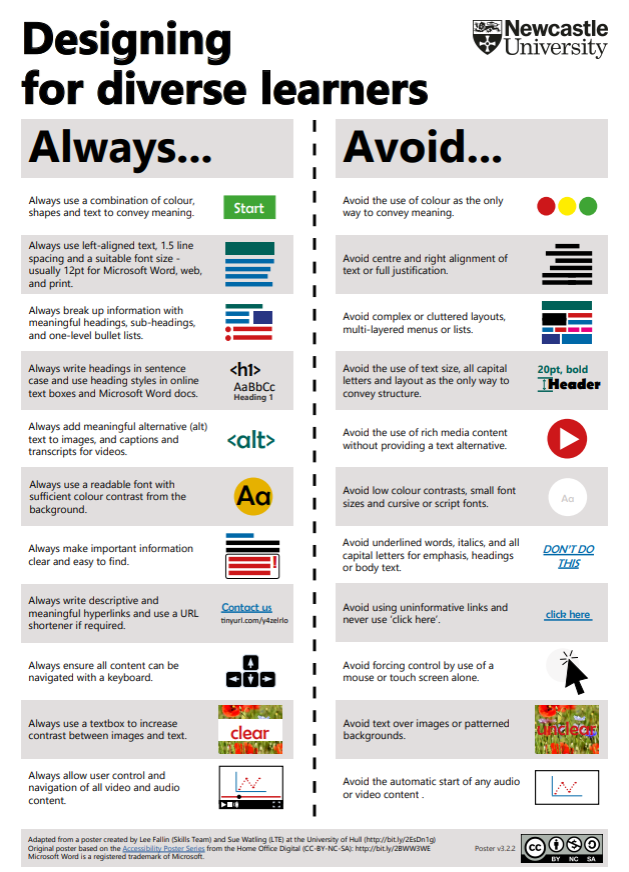
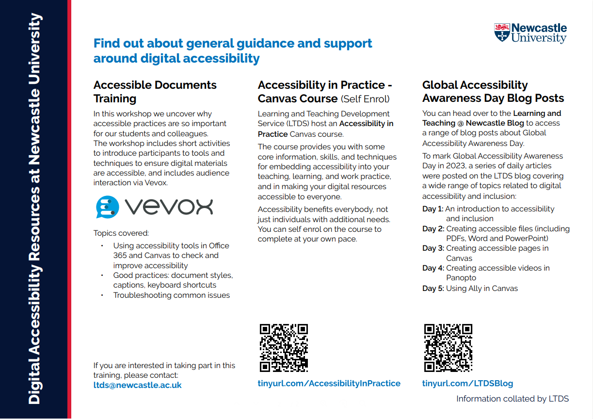
Sample of Handouts
Poster for “Designing for Diverse Learners”Poster for Digital Accessibility Resources at Newcastle University”
You can download copies of these handouts at:
Designing for Diverse Learners – Poster on the what you do and what to avoid when designing content. Digital Accessibility Resources at Newcastle University.
Attendees were also informed of the wide range of digital accessibility resources available on the Digital Accessibility Webpages on the Learning and Teaching Website.
Review of Accessibility Demonstration Stations
We had set up stations that simulated various access requirements and featured different accessibility software for attendees to try out.
Screen Reader
A laptop was set up with a red card covering the screen. Attendees were asked to use the provided headphones and screen reader (NVDA) software to navigate online teaching materials.
After using the screen reader, the red card was removed to reveal the content.
This setup provided attendees with a first hand experience of navigating online materials using a screen reader, highlighting the challenges and solutions associated with this.
NVDA enables blind and visually impaired users to interact with the Windows operating system and many third-party applications through synthetic speech.
Devin Louttit of LTDS testing the Screen Reader Station
Text to Speech Software (ClaroRead)
A station featuring ClaroRead was set up alongside a course created on Canvas with intentionally poor accessibility. This setup aimed to demonstrate the capabilities of text-to-speech software. While ClaroRead was used for this demonstration, many other programs offer similar functionality.
Text-to-speech software converts written text into spoken words using synthetic voices. This technology is designed to assist individuals who have difficulty reading text on a screen, but it can also be used for convenience and productivity.
It was demonstrated how ClaroRead works on the demonstration course, providing attendees with the opportunity to experience the software first hand.
Colour Vision Deficiency
Colour Vision Deficiency (CVD), commonly known as colour blindness, is a condition where an individual has difficulty distinguishing between certain colours.
To demonstrate this, a station was set up with colour filters that removed all colours from the screen, rendering everything in black and white. This setup aimed to illustrate the challenges faced by individuals with CVD and to emphasise the importance of not relying solely on colour to convey meaning. It also highlighted potential contrast issues that could arise if colours were inverted. This also would impact users who print materials in black and white.
By experiencing this simulation, attendees gained a better understanding of the need for accessible design practices that consider colour vision deficiencies.
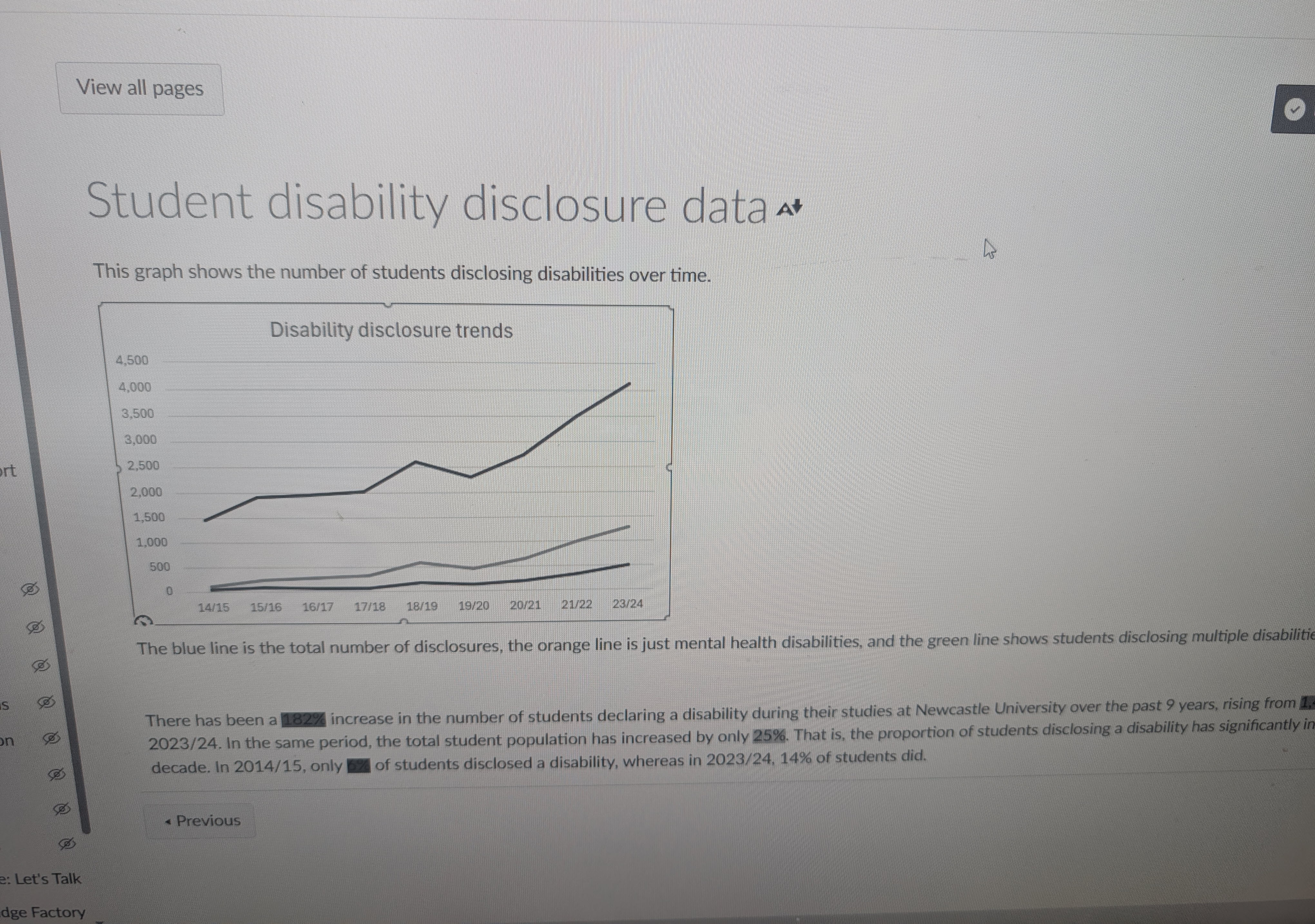
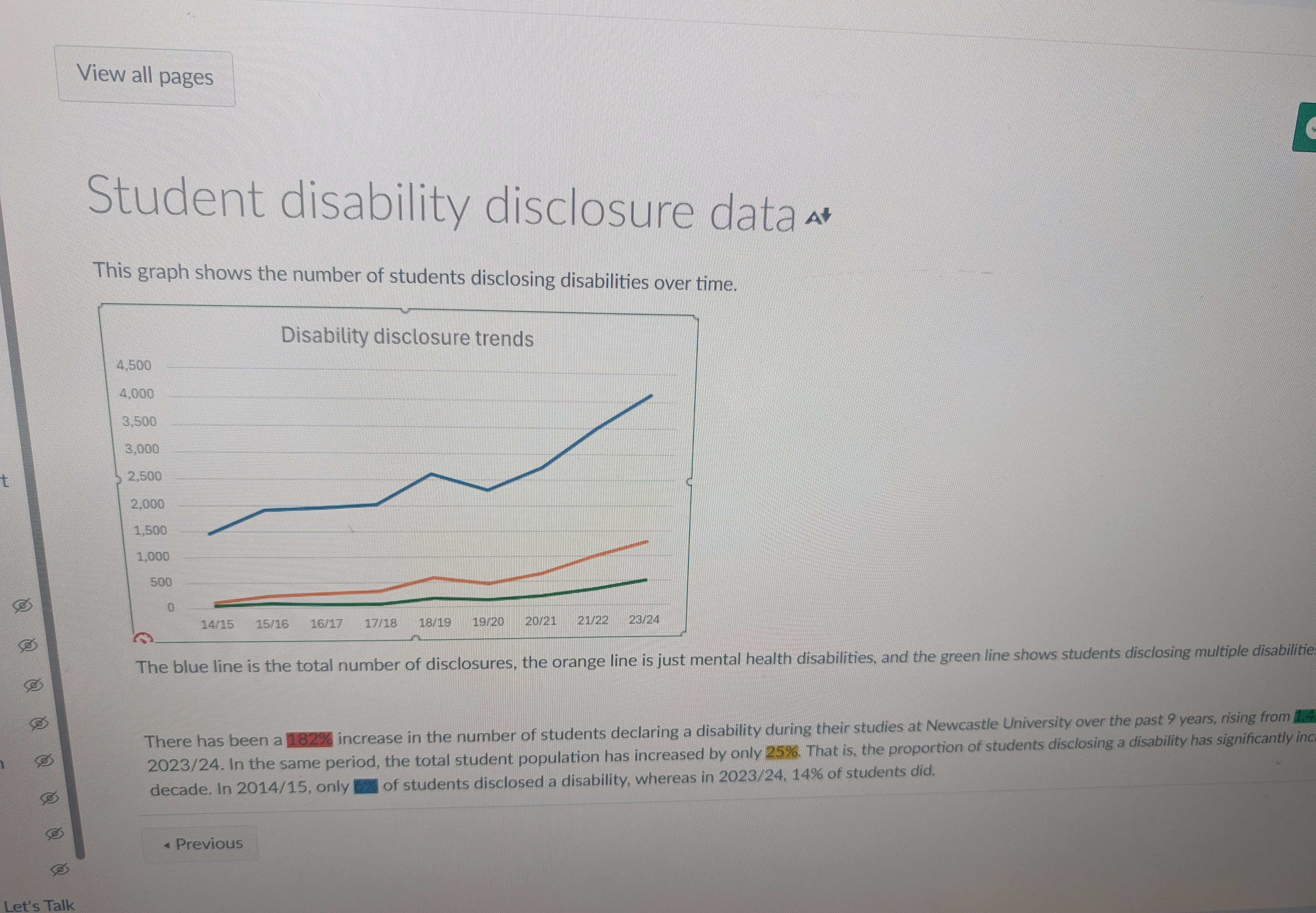
An example was provided of online materials that used colour in a way that could be challenging for users with Colour Vision Deficiency (CVD) to understand, particularly when reading the graph and the highlighted text.
When colour is removed, interpreting the graph and text becomes noticeably more challenging.
Canvas materials in greyscale (with colour removed)Canvas materials with colour
Attendees remarked on the increased difficulty in understanding the content when the colours were changed to greyscale. This experience prompted them to reconsider how they use colour in their own online teaching materials to ensure better accessibility.
Low Mobility
A laptop was set up just out of reach, requiring attendees to use a long stick to access the keyboard. This added level of difficulty was designed to demonstrate the challenges faced by users with mobility issues when accessing content. By experiencing this first hand, attendees gained a deeper understanding of the importance of designing accessible digital environments that accommodate various physical limitations.
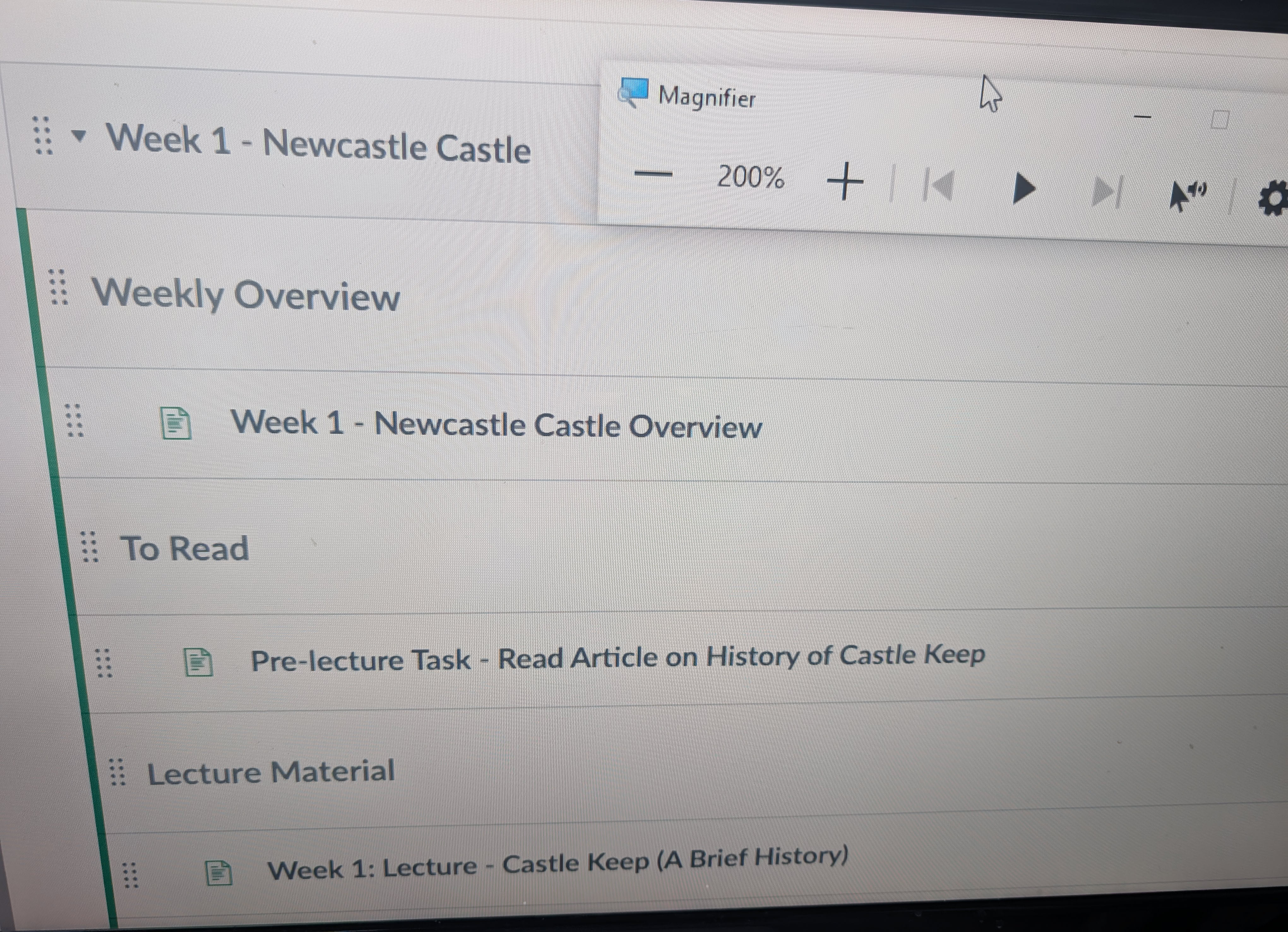
Magnification
A laptop and screen were set up for using the Magnifier in Microsoft Windows. The Magnifier on Microsoft Windows is an accessibility tool designed to make parts or all of your screen larger, making words and images easier to see. This is particularly useful for individuals with low vision.
Microsoft Windows Magnification in action on a Canvas course
Canvas Accessibility Tools
There are numerous accessibility tools built into Canvas and Microsoft Office. At this station, we demonstrated some of the accessibility features in Canvas that can help you make your materials more accessible.
In addition to Canvas, Microsoft Office offers a variety of tools designed to enhance accessibility, such as the Accessibility Checker and Immersive Reader. By integrating these features, attendees learned how to create more inclusive and user-friendly online teaching materials.
Canvas Built in Accessibility Tools
Canvas Rich content editor accessbility checker
The demo included looking at the Rich Content Editor Accessibility Checker which helps identify common accessibility issues within your course content. It checks for issues such as missing alt text for images, improper table structures, and insufficient colour contrast.
canvas immersive reader
The Immersive Reader in Canvas tool designed to enhance reading accessibility and comprehension for all learners. Developed by Microsoft, it offers features such as text-to-speech, syllable breakdown, line focus, picture dictionary, and adjustable text settings.
The Immersive Reader can be used on various Canvas pages, including the Course Home Page, Syllabus, assignments, and individual pages, helping to create a more inclusive learning environment.
A group of students that attended the event were unaware that this was available and were very impressed with how the tool worked, they said they’d be looking to incorporate this into their future use of Canvas.
Ally Tool with Canvas
The Ally tool in Canvas is designed to improve the accessibility of course content. The key features include:
Accessibility Scores: Ally provides detailed accessibility scores for course materials, helping instructors identify and prioritise accessibility issues that need attention.
Instructor Feedback: It offers guidance and support to instructors on how to improve the accessibility of their content, including suggestions and documentation on how to correct barriers.
Alternative Formats: Ally automatically generates alternative formats of course content, such as readable text for screen readers, tagged PDFs, HTML, ePub, and audio files. These formats are made available alongside the original content, ensuring students can access materials in the format that best suits their needs.
Some students attending the event had never been introduced to Alternative Formats and were very impressed with their functionality. They were very enthusiastic about incorporating these tools into their studies moving forward.
Microsoft Office Accessibility Tools
The Accessibility Checker in Microsoft Office is a tool that identifies and suggests fixes for common accessibility issues in your documents and presentations. By scanning your content for problems such as missing alt text, improper table structures, and insufficient colour contrast, it ensures that your materials are accessible to all users. The tool provides real-time notifications and detailed explanations for each issue, helping you understand and address them effectively.
This ensures that content is checked for accessibility before being uploaded to Canvas, which helps improve the course’s accessibility score. Additionally, it can be used to troubleshoot and resolve accessibility issues in existing course materials.
A number of academic and professional service colleagues remarked that they would start using these tools when creating materials following the event as they were easy to use and would save time in the future troubleshooting accessibility issues in uploaded documents to Canvas.
Recap Captioning
The captioning tool in Recap was also demonstrated. Captions also benefit those who may struggle to understand spoken language due to background noise or where their first language isn’t English.
Additionally, captions support flexible viewing in various environments, such as public places where sound may be disruptive.
It was demonstrated how easy it is to check and alter these captions in your course using the Recap editor.
Sample of Tool Demonstrations
Image of Microsoft Immersive ReaderImage of Canvas Accessibility CheckerImage of Alternative Formats OptionsImage of Ally Canvas Course ReportImage of Ally Tool for file checkingImage of Recap captions
In Spring 2025, there will be some updates to Canvas SpeedGrader. This update makes SpeedGrader faster and more stable, while keeping the interface easy to use. The grading process you know will stay the same, but with some improvements behind the scenes.
Previously, courses with large cohorts or assignments with large file submissions experienced frustratingly slow loading times. This update aims to enhance SpeedGrader’s performance, making navigation quicker and more efficient.
In addition to performance updates, there will be minor interface changes to assist with navigation. Although small, these changes will help with the usability of SpeedGrader. After these changes, the interface will still have the familiar SpeedGrader feel.
Let’s dive into the changes made to Canvas SpeedGrader…
Sections Selector Dropdown
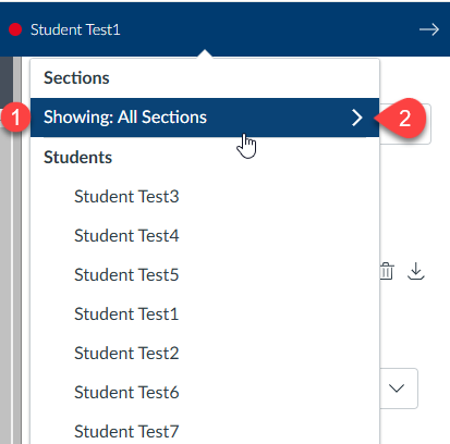
The section selector now has a streamlined interface, making it easier to navigate between different class sections. Previously, filtering by section required more steps. With the new Sections Selector Dropdown, you can quickly filter submissions by section.
In the Student Dropdown List, you’ll now see a Sections header. Under ‘Showing,’ you’ll find the current section that the list is filtered to (point 1).
To apply a new section filter, click on the Section filter (point 2). A dropdown list will then appear, as shown below:
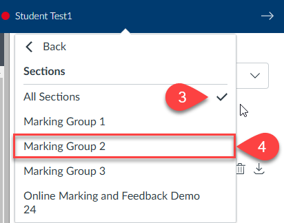
In the dropdown list, you’ll see all the sections associated with the assignment. A tick mark will indicate the section currently applied as the filter (point 3).
To choose a new section filter, click on the name of the desired section (point 4).
No Submission Alerts
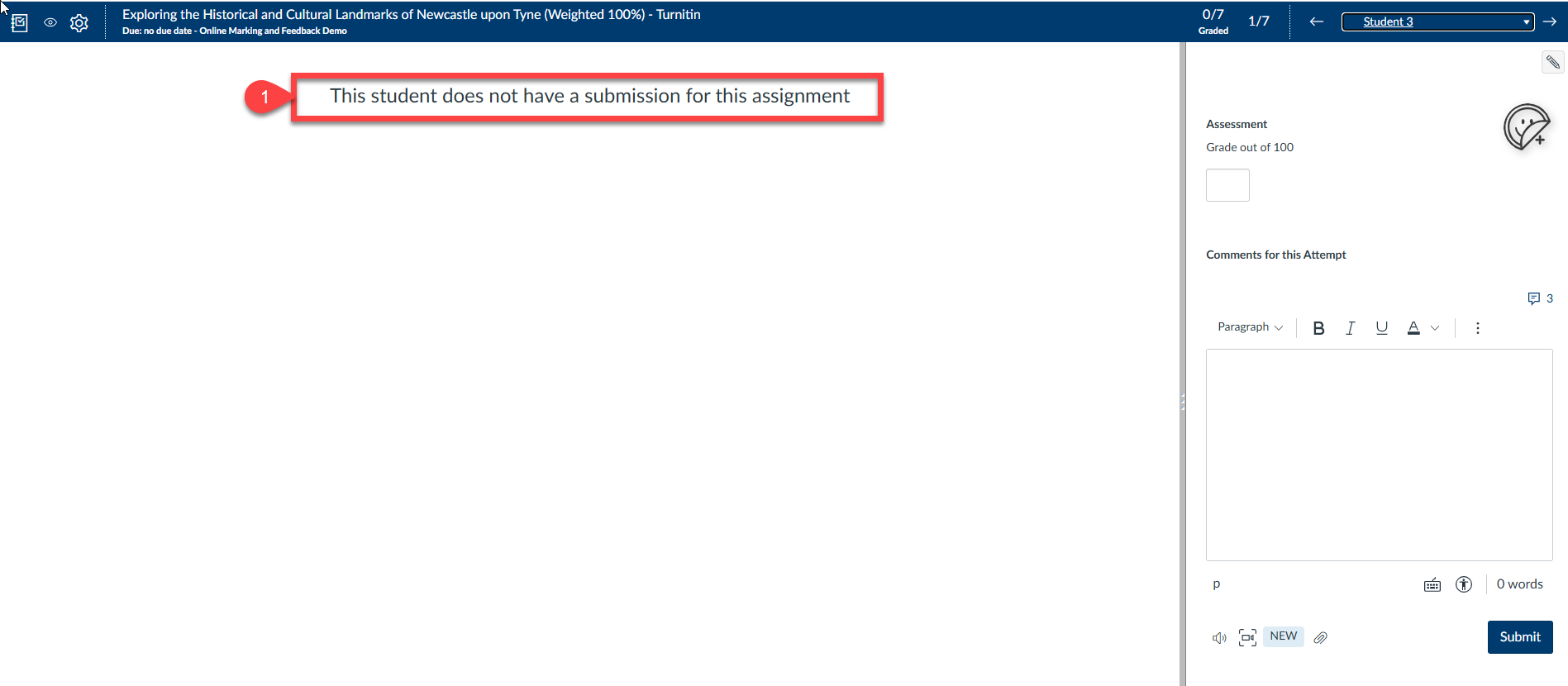
The alert for assignments without submissions has been enhanced to be more prominent and visually clear.
Previously, this would be indicated with the assignment showing as blank in the DocViewer. It is now clearly indicated that there is no submission.
You can see in the below (point 1), this is now clearly displayed in the DocViewer.
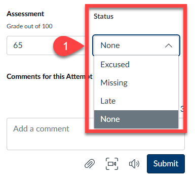
Grade Status Selector
Changing the status of a submission is now easier with a new dropdown box. However, it’s generally not recommended to use this feature, as our assignment statuses are tracked via the NESS system.
Previously, this status was managed by a pencil icon located in the top corner of the marking pane in SpeedGrader.
To change a submission status, click on the dropdown box and selected the appropriate status.
This is demonstrated in point 1 below:
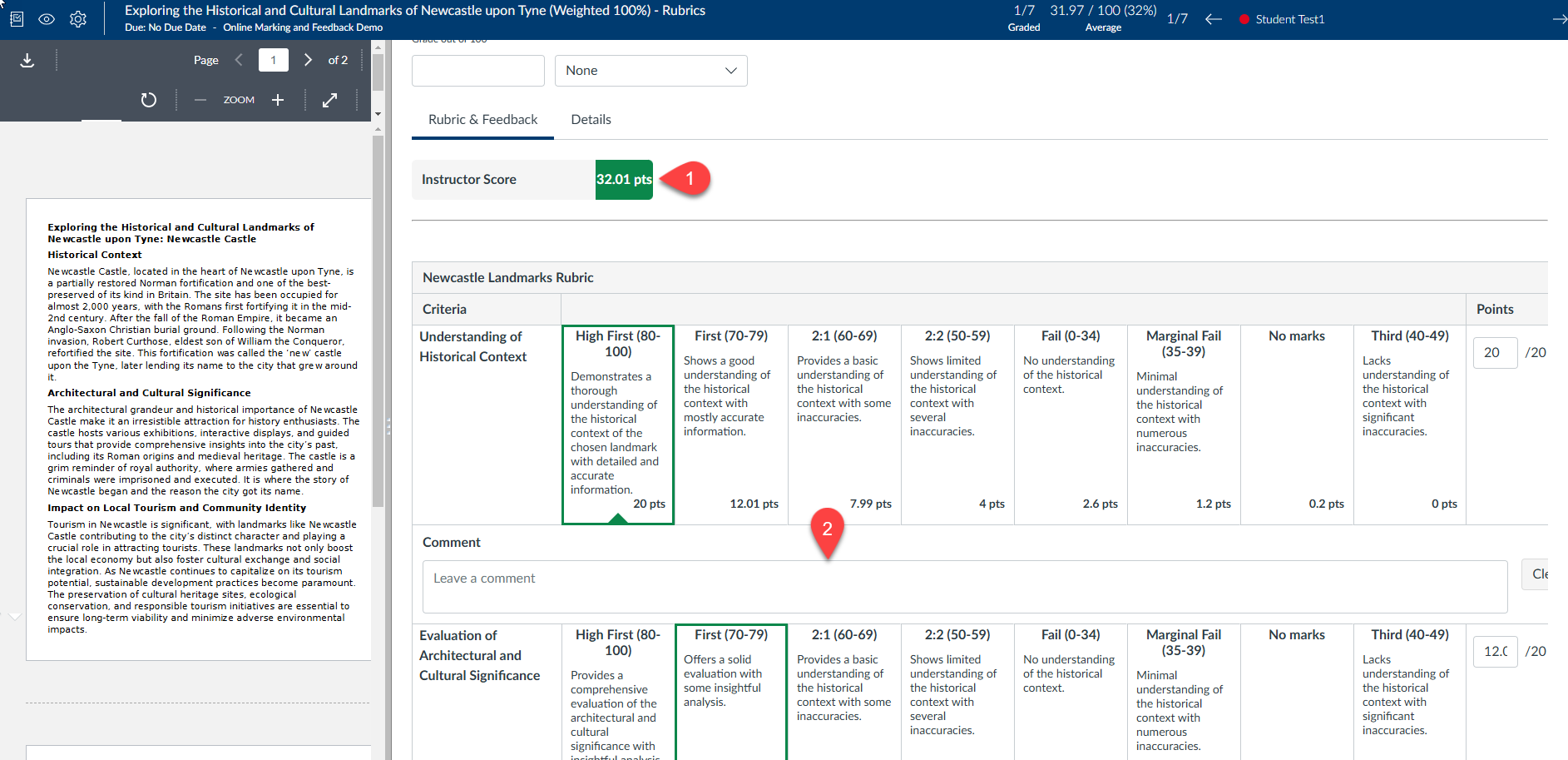
Rubrics
Rubrics are now consistently displayed in the new traditional (grid) view. This view is very similar to the rubrics you’re used to marking with, though there are some minor changes.
The Instructor score is now displayed at the top of the rubric, making it easier to see while marking an assignment (point 1).
Providing feedback for rubric criteria is now easier with the feedback entry box clearly displayed (point 2). Previously, you had to access this feature via a button. Having the feedback option readily available encourages more frequent addition of comments to rubric criteria.
Media Attachments
Uploading and managing media attachments in submission comments is now more intuitive, thanks to an improved dialogue and a more straightforward deletion process.
Deleting an attachment has been made more intuitive with the introduction of a rubbish bin icon, replacing the previous red ‘x’ button (point 1). This change not only modernises the interface but also makes the deletion process clearer and more user-friendly. The rubbish bin icon is universally recognised, ensuring that users can easily identify and use this function without confusion.
Over the summer there have been a series of updates to the Inbox within Canvas.
In this blog post, we will highlight some of the key changes to the Inbox and how you can utilise these changes in your courses.
Video Overview
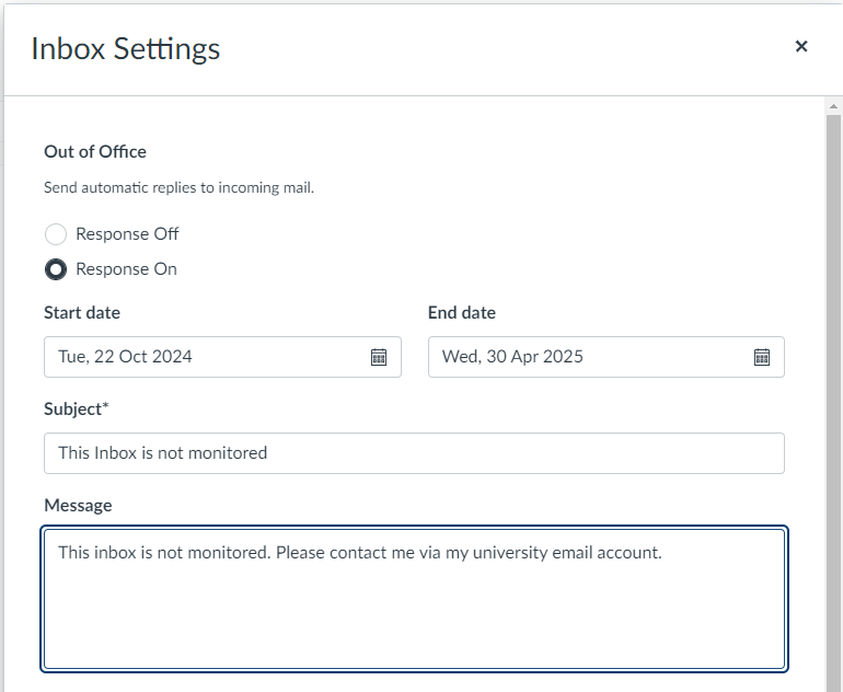
Add Auto Response
All users can now create an Auto Response message in the Canvas Inbox. This works similar to an email Out of Office message however this only within the internal messaging system in Canvas.
An example of this can be found below:
To do this:
In the top left corner of the Inbox, select the cog icon
From the dropdown menu select “Response On”
Add the Start and End Date
Add a Subject
Add a Message
Select “Save”
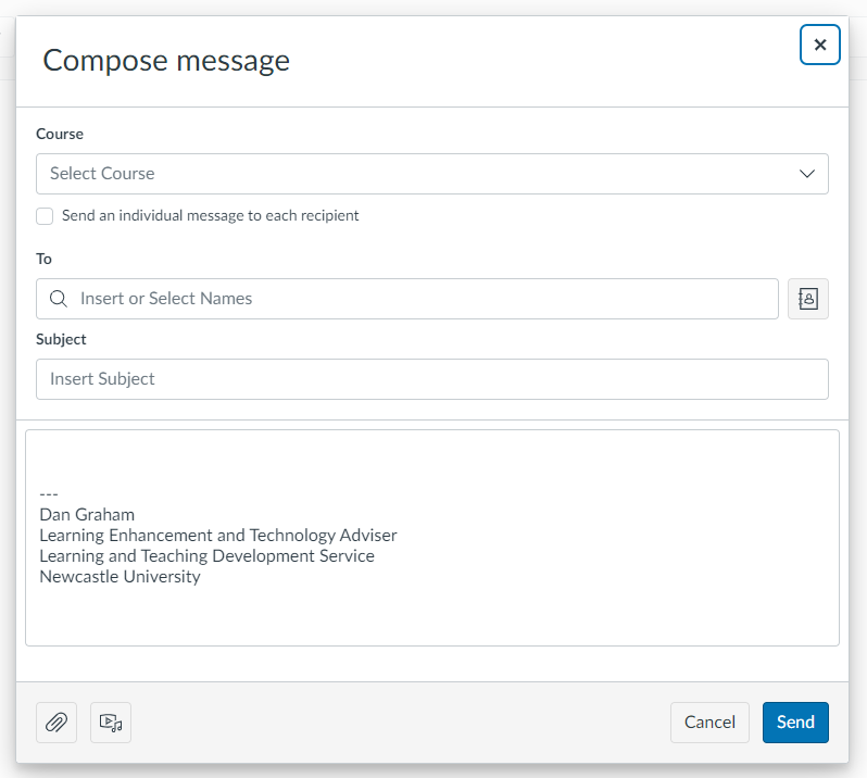
Add Signature to Messages
All users can now create a personalised signature on their Inbox messages in Canvas. This works similar to a signature in Emails and is assigned to internal messages in Canvas.
An example of this can be seen here:
As you can see above, my contact details have automatically been added to my message.
To do this in your own inbox:
In the top left corner of the Inbox screen, select the cog icon
Select the “Signature On” button
Add your personalised signature in the box provided
Over the summer there have been a series of updates to the Announcements feature within Canvas.
In this blog post, we will highlight some of the key changes to Announcements and how you can utilise these changes in your courses.
Video Overview
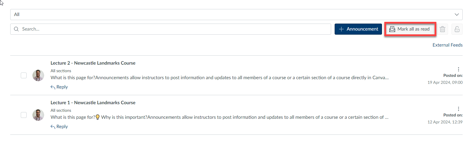
Mark All As Read Button
In Announcements, a Mark all as read button is available.
This update allows users to quickly and efficiently mark all announcements as read. Previously, each message would need to be manually marked then a bulk action applied. With this update, all messages can be marked as read with a single button click.
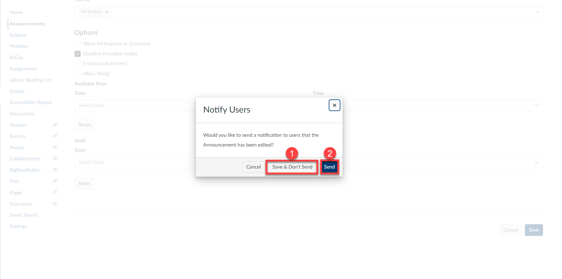
Notification for Changed Content
In Announcements, instructors can notify students when an announcement has been updated.
This feature prevents missed information, allowing users to respond promptly and appropriately to the new information.
Previously there was no way to alert recipients that there had been a change to an announcement other than posting the message again or sending another message informing students of the change.
Availability Dates
In Announcements, the delayed posting field is changed, in addition to the Available from field, instructors can add Until dates.
The update enables instructors to specify a date when the announcement will no longer be visible to students.
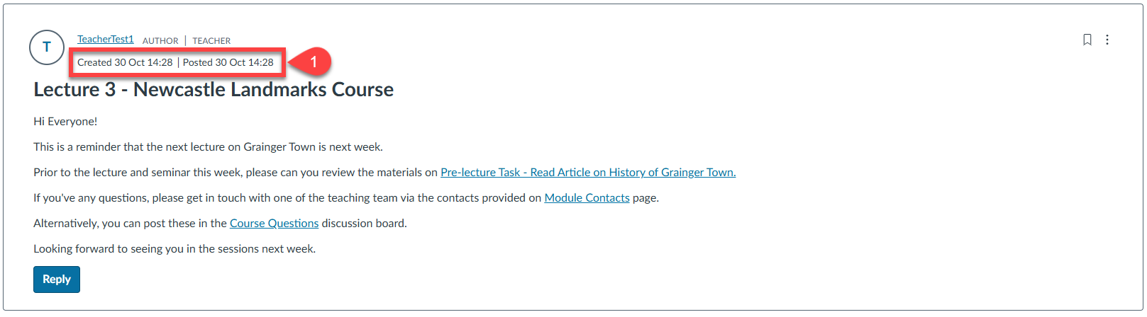
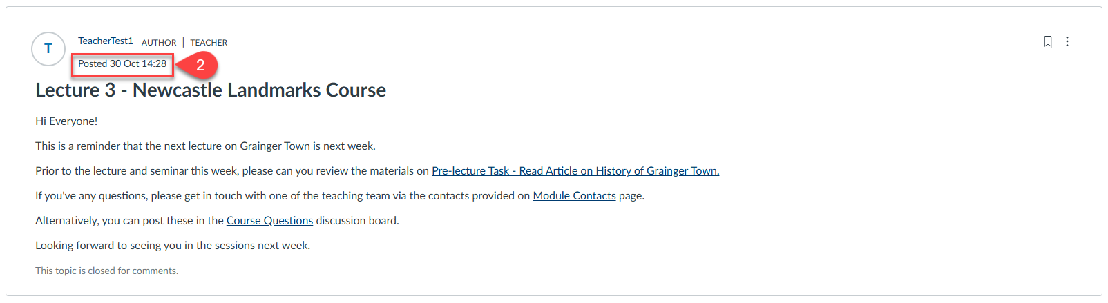
Announcements Timestamp
In Announcements, the Created date is hidden from students, and the Last edited date is only shown if the announcement was edited after being published. Additionally, the Posted date now reflects when the announcement became available.
This update helps prevent any confusion between the Posted and Last edited dates for students.
In the above screenshot, we can see in the teacher view, we can see the creation and the posted date (point 1).
In the student view below, we can see that we only have the posted date (point 2).