Top down? iterative? collaborative? creative? hard work? systematic? hard work? stimulating? fun? messy?
This week my head has been full of design. We’ve had a Bootcamp workshop on Developing your Design and I’ve had some healthy conversations with colleagues as we scope out a NEPS unit on Programme Design. From where I sit now, all the descriptions above apply.
Constructive alignment provides a sturdy skeleton for both programmes and modules but it needs to be clothed and we need other perspectives to inform and evaluate the many potential answers to “how?”. I had a chuckle when I read Jenkin’s Ouija board metaphor describing how curriculum design is influenced and shaped by forces: Assessment as Learning, student time, pedagogy, costs and resources, subject benchmarks… these are all super relevant. But rather than seeing them as forces – I view these as helpful factors which enable us to work within a smaller design space and provide us with insights that help us iterate towards better design.
For both of these task I’ve referred to (our Bootcamp module and the NEPS unit) we are the slightly messy idea generating stage, but importantly, the conversations that we are having now hold the aims and values of both. Convergence isn’t that far off.
Last year I was part of a team that authored our Flexible Learning 2020 (FL2020) course – 11 topics on how to rethink teaching and learning in the shadow of a global pandemic, while changing VLE from Blackboard to Canvas.
Canvas’ stats of page views confirms that the course had a relatively short shelf life. What do we do with it now – do we replace it with another course or a set of resources? Is one approach better than the other? I made a table…
Course
Resource
It has a beginning a middle and an end . There’s some kind of feedback (formative, auto marked) or it is moderated. There is motivation (intrinsic or extrinsic) to complete it. Once complete there is little motivation to return to it, apart from reference . There may be an idea of a cohort progressing through it at key times. It’s designed to take participants from a defined level of knowledge/skill to a more advanced place. Ideally, it contains activities for participants to do with the information.
Something that’s designed to work just-in-time. Signposts further resources and information. Designed to be searchable – jump in at any point. Visit multiple (short) times. Digestible chunks – works on the web .
Now that we are in Semester 2, it’s clear that the questions we are asked are not ones that our FL2020 course answers. We have all moved on. There’s a temptation to add more content for the intermediate audience, but we know this will make everything harder to find and our sense is that what will now be the most valuable is a set of searchable resources.
Co-incidentally, the University of Kent have been running a series of “Digitally Enhanced Education Webinars” and I stumbled on Dominik Lukes’ presentation What should educators know: User interface and User Experience . I was struck by his description of how design needs to be aimed at intermediate users (with routes in for beginners). 2020’s collective baptism-into-blended leaves us with very different mental models than we had pre-covid – and being reminded of the basics is plain annoying.
From this perspective what’s sensible now is to retire the course, it did a reasonable job, but the scaffolding isn’t needed any more. We can pull out some nuggets into shorter help guides, articles and case studies that colleagues can find more easily.
In this week’s bootcamp session we used a couple of techniques to put students at the heart of design.
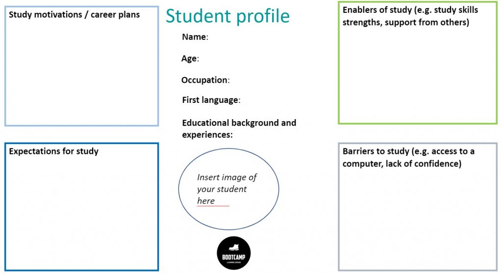
The first was a “Student Profile” in which we imagined a “typical student” and noted motivations, expectations, enablers and barriers to study, alongside their educational background and experiences.
In UX domains these might be called personas becoming the foundations of user stories, keeping users at the centre of design. I was introduced to the idea a while back and have found personas really helpful in curriculum design projects to date, particularly when thinking about vision, values and teaching methods.
We might suggest coming up with a few different personas – maybe an international student, a home student, one with some access needs. The personas can be informed by student feedback, real students, NSS feedback etc – and these imaginary people can be “walked through the design”. Although imaginary, our personas can take on a life of their own — when we were designing HSS8002 we asked questions like “which options would George take?”
We can also use personas to design from the future, by imagining graduates, say three years post-graduation. What did they most value about their programme? What job are they doing? What were the most valuable skills they picked up? What would they like to have seen more of? We can talk to alumni, and employers to flesh these out alongside attributes in our own graduate framework. We can use these insights to prioritise objectives and teaching approaches.
Our second activity involved thinking about the student journey. In our case, the journey through a module – What concerns or difficulties did we envisage students having at certain points? What could we build in at those times to mitigate? This is a really useful exercise to do once the module concept is fixed.
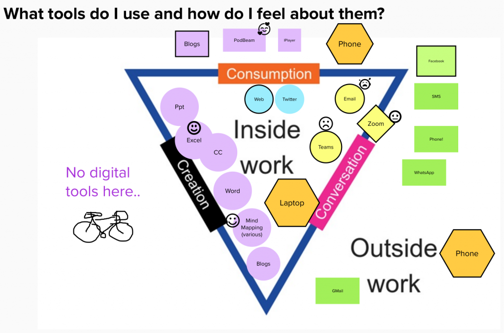
What tools do you use in work and outside work and how do you feel about them? In our introductory Bootcamp session we were asked to draw and then discuss our personal view.
There wasn’t a huge amount of time to do this in the session, so I redid my own diagram afterwards using it as an excuse to try out Mural. The diagram is adapted from work by Lancos and Phipps and, for me, the best bit was adding emoji’s to some of the tools. You will see that email and Teams warranted sad crying but Excel and mindmapping put me in happier zones. (I know I am not exactly normal in my love of data visualisation and infographics.)
Like others in our team I used a laptop inside work, and ignored this when not at work. In many ways Covid-safe working from home has polarised this even more. I don’t do any digital creation outside work, and whilst I would listen to leisure podcasts in my own time – its only a rare occasion that I’d tune into the Wonkhe podcast in work time.
How does this help?
The point of this was to help us get into the shoes of our learners. Our students aren’t a homogenous blob living up to Prensky’s musings on digital natives – they have gaps and preferences. They might feel differently about digital tools? How does that impact our choice of tools to use for learning? How do we scaffold the learning? Is the learning curve worth the reward? Is it inclusive? These questions come well before Privacy/GDPR/Impact Assessment.
Taking a curriculum viewpoint
A tool focus is helpful, but I agree the real trick here is to take a step back, to a curriculum view. How are we developing digital skills and digital agility across the curriculum? Katharine Reedy blog post describes how the OU use card sets to map this out.
We are at the start of our Learning Design Bootcamp journey and have been encouraged to reflect – so lets do it!
I’m not completely new to designing online learning: I’ve supported colleagues through the design of free online courses on FutureLearn, I’ve authored self-paced learning units (on Canvas), and have worked with module teams to redesign Masters level modules for blended delivery. I also had a rich online student experience studying on OU’s MAODE (Masters in Online and Distance Education).
Current approaches to learning design
As far as I know, we don’t really have an institution-wide approach to designing learning, but our programme and module approval process ensures that modules can be articulated in terms of learning outcomes, teaching methods and an assessment rationale. Constructive alignment is hard-baked in!
I’ve been involved in supporting a small number of modules/programmes where I have been allocated to them on a “project basis”. Project work could involve delivering a series of workshops running over a year, or a redevelopment project involving both design and content development.
“Blended” is not the goal
For the projects I’ve supported we’ve found UCL’s ABC particularly useful. It works in our campus-based context and has been effective in helping module teams to consider blended approaches as options (rather than starting out with a goal of N% online).
But ABC only works well when you come to it with a clear view of aims, students, learning objectives and possible assessment approaches.
If these haven’t been thrashed out already, say for a new module or programme, we choose from a range of tools to come up with a shared view.
Go-to tools for “vision” are things like student personas which we draw up to reflect our prospective students. We can also imagine them in the future – and ask “what will students most value about the programme 2 years after graduation?” And, where possible we back this up with input from prospective students, current students (in person or via student voice) and employers as we form the feel, shape and values of the project.
Once the concept is fixed, we’ll work with colleagues to write and refine clear learning outcomes – using guidance from our own institution (and QMU have a great guide too). Next we weigh up appropriate assessment options -what methods will sit best with with the outcomes and skills we want to develop. If we want to encourage creative assessment we’ll offer some form of an assessment sorting hat activity and use prompts on viewpoint cards to spark conversation around feedback or authenticity.
Atisan?
The tools and activities we use are dotted around different workshop folders – we’ve not brought them to a single place. Our pick and mix approach at the moment is somewhat “artisan” and isn’t scalable, or easily communicable to colleagues. I up for picking up new ideas and learning new approaches. One of the things I’d like to see by way of output from this project is a clear pathway of activities leading towards a design goal.
The power of collaboration
In my experience multiple viewpoints and an understanding of the interactive nature of design makes for a better end product. I know design to be a messy, and sometimes contentious process. But with experience comes the knowledge that the uncomfortable thrashing it out process is essential. It helps the project to become “our thing” and at the end there are artifacts and storyboards that articulate what the thing is about, and almost as importantly what it is not about. If there isn’t a shared vision and understanding there will be trouble down the line!