Layout examples: box layouts

The new Research and Conferences template comes with lots of example layouts. Two, three and four column box layouts are some of the most commonly used.

boxes-fw

To create these layouts, add General Purpose content to your Section.

box-layouts-fw

Use the Class field (underneath the General Content box) to tell the content how to appear on the page.

box-two-col-fw

First, type “nosidebar” in the class field (this removes the side menu from your page), then add the word “twocol”, “threecol”, or “fourcol” to specify the layout before clicking “Update and Approve”.

Three or four column grid layouts

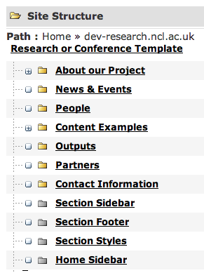
This post talks about grid layouts in the old Research and Conferences template, you can use this post to help you create grid layouts in the new template but we’ve written a new post for that (https://blogs.ncl.ac.uk/t4/2016/11/21/layout-examples-box-layouts/).

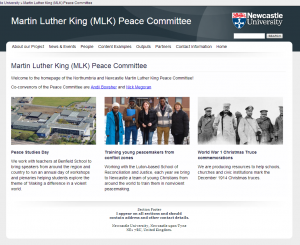
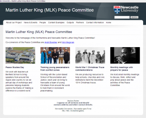
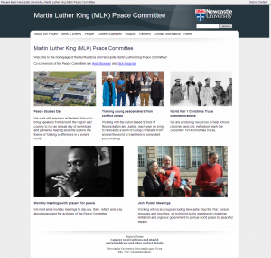
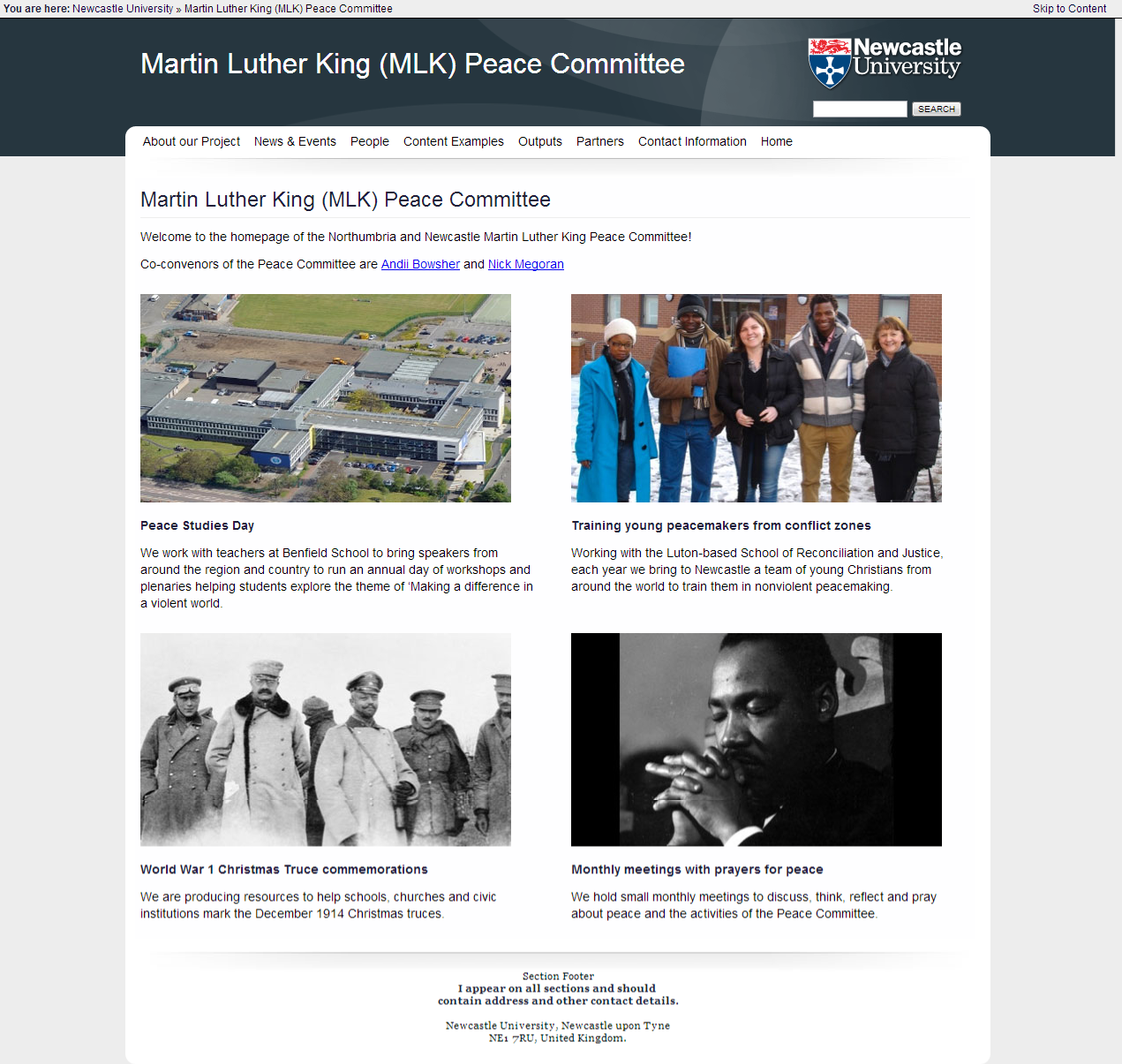
A lot of our websites have a homepage laid out as a grid of boxes containing images and text, where each box relates to a theme of the site or a set of related tasks. With a good choice of photography or illustration, this is a good way to make a site look alive and gets people straight to where they want to be. Here are some examples:

Step 1) Remove the Sidebar

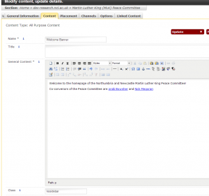
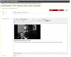
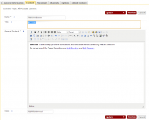
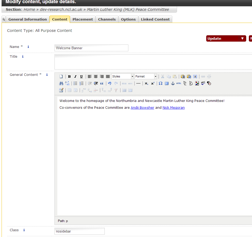
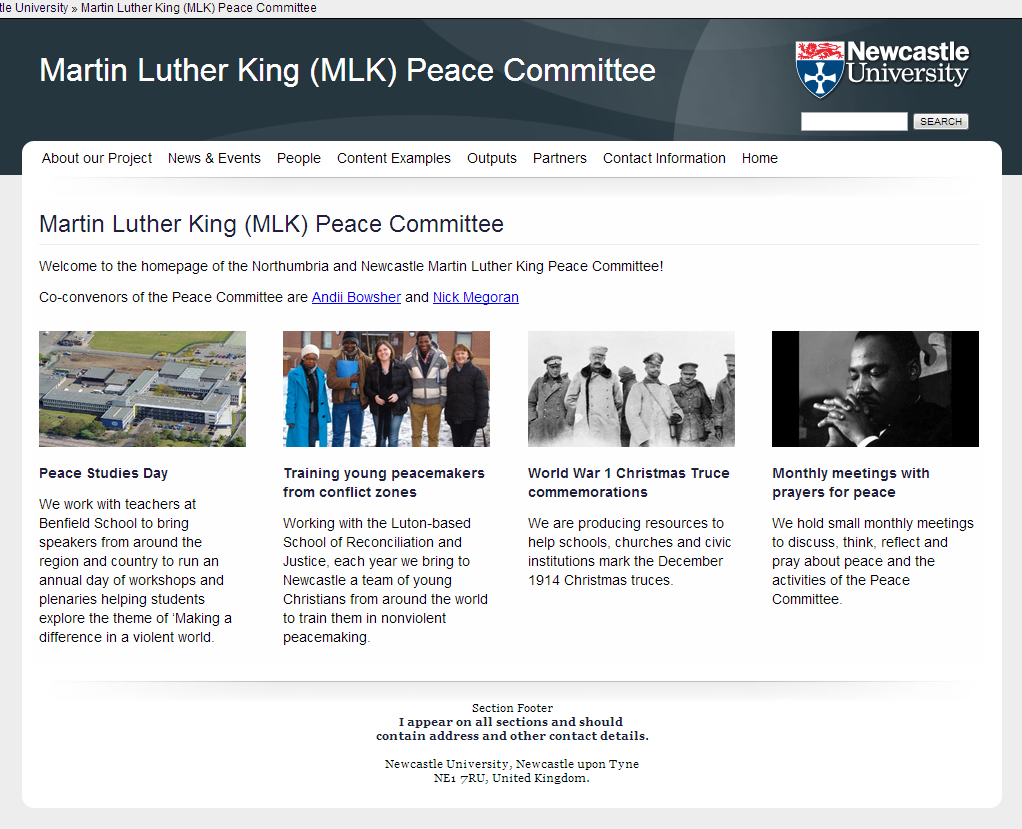
You’ll want to make use of the full width of the template. To remove the sidebar, Modify the Content of the homepage of your site (Modify Content is found in the column of yellow boxes) and add the word ‘nosidebar’ to the class field:

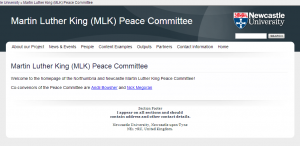
Preview or Publish the content, and your text will fit the full width of the template:

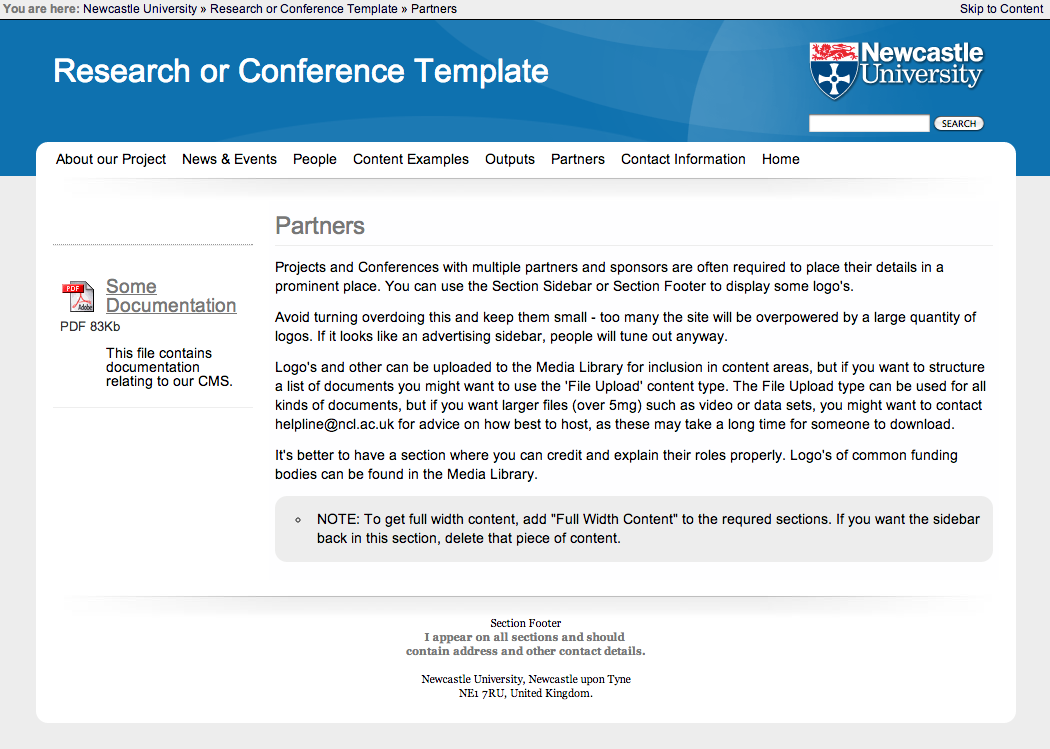
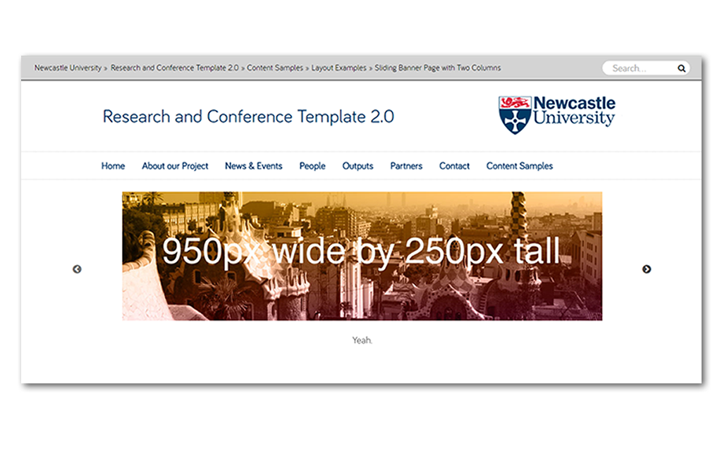
So far so good – note that if you want a full width image, it’ll need to be 960px wide. If you want an fading banner at the top of the page follow these instructions.

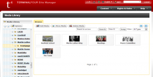
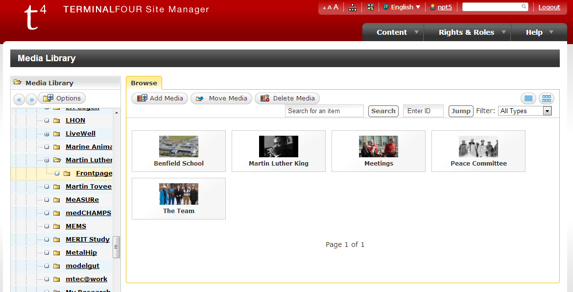
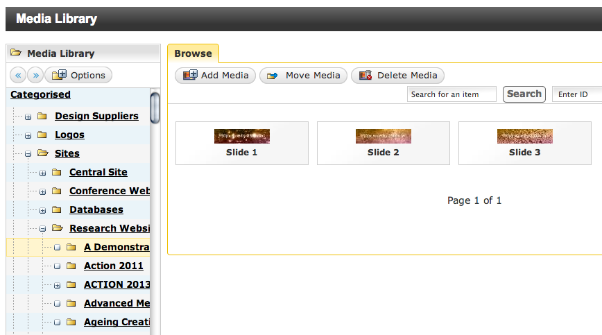
Step 2) Create and Upload your Images to the Media Library

It’s best if you resize all of your images to the same size and shape using photoshop and then upload them to the media library in one go, going back and forth between editing the content and uploading the images will take more time. The images i’m using in this example are 420px wide by 236px tall.

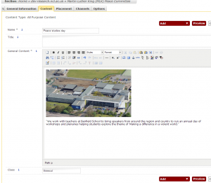
Step 3) Create a new piece of content for each box

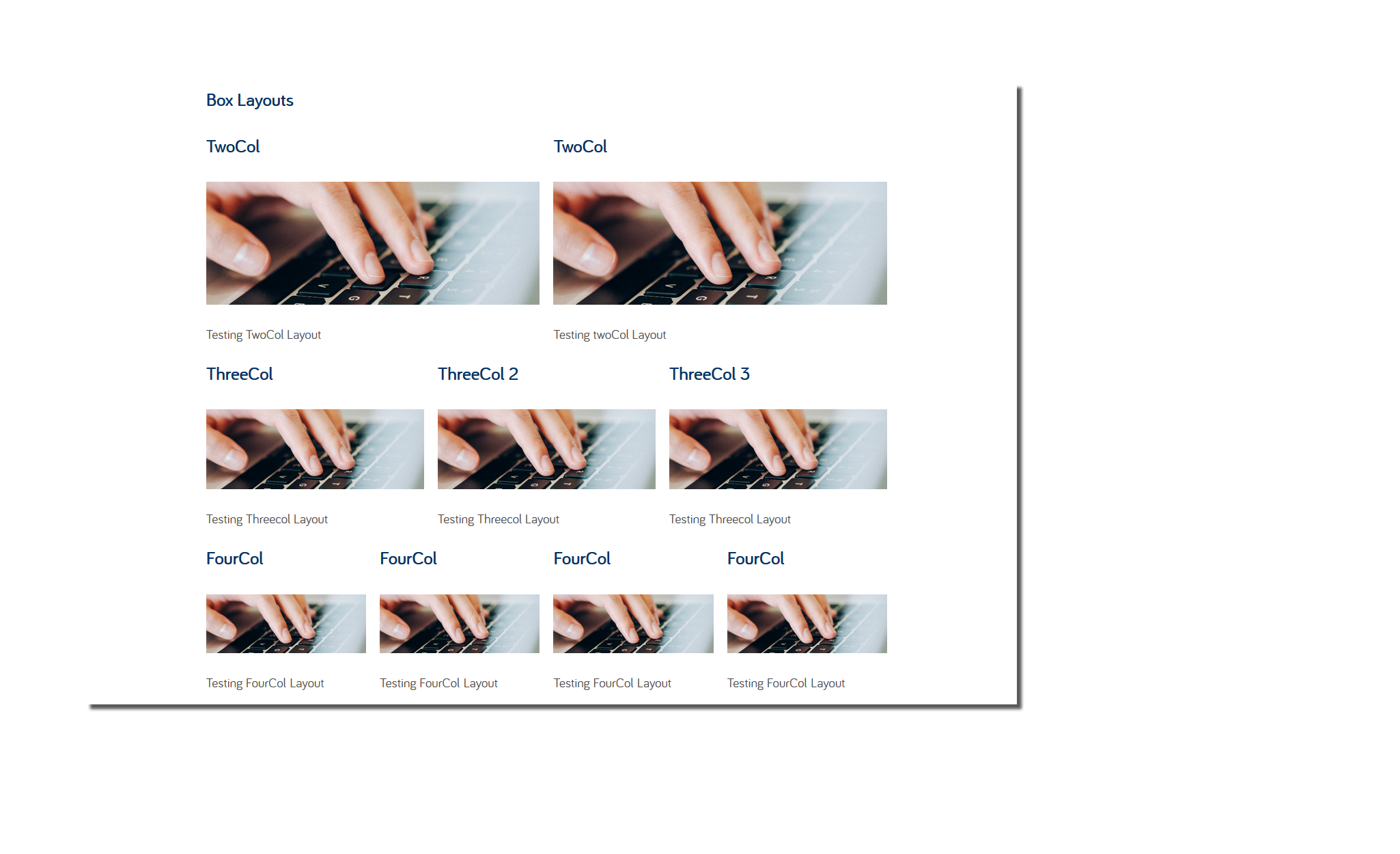
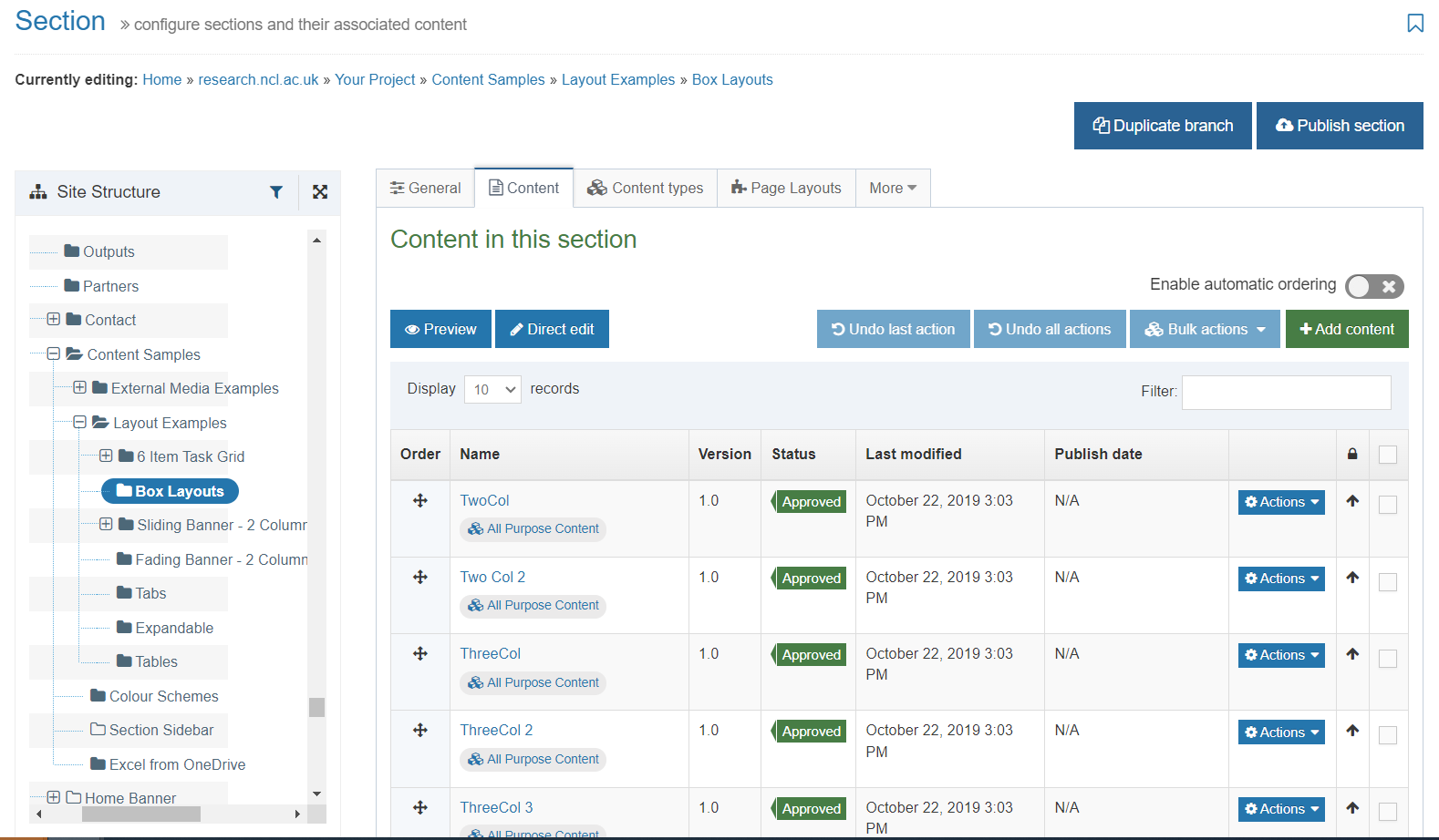
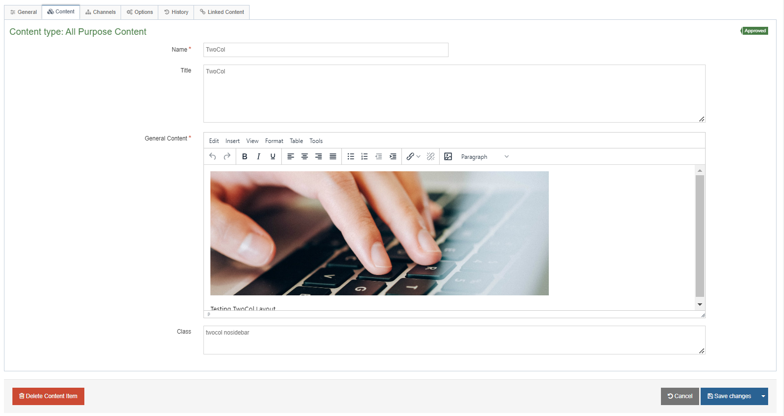
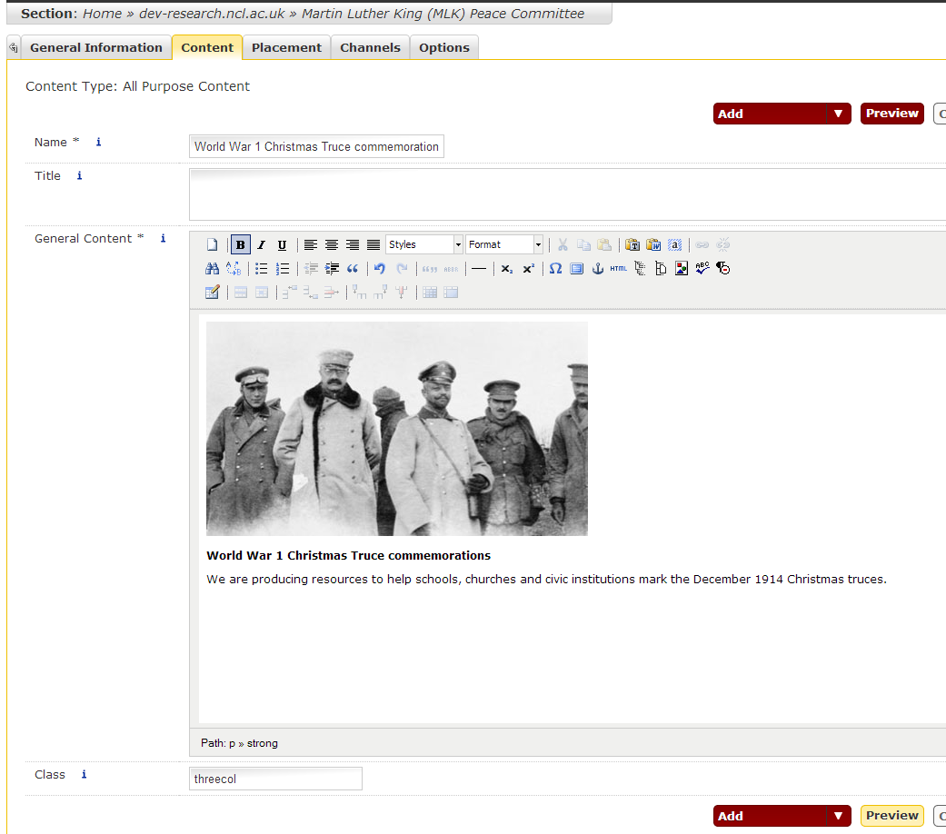
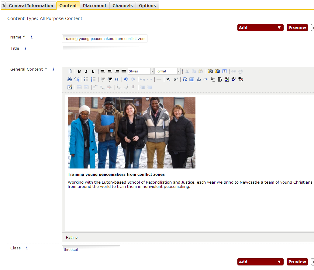
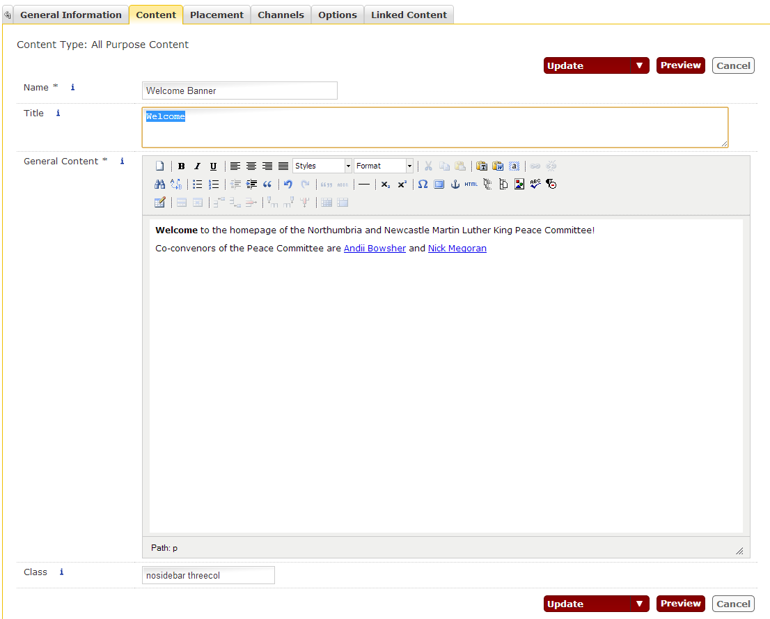
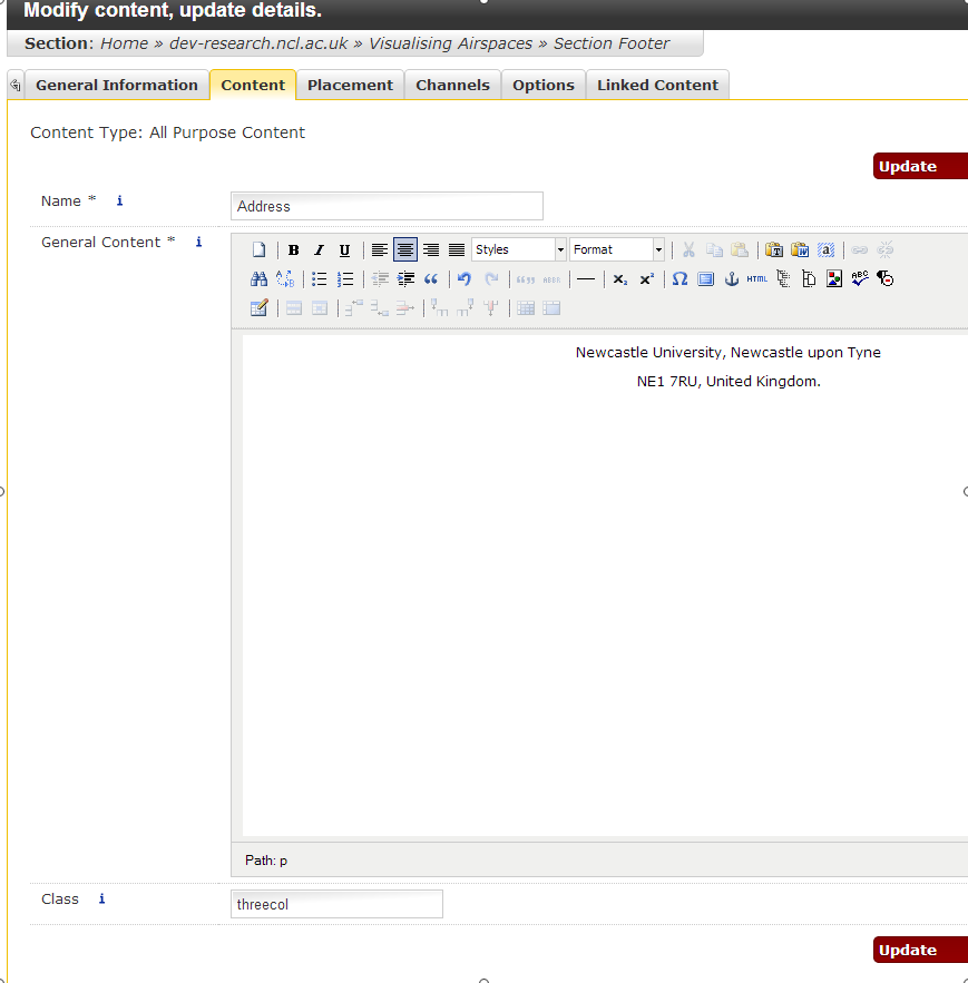
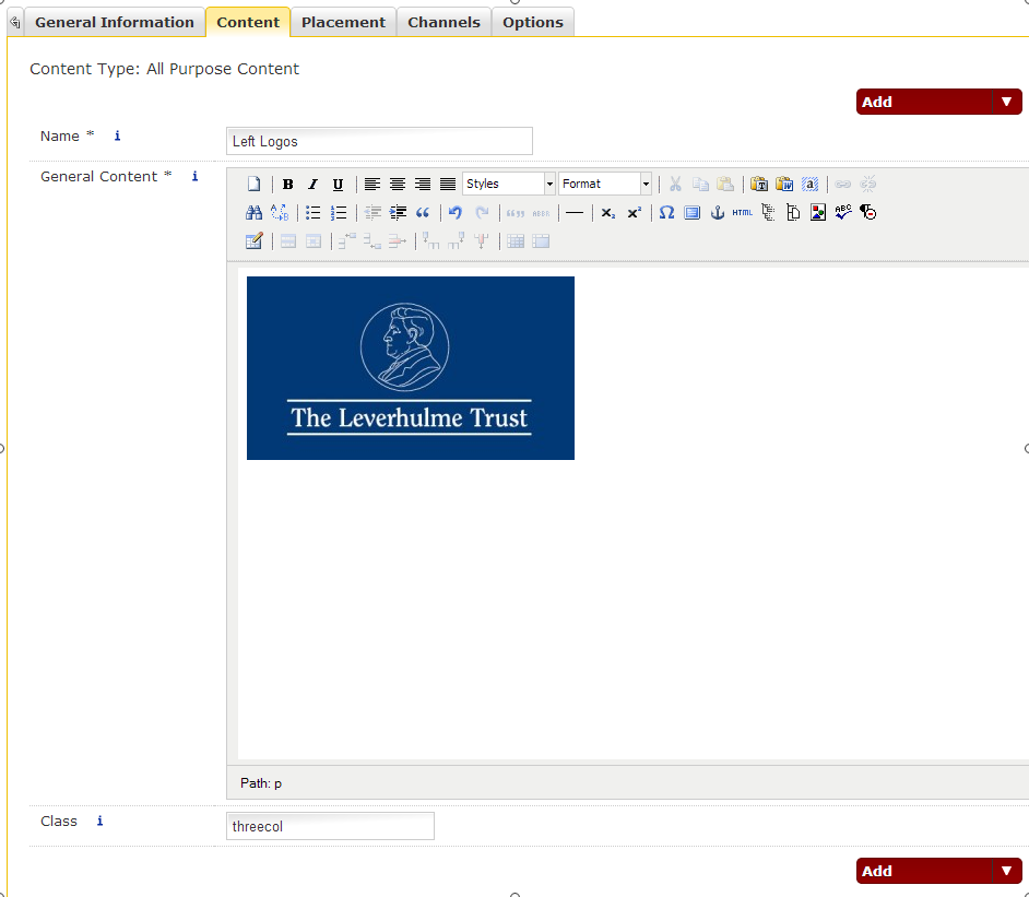
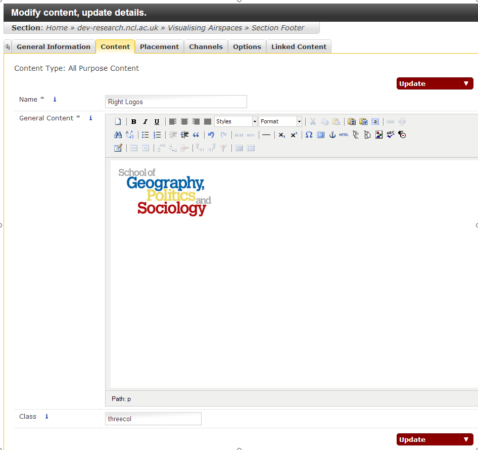
Each box on the page will be a new piece of All Purpose Content. Create three new pieces of content with an image at the top and some text. If you’ve already created them, you should make both the images and the text into links to the appropriate sections of your website. Give each of these new pieces of content the class “threecol” as shown in the screenshots below:


You can reorder them by returning to the site structure and clicking Modify Content to the right of the homepage – the move buttons are up and down arrows to the right of the screen. This can be a bit fiddly, so remember to click Save Changes before leaving this screen.

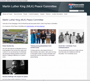
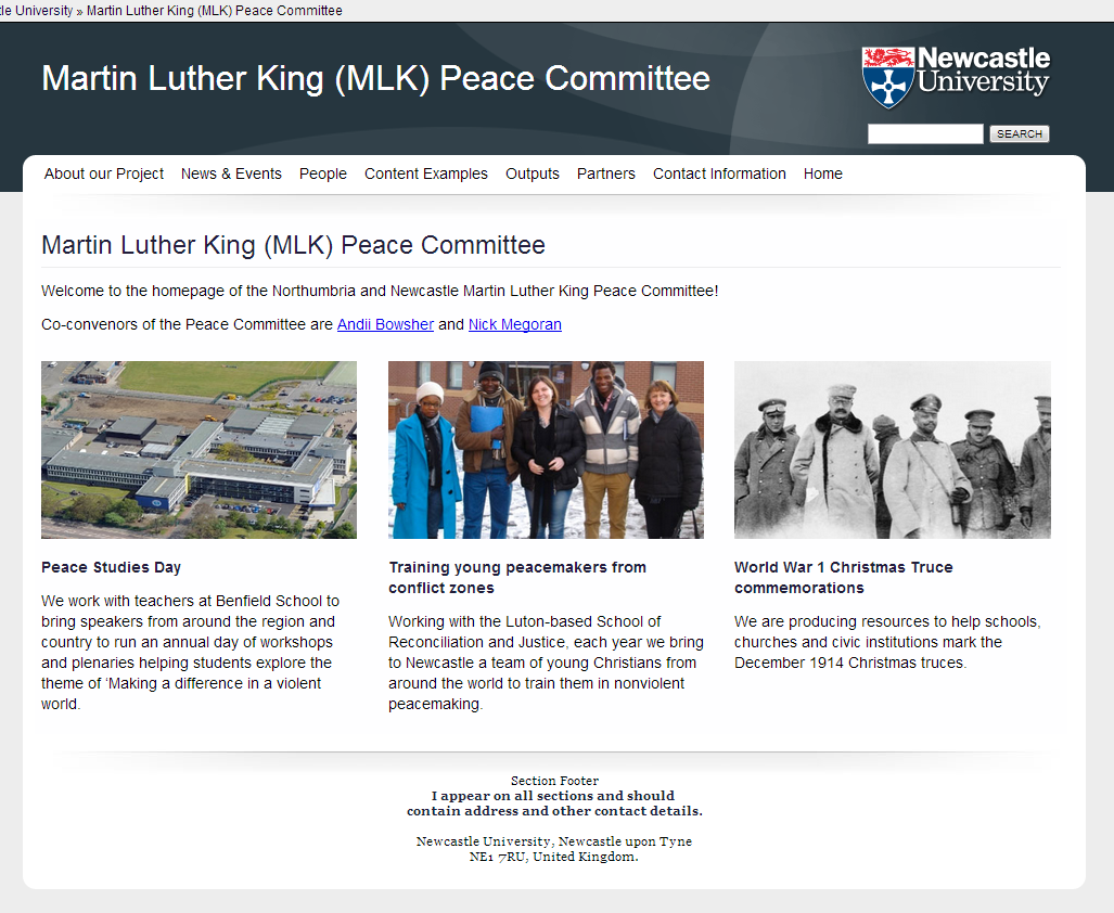
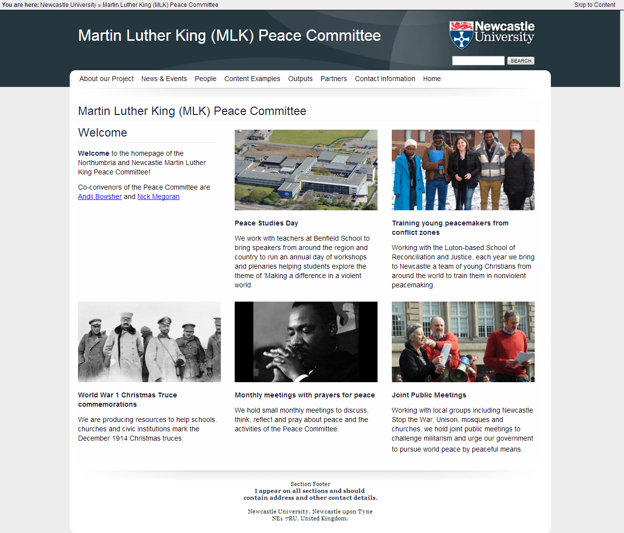
Publish or Preview your site and LO!, you will have three boxes laid out in three columns as in the screenshot below:

Step 4) But I want FOUR boxes!

If you add a fourth box with the class threecol…

…You’ll find that when you publish it, it starts a second row:

Using the threecol class is good if you have a number of boxes divisible by three, so if you have four boxes, you probably want to change all of the class fields for these pieces of content to either ‘twocol’ or ‘fourcol’ – which you choose will depend on the sizes of your images, quantity of text.

twocol:

To make this layout work with two columns, I should have probably formatted the images to be wider and narrower as the second tier now requires scrolling on many monitors, and a second tier may look like second class content, which you might not want.

fourcol:

The fourcol version means that the text ends up looking quite tall, so in this case i’d probably rethink how much text I need in each box – maybe consider just using the titles.

Step 5) But I want FIVE boxes!

We don’t always have the luxury of planning ahead. There is no facility for creating five column layouts at the moment, but you can combine a row of three and a row of two by giving the fist three items a ‘threecol’ class and the final two ‘twocol’. If you resize your images with this in mind it will look ok, but in this particular example it looks like this:

A bit weird. A better solution might be to turn your welcome text into a sixth box and return to a threecol grid by adding the threecol class to the very first piece of content.

It then looks like this:

It will probably look better if the new box also has a similarly formatted image to the others on the page, but hopefully this post has given a good overview of how to create two, three and four column grids on pages.

See also:


Expandable and Tabbed Content

There are two main ways of shortening a very long page:

Firstly, you can make the content Expandable, as seen on our Entrance Requirements pages. This is useful when you have long lists of items on a page, but the page visitor is only likely to be interested in the one item that applies to their circumstances.

expandable-content-fw

Secondly, you can make the content Tabbed, which is also used in the course pages. Tabbed content is useful when you have lots of pages with similar categories (all courses have Modules, Careers, Finance information, for example).

tabbed-content-fw

Both methods are implemented in exactly the same way.

Each Tab or Expandable needs to be its own piece of content within the same section. You’ll have to go to Add Content -> All Purpose Content for each one. Here’s how the content looks for the Tabbed page in the Sample Content site:

In this example, the first piece of content has no special requirements, but the bottom three are tabbed. They become tabbed simply by giving them the class ‘tabbed‘ all in lower case – here’s a screenshot of the second tab from the Modify Content screen:

The class field is at the bottom – remember to use only lower case. Also note that this piece of content has some embedded video from Vimeo – this is documented in another post.

The Content List for the expandable section looks more or less identical:

The only significant difference is that the class field contains the word ‘expandable’ in lowercase:

Remember to Save and Approve, and you’re done. The two types are fairly interchangeable. If you want to switch between one or the other, just change the class field, or to make it back into regular content, remove it entirely.


Ticker Tapes

This post relates to the old Research and Conferences template and so has been Archived.

This article describes how to turn a regular bulleted list into a ticker tape. Another post (coming soon) will discuss how to sync this with your site news page, or with an RSS feed from another site or blog, but there are plenty of cases where you wouldn’t want the content to be fully synchronised.

  • Ticker tapes and other animated elements should be used with restraint, as they effect the readability of content on your site. This technique will only work with one ticker per page – you should not have more 😉

As with sliding banners, column and grid layouts, this makes use of the Class field in All Purpose Content.

Create a bulleted list in some All Purpose Content and make sure that each item is web a link to another webpage using the chainlink icon, this would ideally be your news page or the individual news items.

Give the piece of All Purpose Content the Class ‘tickertape’ in the field at the bottom of the content edit area – see below.

TickerTape

Any bulleted list items within this piece of content will become a ticker tape which types out the item character by character. Obviously the below screenshot isn’t animated:

Ticker Tape Example

Alternatively, using the same technique, you can use a different class ‘scrollingticker‘ which scrolls a new item vertically into view.

Scrolling ticker is slightly more flexible in that it does not restrict you to only having hyperlinked content in your bulleted list and can even work with images if laid out carefully.

Scrolling Ticker

See Also:

Footer Logos and Layout

If you have multiple funding sources, or input from other schools and institutions, you’ll probably want to display their logo’s somewhere.

Having a ‘partners’ section is good for this, but another common option is the sites footer (the sidebar of every page can be too intrusive).

Laying images out in a single piece of All Purpose Content can be fiddly: this is not so much a flaw in T4, but more to do with the web itself and usually requires some knowledge of HTML and/or CSS to achieve good looking results.

Withing our installation of T4, we offer a ‘Class’ field within ‘All Purpose Content’ which we use to give specific instructions about the display of a piece of content. Adding the ThreeCol class.

One such class is ‘threecol’: if you give a piece of content this class, it will take up 1/3 of the width of the template.

Give your Address piece of content this class, and then add two more.Left Logos 

Order the three pieces of content so that the pieces of content with the class ‘threecol’ are in left to right order and click Save Changes.

When the site publishes, each piece of content will take up 1/3 of the width of the template and look like this:

Three Col Footer

  • Note that you may have to work with the media library (or in photoshop) beforehand to ensure that all images are an appropriate size.
  • Logos will have different aspect ratios so figuring out how to give them equal parity while looking tidy is always going to be awkward.
  • If you have more logos, the process is identical for using classes called ‘fourcols’, ‘fivecols’ and ‘sixcols’.
  • Remember that you can make the logos into links to the appropriate websites using the chainlink icon.

Banner Slideshows

Note that these slideshows don’t have to go in the Home Banner – you could easily make one in the sidebar or even in the content area, but the image dimensions mentioned on this page are for that purpose.

It’s a good idea to prepare your images in advance. The best tool for the job is Photoshop, which you can find on RAS. Images in the banner should be 950px wide. The height of the image is up to you, so long as they’re all the same size, but 250px works well.

Upload your images into your folder of the Media Library, which can be found in the Content tab top right of T4.

Media Library Menu

Each site should have its own Media Library folder in the corresponding section – only when you’re your section will you see the Add Media button.

Slides in the Media Library

Uploading a File in the Media Library

Once you’ve uploaded your images to the media library, go back to the Site Structure.

If you don’t already have one, create a hidden section called Home Banner as described here.

Home Banner

Each slide will be its own piece of content in the section, click on Add Content in the column of dropdowns to the right of the Home Banner section and then select All Purpose Content.

All Purpose Content

Add one slide image from the media library to each piece of content. The Media Library is accessed by the button to the right of the too bar with the coloured shapes in.

Media Library

The Media Library will popup in the last section you visited, so this should be the same one you uploaded your slides to. Select the Slide image by mousing over it and clicking on Select.

Selecting a slide from the Media Library

Remember that you can use the chain link icon to make the slides links to different sections in your site.

Slide Class

Enter the word ‘slide‘ into the Class field in the All Purpose Content, and then click Add and Approve.

Repeat this process, creating a new piece of content for each slide.

Banner Content

Banner Content

You can re-order the slides (or any content) by using the Move buttons to the right.

To preview this you need to preview the site as a whole (previewing from within an individual piece of content won’t work because they’re fragments of the page) so use the Preview Site link to the right of your homepage.

The next time the site homepage publishes, your slideshow will publish with it (for the same reason as previewing them as fragments, they won’t publish individually). Use ‘Publish branch’ from the top level section to force the whole site to publish – this may take five or ten minutes for a big site or one with lots of images.

Publish Branch

950_pixels_wide-fw

See Also:

Section Sidebars, Banners and Footers

The simplest way to get content into the sidebar is to create a piece of All Purpose Content in a section and give it the class ‘insidebar‘. This content will then appear in the sidebar (if there is one in the template you’re using). This is demonstrated on the Sample Components site homepage. Images used in the sidebar should be cropped to 200px wide. If you want to remove the sidebar from a section, you give a piece of content in that section the class ‘nosidebar‘.

If you want to alter the sidebar or footer across multiple sections, you will need to use hidden sections – the rest of this post describes how to do that:

Once you’ve got started with the Structure of your site and some basic Content, you’ll have noticed a number of Sections with grey folder icons in the Site Structure.

Initial Site Structure from Template

The grey icon simply means that these are Hidden Sections, however the template we use is set up to recognise certain naming conventions and place these in the relevant area of the site.  We’ll ignore Section Styles for now as it’s a special case. The names you can use are as follows:

  • Section Sidebar 
  • Home Sidebar 
  • Section Footer
  • Home Footer 
  • Section Banner
  • Home Banner

Section Footer and Home Footer

If you click ‘Modify Content’ for Section Footer, you’ll see a piece of content called Address. Modify this and you’ll see the fragment of content that appears on the footer of all pages of your website.

Section Footer

If you add the contact details for your site and click Add and Approve your changes will be reflected in the footer of all pages when the site next publishes.

So: content placed in these hidden sections appears in the part of the site its name suggests: the Sidebar content under the left hand menu, and the Footer content at the bottom of all the content. Banner content appears below the top navigation, but above the sidebar and main content area.

The prefixes Home and Section differ as follows: Home Sidebar/Footer will only appear in the sidebar or footer of that single section. Section Sidebar/Footer will appear in that section and all subsections.

Section Sidebar and Home Sidebar

So, if we wish to create a sidebar to override the rest of the site within only the Partners section (logo’s of funding bodies perhaps?) we click ‘Add Section’ to this…

Add Secton

… and give the new section the name ‘Section Sidebar’. Make sure you uncheck the ‘Show in Navigation’ checkbox half way down the right hand side.

Uncheck Show in Navigation

We then see that the Partners section has a subsection called Section Sidebar.

Add Sidebar Section

You can then Add Content to just the sidebar of the Partners section (and any subsections it might have in future). This overrides any Section Sidebar sections appearing higher up in the structure.

In the below screenshot, content of type File Resource was placed in the Section Sidebar of the Partners Section.

File Resource in Sidebar

Section Banner and Home Banner

Add a section called Home Banner to the top level of the site, remembering to uncheck the Show in Navigation checkbox.

Then go back to the site structure and Add Content to it. Any content you add will appear above the sidebar and content, but below the main navigation. In the screenshot below a large image has been added to the Home Banner section:

Home Banner

The Banner area is 950px wide.

950 Pixels Wide

Next: