With the huge explosion in data volumes that the smart energy era brings, here at the National Centre for Energy Systems Integration our Computing Science researchers are utilising world-leading innovative techniques in data analytics. In this weeks blog, Dr Mike Simpson explains how the interactive visualizations and analysis capabilities of Microsoft’s Power-BI software can make light work of smart meter data.
 Dr Mike Simpson is a Research Associate working part-time with CESI. His background is in programming, game development and visualisation, and he is currently working as a Research Software Developer in the Digital Institute at Newcastle University.
Contact details: mike.simpson@ncl.ac.uk – Profile Details
Exploring Smart Meter Data using Microsoft Power BI
As data scientists, we are often asked to help our colleagues to process the data that they have collected. Often, they will have a set of research questions that they want to attempt to answer, and, in that case, there are plenty of tools that we can use to analyse the data and visualise the results. But what if you don’t know exactly what questions you want to ask? What if you have a dataset that you suspect might hold some additional value, but you’re not sure how to extract that value? These are not uncommon problems, and I’ve been looking at one potential solution.
Microsoft Power BI is a suite of analytics tools that can be used to produce a number of different visualisations by aggregating and filtering data in different ways. It includes a desktop application that can connect to a wide variety of data sources and an online platform that allows the results to be shared with collaborators or embedded on other websites. However, as well as simply displaying the data using static graphs and charts, it can also create dynamic, interactive reports, like the one shown in the screenshot below.
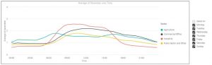
Here, we have taken some sector customer average electricity smart meter data from the Customer-led Network Revolution (CLNR) and produced a visualisation of the data from the participating Small Business Enterprise customers. The first graph shows the average daily energy usage profile for each Sector (the average across the whole week). But what if you want to ‘drill down’ deeper and explore the data in more detail? Well, in this example you can use the ‘Slicer’ – the checklist to the side of the graph – to select individual days within the study, which will adjust the graph to display the filtered data for that day only. Alternatively, you could use the slicer to select other time ranges within the data. In the example below, one graph shows only the data for Monday to Friday and the other graph shows only the data for Saturday and Sunday.
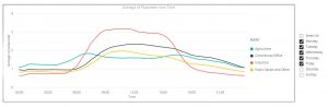
Now it is possible to see the distinct difference in usage patterns between the different sectors during weekdays and at weekends. You can see that, for example, Industrial usage is lower at weekends, as you would expect, while agricultural usage is fairly similar.
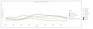
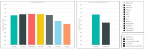
We’ve done something similar with the graphs below, which are part of the same report and show the average daily usage for each day of the week, as well as the average for weekdays/weekends.
As before, we can drill down into the data by using the Slicer to select different months and sectors, which filters the visualisation accordingly. This allows us to study how usage changes for each sector over the course of the year.
These are fairly simple examples, but they show how Power BI can be used to create visualisations that not only display your data, but are also interactive and also allow you to explore the data by filtering it in different ways. A Power BI report can include a number of different visualisations, including Scatter Graphs, Pie Charts, and even Maps, in addition to the Line and Bar Graphs shown in the examples above.
Using Power BI in this way allows you to explore the data that you have collected to look for unexpected patterns, and may help to reveal new Research Questions that you can answer, or may help you discover new ways to extract value from the dataset.