It’s been a great time

It has been our great honour to have the opportunity to work on this project and we think it’s time to look back on the many things we’ve achieved, together.

When we were first assigned the project, we had no idea how to start. We didn’t know what the young people were after. Our team had to come together to explore and think about all possible options to set out a basic framework.

Comparing with other teams, we’ve come a long way before we finally made the decision of what we were gonna do – an educational app. It was late and so we were pushing the time limit a bit, too. With the invaluable input we received from our project partners, we’ve learnt, we’ve grown, we’ve refined, together.
New look
The bright new look!

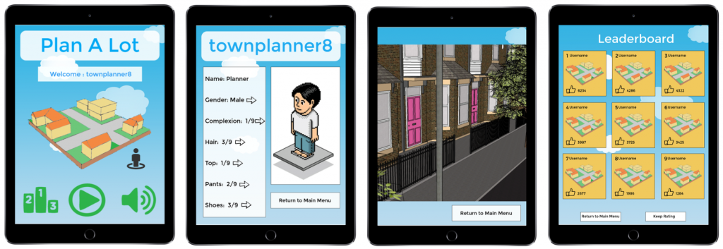
This is the final interface update we expect for now and it is based on the feedback we’ve got from our project partner. We’ve given it a bit more of character, we’ve got the street view and we’ve revamped the way it looks. We’re loving it and we hope you love it as much as we do.

Another reason for us to celebrate the finish of this final Plan A Lot prototype is that it responses to our original intention naturally and successfully. It looks good and it is helping young people to learn about planning. We haven’t gone for the ‘hard-sell’ tactics to get the idea of urban planning across, but it is working even better than using the ‘hard-sell’ tactics. So yes, it really is something to celebrate.

To us, we’ve given our best shot to this project. As much as we want to continue bringing this project further, we’re afraid it has to come to a close at this stage. We’re committed and we still firmly believe that this project will really make a difference to the young people and we hope further developments would be considered by the relevant parties, but we regret to say that this might not be something that’s within our ability today. Please allow us to say a massive ‘thank you’ to you for being part of our journey on Plan A Lot in the past three months.


Presentation visual
P.S. Just before we go, we’d like to let you know that we’ve actually done a presentation plus a write up that chronicles the processes we’ve gone through to produce Plan A Lot. If you’re one of our project partners, you should have received these items electronically already through Teresa, our very charming coordinator whom you really should have known by now. If you’ve never worked with us before but would still like an electronic copy as well as for all other enquiries, please email us at T[dot]Ho1[at]newcastle[dot]ac[dot]uk.
On track

Just before the stand-down period commenced, we’ve been rounding up and reviewed what we’ve done this term – the things we’ve learnt together, we’ve achieved together and also to look at the details we needed to work on and make them even better – these are covered on the previous blog entry.

Apart from that it was very much an admin week in general: we’ve assigned roles for each of our teammates and we’re working closely together to produce the high quality work for final submission in early January 2017.

Have a great Christmas and all the best for New Year and we’ll see you all in 2017.

If you do have any issues over this leave period, please feel free to email me or leave us a message here.

Week 10- User test feedback

This week we were really excited to showcase our prototype to our user clients. The first user test took place on the 8th December at the planning studios in Claremont. We received a lot of critical feedback that we hope to implement into our prototype.  This was with the Youth Council who we can proudly quote “would play with the app” after a few refinements. It’s really eye opening to have these informal conversations about the app as the youth council have reasonable and well thought ideas to further our app.

 plan-a-lot-2

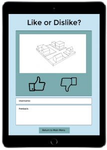
These include the rating systems for our leader board. We have a feedback box where users can state what they like or dislike about the design. However the youth council suggested we make it so other users can read each other comments to generate an interactive conversation between users. Another idea that came up was once the user had completed the design of the development they would then be able to place it into a geolocation. Such as placing the design in google earth or maps to show how their design would look in context. This would make their designs feel more personal and gives them a visual to see how their design would fit in and interact with the surroundings.

The second user test took place at the North Tyneside Council. This gave us an insight to how the planners and developers would use the app to open up conversations between them and the youth. We learnt that planners go into schools to give talks about planning to raise an awareness of planning issues. We questioned whether our app could be used for the youth to help provide an input in actual planning applications but were sadly informed that it wasn’t feasible. However by introducing our app Plan-A-Lot to the school children it allows both parties to have more open conversations and provides a more interactive experience.  We hope it provides the missing connection between the youth, planners and developers.

From the user tests we gained quite a lot of advice and suggestions which we plan to take on board. Some will be ideas for future development of the app and other ideas will be idea’s we can incorporate now.

Week 9 – User test (Re-do)

This week we continued working on our prototype on Marvel. The prototype would give us a chance to see how the users interacted with the app and help us see what we might have missed. They would test this out on the 8th and 9th of December. In the lecture, we watched ‘The five act interview’ by Sprint, which showed us how to set up the user testing. The five steps are:

  1. Friendly welcome
  2. Context questions
  3. Introduce the prototype
  4. Tasks
  5. Quick debrief

The context questions would be similar to what we previously asked at our client meetings which informed us on the direction we needed to go in for our prototype. We decided on creating an app called Plan A Lot where the users would be able to develop communities with different criteria for each level. As the levels increase so would the difficulty by providing more components to drag and other realistic limitations. We hope this app would allow us to open conversations between planners and the youth.

One issue we had with producing the prototype was that we would not be able to drag components onto the 3D plot to create the community. This was a major part of the app and had to look at other means of providing this feature. We were thinking of using either Microsoft PowerPoint or Keynotes to have a demo of the game. However we thought the users would be confused if were to switch from marvel to another software. We decided to print out a plot and get the users to use paper cut outs to drag on to the site, to replicate how it would work in the app. We would use Marvel to show our vision of the app.

We have two user tests. The first will be with the youth council and will be in the planning studios. The youth council will be familiar with this area as this is where we previously held our user interviews. If it was up to us we would have chosen to do it at a school so they would feel comfortable. The second interview would be with Sean Gallagher who works for Capita at North Tyneside Council. For this interview we will be heading to the planning office at North Tyneside which is what we would have chosen as an ideal setting. We decided that two people would talk while the other three would observe.  On the second interview one of our members would not be present. Therefore we would have another member speaking on Friday.

We want to keep the user tests informal and just let the conversation flow naturally. We don’t have many questions to ask at the moment. However we hope that user tests will point out things we would have overlooked. There are still small details that we’re not sure of and we hope to get critical feedback to refine our prototype and concept.

Week 9 – User testing

This week we continued working on our prototype on marvel. The prototype would give us a chance to see how the users interacted with the app. They would test this out on the 8th and 9th of December. In the lecture we watched ‘The five act interview’ by Sprint which showed us how to set up the user testing. The five steps are:

  1. Friendly welcome
  2. Context questions
  3. Introduce the prototype
  4. Tasks
  5. Quick debrief

From this we learnt that we cannot just simply ask them to test out the prototype immediately. Instead, we should ask questions in context such as; have they used any apps related to planning? How they felt about them? Although we already asked these questions at the User Interview at the beginning of the module.

Reinforced throughout the interview was to reassure the user. The user should not feel, as though they are at an interview as, this would lead them to believe there is a right answer. We want the user to think aloud to give us a better understanding of how usable the app is.

We realised that without a dragging feature on marvel the prototype would not help us assess how viable the app would be, how the client would interact with the app without us present. We decided the users would test it out on keynotes with the marvel prototype as a supporting model to show what we envision the app to look like.

During the seminar, we assigned roles during the user interviews. We would have three observers and two speakers. We will be showing the prototype to five people, which means 80% of any faults of our app, would be flagged up. Any other details would be minor details that would not affect the function of the app. Hopefully we would be able to get valuable information from the user testing.


Week 8 – Introducing Prototyping

To follow on from the storyboard, we planned out how we wanted our product to be accessed and seen by the potential users. The next step for us was to plan out our iPad app and work out the display interface, how we wanted to present our idea and capture the audiences attention. We all attended the lecture where prototyping was introduced to the class and as a group we looked at the concept of prototyping, how it would be beneficial and further our work. It was discussed how we could use prototyping and we were shown examples, including ‘Marvel’, a software that would allow us to capture the interface step by step and showcase how we want our application to work.

In the following seminar we set up the Marvel design and started to add the frames to our project. We were slightly stuck with inspiration for how it would look, so we agreed to each go away over the weekend and mock up some of our own designs of how we would want the screen to look and what would be included. Individually, we had to think about what would appeal to the users as our project is aimed at young people, so it had to be kept quite simple and make the application interactive and fun to use. When we came together next, our designs were all the same, in terms of the features we wanted to include and where we wanted the symbols and icons to be placed.

It was a successful week in terms of keeping our work on track and moving forward with our project. The team is working really well together and each of us are having our ideas implemented into the product. The next step for us is to complete the prototype on Marvel and have it finished in time for our user meetings where we will be undertaking user testing.

Plan A Lot. Planning a lot at a time.

Cogito ergo sum.

Just as we started to go deeper and refine our offerings, we stepped back. We thought.

Why did we do it? Who would it help? What made it deserved to exist?

We simplified. We started over. We’ve made it better.

And this is it.
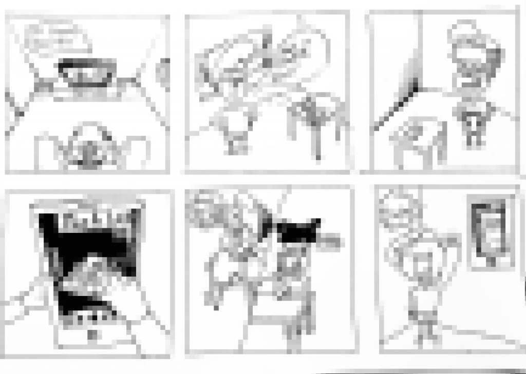
Storyboard

Young People Engagement – Week 5

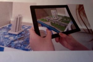
After a successful site visit, we came together as a group and discussed the different possibilities of creating a digital device. We were inspired by a number of non-digital and digital ideas. We came across ideas such as having a VR hologram projecting the user’s propositions of the development. We debated other potential ideas, like the use of chalk to make graffiti visualisations on a surface that could show the user’s proposals but chose to keep a more digital approach to our final project because we considered the non-digital ideas to be less suitable for our users.

At first, we thought of making a QR code. The idea was that the code would be scanned by the users which would lead them to a government related website with information about the current development site. We knew this idea would appear quite late during the planning process and thought it might have an affect on the user’s propositions. We were also worried that the website would provide too much information at once for the users which would not be easy to understand nor enjoyable to read.

The second concept we were trying to develop was an app. We thought the proposition of an app would allow the users to take part in the planning process at an earlier stage, therefore giving time to the Council and developers to consider the user’s propositions. The app would work like a visual interface. The app will allow for new topics and activities to be created. How does it work? Well, once the app is opened, a plot of land would show up on the screen. Through its tools, the app would support a large variety of subjects, like inserting different types of infrastructures or ponds onto the plot of land. A dragging feature would allow the plot of land to be filled with houses, schools, parks, roads, shops. These would be designed through Sketch Up (One of our design software’s) and then integrated into our app with the help of our technician. We want these animated features to reflect what the users want to see in the new development like leisure centres, open spaces and well linked roads. We also suggested that the app would have a share button indicating that the user designs can be commented on by other users, or shared with developers and the community and downloaded for future use. This is where we have got to so far, next week we’ll be looking into more detail about our concept while discussing it with our project mentor.

photo-on-10-11-2016-at-18-18


Young People Engagement – Week 4

Following the interview with the user representatives and planners from North Tyneside Council, our project partner, we have been invited to go on a site visit in Murton, where the site concerned was.

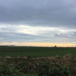
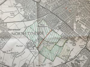
When we reached the site, we were given some maps printed in different scales. These maps certainly helped us to have a broader view of Murton. Situated about 15 minutes away from the Quadrant, which was the North Tyneside Council’s offices, it was a small village consisted mainly of houses, with a few services to complement. Residents and visitors could only access the site through a winding yet narrow road. At the heart of the site were some moors and farmlands, which was fascinatingly refreshing, given that the site was in the central part of North Tyneside. Although, as we were told, some of the land there were privately owned, it  was well used by the public. It was morning when we went there, some joggers were seen, with a few others walking their dogs.

log4log3Please allow us to show off our photography skills for a minute… #nofilter
Obviously it would be a shame to have to build on such a lovely site with extensive public, green spaces, the planners reassured us that green spaces would take up 50% of the whole development area. However, the challenging bit was that the current residents chose to live there because of its proximity to the city centre as well as the amount of green space it currently offered, which were something that would be impossible to compensate if the project got the go-ahead. In fact, the residents were already voicing out their objection to the development by putting up “save our green belt” and “no build” signage at the site.

Despite the adverse comments made by the residents, the user representatives, who also went on this trip and were locals of North Tyneside, showed their understanding as to why the development was needed. They recognised the increasing number of people moving to North Tyneside, which caused some housing problem to the area and they agreed that  personal interests should have a lesser priority than the general public’s. Moreover, they had noticed the lack of leisure facilities in the area. Indeed, the major public facilities in the area were only hospitals and schools.

img_0500Area hatched with green Sharpies was the moor and farmland, whereas the orange dotted line in the middle was the proposed north-south link road, an extension of the current access road.

During the course, the user representatives showed their efforts to balance the benefits of different stakeholders and strong critical thinking. They were also keen on seeing new developments in the area and embracing changes. Some of the suggestions they made regarding the development were undoubtedly valuable and very much viable to the Council and developers. Back into our office in Newcastle, we are going to come up with some ideas to help these suggestions to get across very soon…