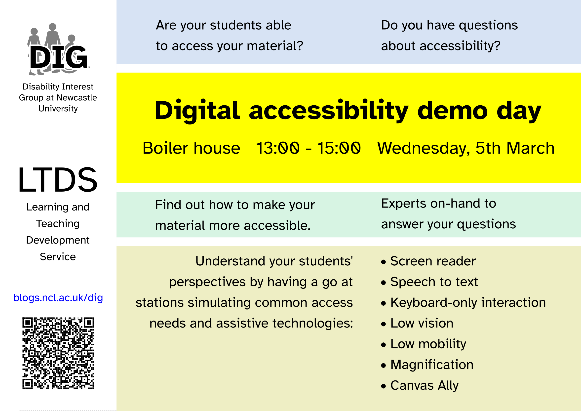
What difficulties do students have accessing the material we provide?
How do students surmount those difficulties?
How do you improve the accessibility of your material?
We’re putting on an event to help answer those questions.
It’s important that all of our digital services are accessible to their users, whether they’re students or colleagues. The Public Sector Bodies Accessibility Regulations set out some legal requirements that we must meet.
But digital accessibility is a complex topic and many colleagues have found it hard to understand what they need to do to ensure their teaching material is accessible.
At our digital accessibility demo day, you can have a go at accessing university teaching material at a selection of stations simulating different access requirements and supports, including:
Screen reader
Speech to text
Keyboard-only interaction
Low vision
Low mobility
Magnification
Canvas Ally
We’ll have plenty of pointers to guidance and training opportunities to help you improve the accessibility of your material.
People from LTDS, NUIT and the Disability Interest Group will be there to offer support and answer any questions you may have about digital accessibility.
Time and location
The event will take place 13:00 – 15:00 on Wednesday 5th March 2025, in the Boiler House.
The Boiler House is in the middle of campus, between the Armstrong Building and the Student Union. Access is step-free.
There’s no presentation as part of the session – just drop in and talk to one of the facilitators.
In Spring 2025, there will be some updates to Canvas SpeedGrader. This update makes SpeedGrader faster and more stable, while keeping the interface easy to use. The grading process you know will stay the same, but with some improvements behind the scenes.
Previously, courses with large cohorts or assignments with large file submissions experienced frustratingly slow loading times. This update aims to enhance SpeedGrader’s performance, making navigation quicker and more efficient.
In addition to performance updates, there will be minor interface changes to assist with navigation. Although small, these changes will help with the usability of SpeedGrader. After these changes, the interface will still have the familiar SpeedGrader feel.
Let’s dive into the changes made to Canvas SpeedGrader…
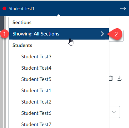
Sections Selector Dropdown
The section selector now has a streamlined interface, making it easier to navigate between different class sections. Previously, filtering by section required more steps. With the new Sections Selector Dropdown, you can quickly filter submissions by section.
In the Student Dropdown List, you’ll now see a Sections header. Under ‘Showing,’ you’ll find the current section that the list is filtered to (point 1).
To apply a new section filter, click on the Section filter (point 2). A dropdown list will then appear, as shown below:
In the dropdown list, you’ll see all the sections associated with the assignment. A tick mark will indicate the section currently applied as the filter (point 3).
To choose a new section filter, click on the name of the desired section (point 4).
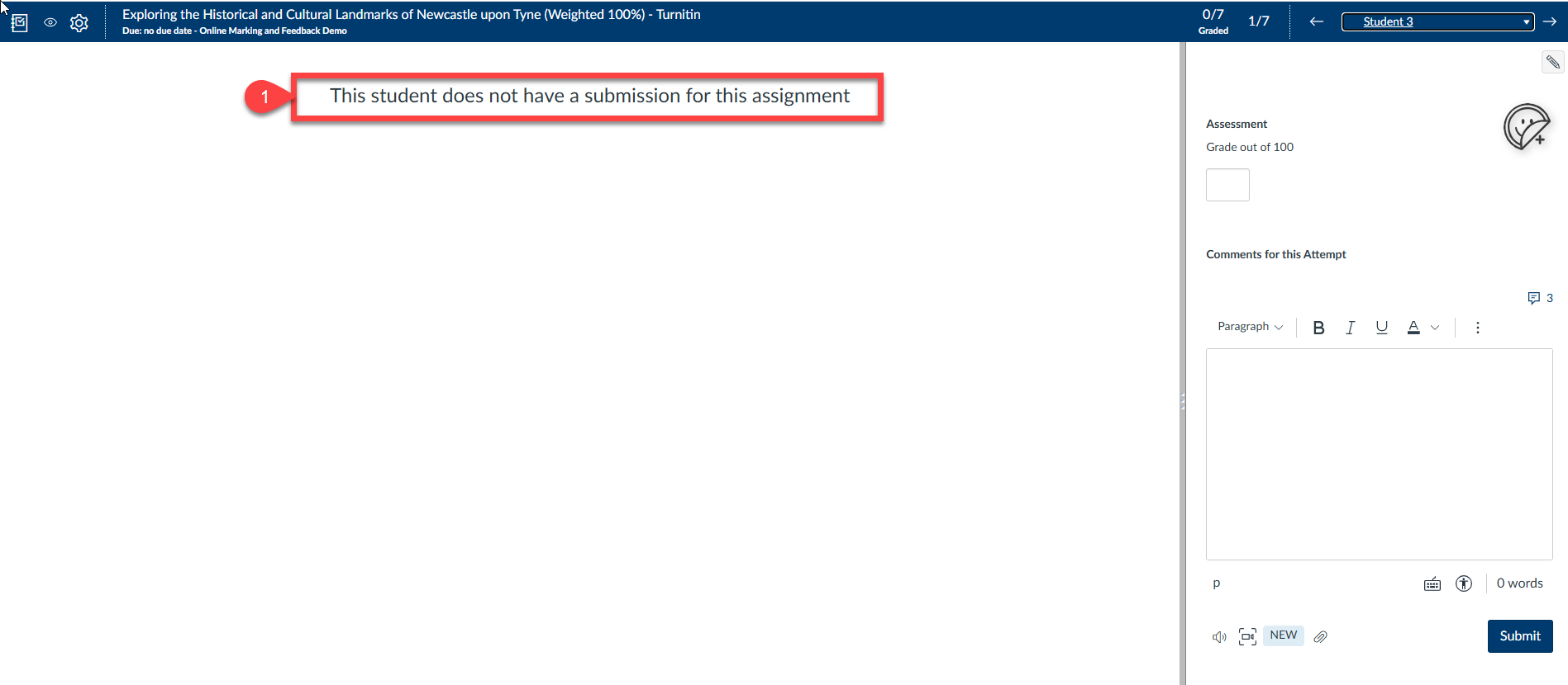
No Submission Alerts
The alert for assignments without submissions has been enhanced to be more prominent and visually clear.
Previously, this would be indicated with the assignment showing as blank in the DocViewer. It is now clearly indicated that there is no submission.
You can see in the below (point 1), this is now clearly displayed in the DocViewer.
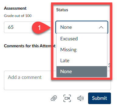
Grade Status Selector
Changing the status of a submission is now easier with a new dropdown box. However, it’s generally not recommended to use this feature, as our assignment statuses are tracked via the NESS system.
Previously, this status was managed by a pencil icon located in the top corner of the marking pane in SpeedGrader.
To change a submission status, click on the dropdown box and selected the appropriate status.
This is demonstrated in point 1 below:
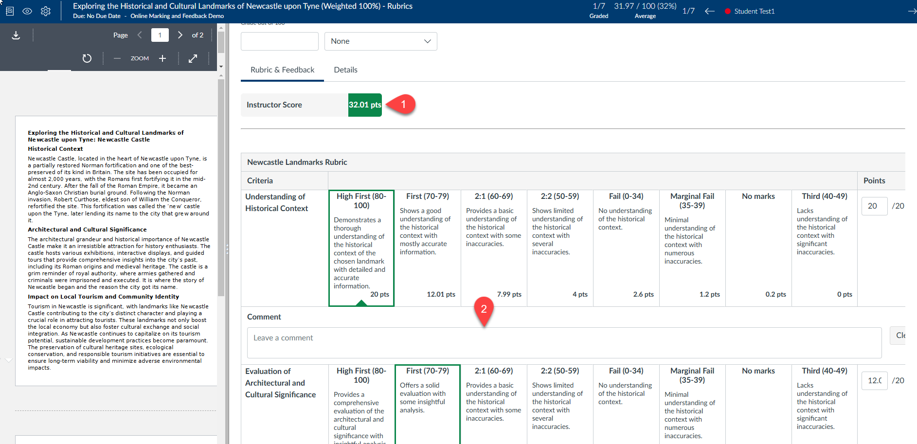
Rubrics
Rubrics are now consistently displayed in the new traditional (grid) view. This view is very similar to the rubrics you’re used to marking with, though there are some minor changes.
The Instructor score is now displayed at the top of the rubric, making it easier to see while marking an assignment (point 1).
Providing feedback for rubric criteria is now easier with the feedback entry box clearly displayed (point 2). Previously, you had to access this feature via a button. Having the feedback option readily available encourages more frequent addition of comments to rubric criteria.
Media Attachments
Uploading and managing media attachments in submission comments is now more intuitive, thanks to an improved dialogue and a more straightforward deletion process.
Deleting an attachment has been made more intuitive with the introduction of a rubbish bin icon, replacing the previous red ‘x’ button (point 1). This change not only modernises the interface but also makes the deletion process clearer and more user-friendly. The rubbish bin icon is universally recognised, ensuring that users can easily identify and use this function without confusion.
On November 6th we came together as a community to celebrate the achievement of 198 colleagues across our university who gained Advance, HE Fellowship recognition (D1-D4) during the 2023/24 academic year. This milestone reflects a significant increase from 161 colleagues in 2022/23 and demonstrates the growing engagement and commitment of our staff to advancing teaching excellence.
At the heart of this achievement is a collective dedication to providing an outstanding educational experience for our students. Reflecting on and refining practice to align with relevant pedagogies underscores the values we uphold as an institution. As Sarah Graham, HaSS Dean of Education, remarked:
“It’s really positive to see this growth in recognition. As a community, it’s important that we keep spreading the word and raising the profile to support more colleagues in achieving recognition.”
The flexibility and inclusivity of the Professional Standards Framework (PSF) enables colleagues across diverse roles – academics, technicians, professional services and central services staff to achieve recognition. Notably, we celebrated the success of education managers, technicians, and colleagues from the Library, Careers, and LTDS. Their contributions enrich the fabric of our learning and teaching culture, further aligning us with the wider sector’s standards.
The event also highlighted the pivotal role of mentorship. Dr. Paul Hubbard, Chair of the Board of Studies, expressed gratitude to PSF mentors, including newly recognised colleagues stepping forward to support others. This spirit of mentorship strengthens our community, as mentors not only guide peers but also exemplify continuous professional development.
Special congratulations went to Ben Steel, this year’s recipient of the Dr. Phil Ansell Award for Mentoring, which honours exceptional support for colleagues pursuing Fellowship recognition.
Being recognised under one of the four categories of Fellowship is not the final destination and can be a springboard for ongoing contributions to our learning and teaching community. Opportunities include;
Participating in the 2024/25 University Learning and Teaching Conference on April 3rd, 2025.
Joining networks like Newcastle Educators or discipline-specific groups.
Sharing innovations by submitting case studies to the Case Studies of Effective Practice database.
If you would like any information about how to apply for a Advance HE Fellowship recognition, or anything discussed in this blog please do get in touch with the Academic Practice Team apt.lts@newcastle.ac.uk.
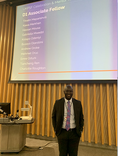
Proud moment for D1 Associate Fellow – Kolapo Odeniyi.
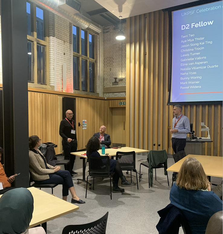
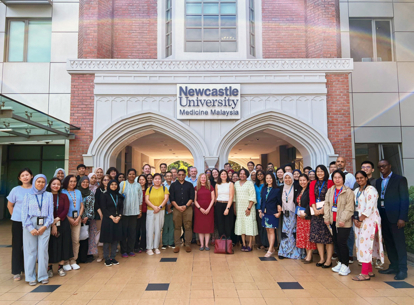
NU Med Education Day and Celebrating Success Event – 15th October 2024
During October 2024, Pro Vice Chancellor of Education, Professor Ruth Valentine, visited NU Med hosting an Education Day and a ‘Celebrating Success’ event for colleagues who have recently completed successful PSF applications. During the education day, Professor Valentine focused on the new University Education Strategy (Education for Life 2030+), and looked at how branch campuses can contribute to achieving its key objectives – Education for Life and other important education priorities moving forward.
The joint Education Day also provided an opportunity to strengthen connections between NUMed and NUIS colleagues, both for academic and PS teams.
Pic A NU Med colleagues attending the Education Day
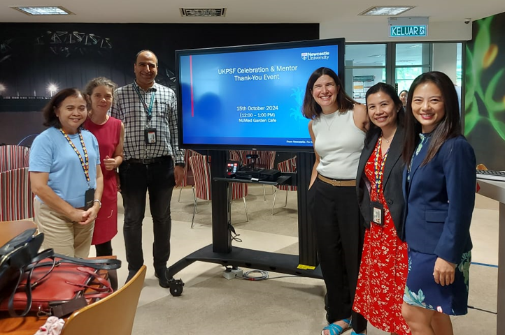
The NU Med Garden Cafe hosted the celebration as the institution honored the achievements of staff members who excelled in their professional growth and development under the UK Professional Standards Framework (UKPSF). The event also recognised the invaluable contributions of mentors and those who completed the Advance HE External Examiner course. The event kicked off with an address by Professor Ruth Valentine, setting the tone for the celebrations. The event emphasised the importance of mentorship and professional development in fostering a thriving academic environment.
Recognition was given across several categories:
D3 Senior Fellows: A testament to their leadership and contribution to teaching and learning excellence.
D2 Fellows and D1 Associate Fellows: Acknowledged for their commitment to upholding and advancing professional teaching standards.
Advance HE External Examiner Course Graduates: Celebrating individuals who enhanced their expertise in quality assurance practices in higher education.
The event concluded with a lunch and networking session, providing a wonderful opportunity for the NUMed community to connect, reflect, and share best practices.
Over the last couple of months, Inspera have been making some updates to their Grade workspace. Graders may have noticed some name changes in the appearance or naming in the Grade area. Ahead of our Semester 1 assessment period, the Digital Exams Team wanted to share some information about the changes you will see.
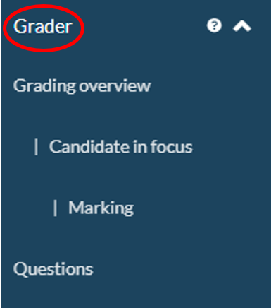
To complete marking within Inspera, graders will use the different workspaces in the Grader workflow:
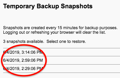
If a student accidentally deletes text in an essay question, there is an option to restore it using Snapshots. This Snapshot functionality is available for students during their live Inspera exams.
Snapshot is accessed via the test editor/option panel available to students on any essay question:
The icon to retrieve Snapshots which are available is a backwards arrow around a clock face: .
Once selected, students can retrieve previous versions of their work. A new snapshot is taken every 15 minutes and is saved in the browser memory. Snapshot use is available after 15 minutes of beginning work on an essay question. Navigating away from the question, and then returning to it would not disrupt the Snapshot. Snapshots are activated per question, so using this option could not revert any other question answers to an earlier instance.
Important note: As browser-based memory is used for this feature, exiting the Inspera exam or refreshing the browser will disable Snapshots. (Note: refresh is only available in non-locked down exams).
How does it work for students?
When students click the Snapshot button, a message like the one below will appear. The student will be advised to select a snapshot and then click continue. This will enable them to retrieve prior instances of their work. Students can click the icon and select a different snapshot if their first selection is not what they were searching for.
Next steps
For academic year 2024-25, Instructions will be available to exam invigilators, these can be shared with students if needed in their exam.
Instructions are also available for students to familiarise themselves with ahead of their exams via the ‘Instructions in Inspera’ tab on the Student Inspera ASK website
Over the summer there have been a series of updates to the SpeedGrader tool within Canvas to improve the ability to provide feedback.
In this blog post, we will highlight some of the key changes to the SpeedGrader and how you can utilise these changes in your courses.
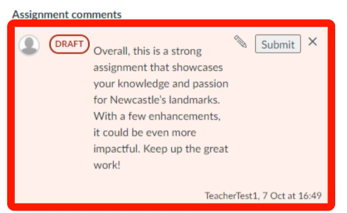
Submission Comment Drafts
In SpeedGrader, after adding a submission comment, if this has not been saved, a Draft pill displays indicating that this comment has not been saved and a warning message is presented alerting the teacher that the comment has not been saved.
Previously there was no clear indication that a comment had been submitted and this would lead to students not seeing comments/feedback in their assignments.
With this update, it is clear for a teacher to see the status of a submission comment.
You can see in the example below that the submission comment has not been submitted and we have a draft pill alongside our comment:
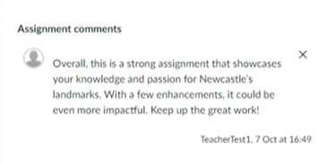
When we press submit on this comment, the draft pill disappears which means the comment is visible to the student:
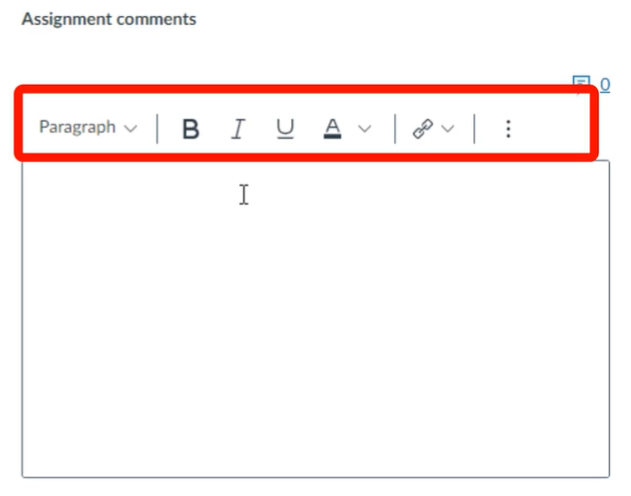
Rich Content Editor (RCE) In Submission Comments
In SpeedGrader, some Rich Content Editor (RCE) features are available when using submission comments. The available RCE features include:
Heading
Bold
Italic
Underline
Font colour
Insert Hyperlink
Bullets
This allows teachers to style feedback and provide further resources via linking. In the example below, you can see a link is provided to further resources to assist the student:
This functionality is available at the top of the submission comments box as demonstrated below:
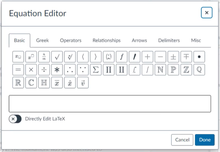
Equation Editor in Submission Comments
In SpeedGrader, an Equation Editor function has been added to the Rich Content Editor. This feature enables instructors to incorporate math equations into their submission comments.
In the below example, you can see the new equation editor function within the submission comments in SpeedGrader:
Randomise Students in Submission List
In SpeedGrader Settings, instructors now have the option to randomise the order of students within each submission status. This update helps mitigate grading fatigue and biases by ensuring a random sorting of students. Additionally, it enhances grading efficiency by maintaining this random order within submission statuses.
Below are step by step instructions on how to do this:
In the top left corner of the SpeedGrader, select the cog icon
From the dropdown menu select “Options”
Within SpeedGrader options, select “randomise students within a submission status”
Select the “Save settings” button
Please note that when the randomised students, the preference is saved as the default in the browser for the course. When logging in on another device, instructors must select the sort by options again.
In the last academic year, our cycle came to a close with the support of Resit and Deferral Digital Inspera exams. Overall, there were 103 Resit/Deferral Inspera exams which ran between 8-16 August, with 101 exams being held successfully on campus. The Digital Exams Team were delighted to see an increase in the use of content features for this period, showcasing the wide range of benefits Inspera can provide.
The removal of the minimum threshold for the August assessment period, (in 22-23 Inspera could only be used for Resits if a certain number of students were due to take the digital exam) saw a vast increase in the number of module teams using Inspera. We can confirm the removal of the minimum threshold was a success and all Inspera users can opt for a Resit in 24-25 if their Semester 1 and/or 2 assessment runs as an Inspera Digital Exam.
Inspera Training 24-25
Training for Semester 1 preparation is now available to book via the Newcastle University LMS. Please use the links below to book onto appropriate training as required:
Here are the important deadlines you need for the new academic year:
Deadlines for Semester 1 and 2 assessment periods
Task
Deadline
Deadline to complete the digital exam form for Semester 1
25 October 2024
Deadline to prepare question set in Inspera for Semester 1
15 November 2024
Digital exams: hard deadline to submit backup paper for digital exams to Exam Paper Portal for Semester 1
Within 2 working days of backup paper being sent to module team by LTDS, and no later than 6 December 2024
Deadline to complete the digital exam form for Semester 2
19 February 2025
Deadline to prepare question set in Inspera for Semester 2
8 March 2025
Digital exams: hard deadline to submit backup paper for digital exams to Exam Paper Portal for Semester 2
Within 2 working days of backup paper being sent to module team by LTDS, and no later than 11 April 2025
Deadlines for August assessment period
For Resits/Deferrals from Semester 1
Task
Deadline
Deadline to complete the digital exam form for the resit period exam (which was originally a Semester 1 exam)
17 March 2025
Deadline to prepare question set in Inspera
17 April 2025
Digital exams: hard deadline to submit backup paper for digital exams to Exam Paper Portal for the resit period
Within 2 working days of backup paper being sent to module team by LTDS
For Resits/Deferrals from Semester 2
Task
Deadline
Deadline to complete the digital exam form for the resit period exam (which was originally a Semester 2 exam)
1 July 2025
Deadline to prepare question set in Inspera
8 July 2025
Digital exams: hard deadline to submit backup paper for digital exams to Exam Paper Portal for the resit period
Within 2 working days of backup paper being sent to module team by LTDS
All information regarding deadlines for Inspera Digital Exams is also posted on the colleague facing website along with a wide range of helpful resources on all aspects of Inspera. Go to the Frequently Asked Questions section and deadline information can be found under ‘How should I prepare for an Inspera digital exam?’ and ‘Can I use Inspera for August assessment period exams?’.
Further Support for Students 24-25
ASK webpage
The Digital Exams Team have recently updated the student facing website which includes access to newly created demo exams for students to practice using Inspera.
Who: Dangeni, Professional Development Adviser, LTDS and
Minki Sung, Postgraduate who Teach, HaSS
Graduate students frequently act as instructors for labs and lead seminar discussions while juggling significant research and academic duties. This dual role places graduate teaching assistants (GTAs), or Postgraduates who Teach at Newcastle University, in a unique position. The Academic Practice Team at LTDS provides essential training and community support through various routes:
This blended learning programme offers those with little to no teaching experience an opportunity to explore key concepts and issues in Higher Education teaching. It aims to equip participants with the practical skills and knowledge necessary to begin teaching and supporting learning at Newcastle University with confidence and enthusiasm.
This pathway, accredited by Advance HE, leads to recognition as an Associate Fellow of the HEA (AFHEA). It is designed for Postgraduates Who Teach (PGRwT) at Newcastle University who want to develop their early teaching careers in Higher Education. The syllabus and assessments are based on standards set by Advance HE, focusing on the professional practice of teaching and supporting learning as described in the Professional Standards Framework (PSF).
An online communication platform has been developed since 2023 to allow PgRs who Teach to continue engaging with teaching practices. This initiative emerged from the anticipation that micro-teaching sessions could focus on sharing PhD research and provide opportunities for those interested in further developing their teaching skills after completing the ILTHE and ELTS pathway.
Following last year’s discussion at the Advance HE GTA Network event at the University of Manchester, this year the community continued these discussions at the University of Sheffield on June 19th. The event aimed to champion the voice of GTAs, sharing ideas, resources, and educational development practices across the sector. The day featured three main themes: developing teaching competencies, inclusion and its relationship to GTA work, and institutional approaches to GTA development, with speakers from UK institutions sharing effective practices and case studies.
Case 1: Effective Use of Peer Teaching and Self-Reflection for Pedagogical Training
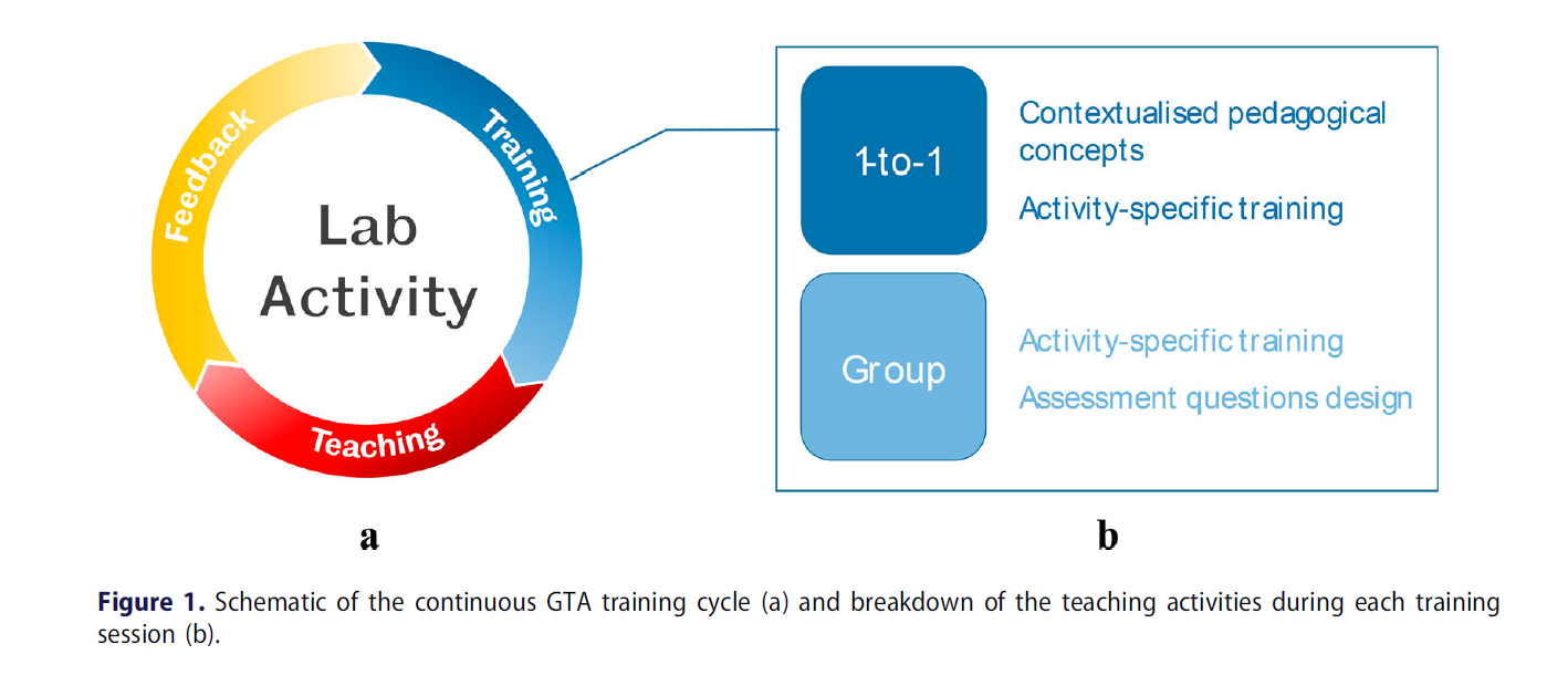
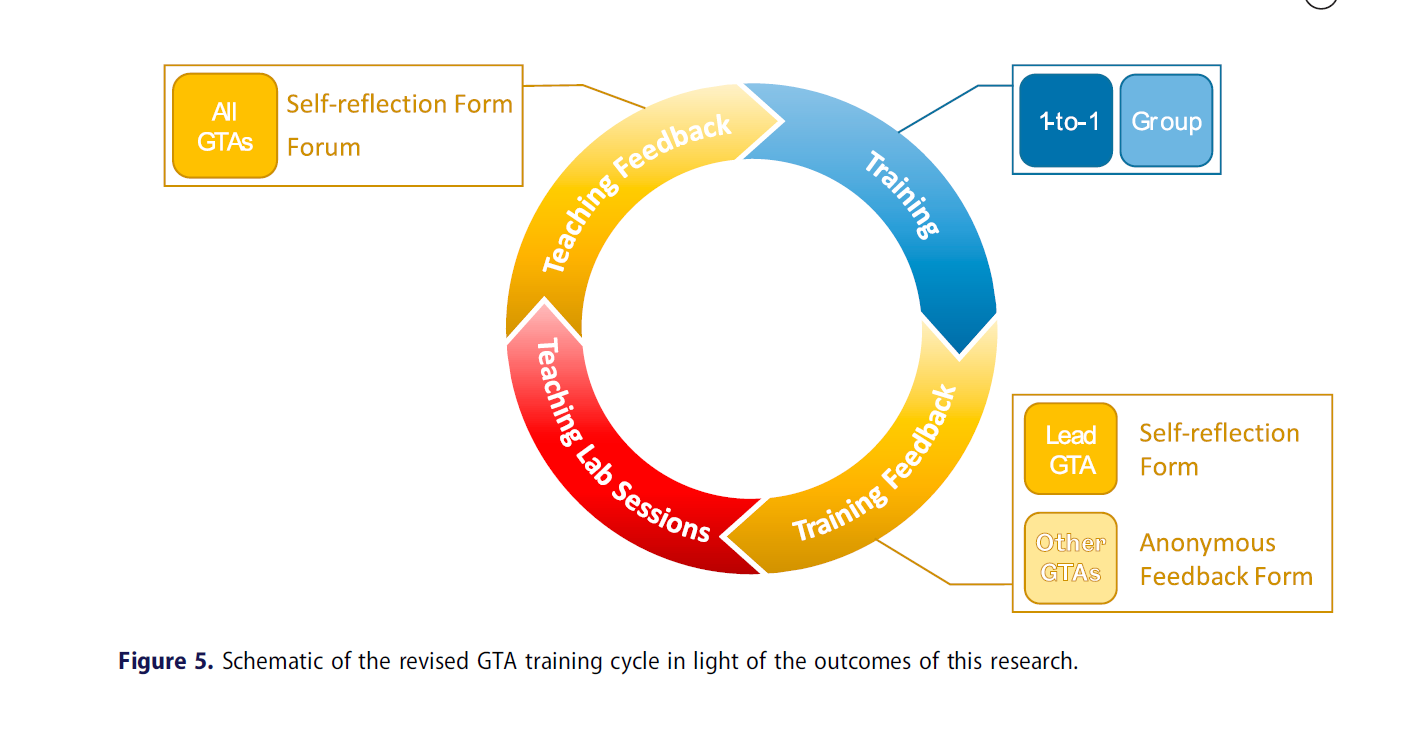
A notable example from colleagues at the University of Sheffield highlighted a training method for GTAs teaching in engineering laboratories. This training, based on session-specific content and contextualized pedagogical material, emphasized self-reflection and peer teaching.
It included individual and group sessions where GTAs could practice before engaging in real teaching, building their confidence, supporting self-reflection, and developing student-centered teaching skills. By comparing their training perceptions with their teaching assessments and feedback, the programme demonstrated its effectiveness.
These figures are from Di Benedetti, M., Plumb, S., & Beck, S. B. M. (2022). Effective use of peer teaching and self-reflection for the pedagogical training of graduate teaching assistants in engineering. European Journal of Engineering Education, 48(1), 59–74. https://doi.org/10.1080/03043797.2022.2054313
Case 2: Towards a Toolkit for Supporting GTA Teaching Identity
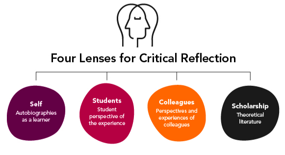
Colleagues from University of Glasgow shared another excellent example, a training model that supports GTAs in developing their teacher identity through best practice pedagogy, Brookfield’s lenses of reflection (see figure below), and graduate attributes has been considered and embedded. This model aims to enhance GTAs’ ability to engage with and confidently deliver active learning practices, thereby generating stronger learning experiences for undergraduate students.
Case 3: Newcastle University GTA Community Building Chat
As the lead and convener of ILTHE and ELTS, as well as the creator of the community building chat, I invited Minki Sung, a PGRwT from HaSS, to co-present with me. The following section is taken from Minki’s reflection. It outlines his motivations, benefits, impact and areas for follow-up.
Motivations
After attending the introductory workshop, i.e., ILTHE and six ELTS sessions on applying for associate teaching fellowship, I decided to participate in the GTA community to enhance my current teaching practices.
Firstly, the motivation for joining the GTA community chat was that it didn’t require much time commitment. At that time, I had my PhD project, teaching responsibilities, and research assistant work for government projects. Secondly, there was no dedicated teaching community for PGRs who teach, except for the GTA community chat. By sharing some challenges and best practices with other TAs, I realized that I was not alone in struggling to increase student attendance. Thirdly, my previous experience as an educational military officer in my home country made the PGR demonstrator role familiar, but seminar-leading was quite new to me. Learning how other TAs lead their seminars and manage teaching difficulties was valuable.
Gains
A GTA community chat offers several advantages. It provides a platform to share teaching-related anxieties and concerns with minimal time commitment (one hour per month). It also facilitates the integration of research and teaching skills, broadening the understanding of different TA roles: PGR demonstrator, seminar leader, lab leader, and guest lecturer.
Personally, I learned the value of student interaction and understanding their different needs based on their learning stage. For example, Stage 1 students sometimes view their first year as a “party year,” which was surprising to me. Also, most students prefer visual and technological content over reading or seminar discussions. I am interested in exploring the access and using technological tools, although in my country, I would have to pay for these gadgets. Additionally, I was able to support and challenge students’ thinking using various case studies from my experiences in South Korea, China, Japan, and Vietnam, which was able to foster their critical thinking. Finally, I could pilot test some teaching ideas with other TAs and gain valuable feedback.
Impact of Community Engagement
The ELTS initially offered six workshops, providing a good starting point for PGRs assuming teaching roles in higher education. However, further development is necessary to share best practices and address challenges. For instance, at a recent sociology TA workshop, the lack of training after the ELTS workshop was highlighted. I suggested introducing a GTA community chat to gain practical experience together.
In summary, participating in this GTA community helped me understand my students’ needs and integrate my knowledge into their learning process effectively. This involvement also had a larger impact, as I connected with some PGR and PGT students in my seminars and labs, which helped me perform effectively as a school rep. Ultimately, many PGR colleagues and PGTs nominated me for School Rep of the Year, and I won the award.
Current Gaps and Challenges in Participating in the Community Chat
Advertisement and Participation
As a PGR school rep in the School of Architecture, Planning, and Landscape, I’ve observed similar challenges with participation between the PGR community cohorts and the GTA community chat. Some TAs hesitate to share difficulties, fearing it may be perceived as a weakness and jeopardize future TA opportunities. Additionally, disciplinary differences pose a challenge. Each discipline has its teaching requirements and TA recruitment practices.
Additionally, nurturing the GTA community chat may rely heavily on word-of-mouth within the PGR community. Utilizing networks established by PGRs who have completed ELTS workshops and achieved D1 certificates could enhance visibility and participation in the community chat. It needs to be advertised with a clear message that it will benefit any PGRs interested in teaching post-PhD.
Thank you for taking the time to read this GTA-themed blog post. Please get in touch at apt.lts@newcastle.ac.uk if you’d like to chat about our pathways and your practice!
Inspera Assessment, one of the University’s Digital Exam platforms, is in its third academic year of deployment. Following the launch of Inspera, the Learning and Teaching Development Service (LTDS) have asked for student feedback annually. Such feedback aids LTDS to ensure we are continually developing the service to improve student experience when taking an Inspera Digital Exam.
142 students submitted their feedback in academic year 21-22
104 students submitted their feedback in academic year 22-23
Our comparison findings:
Students are reporting that they are more satisfied with Inspera Digital Exams in academic year 22-23 compared with 21-22. An increase is also seen in its ease of use:
Evaluation statements from Student Users
21-22
22-23
% increase (21-22 to 22-23)
I found starting my Inspera exam somewhat or very easy
81%
89%
+8%
I found submitting my Inspera exam somewhat or very easy
80%
93%
+13%
I am satisfied or very satisfied with my experience of taking an exam(s) using Inspera within a PC Cluster venue
73%
79%
+6%
I have tried at least one Inspera demo exam
60%
73%
+13%
The use of demo or practice Inspera exams is also on the up. Students reporting using demos more so in 22-23 compared with 21-22; this is reflected in the increased figures on the self-enrol Student Inspera Demo Canvas course. Enrolment figures across the demo exams showed an 87% increase in usage for 22-23.
Student engagement with Inspera demos is encouraging and LTDS would like to thank all colleagues who are promoting the use of demo exams to aid students’ familiarity with the Inspera platform. Try it out or share with your students: Student Inspera Demo Course.
Next Steps
LTDS will be requesting feedback from students for our current academic year after Semester 2’s assessment period. Where possible please encourage your students to complete the form as it helps to continue the improvement of the service.