We were conscious after the first run of our “Hadrian’s Wall: Life on the Roman Frontier” that many learners had struggled with time. The course covered a 400 year timespan and the thematic nature of the some elements of the course meant that we didn’t always move from 0- 400 in a linear way.
So, for subsequent runs we started to have a look at timeline tools, our favourites were TimeLineJS and Tiki-Toki.
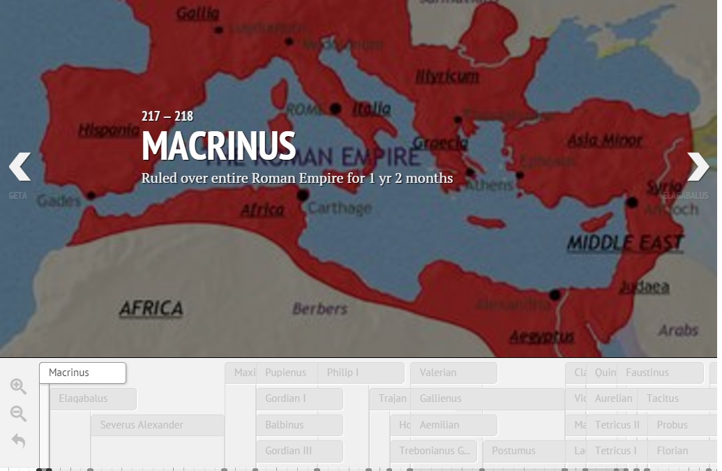
The attraction of TimeLine JS was that it was FREE, and that we could drive it from a Google Spreadsheet. We wanted to use timelines in two ways, to provide a course overview at the beginning, and to show the ridiculously fast turnover of emperors in the 3rd and 4th centuries.
TImelineJS was easy to set up, but we found that the number of items we wanted to plot meant that it was just a bit too confusing. The tool would have worked well if we had wanted to give a lot of detail (and had a picture for each item), but for us the space usage on the screen didn’t work so well. There’s a screenshot of our quick test below (you can also see the actual timeline and the google sheet we used to create it).
For our purposes Tiki-Toki gave a better learner experience. We liked a number of things – there were a number of views (we could set a default), it was searchable, and we could categorise our emperors and the more adventurous learners could filter it by these categories.
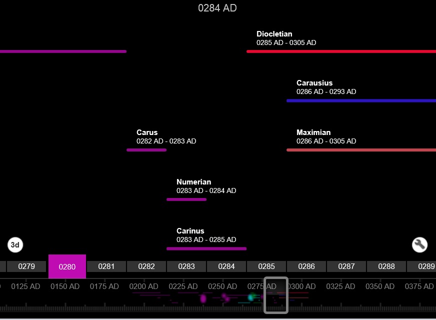
Here’s a link to the 3rd Century Emperors timeline we published on the course. Our only disappointment was that while it was possible to export the entries as CSV we couldn’t import the data that we (Rob) had so carefully collated. (That gave an excuse to experiment with AutoIT keyboard macros, but that’s another story).
We can’t prove that the timelines themselves improved the overall learner experience as too many things changed. Notably, we placed “Timeline: Life on the Northern Frontier” in a dedicated “step” rather than tagging the time information at the end of a video. So this brought time right to the fore. We know from the analytics that learners spend time on this new step, and we used bit.ly to track links to the interactive timeline, so we know it was viewed.
Learner comments implied that while some liked the interactive timelines, many of them were even more happy with the printable pdfs we provided as downloadable reference links.
It took a few days create the interactive timelines. Was it worth it? My view is yes; but yet again I’m struck that the accessible pdf can be just as valuable a resource as the whizzy clicky shiny thing – I’d see them as complementary. The most important learning point though, is if the content/concept is important, give it the space.