Working with colleagues Ali Ford, Oliver Heidrich, and David Manning on various papers and proposals, we have started to pull together a Sankey diagram of the reported tonnages of cobalt in 2012 through various processing stages within its life cycle. The orange and green colours denote the quantities of cobalt reported by the respective importing or exporting countries, but we have aggregated to the continent level. This information was extracted from the UN COMTRADE database and linked to eSankey! software via an intermediate Excel spreadsheet. The good thing about this approach is that by updating the spreadsheet with new values e.g. for different years etc, or for different elements/commodities/products, we can auto-generate (ish) the Sankey diagram.
Source: Cobalt, 2012, DESA/UNSD, United Nations COMTRADE Database
Going even further, Ali reproduced the data above at the country-level, across the same three stages i.e. Mining->Refining; Refining->Manufacturing; Manufacturing->Use, but using only the import flow data for now (matches orange flows above)
Source: Cobalt, 2012, DESA/UNSD, United Nations COMTRADE Database – Mining to Refining imports only
Source: Cobalt, 2012, DESA/UNSD, United Nations COMTRADE Database – Refining to Manufacturing imports only
Source: Cobalt, 2012, DESA/UNSD, United Nations COMTRADE Database – Manufacturing to Use imports only
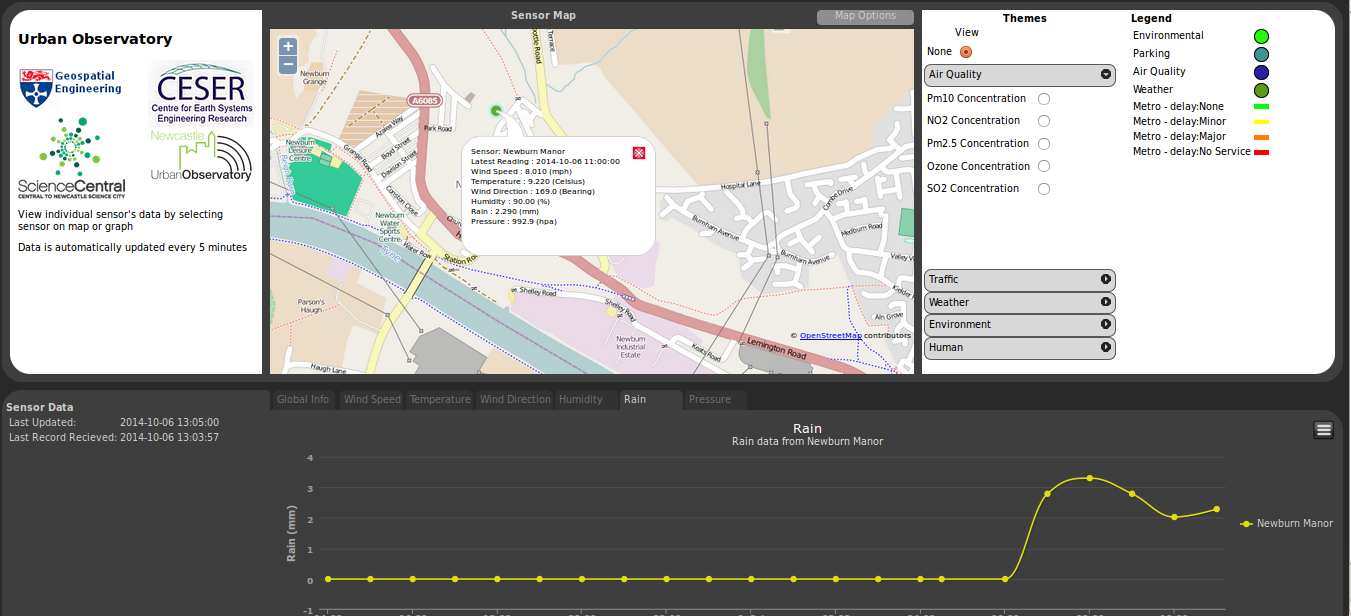
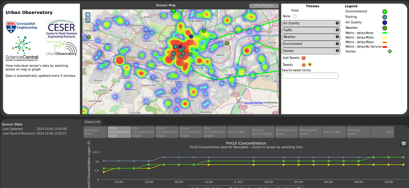
The Urban Observatory programme is deploying sensors and exploring the use of data to help inform the public about city services, and to help researchers better understand how cities work.
The data for this comes from a number of different streams and is held in a schemaless data structure. A python based middleware layer has been developed to ease the interactions with this structure. Facilitating the storing of data, the management of data and also creating different views onto the data.
It is through this middleware layer that a portal has been developed. By using django, the Python Web framework tool. That allows data to be extracted that works with a number of JavaScript libraries e.g openlayers , highcharts.
The portal itself show the location of the sensors, provides graphs of the sensor data. As well as some extra functionality like heat mapping.
With the deployment of a wave of new sensors being planned in the next few months. You should see a few more dots appearing on this map shortly.
Wednesday 16th – Thursday 17th saw me attending my first sandpit event. Not really knowing what one was even when I was told I would be attending a sandpit event by the beach in Cullercoats I got very excited. Unfortunately I wasn’t given a bucket and spade on arrival but actually found the event probably more enjoyable and interesting than merely making sand castles on the beach for 2 days.
The venue for the sandpit
The event was actually part of the Urban Observatory (UO) with the aim of the 2 days to come up with ideas of pilot projects that could form part of the overall UO. The focus for the first morning was to brainstorm ideas of what data we should be recording and how we should be recording it. With a wide array of sectors being represented in the room these ideas varied greatly from transport flows, microbiology of computer keyboard, building movements and people’s motivations. In the afternoon we were asked to predict what the world will be like in 20 years time. With most group taking a pessimistic approach the outlook proposed was rather depressing. Basically climate change will only get worse, economic disparity will increase, society will divide , technology will take over people’s lives and who knows what league Norwich City will be playing in. The conclusion made was if this is to happen the Urban Observatory has to be the “good-guy” and not just record interesting information but to make recordings and carry out analysis that will help the general public and feed this data back to the general public in a manner which will be beneficial to masses.
Day 2 begun with cross-sectoral teams of three sent off to come up with an idea that represented the overlap in the 3 represented sectors of research. This is where my blog post has to get a bit cagey as it seemed every idea that came from this breakout session was either a clever or novel piece of research. The main overall theme of the ideas was public participation, either in collection of the data or in how the data was disseminated. These ideas were then honed down with more people contributing their suggestions on how an idea could be improved. As a result of this process 7 projects began to take shape. These ideas were presented to the group with more feedback coming from across the room. Some more polishing was done taking on board the feedback before again each of the 7 projects were presented. Each of which I thought had the potential for some great research and development to take place. Having not been to an event like this before I didn’t know whether this was a good haul or not. But I was told it is very rare for there to be so many good ideas which exhibit so much cross-sectoral research. Either way I don’t envy those in charge of whittling these ideas down.
I’d like to thank Rich, Phil and the other members of the UO team that put on the event. And a massive thanks to Tim and Liz from KnowInnovations for brilliantly facilitating the event.
From the 14th to the 16th April the annual RSPSoc Wavelength conference, aimed at students and young professionals to present their work to their fellow peers in an informal environment, was hosted among the quaint hills of Great Malvern, Worcestershire.
I was given the pleasure of opening the conference with a presentation on the work I have been undertaking on automatic 3D city modelling. This was followed by presentations on change detection, archive stereo imagery and forestry applications from various remote sensing satellites. Other presentations during the conference included the use of UAV and structure from motion, atmospheric correction of remote sensing data and the fusion of imagery and lidar.
During the three days keynote speakers included Dr Alastair Graham of Geoger Ltd, Dr Matthew Blackett from Coventry University and Professor James Brasington from Queen Mary University, who all gave invaluable advise of skills and abilities needed to progress during these early steps of research. A consistent theme mentioned by all was the need to be able to write software via different programming languages. A good historical overview was given by all of how data capture, storage and processing has changed. This was also the first year that a sponsor session was held allowing sponsors to present what their respective companies do and how our work fits into these remits. Simon Mears from Leica Geosystems presented some of their recent hardware, particular the Aibotix UAV which was on display, and software developments. Dr Andy Wells from Sterling Geo gave a good overview of the developments of the ERDAS Imagine software and linked this to the topics that had already been presented that day.
The always popular poster session saw a wide range of topics being presented from mass grave detection to how soil moisture content change can be detected. The sessions was almost dominated by Newcastle University with posters presented by first year PhD students Polpreecha Chidburee, Maria Peppa, Magdalena Smigaj, Elias Berra, who presented work on how they intend to undertaken their individual research projects, and Mitko Delev, who presented work undertaken as part of his masters project on using photogrammetry for structural gauging in a railway environment. A poster was also presented by undergraduate student Cedric Meyer who presented his dissertation work on the potential for bio-physical information retrieval.
As well as having a strong scientific program , several social activities were also offered including high pole activities, a trip to Worcester and a guided walk around the hills of Great Malvern. Luckily the sun shone all week, which made the walk much more enjoyable. An evening activity of laser quest was well attended with individuals battling it out to become the ultimate champion. With many references being made about laser scanning and how a scanner could be set up in the arena to make it even harder, it is fair to say I will never look at laser quest in the same way. Drinks were enjoyed at the end of both days allowing delegates to discuss their research work further as well as taking the opportunity to talk to the sponsors and keynote speakers.
A huge congratulation goes to Amy Woodget of Worcester University for organising such a successful conference. As I am about to take over as RSPSoc Wavelength Representative and start to organise next year’s conference here in Newcastle, I hope to build on the success on this year’s conference as well as show everybody what a vibrant city Newcastle is and what it has to offer.
From the 16th April to 18th April I attended GISRUK in a surprisingly sunny Glasgow. The started with a welcome from Jane Drummond followed by an interesting key-note talk from Mike Worboys , A Theoretician’s eye view of GIS Research. He talked about how GISRUK has developed there has been a dramatic fall in the proportion of papers that covered the theoretical side of GIS, with the focus now being on Application.
Talks from the first day that I particularly enjoyed focused on Spacebook, a system of delivering directions via audio as users encountered various way points on a route. William Mackaness talked about his research in comparing directions given using street names and direction given using landmarks.
Phil Bartie, who was a researcher on William Mackness’s paper delved deeper into the issue of Landmarks. Using images he looked at what people identified as landmarks and then analysed them semantically and spatially to distinguish related and unrelated features.
The following day saw me presenting a talk on some of the sensor infrastructure work we’ve done at Newcastle using HStore as a key-value based approach to storing heterogeneous data. Robin Lovelace’s talk round the merits of twitter data in research. Sparking some interesting debate about how research using twitter data uses data from the public so should benefit the public.
Thursday evening then featured the conference dinner followed by the Céilidh, an event that I was secretly dreading, dancer I am not. So was pleasantly surprised at how much fun the event was, as someone pointed out to me; it’s dancing but dancing with an algorithm.
Friday morning then featured my favorite talk of the conference with Paul Brindley talking about his Phd work on extracting the additional address information from addresse listed on the internet to map out neighborhoods. A simple idea but with fascinating results.
The conference was then wrapped up with a keynote from Professor Alias Abdul Rahman who gave an interesting overview on the state of 3D GIS work.
The event was a fun filled thought provoking and thoroughly interesting. Thanks must go to Jane Drummond for seamlessly organizing the event, even managing the weather. I would also like to thank William Mackness who brilliantly chaired my session.
Bring on Leeds 2015. Wonder what there version of Céilidh will be?
Monday 3rd till Tuesday 4th March saw the introductory lectures held for the 12th EuroSDR EduServ e-learning course at the University of Trento, Italy. Located just south of the Alps, the city sits in the Adige Valley so is surrounded by snow-caped mountains to give a picturesque view. The lectures were attended by a small delegation, mainly from national mapping agencies and universities from across mainland Europe. The four courses of the EduServ programme were introduced and presented by the various course leaders over the two days.
View from Bruno Kessler Foundation, Trento University
On the first day Professor Norbert Haala, of Stuttgart University, started proceedings and presented material for his course on high density imaging matching. He presented some of the results of DSM creation from different software packages as part of his EuroSDR benchmark on image matching, whilst giving an overview of the Semi-Global Matching (SGM) algorithm, which I am using as part of my PhD, It was shown how a dense point cloud can be created from UAV and aerial photography by using the SGM approach. Hopefully this workshop will give greater insight and help overcome issues that have been experienced with ‘noisy’ photogrammetric point cloud.
Afterwards Dr Petri Ronnholm, of Aalto University in Finland, presented his course on the integrated use of airborne laser scanning and aerial photogrammetry. This was again based around a EuroSDR benchmark which tested different methods for the integration of the two dataset, some of which will be used in the course. The lecture was concluded with an interactive session to discuss the advantages and disadvantages of integrating the two dataset and what future applications this could be used for. One point that arose and was discussed was whether there was a need to integrate the two datasets due to high density point clouds being created from imagery, by the principles outline previously by Professor Haala. It was concluded that although lidar is still essential for forestry application, research may prove that photogrammetric point clouds are just as suitable as lidar for other applications.
A meal was held after the first day’s lectures at a local restaurant in Trento, with exquisite pasta and other traditional Italian food enjoyed over four courses and wash down with a glass (or two) of local wine. This offered a great ice breaker and a way to get to know other delegates as well as the course leaders.
Dr Clement Mallet, of IGN France, started the second day by presenting material for his course on change detection in high-resolution land-use/land-cover geodatabases and presented work from his EuroSDR benchmark regarding change detection methods. The need for land cover and land use was introduced followed by many different approaches presented, which mainly used satellite imagery.
Dr Daniella Poli, of Terra Messflug GmbH, closed proceedings with the last of the four courses on mapping using high-resolution satellite imagery. An insightful overview was given of low resolution film-based satellites to new high resolution digital-based sensors as well as the processing that is required for processing the data. This carried on from some of the principles covered by Dr Mallet, giving more details on the processing that may be required in order to use satellite imagery including radiometric corrections and Rational Polynomial Coefficients.
Thanks to Fabio Remondino of Trento University for hosting an excellent introductory workshop. With the first course starting today (10th March) and the final course finishing on the on the 13th June it is hope many new skills will be learnt over the next four months.
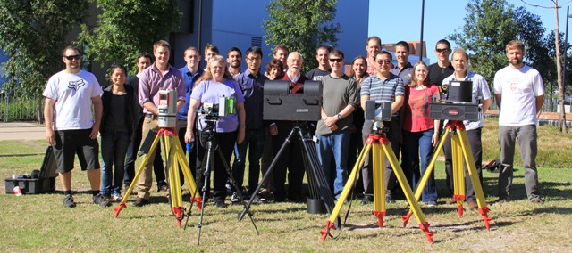
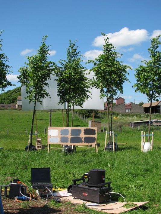
Geospatial Engineering researchers recently took a trip ‘Down Under’ to participate in a unique terrestrial laser scanning inter-comparison exercise. Dr Rachel Gaulton and Dr Steve Hancock joined almost 30 leading researchers from the UK, Australia and the U.S. at field sites near Brisbane in early August to evaluate and compare how five different laser scanners and a range of other measurement approaches can help to measure and monitor forest canopy structure. These scanners included the Salford Advanced Laser Canopy Analyser (or SALCA) , the subject of on-going NERC-funded research at Newcastle, in collaboration with University of Salford and UCL, examining the potential of dual-wavelength laser scanning for assessing forest canopy health.
The exercise, organised by John Armston and colleagues at DSITIA Queensland and CSIRO, was an activity of the Terrestrial Laser Scanning International Interest Group (TLSIIG), a recently formed network of scientists with an interest in forest laser scanning. Alongside SALCA, measurements of three field plots were made with the World’s only other dual-wavelength TLS, DWEL (developed by Prof. Alan Strahler at Boston University with collaborators at CSIRO, UMass Boston and UMass Lowell), the low-cost Canopy Biomass Lidars (named Candi and Bruno and developed by UMass Boston and RIT) and two commercial systems. Photogrammetric techniques also played a part with co-incident measurements made with the AusPlots ‘Photopoint’ method, a system designed to obtain 3D forest structure information from photo panoramas. A report on the exercise featured on Australian TV News .
Intercomparison exercise participants and their scanners. From left to right: A Riegl VZ400, a CBL, DWEL, a Faro scanner and SALCA.
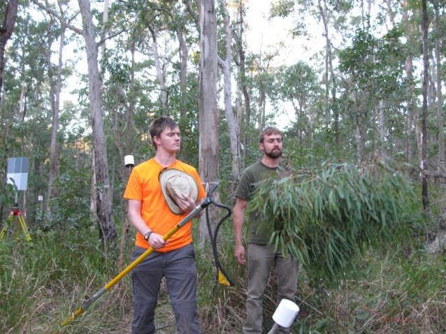
Alongside the high-tech methods, leaf samples from the tree canopies were needed to allow measurement of spectral properties and to test the ability of dual-wavelength data to distinguish leaves and bark – a key factor in producing accurate estimates of canopy structure. Steve joined the destructive sampling team in using a ‘line thrower’ (or big slingshot) to collect the samples and undertook additional sampling to estimate the true leaf area index of a section of heavily laser scanned tree canopy. Work is now on-going to calibrate and compare the data sets, with early results presented by TLSIIG members (John Armston, Crystal Schaaf and Alan Strahler) at the Silvilaser 2013 conference in Beijing.
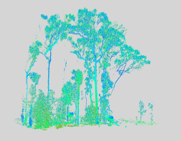
Ian Paynter (UMass) and Steve with canopy samples and the line thrower (left) and a subset of SALCA data from Brisbane Forest Park (right).
The work in Brisbane followed a month-long field experiment with the SALCA instrument at the University’s Cockle Park Farm. The experiment, part of a NERC-funded research project examining the potential of dual-wavelength laser scanning in forest health monitoring, was focussed on testing the sensitivity of the instrument to changes in canopy water content – an indicator of drought or disease. The canopy-scale experiment at Cockle Park involved subjecting 22 trees to drought stress, whilst making extensive physiological, spectral and laser scanner measurements and preliminary results have recently been presented by Rachel at the RSPSoc 2013 Annual Conference in Glasgow and the 9th EARSeL Forest Fire Special Interest Group Workshop held in Warwickshire.
More information about the SALCA instrument and on-going research can be found in the SALCA Diaries.
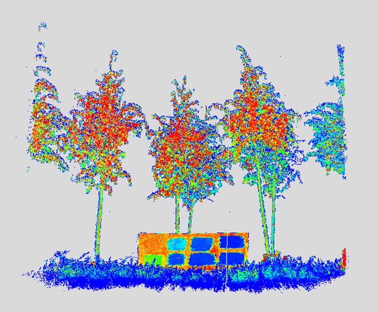
Scanning small-leaved lime at Cockle Park farm and SALCA data from a group of trees suffering drought stress (colours indicate reflectance at 1545 nm).
Many thanks are due to John Armston and colleagues for their hard work organising the Brisbane field work. Steve Hancock’s travel to the inter-comparison exercise was funded by a small grant from the Douglas Bomford Trust.
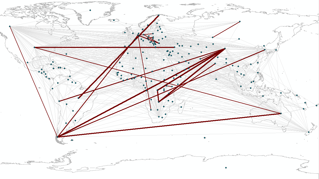
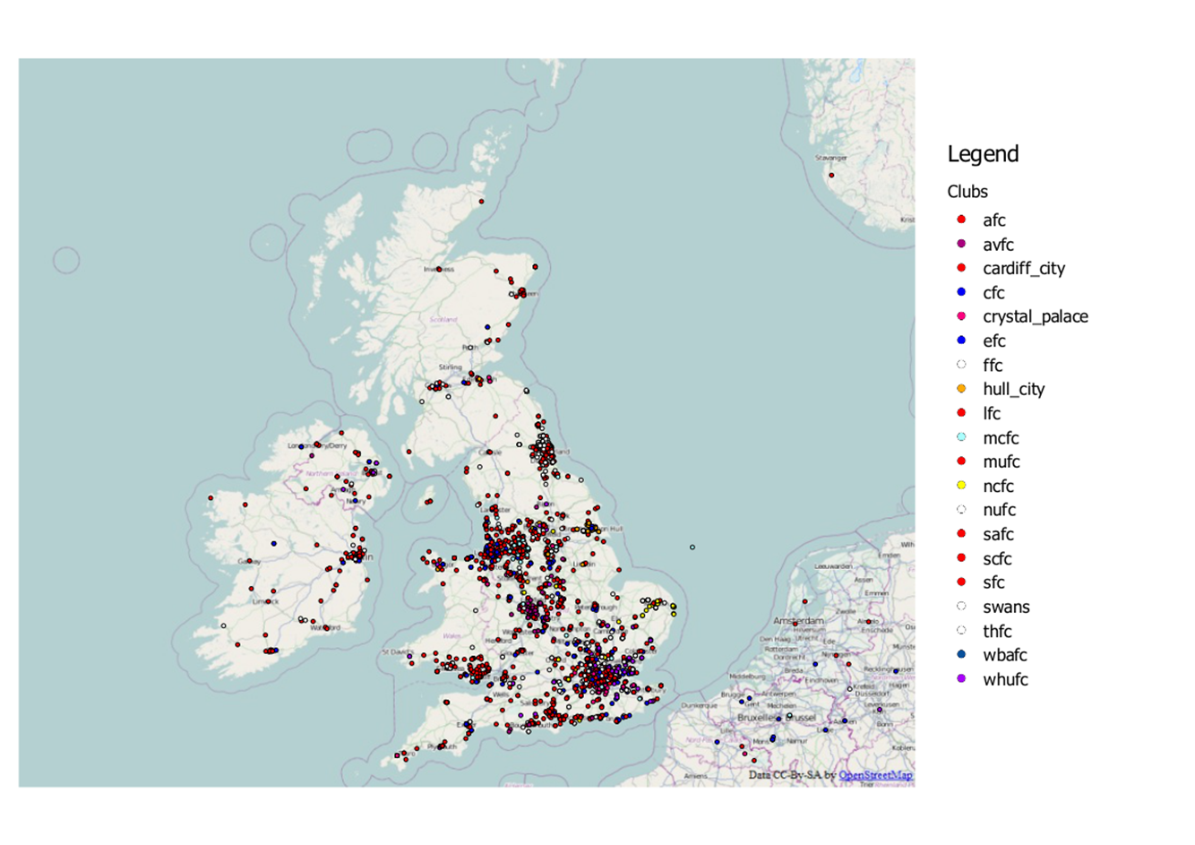
A while ago here at Newcastle we set up a system to record the locations of football fans on twitter. Whilst this system was mainly a bit of fun and also a great means of testing our infrastructure it also very rapidly provided us with a considerable amount of data. And with an upcoming talk about our football tweet work I was given the opportunity to again carry out some analysis on this data.
Last time round when I analysed the football data I used about a month’s worth of data to look at football team fan locality. However this selection of data wasn’t particularly fair as it contained a number of different fixtures with teams playing both home and away which would have heavily affected the distance from tweet to club. For instance if Newcastle were playing away at Fulham it’s not fair to measure the distance from “#NUFC” tweets to St James Park “ooh look Newcastle have loads of fans in London, they’re not local supporter are they”. So this time round I looked at just tweets taking place in the UK during the recent international break during which there were no Premier league games. The map below shows this data subset.
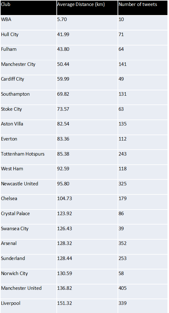
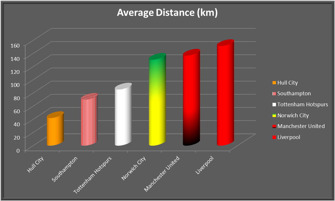
Firstly I carried out the same analysis as last time whereby I measured the distance from tweet to the ground of the club it was about. These distances were then averaged per club to give an average tweet distance for each club. The result are below (click to enlarge). The club with the shortest distance was West Brom with a very impressive average distance of 5.7km. However we only actually recorded 10 tweets during this period, so in short not many people tweet about West Brom but the ones that do are very close to The Hawthorns. At the other end of the spectrum you have your expected “glory” clubs. Your Liverpools, your Man Us and your Norwich Citys…
…hang on Norwich City?? I myself am a Norwich City fan so found this stat at little hard to believe, you’d be hard pressed to call me a glory supporter. I tried to think about why Norwich may have scored so highly here. My conclusion was that as Norwich is the only football league team in Norfolk it represents a larger area than most clubs. Therefore this large distance could maybe be justified.
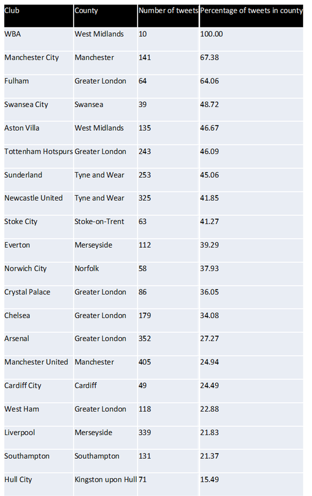
So my next piece of analysis was to look at whether the tweet about a club fell in the same county as that club. Again my results are shown below. Yet again West Brom performed the best with 100% of its tweets falling in the west midlands. And Norwich city had disappeared from the bottom 3 into mid table (something I wish we’d do in the premiership). But now the worst performer was Hull City. Had their rebrand to Hull City Tigers really caused them to have a wider fan base? Probably not, this is probably caused by Kingston upon Hull being considerably smaller in comparison to a lot of other football team counties. And you could very easily be from outside Kingston upon Hull with Hull city still being your nearest (premier league) club.
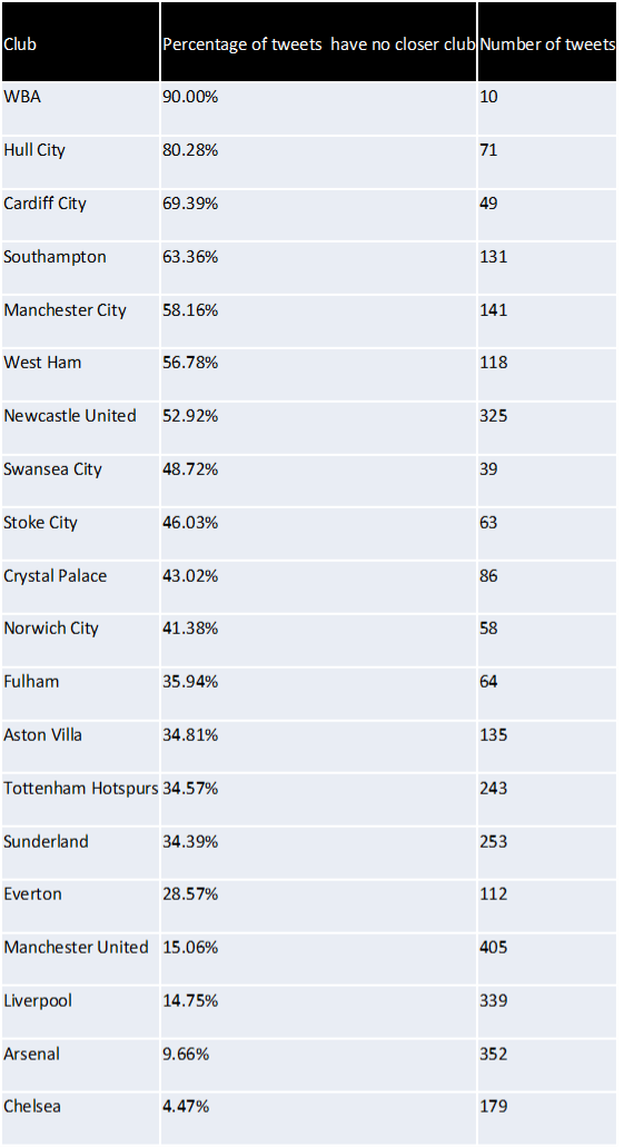
Therefore I thought I’d carry out another piece of analysis this time looking at whether or not the tweet was about their nearest club. Once again my results are displayed below. Here Hull have leapt from bottom to 2nd and Southampton have also made a considerable leap up the table. However again I noted something from the results which was that this time the bottom 5 is made up of clubs with another in very close proximity so the tweet may still be about a “nearby” club but not be counted as there is a club closer.
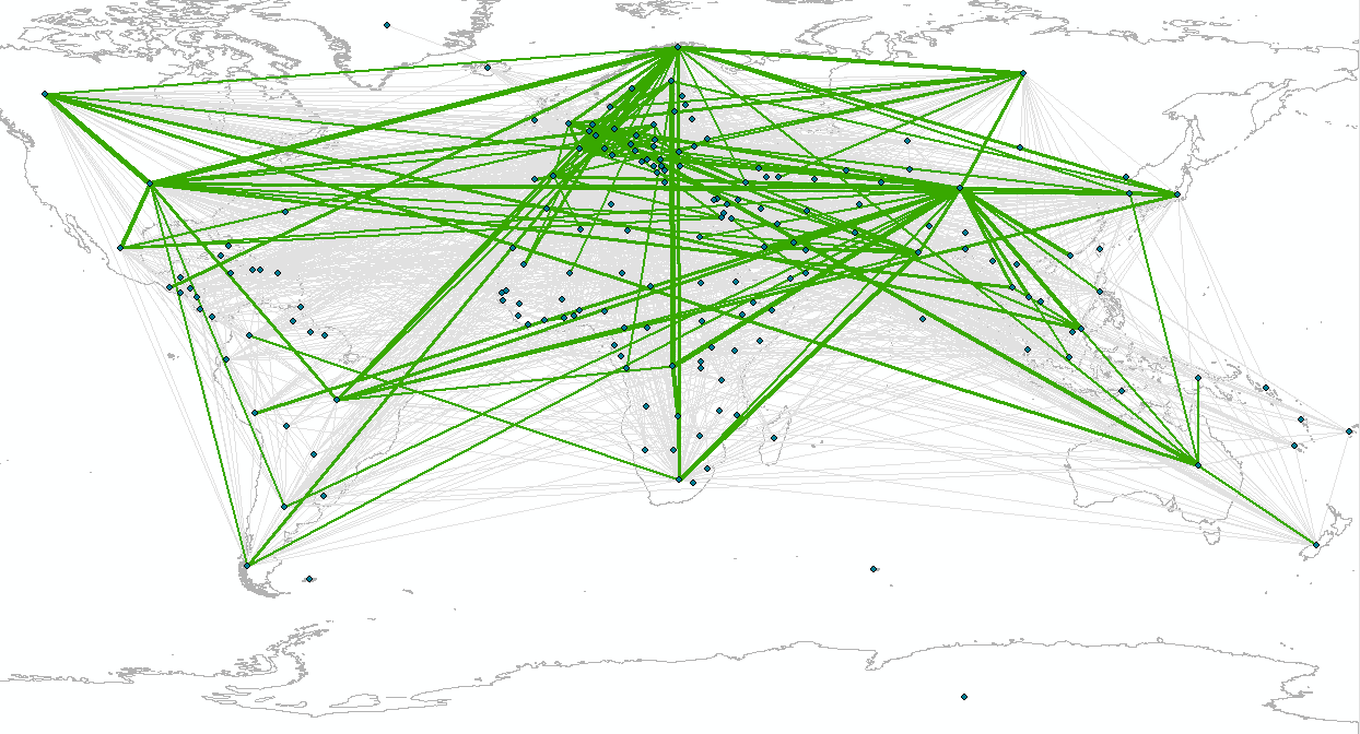
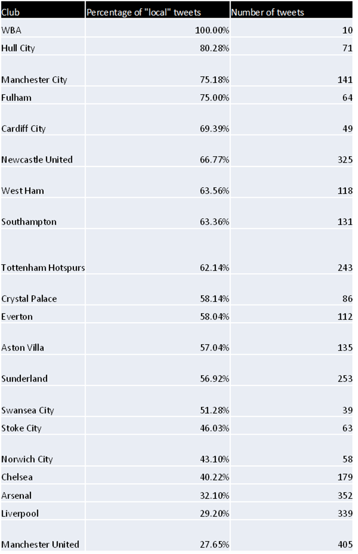
To account for this I needed some meaningful distance which would be considered as local. After a quick search I found that CAMRA consider any ale produced in a 20 mile radius of the pub to be local, could this be applied to football fan? Therefore I conducted one last test using this CAMRA metric of “localness” which counted the number of tweets which had no closer club OR were with 20 miles of the club. And for a final time my results are shown below.
Hopefully this shows some interesting results produced by just a few simple POSTGIS queries.
The inaugural International Symposium for Next Generation Infrastructure was held between 1st and 4th October 2013, at the SMART Infrastructure Research Facility at the University of Wollongong, Australia, and one lucky Geospatial Engineering researcher from Newcastle was able to attend. David Alderson gave a 20 minute presentation entitled “A National-Scale Infrastructure Database and Modelling Environment for the UK” following a successful submission of a conference paper to the conference committee, under the same title. The work contained within the paper and the presentation represented an amalgamation of work conducted by David and other researchers from the Geospatial Engineering group at Newcastle and other research institutes and universities involved in the Infrastructure Transitions Research Consortium (UK ITRC) programme. The focus of the paper and presentation was to give readers and delegates alike a glimpse of some of the work undertaken in the process of constructing a database of infrastructure-related data relevant to the UK. This included not only an overview of some of the datasets that may be found within the database, but also a preview of some of the visualisation tools that are being developed on top of the data. An overview of these visualisation tools can be found within other posts in this blog site here.
A copy of the slides can also be found here and here. Unfortunately the presentation has had to be split into two parts, so please download from both links to get the full presentation.
Other representatives from the School of Civil Engineering and Geosciences at Newcastle University, UK could also be found delivering presentations at the event including:
Further to this fantastic opportunity, a further round of meetings looking to develop collaborations between researchers at SMART, including former Newcastle-based PhD student and post-doctoral researcher Dr Tomas Holderness, and the Geospatial Engineering group at Newcastle, is being held at the SMART infrastructure facility between October 8th and 11th 2013. These meetings will look to focus on potential collaborative opportunities regarding network interdependencies between infrastructure networks, and also web-based data dashboards for visualisation and dissemination purposes.
In an attempt to begin to think about how some of the data being generated by colleagues within the Infrastructure Transitions Research Consortium (ITRC) could be visualised, I started by considering how to visualise the seed projections that are used as inputs to the infrastructure capacity and demand models (CDAM) that have/are currently being developed by different institutes within the consortium. To find out more information about this aspect of the consortium please follow this link. The demographics projections have been developed by Leeds University, and give indications as to the number of people living in each government office region and local area district within the UK, out to the year 2100. Alongside this standard variable, projections for the quantity of urban area and number of households are also calculated and provided, although at this stage they are not being fed in to the CDAMs. The economics projections, developed by Cambridge Econometrics, contain many variables with reference to employment levels, imports/exports, gross value added (GVA) by industry, energy use by different fuel users, and many others. Each of these variables is supplied along a similar timescale to the demographics projections, whilst some are also disaggregated from UK-wide values to the government office region level. The following variables from the economics projections are supplied with this spatial disaggregation:
– GVA by region and industry
– Household expenditure by consumption category and region
– Investment by investing sector and region
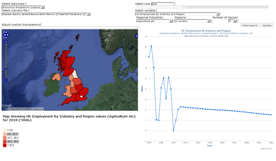
– Employment by industry and region
The two data sets themselves are supplied in either comma-separated value (.csv) format, or via the use of the netCDF (.nc / .cdl) formats. In order to store these data, and then subsequently query them, the data is loaded via a Django-powered web form in to a PostGIS-enabled PostgreSQL relational database. The web form uploading process attempts to validate the values supplied within each of the projection sets against sensible ranges of values for each variable such that any erroneous data values can be detected. This approach ensures that the data is stored alongside other data related to the consortium, such as the infrastructure network models, and subsequently makes it quite (!) straightforward to create a web-based visualisation dashboard / platform for the data. The chosen web framework, Django, is Python-based and natively allows connections to PostgreSQL/PostGIS-enabled databases.
Both sets of projections, demographics and economics, are similar in nature in that they have a mix of UK-wide outputs over time, as well as a mix of spatially disaggregated outputs. I therefore chose to include the ability to view both a map, as well as charts and plots to give a user access to as much of the information as possible, without overloading them, within a single web page. In order to achieve this, a series of Django-enabled, and just standard SQL queries were developed to deliver data from either of the projections sets as JSON to the webpage. The webpages themselves (one each for demographics and economics respectively) communicate to Django via a synchronous AJAX request, which is all handled and powered via the use of the JavaScript framework, jQuery. Each webpage offers the user a series of dimensions or options that they can choose from, resulting in a new request being sent to the server to retrieve data matching against the chosen criteria. The following table represents the options available to a user for the two different interfaces:
Demographics Dashboard
Economics Dashboard
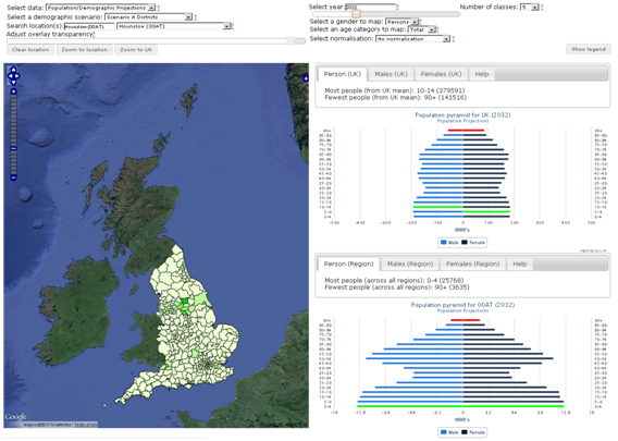
Data:– Demographic projections – number of people in each government office region, or local area district
– Proportion of urban area projection – the percentage of each government office region, or local area district considered as urban
– Change in the proportion of urban area projection – the change in the percentage of each government office region, or local area district considered as urban.
– Household projections – the number of households in each local area district
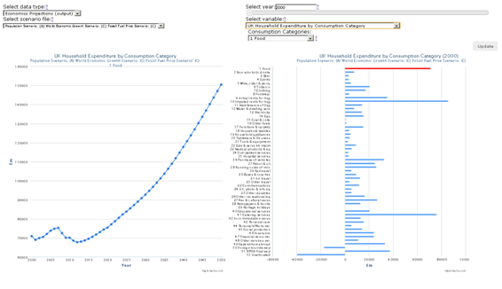
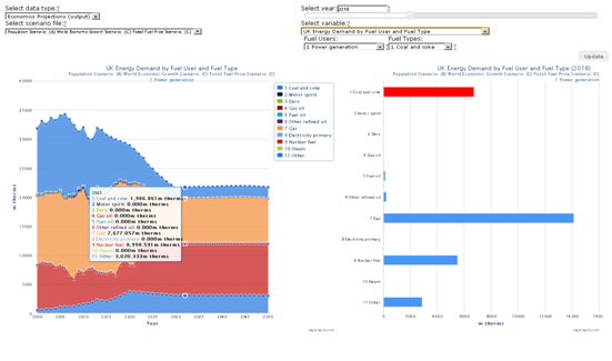
Data:– Economics projections – a set of different economic-focussed variables in relation to employment, consumption, energy use and much more
Scenario – a user can select from a drop down list of scenarios that have been uploaded to the database. Each set of demographic data represents a different scenario of demographic change, and each value within the database references which scenario to which it is related. The different scenarios are generated by using different values for the attractors and detractors that make a region or district more or less attractive to reside in.
Scenario– a user can select from a drop down list of scenarios that have been uploaded to the database. Each set of economics data represents a different scenario of economic change, and each value is referenced against a particular scenario. In the case of the economics projections, each scenario represents a different combination of inputs for:- Population- World Economic Growth
– Fossil Fuel Price
Time – a drop down list of available years of data
Time – a drop down list of available years of data
Location – depending on the user’s selection of scenario, a drop down list of government office regions or local area districts is presented. The selection of a particular location is also possible via direct interaction with the map interface itself.
Location – as previously described, only a subset of all economics variables are disaggregated to the government office region level, and these regions are presented via a drop down list. Similarly to the demographics data dashboard, a location of interest can be selected by interaction with the map interface itself, as well as via the drop down list.
Number of equal-interval map classes – this option allows a user to determine the number of equal-interval classes to use when mapping the data satisfying the matched criteria defined by the user.
Adjust overlay transparency – this slider allows a user to increase or decrease the transparency of the overlay map displaying the projections to allow them to more easily see the underlying base map layers provided. This for example can be used to help the user orientate themselves on a particular area of the UK, before seeing the overlay of chosen demographics or economics values.
Gender – when selecting the standard demographics output i.e. the number of people in each region or district, this option determines whether the displayed map is showing projections for males, females, or both i.e. the total population.
Variable– the user is able to select from a drop down list of 18 possible variables to retrieve maps and charts about. The particular choice of variable determines which combination of the following options can subsequently be selected:- sector
– regional industry
– fuel user
– fuel type
– consumption category
– UK-wide investment sector
– Regional investment sector
– UK macro economic indicator
– region
Age category – similarly to the gender option, when selecting the standard demographics output, this option determines which age category is being mapped. Each category represents a 5 year cross-section of the population, ranging from 0 to 90+.
Normalisation – this option allows a user to tell the displayed map to create equal-interval classification bounds based on other values that also satisfy the user’s selected criteria. For example a user could wish to normalise based on values for males/females for a particular region or against the whole of the UK.
As a user is changing the combination of the afore-mentioned options selected, whether for the economics or demographics data projections, a new request is sent to the server to query the database. Once the JSON data matching the selected criteria is returned to the webpage, JavaScript alongside the use of the HighCharts JavaScript-based graph library are employed to create the charts and graphs of the time series data. I selected HighCharts as it offers some fantastic, out-of-the-box functionality such as the slick animations activated when new data is supplied, or the hover-over tooltips to return actual data values. HighCharts however is a paid-for product, but has been used here as the work falls under the academic/research use. Furthermore, it is pretty straightforward to coerce the JSON output from the database in to something that HighCharts can handle. The maps themselves are created via the use of the OpenLayers JavaScript mapping client, largely employing the client-based vector layers and features for the rendering, rather than employing a WMS to serve the data. However it is possible that in the future a WMS version of the data streams will also be needed, probably employing Geoserver to do the leg work for this.
The following images illustrate the demographics and economics dashboards in their current form:
Demographics Data Dashboard
Economics Data Dashboard (household consumption)
Economics Data Dashboard (energy demand by fuel user and type)
Economics Data Dashboard (employment by industry and region)
Please note that all the values displayed in the charts, plots and maps within the previous four images of the different dashboards are indicative only.