Week 8: User Test Preparation

As we are going to do 2 user tests in the coming week, everything needs to be well prepared to achieve a smooth run through. The Marvel App prototype must be completed and tested before we show to the users to avoid any technical problems during the test. During the testing workshop section, we assigned team members roles for the user testing day. While one of us is introducing the app to the users, the others are demonstrating the using of the app from tablets and other devices. Good time management is a necessity.

Our first User Prototype Test was scheduled on 9th December from 10-11am at Kids Kabin with Will and Gerrard, with the second test scheduled at 12pm in Walker Learning Hive with Heather. We have been to those two places for client interviews before so there should not be a problem.

We based our interview around the five-step interview guide:

  1. Give an introduction
    Allow the user clients to have a brief self-introduction and ask why are they interested on the project. Our project aimed to served the local community, therefore we must have better understanding with our users.
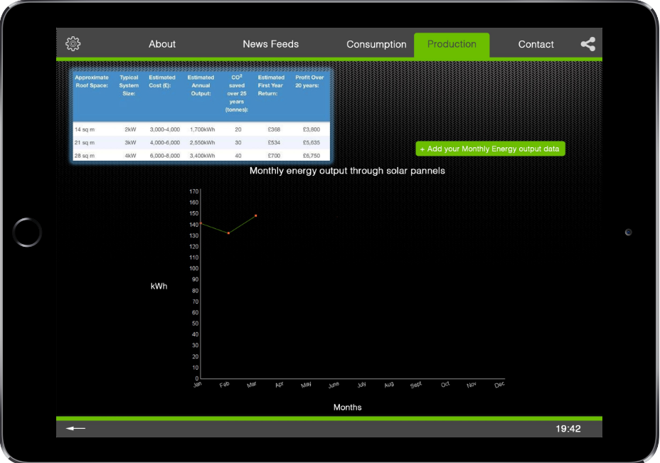
  1. Run the application in Marvel App and introducing the details and functions of the prototype.
  2. Tasks
    Give the users to have a taste of using the app at first hand experience. Ask them to navigate and execute tasks on different sections on the app to see if they can handle the functions and put to real life practise.
  1. Observe their reaction
    Document and capture their instant reaction when navigating the app. Observe and listen to what they say.
  1. Collect general feedback
    Ask them how, why and what they feel worked well or didn’t worked well. Can request more detailed feedback, such as “what should be done here on the page?”, or “what do you wish we had included but didn’t include?”
  1. Conclude with a Debrief
    Set up a set of questions other than those from feedbacks in order to collect more data from the future users to modify the app to be more appealing and user friendly. (e.g How useful did you find this app for the use of the local community?)

We aimed to test what we have done throughout the project, how the prototype works and does it meet the demands of our users in Walker local community. Moreover, Users responses in Testing section it very important  for designing the prototype. During the testing progress, we need to make sure they know how to use our app and solve any confusion by explaining thoroughly.  With positive and negative responses from the users, we can improve the prototype to a better future app for community.

Week 9 – Prototype User Tests

Users reacted to our prototype mostly highly positively, with notice board idea being the most appreciated by all users. Every user put high emphasis on improving feedback system, which would encourage constructive criticism and that there should be a follow-up for feedback from organisations receiving it. Bud and Will agreed that regular newsfeed on social media, especially Facebook, but possibly also twitter should be present to keep younger Walker residents informed and, over time, convince them to use the website more often. Heather insisted on creating an introduction guide for new users. This could be solved by an overlay on the home page, adding new, separate subpage for this or just having the guidance on the main page. Overlay seems to be most effective, as it allows for user interaction, instead of only having passive information somewhere on the page. For all users it was highly important that the whole initiative, including the website will stay in hands of the people, and/or the organisations present in Walker, as it is a matter of distrust to the local council or ‘outsiders’. Unfortunately our idea of having achievements and volunteer points systems  was not well received, user’s reason for this was that it would rather confuse the general public, rather than helping them to be more committed for the local causes, but they did not exclude a possibility of adding it later, as the wide user group gets used to the website.


The user tests went mostly as expected, with an exception of our idea of volunteering points and achievements (a reward for activity system), which wasn’t accepted very enthusiastically by the users. Nevertheless, users ‘rejected’ this system, not because it is bad, wrong, etc., but rather than that it would simply confuse the general public, so they advised implementing the system later on, after most website users get used to it.

User testing with Will and Gerrard were quite informal and pleasant for both sides, as we have already spent significant amount of time talking together before. User test with Heather was also alright, but a little bit more tense, as Heather was very focused on constructive criticism of our prototype and after-test discussion regarding the prototype.

The process was fairly easy to understand for everyone, even for Will, who self-declares himself as ‘techno sceptic’. Heather raised the need for an introductory guide for the website, bearing in mind wider public’s computer literacy levels.

I think the user interviews went very well and that there isn’t much, if anything, that could be changed for better, perhaps maybe organising the user test for all users at the same time and providing each user with a device for testing. Unfortunately this was not possible at the time.

Blog 10: User Tests

Here we are again, nearing the end of the project and this week we have completed two user tests on our app. The two who participated were Peter Kellet and Steve Emsley, Peter works at the university as a senior lecturer in Architecture, he has a strong interest in the environment and sustainability. Steve is formerly a social worker , now retired , he is a resident in Jesmond and has a very keen interest in renewable energy , with a PVC panel installation on his own home now for over 10 years as well as an active member of the local Green Party.

Last week we spoke about what we planned for the user test so that the tests would run smoothly and all went to plan , so this week we will be filling you in on how they went, fingers crossed!

Now to take you through how the user tests with Peter and Steve went, to keep it simple  we will discuss Peter’s answers first with Steve’s following after.

User test with Peter Kellett 14/12/16, Claremont Tower

Peter participated in our first user test, so it felt right to discuss our findings from this first, most importantly to discuss first is how they reacted to the prototype we had created with it being the first time they had ever seen it.

Openly admitted he “wasn’t the most tech savvy person on the planet” however would give the best feedback he could based on what was in front of him, but all things considered he managed to navigate the app successfully without becoming stuck on anything and being very vocal throughout with constant feedback and everything he was doing/interacting with.

Peter provided us with good feedback for us to further develop our prototype with reflections such as:

  • A yearly consumption figure perhaps not such a good idea, and  broken down  two figures, one for summer and the other for winter as consumption patterns would be very different in those two, in addition energy providers typically take quarterly meter readings.
  • Integrating a pop up on the app projecting a well informed hypothetical figure  for the user if that particular user should not have solar panels.

With lots of other feedback on colour schemes, button’s, size’s etc.

We felt as though Peter interacted with the prototype as we expected him too with a good understanding of all the content, a good insight in to the goals we’re trying to achieve. The only thing I would say is that he didn’t really interact with the social media side of things but understood why we had it on our product.

Now, we move onto our user test with Steve who of course we already know from when we back at our research stage so it was good to meet up and show the progress we have made as a group.

User test with Steve Emsley 15/11/16, Jesmond Library

Much like Peter, Steve managed to navigate the prototype well and understood all of the content we had and didn’t have any negative comments towards colour schemes, text, sizes. We did feel as a group that the app wasn’t thoroughly tested by Steve as on the occasion there would be a long pause between using the app to talk about other matters that weren’t part of the interface.

However we did feel like we got some good feedback from Steve towards our project objectives as we had a discussion about fossil fuels and renewable energy. Steve expressed that he understood the link between the two but people should be buying their energy from renewables only companies which isn’t widely publicised on the app itself, so as a group we feel this is something we could push on with for our project and make Jesmond push towards being a renewables only using area with the right information and understanding throughout the app.

The general feedback we got from Steve in regards to the app was that it needed to be more informative with more text, pictures to ensure and enhance that understanding of energy and renewable energy in a simplistic way for everyone to understand.

In Conclusion

We felt that both our user tests went well and that we learnt a lot through the process but there are some things we would change if we was to do it again. I think the main one being that we kept the whole process a little too open which caused it to go off onto other subjects or start conversations that weren’t in regards to the prototype. So add a little more structure with it still being open discussion type feeling.

Now that we have come towards the end of the project as a group we can reflect that in spite of a hesitant start with the understanding of where we envisioned the product we have persevered and we are all pleased with the progress of the project and also the character of the group . We are satisfied with where we have taken this prototype and got the concept of a dashboard not just for the individual homeowner but also one that resonates at community level off the ground! We are happy to develop this concept through further with the client and have expressed this to them!

Blog 9: User Test Preparation

Firstly, before the test we need to prepare as a group and this is how we have managed that.

It may seem obvious but we made sure to begin with that the prototype on marvel was complete and everything was in working order ready for the tests.

We assigned the roles to team members for the day of the test and agreed that our schedule would allow for holistic input in addition to the Interviewer’s schedule from individual group members to the user if they thought it were necessary to do so. Each team member was asked to familiarise themselves with the schedule first.

An important part of the user test is location of the test and also creating an interview schedule to keep us on track so that during we remain on topic for the user and leave ample time for useful feedback.

Whilst one of the user tests is in an office on university campus the second user test will be taking place in a public library in Jesmond. As previously mentioned we keep it a very open experience without overly instructing the user what to do on the app, this way they are able to navigate the app freely and instinctively.

Google Developer’s usability testing video among others on youtube were able to guide us to make a 5 step process for the user interview ,as a schedule this will consist of: 1. A friendly welcome 2. Context and user background 3. Introduction to the prototype 4. User Tasks and 5. Debrief/ Final Feedback.

Examples of our format could include:

  1. Setting the tone to the user and reassuring them that “We aren’t testing you, we’re just testing the prototype” This will make them feel at ease right away.
  2. Ask the user a bit about themselves and why they are interested in the project/product.
  3. Introduce the app and the activity that we have planned for them to try. Play down the app a bit and explain it will be developed further.
  4. Set the user a task to do on the app and see if they can remember from memory what to do/where to go. Continue to prompt questions such as like, how, why, what do you feel worked well/didn’t work well. Observe what they are doing whilst using the app. Keep asking them to think aloud throughout to ensure the feedback is good quality.
  5. Gather general feedback of what they thought of the product and finally thank them for the time!

We now go again for the user tests, thank you.

Air quality group week 9

For our user test, we have prototype of our air quality app and bus stop. The app is done by Marvel and bus stop is showed by photoshop. As there is no enough time for us to finish photoshop, so we will just screenshot some pages of bus stop to show the important parts such as information and interaction page. It is just user test so we may still play our app at laptop although it is an phone app. We will do our user test at university library downstairs. We will ask our users some questions about what do they think about air quality firstly or have they used something like this before, then we will show him our app and users can use this app by himself. The main reason for user test is to test what we have done, how it works, does it meet demands of users and so on. The goal of our group is to increase the awareness of public about air quality and pollution and help those who want to know more to understand data more easily. So out “foot” page will be kept focus on and tested as the real-time air quality map is designed for our goal which can also shows the safe area (less-polluted area). From the interview before, we knew that traffic is another big problem both the commuters and buses. Walk should be encouraged so the effectiveness of our foot page may affect people’s willingness to walk and use our app. User responses are really important for our design. About our app, if user do not know how to use our app or he feel confused about why we have this page, we can explain to him and make some improvements.

Blog 8: Jesmond Energy Production Platform Prototyping

This week we have been working towards starting making a prototype for our project collating all our data and refining all the content we want to include in our product and with this session we were aiming to see how we use all this within our prototype to show Tony.

We felt the session was pretty clear on what we needed to understand when working on the prototype and that was the fidelity of our prototype and how we should be going about using this to our benefit and not hindering us when it comes to the user tests.

When prototyping depending on the product/idea you’re trying to get across to the consumer is which type of fidelity you should using whether it’s low or high.

We were told that it is sometimes better off using low fidelity prototyping rather than high, due to it being a prototype and will probably be edited, scrapped etc and then you don’t waste high sums of money on the prototype stage. Low fidelity can also sometimes cover the feasibility of it as well.

We feel as our project is based on renewable energy in Jesmond, we felt that the best subject on our app to prototype is this section as it would be the most interacted part with on our app, therefore is the most important to make sure is correct for the users not only with the user ability of this particular section that also all the content is easily accessible and understandable.

On our prototype we’re using Photoshop to create images which we show through the marvel app and edit them on there so it works like an app on the iPad when pressing on the screen for the hyperlinks so that the active parts of the prototype work like they would as if they were using them on a tablet such as the iPad we will be using for our user tests.

As a group we all decided to go with in between low and high fidelity and go in the middle so you can see the real potential with our prototype without it costing much money. We class our fidelity in the middle because of the software we are using to make and show our prototype on with using Photoshop, marvel and an showing it on an Ipad like an app and not for example on low fidelity which would be classed as low fidelity.

You will be able to see from these images how we first started prototyping with and have then progressed in on to something more in depth and better quality which we will take on to use for the user tests.

  1. When we first started prototyping with paper (We have progressed our thoughts into a more in depth conclusion)

paper-1
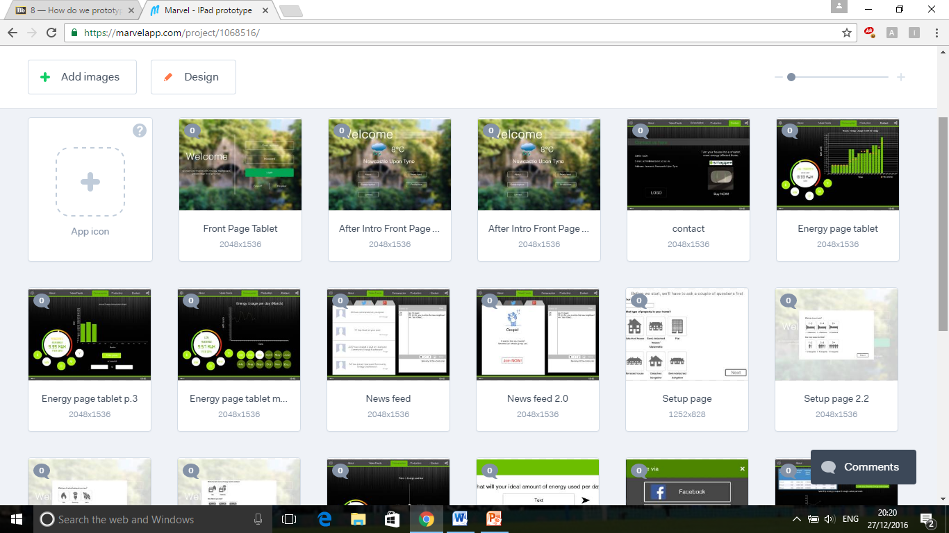
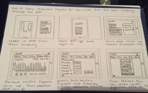
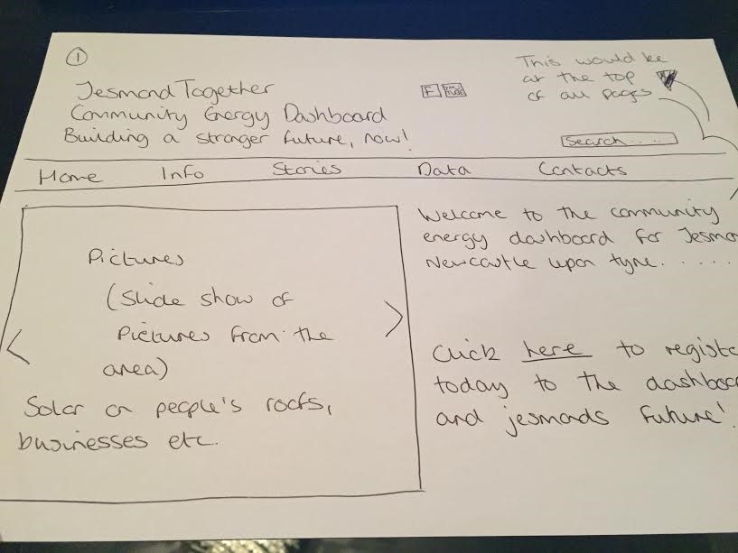
2. Multiple different pages we’ve all linked together through marvel.

thumbs


3. This is our prototype up to date and ready to be user tested in the coming days.

33

Blog 7 :Our approach to prototyping

A prototype is typically a physical manifestation of ideas or concepts and its form can range from a rough to finished take on the proposed end result(Stappers,2014). In the case of our product, we wish to test this with the user in week 10. Knapp (2016) suggests that a prototype mindset which follows 4 principles are key to the success of the prototype and feedback it evokes altogether. A “goldilocks-quality prototype” , that appears 90% real is recommended in order to gain the most from the feedback phase, whilst ultimately remaining time efficient.

knapp


Knapp et al. 2016 “Sprint : how to solve big problems and test new ideas in just five days


In the case of our Community Energy Dashboard a set of facades that are real enough to test and temporarily ready for simulation in the user test is our ideal approach , however we would hope they still equally evoke honest feedback results.

“If the quality is too low people won’t believe the prototype is a real product, if the quality is too high , you’ll be working all night and you won’t finish”(Knapp,2016) .It is also highly likely that the longer you spend on working on something the more attached you will become and the less likely you will take negative results to heart.

We have chosen marvel software to develop the facades of our dashboard application in addition to this a group member allocated the role of asset collector will source for the 2 makers/designers some data and empirical looking visualisations for the dashboard itself, which will require basic use of adobe photoshop 10 to weald these data based visuals such as gauges and graphs together.

The information display in particular regards to consumption and production is integral to our concept, however also is the role in promoting the user to think about their collective neighbourhood energy consumption, thus engaging them and creating a “buzz” to think about these issues and share their thoughts with their local community is also key, so the team is willing to invest time into providing a friendly space for thought and reaction to these topics, also equally important is the tone we deliver to the user.

Blog 6: Storyboarding our product

Before we jumped straight ahead into prototyping, the team had reservations about the number of potential conflicting concepts we had. Therefore, we approached the means of storyboarding to set the design in context , which would help us to visualise the app itself and clarify the key function we would like to include for our prototype.

Plot

Set: Friday night

After a long working week, our main character, Mr. X went back home and planned to have a chill out night. He then took out his iPad, went on Facebook and starting to browse his wall.

Suddenly, a notification from Jesmond Community Energy Dashboard pops up, saying ‘your estimated monthly bill for the end of the month: £124’. Mr. X was shocked, he didn’t expect to pay that much, since he normally pays £50-70 for a month.

He then went on the app, checked on the energy usage and found out the main source of energy usage was the radiator in the living room, which he always forget to turn it off when he doesn’t need it.

He’d like to share this experience with his family and friends, warning them not to leave any electric applicant on when not using it.

Luckily, there is a share button in the app, making it a convenient way for Mr. X to share it to his friends and family.

storybvoard-1

Unfortunately, this was the storyboard specifically for the app only. There will be some alteration so that there’s an influence to install a solar panel for their house, aiming specifically to the Jesmond Community. However, we’ve managed to determine that there are several key aspects that we would like to include in our dashboard prototype.

  1. Monthly Energy Consumption (i.e. the graph that shows how much energy used for the month)
  2. Estimated Monthly Bill (what all users care about the most)
  3. Energy Consumption Pattern of user
  4. Graph that shows the amount of energy used for the past months (Archives)
  5. Push Notification (smartphones and tablets specifically)
  6. Social Media Buttons for easy shares
  7. Of course, some extra minor widgets to add a little spice to the app.


However, after feedback on our first storyboard we as a group decided to alter our storyboard and we now have a new story based on the most important feature of our project which is renewable energy.

storyboard2-feedback


The concept is very much the same as previous just slight alterations.

They are as follow:

Setting is now end of July and the new production figures have come through from the company, so he/she goes signs into the app, goes onto the production page where last month’s figures for June are present, they then select the add new button which then takes them onto another page where they can enter the new data, once that has been done they can then submit the new data which updates on their production stats. Then finally they share their monthly figures with everyone on the JEPP app to show how much energy they’ve made for the month.

We have now finished with the storyboarding and are now moving on to start thinking about making the prototype, watch this space!

Week 10- User test feedback

This week we were really excited to showcase our prototype to our user clients. The first user test took place on the 8th December at the planning studios in Claremont. We received a lot of critical feedback that we hope to implement into our prototype.  This was with the Youth Council who we can proudly quote “would play with the app” after a few refinements. It’s really eye opening to have these informal conversations about the app as the youth council have reasonable and well thought ideas to further our app.

 plan-a-lot-2

These include the rating systems for our leader board. We have a feedback box where users can state what they like or dislike about the design. However the youth council suggested we make it so other users can read each other comments to generate an interactive conversation between users. Another idea that came up was once the user had completed the design of the development they would then be able to place it into a geolocation. Such as placing the design in google earth or maps to show how their design would look in context. This would make their designs feel more personal and gives them a visual to see how their design would fit in and interact with the surroundings.

The second user test took place at the North Tyneside Council. This gave us an insight to how the planners and developers would use the app to open up conversations between them and the youth. We learnt that planners go into schools to give talks about planning to raise an awareness of planning issues. We questioned whether our app could be used for the youth to help provide an input in actual planning applications but were sadly informed that it wasn’t feasible. However by introducing our app Plan-A-Lot to the school children it allows both parties to have more open conversations and provides a more interactive experience.  We hope it provides the missing connection between the youth, planners and developers.

From the user tests we gained quite a lot of advice and suggestions which we plan to take on board. Some will be ideas for future development of the app and other ideas will be idea’s we can incorporate now.

Air Quality Group – Week 10 User Test Feedback

User test: Peter Macdonald

Presentation of the bus stop:

Concerning the Bus stop display, Peter is liked the concept and the design but found there was too much data on some of the screens when looking at them. He suggested to put more consequences of pollution on health on the display, like on the screen have the “data” related of asthma (This is the impact of this level of pollution). The data on the impacts can be found on the website of SPACE for Gosforth, exactly in the blue house link.

He said he can provide us with some catchy phrases for us concerning the impact of air pollution.

Test of the application:

Concerning the app, Peter found all of our pages without difficulties. He navigated easily in the app, find what he wanted to show us and ask questions. He liked the app, but there is a text in the part for people by foot which it maybe too much “violent” or “hard”. He asked us to send to him this picture to ask to other people.

After the test he put forward the proposition of app user having a profile to have a more personalised app, to record the history or the users location. After one month, six month, twelve month for example, put the effect of the real pollution on the health corresponding of the historic of locations because the pollution on health is a long term effect.

User test: Peter Smith

Presentation of the bus stop:

Peter also like the design and concepts of the bus stop display and found it easy to understand what was being shown to him. However during the test we found that what was being displayed on the bus stop display was not enough to concern him with air pollution. Like the other Peter he would of liked the health impacts of air pollution to be shown.

Test of the application:

When using the app Peter was able to navigate to all the pages and functions with relative ease. He liked the concept of the map but said it would not deter him from going to the high street at times of high air pollution as he has to buy food for himself and others.

Additional Information:

After the test he expressed concerns about the inclusion of the elderly population in what we are proposing. He said despite being in that demographic others were not as tech-savvy as himself. He then suggested having something like leaflet for people houses in a similar design detailing what is being done and recent air pollution data. This was an interesting proposition as Duncan Young suggested something very similar back at the user interviews stage.