Air Quality Group – Week 8 Prototyping

From this week’s lecture about prototyping we took away as a group that prototyping was about making an example about what your product could be. It also demonstrated how this could be achieved use different methods with varying levels of fidelity.

The methods we considered to prototype our app was Marvel, PowerPoint or drawings on paper. To prototype the bus stop display we considered photoshoping the screens that could be displayed on the bus stop or making a scaled mock-up of the bus stop

We eventually decided to use marvel to prototype our app and Photoshop to prototype our bus stop display. For the app prototype we choose Marvel as it would allow to provide a high level of fidelity in the navigational elements of our app while only showing basic screen designs for the more complex elements of our app such as the AR. For the bus stop we decided just to Photoshop what would be displayed on the screens of the bus stop, this is because it would show the most important element of our design (the air pollution screens displayed on the bus stop) and because we did not think it was feasible to make a scaled mock up in our time frame. In order to make the prototypes the group split into two with each pair focusing on one prototype.

Below are some screenshots showing the outcomes of our prototyping.

15577618_10209590382054687_367732998_n 15409562_10209452881217252_1717519051_o

Week 9 – User test (Re-do)

This week we continued working on our prototype on Marvel. The prototype would give us a chance to see how the users interacted with the app and help us see what we might have missed. They would test this out on the 8th and 9th of December. In the lecture, we watched ‘The five act interview’ by Sprint, which showed us how to set up the user testing. The five steps are:

  1. Friendly welcome
  2. Context questions
  3. Introduce the prototype
  4. Tasks
  5. Quick debrief

The context questions would be similar to what we previously asked at our client meetings which informed us on the direction we needed to go in for our prototype. We decided on creating an app called Plan A Lot where the users would be able to develop communities with different criteria for each level. As the levels increase so would the difficulty by providing more components to drag and other realistic limitations. We hope this app would allow us to open conversations between planners and the youth.

One issue we had with producing the prototype was that we would not be able to drag components onto the 3D plot to create the community. This was a major part of the app and had to look at other means of providing this feature. We were thinking of using either Microsoft PowerPoint or Keynotes to have a demo of the game. However we thought the users would be confused if were to switch from marvel to another software. We decided to print out a plot and get the users to use paper cut outs to drag on to the site, to replicate how it would work in the app. We would use Marvel to show our vision of the app.

We have two user tests. The first will be with the youth council and will be in the planning studios. The youth council will be familiar with this area as this is where we previously held our user interviews. If it was up to us we would have chosen to do it at a school so they would feel comfortable. The second interview would be with Sean Gallagher who works for Capita at North Tyneside Council. For this interview we will be heading to the planning office at North Tyneside which is what we would have chosen as an ideal setting. We decided that two people would talk while the other three would observe.  On the second interview one of our members would not be present. Therefore we would have another member speaking on Friday.

We want to keep the user tests informal and just let the conversation flow naturally. We don’t have many questions to ask at the moment. However we hope that user tests will point out things we would have overlooked. There are still small details that we’re not sure of and we hope to get critical feedback to refine our prototype and concept.

Week 9 – User testing

This week we continued working on our prototype on marvel. The prototype would give us a chance to see how the users interacted with the app. They would test this out on the 8th and 9th of December. In the lecture we watched ‘The five act interview’ by Sprint which showed us how to set up the user testing. The five steps are:

  1. Friendly welcome
  2. Context questions
  3. Introduce the prototype
  4. Tasks
  5. Quick debrief

From this we learnt that we cannot just simply ask them to test out the prototype immediately. Instead, we should ask questions in context such as; have they used any apps related to planning? How they felt about them? Although we already asked these questions at the User Interview at the beginning of the module.

Reinforced throughout the interview was to reassure the user. The user should not feel, as though they are at an interview as, this would lead them to believe there is a right answer. We want the user to think aloud to give us a better understanding of how usable the app is.

We realised that without a dragging feature on marvel the prototype would not help us assess how viable the app would be, how the client would interact with the app without us present. We decided the users would test it out on keynotes with the marvel prototype as a supporting model to show what we envision the app to look like.

During the seminar, we assigned roles during the user interviews. We would have three observers and two speakers. We will be showing the prototype to five people, which means 80% of any faults of our app, would be flagged up. Any other details would be minor details that would not affect the function of the app. Hopefully we would be able to get valuable information from the user testing.


Week 8 – Introducing Prototyping

To follow on from the storyboard, we planned out how we wanted our product to be accessed and seen by the potential users. The next step for us was to plan out our iPad app and work out the display interface, how we wanted to present our idea and capture the audiences attention. We all attended the lecture where prototyping was introduced to the class and as a group we looked at the concept of prototyping, how it would be beneficial and further our work. It was discussed how we could use prototyping and we were shown examples, including ‘Marvel’, a software that would allow us to capture the interface step by step and showcase how we want our application to work.

In the following seminar we set up the Marvel design and started to add the frames to our project. We were slightly stuck with inspiration for how it would look, so we agreed to each go away over the weekend and mock up some of our own designs of how we would want the screen to look and what would be included. Individually, we had to think about what would appeal to the users as our project is aimed at young people, so it had to be kept quite simple and make the application interactive and fun to use. When we came together next, our designs were all the same, in terms of the features we wanted to include and where we wanted the symbols and icons to be placed.

It was a successful week in terms of keeping our work on track and moving forward with our project. The team is working really well together and each of us are having our ideas implemented into the product. The next step for us is to complete the prototype on Marvel and have it finished in time for our user meetings where we will be undertaking user testing.

Week 5: Concept ideas sketch

Our original idea for the project was to create a website – online platform for volunteer groups and wider  community in Walker to communicate, share ideas, information and opportunities. While this is still main focal point of our design, during interviews we have noticed that many people in Walker have difficulties regarding computer literacy and/or accessibility to computers or smartphones. To overcome this difficulty we assumed we need to promote our website as well as various courses in computer literacy offered by volunteering organisations across walker, but as well creating a paper version of a ‘newsletter’ – something like yellow pages. This will help to reach to the elderly, and to people who would not be keep on learning how to use a computer. The drawback of printed newsletter is it’s cost, so to cover for it, we believe it would be a good idea to ask local businesses to pay a small monthly fee, so that we can run the website and the newsletter, and for that the businesses could advertise themselves to the local community.

Other alternative that we propose to help to reach out to as many Walker residents as possible is to mount a public interactive displays, where people could gain information what events, activities and opportunities are available for them and sign up for them. Public displays could be placed in libraries, community centres, etc. They would also be provided with easy to read and follow infographics how to use them, so the people won’t be discouraged to use them. Other discussed alternative was a smartphone application, something like a simplified version of the website, but we have agreed that since Walker is facing economic hardships and not many people do have a smartphone, combined with low computer literacy skills it won’t be too useful for the community, at least during first few years of the project.

To summarise, the main point of the program will be the website, as it can be easily modified to suit the needs of the users, and as well as it has relatively low cost of running. It could also help to create sense of community without a need of leaving your home. To reach to computer illiterate people we aim to advertise computer skills training sessions and as well as hand out a monthly newsletter through the mail door. This way everyone in Walker will be informed about opportunities, events and activities, while the cost will most likely be covered from advertisements from local businesses. Public interactive displays can be a helpful add-on to the website for the people who lack a computer in their homes. We estimate that a smartphone application would not be used to the extent it will be worth creating it on so early stage of the project.

Walker Creative Neighbourhood Week 3: User Interviews

Reflection and Summary of the User Interviews

We have arranged two Users Interviews in Walker on 21st and 26th October respectively. On our first interview, we have met Alice McCreadie, project development worker in Worker’s Educational Association and the other two clients Will Benson, manager from Kids Kabin, a charity for children (primary school students) and Gerard New from Tyneside Outdoors, an outdoor youth work organisation which provides young people skills and opportunities. They encourage people to learn and build. The WEA project in Northumbria and Building Future East helps people who want to start a new business and act as a community directory in sharing of resources. On the second interview, we have met Bud Russell and Liz Coates from Worhoose, Francesca Maddison from Building Futures East.

They stated that usually University students, Local Residents, International volunteers as well as parents of the children and youngsters who benefits from the organisations get involved in volunteering, some ex young-groups participants came back as volunteers but drop in and out occasionally. Students come more often but some may come for placements and experiences. They picture the motivation and the way they wanted to volunteer. However, most of the people only volunteer when they know how to deal with the project. Volunteers may lack of confidence when they experience barriers such as application forms. They are afraid of failure. Volunteers may  participate in it because their families and friends have received the services before and they have had loyal to it. Parents who wanted to volunteer but haven’t been able to commit and not consistent. Problems with housing and children as well as financial stuff, utilities compulsory and debt. Students are more free and available. But the inconsistency of young person is a problem. They don’t based in the same place and maybe have issue to deal with and cannot arrive on time.

Our aim is to motivate and encourage more people to volunteer in the local area. Clients think that the best way to inspire and develop potential volunteers themselves is illustrating to them the benefits of the volunteering. Build up the strong of pride and unity in Walker. They often said that  they want to bring the community together but none of them execute the idea. By offering more opportunities for people to share their resources, such as funds, can help achieving the social needs. People will be attracted to get on volunteering if they are sure that they can have reward and opportunities. However volunteers may come only for reward, such as for CV purpose.

In order to promote our initiative, setting up a webpage and encourage everyone to be on that, increase residents motivation to click on the link, also Get to advertise the organisation and their base through giving out handbooks. Most kids have phone nowadays. According to Will, he will use website for research but not Facebook. Most parents use Facebook but they don’t allow young people to use . School only admit Facebook for age 13+. Sometimes social media might not be an ideal platform for promotion. As we would like to encourage volunteers in a digital way, Internet access is more important as wifi limited throughout the area. The Pottery bank got a suite of computer to offer. The Local mapping idea with tag and present all the barriers, avoid hidden information will help people to know the base for volunteering, so to persuade them to volunteer easily. Other than network, handbook giving to door not run by company but well written might work. It has games, section with local communities group put up their news, spreading their group and organisation around the area. Finding help from local people through the handbook instead of from web found people from elsewhere. It also creates local identity, encourage people to start looking at it. Creating the handbook can be a social enterprising, strengthening social cohesion and awareness of what surround you.

In order to run the project smoothly, we need to encourage local businesses for social reinvestment. They have political investment, they want to invest in a project with good outcome and 100% productive, well prepared, best quality and best time. If these are all possible they will continue to support. We have also concerned about the role of local authorities, the clients suggest that they should have participation but they shouldn’t have a role in it. The initiative is acting for the community’s social health, the authorities should have responsibility to buy and share them as local residents don’t have money and expertise to do it.

Other than our proposed initiative, Building Future East has an education course for the benefit of young people in the area, formal education allows higher education for adult to get back into job.

In Conclusion, our clients looking towards the summer putting together a programme for a family to go in the website and the handbook. Summer holiday planner including activities for different ages, different opportunities for different days. Therefore, volunteers and participants can know whats coming on.
Air Quality Group – Week 6 Storyboard


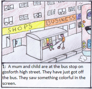
storyboard-box-1

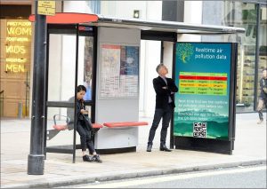
Gosforth high street is a quiet busy street and there are many business on the street. And 96 buses drive through the street everyday which is uncontrolled and air-polluted. So every passenger and pedestrian can see this screen when they walk pass it.

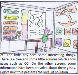
storyboard-box-2

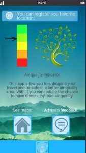
On the right hand side, The tree is our logo and can change depends on the air pollution that can be seen easily. Our whole colors is red, green and yellow (traffic lights color) as it is markedness and attractive. On the center screen, our information is on the left part of whole screen and will not effect bus routes information.

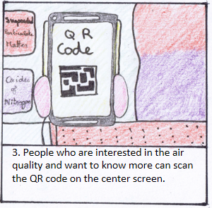
storyboard-box-3

When people scan the code, they can have a link to download our app on apple app store and google play store.

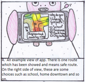
storyboard-box-4

safe route means less-polluted route. Choices can be chosen by ticking the box. This route is planned for people who walking through Gosforth. With healthier routes, more people will choose to walk and this is what we are looking forward and encourage. It may be difficult to use this for car users as they may not want to drive another route as they are not familiar with that and it sometimes has to take more time. If they have to buy something, most of business are on the high street and they do not have other choices. Walk routes are more flexible and easier for people (parents with kids to school, people want to run or jog, people who want to take a walk after dinner) to choose.

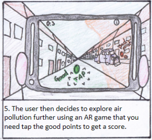
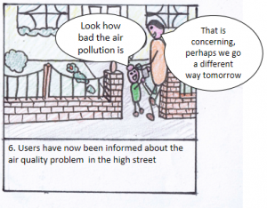
storyboard-box-5storyboard-box-6

We are also considering adding a forum / comment feature on the app so users can get involved in a discussion about how to tackle the air pollution now they are informed.

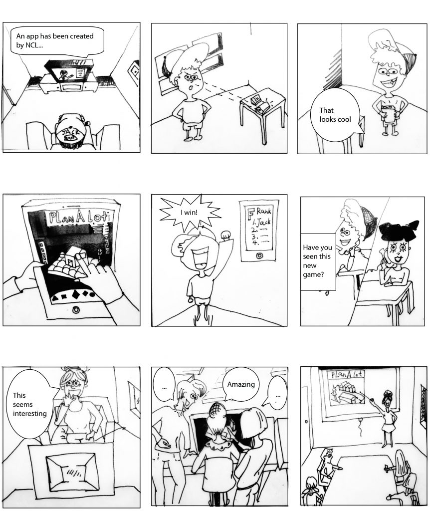
Plan A Lot. Planning a lot at a time.

Cogito ergo sum.

Just as we started to go deeper and refine our offerings, we stepped back. We thought.

Why did we do it? Who would it help? What made it deserved to exist?

We simplified. We started over. We’ve made it better.

And this is it.
Storyboard

Walkers: Designing Storyboards (week 6)

Week 6

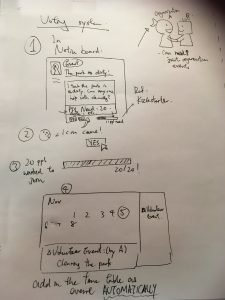
While we have settled on the function of the webpage, we will be focusing to demonstrate the voting system and the volunteer point system in the storyboard.

photo-20-11-2016-01-51-40


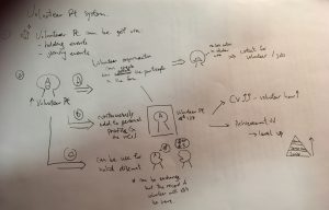
The voting system is a function for basic members to create their event on their own via Notice board. When they choose the ‘event’ categories in the notice board, they may be able to uphold their own event concerning no matter what. For example, in the above picture, a resident may be unsatisfied with a dirty park. He may send a post recruiting volunteers to clean it up. By inserting a number of minimum participants need (e.g. 20 people need here), the event will be created automatically on the calendar when 20 interested participates click ‘yes’ in the post. This save works in administering and can allow people to have a first try in participating in volunteering without processing a lot of registering process that gives pressure on them.


photo-20-11-2016-17-40-36

Another storyboard showing is one demonstrating how the volunteer point system works.

Volunteer points can be earned through holding and participating events. We try to make the online points to have an actual benefit in real life so as to encourage the community to involve in it. There are three major ways to use it:

  1. It can act as a counter for organization to know how active a participate in the community. It somehow works as an online cv, but more informal one to show some organization in the site who are potential volunteers or employee.
  2. When the points continuously add on, participates may unlock achievement and level up as higher level members to have higher authority (like admin) to edit post etc. Achievement may include exchanging for volunteer hours on CV in certain rate. (1 :1 may do also).
  3. By cooperating with business we can offer discounts through exchange points. (may involve another unit for exchange since the volunteer hours should not be gone when you purchase anything)

Both story boards are just showing the basic concept and may not be complete and thorough enough. We will continue to try editing for the final output.

Blog 4 – Energy Dashboard

After reviewing on our interviews with Tony and Steve, we have evaluated our goals again for initial development on our designs. We had ‘to support residents, organisations and businesses in Jesmond in adopting  a more energy efficient approach  to their current consumption patterns.’ as our initial ultimate goal, and this does not change.

With the details of what the client want in the energy dashboard we are going to developed, we tried to do some more in depth research on different dashboards as examples for us to get an idea on our initial design. Each of us brought in an example of an energy dashboard we found on the internet and indicate what is the pros and cons of every single detail of it, hoping to pull all the best things about each dashboard together to create the most suitable one for Jesmond. There were examples from America, Lincoln University and other companies, each has a different feature depending on the building it serves (eg. university campus, accommodation, commercial building etc)

However, we would still need different datas from the stakeholders in Jesmond in the future for further development. We would also need to decide on creating an app or a webpage for the Jesmond residents based on which one we think would allow more people to look at it constantly and conveniently.