7) TRECC: prototyping.

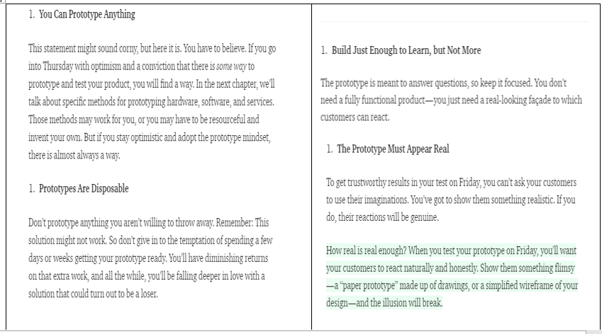
This week we learnt the importance of prototyping, and the implications it has on our own project (DigiVox). It was interesting to learn and consider that a ‘prototype is a manifestation of a design that allows stakeholders to interact with it and to explore its suitability’. This manifestation has directed our design focus, a goal to create an efficient mobile application to improve community outreach between developers and residents and ultimately, our client’s needs.

Considering our story board, the area we want to prototype is the use of the app. With this in mind, our group has worked on designing and creating are first prototype this week. It was clear the process of a user using the app interface is the most important part of the storyboard to prototype because it is a radical innovation that has not been done before, so testing will be integral to meeting our goal. By doing this we can refine the application, and hopefully developing an ideal way to tackle community outreach between developers and the community.

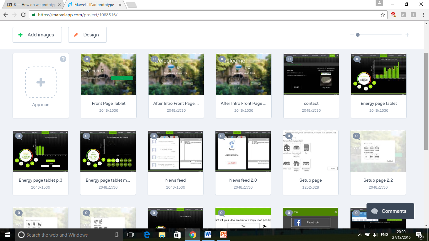
Moreover, from this week’s lecture it was interesting to understand the broad scope to prototyping, especially with our own prototyping getting underway. With relevance to our own project, it was clear that our prototype has a fairly high level of fidelity. We knew early on that a mobile app was the way to answer our client’s needs, so after a only small amount of research by using other mobile apps, and a few sketches we were ready to create a digital version. By using MarvelApp to formulate our application we have been able to get as close to a final product as possible. This means we can test how easy the final interface is to use. The advantage to this is that we have the opportunity to get our stakeholders involved, and gain valuable feedback.

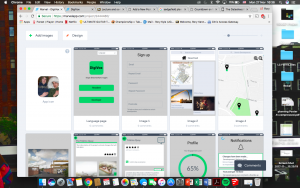
First use of MarvelApp
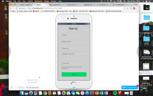
Sign Up page

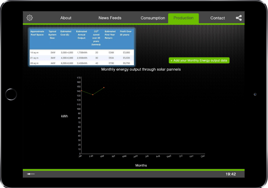
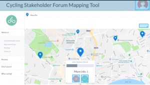
Refined and Detailed version of our prototype (1)

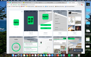
Refined and Detailed version of our prototype (2)

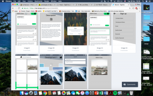
The first use of MarvelApp was to get an understand to how the software works and ultimately organising the basics of our app.  We then added more detail in aesthetics and in the functionality of the app. By doing this there is more and more tweaking done to hopefully make the final product.

8) We love Bikes Prototyping and its challenges

Lecture​ ​8​ ​about​ ​prototyping​ ​was​ ​quite​ ​helpful​ ​because​ ​we​ ​saw​ ​why​ ​we​ ​need​ ​to​ ​do​ ​a prototype​ ​of​ ​our​ ​project​ ​and​ ​what​ ​different​ ​ways​ ​we​ ​could​ ​do​ ​it. Indeed,​ ​this​ ​activity​ ​must​ ​be​ ​taken​ ​seriously​ ​as,​ ​first,​ ​it​ ​allows​ ​us​ ​to​ ​see​ ​if​ ​this​ ​project can​ ​easily​ ​work​ ​when​ ​we​ ​trying​ ​to​ ​put​ ​it​ ​in​ ​a​ ​prototype​ ​and​ ​therefore​ ​meets​ ​our desired​ ​objectives​ ​for​ ​our​ ​project.​ ​Secondly,​ ​it​ ​is​ ​an​ ​interactive​ ​way​ ​to​ ​show​ ​how​ ​far we​ ​are​ ​in​ ​our​ ​work​ ​to​ ​our​ ​stakeholders​ ​and​ ​let​ ​them​ ​have​ ​their​ ​own​ ​point​ ​of​ ​view​ ​on the​ ​suitability​ ​of​ ​it.​ ​This​ ​interaction​ ​also​ ​is​ ​a​ ​test​ ​of​ ​our​ ​overall​ ​design​ ​of​ ​our​ ​prototype to​ ​see​ ​how​ ​easy​ ​it​ ​is​ ​for​ ​our​ ​stakeholders​ ​to​ ​use.​ ​This​ ​use​ ​test​ ​is​ ​important​ ​as​ ​before releasing​ ​the​ ​final​ ​version​ ​we​ ​want​ ​to​ ​be​ ​sure​ ​that​ ​the​ ​design​ ​is​ ​easy​ ​to​ ​navigate​ ​and not​ ​confusing​ ​for​ ​the​ ​end​ ​user.

Then,​ ​this​ ​session​ ​put​ ​the​ ​light​ ​on​ ​the​ ​concept​ ​of​ ​the​ ​prototype’s​ ​fidelity​ ​and​ ​more precisely​ ​the​ ​difference​ ​between​ ​the​ ​low​ ​fidelity​ ​and​ ​the​ ​high​ ​fidelity.​ ​Our​ ​focus​ ​on the​ ​high​ ​fidelity​ ​application​ ​is​ ​the​ ​progress​ ​bar​ ​which​ ​will​ ​show​ ​the​ ​accountability​ ​of the​ ​forum/council/webpage​ ​and​ ​it​ ​will​ ​be​ ​easy​ ​for​ ​the​ ​user​ ​to​ ​see​ ​at​ ​what​ ​stage​ ​of​ ​the progress​ ​the​ ​issue​ ​is​ ​at.​ ​To​ ​make​ ​it​ ​easier​ ​for​ ​the​ ​user​ ​to​ ​understand​ ​the​ ​different parts​ ​of​ ​the​ ​progress​ ​there​ ​will​ ​be​ ​different​ ​pages​ ​explaining​ ​the​ ​steps​ ​and​ ​allowing users​ ​to​ ​comment​ ​on​ ​each​ ​separate​ ​step​ ​to​ ​increase​ ​levels​ ​of​ ​accountability. Information​ ​that​ ​the​ ​council/forum​ ​can​ ​add​ ​to​ ​the​ ​different​ ​steps​ ​of​ ​the​ ​process​ ​and the​ ​users​ ​will​ ​also​ ​be​ ​able​ ​to​ ​add​ ​and​ ​read​ ​comments​ ​regarding​ ​the​ ​issue​ ​and​ ​the process.

In​ ​our​ ​opinion​ ​the​ ​hardest​ ​part​ ​to​ ​overcome​ ​during​ ​the​ ​prototyping​ ​stage​ ​will​ ​be creating​ ​an​ ​interactive​ ​and​ ​interesting​ ​way​ ​to​ ​show​ ​off​ ​the​ ​different​ ​reported​ ​issues and​ ​their​ ​progress.​ ​The​ ​most​ ​challenging​ ​part​ ​of​ ​this​ ​is​ ​designing​ ​the​ ​prototype​ ​to display​ ​all​ ​this​ ​information​ ​and​ ​the​ ​accountability​ ​of​ ​the​ ​council​ ​whilst​ ​still​ ​being​ ​easy for​ ​the​ ​end​ ​user​ ​to​ ​understand.​ ​We​ ​are​ ​attempting​ ​to​ ​overcome​ ​this​ ​challenge​ ​by​ ​not overloading​ ​the​ ​user​ ​with​ ​information​ ​they​ ​would​ ​have​ ​to​ ​click​ ​on​ ​a​ ​pin​ ​to​ ​reveal​ ​its information​ ​to​ ​avoid​ ​the​ ​screen​ ​from​ ​appearing​ ​cluttered.​ ​We​ ​will​ ​also​ ​use​ ​a​ ​colour scheme​ ​on​ ​the​ ​pins​ ​to​ ​illustrate​ ​the​ ​different​ ​stages​ ​of​ ​each​ ​project​ ​in​ ​a​ ​simplistic approach,​ ​with​ ​green​ ​showing​ ​the​ ​project​ ​being​ ​completed,​ ​orange​ ​illustrates​ ​the project​ ​is​ ​in​ ​progress​ ​and​ ​red​ ​means​ ​the​ ​projected​ ​hasn’t​ ​yet​ ​been​ ​started.

7) We Love Bikes : Prototype activities and setting goals

With our last step of the storyboard, we wanted to show how easy it will be for everyone to give their opinion or to raise issues about cycling through the project we are working on. For the prototype demonstrations, we will try to achieve the same goal and make it as simple as possible to use the interactive map or to log in as a member of the forum in order to comment on each individual step of the process.

In order to test this prototype we are going to send invites to two of our stakeholders, Heather Evans and Mark Nelson. During the initial interview of Heather she seemed to be reluctant about bringing new technologies into the forum and didn’t want any changes, so this prototyping session could be a good way to try to change her mind with something easy to understand whilst also being respectful to her role in the forum.

Our stakeholders will be led through our platform and will be shown how we have structured in the minute of the forum and other interactive features. The Prototype will be a replica of our website that contains all the areas we plan to have on our final product. the user will be able to navigate these as they would a website. our first steps will be to design the first page where the idea behind our website is explained and also a section which contains the information on how to use the site to help the user navigate the site.

After that we arrive on the main page where the interactive map will be situated  in the center with all pins representing the issues marked, there will be a menu at its left and a “login section” in the top right corner, just like the picture below:

Through this main page we can access all the features so we will be able to clearly show  our stakeholders how to easily navigate the site including; creating a profile, how to access the notes and minutes of meetings and how to raise an issue on the map. the main section of our website will be the progress bar which show how the council is dealing with this problem and shows feedback from the users from the site, when the issue is resolved there will be a section where people can give their feedback on how the process went and an opportunity to add constructive criticism to the council

To build a convincing prototype, we are thinking about using the website Marvelapp. This tool is quite helpful for anyone who wants to create a “demo” of his project from pictures, draws or sketches. In this way, we can put together all we did as an interactive process and create a convincing prototype for our issues.

Week 7, NUDC: Prototype Planning

Hello again,

This week we started planning out our prototype. We aim to have a somewhat high fidelity design which should be able to be used in an interactive way, for this we plan on using the online tool ‘Invision’. We’ve reached out to our stakeholders and booked a meeting with them so they will have the opportunity to test our design first hand. We hope to discover if our design has an easy to understand and simple to use interface, is enticing and time efficient, relates information about the Streets for People program and the planned changes in a useful way and, lastly, collects feedback appropriately.

To do this we need to create pictures, or so called slides, depicting how the interface should look like. For example we need a welcome screen, a map over Jesmond showing where the locations are, a location slide with information and ways of feedback, a slide showing previous comments, and an ending slide providing the sticker. All of these will then be uploaded into Invision where they will be linked together so as the user could use it in an interactive way.

For our user testing we will divide the stakeholders to try out the prototype on individual screens, with each one of us as a personal guide assisting/monitoring their progress. We will after this ask some prepared questions one on one before joining together for a group discussion about the prototype and design. Hopefully they will give us an unique insight of how the design is perceived by a user.

Week 9 – Prototype User Tests

Users reacted to our prototype mostly highly positively, with notice board idea being the most appreciated by all users. Every user put high emphasis on improving feedback system, which would encourage constructive criticism and that there should be a follow-up for feedback from organisations receiving it. Bud and Will agreed that regular newsfeed on social media, especially Facebook, but possibly also twitter should be present to keep younger Walker residents informed and, over time, convince them to use the website more often. Heather insisted on creating an introduction guide for new users. This could be solved by an overlay on the home page, adding new, separate subpage for this or just having the guidance on the main page. Overlay seems to be most effective, as it allows for user interaction, instead of only having passive information somewhere on the page. For all users it was highly important that the whole initiative, including the website will stay in hands of the people, and/or the organisations present in Walker, as it is a matter of distrust to the local council or ‘outsiders’. Unfortunately our idea of having achievements and volunteer points systems  was not well received, user’s reason for this was that it would rather confuse the general public, rather than helping them to be more committed for the local causes, but they did not exclude a possibility of adding it later, as the wide user group gets used to the website.


The user tests went mostly as expected, with an exception of our idea of volunteering points and achievements (a reward for activity system), which wasn’t accepted very enthusiastically by the users. Nevertheless, users ‘rejected’ this system, not because it is bad, wrong, etc., but rather than that it would simply confuse the general public, so they advised implementing the system later on, after most website users get used to it.

User testing with Will and Gerrard were quite informal and pleasant for both sides, as we have already spent significant amount of time talking together before. User test with Heather was also alright, but a little bit more tense, as Heather was very focused on constructive criticism of our prototype and after-test discussion regarding the prototype.

The process was fairly easy to understand for everyone, even for Will, who self-declares himself as ‘techno sceptic’. Heather raised the need for an introductory guide for the website, bearing in mind wider public’s computer literacy levels.

I think the user interviews went very well and that there isn’t much, if anything, that could be changed for better, perhaps maybe organising the user test for all users at the same time and providing each user with a device for testing. Unfortunately this was not possible at the time.

Blog 8: Jesmond Energy Production Platform Prototyping

This week we have been working towards starting making a prototype for our project collating all our data and refining all the content we want to include in our product and with this session we were aiming to see how we use all this within our prototype to show Tony.

We felt the session was pretty clear on what we needed to understand when working on the prototype and that was the fidelity of our prototype and how we should be going about using this to our benefit and not hindering us when it comes to the user tests.

When prototyping depending on the product/idea you’re trying to get across to the consumer is which type of fidelity you should using whether it’s low or high.

We were told that it is sometimes better off using low fidelity prototyping rather than high, due to it being a prototype and will probably be edited, scrapped etc and then you don’t waste high sums of money on the prototype stage. Low fidelity can also sometimes cover the feasibility of it as well.

We feel as our project is based on renewable energy in Jesmond, we felt that the best subject on our app to prototype is this section as it would be the most interacted part with on our app, therefore is the most important to make sure is correct for the users not only with the user ability of this particular section that also all the content is easily accessible and understandable.

On our prototype we’re using Photoshop to create images which we show through the marvel app and edit them on there so it works like an app on the iPad when pressing on the screen for the hyperlinks so that the active parts of the prototype work like they would as if they were using them on a tablet such as the iPad we will be using for our user tests.

As a group we all decided to go with in between low and high fidelity and go in the middle so you can see the real potential with our prototype without it costing much money. We class our fidelity in the middle because of the software we are using to make and show our prototype on with using Photoshop, marvel and an showing it on an Ipad like an app and not for example on low fidelity which would be classed as low fidelity.

You will be able to see from these images how we first started prototyping with and have then progressed in on to something more in depth and better quality which we will take on to use for the user tests.

  1. When we first started prototyping with paper (We have progressed our thoughts into a more in depth conclusion)

paper-12. Multiple different pages we’ve all linked together through marvel.

thumbs


3. This is our prototype up to date and ready to be user tested in the coming days.

33

Blog 7 :Our approach to prototyping

A prototype is typically a physical manifestation of ideas or concepts and its form can range from a rough to finished take on the proposed end result(Stappers,2014). In the case of our product, we wish to test this with the user in week 10. Knapp (2016) suggests that a prototype mindset which follows 4 principles are key to the success of the prototype and feedback it evokes altogether. A “goldilocks-quality prototype” , that appears 90% real is recommended in order to gain the most from the feedback phase, whilst ultimately remaining time efficient.

knapp


Knapp et al. 2016 “Sprint : how to solve big problems and test new ideas in just five days


In the case of our Community Energy Dashboard a set of facades that are real enough to test and temporarily ready for simulation in the user test is our ideal approach , however we would hope they still equally evoke honest feedback results.

“If the quality is too low people won’t believe the prototype is a real product, if the quality is too high , you’ll be working all night and you won’t finish”(Knapp,2016) .It is also highly likely that the longer you spend on working on something the more attached you will become and the less likely you will take negative results to heart.

We have chosen marvel software to develop the facades of our dashboard application in addition to this a group member allocated the role of asset collector will source for the 2 makers/designers some data and empirical looking visualisations for the dashboard itself, which will require basic use of adobe photoshop 10 to weald these data based visuals such as gauges and graphs together.

The information display in particular regards to consumption and production is integral to our concept, however also is the role in promoting the user to think about their collective neighbourhood energy consumption, thus engaging them and creating a “buzz” to think about these issues and share their thoughts with their local community is also key, so the team is willing to invest time into providing a friendly space for thought and reaction to these topics, also equally important is the tone we deliver to the user.

Air Quality Group – Week 8 Prototyping

From this week’s lecture about prototyping we took away as a group that prototyping was about making an example about what your product could be. It also demonstrated how this could be achieved use different methods with varying levels of fidelity.

The methods we considered to prototype our app was Marvel, PowerPoint or drawings on paper. To prototype the bus stop display we considered photoshoping the screens that could be displayed on the bus stop or making a scaled mock-up of the bus stop

We eventually decided to use marvel to prototype our app and Photoshop to prototype our bus stop display. For the app prototype we choose Marvel as it would allow to provide a high level of fidelity in the navigational elements of our app while only showing basic screen designs for the more complex elements of our app such as the AR. For the bus stop we decided just to Photoshop what would be displayed on the screens of the bus stop, this is because it would show the most important element of our design (the air pollution screens displayed on the bus stop) and because we did not think it was feasible to make a scaled mock up in our time frame. In order to make the prototypes the group split into two with each pair focusing on one prototype.

Below are some screenshots showing the outcomes of our prototyping.

15577618_10209590382054687_367732998_n 15409562_10209452881217252_1717519051_o

Week 8 – Introducing Prototyping

To follow on from the storyboard, we planned out how we wanted our product to be accessed and seen by the potential users. The next step for us was to plan out our iPad app and work out the display interface, how we wanted to present our idea and capture the audiences attention. We all attended the lecture where prototyping was introduced to the class and as a group we looked at the concept of prototyping, how it would be beneficial and further our work. It was discussed how we could use prototyping and we were shown examples, including ‘Marvel’, a software that would allow us to capture the interface step by step and showcase how we want our application to work.

In the following seminar we set up the Marvel design and started to add the frames to our project. We were slightly stuck with inspiration for how it would look, so we agreed to each go away over the weekend and mock up some of our own designs of how we would want the screen to look and what would be included. Individually, we had to think about what would appeal to the users as our project is aimed at young people, so it had to be kept quite simple and make the application interactive and fun to use. When we came together next, our designs were all the same, in terms of the features we wanted to include and where we wanted the symbols and icons to be placed.

It was a successful week in terms of keeping our work on track and moving forward with our project. The team is working really well together and each of us are having our ideas implemented into the product. The next step for us is to complete the prototype on Marvel and have it finished in time for our user meetings where we will be undertaking user testing.

Week 5: Concept ideas sketch

Our original idea for the project was to create a website – online platform for volunteer groups and wider  community in Walker to communicate, share ideas, information and opportunities. While this is still main focal point of our design, during interviews we have noticed that many people in Walker have difficulties regarding computer literacy and/or accessibility to computers or smartphones. To overcome this difficulty we assumed we need to promote our website as well as various courses in computer literacy offered by volunteering organisations across walker, but as well creating a paper version of a ‘newsletter’ – something like yellow pages. This will help to reach to the elderly, and to people who would not be keep on learning how to use a computer. The drawback of printed newsletter is it’s cost, so to cover for it, we believe it would be a good idea to ask local businesses to pay a small monthly fee, so that we can run the website and the newsletter, and for that the businesses could advertise themselves to the local community.

Other alternative that we propose to help to reach out to as many Walker residents as possible is to mount a public interactive displays, where people could gain information what events, activities and opportunities are available for them and sign up for them. Public displays could be placed in libraries, community centres, etc. They would also be provided with easy to read and follow infographics how to use them, so the people won’t be discouraged to use them. Other discussed alternative was a smartphone application, something like a simplified version of the website, but we have agreed that since Walker is facing economic hardships and not many people do have a smartphone, combined with low computer literacy skills it won’t be too useful for the community, at least during first few years of the project.

To summarise, the main point of the program will be the website, as it can be easily modified to suit the needs of the users, and as well as it has relatively low cost of running. It could also help to create sense of community without a need of leaving your home. To reach to computer illiterate people we aim to advertise computer skills training sessions and as well as hand out a monthly newsletter through the mail door. This way everyone in Walker will be informed about opportunities, events and activities, while the cost will most likely be covered from advertisements from local businesses. Public interactive displays can be a helpful add-on to the website for the people who lack a computer in their homes. We estimate that a smartphone application would not be used to the extent it will be worth creating it on so early stage of the project.