We’re often asked for examples of really good websites. The thing is, each site is different, depending on the type of site, their users, and their needs. Websites constantly evolve due to changing user needs, business goals or time-sensitive messaging.
So there’s not really one static best practice example that ticks all the boxes for everyone.
What we can do is point you in the direction of really good content usage to take inspiration from.
Each batch we put through the go live process has examples of excellent content. In this new series of blog posts, we’ll use these to highlight best practice examples.
Here’s a couple of examples of best practice for grid boxes from recent Go Mobile batches.
Grid boxes
Grid boxes are used for homepages and section openers. These are pages that give an introduction for a particular section (eg Research, Study with Us, About Us).
They help create visual hierarchy, so users can easily see where they are in your site. Because of this, they should only be used for top level sections of your site (the pages that appear in the side menu when you’re on the homepage).
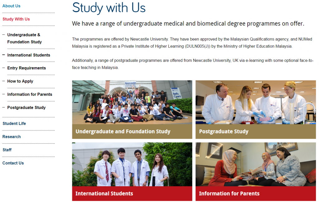
This example is from Newcastle University Medicine Malaysia. It uses our ‘top task box – dark’ content piece.
This is basically four links, but presented in a visual, structured way. Visitors can immediately see what’s on offer. This is a good option when you want to give a quick overview of different services, for example.
For this Study with Us section, it was important that we had clear pathways signposted for four key groups of users: undergraduates, postgraduates, international students, and parents.
We wanted each group to feel catered for, supported, and have easy access to pages that would help them.
You can have some text above grid boxes. Keep it short, and don’t add any if it’s not needed. The boxes should take centre stage, and do a quick job of moving users on to core pages.
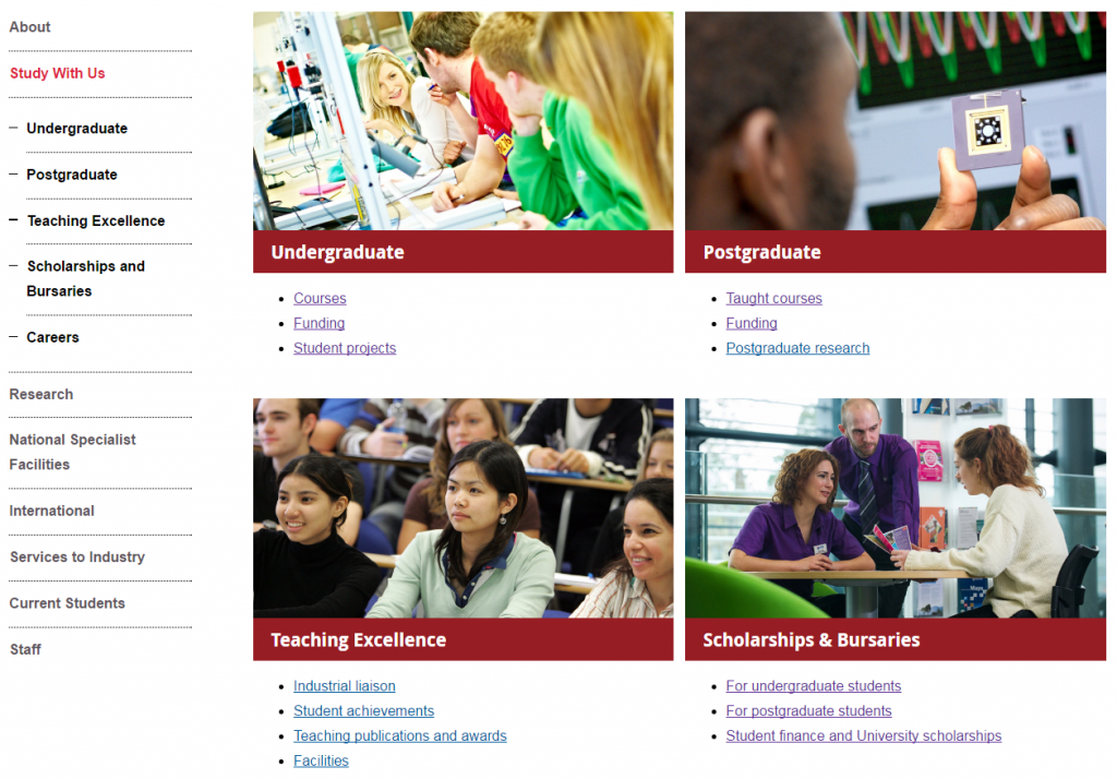
This example is from the School of Mechanical and Systems Engineering. It uses our ‘top task box – light’ content piece.
This box type gives you the option to include some hyperlinks (max. 4) below the image and main link. It’s a good option for pages where you know there are several core pages that you want to highlight.
In this example, we wanted to signpost prospective students towards the undergraduate pages, but knew that they’re likely to want to know about courses and funding in particular.
Light top task boxes are great for larger sections where you want to direct users explicitly to core pages.
Think about what the key messages for the section are, and what your user is looking for. Work out what are core areas (give them boxes), key pages within these areas (give them links), and what is additional information (don’t link them from your section opener).
Your additional information pages (in this case, the Careers page) will always be available within the section via the menu.
Learn more
You’ll learn how to create and manage these pages in our T4 training sessions. And you’ll find out how to identify your core pages in our training on planning web content.
If you’re stuck, we can help you work out what format will work best for your navigational pages, and help you with setting up grid layouts.
Have a look at :
- types of boxes, and example layouts on our demo site
- our blog post on using design to help users navigate your site
- our blog post on using the core model, which can help you work out where to use grid boxes


