Creating Effective Calls to Action

In our planning for the web training, we told you all about the core model; web pages that direct users to business goals or further information.

The paths through these pages can be highlighted as calls to action (CTA). Today, I’m going to talk about them in a little more detail.

Transactional vs navigational

There are two types of CTA, transactional and navigational.

Transactional CTA achieve business goals by getting your users to:

  • buy
  • order
  • book
  • enquire
  • pay
  • apply

Navigational CTA provide users with forward paths by linking to further information or a logical ‘next step’ in the user journey.

When you need to button it

Navigational CTA generally only need a hyperlink within the textFor example, ‘visit our Postgraduate website to find out more about funding opportunities’.

Transactional CTA require something with more impact. That’s where the T4 content type 08. Button comes in.

Buttons are larger and more eye-catching than hyperlinks. The text on them should be active, and encourage the user to do something like ‘buy now’ or ‘sign up’.

There’s examples of CTA buttons on our Go Mobile Demo website.

Storytelling

Think of your web page as a story, with the call to action as the epic climax. The narrative or your page (ie the rest of the content) should build anticipation for the call to action.

You should tell your users:

  • what the page is about
  • what the problem/issue/benefit is
  • a little of what the user will get out of pressing your button

Get it right

You can find out about different types of CTA, what types of pages to use them on, and even our top tips for using buttons.

Share this post:
Share

Usability heads in the right direction

We’ve built something new. It’s a widget for giving your web users easy access to clear directions for the location of your school/faculty/service.

It’s the efficient way for our lovely web editors to help potential visitors to the University.

It eliminates the need for paragraphs of vague/potentially incorrect routes to take:

  • roads
  • rail services
  • walking routes
  • cycling routes

Our new T4 content type is ideal for your website’s Find Us or Contact Us page.

How it works

If you’re seeking to add this content type, you’ll need to choose 14. Google directions.

We advise you add this to the bottom of your page, as it sits to the left under preceding content. Use it further up and people might miss something you’ve written that is important.

There are two boxes to fill out once you’ve selected this content type. The first is title, which should be filled out with:

DIRECTIONS: insert name of your school/service/faculty here

The second box relates to where you actually want to send your website users.

Because much of the university campus has the same postcode, you need to enter the building name and postcode.

An example for the Institute of Cellular Medicine, would be:

William Leech Building NE2 4HH

Then just update and approve your content and wait for it to publish.

What your users get

Your website users will see a search facility on the page with a Find Us button. All they need to do is add their address or postcode into the box and click on the button.

They will instantly arrive on a Google Maps page that will plot the routes to your location:

  • road
  • rail
  • walking
  • cycling
  • flight (if they’re far enough away)

Because it’s all done through Google, the information is constantly updated to remain as accurate as it can be.

It’s also a visual representation that takes you through the journey and works with GPS, instead of paragraphs that vaguely get your users here.

An example is on our demo site. Have a go applying it to yours.

Share this post:
Share

Editing Other People’s Content

So you’ve attended our Writing for the Web training and you know all about the inverted pyramid and writing concise, scannable web content. Now you’re faced with a request to add some new content to the website…

It’s a wall of text – full of long sentences, a lot of jargon and it’s about a topic that you don’t have any subject knowledge of. A feeling of dread washes over you, questions start racing through your mind. How will I prioritise the information? How can I shorten sentences when I don’t really understand them? What are the important points that I need to emphasise with bold or a bulleted list?

In our recent Writing Web Content training there were a few questions about how to edit other people’s content – particularly how to prioritise and edit complex content.

In Corporate Web Development (CWD) we face this challenge on a daily basis. In this post I’m going to share my top five tips for editing other people’s content.

1. Find out the purpose of the content

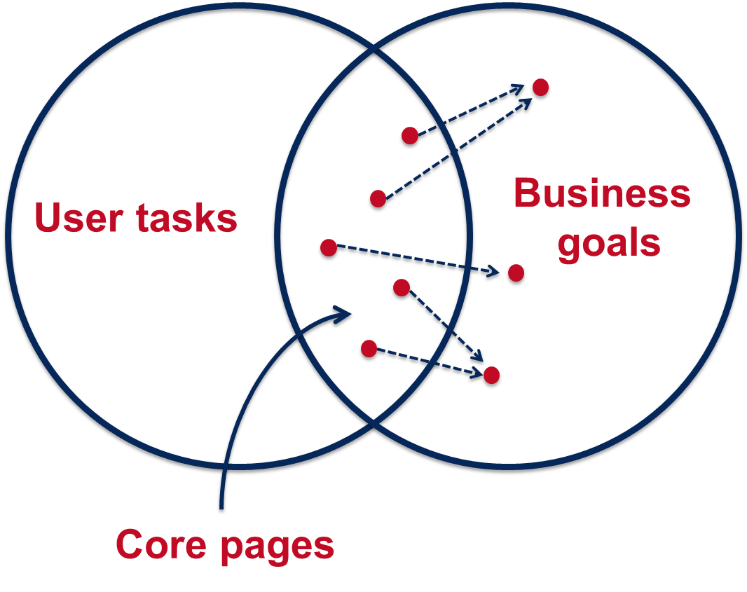
For any webpage you create you need to know why you’re creating the page and how it fits into your site purpose.

You need to be able to answer the following questions:

  • who am I creating this page for? (your users)
  • what do the users want to find out? (their questions/tasks)
  • what does the organisation want the user to do after reading your content? (business goals)

Without these answers you’ll struggle to edit the content so it’s important to speak to the subject-expert or the person who provided the content.

Discuss with content author

Set up a meeting with, or speak to, the author of the content so that you can find out the purpose of the content.

initial face-to-face or verbal briefings need to give content creators an understanding of where their work will sit in terms of the wider project and give them the chance to ask initial questions

Jackie Kingsley, Sticky Content

Armed with the knowledge of who the users are, their tasks, and what the author wants to achieve, you’ll have the confidence to start prioritising and reconfiguring the content for the web – and deleting any unnecessary words!

It’s also important to get the agreed content purpose in writing and send to all involved. This acts as a written record so that you have something to refer to when editing and it makes it clear and transparent for everyone involved.

2. Agree deadlines

It’s important to agree on specific deadlines.

It’s impossible to keep your content production slick and manageable without well-enforced deadlines

Rhiannon Jones, Sticky Content

There might be deadlines for:

  • completing a first pass edit and sending content back to the author
  • the author and stakeholders to send amends
  • the author and stakeholders to sign off content
  • content to go live on the site

Again getting deadlines in writing (even if it’s just an email) gives you a written record to refer back to. Then, if additional content is needed or if the author misses the deadline for sign-off, the record shows there will be an impact on content going live.

3. Take ownership of the content

When editing other people’s content all the rules of writing for the web still apply. Often as editors we can feel nervous about changing someone else’s words but it’s important not to fall back into the role of a content-putter-upper.

You’re the one publishing the content so it’s important that you take ownership of it. Remember you will probably know more about writing for the web than the author so it’s up to you to edit the information so that it’ll work across devices.

Proofreading

If possible, get someone else to check the content after editing and before sending back to the author.

In an ideal world no one will proof copy they have created. That’s because it’s extremely difficult to see your own mistakes

Jackie Kingsley, Sticky Content

Again, if you’ve got the purpose of the content from the author in writing you can use this at the proofing stage.

Content can also be checked against the written brief during the QA process

Jackie Kingsley, Sticky Content

4. Ask the author to check for accuracy only

When you send the content back to the author for sign off, ask them to check for accuracy only. It’s important that the facts are correct, which may have been misinterpreted through the nature of editing. However, you don’t want lots of opinions about style, tone or format as the content has already been edited for the web.

I often find it helpful to compile a document of any content gaps or questions that I’ve come across while editing the content. You can also use this document to explain any editing choices you’ve made and why the edited content works better for different devices. Again, a written record makes everything clear and transparent.

5. Schedule time to review content

Often content is edited and polished before it’s published but then after it goes lives it’s left to languish on the site. Links become broken and content becomes out of date – resulting in frustrated users and the credibility of the site being questioned.

So whatever the content you’re editing, however small it might be, make sure you schedule in time to review it. Speak to the author about whether it is still relevant to their business goals and their users’ tasks.

Share your tips

And that’s my whistle stop tour of editing other people’s content.

Let us know in the comments if you’ve got a challenging editing situation, or share your tips for editing other people’s content.

Further reading and references

Related posts

Share this post:
Share

Using Design to Help Users Navigate Your Site

In our training for planning and writing for the web we talk a lot about user tasks. We use the core model to identify which pages on our websites provide the answers to our users’ tasks and also meet our business goals. These are known as the website’s core pages.

It’s incredibly important that we help our users get to these core pages, as they may sometimes be two or three levels down in the site’s structure. One thing we can do to help is to create inward paths to them from site homepages and section openers.

Top task driven homepages

Deciding what goes on to a site’s homepage can be a political battle. Everyone wants a link to their page. It’s also often done in isolation from planning the content on the rest of the site. Not anymore. We can use our core pages and users’ top tasks to determine what should go on a site’s homepage.

“the homepage is usually the last page we design. (How can you design the wrapping before you know what’s inside?)”
Ida Aalen, The Core Model: Designing Inside Out for Better Results

Take the new Information for Schools website, for example. Instead of having links to all of the main sections of the site (which can now be accessed from the menu on the left), there is a grid with links to the core pages: Events on Campus, Book a Visit and Support for Visits. There’s also a feature on the PARTNERS programme with links into the core pages within this section.

Screenshot of the Information for Schools and Colleges homepageDesign features for section openers

First off, let’s deal with the question of what exactly we mean by ‘section opener’. These are the top level pages below your homepage. You may find it easier to think of this in terms of a hierarchy diagram, with branches for the main sections of a site coming off the homepage.

Website hierarchy diagramThere are a couple of design features you can add to your section openers, depending on their purpose.

Like your homepage, you may choose to include a top task grid to help your users navigate to the core pages in the section.

Alternatively, you can choose to add a masthead which creates a visual opener for the section. This allows you to include some contextual information to answer users’ questions, as well as links to other pages in the section.

Screenshot of Research Support section opener with mastheadVisual hierarchy

Using grids and mastheads at the section opener level can help to create a visual hierarchy so your users know where they are in the site. If we have these features deeper in the site it can cause confusion. We want to create a clear distinction between the look of a section opener, and a standard content page.

Here you can see the difference visually of a section opener and a standard content page at the next level down.

Screenshot of the Business and Outreach section opener on the AFRD website

Top task grid on the AFRD Business and Outreach section opener

Screenshot of standard content page on the AFRD website

Standard content page for the AFRD Services to the Rural Economy page

With persistent use of grids there’s also another problem – where’s all your content? With grid after grid, you’re never actually providing the core content that will answer your users questions.

Conclusion

You can use top task grids on homepages and section openers to help your users navigate to your core pages.

Sometimes on a section opener you may want to provide some contextual content as well as links to core pages in the section. You can use a masthead in these cases.

Make sure you’re creating differentiation in the design of the section openers and your core pages. Only use grids and mastheads for your top level pages so they don’t lose their impact and so users know where they are in your site. Also remember that grid layouts are navigation rather than content so too many can create extra steps for users to find your core content.


Share this post:
Share

How to Use the Core Model to Improve Your Web Content

I came across the idea of the Core Model at a content strategy conference last year.

It’s an exercise that helps you to identify pages on your website where user tasks and business goals meet. These are your core pages and you should focus your efforts on improving these before other content on your site.

Core Model diagramWe use the core model exercise in our training on planning web content. So far we’ve introduced it only to those editors on the Go Mobile programme, but it’s a useful tool for anyone who looks after a website.

Elements of the core model

The core model helps you to answer a series of questions about a page on your website, and this in turn determines what content is needed on the page.

User tasks – what questions will users come to this page to answer and what tasks do they want to complete?

Business goals – what business goals drive the content on your page?

Inward paths – how will users find and access this page? Where will they start their journey?

Core content – what is the essential content you need on your page to help your users answer their questions and complete their tasks? What secondary content will help you achieve your business goals?

Foreward paths – where will users go after they’ve answered their question/completed a task on your page? Are there more business goals that you can drive them towards?

Let’s work through an example

This example is taken from the About section of the University website. It’s a page about the quality of our research.

Core Model worked example - research excellenceUser tasks

A user might come to this page to find out about the quality of research done at Newcastle and to see how we rank against other universities.

Business goals

Our goals for this page are to attract new research collaborators, partners, staff and students.

Inward paths

The inward paths to most pages on the University website will be very similar. Users might get there from a:

  • search, either on the website itself or from a search engine
  • link from elsewhere on the University website, or from a link on an external site
  • link from a publication or email

Core content

For our users to complete their task we need to provide some context for them by outlining what research we do at Newcastle and who we work with. They also need to know the headlines from our REF results so they can quickly answer the question of how our research ranks against other universities. The awards we’ve received for our research are also relevant.

Foreward paths

This is where we need to think about the onward journey of our users, and how that fits with our business goals. From the research excellence page we want visitors to go on to find out more about our:

  • impact case studies
  • societal challenge themes
  • REF results

We must make sure there are calls to action on the page that link to all these destinations. These in turn will have their own calls to action, for example from the impact case studies to job vacancies.

Have a go yourself

Now that you’ve read about the core model and how it can help you prioritise content for improvement on your website, why not have a go yourself.  You can download a core model template from our website (University login required).

Share this post:
Share