A Quick Guide to…Embedding Videos in T4

For University web editors who have gone through Go Mobile and are using T4 to edit their sites, here’s a refresher on how to embed video content.

In the new responsive template videos are embedded using the content type ‘06. External Media’. They should be hosted on a dedicated delivery service, eg YouTube.

Before embedding a video you should check that it relates to and supports your written content.

You should also check the thumbnail for the video. If it’s caught between frames or doesn’t seem appropriate, don’t use the video and flag the issue with whoever uploaded it to the channel.

Embed code

When adding a video to your content always take the web address from the video’s embed code.

Screenshot of protecting coral reefs video on YouTube

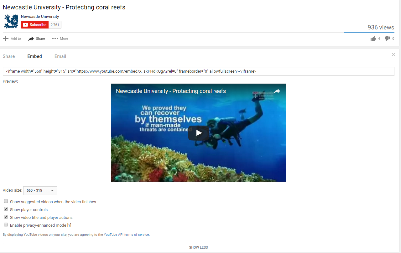
Protecting coral reefs video on YouTube

You’ll also need to make sure the option to ‘show suggested videos when the video finishes’ is unchecked. Otherwise you run the risk of unrelated videos, or worse competitors’ videos, being pulled into your page.

Screenshot of embed code for a video on YouTube

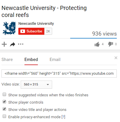
Embed code for Protecting Coral Reefs video on YouTube

Example

The video embed code will look something like this: https://www.youtube.com/embed/X_skPHdKQgA?rel=0

The code for the Protecting Coral Reefs video is X_skPHdKQgA, while the part of the code that ensures no additional videos are pulled in is: ?rel=0.

Adding to T4

When adding to T4:

  • add the prefix and name of the video
  • paste in the embed code to the Media URL field
  • add a caption to give context (limited to 50 characters)
  • don’t duplicate the video title in the caption if already displayed in the media player
  • select the most appropriate alignment for the video
Screenshot of video embed screen in T4

Screenshot of video embed screen in T4 (select to view larger image)

Alignment

On desktop, you can choose to align videos to the right of your content or make them full width so they stretch to the size of the screen.

We recommend using the full width option with caution, though – this often reduces the quality of the video. It can also look more cluttered and can make it harder for the user to find the answers to their questions.

On mobile, videos behave the same as images – stretching to fill the width of the screen and flowing below content.

Load time

We recommend that you only add one video per page. This is so that you don’t bombard the user with too much video content, but more importantly so that you don’t slow down the load time of the page.

Find out more

Check our T4 Moderator guide for how to embed external media (University login required).

Visit our website to find further advice and support about video hosting (University login required).

Related posts

Share this post:
Share

5 Reasons to Limit Video Content on your Site

As we take more sites through Go Mobile we’ve been removing quite a few video pages. We get asked a lot why we consider videos to be supplementary content on websites, and why we discourage a page containing only video content.

In this post I’m going to share five reasons why I think you should limit video content on your site.

1. Videos can be time consuming

People read differently online – they scan and dedicate less time, and often come to a website to find the answer to a question.

They are looking for a bridge for that information gap. They want to get over that bridge as quickly as possible.

Gerry McGovern

Videos are not the quickest bridge to information because, as Amy Schade (Nielsen Norman Group) points out, “they force users to access the content sequentially”. This means that users can’t quickly scan the information to see if it will be relevant to them  like they could with text.

If we rely solely on video content to convey our primary messages we run the risk of burying them. Users might not watch a video to the end, or worse, they might not watch it at all. In our new responsive template videos don’t play automatically, giving the user control over what they view.

As Amy Shade argues, users should “have the ability to collect information in another way”.

If using videos on your site you should always ensure that your primary message is also presented in text so that users can access it quickly.

2. Videos are not always accessible

When using video content you need to be mindful of accessibility.

Providing content as a video can limit access to the information contained in this format for anyone who cannot see or hear the content.

Amy Schade, Nielsen Norman Group

Is video the most appropriate medium to convey information to your target audience? For example, if one of your target audiences is from a country where Youtube is not available, relying on videos to provide information means that your audience can’t access it.

Videos can also break or be removed from the channel they’re hosted on.

3. Videos can distract from your core content

As well as videos being time consuming they can also interrupt the flow of your core content.

Video and the accompanying audio, can confuse or distract users”.

Amy Schade, Nielsen Norman Group

On mobile devices videos can take longer to scroll through as they stack to fill the smaller screen.

Since videos are potentially distracting users from your core messages, it’s important to think carefully about when and where to use them on your webpages.

4. Videos can slow the page load

Videos, like images and virtual tours, can slow the load time for your webpage. If users can’t access your information quickly they can become frustrated and leave your site.

5. Videos often don’t provide a next step

As well as coming to the web to find something out, users often come to a website to complete a task. There is a danger with videos just to tell a story rather than provide information with a call to action.

“Many videos are essentially dead ends that leave the user with no clear path to additional information.”

Amy Schade, Nielsen Norman Group

This supports my argument that videos are usually supplementary content on websites. They should sit alongside your core content to provide context or qualifying information rather than being relied on to provide essential next steps in the user journey.

Final thoughts

I’m not trying to say videos are not useful content. Do I believe they are more suitable in other mediums, such as social media? Absolutely. Like Gerry McGovern, I believe that a website is still “primarily a text-driven medium”.

However, I can also see the benefits of videos on a website. Like other dynamic content, videos can be engaging and can help break up blocks of text. They also provide context and qualifiers to support your core messages.

It’s essential though that we use this content type sparingly on websites to maximise impact, and to ensure that we’re not excluding, distracting or annoying our users.

Remember, there isn’t much time to grab the user’s attention on the web, it’s best to present your primary messages as quickly and as clearly as possible.

References and further reading

Amy Schade, Video Usability, Nielsen Norman Group (NNg), 16 November 2014

Gerry McGovern, Text is more important than images on the Web, New Thinking, 26 September 2010

Gerry McGovern, The Challenge for Writers of Web Content, New Thinking, 24 May 2015

Related posts

Share this post:
Share

Designing the New University Homepage

As part of phase one of Go Mobile we redesigned the University homepage so that it works across all devices. Like the other sites going through Go Mobile it is managed in T4, the University’s content management system.

Features of the homepage

Our new homepage can be broken down into eight distinct sections.

  1. Global menu for quick access to key links
  2. Course finder for direct access to Undergraduate and Postgraduate courses
  3. Hero image slider to highlight key news, event and research stories
  4. Video content to support our key messages
  5. Seasonal message top task boxes
  6. Latest news from the Press Office
  7. Partner logos and awards carousel
  8. Social media links and directory
Newcastle University homepage features and layout

Homepage design features and desktop layout

On mobile devices these stack horizontally, one on top of the other.

We’ll look at a couple of these features in more detail.

Hero image slider

The old homepage image slider was full width. Although this created a strong visual impact, sourcing images to fit this area could be problematic.

Old full-width hero image slider

Old full-width hero image slider

The new hero image slider is smaller. It allows the Press team to source images that would fit a standard landscape 4 x 6 photo.

New hero image sliderOn mobile devices the caption drops below the image to avoid the image from being fully covered. The caption and image form a single clickable link. This is important on mobile devices as it creates a large hit target to increase successful touch interactions.

Video content

The new homepage layout has allowed the use of rich media content such as video. The analytics show that the external homepage is the most popular destination for video consumption. This has helped increase the profile of some key videos during the months of October to December 2015:

  • The Impact of a World-Class Civic University
  • How Smoking In Cars Can Affect Children
  • Dr Martin Luther King Jr Honorary Degree Ceremony
  • Our City
  • Our Campus

Related posts

Read more about the new responsive website template in our case studies:

Share this post:
Share

How to Improve your Website Images and Videos

Images and video are used as supporting content on the University’s websites.
People don’t tend to prioritize our websites specifically for images or videos – they visit for information; your content.

That said, content can be greatly enhanced by using images or video to support your messages if they are used in the right context. So what is the right way to use them?

Choosing an image/video

High Quality

Use only high quality images. Images should not be blurry, stretched or pixelated. There is a range of University photography you can use in the photo library. Always preview your image to check the quality before publishing.

Videos should be selected from an official University YouTube channel and embedded in your site. Don’t upload the original video file directly to your website.

Support the content

Images and videos are supporting messages. They should always make sense to the user, their job is to help to enhance the meaning of your page. Your content should provide the context for the image/video.

It’s important your images and video is relevant to the content on the page. User testing increasingly shows that people are feeling more and more negative towards the use of generic stock images.

Less is more

If you have too many images or videos on a page, you can compromise the effectiveness of your content. They can:

  • slow page load times
  • interrupt the reading experience
  • make pages disjointed and harder to read

Images of text and complex images, like flowcharts or graphs, can also present a barrier for users accessing your content, and should be avoided.

This content in the image is effectively invisible to users of screen readers and anyone viewing the text only version of your site, for example a mobile user with images turned off. It is also impossible for search engines to index this content – so if you want people to find this information, use content!

If you must include a complex image in your site then a text alternative of the essential information contained in the image is required.

Image size and orientation

For sites edited via Contribute the standard image size is 320 x 180 pixels. We recommend that you use landscape images. Specific templates may have alternative sized images for banners and grid layouts.

Sites edited in T4 have many image options. For these size requirements you can view the image guide on our demo site (University login required).

Keep an eye out for a future post on editing images.

As videos are embedded onto your webpage, your website template should automatically provide you with the right size and a preview image for the box. Just look at our support pages to find out how to embed a video (University login required).

Alt text

Alt text provides alternative, textual content when an image cannot be displayed or for users of screen readers. It should be descriptive, but not necessarily a literal description of the image. Think about describing what the image represents.

Linking images

Many of our websites contain pages with grids of images, for example the Open Day landing page. Linking the image used here increases the area a user can ‘click’ or ‘tap’.

This is useful for mobile users who may be trying to select links using their finger or a stylus. Image links should always be supported by links in the text of your page.

Social media

Individual posts and campaigns run on social media are ideal for hosting video content. These channels tend to be seen as more engaging for people, as they can so easily share content – but more importantly, they enable people to talk directly to us.

Consider using social media alongside your website in this way to help your messaging. Social media can help direct people to your website, and your website should connect people to your social media.

Find out more about using social media in this way from the University’s Social Media Team.

Final thoughts

So that’s your whistle stop tour of improving images and videos for your website. These assets should always be used to enhance your pages, to enable people to better engage with your content. Find out more from our guide to images (University login required).

Share this post:
Share

Meet the Supporting Cast for your Core Content

Me: “Hey website, I have a question, help me answer it. How do I get to Newcastle?”

Website: “Before I do that, why not stay a while, look at our pictures; see how they glide by. We’re showcasing our city, our campus, our staff, our facilities, and our cat (oh, you didn’t stick around for that one).”

Me (scrolling quickly): “No really, just directions would do…”

Website: “Could I interest you in this video – it’s actually about the Law School, but you know, it might have a map in it, or perhaps a Virtual Tour? We’ve got a nice one of the Sports Centre: the gym is amazing”.

Me: “Er, no thanks, bye.”

Meet your supporting cast

These image galleries, videos and virtual tours have a lot to bring to your web pages.

They can provide engaging content. They help reinforce reputation and quality. They should act as support for the core content of the page.

Problems occur when they take over and try to be the star of the show.

They interrupt the flow of your carefully crafted content. They butt in. They push the priority messages out of the way.

 “Most people come to the Web because there’s an information gap. Something has cropped up. There’s something they don’t know, something they need to do.”

Gerry McGovern

Prioritise web page content

We should be careful about placing too much emphasis on the supporting content in a page.

Stop this from happening by focusing on the priorities for the page.  Read our blog post on Structuring Content to help you.

All our supporting content flows after the core content. On desktop it floats right or under the core message. On mobile it flows under the core messages.

This means our site users are not interrupted when trying to find the answer to their questions. The supporting content is there if they have time or want to read more, watch or listen.

 “Let us not focus on getting people to spend time with our content but rather on seeing how we can save them time.”

Gerry McGovern

Supporting content examples

Supporting web content includes a whole raft of things from images to interactive virtual tours. As long as it’s relevant to the page and its placement is considered: it’s all good.

Qualifiers

Qualifiers back up our claims. They could be quotes or accolades that reinforce a core message. Partner logos and accreditation can also lend weight to statements within the content.

Images

A picture is worth a thousand words – this can be true. A good, clear, relevant photo can enhance your core content.

But, too many images can start to bring noise and distraction to the page. Consider displaying these as an image gallery. This can group together similar photography: facilities for example.

Video

Add a video if it supports the content of the page – don’t get sucked into adding videos “just because they were made”. This all represents clutter to your end user.

Virtual tours

These are a great way to showcase facilities and can help engage with your users. Again, make sure they support the context of the page.

Calls to action

Supporting content can also provide a next step.

They include calls to action like booking a place at an event. We have styled content buttons for this.

We’ve also got a suite of social media icons that can help increase visits to Facebook or Twitter.

Delete it!

Test if it really is supporting content. If you took it away would your reader still leave the page happy that they found out what they needed?

References

Gerry McGovern. The Challenge for Writers of Web Content. New Thinking. 24 May 2015.

Related posts

Image credit: magic moment by rvoegtli on Flickr

Share this post:
Share